Published at: 2025-10-30
Creating and Viewing Statistic Charts
1. Create Charts
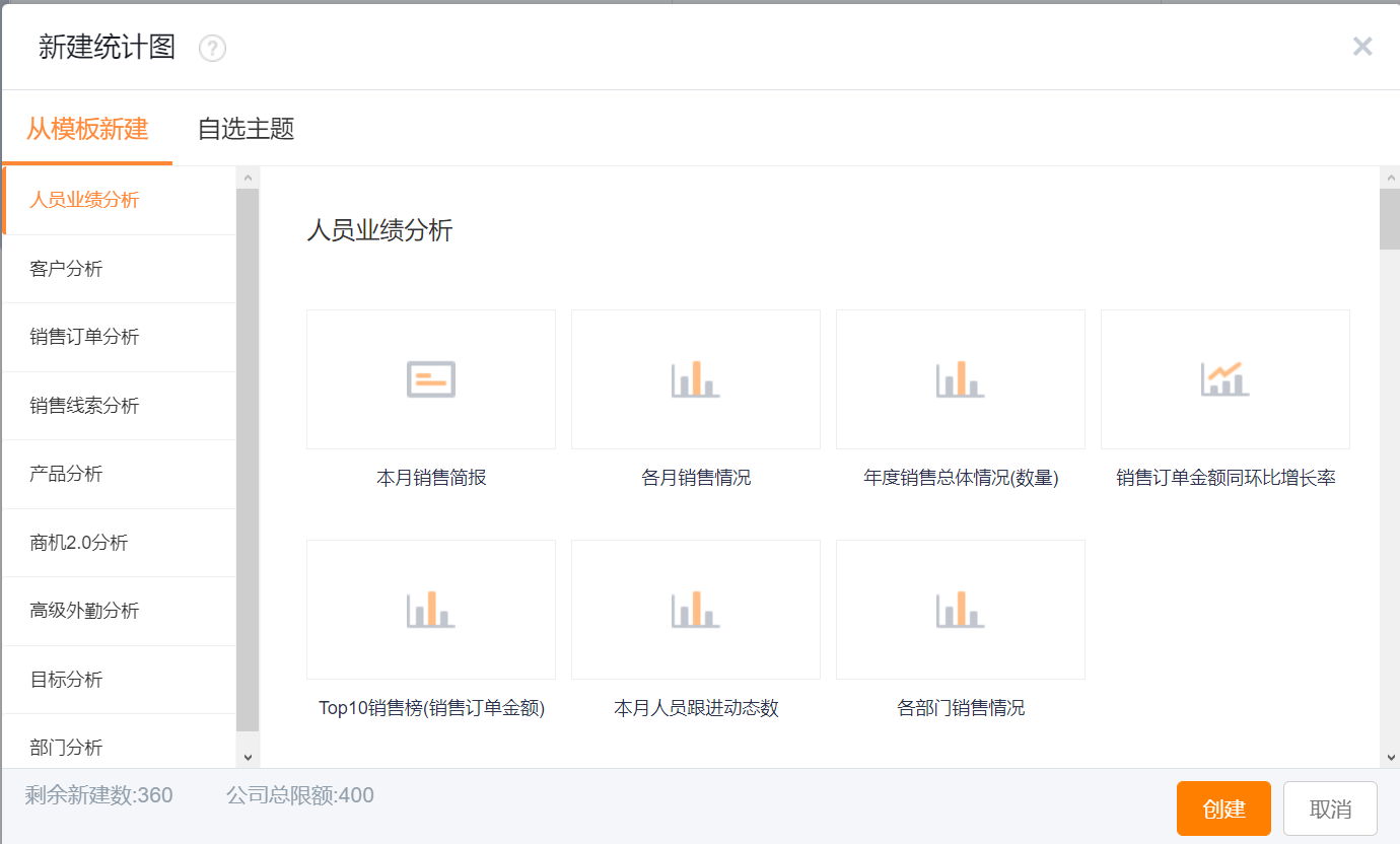
1.1 Create a Chart from a Preset Template
The product provides multiple preset Chart templates organized by business domain. Choose the template that matches your scenario to create a new Chart.
- Template description: All Charts are built around a business subject domain. For example, the Account Analysis domain focuses on analyzing Accounts, including Charts for Sales Order distribution by account level, transaction status by account level, follow-up trends, and other Account-centered analytics.
- Using Chart templates: When you click to create a new Chart, the system opens the preset Chart templates. Select the subject domain and template that match your business scenario to create the Chart.
- Create all Charts at once: This option creates one Chart for each latest system template. Creation will fail if a Chart category already exists. When you add the ShareCRM app, the system automatically creates all Charts for your organization based on default templates—this is why the report categories and Charts appear the first time you open Reports, and you usually do not need to run this operation manually.
 </img>
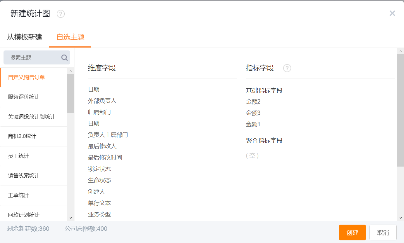
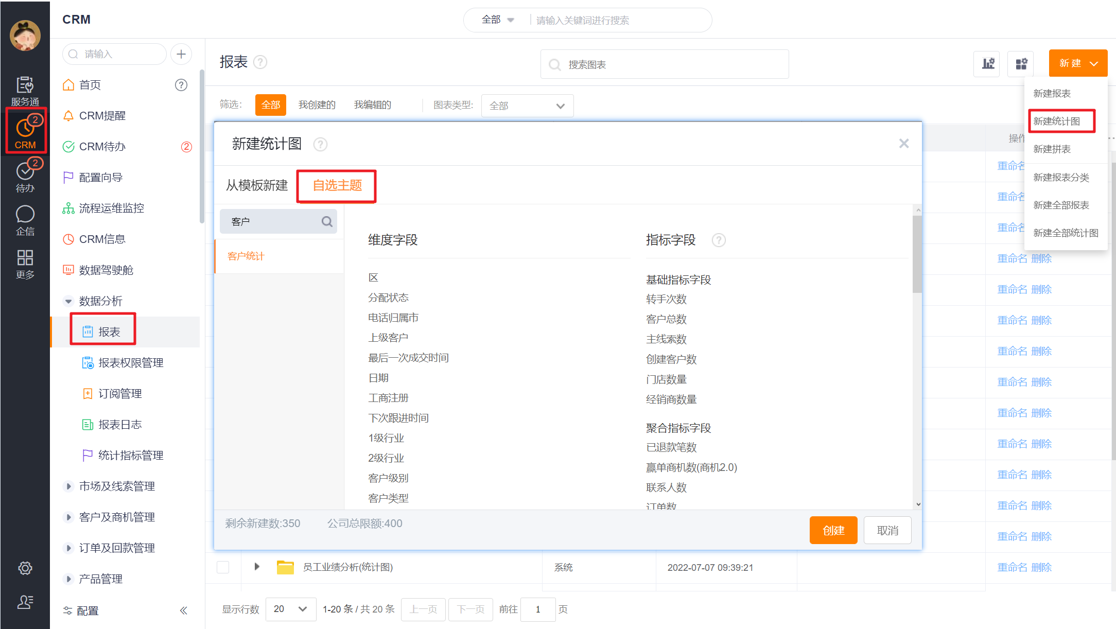
1.2 Create a Chart from a Custom Subject
If no preset template fits your needs, create a Chart by selecting a Custom Theme (Custom Subject). Choose the subject you require and proceed to configure the Chart.
 </img>
2. Edit Charts
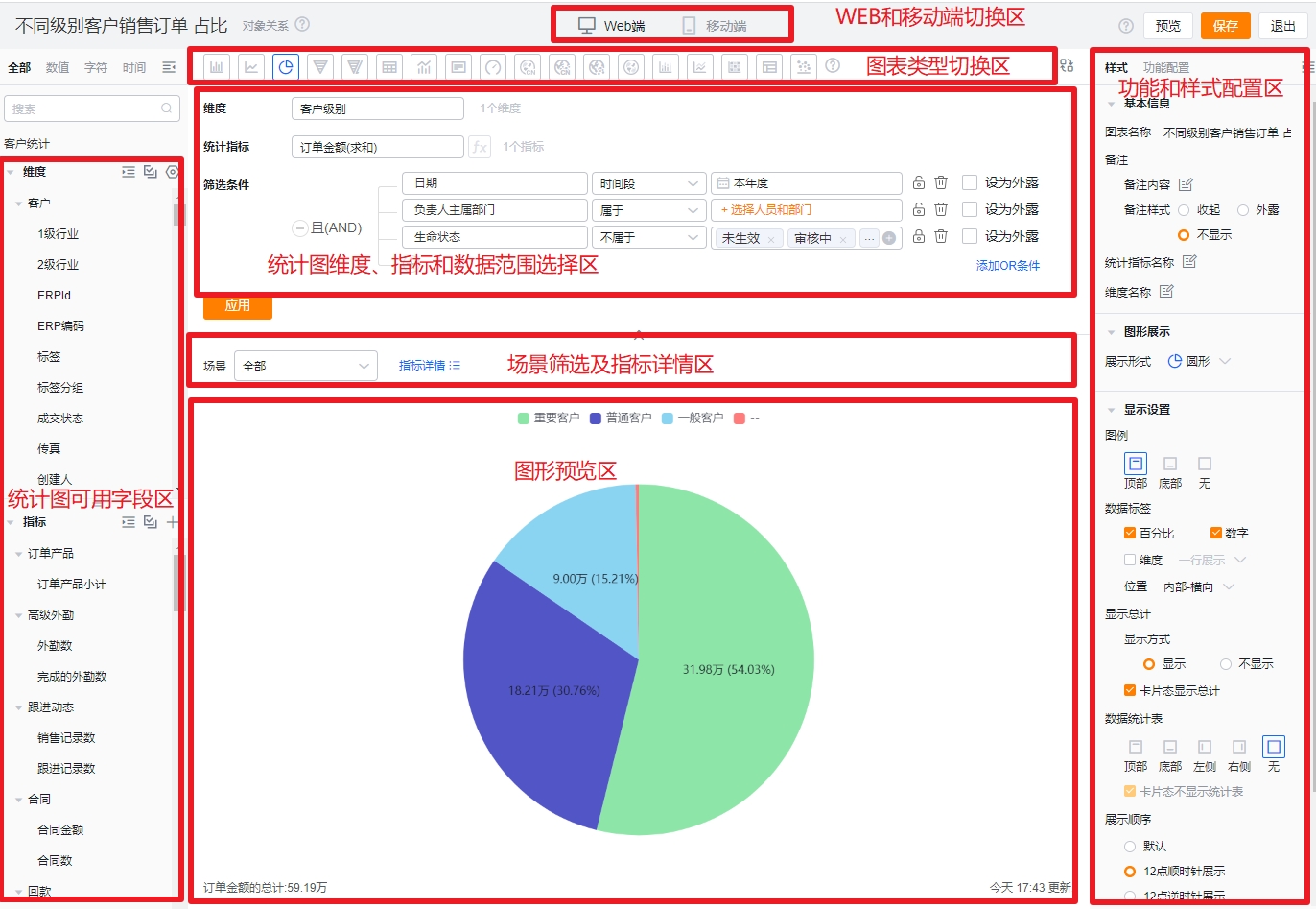
2.1 Designer Layout
- Left: Available Fields area. Available fields vary by template and can be dragged to the right design area.
- Top-right: Chart Design area. Configure axes, data range, appearance, sorting, display, and collapse/expand the design section here.
- Middle-right: Filter Scenes. Specify the default filter scene for the Chart.
- Bottom-right: Chart Preview area.
*Note: Available fields include attributes of the subject object and characteristic values from objects related to that subject. For example, for the Account subject, Account attributes include Account Name, Account Status, Industry, Affiliated Account Pool, Owner, etc. Characteristic values come from related objects such as Opportunity, Visit, Sales Order—for example, number of Opportunities linked to the Account or Opportunity amount.
 </img>
2.2 Configure a Chart
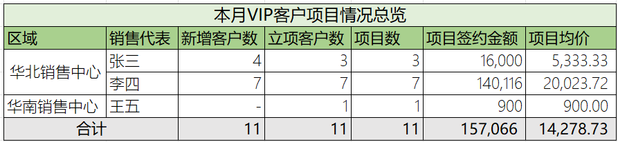
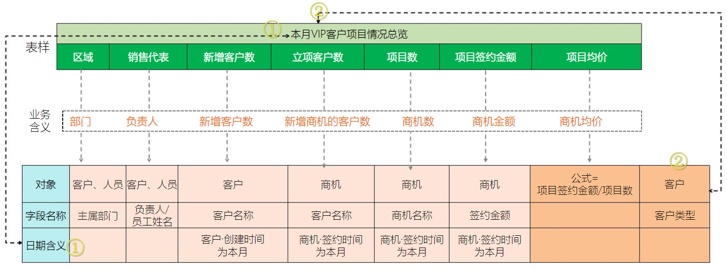
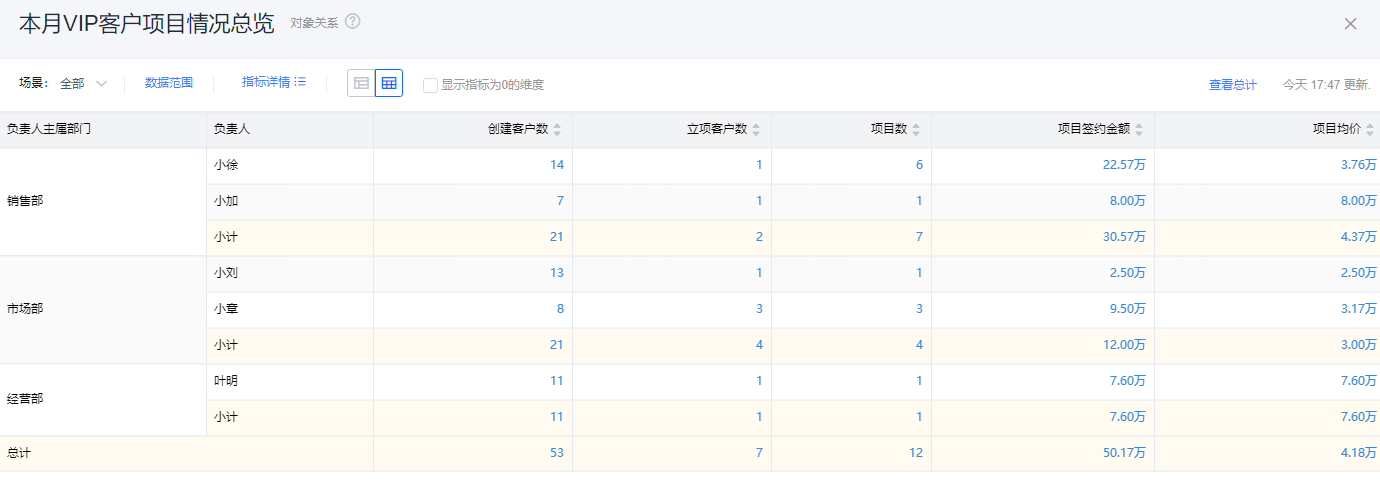
The following example shows the process from receiving a requirement to completing a Chart configuration. Suppose the request asks for an Account report: analyze this month's VIP Accounts’ project progress. Can the BI Chart deliver this?
 </img>
2.2.1 Step 1: Break Down the Requirement
- The client wants to analyze this month · region-wise · VIP Accounts’ project progress.
- Business metrics to report (business language):
- New Accounts, Accounts with project initiation, Number of projects, Project contract amount, Average project price
- Corresponding CRM system metrics (system language):
- New Account count, New Opportunity Account count, Opportunity count, Opportunity amount, Opportunity average price
*Note: "Accounts with project initiation" differs from "Number of projects" because a single Account can have multiple Opportunities.
- New Account count, New Opportunity Account count, Opportunity count, Opportunity amount, Opportunity average price
 </img>
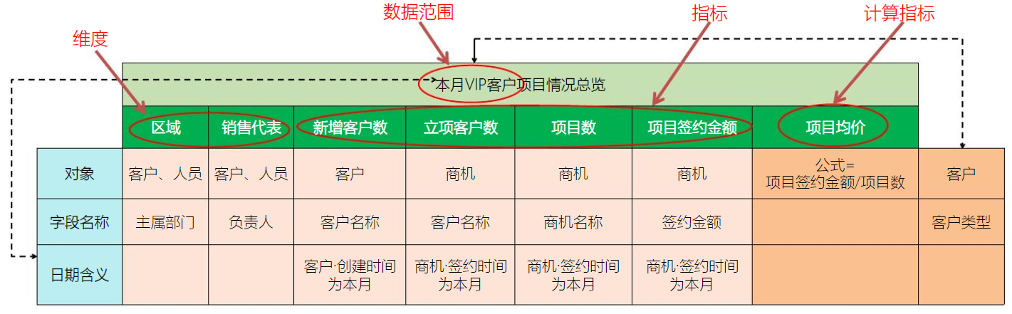
2.2.2 Step 2: Define Dimensions, Metrics, and Data Scope
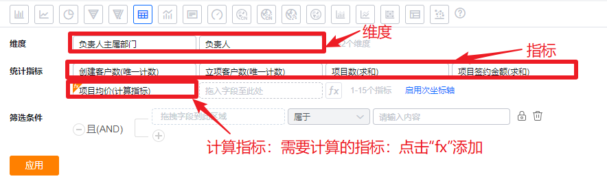
- Dimension: What you group by — the Chart's X-axis. Examples: Dept., User, Region, Industry, Status, Type, Date. For this case, Region and Sales Rep are dimensions.
- Metric: The number or amount to measure — the Chart's Y-axis. Examples: Account count, Sales Order amount, Product quantity, Payment Collection amount. This case's metrics are New Account count, Accounts with project initiation, Project count, Project contract amount, Average project price.
- Calculated metric: A metric derived from other metrics, e.g., Average Price = Sales Price / Account count, Lead Conversion Rate = Converted Leads / Total Leads. In this case, Average project price = Project contract amount / Project count.
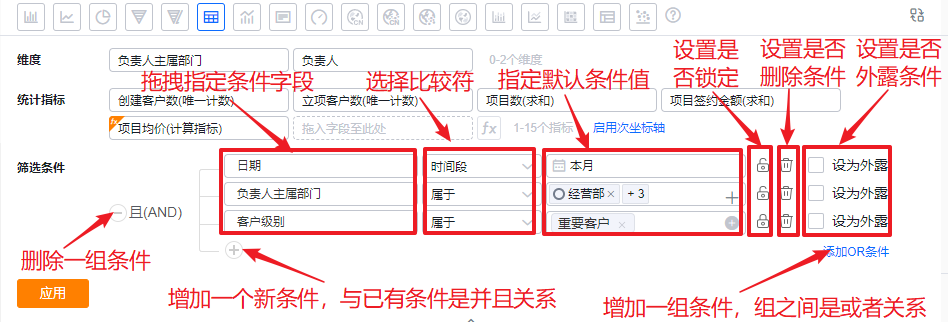
- Data scope: Constraints that limit the Chart data, e.g., Date = This Year, Life Status = Active. For this case: Date = This Month, Account Level = VIP.
 </img>
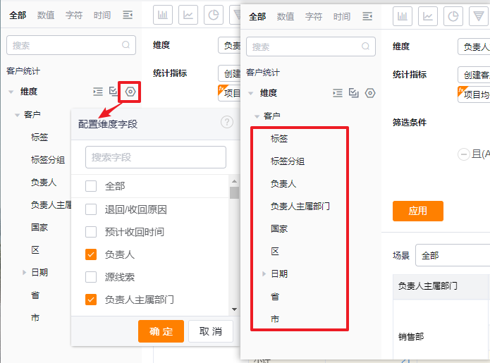
2.2.3 Step 3: Select the Subject
Typically the chosen dimension fields indicate the subject domain. When some dimension fields are common across subjects, use fields from the data scope to determine the correct subject.
- In this example, Region and Sales Rep are dimensions, and Date and Account Level are data scope fields. Because Account Level is specific to Account analysis, choose the Account subject.
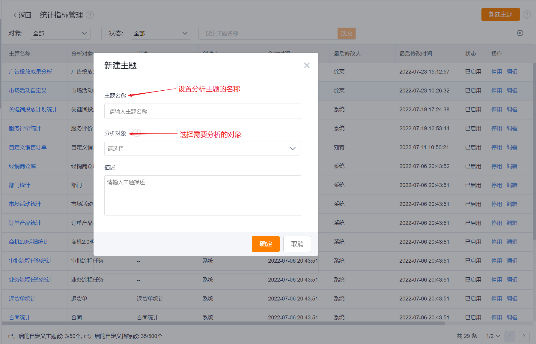
- Create a new subject:
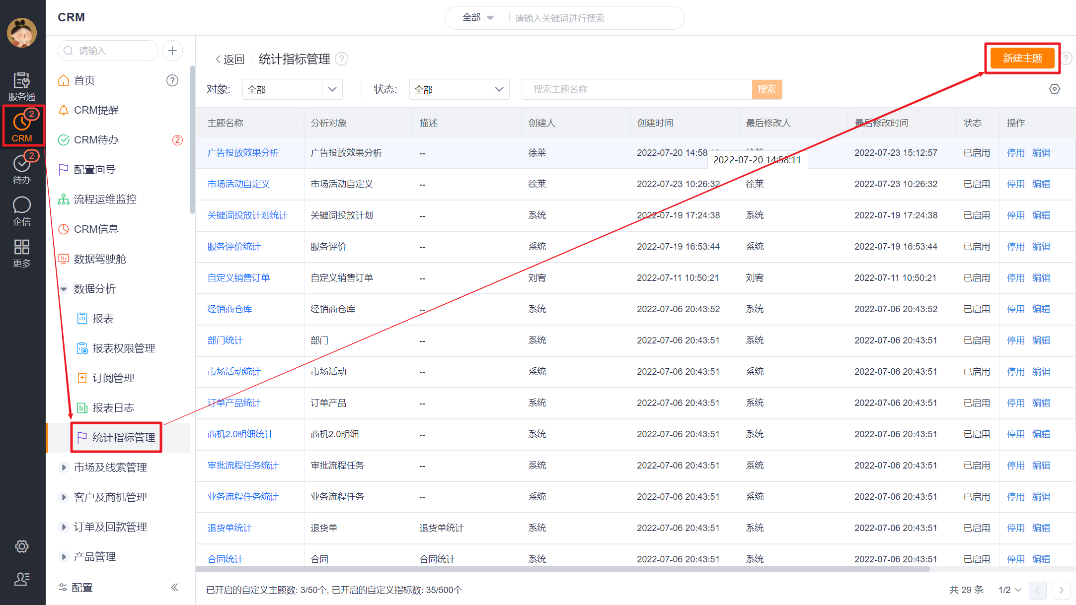
- CRM → Data Analysis → Metric Management → Create Subject
- CRM → Data Analysis → Reports → Metric Management → Create Subject
 </img>
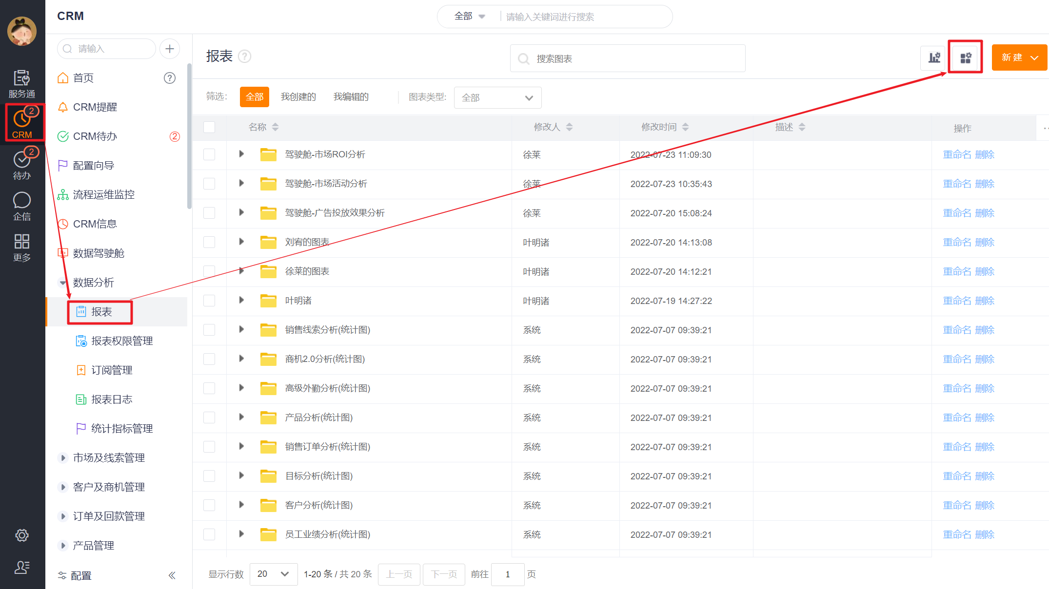 </img>
When creating a subject, choose the correct analysis object. In this example, select the Account subject because it's preconfigured; no new subject creation is necessary. If an appropriate subject does not exist, create one as described above.
 </img>
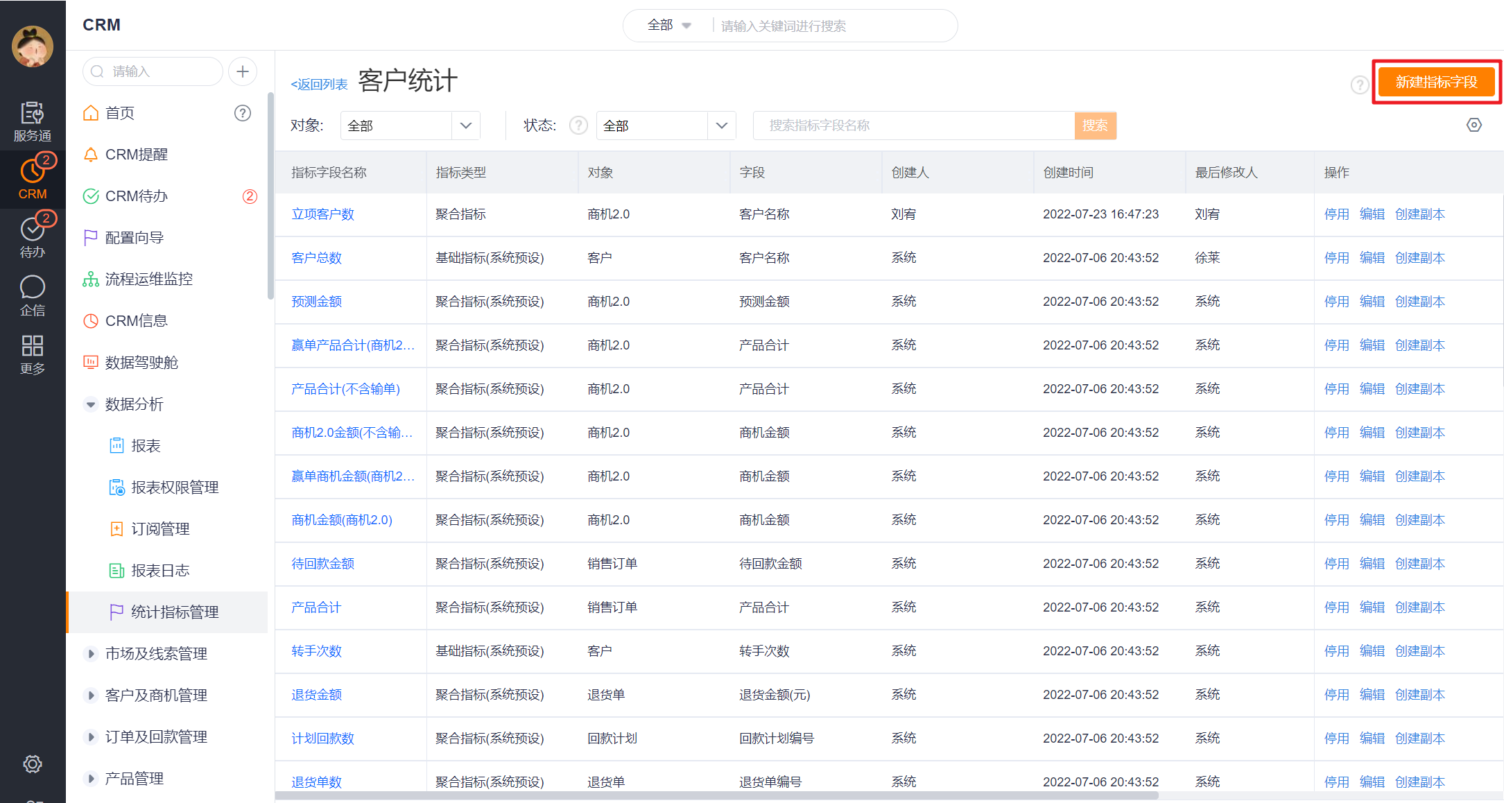
2.2.4 Step 4: Choose Metrics
Check whether the preset metrics under the selected subject meet the report requirements. If not, create new metrics. Current metrics in this example: New Account count (preset); Accounts with project initiation, Project count, Project contract amount (need to create); Average project price (derived metric).
- Create metrics: From the subject's metric list page (accessed in Step 3), create new metrics as needed.
 </img>
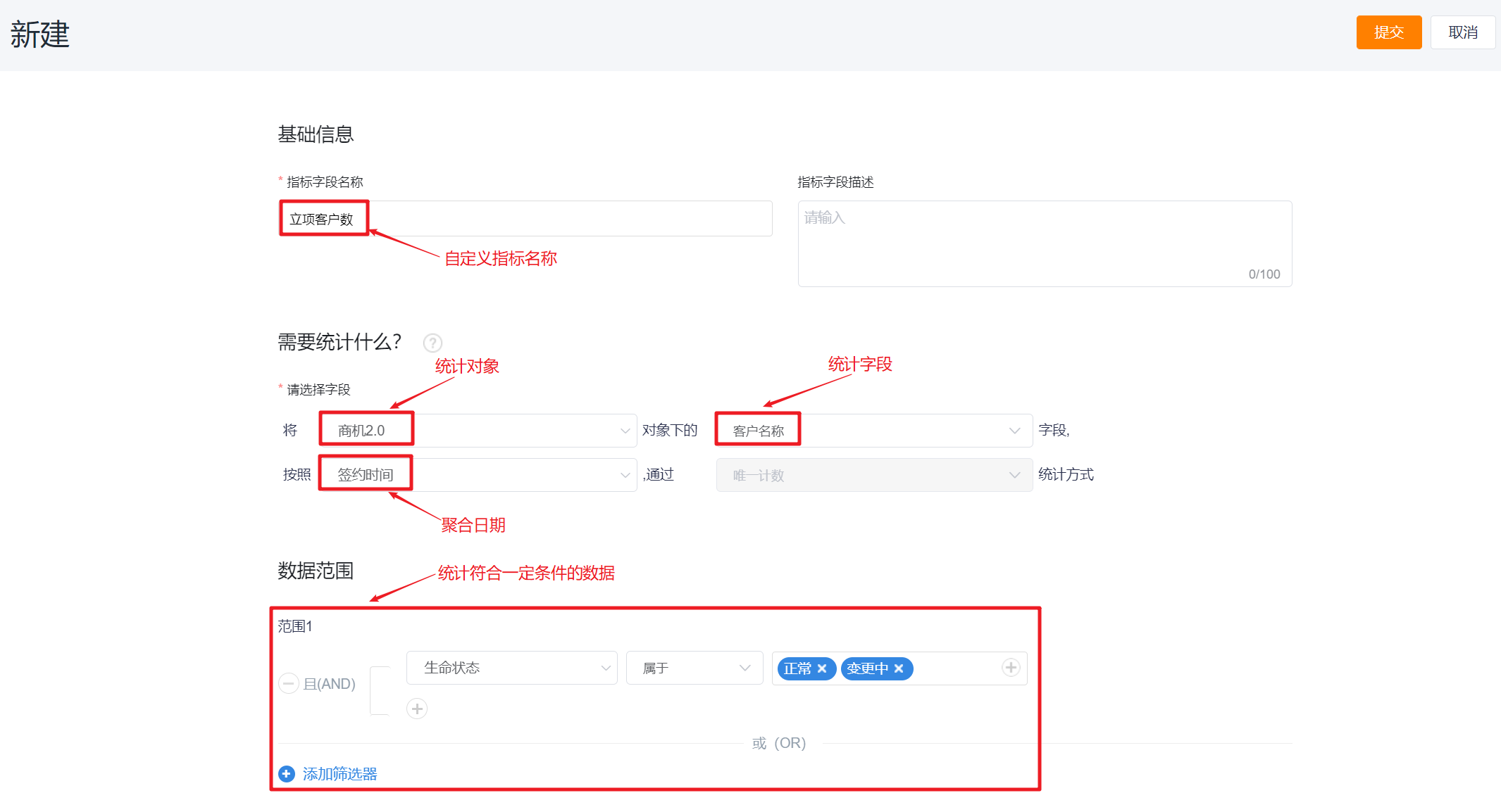 </img>
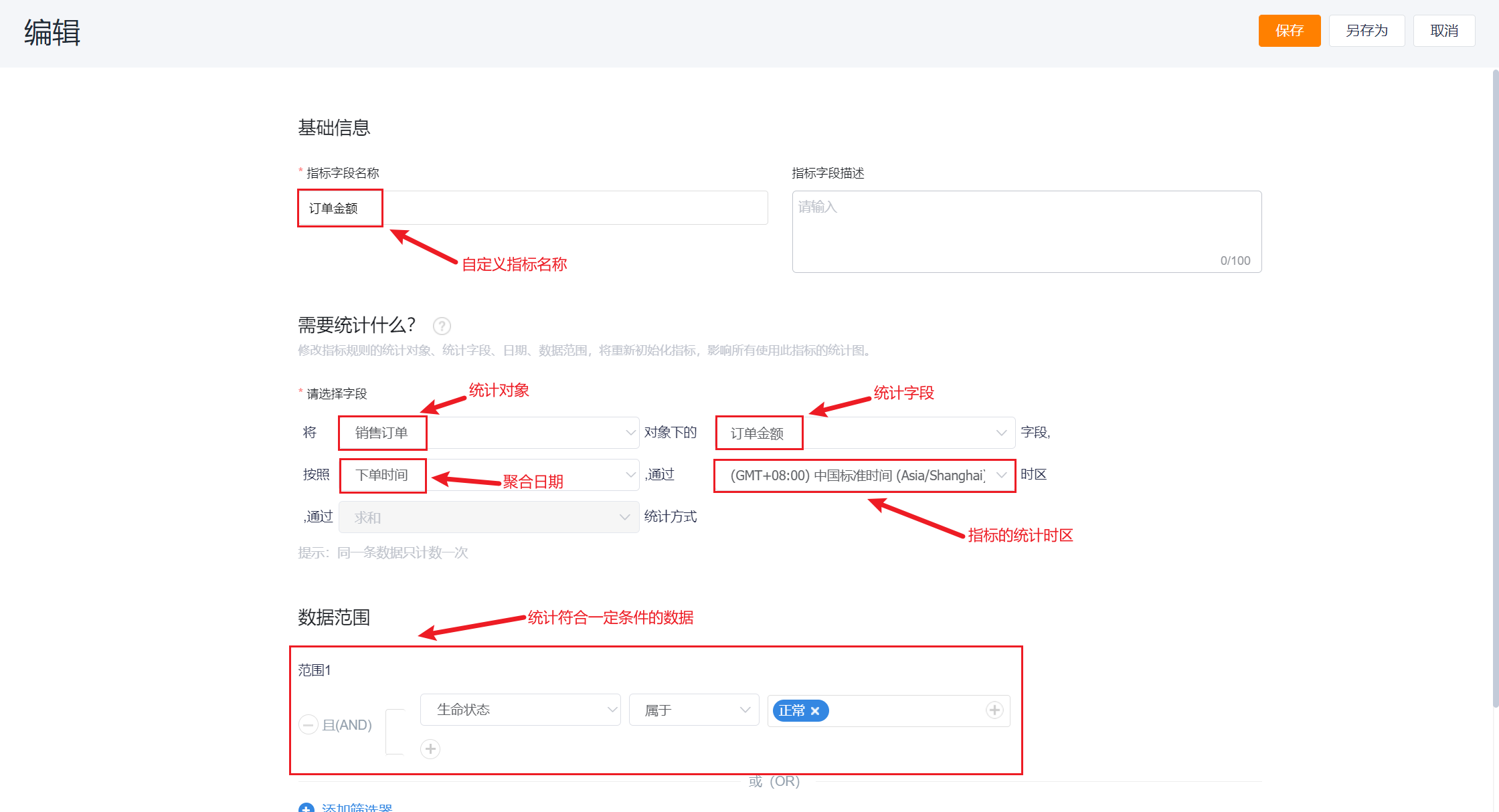
- If multiple time zone support is enabled for your organization, you can set a custom timezone when creating a metric; the default is the tenant timezone. When the aggregation date is empty, timezone selection is disabled. If the aggregation date field is configured as single-timezone (not multi-timezone), the metric timezone is fixed to "Event Timezone". Changing a metric's timezone triggers metric initialization.
 </img>
- For more on metric management, see: Metric Management
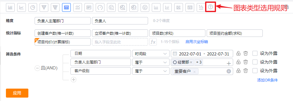
2.2.5 Step 5: Configure the Chart
- Entry: CRM → Data Analysis → Reports → Create Chart → Custom Theme → Select the created subject (e.g., Account Statistics) → Open the configuration page
 </img>
- Drag the dimensions and metrics identified in Step 2 to their target positions, and set display formats for metrics as needed.
 </img>
- Place Date, Owner’s primary Dept., and Account Level into the Data Scope area.
 </img>
- If multi-time zone is enabled, the Chart editor supports switching the Chart timezone. Changing timezone clears existing metric configurations and only allows metrics whose timezone matches the Chart timezone, metrics with empty aggregation date, and metrics configured as single-timezone.
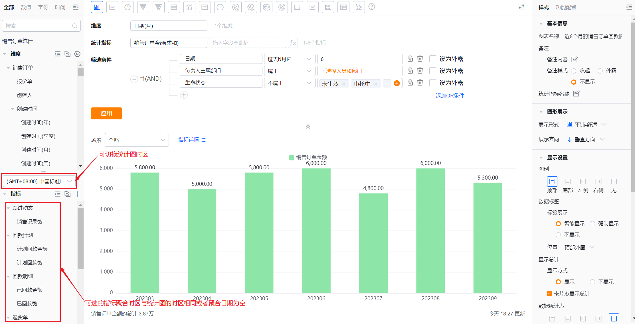 </img>
- Style and feature settings are optional. See Chart Type Guide for details on styles and features for each chart type.
- Click Apply to complete the configuration.
 </img>
Notes on operations within the Chart Design area during configuration
2.2.5.1 Admins Can Control Visible Dimensions
- CRM Administrators and Report Administrators can hide unnecessary dimension fields per Subject. This is a subject-level setting: after admins apply it, all users who use that subject will only see the configured dimensions.
 </img>
2.2.5.2 Switch Chart Type
- Available chart types depend on the number of dimensions and metrics. See Chart Type Guide.
 </img>
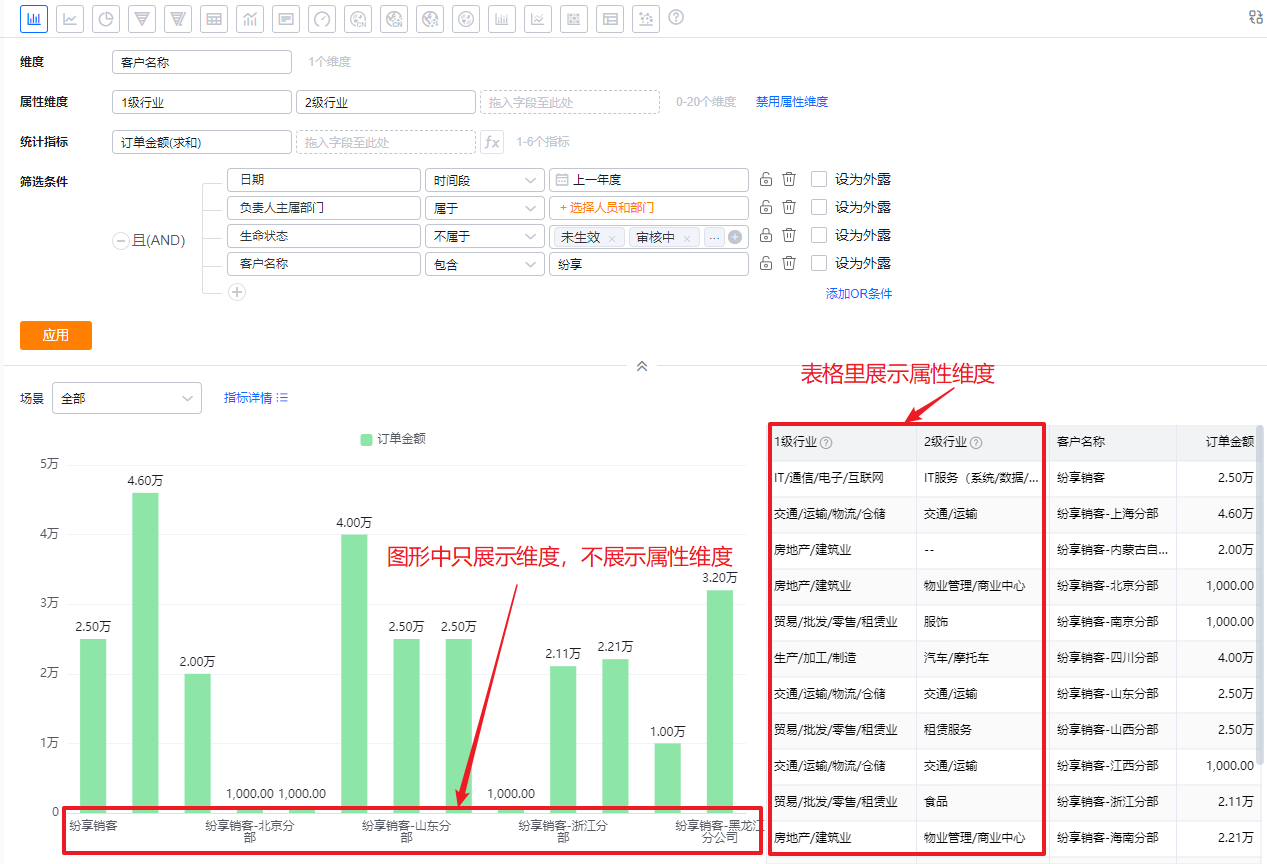
2.2.5.3 Attribute Dimension
- When you drag a primary Attribute field of the current subject into the dimension area, you can enable the Attribute Dimension regardless of chart type. For graphical charts, Attribute Dimensions do not display directly in the visual chart; they only appear in the Table view. For table charts, they display directly in the table.
- When you remove the primary Attribute field from the grouping dimensions, the Attribute Dimension is automatically disabled.
 </img>
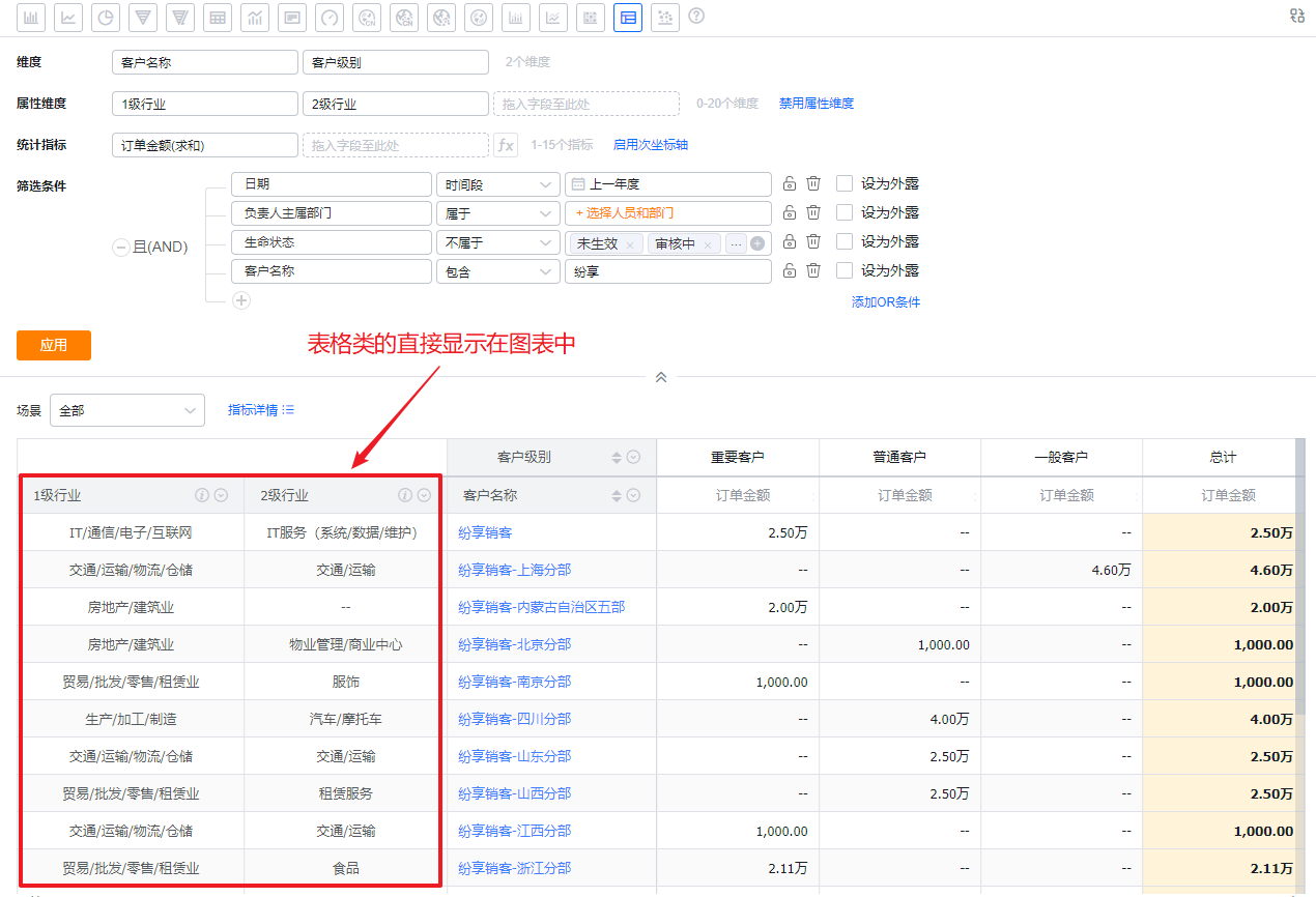 </img>
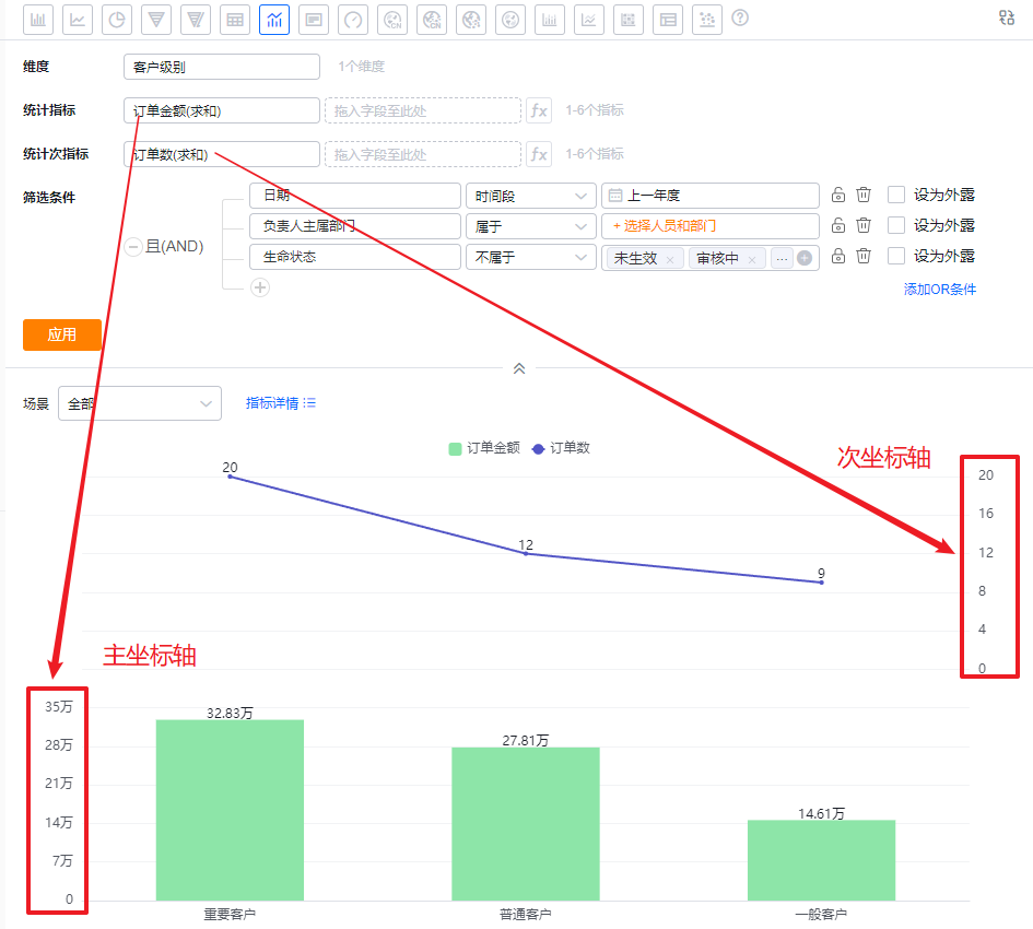
2.2.5.4 Enable Secondary Axis
- Used primarily for dual-axis charts to display multiple metrics on separate axes.
 </img>
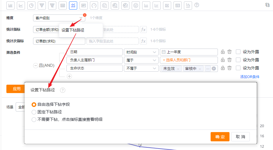
2.2.5.5 Configure Drill Path
- You can set drilling behavior for dimension fields. The default is free selection:
- Free drill field selection: When drilling down, you choose which dimension to drill into dynamically;
- Fixed drill path: Define the sequence of drill fields during Chart configuration; clicks automatically follow that fixed path;
- No drill: Clicking a metric opens its detail view directly.
 </img>
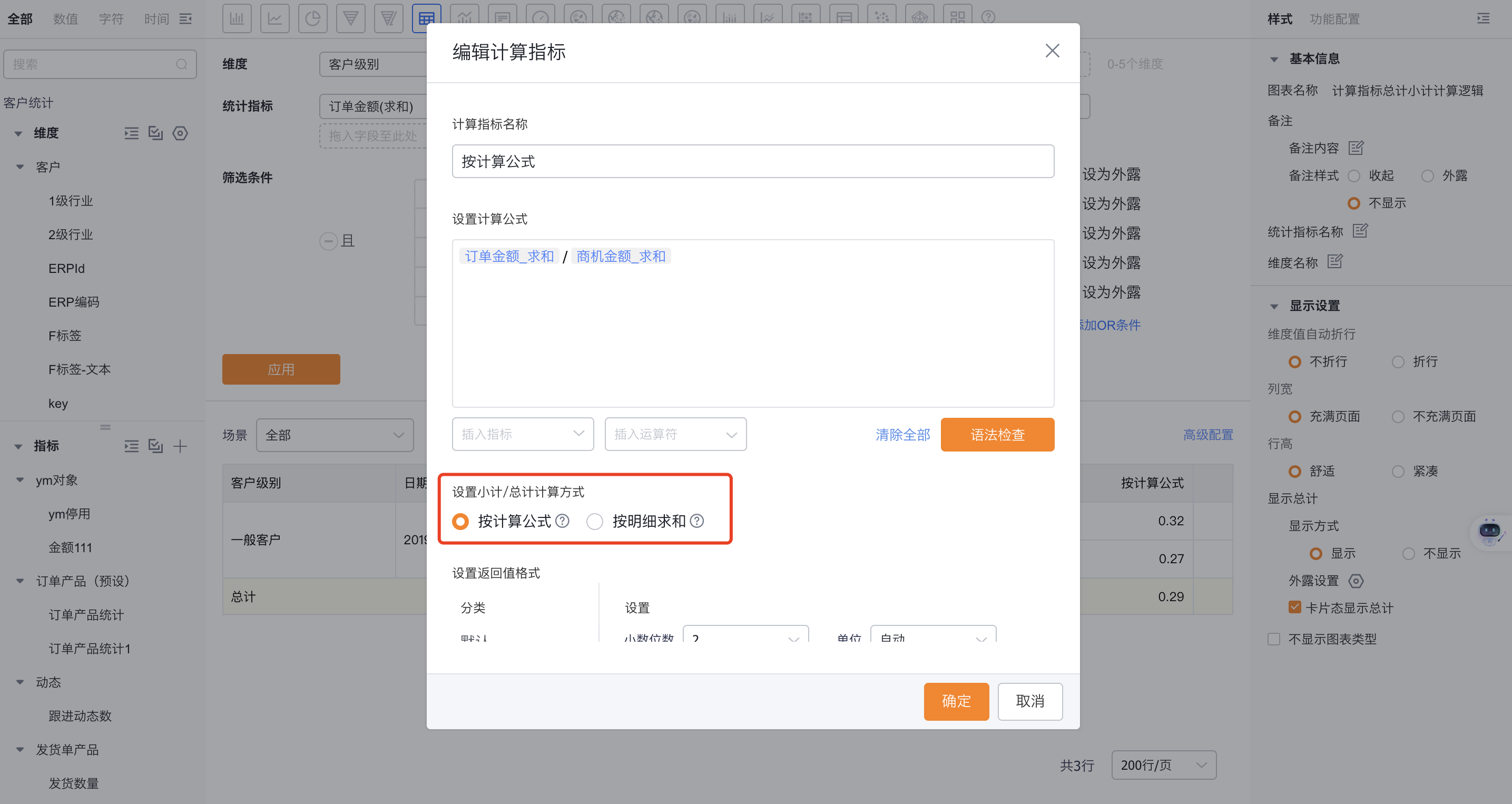
2.2.5.6 Add Calculated Metrics
- Create calculated metrics by combining existing metric fields with + - * / () || operations. You can choose how subtotals/totals are computed: by formula or by summing details.
- By formula: Subtotals/totals for involved metrics are computed using the formula.
- By detail sum: Subtotals/totals are calculated by summing all detail rows.
 </img>
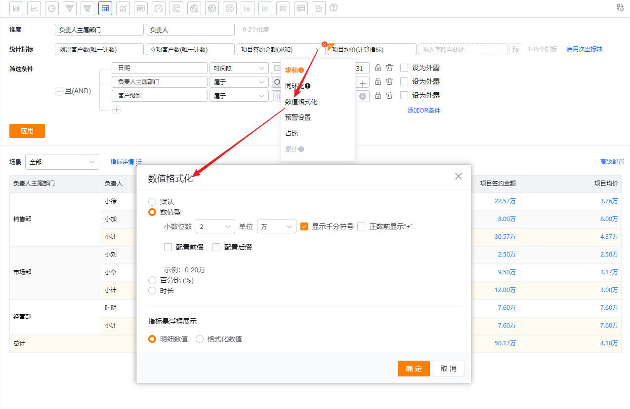
2.2.5.7 Numeric Formatting
- Default: Metric uses the default display;
- Numeric: Convert metric to numeric display. Configure decimal places, display unit (e.g., K, M), thousand separators, whether to show “+” for positive values, and optional prefix/suffix;
- Percentage: Display the metric as a percentage;
- Duration: Display the metric as a duration.
*Metric tooltip displays:- Detail value: Raw metric value (default);
- Formatted value: Metric value after formatting.
 </img>
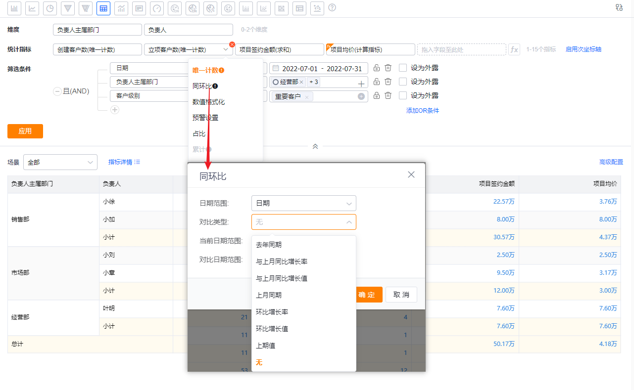
2.2.5.8 Period-over-Period Metrics
- Period-over-period comparisons (e.g., year-over-year, month-over-month) are available only when the dimension is a Date field or when the data scope uses a Date filter. Supported comparison types vary by date granularity.
 </img>
 </img>
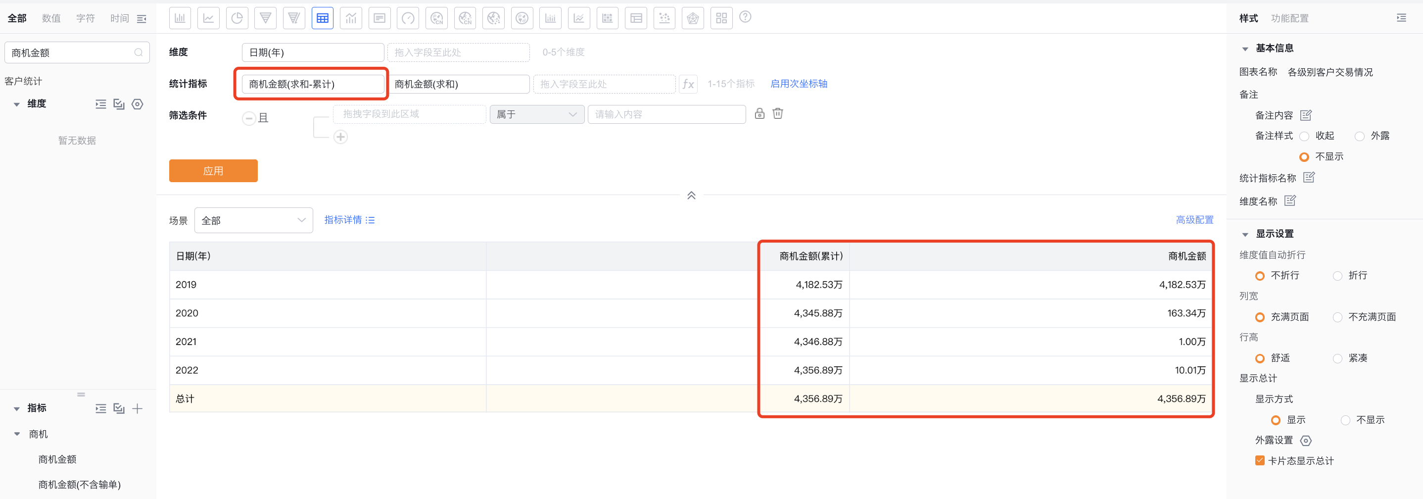
2.2.5.9 Cumulative Metrics
You can enable cumulative calculation for any metric via the dropdown. Cumulative calculation is supported only when the dimension contains exactly one Date or DateTime field; otherwise cumulative calculation is not available.
 </img>
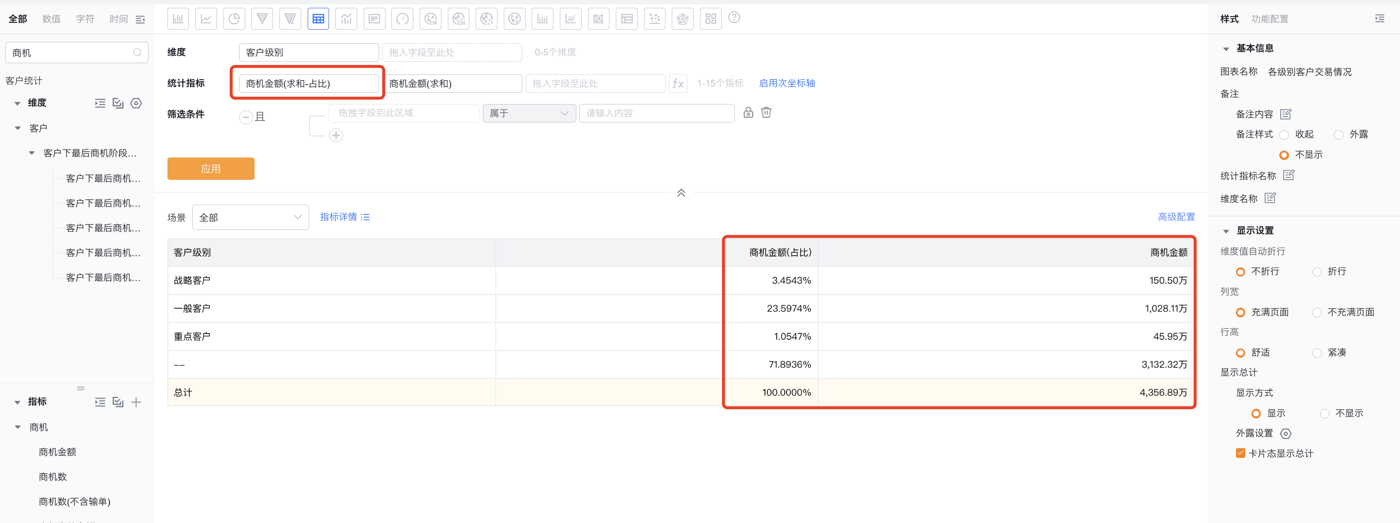
2.2.5.10 Metric Proportion
You can enable proportion ranking for any metric via the dropdown. Enabling proportion computes the share of each row relative to the grand total. Currently only global proportion (each row's share of the total) is supported.
 </img>
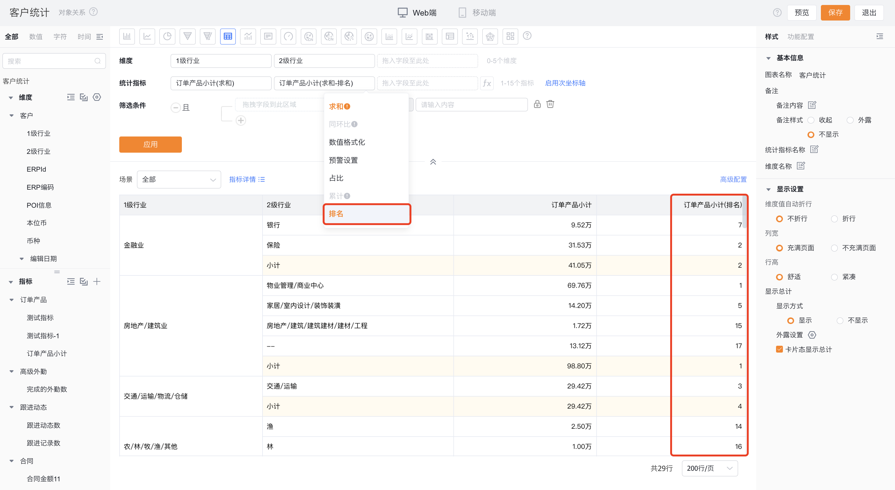
2.2.5.11 Metric Ranking
Configure ranking for any metric from the dropdown. Clicking Ranking opens a configuration dialog where you define ranking rules.
- Enable ranking: off by default
- Ranking type: Global ranking or Group ranking
- Global ranking: Ranks rows across the entire chart (subtotals/totals excluded).
- Group ranking: Ranks within each dimension group (subtotals/totals ranked separately).
- Ranking method: Tied ranks can be continuous or non-continuous
- Tied continuous ranking: Equal values receive the same rank, and subsequent ranks continue sequentially.
- Tied non-continuous ranking: Equal values receive the same rank, and subsequent ranks skip numbers.
- Sort order: Ascending or Descending
- Descending ranking: Rank from largest to smallest (1..N).
- Ascending ranking: Rank from smallest to largest (1..N).
 </img>
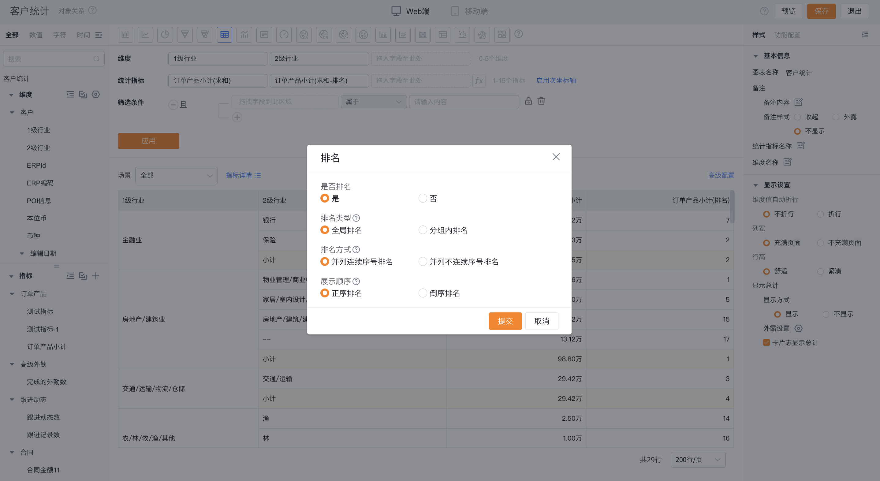 </img>
2.2.5.12 Styles
- Styles define the Chart's visual presentation.
- Different chart types offer different style options.
- Adjust the Chart's appearance as needed.
- You can set axis titles and label rotation angles.
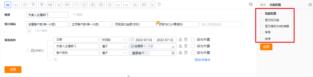
2.2.5.13 Feature Configuration
- Available features vary by chart type. See Chart Type Guide for details.
 </img>
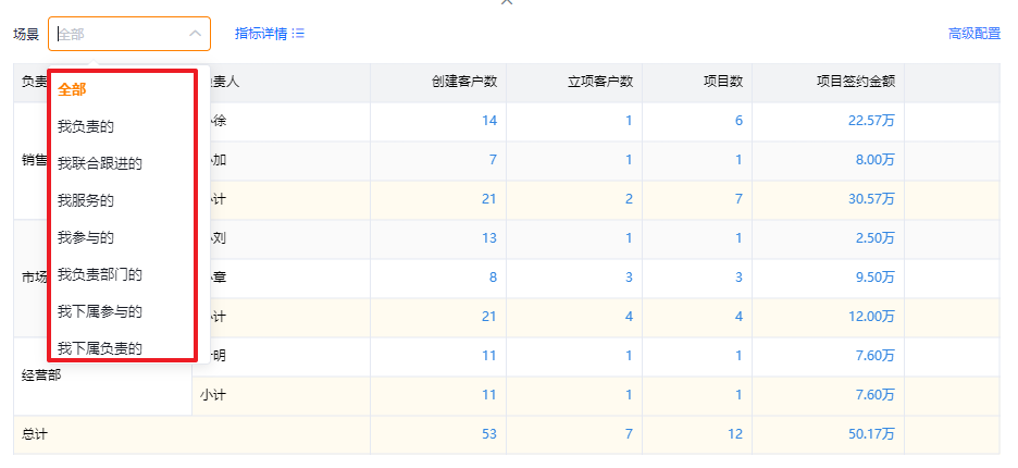
2.2.5.14 Filter Scenes
- BI preconfigures filter scenes for each Chart. You can set which scene tag the Chart should use by default when viewed.
 </img>
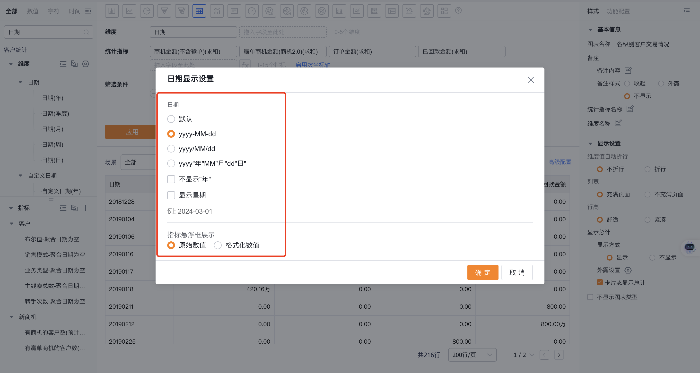
2.2.5.15 Date Formatting
- When Date/DateTime fields are used as dimensions, BI lets you customize date formats. You can also customize Year, Quarter, Month, Week, and Day splits independently.
 </img>
3. View Charts
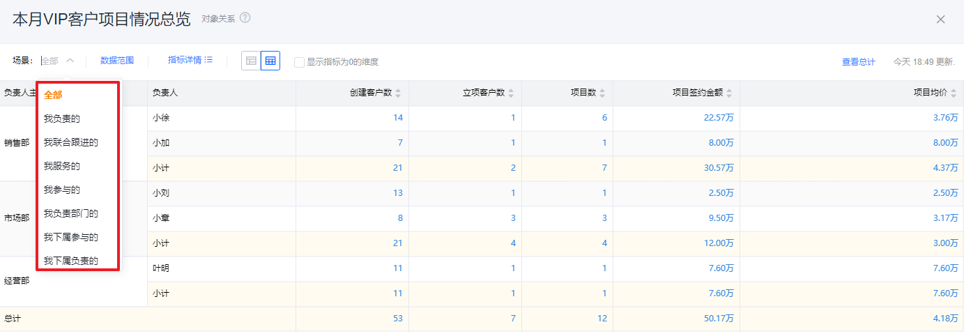
3.1 Filter Scenes
- Switching scene tags quickly shows data for different scenarios.
Web view:
 </img>
Mobile view:
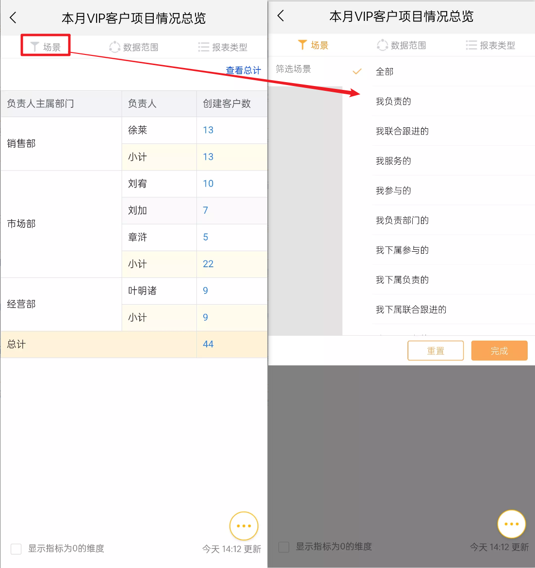 </img>
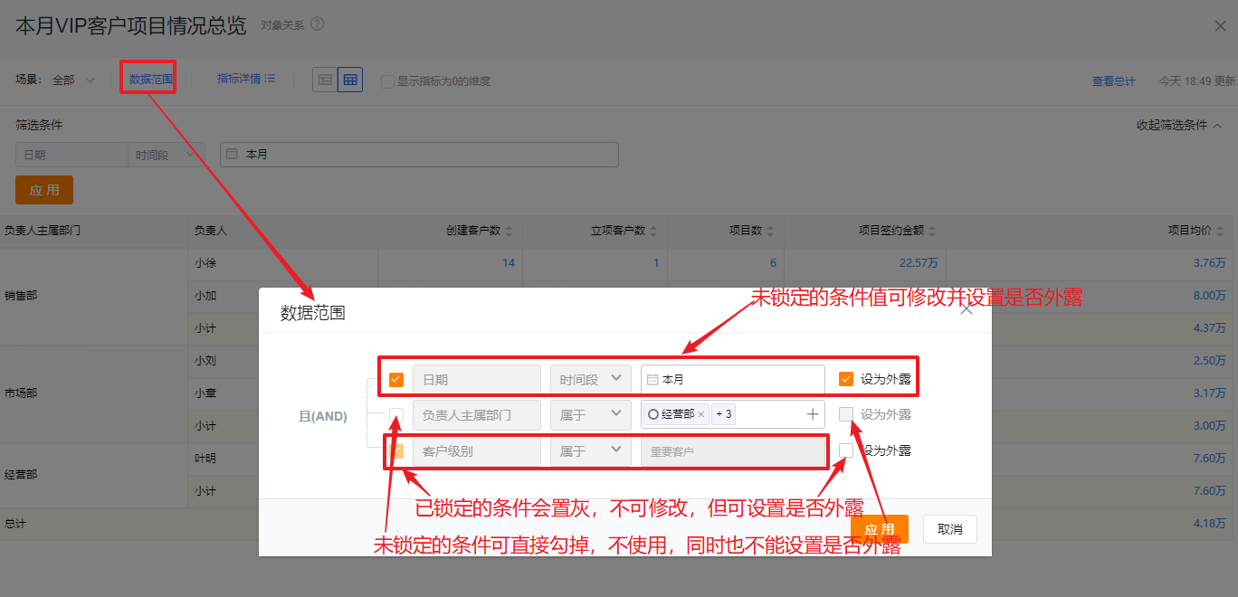
3.2 Data Scope
- When viewing a report you can modify unlocked conditions in the Data Scope dialog and choose whether to expose those values.
Web view:
 </img>
Mobile view:
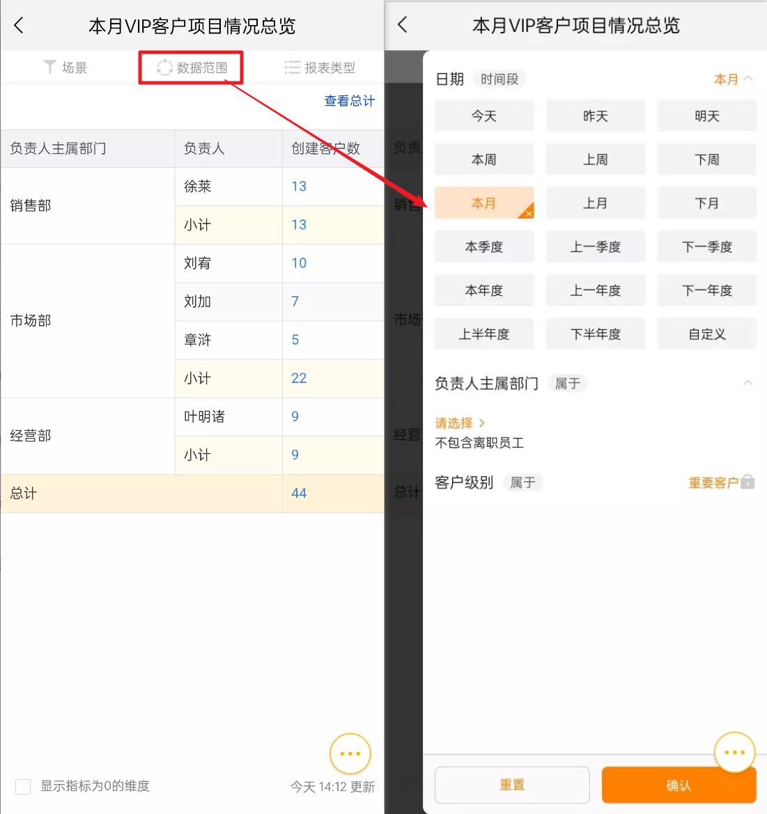 </img>
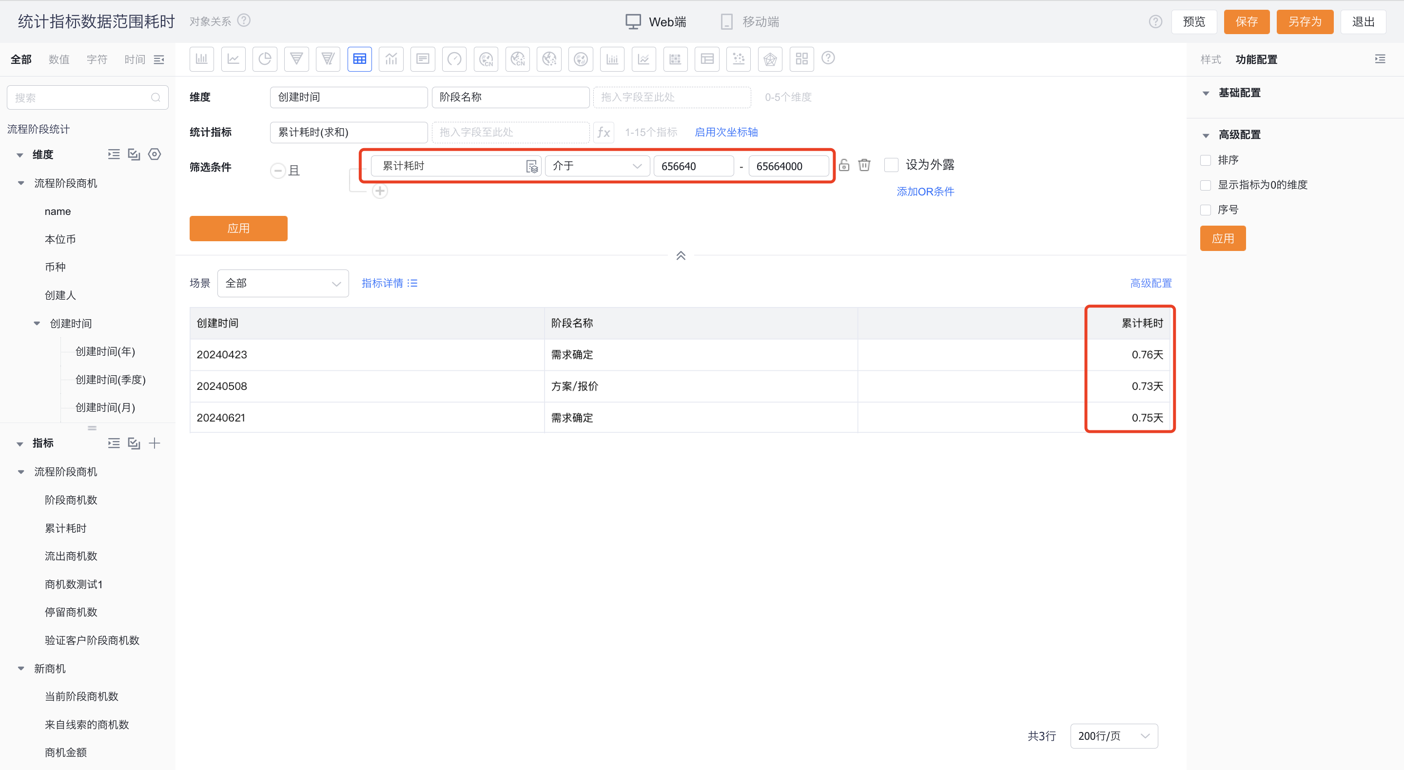
- Using metrics as Data Scope:
- You can drag metrics from the Chart into Data Scope to filter by them. For duration-type metrics, filter values use milliseconds;
 </img>
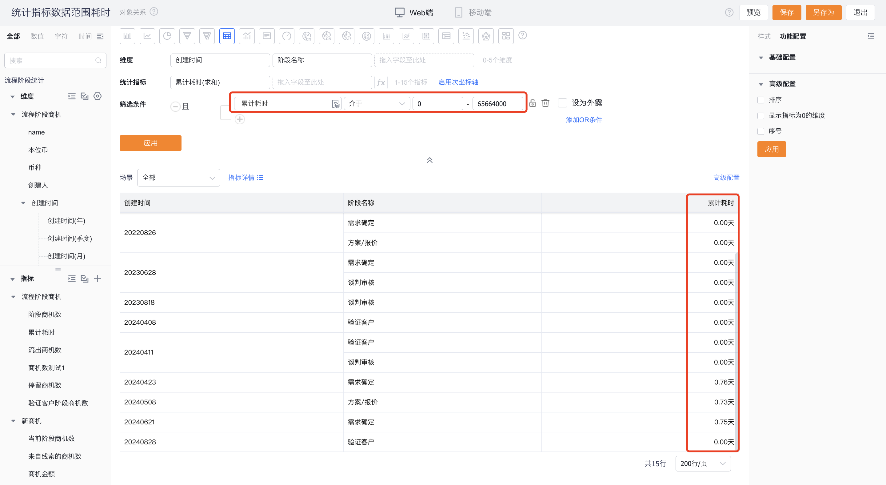 </img>
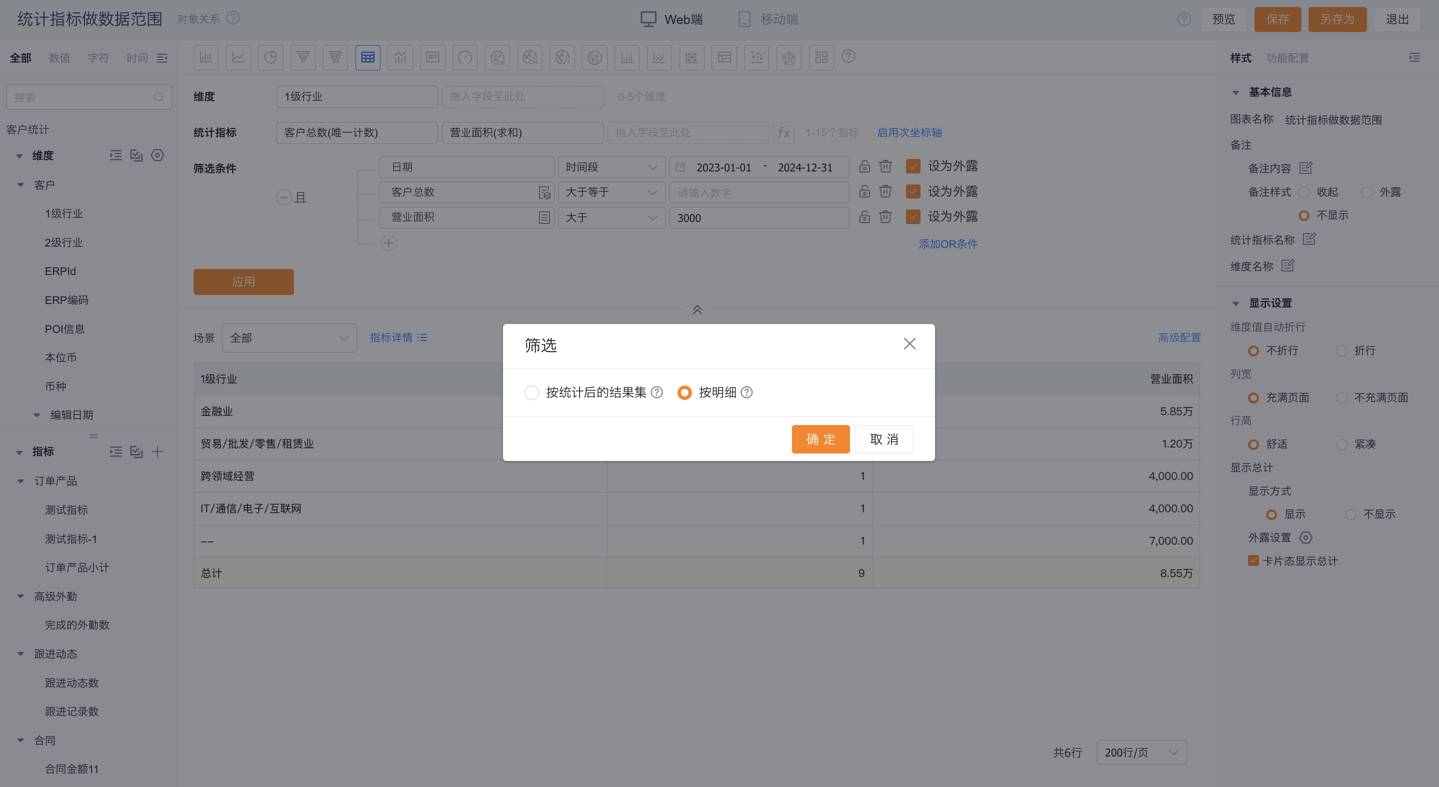
For metrics based on sum aggregation under the same object, you can filter by either the detail-level values or the aggregated result set. Other metric types are filtered by the aggregated result only, as illustrated below.
 </img>
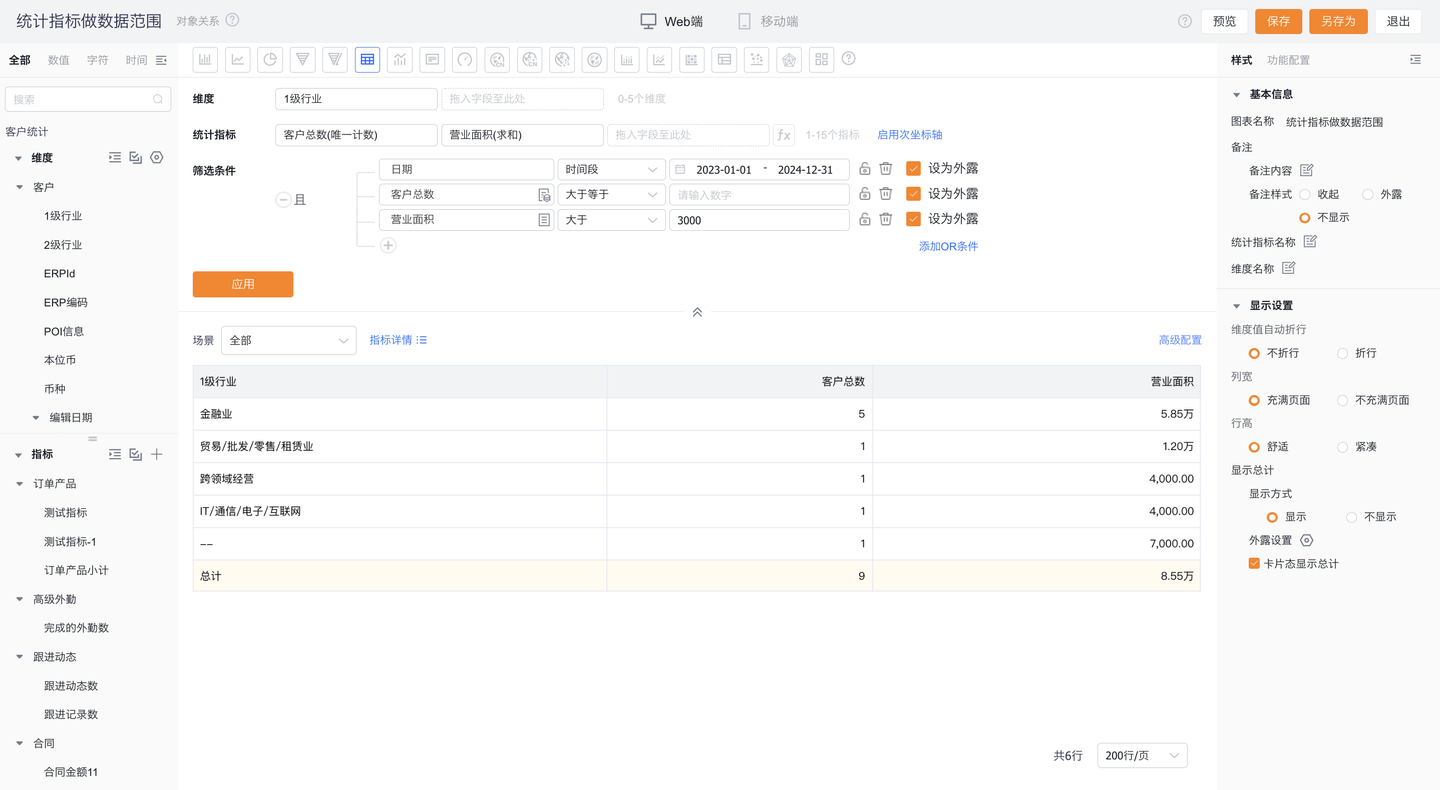 </img>
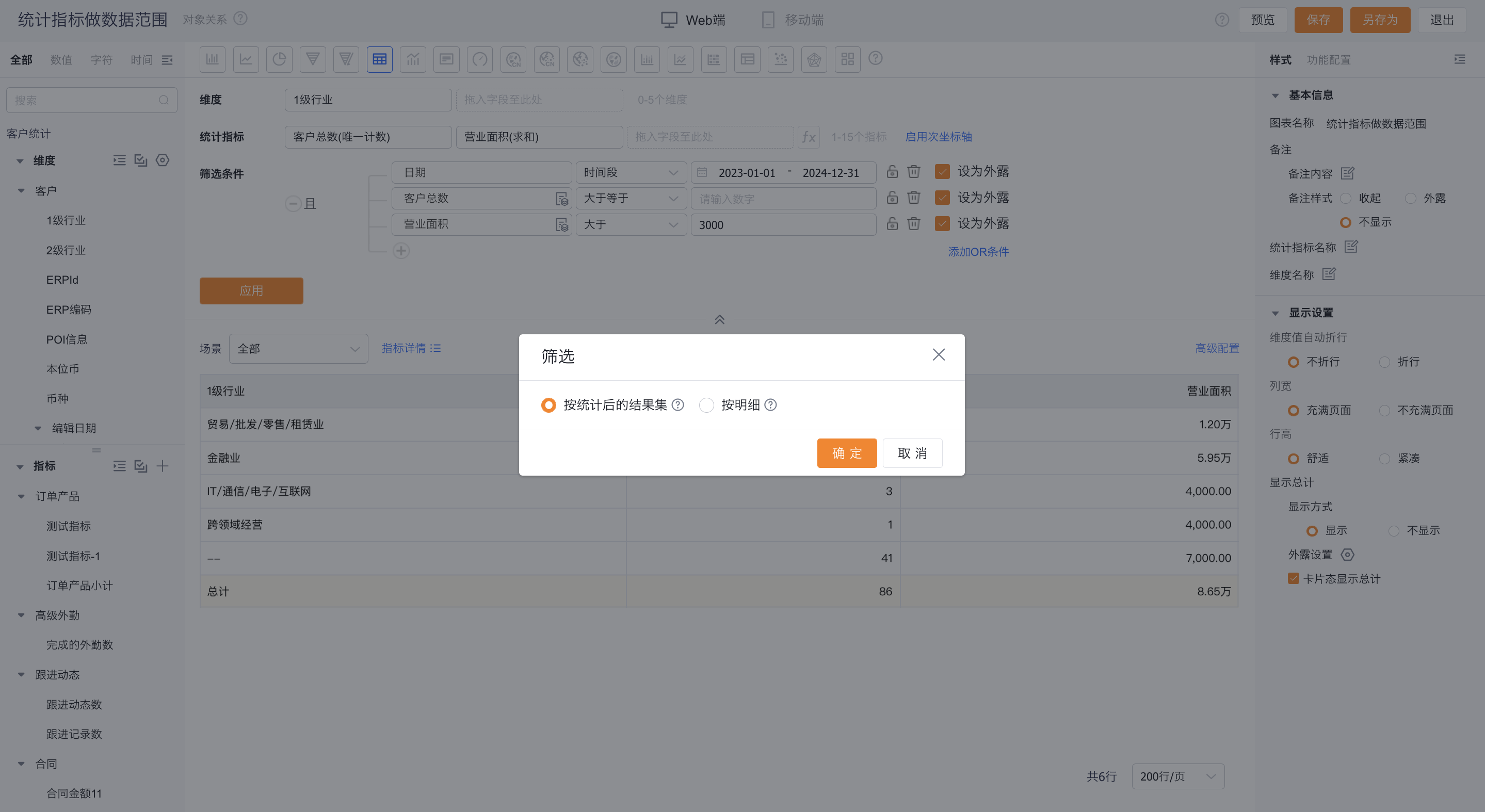 </img>
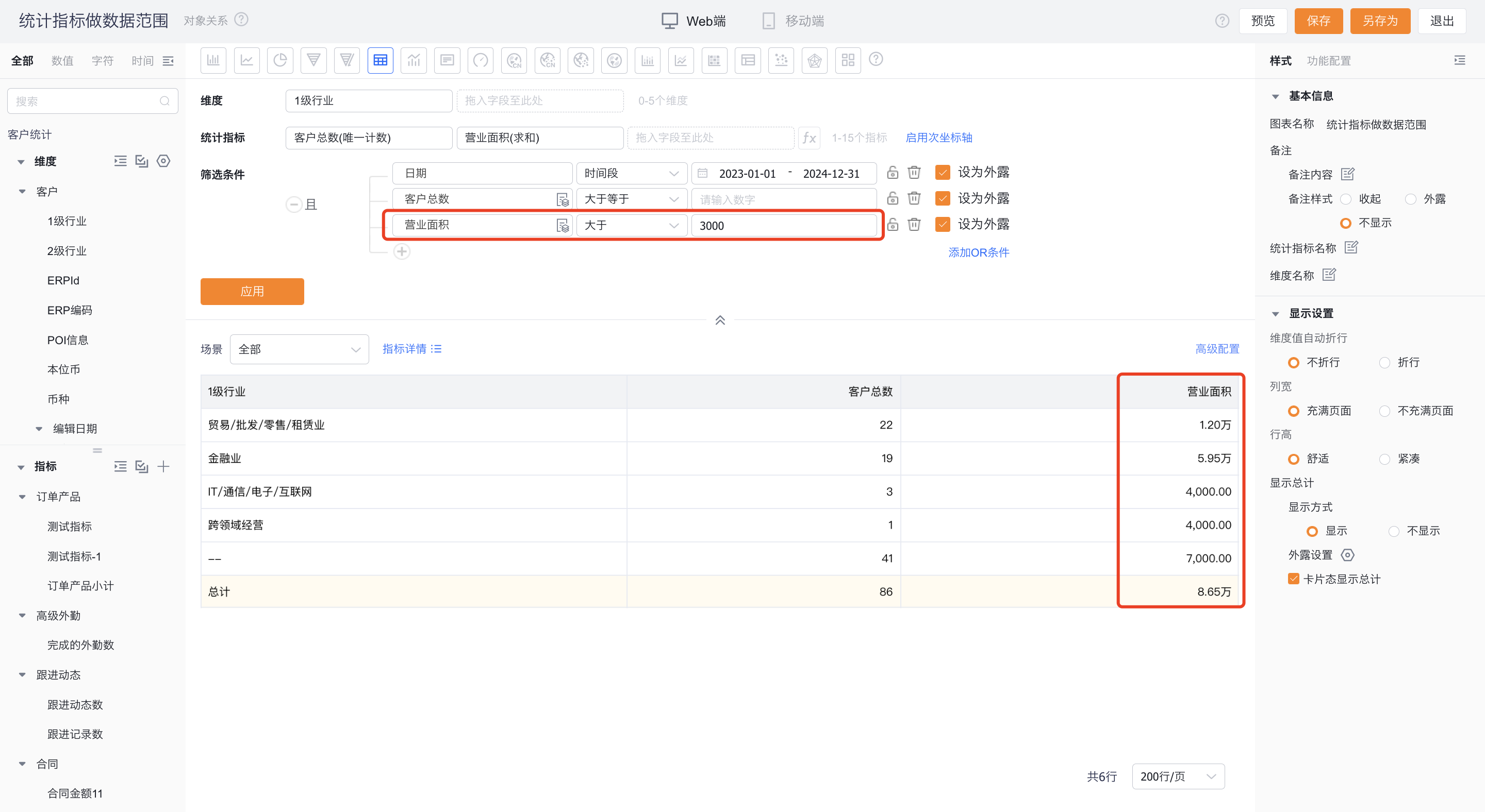 </img>
3.3 Drill
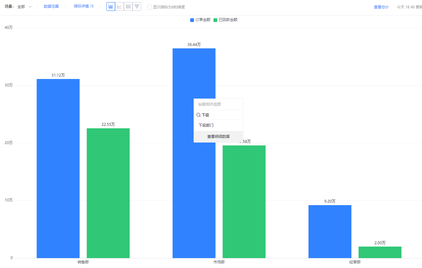
- Drill-down helps you explore other dimensions at the same data level. For example, when Owner’s primary Dept. is a dimension, you can drill into a department to view its child departments’ data.
Web view:
 </img>
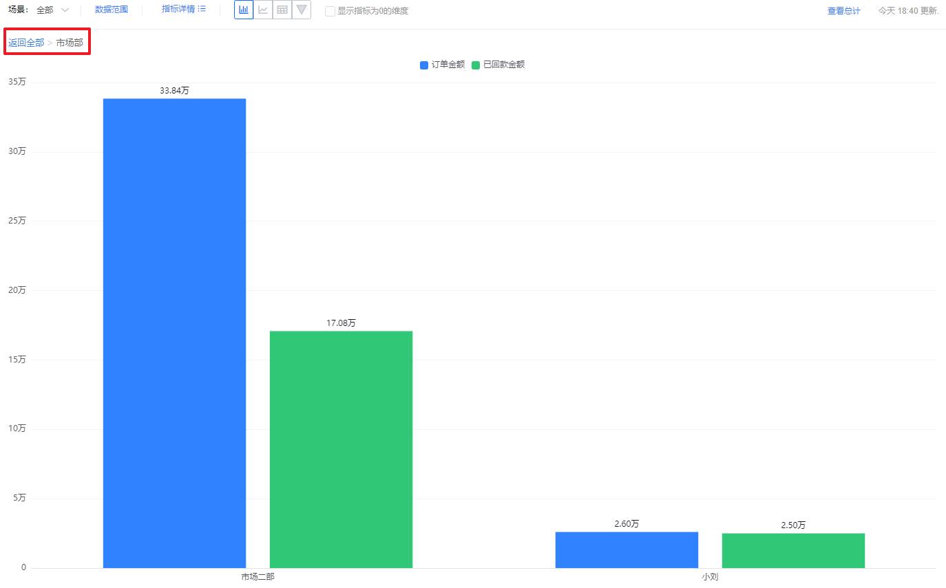 </img>
Mobile view:
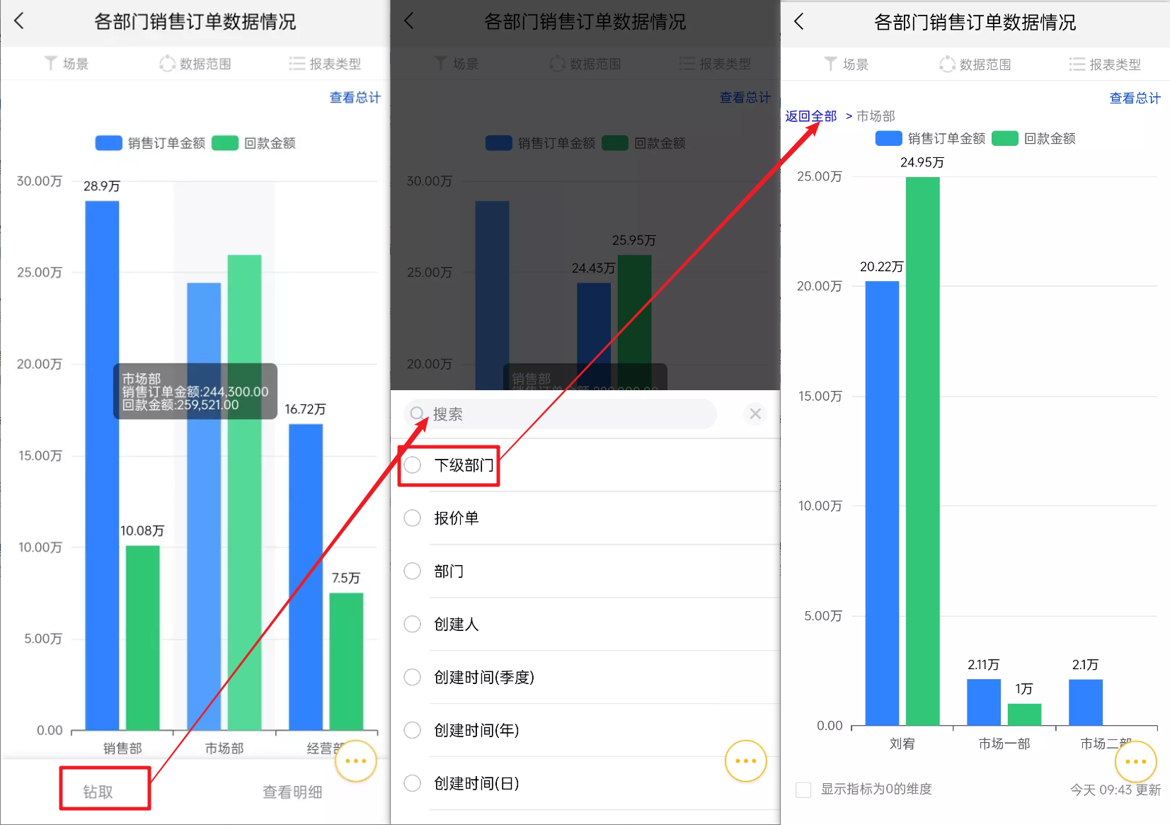 </img>
3.4 View Details
- Charts show aggregated values for a given dimension. Use "View Details" to see the underlying detail records that make up that aggregate.
- If the Y-axis includes multiple metric fields, hover over the specific metric to view its detail records.
Web view:
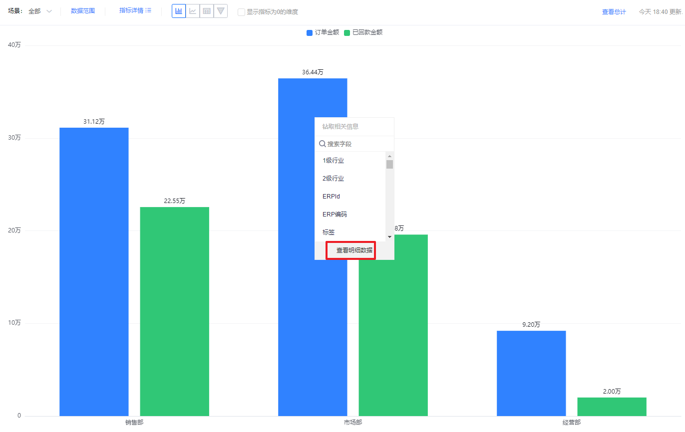 </img>
Mobile view:
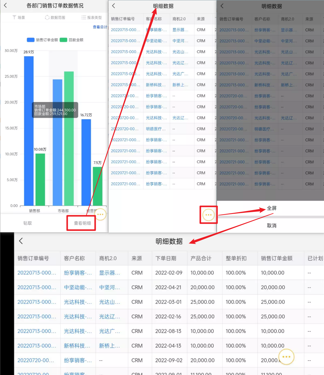 </img>
- Click the Total area in the top-right to view detail records for the total.
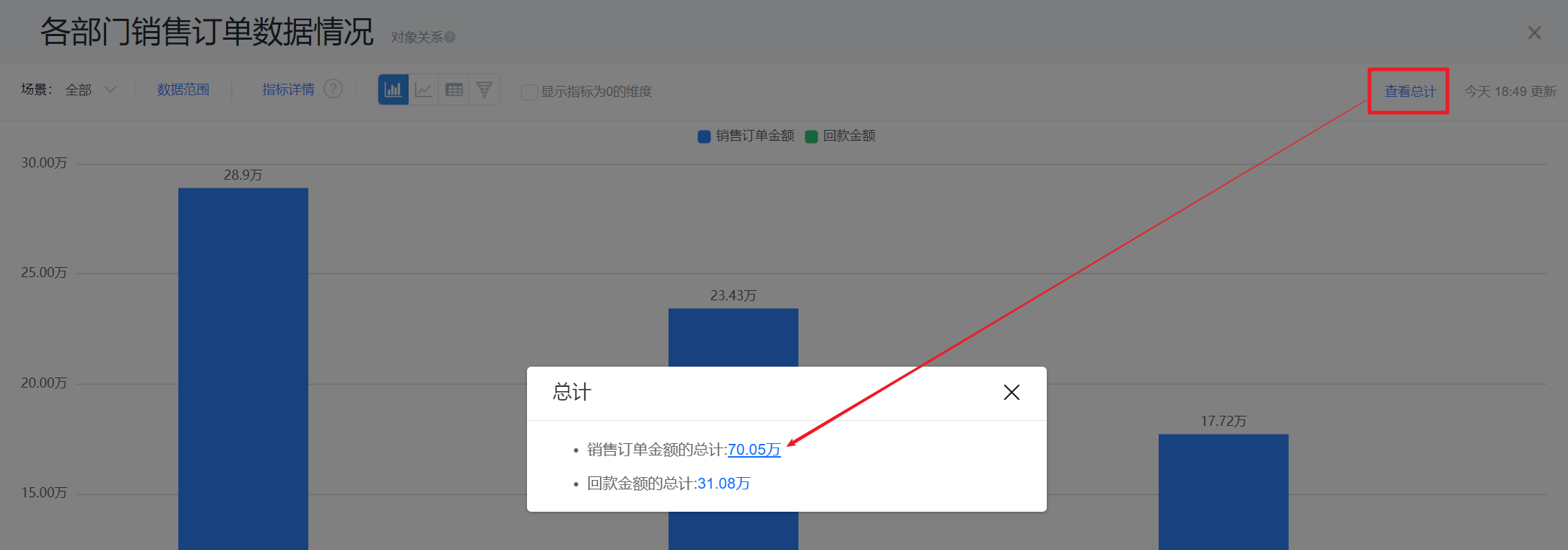 </img>
3.5 View Object Relationships
- Charts present multiple metric values. Click Object Relationships to view the links between each metric object and the analysis subject.
 </img>
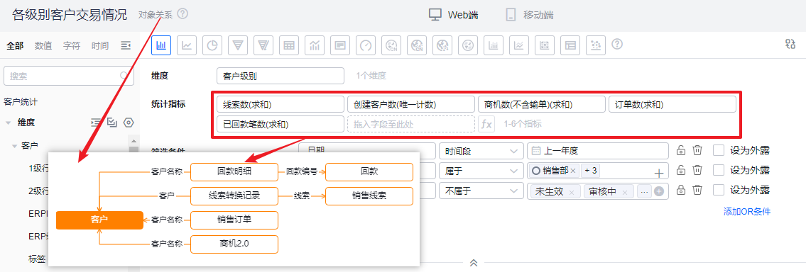 </img>
3.6 Other
- Forward: When you forward a Chart to other users, they see data within their own permission scope—they cannot see data accessible only to the sender;
- Post: Sharing a Chart converts it into a single image for sharing. All viewers within the Chart’s visibility scope see the same image;
- Export:
- Exporting from a Chart view includes the current Filter Scene and Data Scope so the exported data matches what you see on screen;
- Exporting from the Charts list uses default Filter Scene and Data Scope;
- From the Chart view you can export either an image or the report data.
- Subscriptions: Each user who receives a subscribed Chart gets data limited to their own permission scope. Subscriptions do not expand a user’s visibility.
Note: Filter Scenes and Data Scope settings applied when viewing a Chart are transient and not saved. To persist changes, edit the Chart in the Chart Designer.