Published at: 2025-10-30
Stacked Line Chart
Stacked Line Chart
1.1 Use Cases
The stacked line chart shows the trend of each second-dimension value across a range of data under a primary dimension. For example, it can compare the number of Accounts across different industries and Account tiers.
 </img>
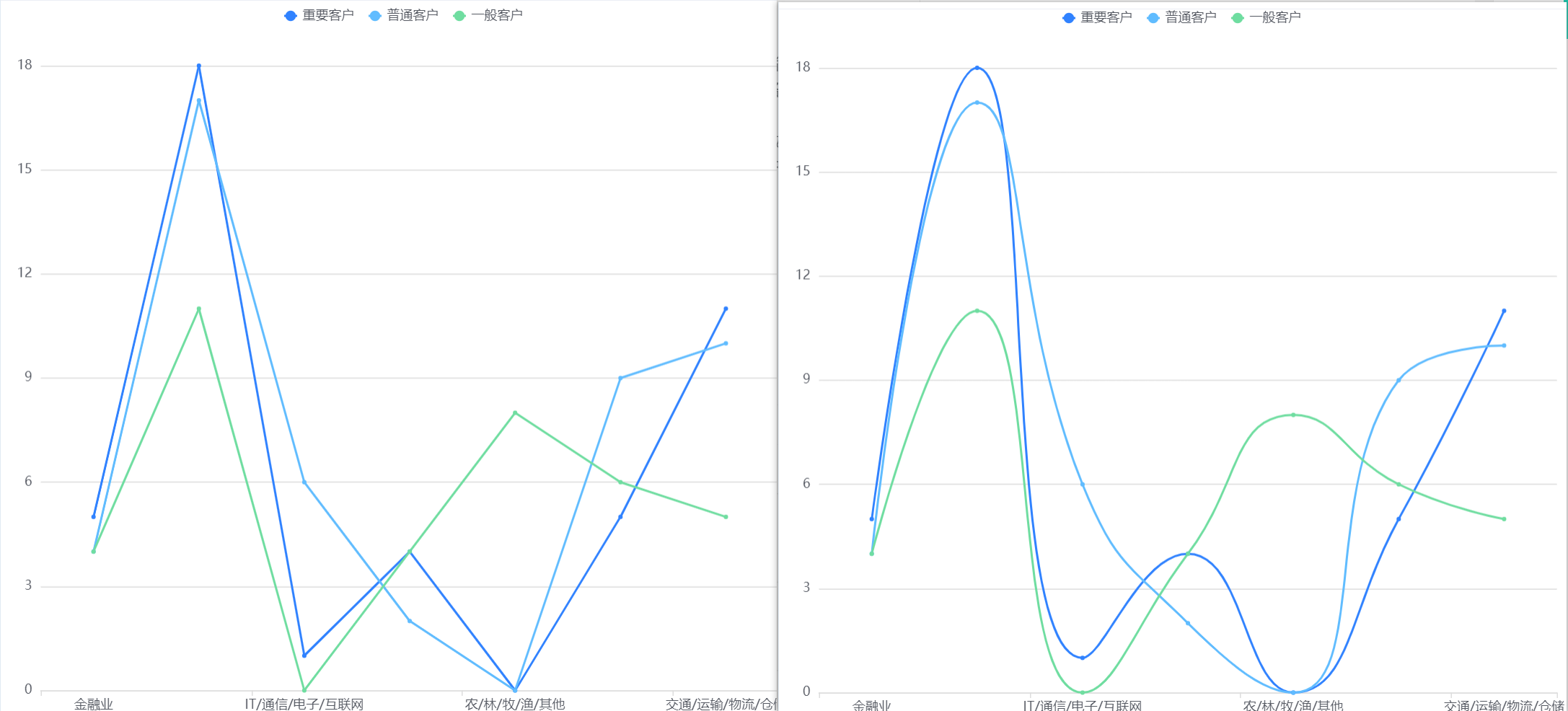 </img>
1.2 Chart Configuration
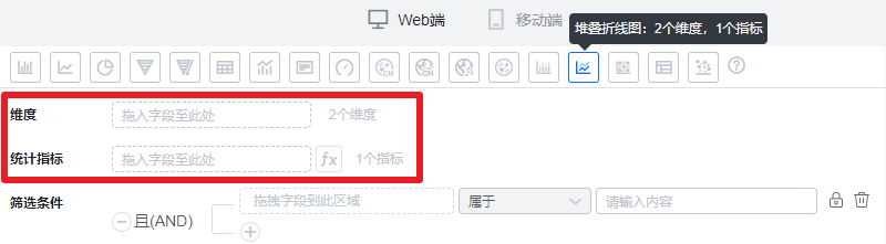
1.2.1 Axis Data
- Dimensions: 2 dimensions
- Metrics: 1 metric
 </img>
1.2.2 Style (Web)
1.2.2.1 Basic Info
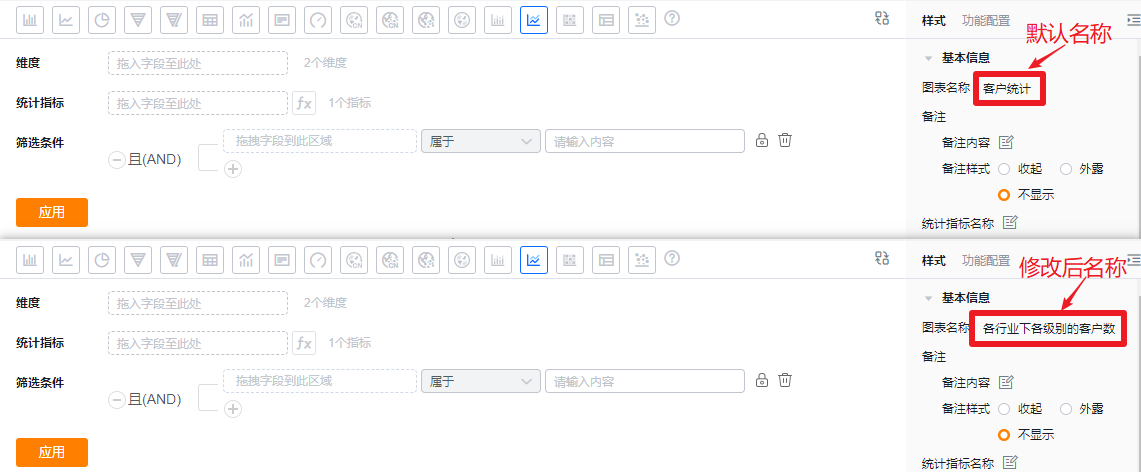
- Chart name: When created, the default is the analysis Subject name. You can customize the chart name in chart settings.
 </img>
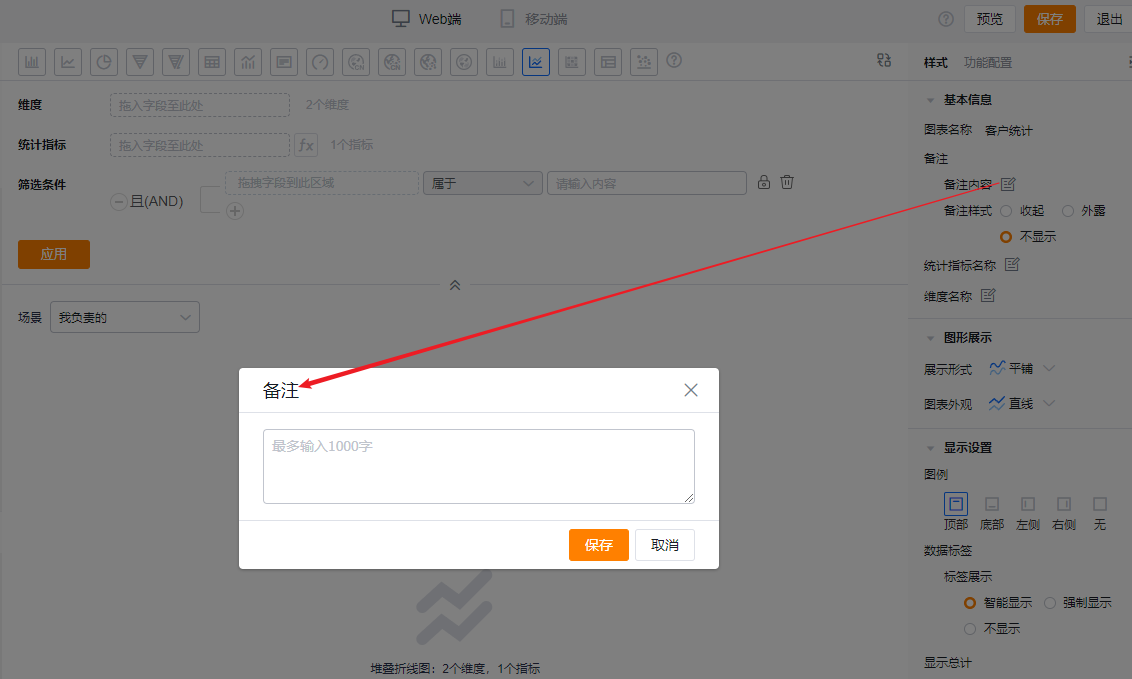
- Notes:
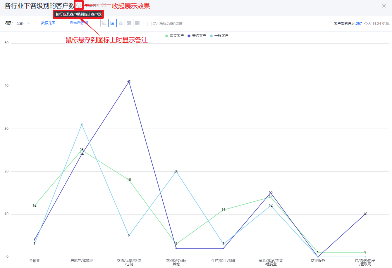
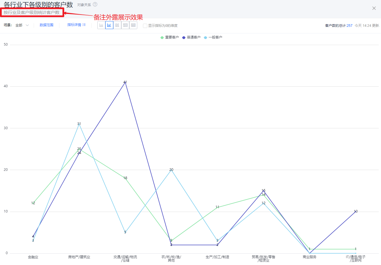
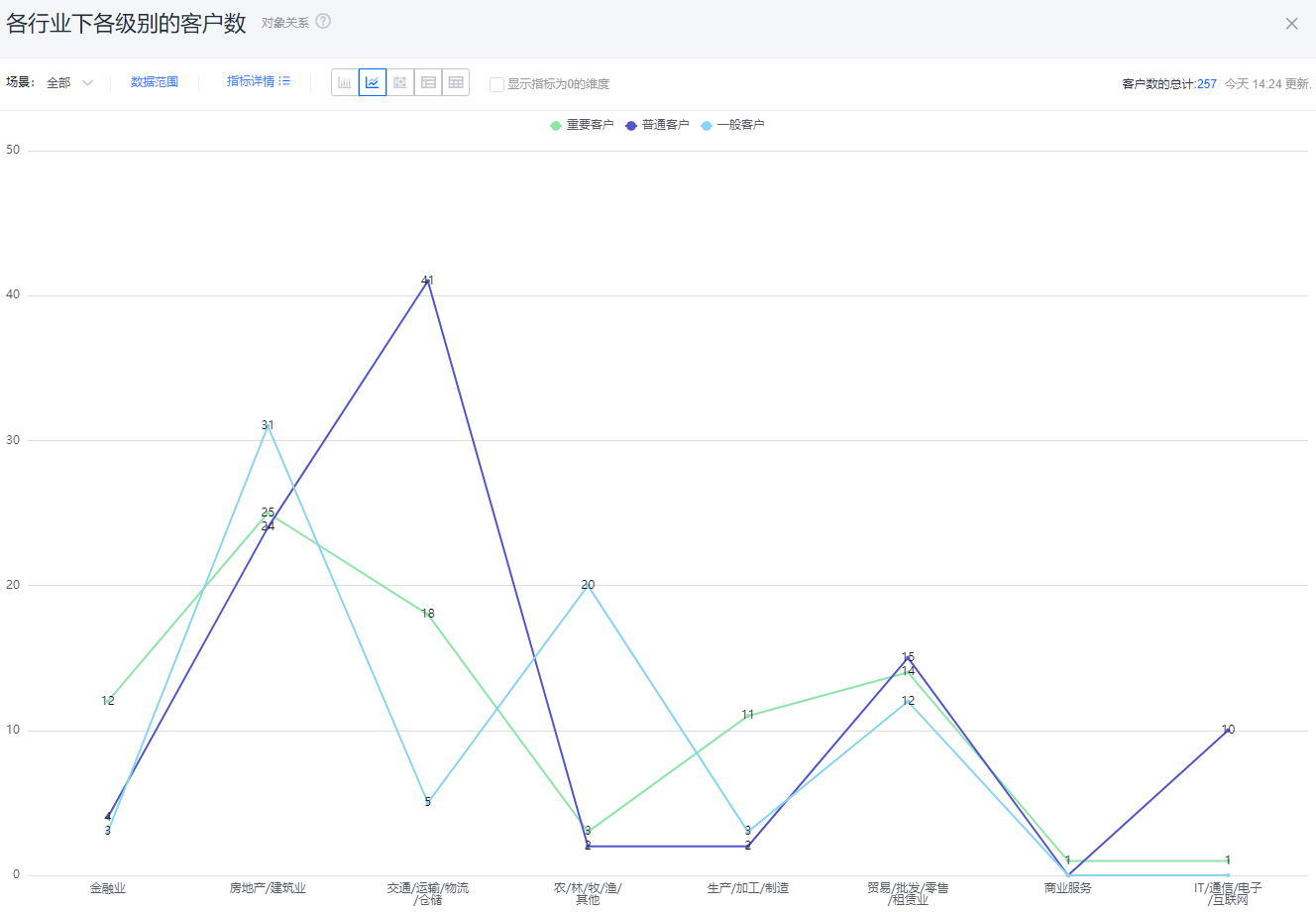
- Note content: Add notes for the chart to help viewers understand the data and intent.
- Note style:
- Collapsed: Shows an icon after the chart title in detail and Tile views; hover to reveal the note content.
- Expanded: Shows the note text directly after the chart title in detail and Tile views.
- Hidden: Do not display notes in either detail or Tile views.
 </img>
* Add note content
 </img>
* Collapsed note style
 </img>
* Expanded note style
 </img>
* Hidden note style
- Metric label: By default shows the metric name; you can edit the displayed label.
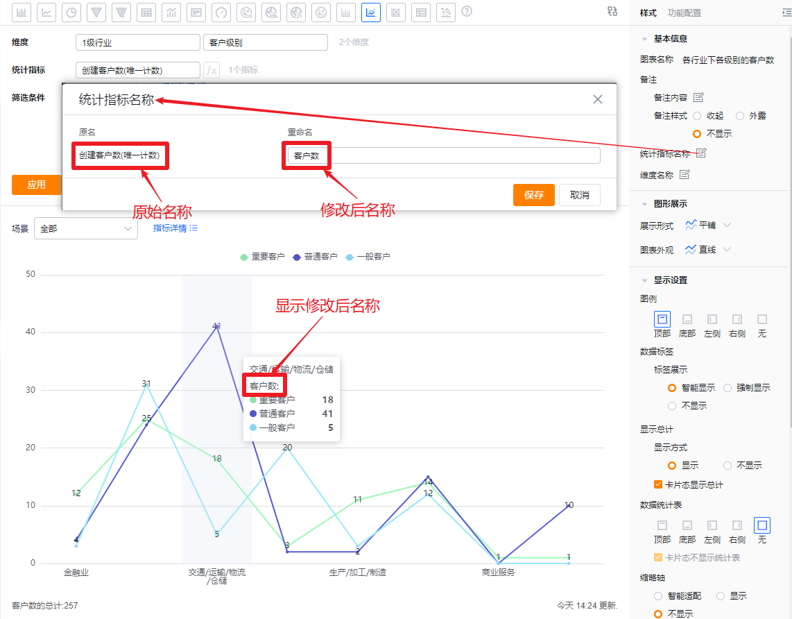 </img>
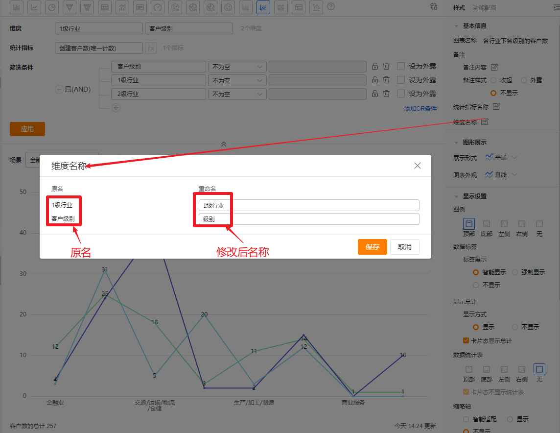
- Dimension label: By default shows the dimension name; you can edit the displayed label.
 </img>
1.2.2.2 Plot Types
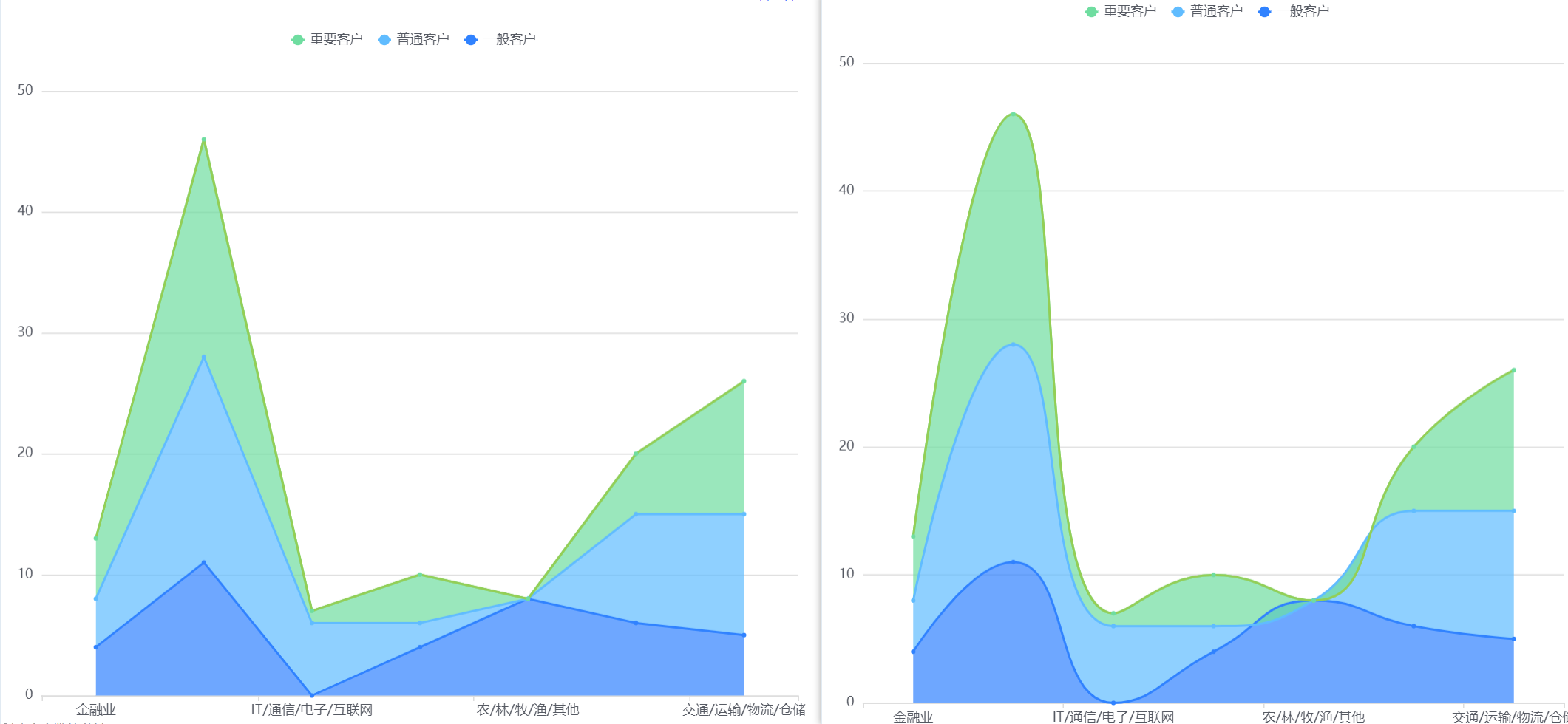
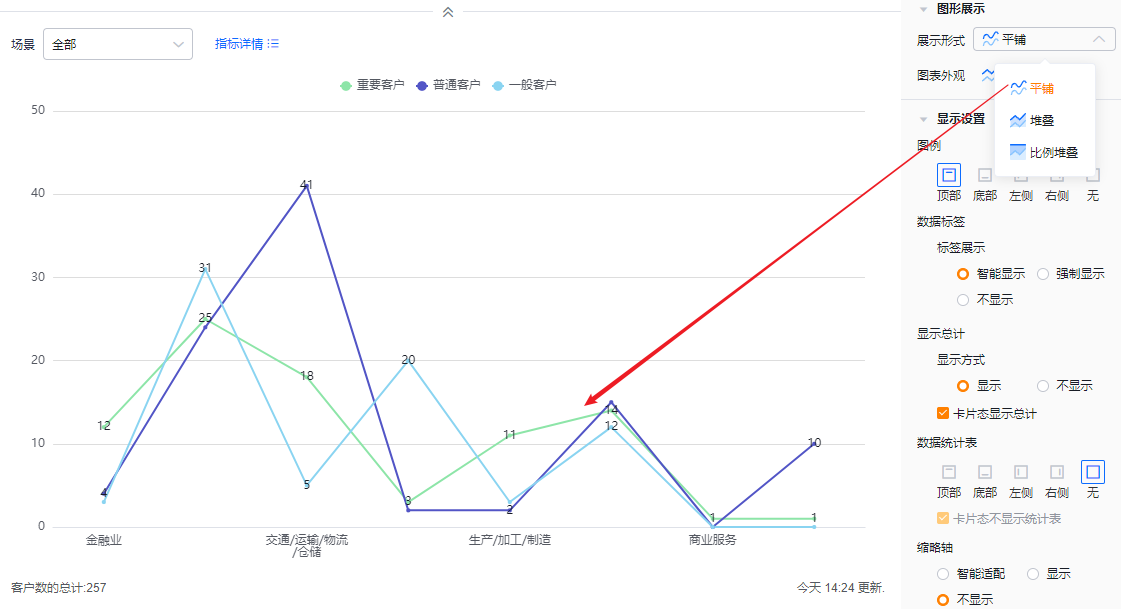
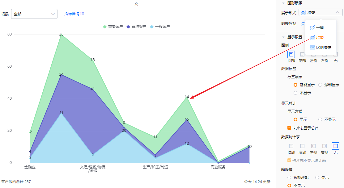
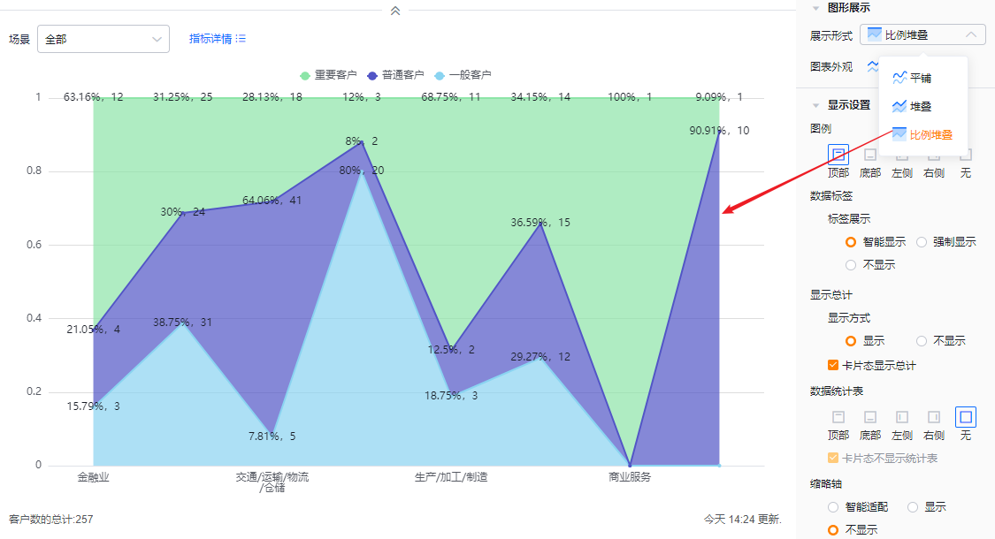
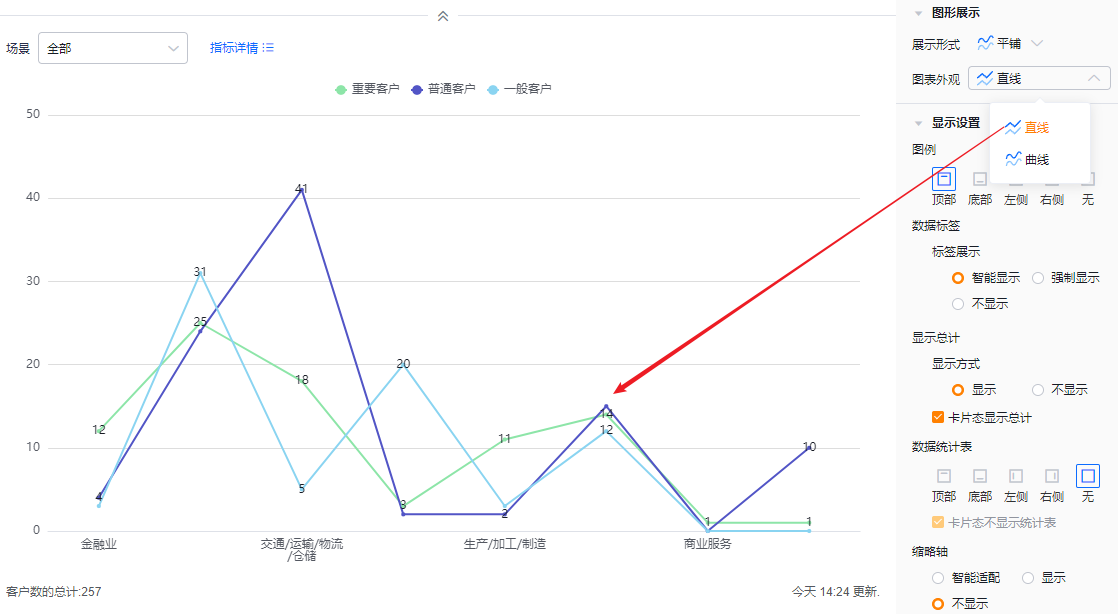
- Display mode: Default is Tile; you can switch to Stacked or 100% Stacked
- Tile: All metrics plot independently; each metric is one line starting from the X-axis baseline.
- Stacked: Lines stack on top of each other to show cumulative values.
- 100% Stacked: The chart height is normalized; each metric is shown as a percentage of the total.
 </img>
* Tile display
 </img>
* Stacked display
 </img>
* 100% stacked display
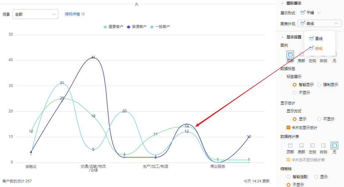
- Chart appearance: Default is straight lines; you can switch to smooth curves.
 </img>
* Appearance settings and straight-line example
 </img>
* Smooth curve example
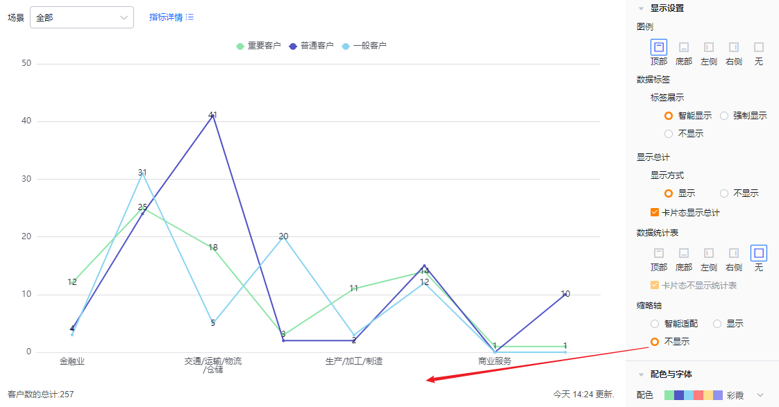
1.2.2.3 Display Settings
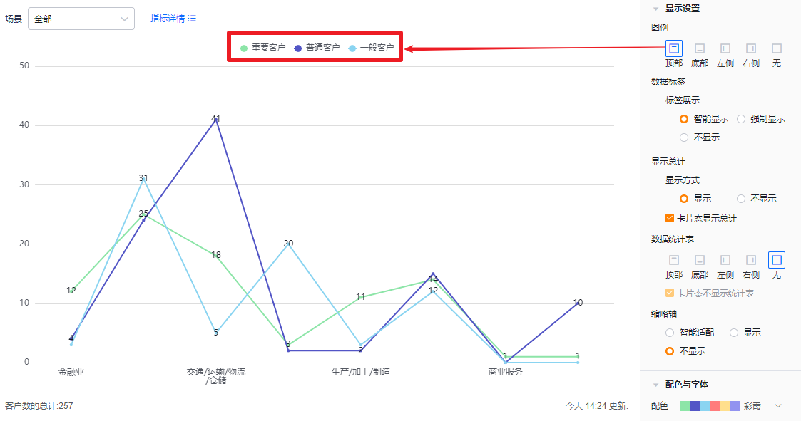
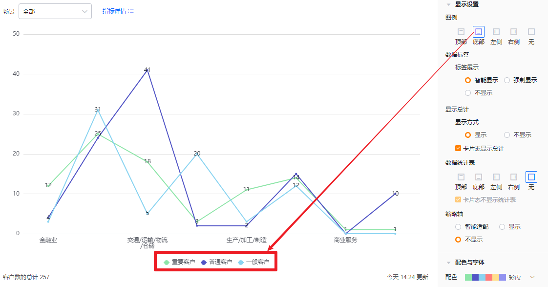
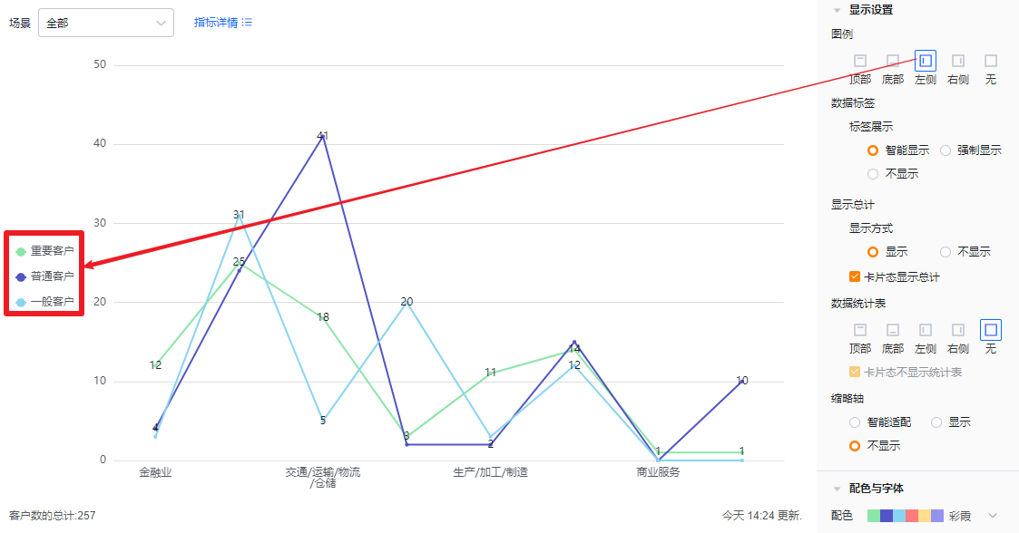
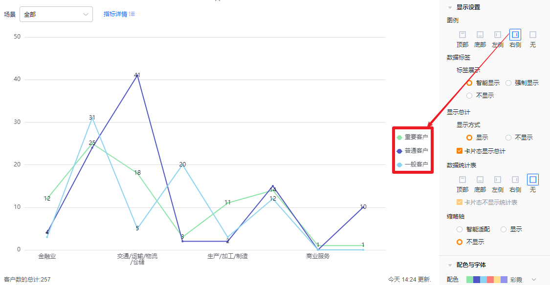
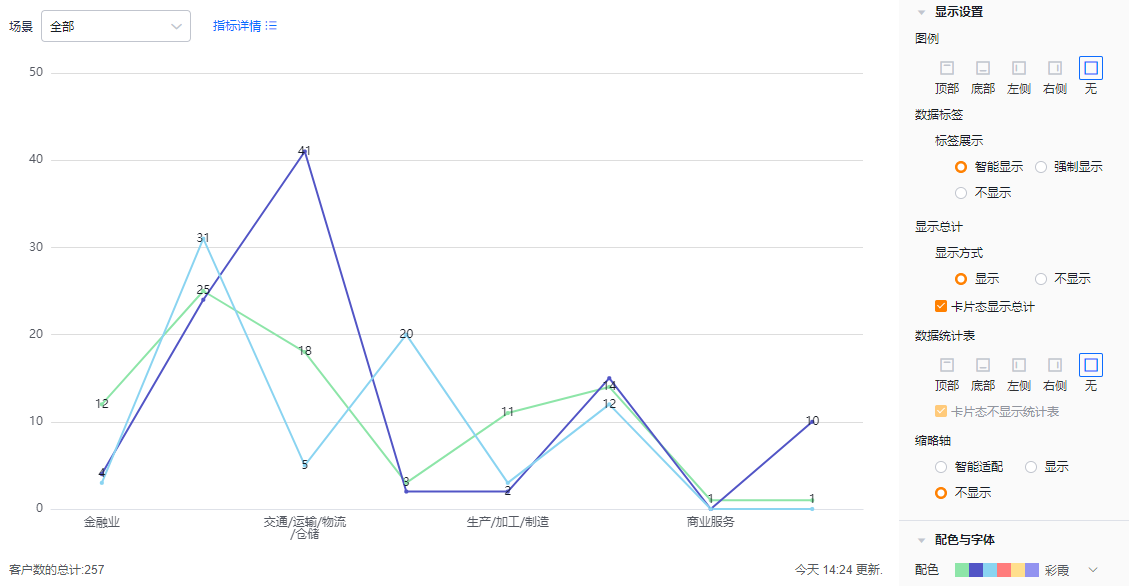
- Legend: Default at top; you can move it to bottom, left, right, or hide it.
 </img>
* Legend at top
 </img>
* Legend at bottom
 </img>
* Legend at left
 </img>
* Legend at right
 </img>
* Legend hidden
- Data labels:
- Label display:
- Smart: Shows labels selectively based on available space; hides some labels when values are similar to avoid clutter.
- Force show: Displays all labels; may overlap or stack when values are close.
- Hidden: Do not display data labels.
- Label display:
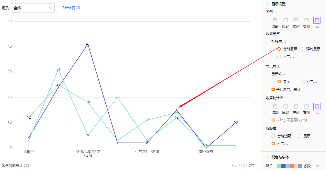 </img>
* Smart data label example
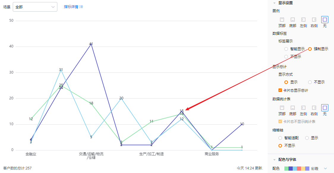 </img>
* Force show data labels
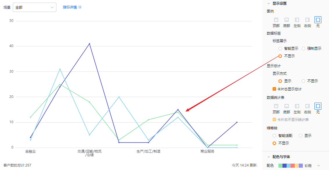 </img>
* Data labels hidden
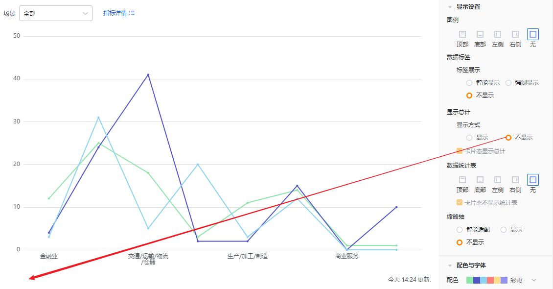
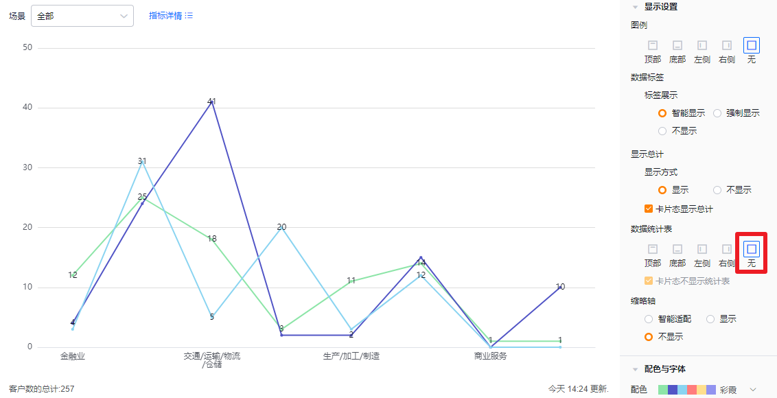
- Show totals:
- Display mode: Default is shown; you can switch to hidden. When shown, totals can appear in edit, detail, and Tile views depending on settings. When hidden, totals do not appear in any view.
- Show totals in Tile view: Checked by default. Uncheck to hide totals in Tile view. If Display mode is set to Hidden, this option is read-only.
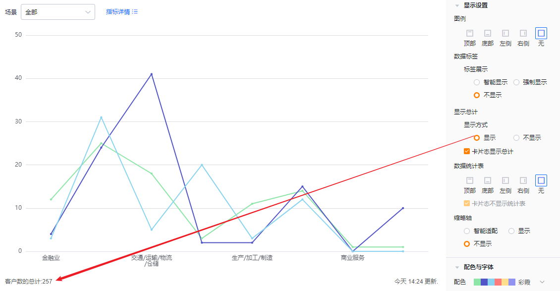 </img>
* Totals displayed
 </img>
* Totals hidden
- Data table: Choose whether to display the data table and its position. Default is hidden. You can position it at top, bottom, left, or right of the chart.
- Hide data table in Tile view: This option is checked by default and hides the table when the chart is shown in Tile view.
 </img>
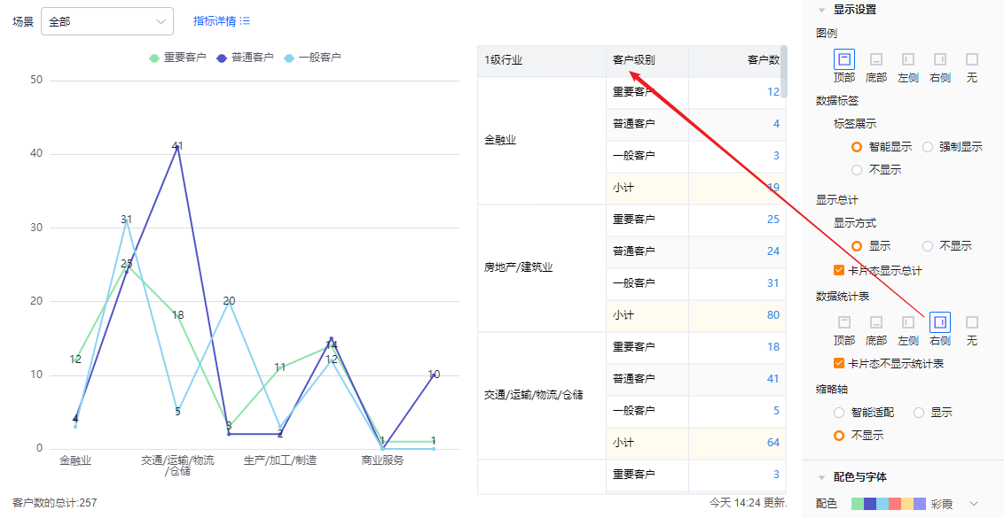 </img>
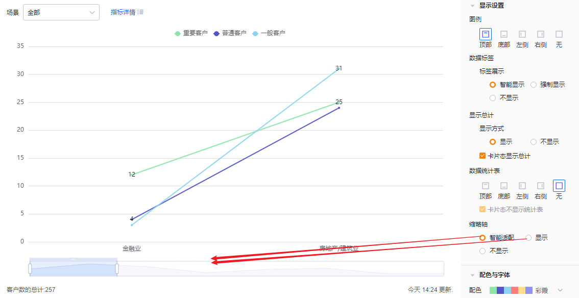
- Overview axis (thumbnail axis): Default is Smart; you can set it to Always show or Always hide
- Smart: The system determines whether to show the overview axis based on available space and number of dimension values. If values exceed the displayable amount, the overview axis appears.
- Always show: Show the overview axis regardless of screen size or number of dimension values.
- Always hide: Hide the overview axis regardless of screen size or number of dimension values.
 </img>
* Overview axis shown and Smart behavior
 </img>
* Overview axis hidden
1.2.2.4 Colors & Fonts
- Color palettes: The system supports New and Classic palettes. Default is the first set of the New palette. You can enable accessibility patterns (note: patterns are not applied in Tile display).
- New palette: Supports customizing colors based on a chosen palette.
- Classic palette: Colors are fixed and cannot be customized.
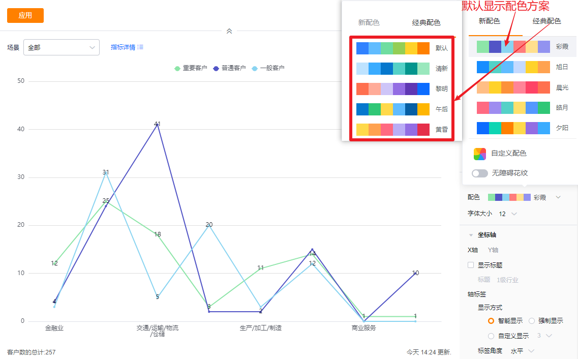 </img>
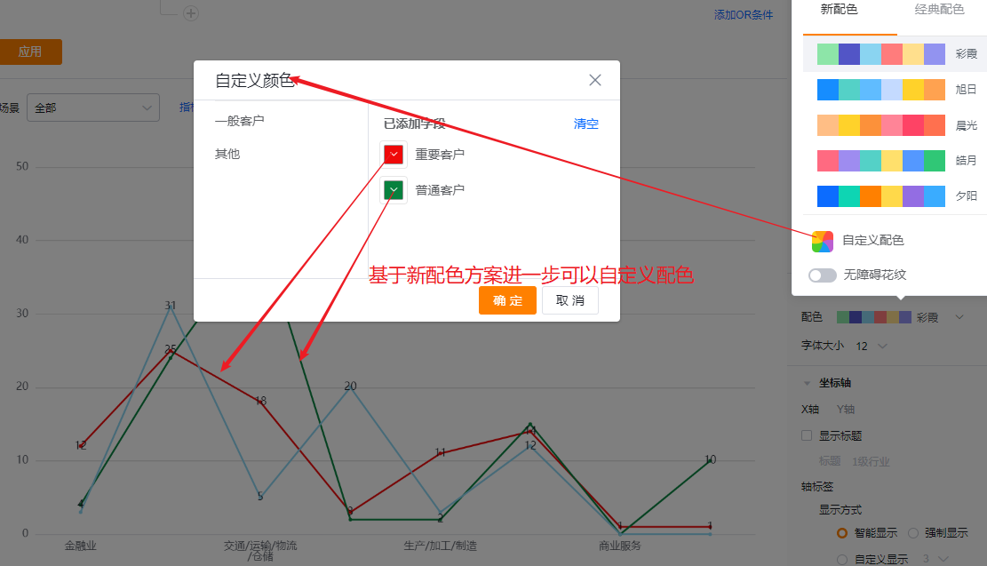 </img>
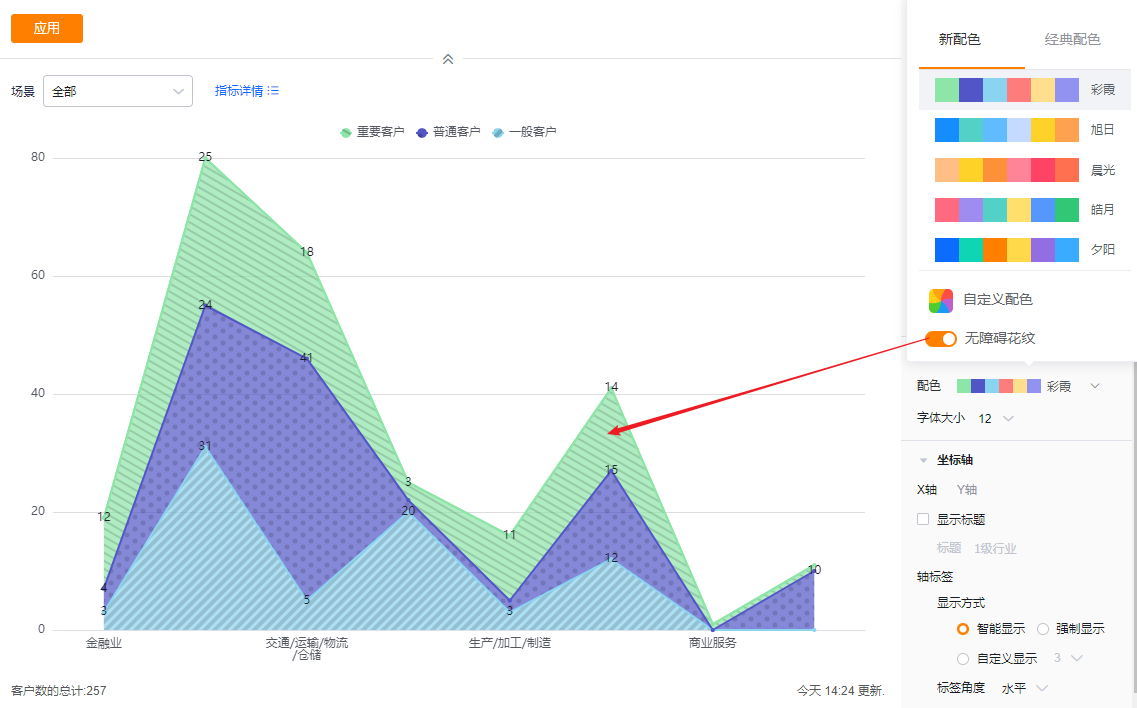 </img>
- Font size: Default 12 px; options: 13, 14, 15, 16 px.
 </img>
1.2.2.5 Axes
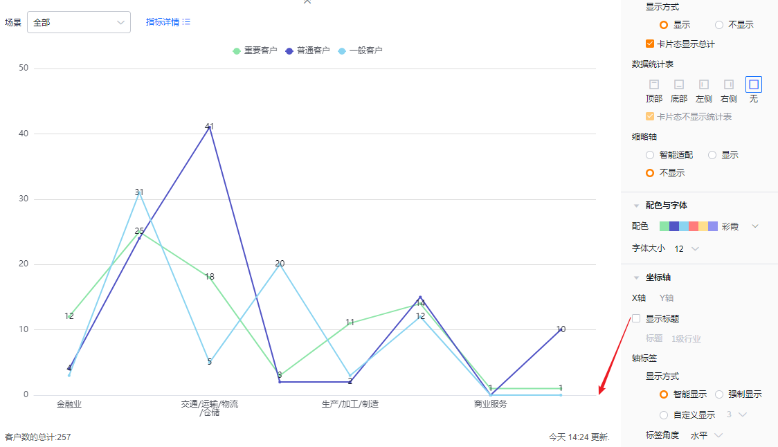
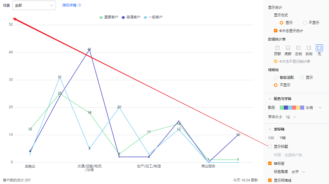
- X axis
- Show title: Unchecked by default. When checked, the dimension field name appears and you can edit it.
- Title: When Show title is unchecked, the title is read-only. Check it to edit.
- Show title: Unchecked by default. When checked, the dimension field name appears and you can edit it.
 </img>
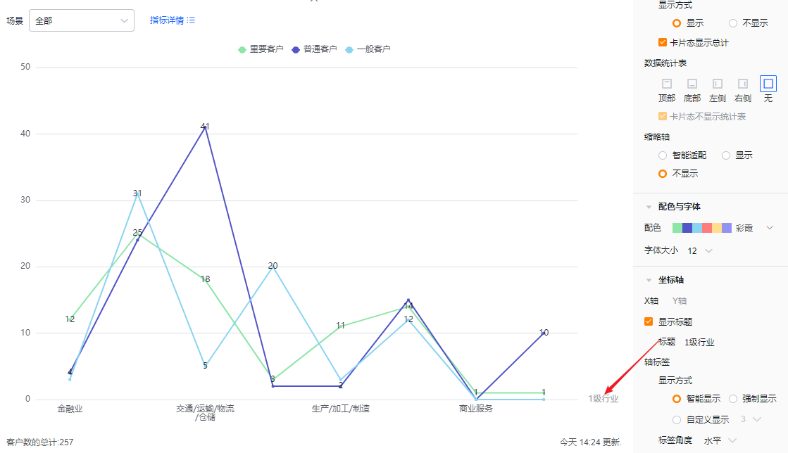 </img>
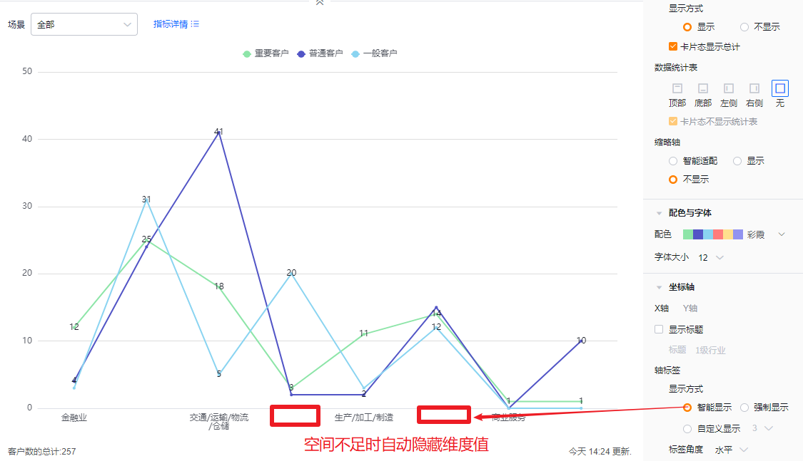
- Axis labels
- Display mode:
- Smart: Truncates labels based on available space and appends "..." when necessary.
- Force show: Shows full labels; may overlap when labels are long.
- Custom: Default shows 3 characters; supports 3–12 characters.
- Display mode:
 </img>
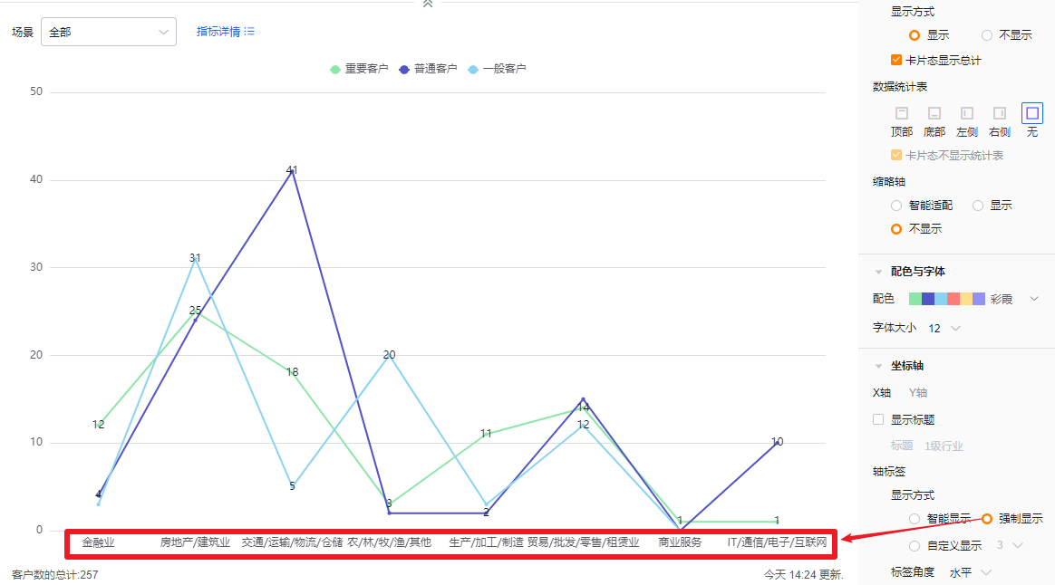 </img>
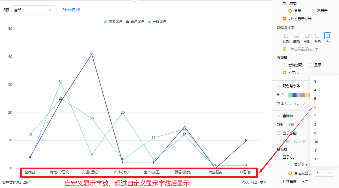 </img>
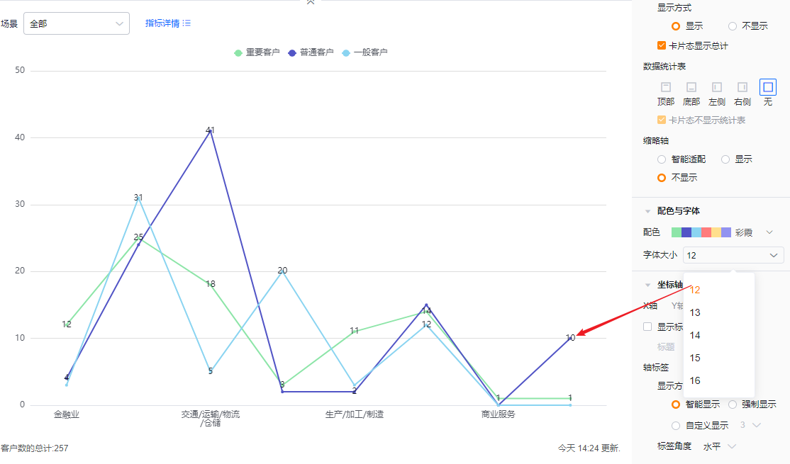
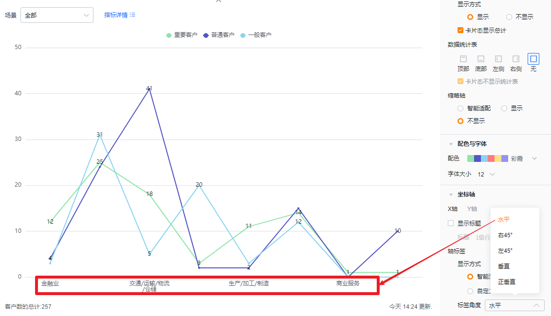
- Label angle: Default horizontal; options: Right 45°, Left 45°, Vertical, Upright Vertical.
 </img>
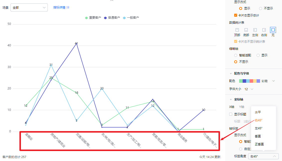 </img>
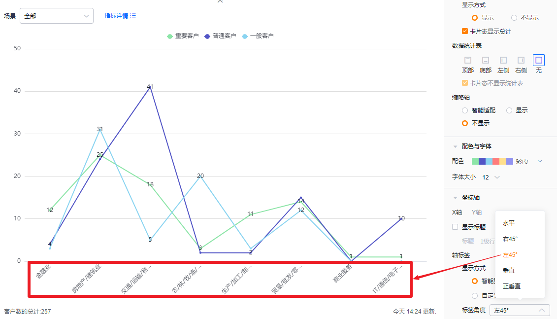 </img>
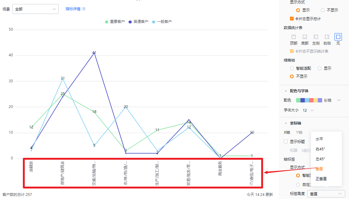 </img>
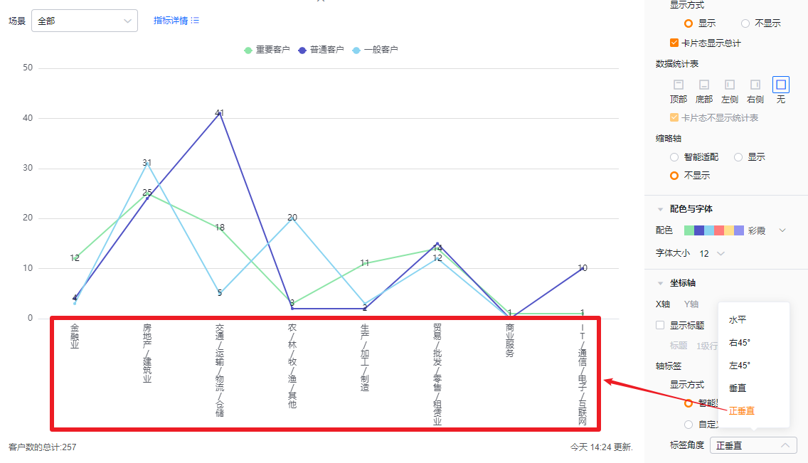 </img>
- Y axis
- Show title: Unchecked by default. When checked, it defaults to the first metric name and can be edited.
- Title: When Show title is unchecked, the title is read-only. Check it to edit.
- Show title: Unchecked by default. When checked, it defaults to the first metric name and can be edited.
 </img>
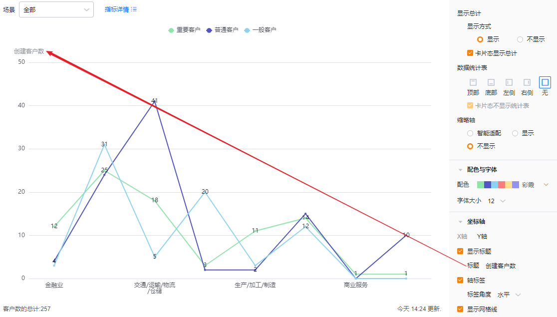 </img>
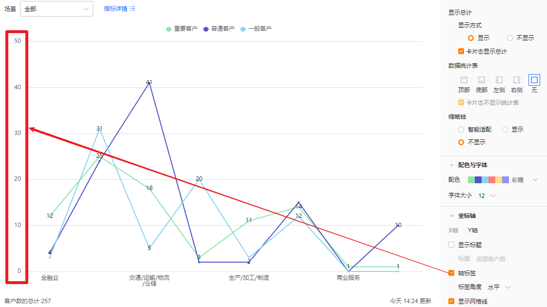
- Axis labels: Checked by default; you can uncheck.
- Label angle: Available when axis labels are enabled. Default horizontal; options include Left 45° or Vertical (same visual behaviors as X axis).
 </img>
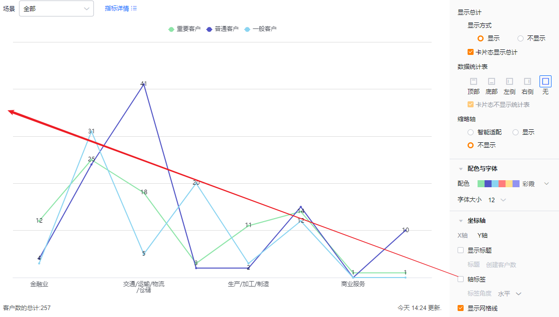 </img>
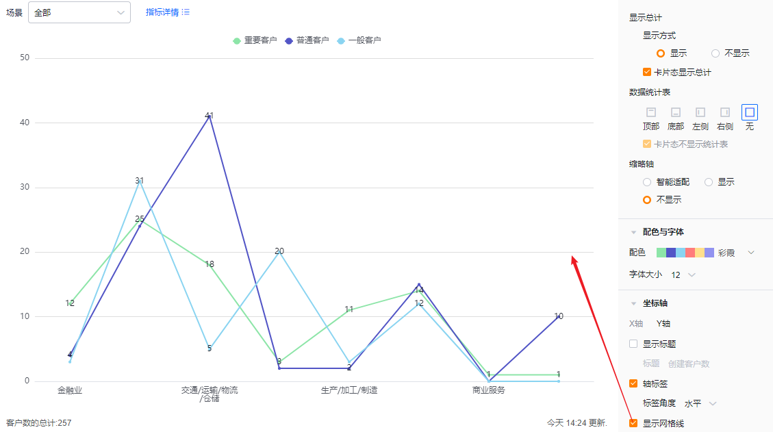
- Show grid lines: Checked by default; you can uncheck.
 </img>
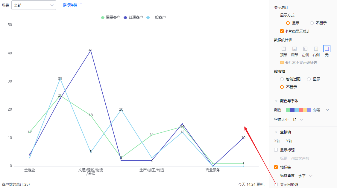 </img>
1.2.3 Functional Settings
1.2.3.1 Advanced Settings
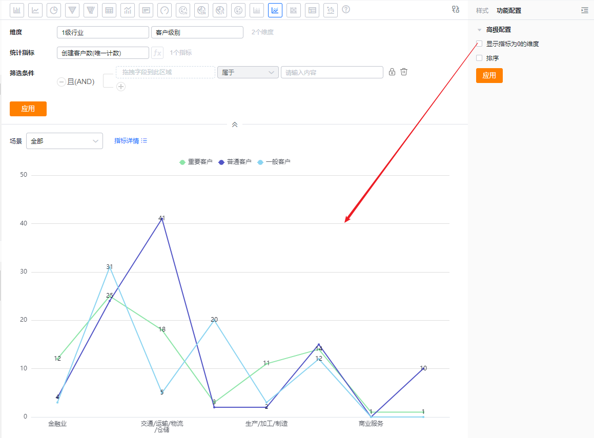
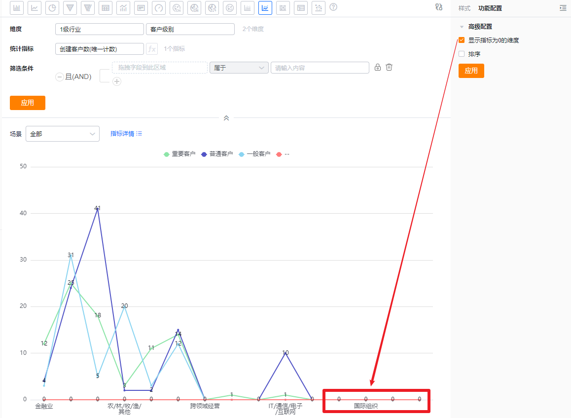
- Show dimensions with zero metric value: Unchecked by default. Check to include dimension values whose metric equals 0.
 </img>
* Effect when unchecked (hide zero-value dimensions)
 </img>
* Effect when checked (show zero-value dimensions)
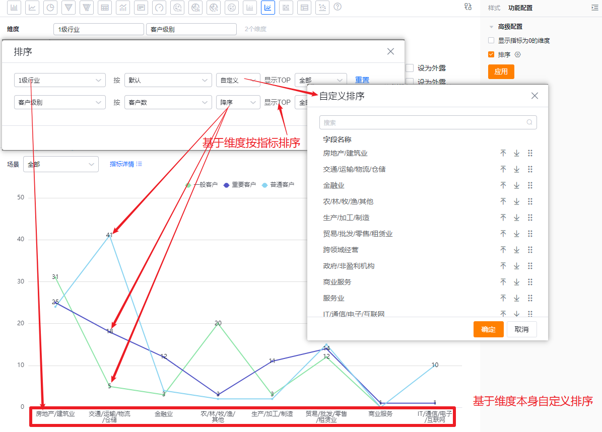
- Sorting: Unchecked by default. When enabled, you can sort dimensions by their natural order or apply Top N. Alternatively, sort dimensions by a specific metric and apply Top N. Top N supports preset values or manual input.
- When the dimension is an enumeration or Dept. field, custom sorting is supported.
 </img>
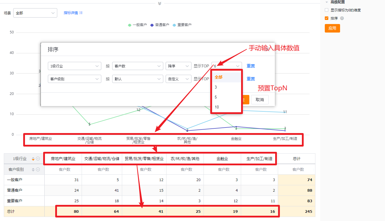 </img>
1.2.4 Style (Mobile)
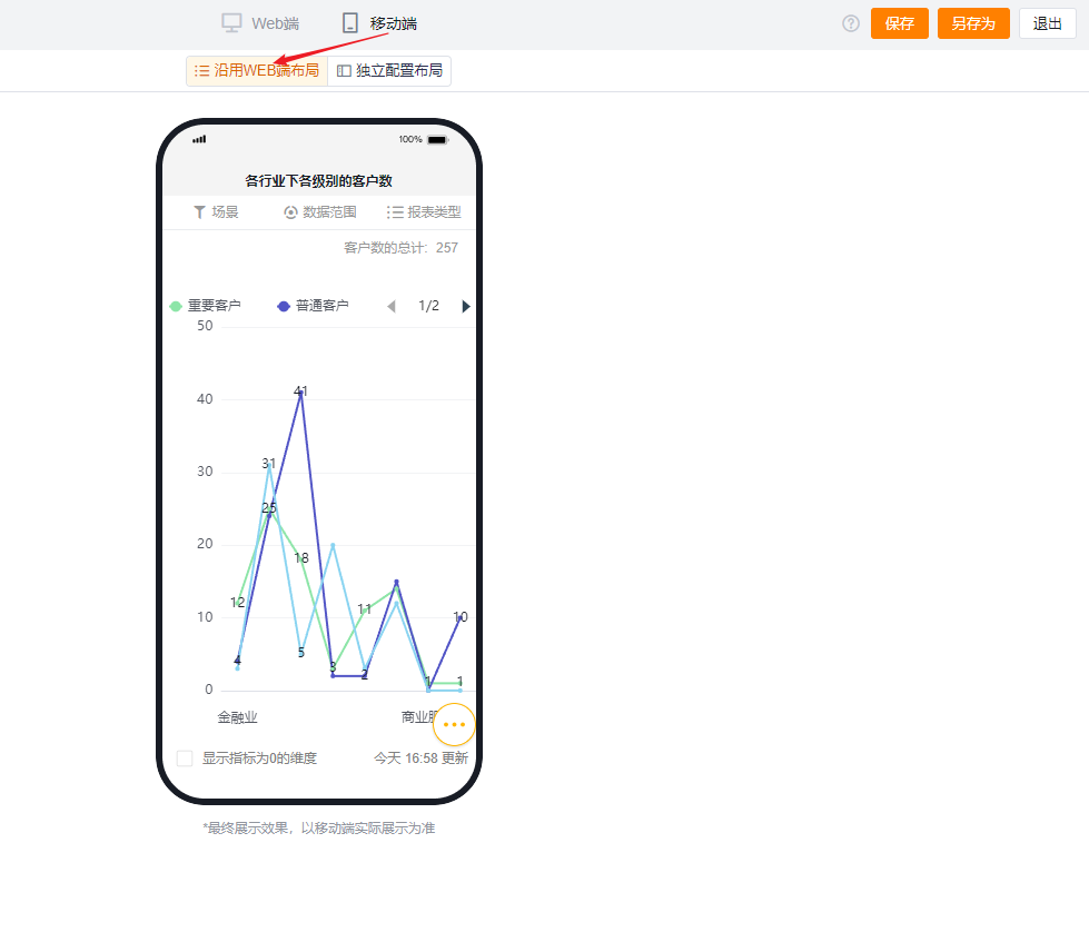
1.2.4.1 Follow Web layout
- Reflects Web layout settings and cannot be adjusted independently.
 </img>
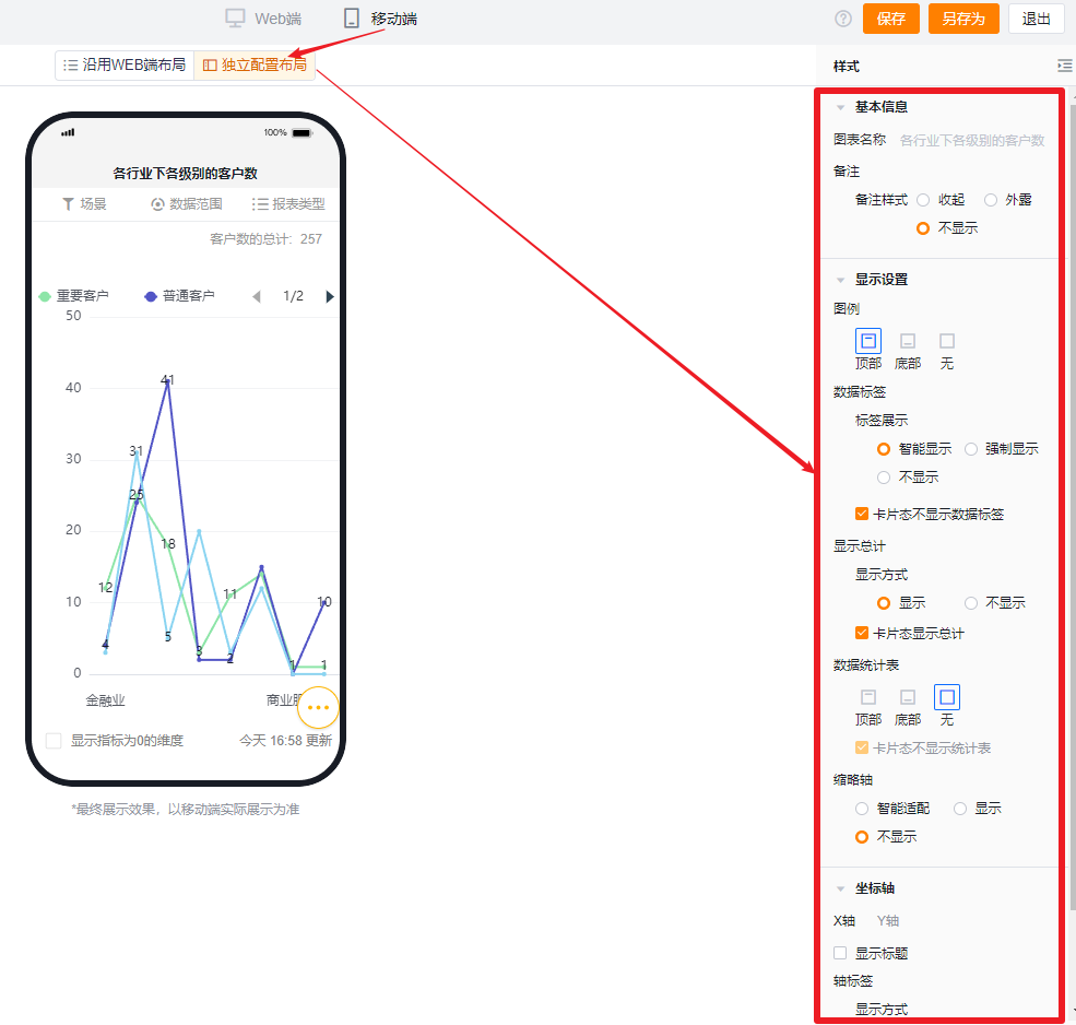
1.2.4.2 Independent mobile layout
- By default, mobile shows the Web-selected settings but you can further adjust for better mobile display.
- Mobile has fewer configurable options than Web. Settings that cannot be set on mobile inherit the Web configuration. Configurable mobile options follow the same display behavior and logic as Web.
 </img>