Published at: 2025-10-30
Dashboard
Dashboard
1.1 Use Cases
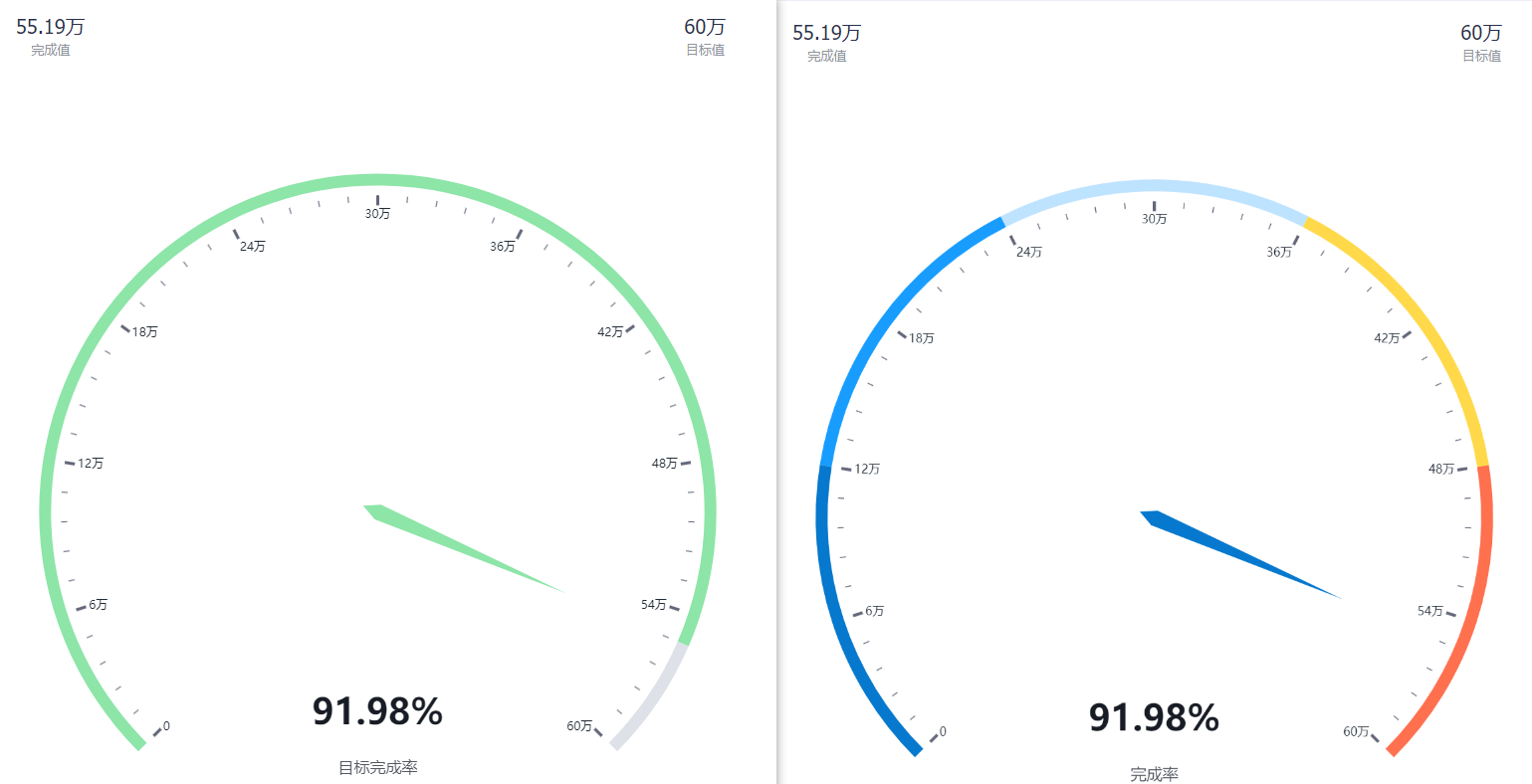
The Dashboard displays overall progress and completion metrics, typically used together with Targets. For example, company-wide target completion rates.
 </img>
1.2 Chart Configuration
1.2.1 Axis Data
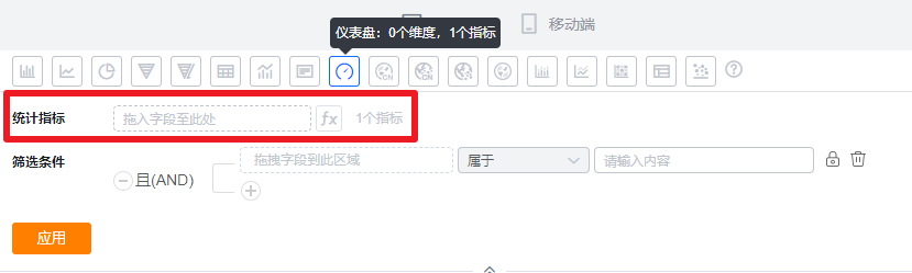
- Dimension: 0 dimensions
- Measure: 1 measure
 </img>
1.2.2 Style (Web)
1.2.2.1 Basic Information
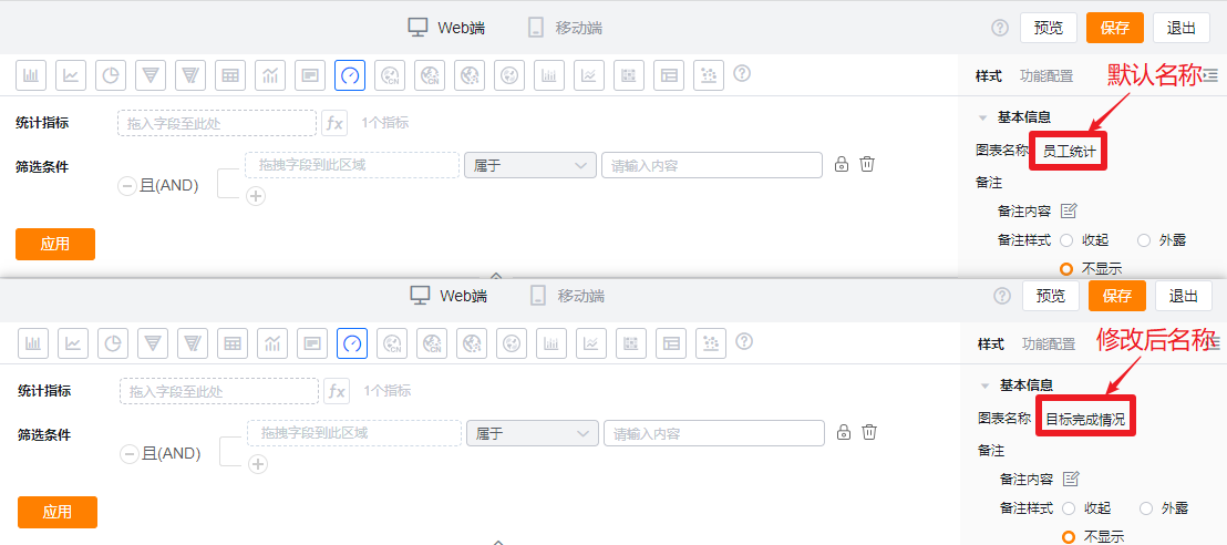
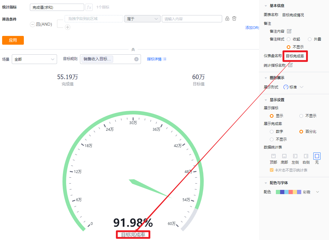
- Chart Name: When creating a chart, the name defaults to the analysis Subject name. You can customize the chart name in Chart Configuration.
 </img>
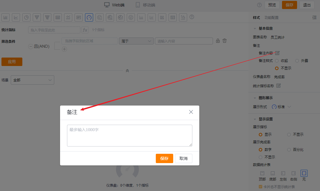
- Notes:
- Note content: Add contextual notes for the current chart so viewers better understand what the chart represents.
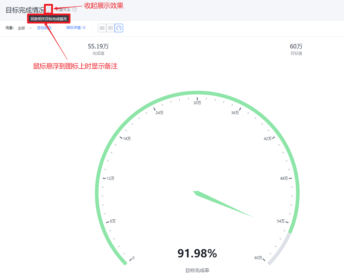
- Note display style:
- Collapsed: Shows as an icon after the chart title in both detail and card views; hovering the mouse over the icon reveals the note content.
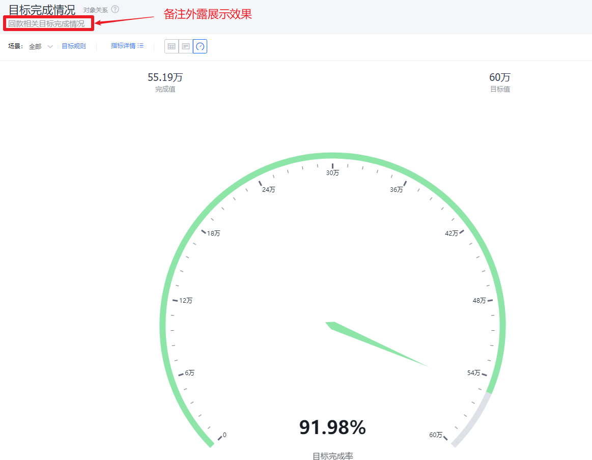
- Expanded: Displays the note text directly after the chart title in both detail and card views.
- Hidden: The note is not shown in either detail or card views.
 </img>
* Add note content
 </img>
* Collapsed note display
 </img>
* Expanded note display
 </img>
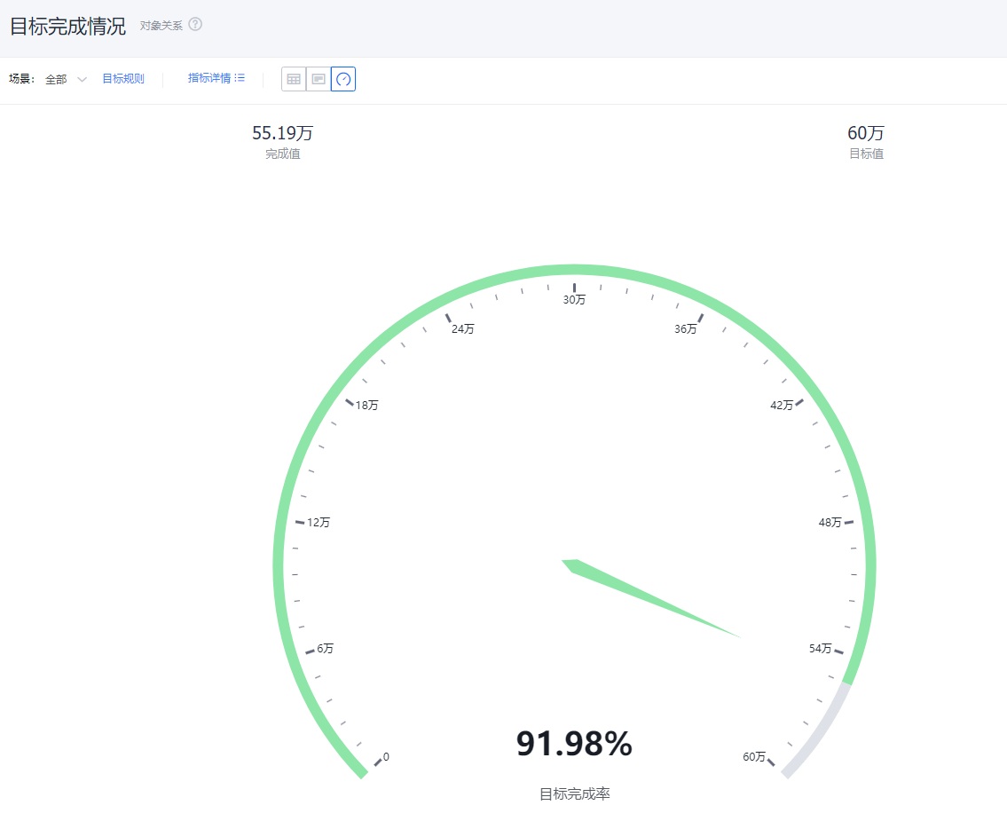
* Hidden note display
- Dashboard Title: Defaults to "Completion Rate"; you can edit the dashboard title.
 </img>
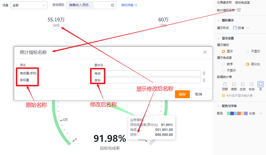
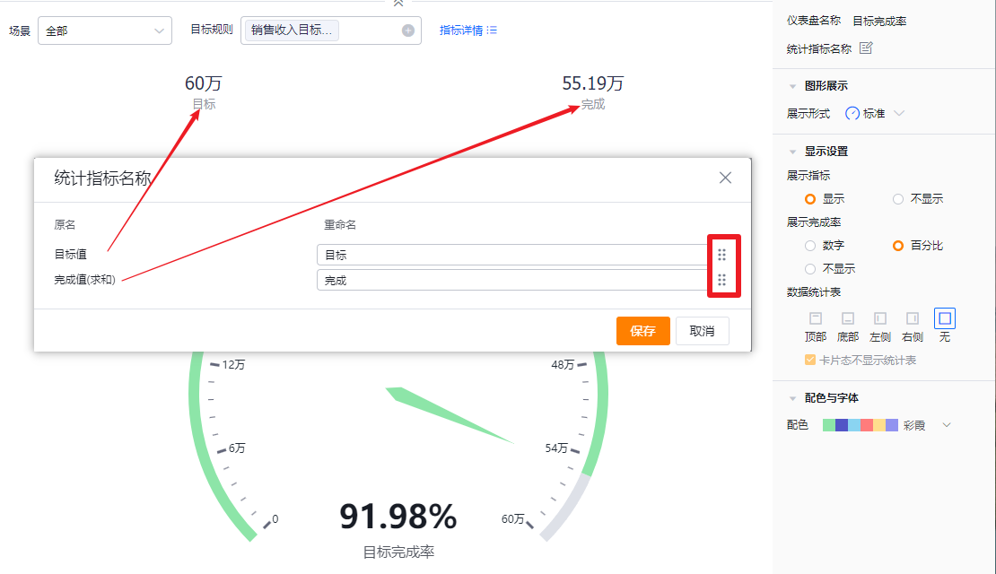
- Measure Label: By default, the measure name displays. You can edit the displayed label.
- Reorder measures: Drag and drop to change the order in which measures appear.
 </img>
* Edit measure label
 </img>
* Reorder measures
1.2.2.2 Chart Type
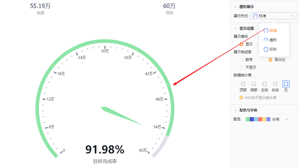
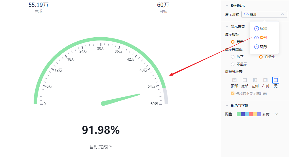
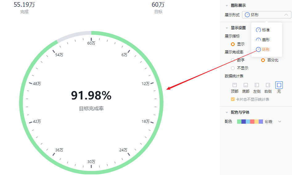
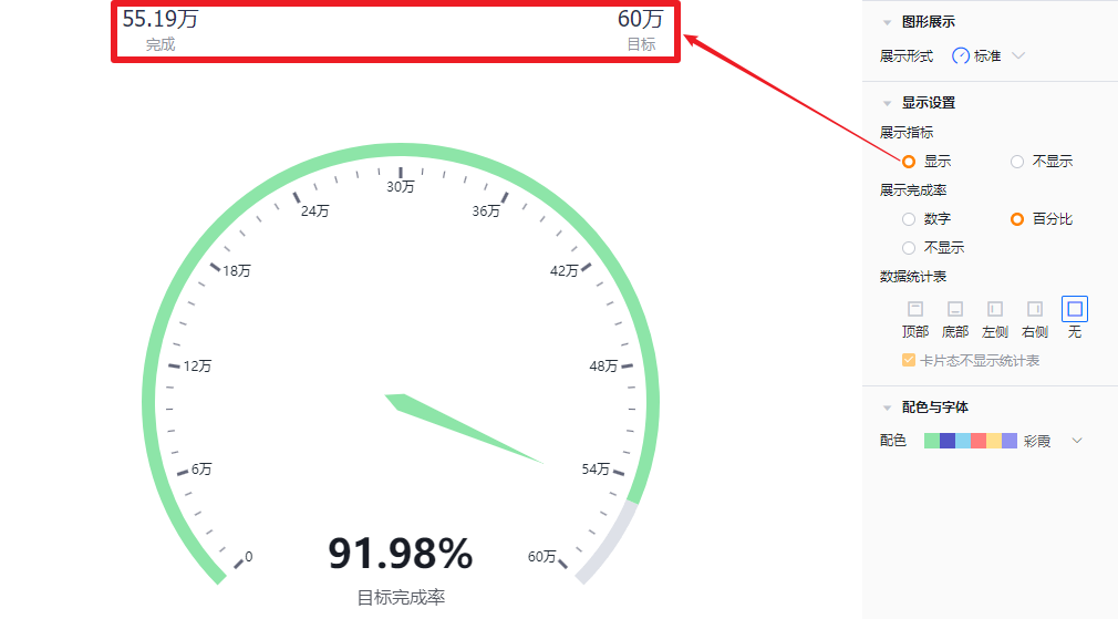
- Display mode: Standard by default; you can switch to Pie or Donut.
 </img>
* Standard display
 </img>
* Pie display
 </img>
* Donut display
1.2.2.3 Display Settings
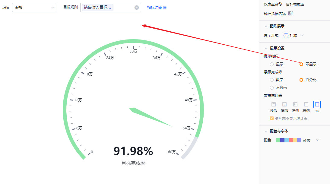
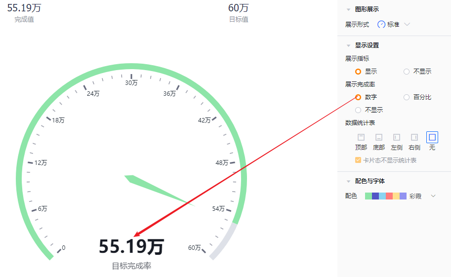
- Show measures: Enabled by default; you can disable it.
 </img>
 </img>
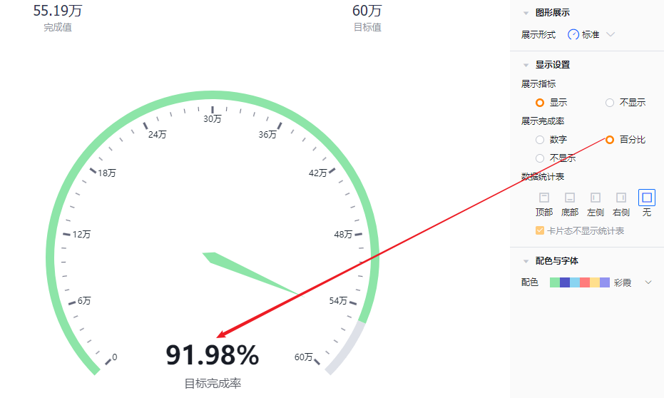
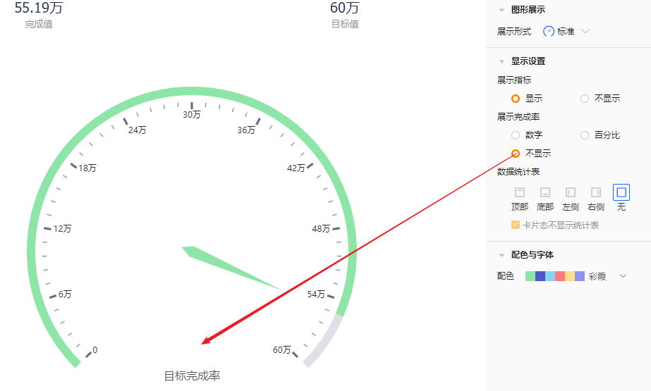
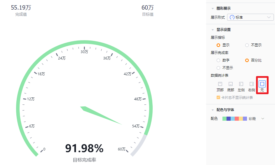
- Show completion: Defaults to percentage; you can switch to absolute number or hide it.
 </img>
 </img>
 </img>
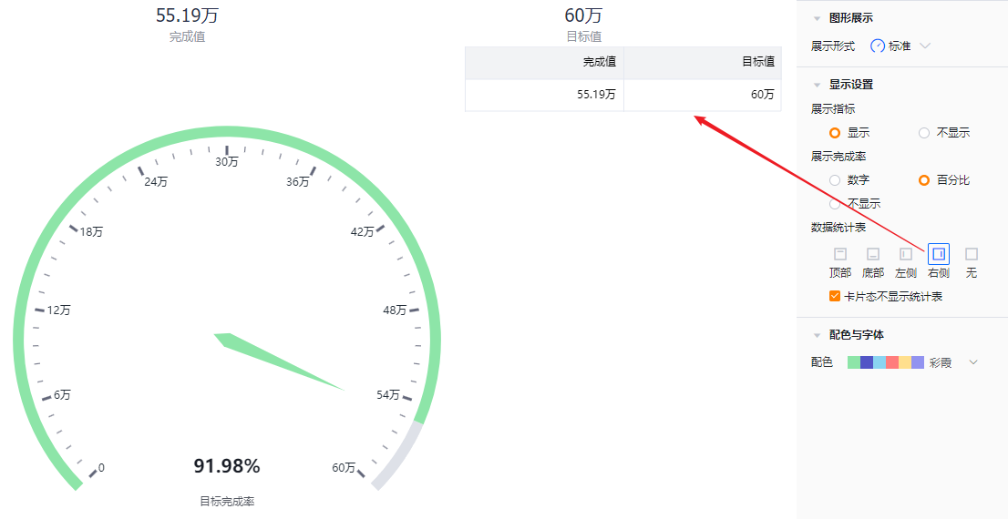
- Data table: You can choose whether to show the data table and its position. Default is hidden. When enabled, you can place it at top, bottom, left, or right of the chart.
- Hide table in card view: When showing the data table, you can set it to be hidden in card view. This option is checked by default.
 </img>
 </img>
1.2.2.4 Colors & Fonts
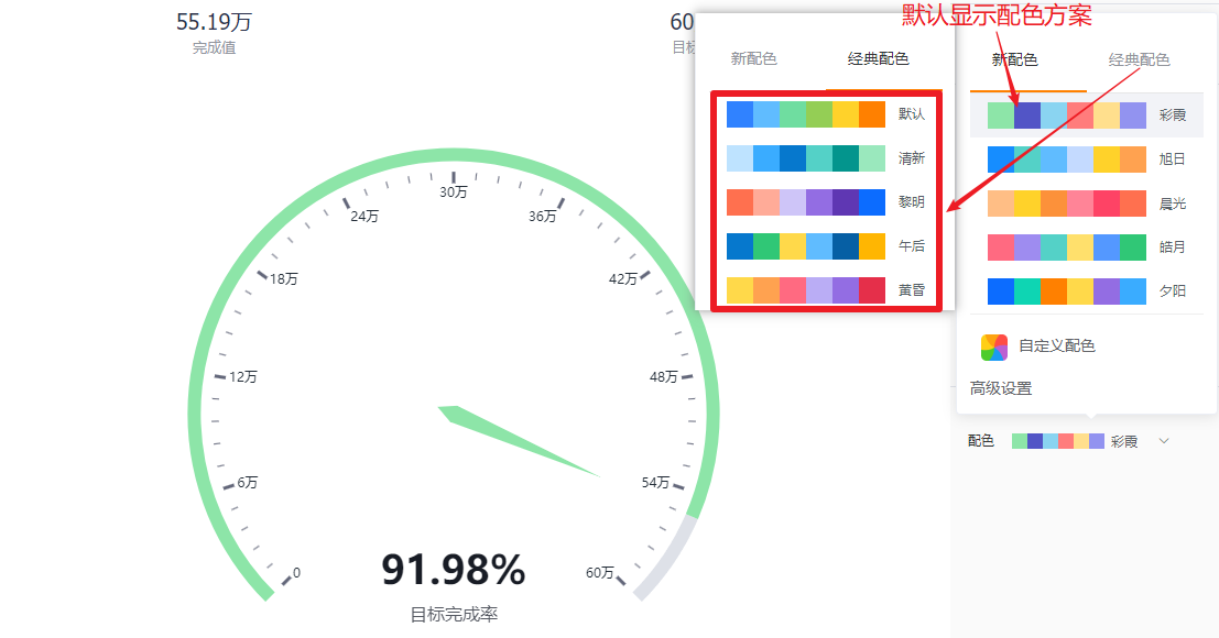
- Color schemes: The system supports two types of palettes: New and Classic. Default is the first set of the New palette.
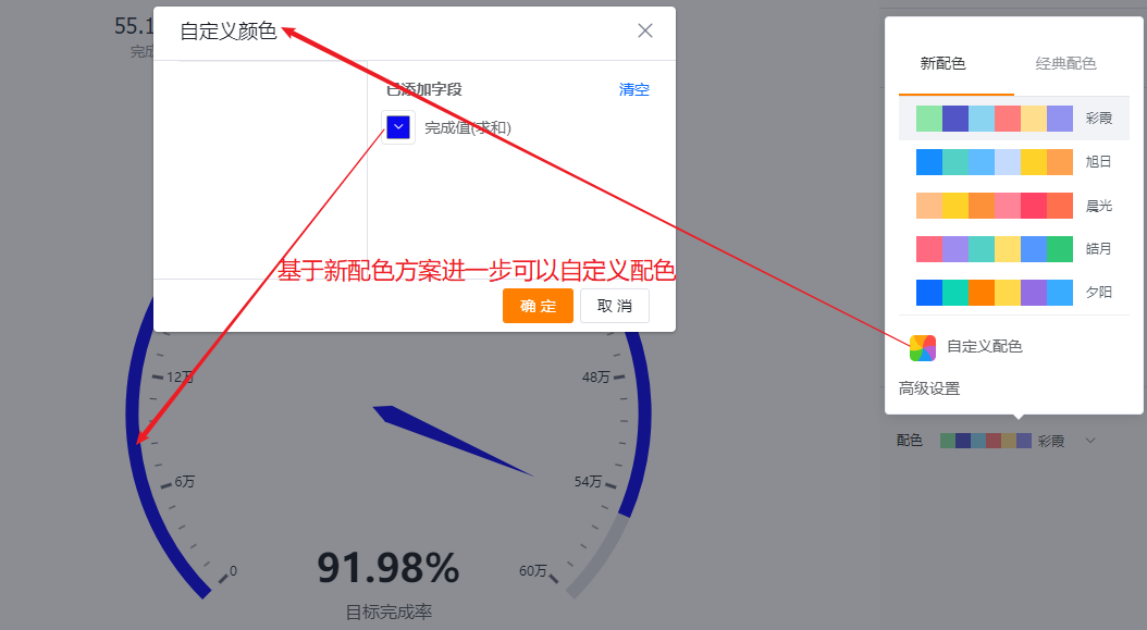
- New palette: You can further customize colors based on a chosen palette.
- Classic palette: Custom colors are not supported.
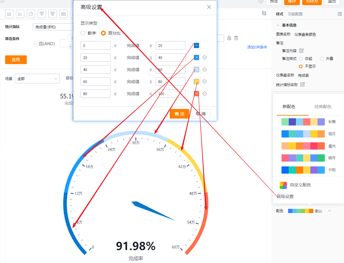
- Advanced settings: Define display color by ranges. The default unit is numbers but you can switch to percentage. Up to 5 segments are supported and each segment can use a custom color.
 </img>
 </img>
* Custom color preview
 </img>
* Advanced settings preview
1.2.3 Functional Configuration
1.2.3.1 Advanced Configuration
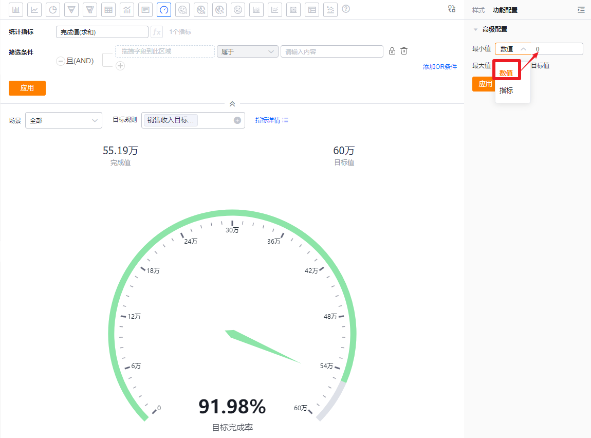
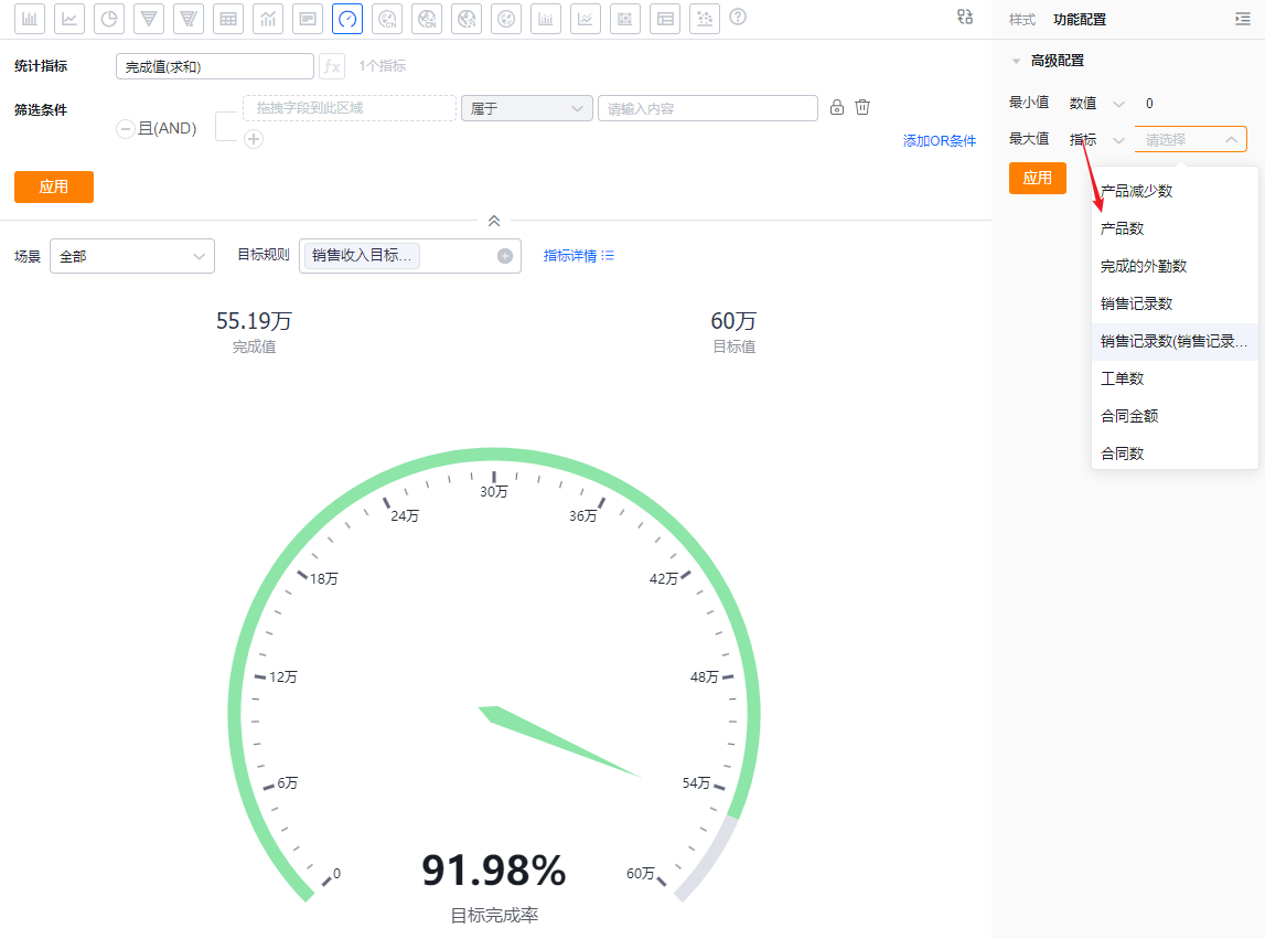
- Max / Min value: Default mode is manual numeric input (max default 100, min default 0). You can switch to select a measure to compare against by choosing a measure from the current Subject.
 </img>
* Numeric input example
 </img>
* Measure selection example
1.2.4 Style (Mobile)
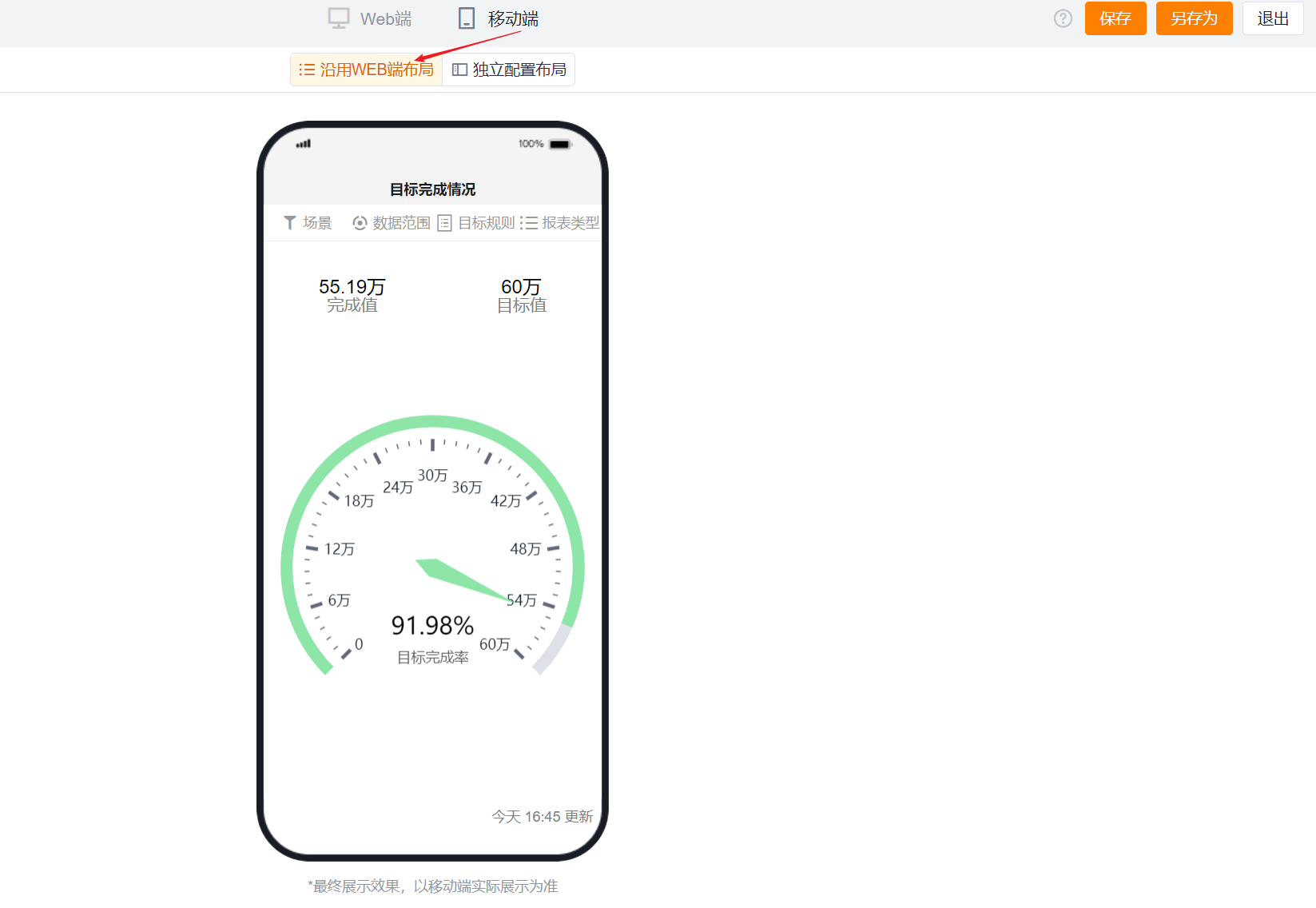
1.2.4.1 Follow Web Layout
- Mobile follows the Web layout and cannot be configured independently.
 </img>
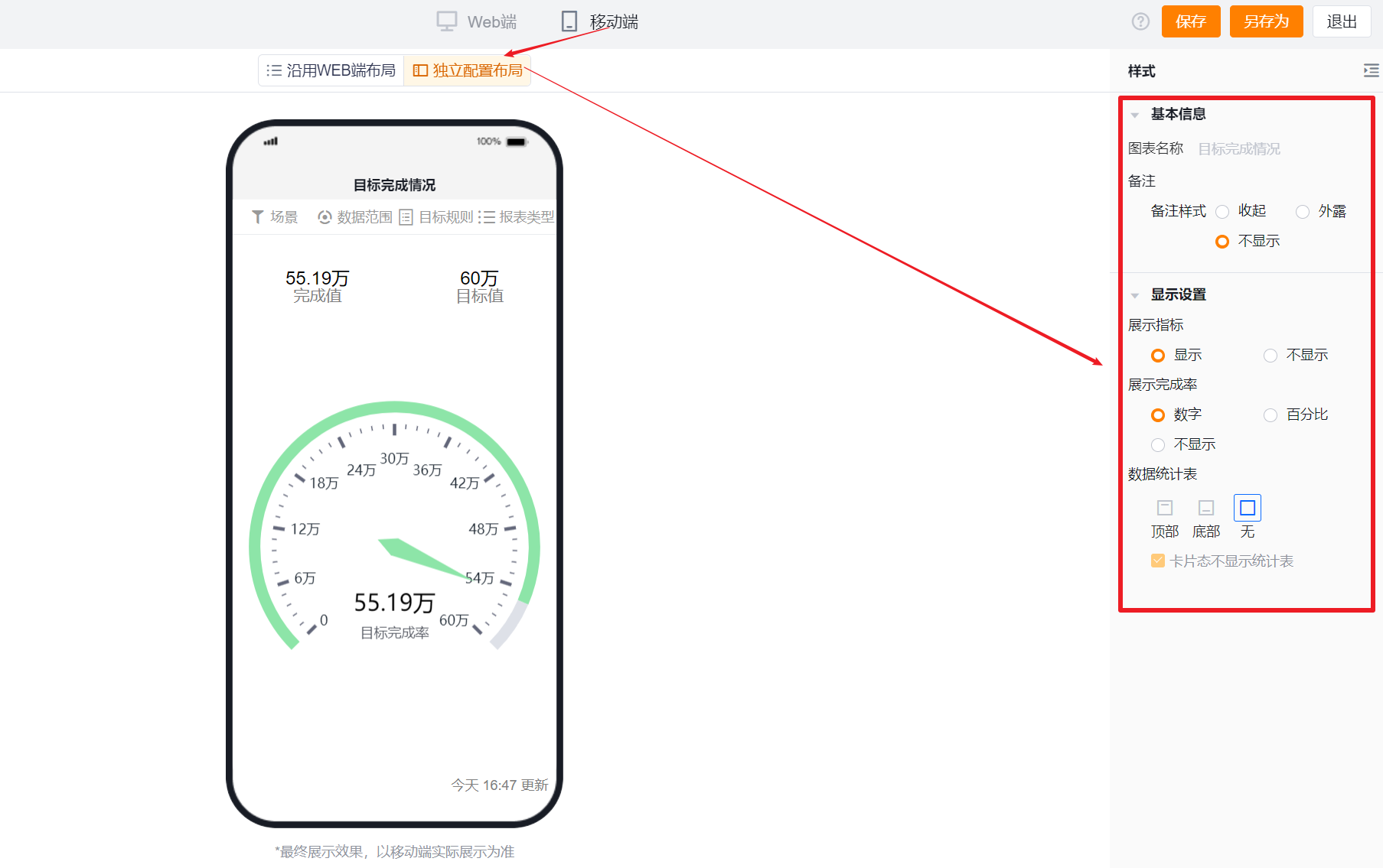
1.2.4.2 Independent Mobile Layout
- By default, mobile echoes the selected Web configuration but you can further adjust it to better suit mobile displays.
- Mobile has fewer options than Web. Settings that cannot be configured on mobile inherit the Web configuration. Configurable mobile options follow the same presentation and logic as Web.
 </img>