Published at: 2025-10-30
Bar Chart
Bar Chart
1.1 Use Cases
Bar charts show how each dimension varies or compares within a data range. For example, you can compare Sales Order performance by Account tier or rank annual Sales Orders across Departments.
1.2 Chart Configuration
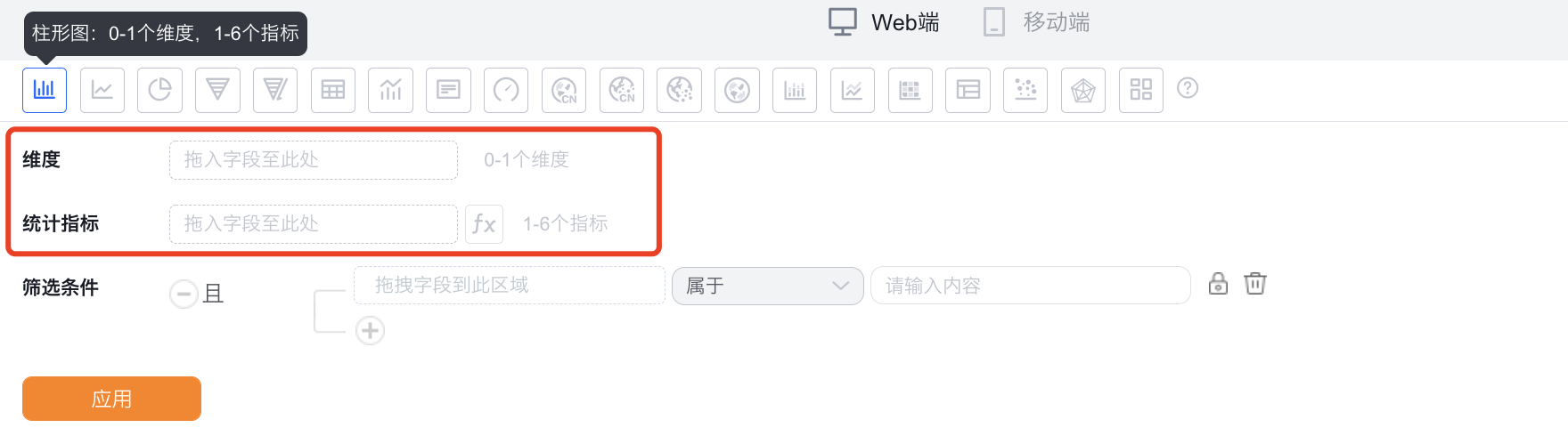
1.2.1 Axis Data
- Dimension: 0–1 dimension
- Metric: 1–6 metrics
1.2.2 Style (Web)
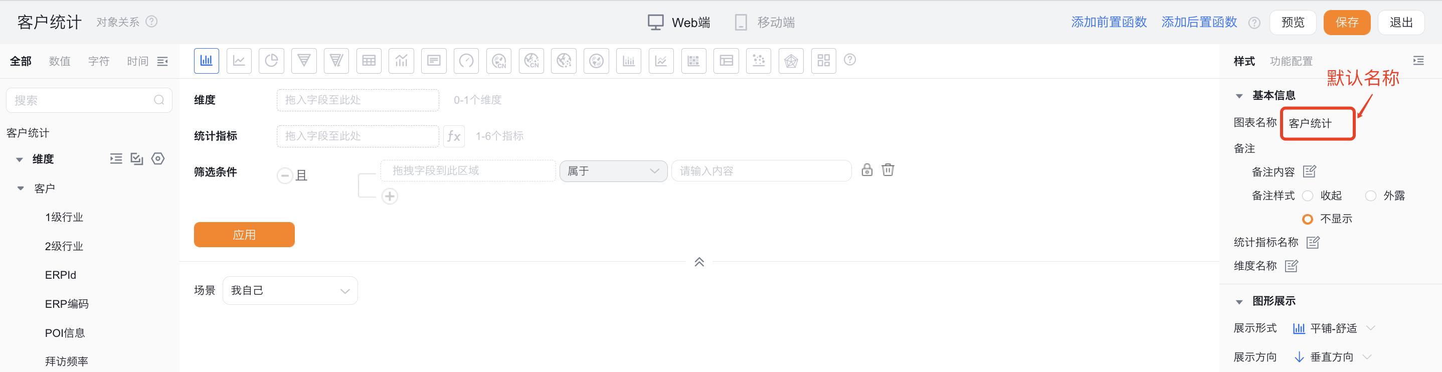
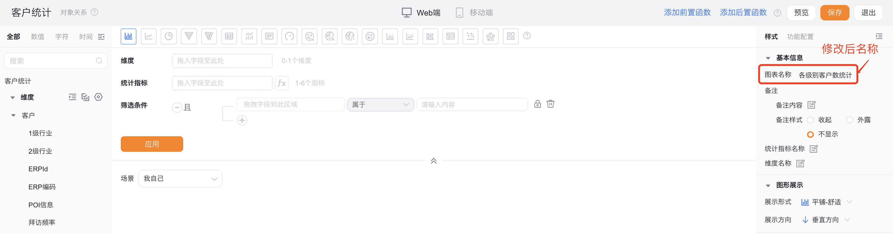
1.2.2.1 Basic Information
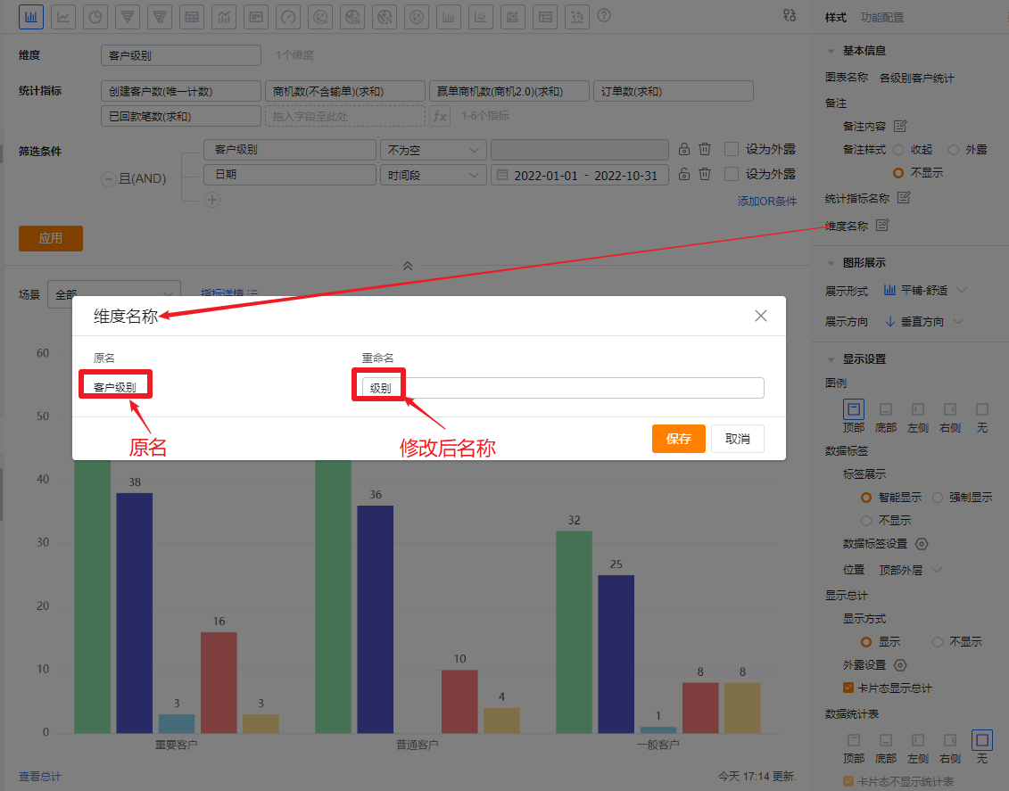
- Chart name: Defaults to the analysis Subject when created; you can customize the chart name in Chart Configuration.
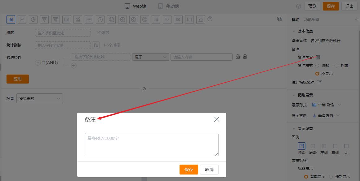
- Notes:
- Note content: Add notes for the current chart to help viewers better understand the chart’s meaning.
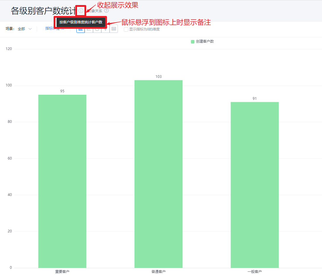
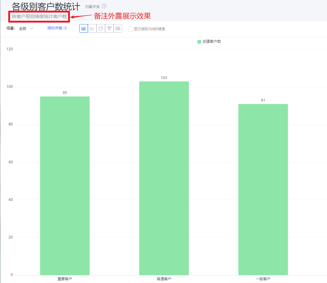
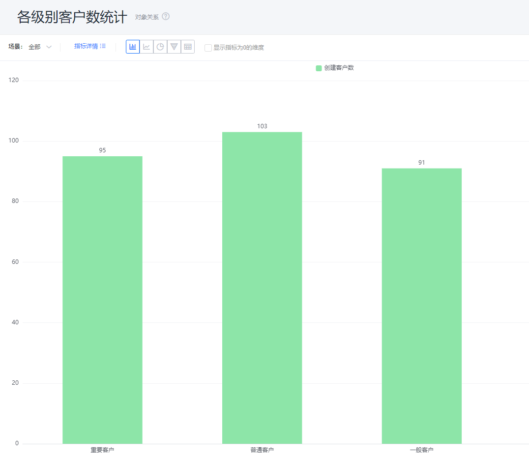
- Note style:
- Collapsed: Displays an icon after the chart title in detail and card views; hover shows the note content.
- Exposed: Shows the note text directly after the chart title in detail and card views.
- Hidden: Does not show the note in either detail or card views.
 * Add note content
 * Collapsed note style
 * Exposed note style
 * Hidden note style
- Metric label: By default displays the metric name; you can edit the displayed text.
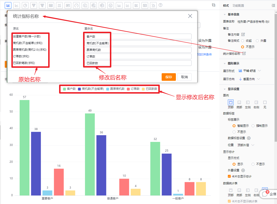
- Dimension label: By default displays the dimension name; you can edit the displayed text.
1.2.2.2 Chart Presentation
- Layout options: Default Tile - Comfortable. You can switch to Tile - Compact, Stacked, or Percentage Stacked.
- Tile - Comfortable: Each metric is a separate bar with spacing between bars.
- Tile - Compact: Each metric is a separate bar with no spacing between bars.
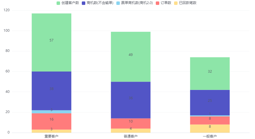
- Stacked: Bars stack together; when stacked, Value Label position cannot be changed and values default to inside.
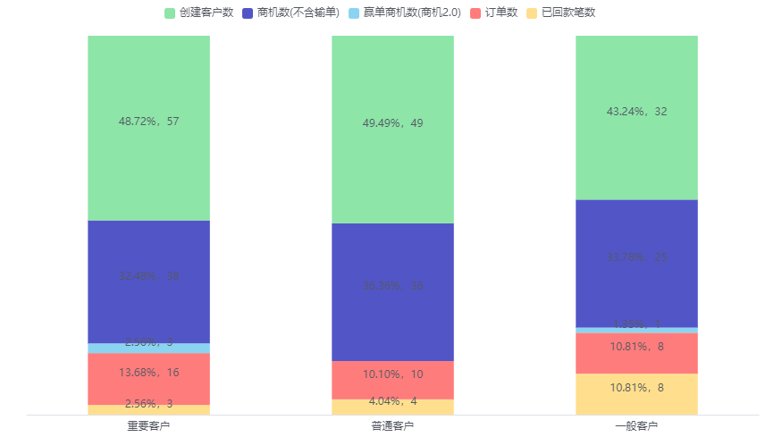
- Percentage Stacked: Bars normalize to equal height and display subgroup percentages; when enabled, Value Label position cannot be changed and values default to inside.
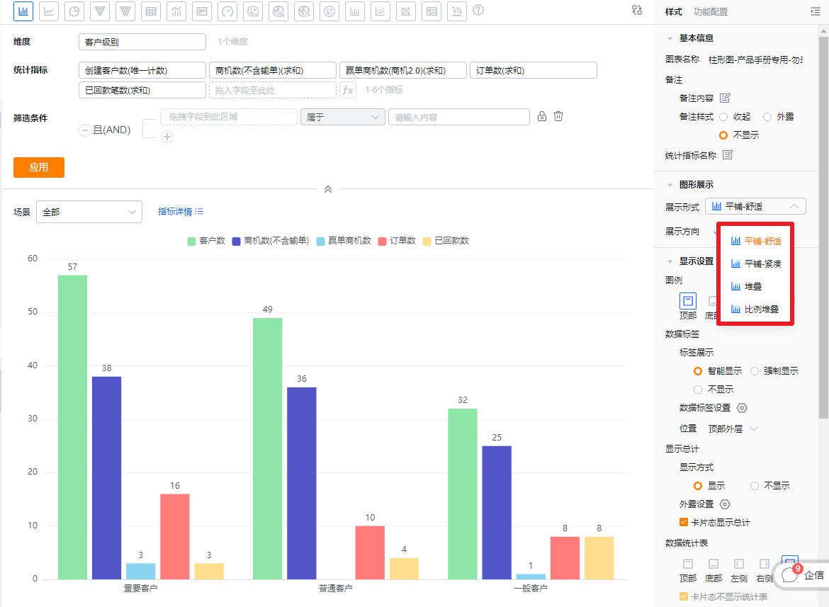 * Layout configuration
 * Tile - Comfortable
 * Tile - Compact
 * Stacked
 * Percentage Stacked
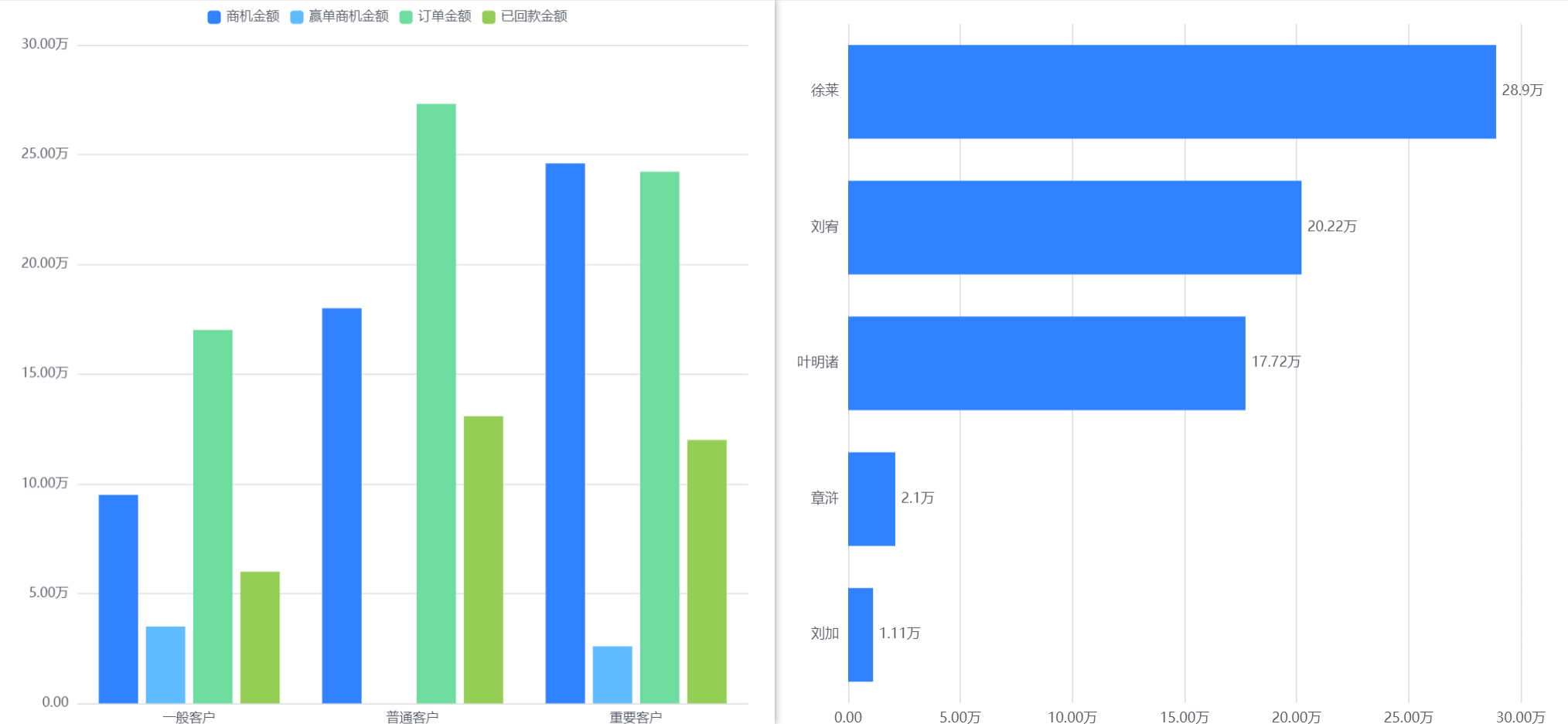
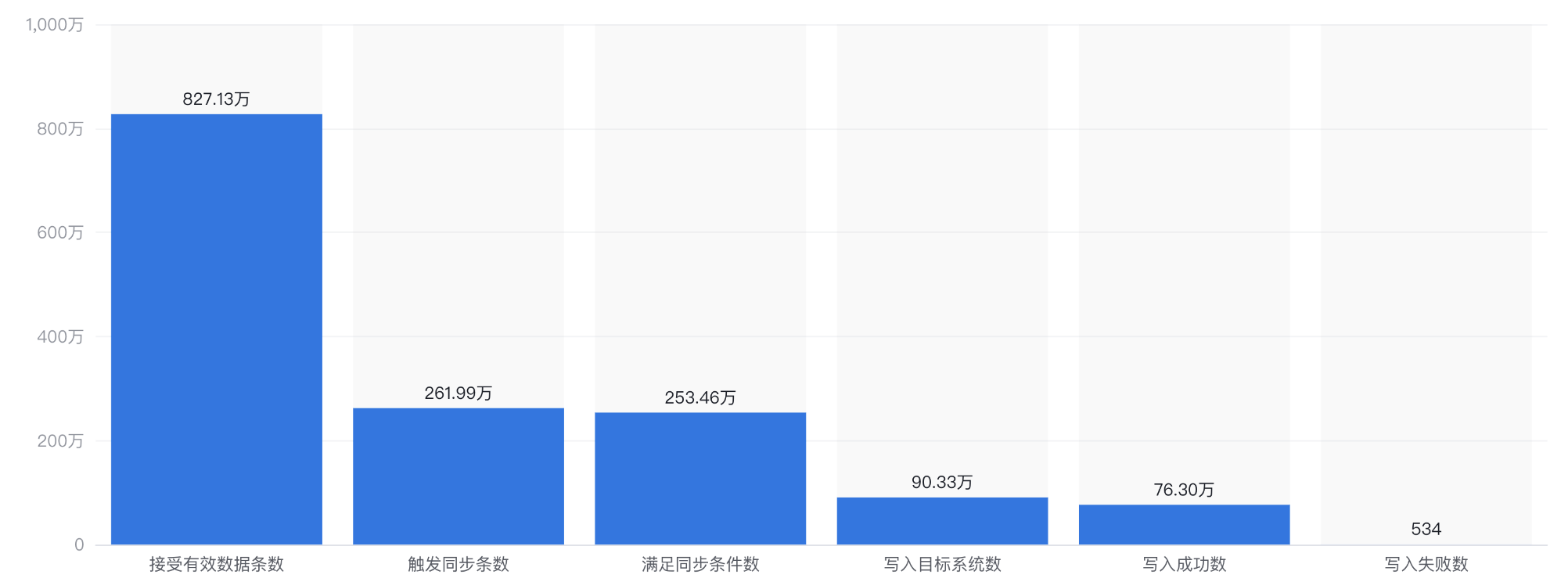
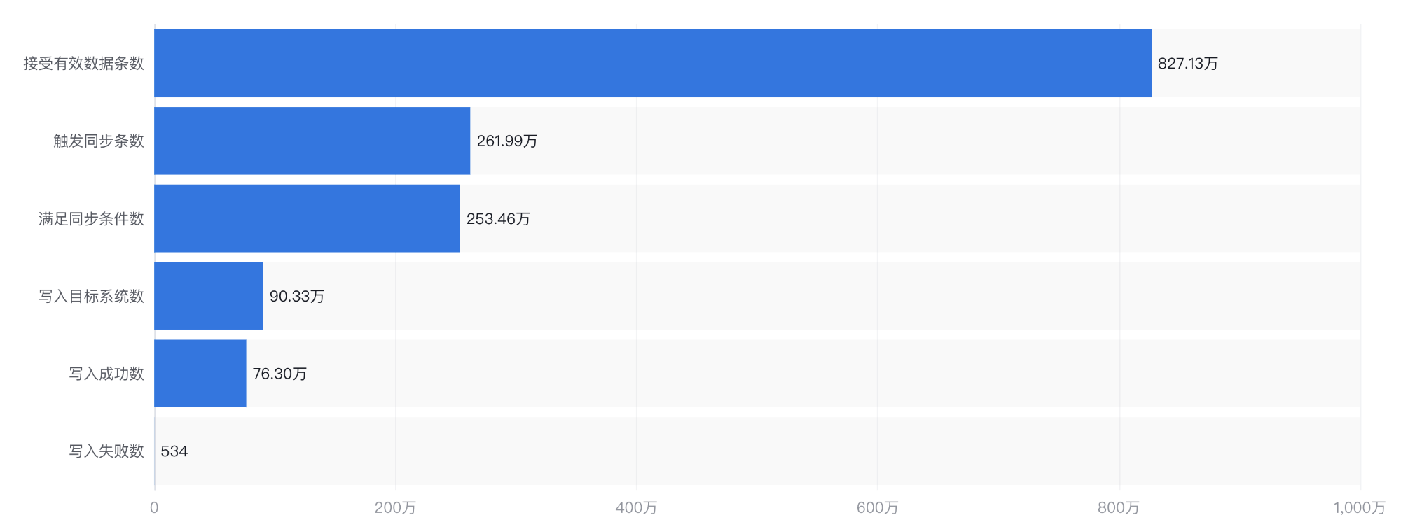
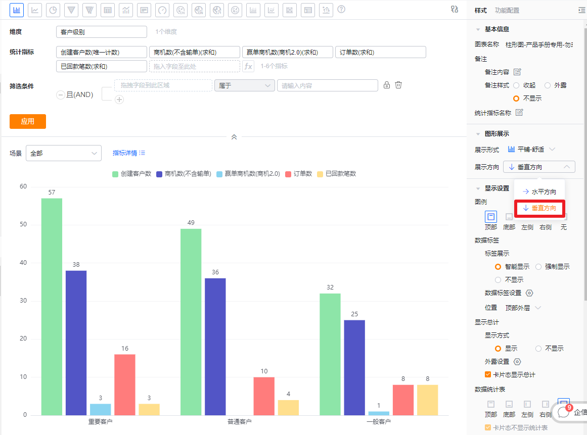
- Orientation: Default is vertical; you can switch to horizontal.
 * Orientation settings and vertical example
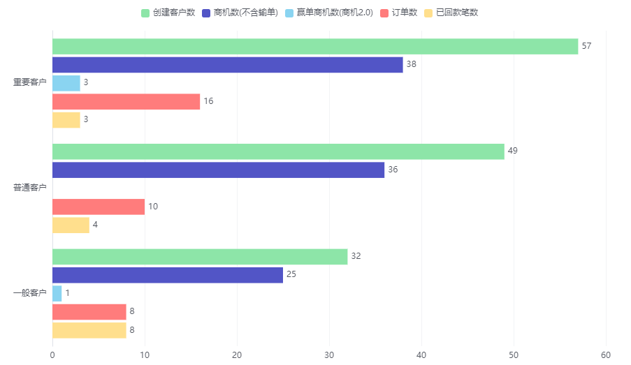 * Horizontal example
1.2.2.3 Display Settings
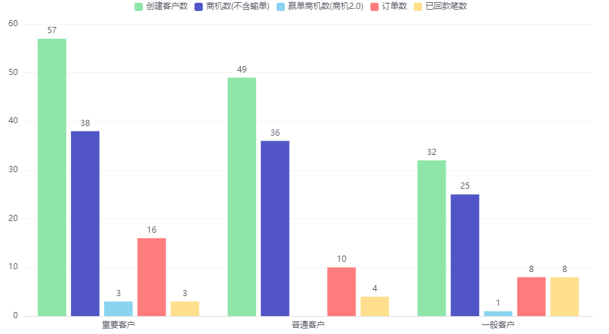
- Legend: Default at top. Options: top, bottom, left, right, none.
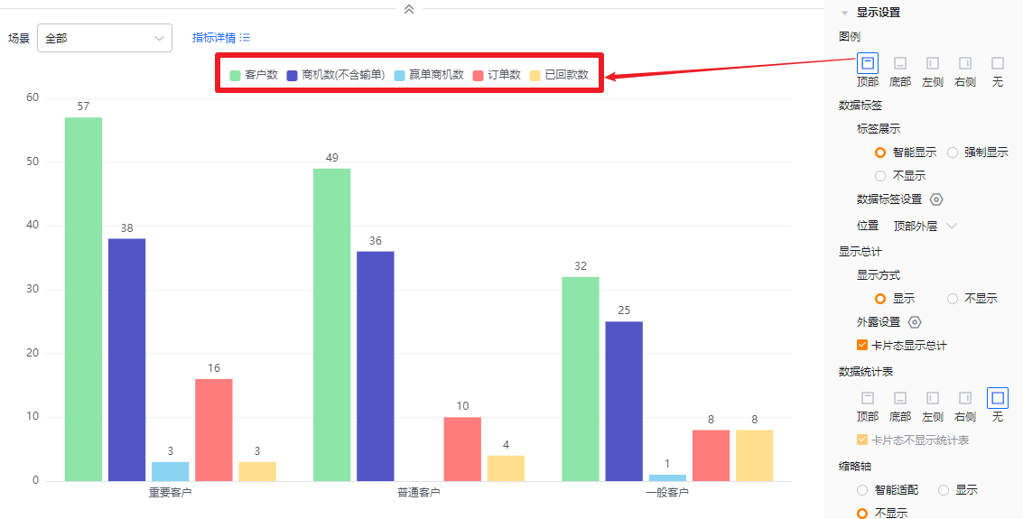 * Legend at top
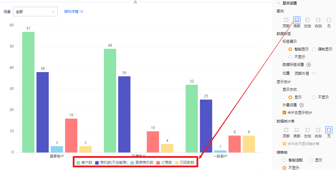 * Legend at bottom
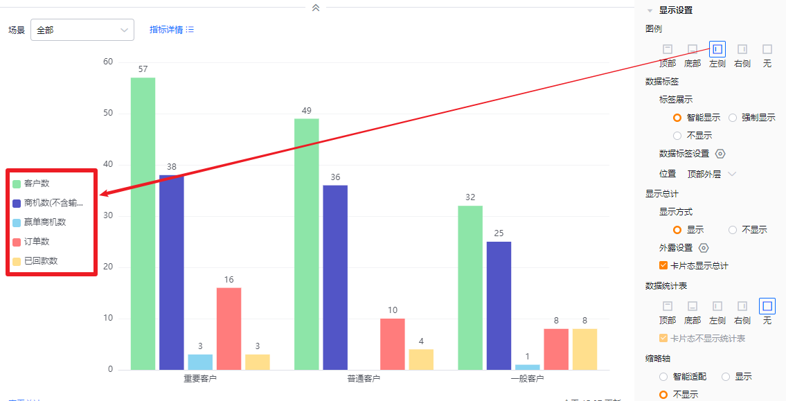 * Legend at left
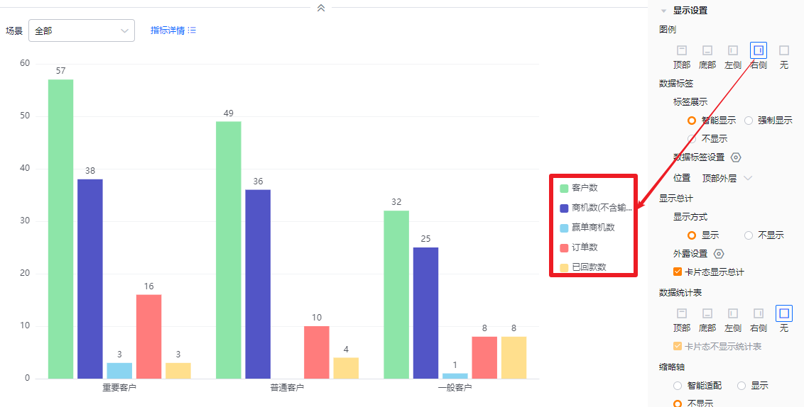 * Legend at right
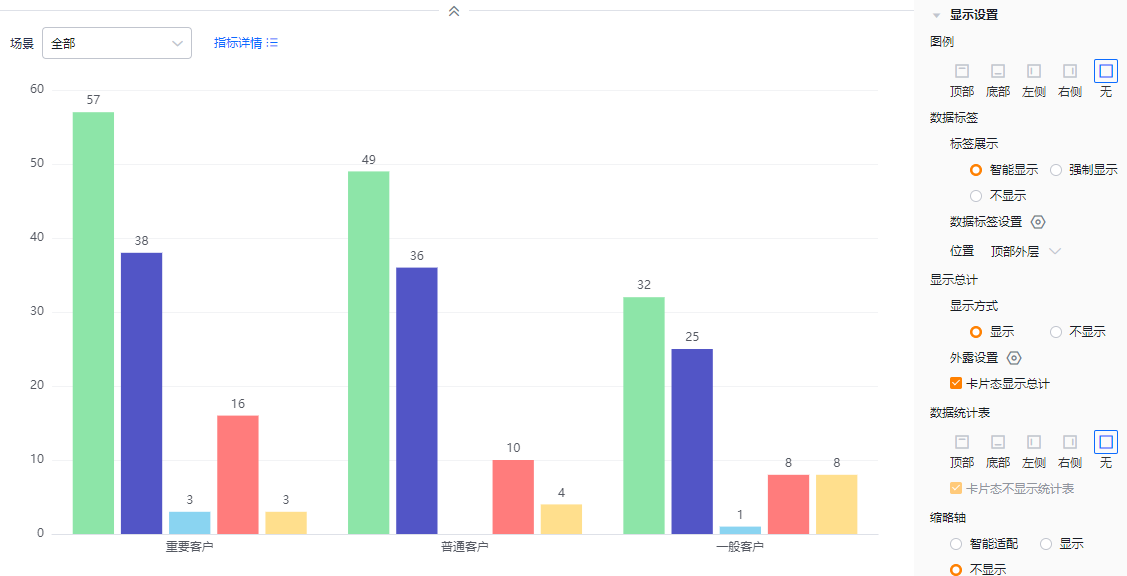 * No legend
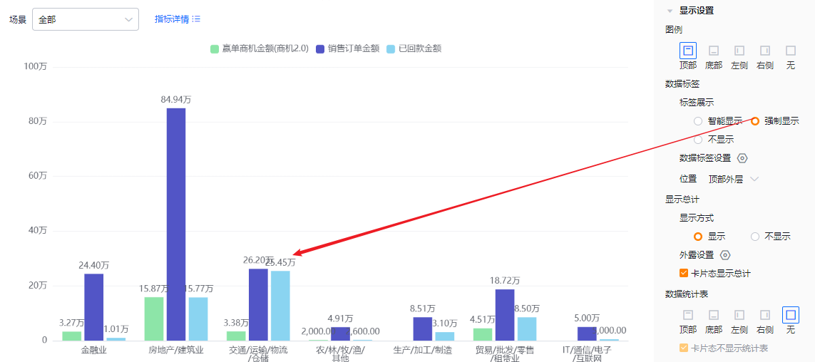
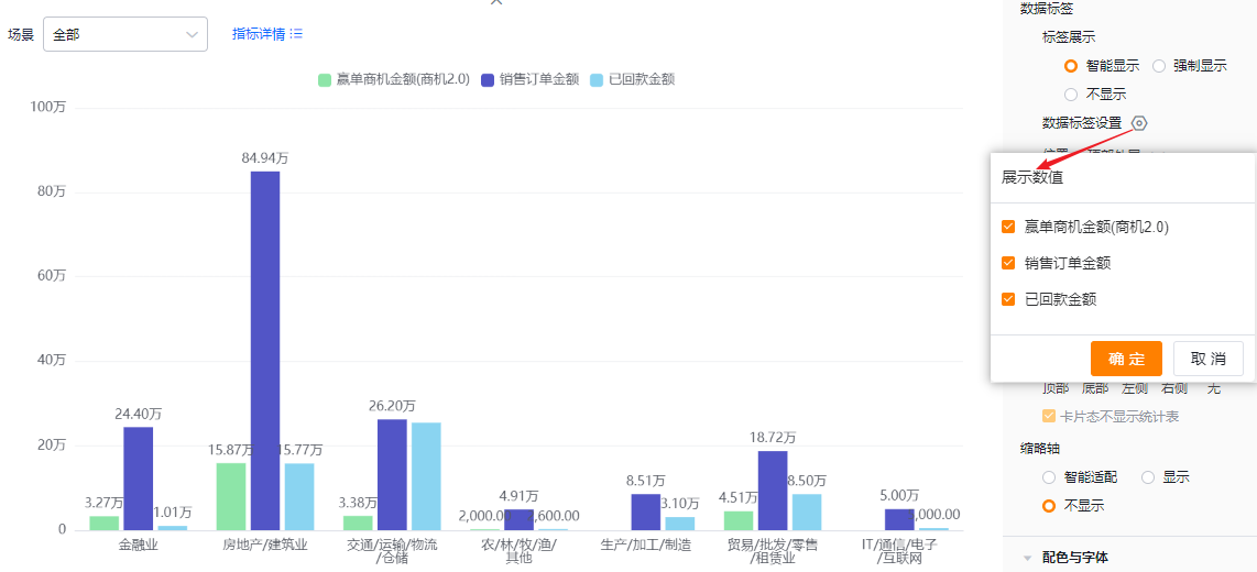
- Value labels:
- Label display:
- Smart: Automatically displays value labels based on available space; when values across metrics are similar, some labels may hide to avoid overlap.
- Force: Displays all value labels; overlapping may occur if values are close.
- None: No value labels displayed.
- Label display:
 * Smart display
 * Force display
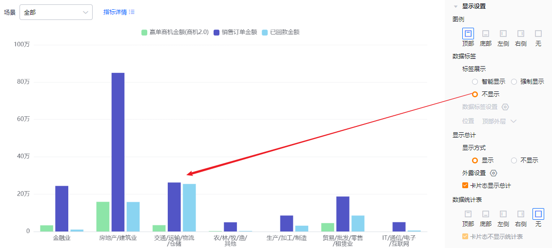 * No labels
- Value label options: When there are two or more metrics, you can select which metrics show labels (all checked by default). If Label display is None, this setting is read-only.
- Position:
- Top Outside: Values display outside the top of the bar.
- Inside Bottom: Values display at the bottom inside the bar.
- Inside Center: Values display centered inside the bar.
- When Label display is None, this setting is read-only.
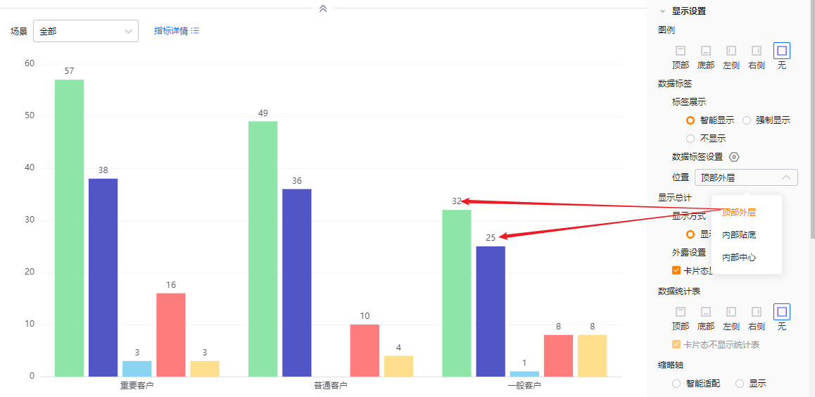 * Top Outside
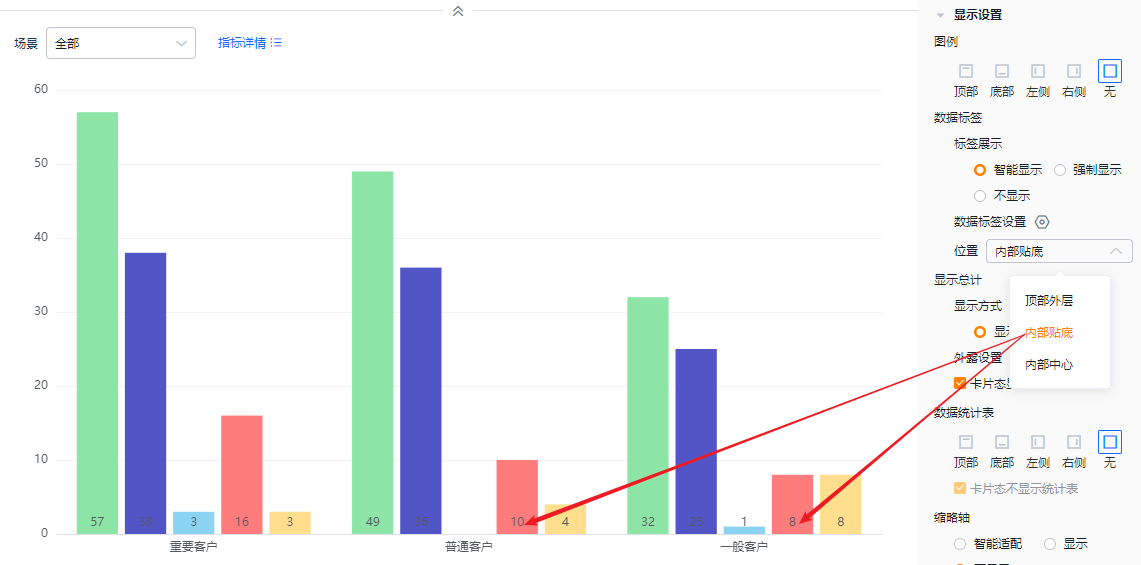 * Inside Bottom
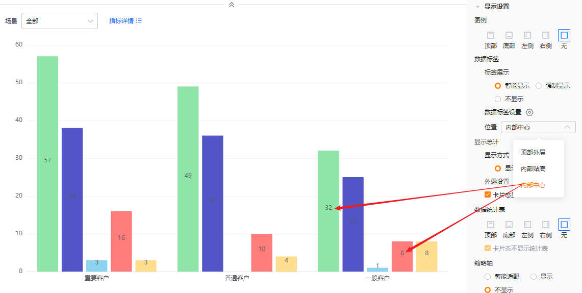 * Inside Center
- Show totals:
- Display mode: Default is On; switch to Off to hide totals. When On, totals can appear in edit, detail, and card views depending on configuration. If Off, totals are hidden in all views.
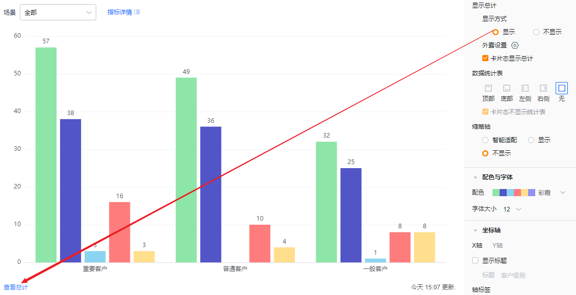 * Totals visible
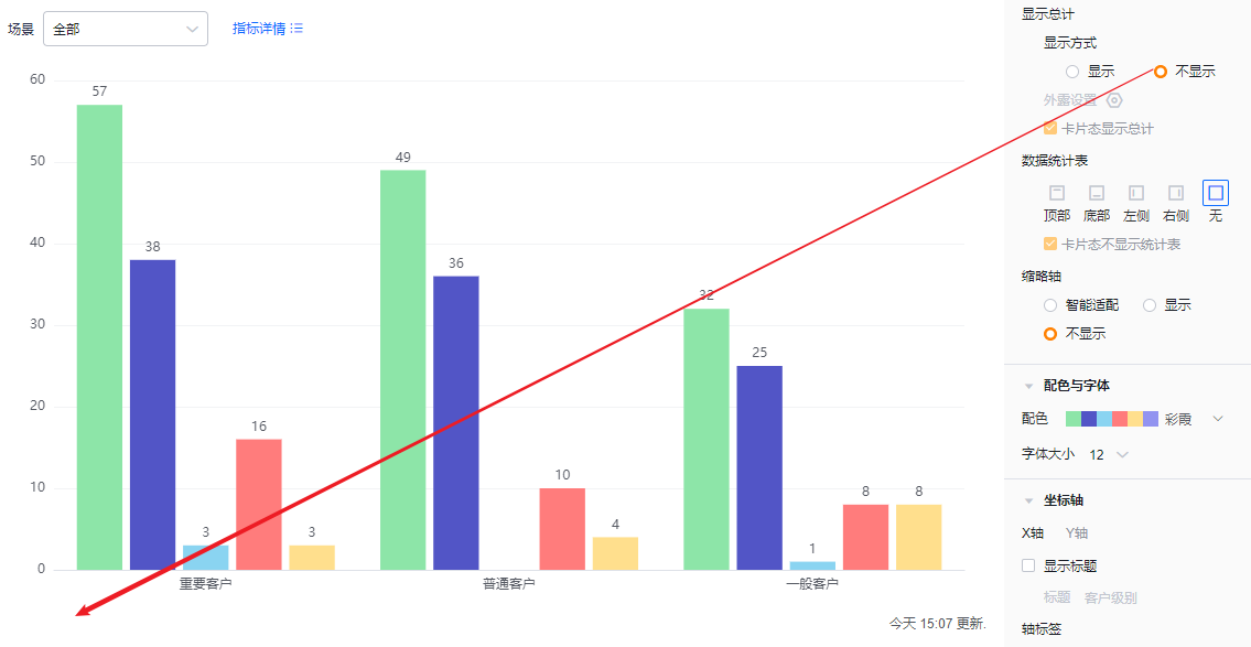 * Totals hidden
-
Exposed totals: When there are two or more metrics, you can choose which metrics’ totals display externally; none selected by default. If Display mode is Off, this setting is read-only.
-
Card view show totals: Default checked. Uncheck to hide totals in card view. If Display mode is Off, this setting is read-only.
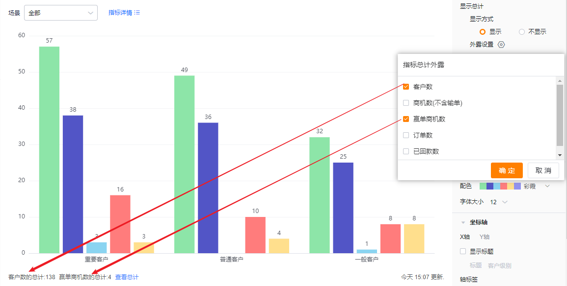 * Example of exposed metrics totals
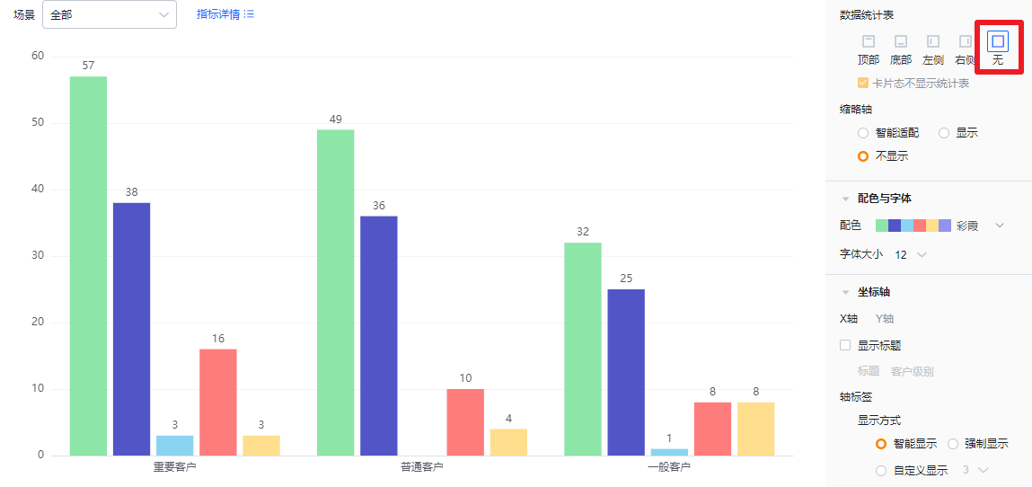
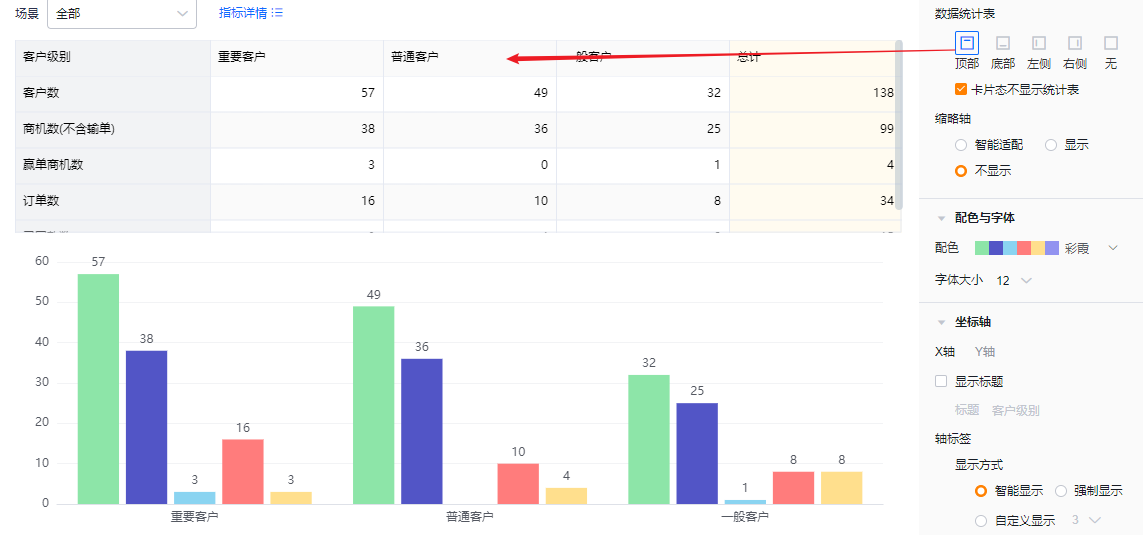
- Data table: You can enable a data table and set its position. Default is Off. Options: Top, Bottom, Left, Right.
- Hide table in card view: Default checked; when checked, the table is not shown in card view.
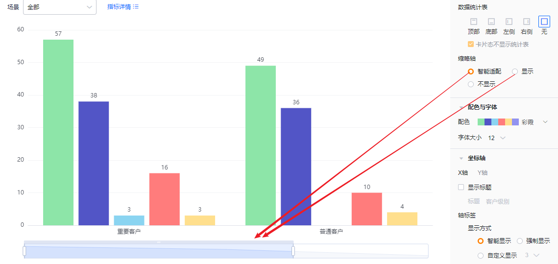
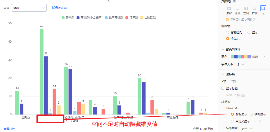
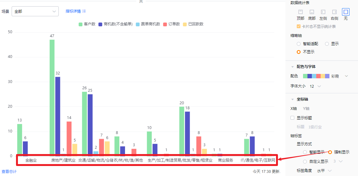
- Mini-axis (compact axis): Default Smart. Options: Smart, Show, Hide.
- Smart: Detects how many bars fit the current chart area. If bars exceed the displayable count, the mini-axis appears; otherwise it hides.
- Show: Always show the mini-axis.
- Hide: Never show the mini-axis.
 * Mini-axis visible (Smart triggered)
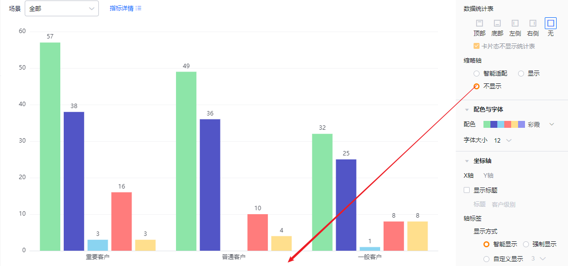 * Mini-axis hidden
1.2.2.4 Colors & Typography
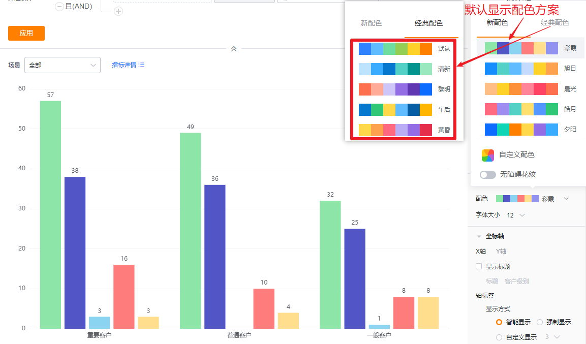
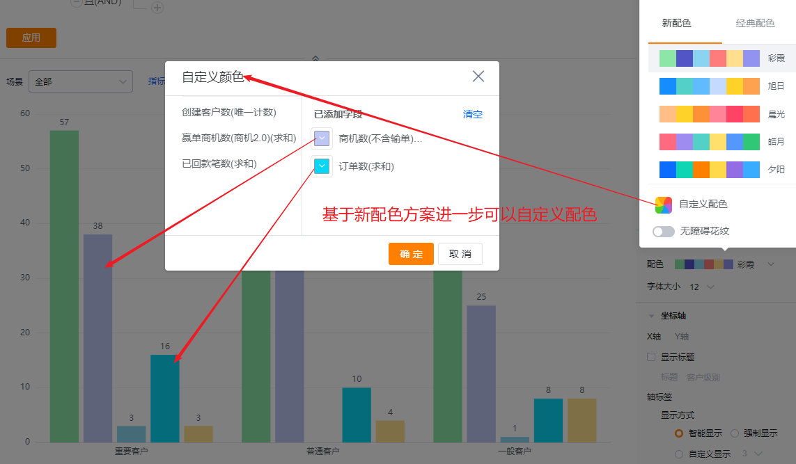
- Color schemes: The system supports New and Classic palettes. Default selects the first set in New. You can enable accessibility patterns.
- New: Supports customizing colors based on a selected palette.
- Classic: Does not support custom colors.
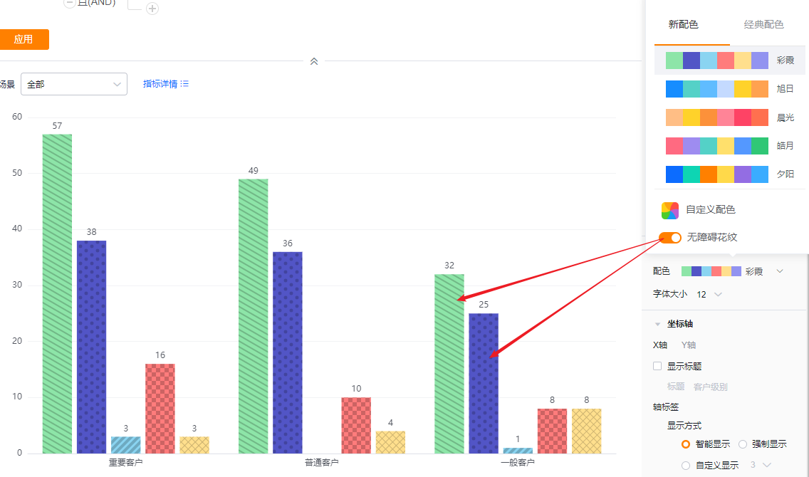
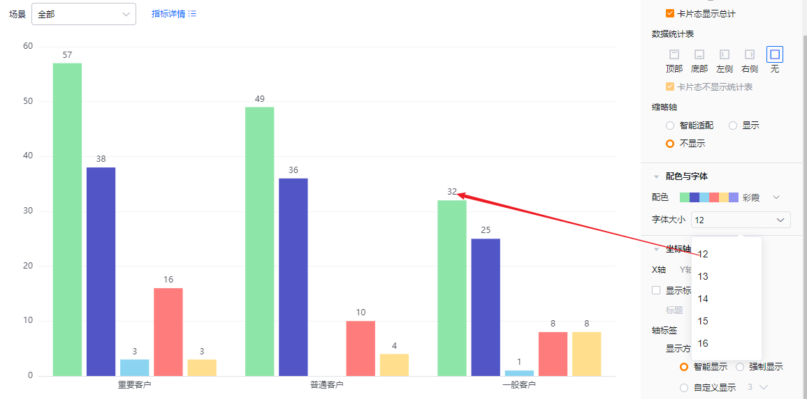
- Font size: Default 12; options: 13, 14, 15, 16.
1.2.2.5 Axes
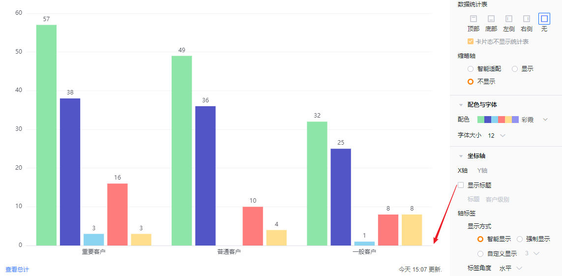
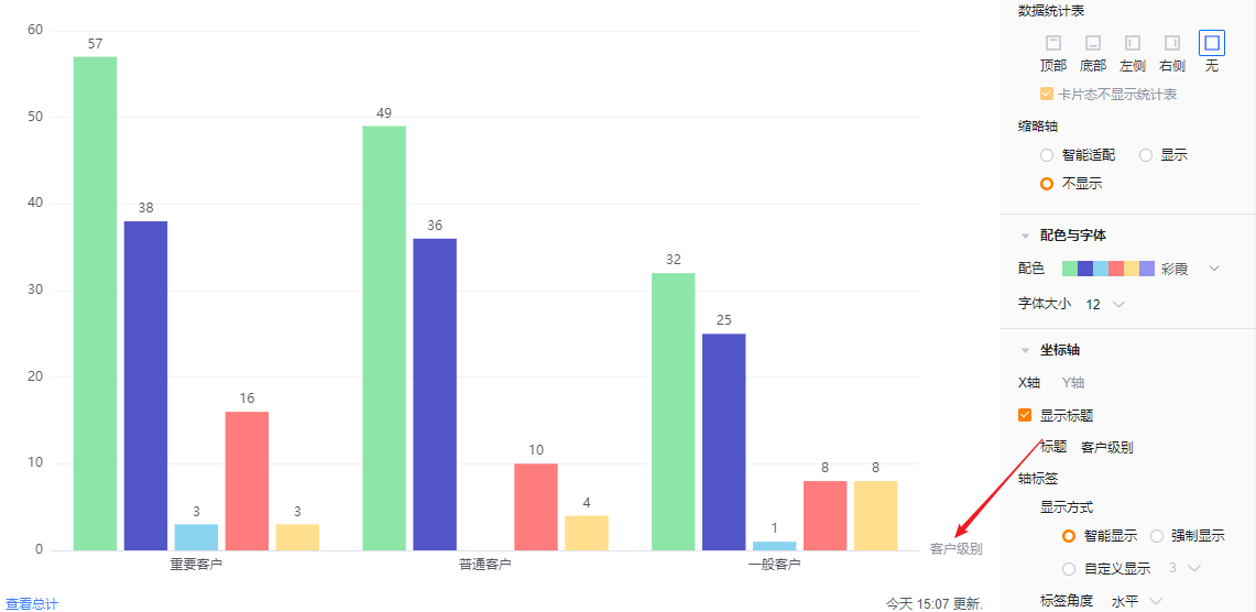
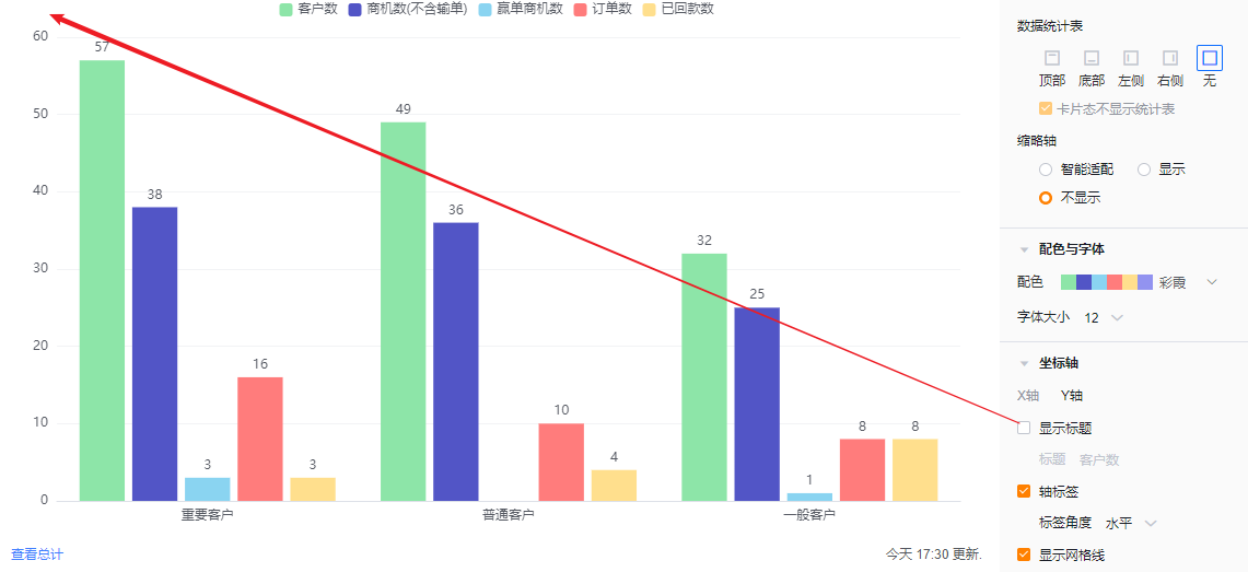
- X Axis
- Show title: Default Off. When enabled, it echoes the dimension field name and is editable.
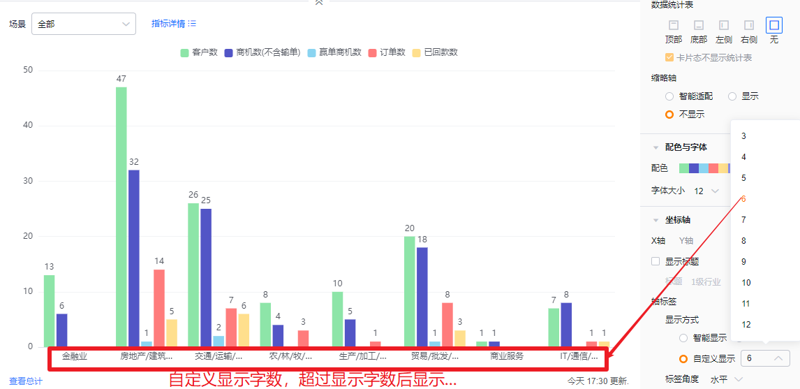
- Axis labels
- Display mode:
- Smart: Adjusts the number of visible characters based on the available space; truncates with “…” when exceeding space.
- Force: Show full labels; may overlap if labels are long.
- Custom: Default shows 3 characters; supports 3–12 characters.
- Display mode:
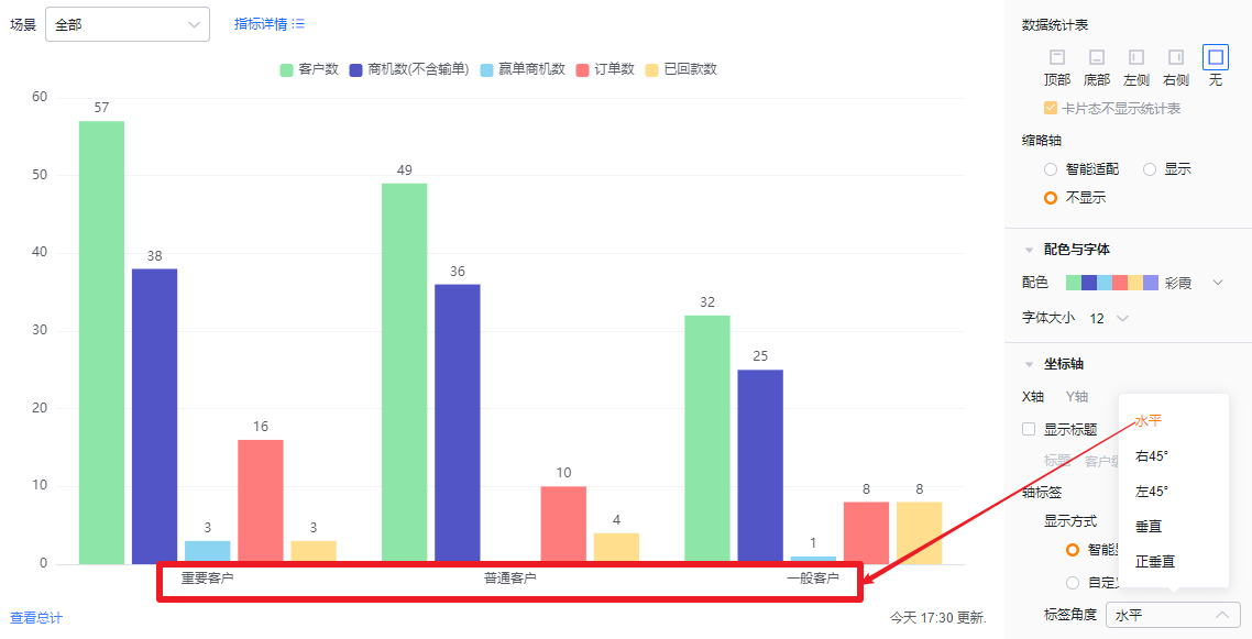
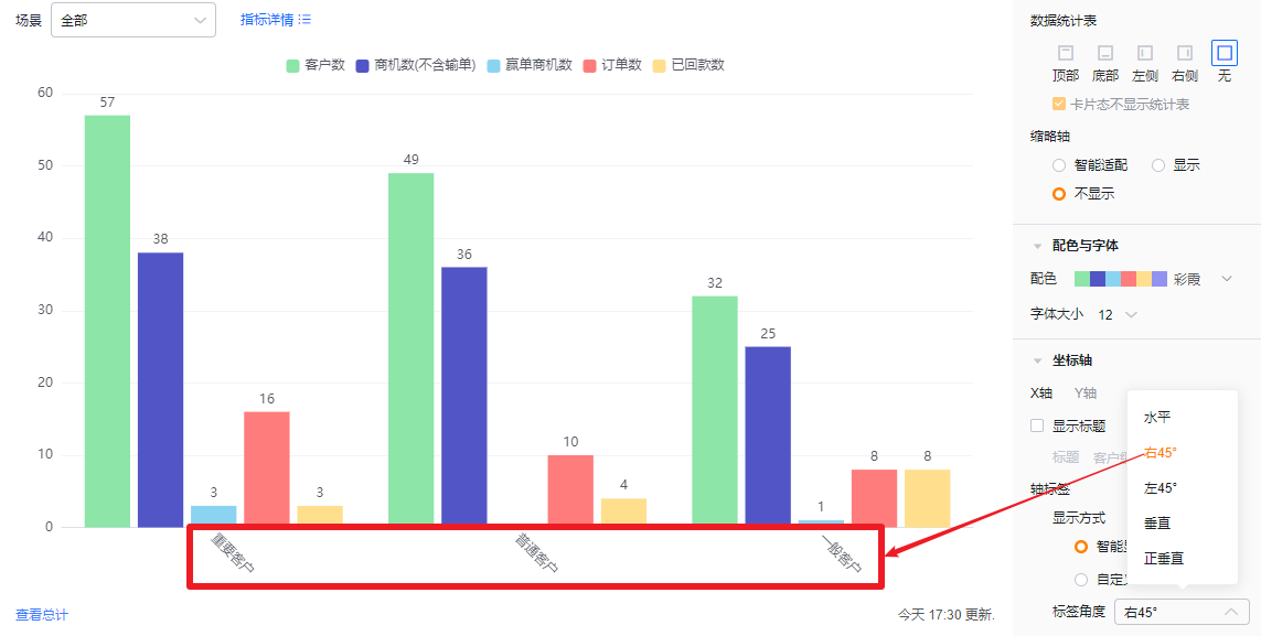
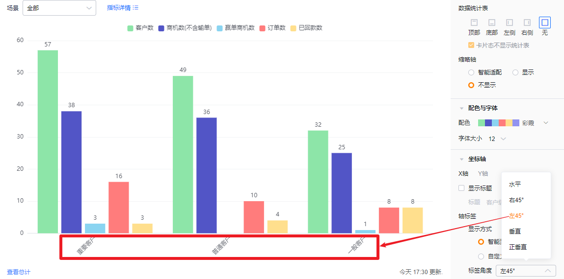
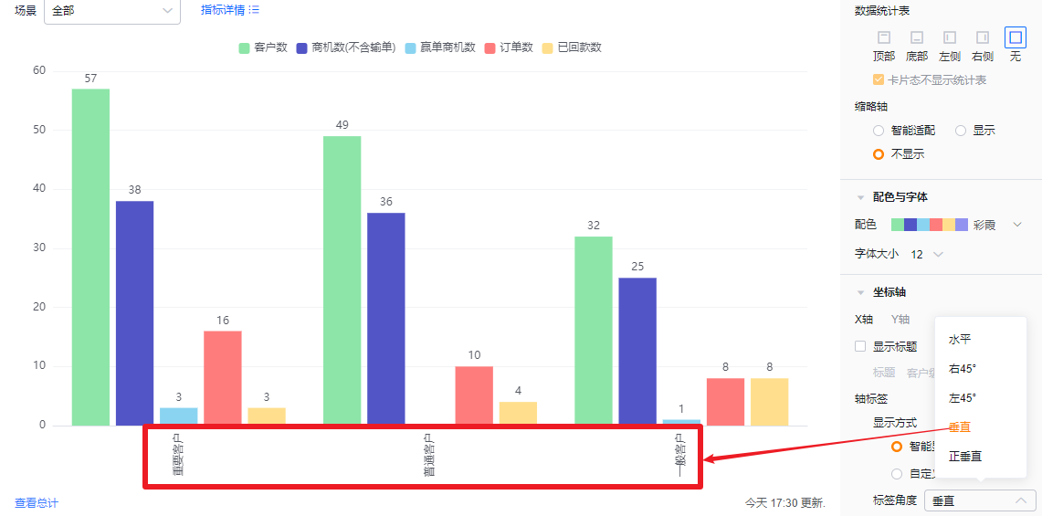
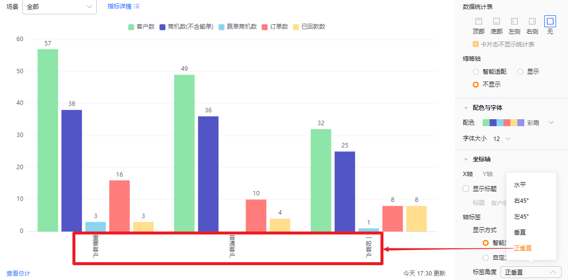
- Label angle: Default horizontal. Options: Right 45°, Left 45°, Vertical, Fully vertical.
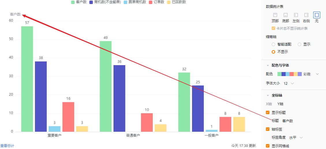
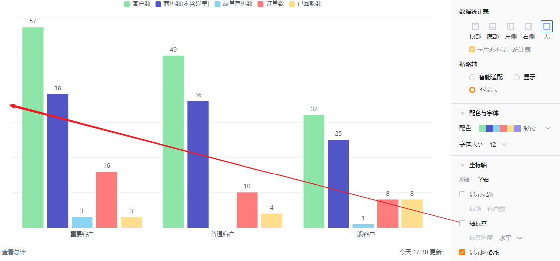
- Y Axis
- Show title: Default Off. When enabled, it echoes the first metric name and is editable.
- Axis labels: Checked by default; you can uncheck to hide.
- Label angle: When labels are enabled, you can set angle: Horizontal (default), Left 45°, or Vertical (same visuals as X axis angles).
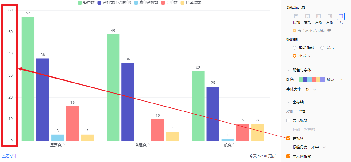
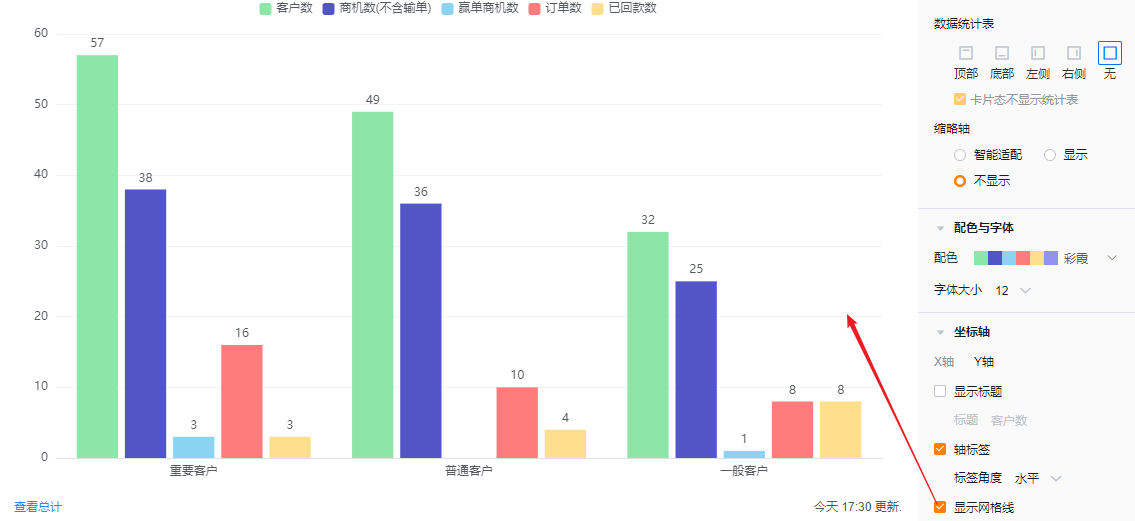
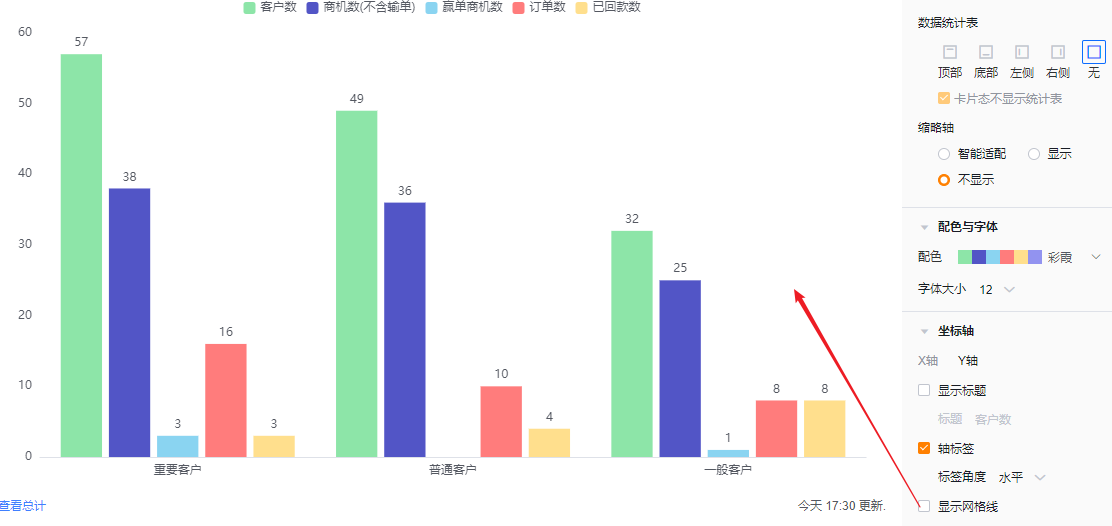
- Show gridlines: Checked by default; you can uncheck.
1.2.3 Functional Configuration
1.2.3.1 Advanced Settings
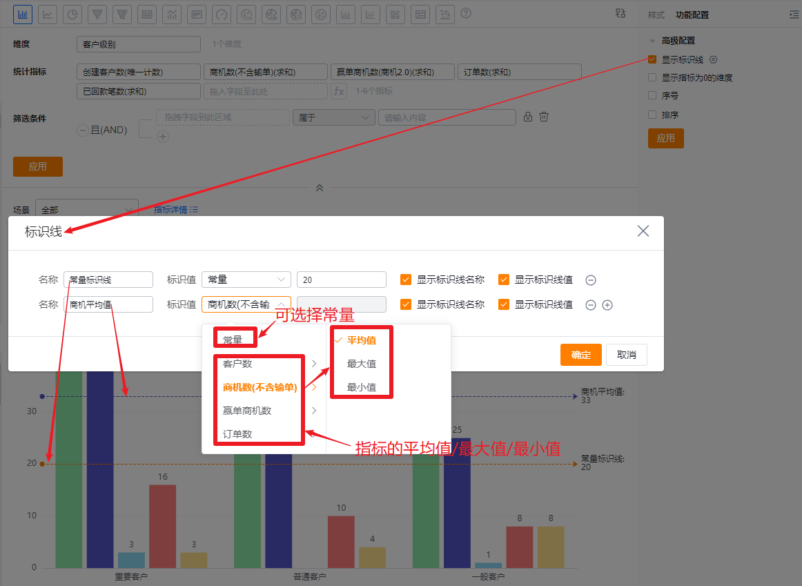
- Show reference lines: You can add up to 6 reference lines per chart. Default Off.
- Name: Set a label for the reference line.
- Value type: Default Constant; you can choose Metric Average, Max, or Min. If Constant is selected, enter a numeric value.
- Show reference line name: Default Off; check to display the name.
- Show reference line value: Default Off; check to display the value.
- Show dimensions with zero metrics: Default Off. Check to display dimensions whose metric values are zero.
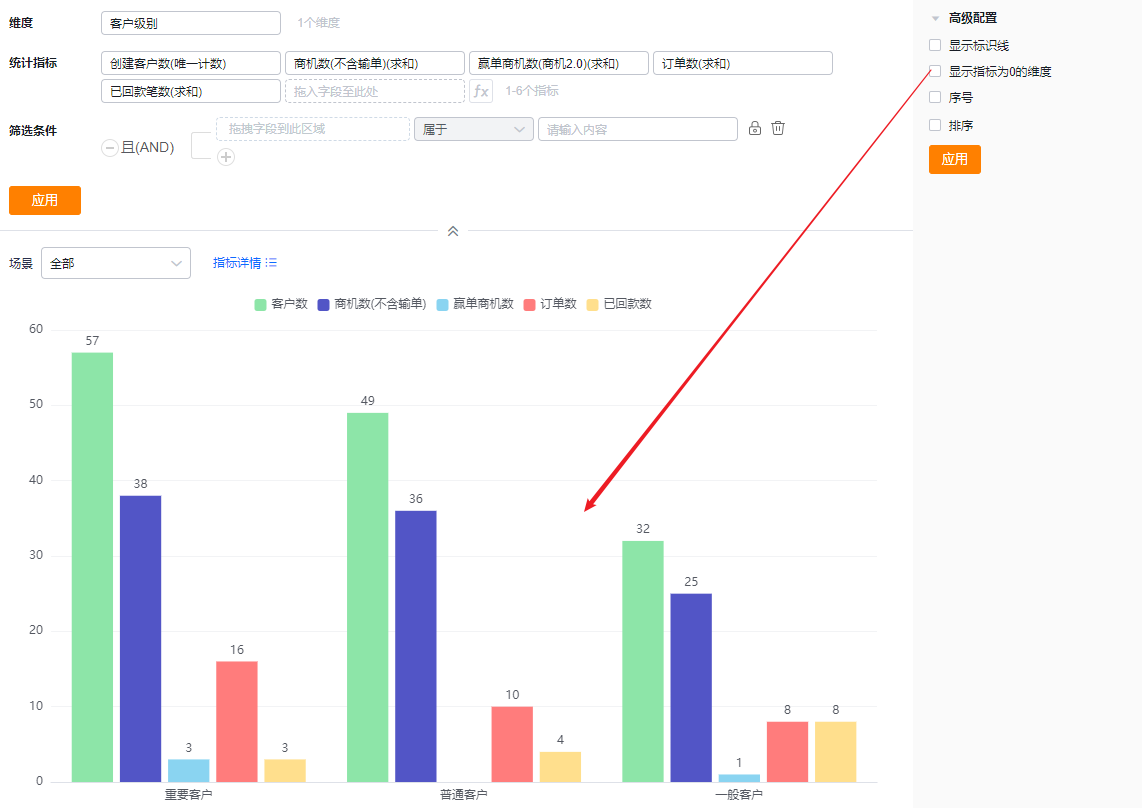 * Zero-value dimensions hidden (default)
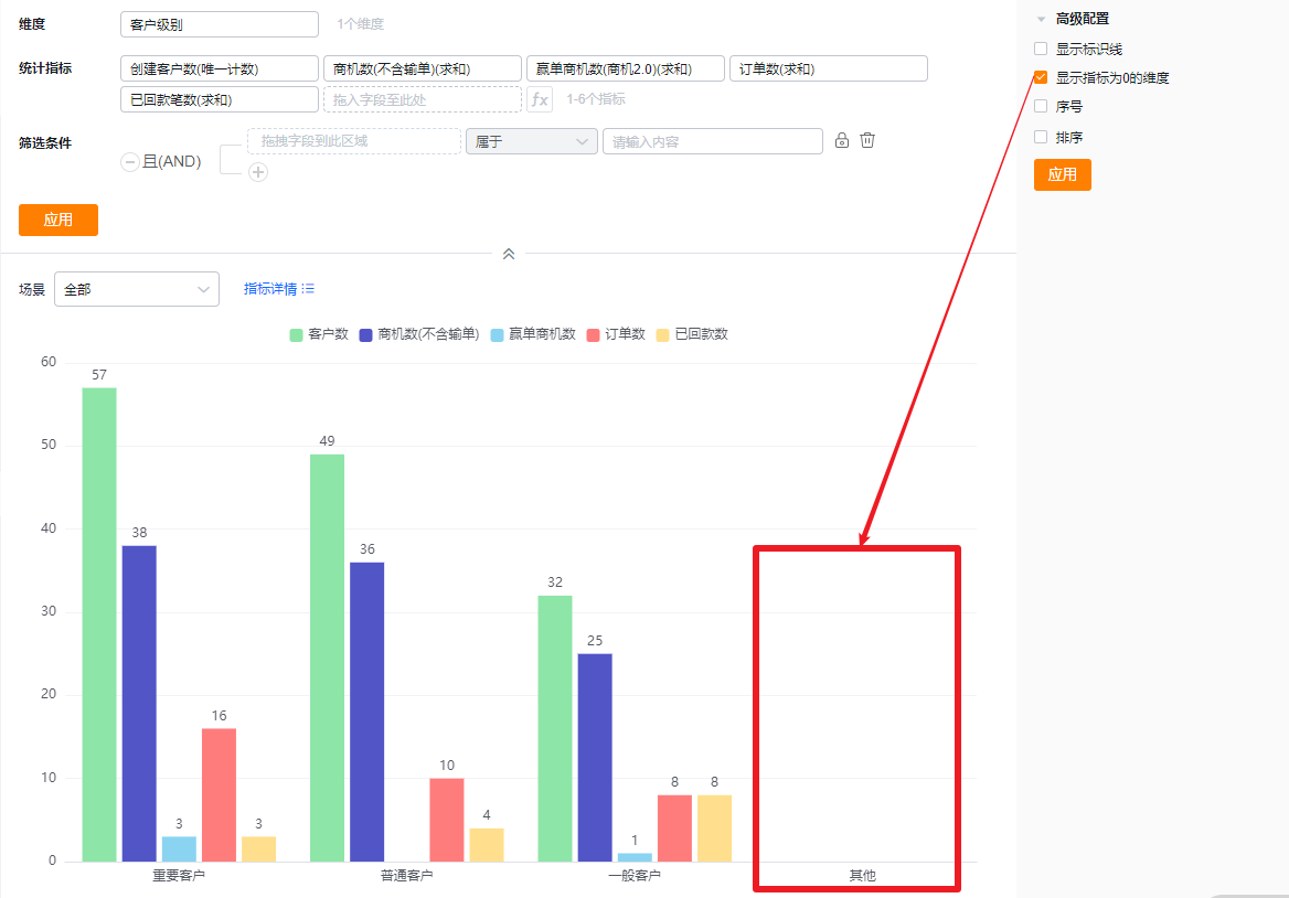 * Zero-value dimensions shown
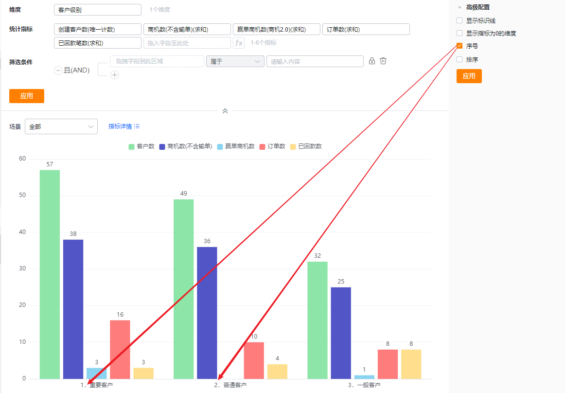
- SN: Default Off. Check to display a serial number column.
- Sorting: Default Off. When enabled, sort dimensions either by their natural order with optional TopN, or sort dimensions by a chosen metric with optional TopN. TopN supports preset values or manual entry.
- When the dimension is an enumeration or Dept., custom ordering is supported.
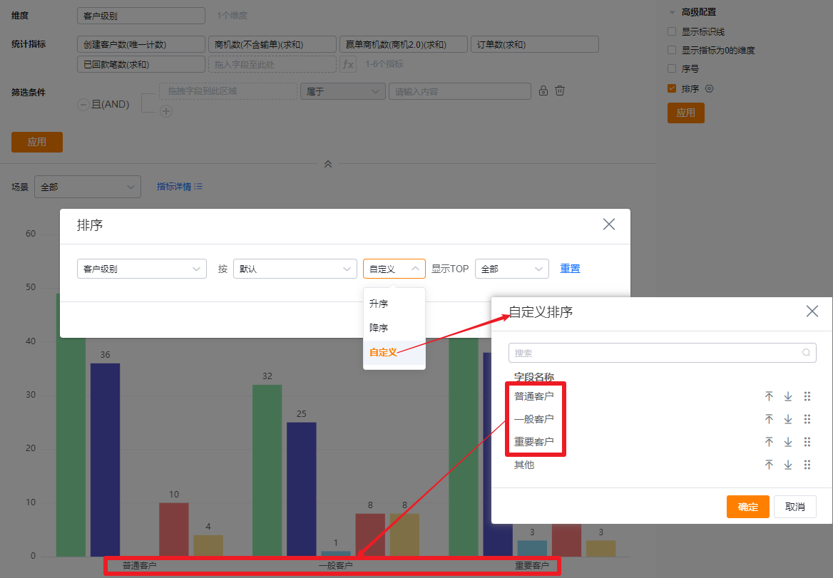 * Custom order by dimension values
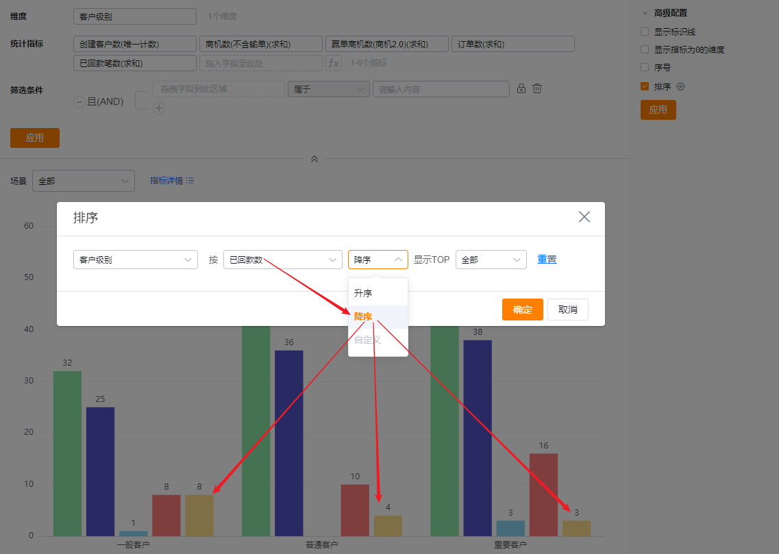 * Sort dimensions descending by metric
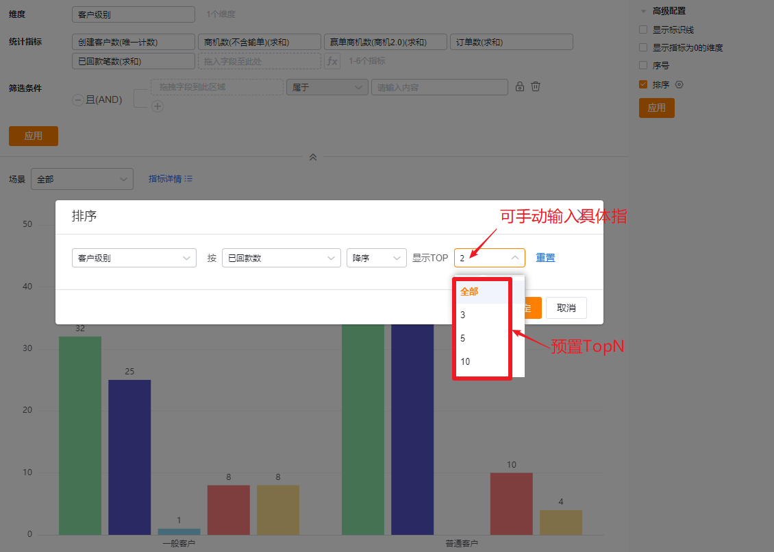 * Show TopN after sorting
1.2.4 Style (Mobile)
1.2.4.1 Follow Web layout
- Mobile layout echoes the Web configuration and cannot be set independently.
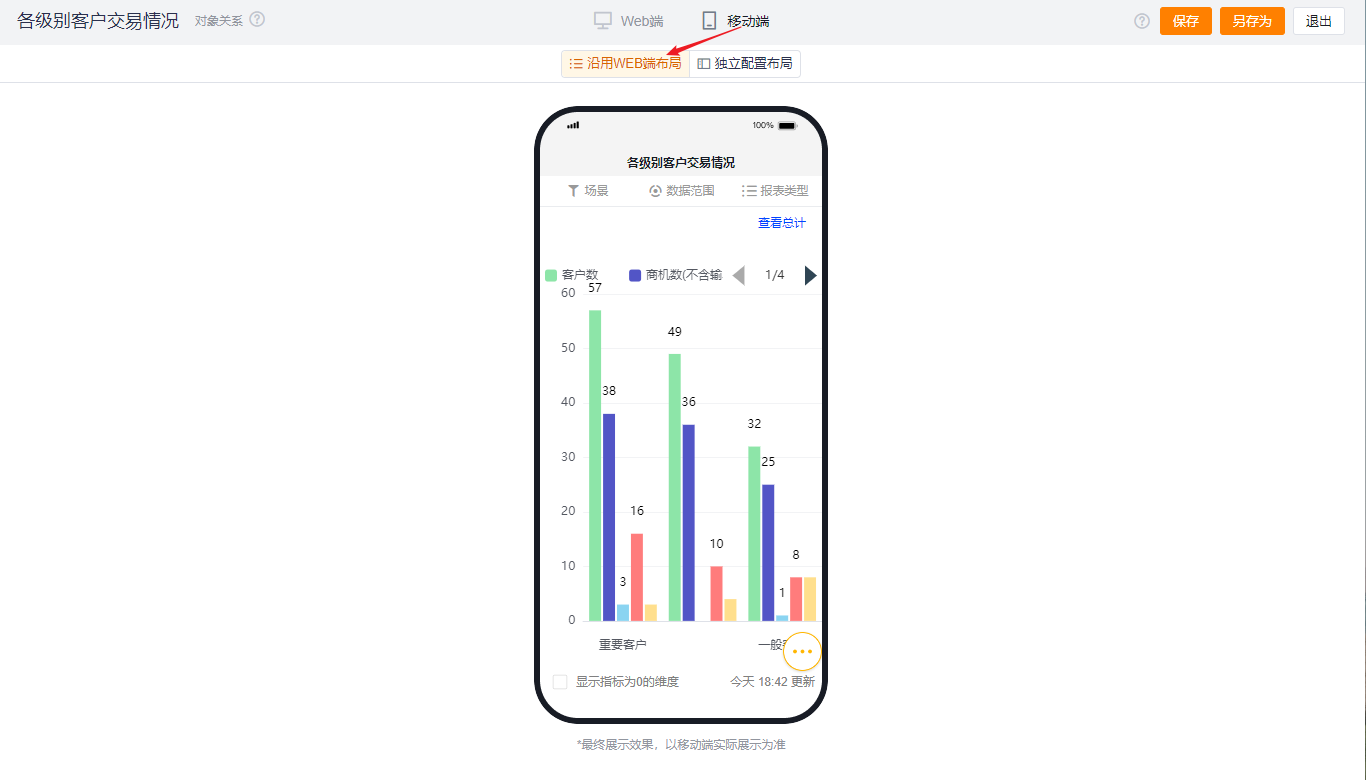
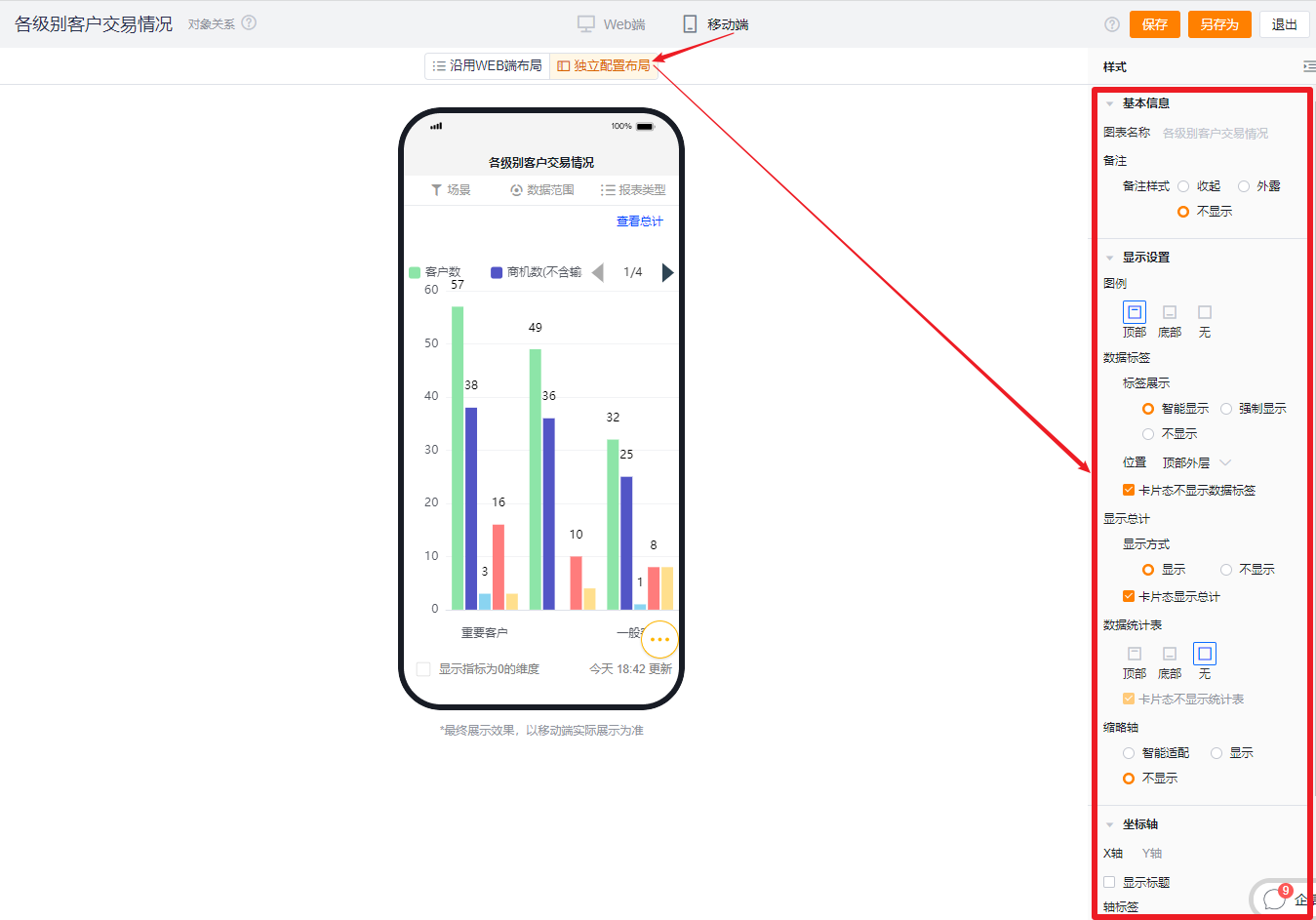
1.2.4.2 Independent mobile layout
- Default shows the Web-selected options; you can further adjust settings for a better mobile presentation.
- Mobile configuration exposes fewer options than Web. Items not configurable on Mobile follow Web settings. Available mobile options use the same display logic and effects as Web.