Published at: 2025-10-30
KPI Card
KPI Card
1.1 Use Cases
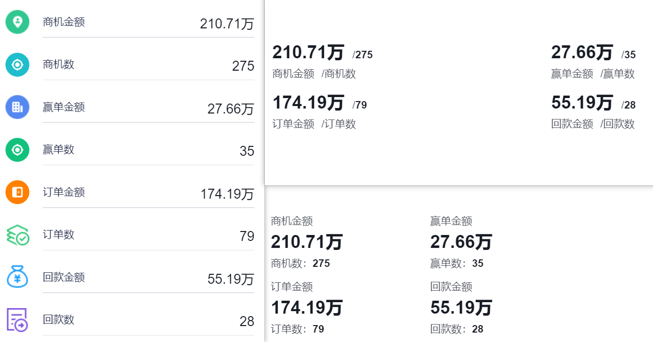
KPI cards display the numeric value of selected metrics directly. For example: Opportunity amount, order count, headcount, etc.
 </img>
1.2 Chart Configuration
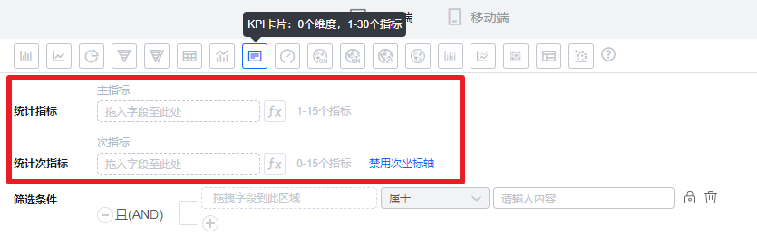
1.2.1 Axis Data
- Dimension: 0 dimensions
- Metrics: 1–30 metrics
 </img>
1.2.2 Style (Web)
1.2.2.1 Basic Info
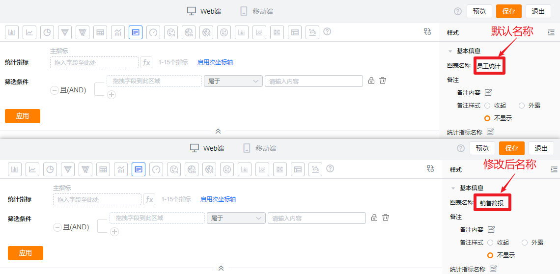
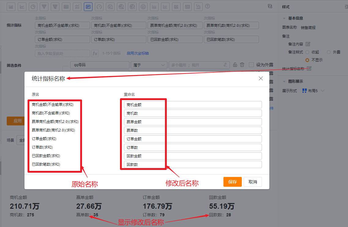
- Chart name: By default, the chart name uses the analysis Subject name when created. You can change it to a custom chart name in chart settings.
 </img>
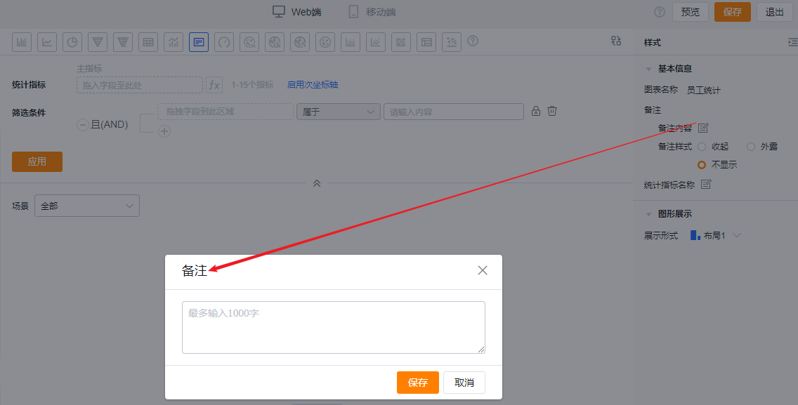
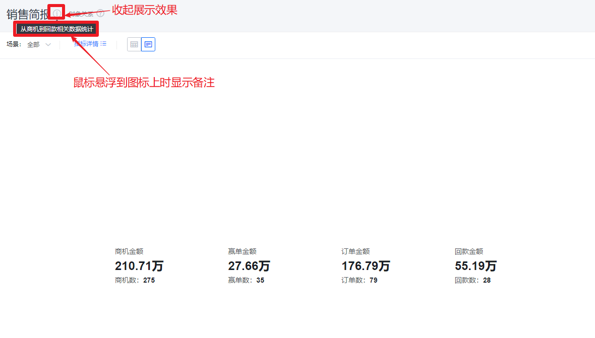
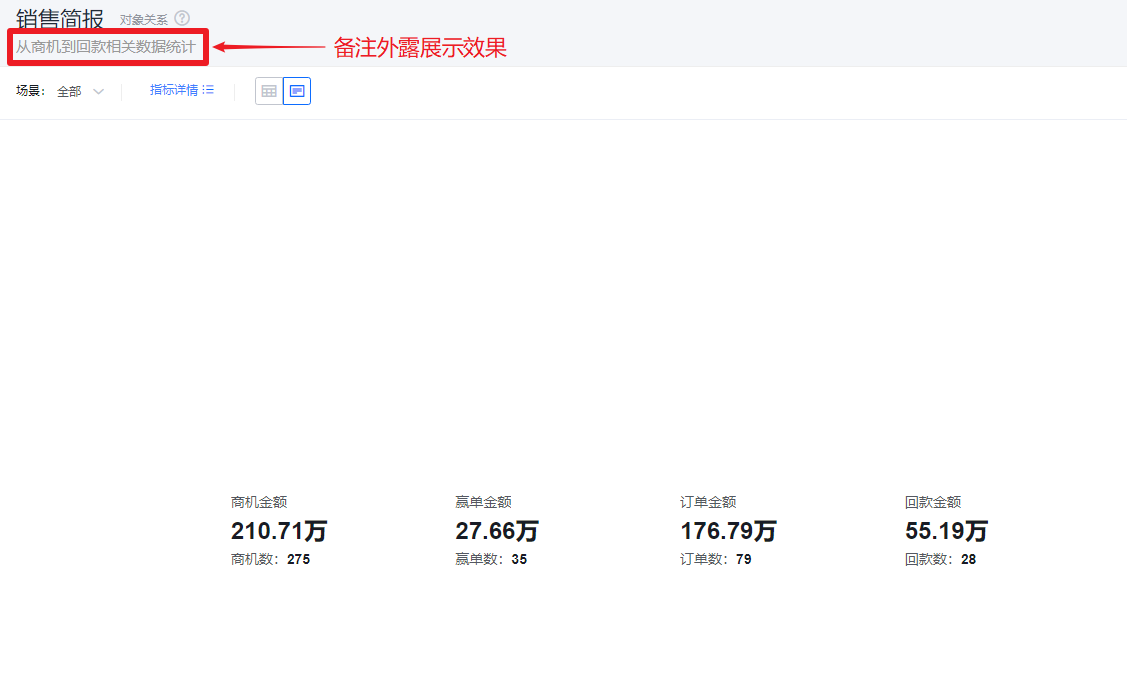
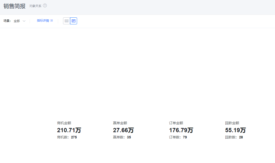
- Notes:
- Note content: Add contextual notes for the current chart so viewers better understand what the chart communicates.
- Note display style:
- Collapsed: Shows an icon after the chart title in both detail and card views; hover over the icon to see the note content.
- Exposed: Displays the note text directly after the chart title in both detail and card views.
- Hidden: Does not display the note in either detail or card views.
 </img>
* Add note content
 </img>
* Collapsed note display
 </img>
* Exposed note display
 </img>
* Hidden note display
- Metric label: By default, displays the metric name. You can edit the display label.
 </img>
1.2.2.2 Visual Presentation
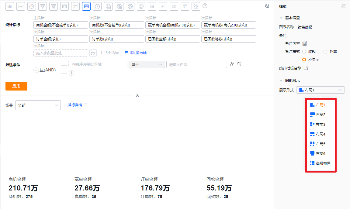
- Display mode: Default is Layout 1. You can switch to other layouts.
 </img>
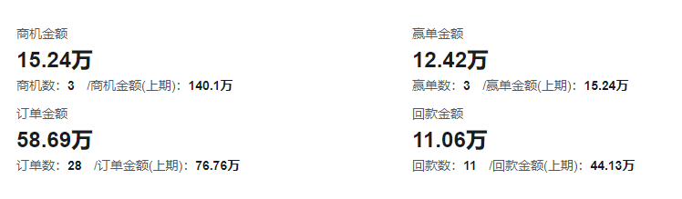
- Layout 1: Default layout. Two metrics grouped together, displayed side by side.
 </img>
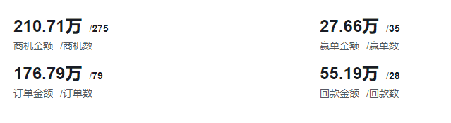
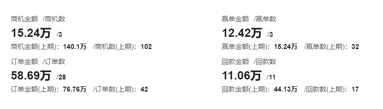
- Layout 2: Two metrics grouped together, stacked vertically.
 </img>
- Layout 3: Three metrics grouped together, stacked. Two metrics on top, one metric below.
 </img>
- Layout 4: Three metrics grouped together, stacked. One metric on top, two metrics below.
 </img>
- Layout 5: Four metrics grouped together, stacked. Two metrics on top, two metrics below.
 </img>
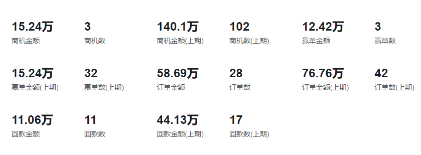
- Layout 6: Direct display without grouping.
 </img>
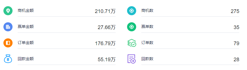
- Advanced layouts: You can assign icons based on displayed metrics.
 </img>
- Custom layouts
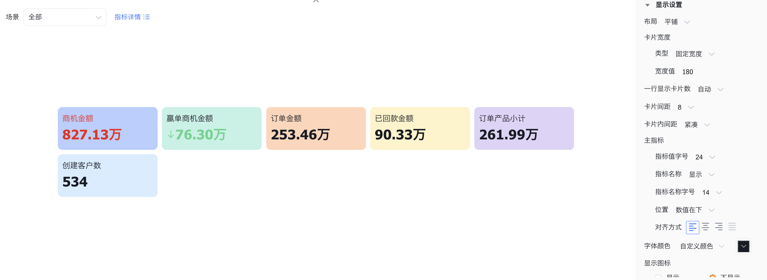
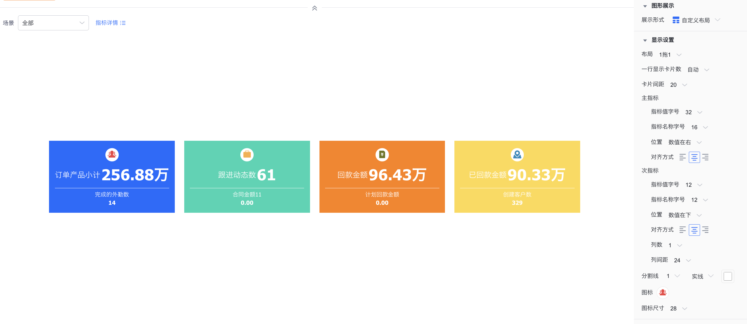
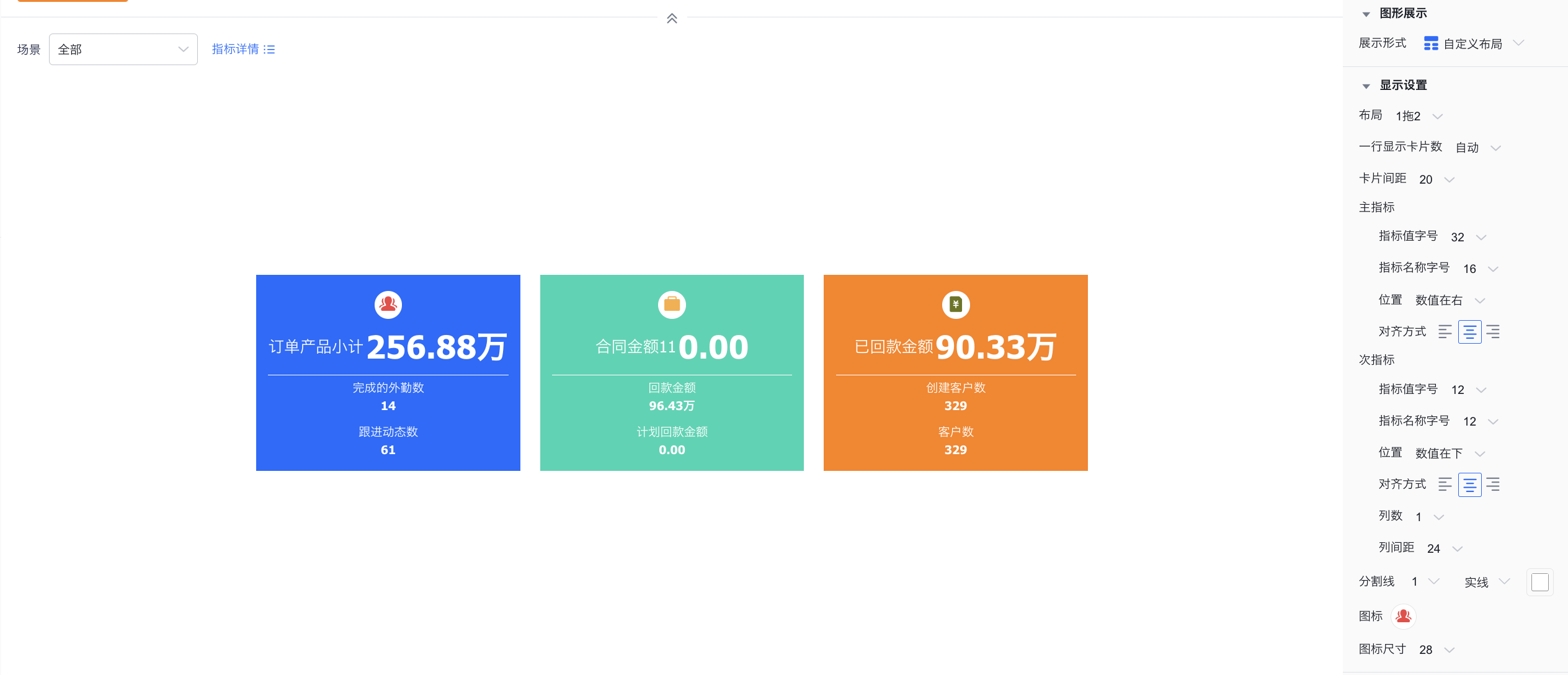
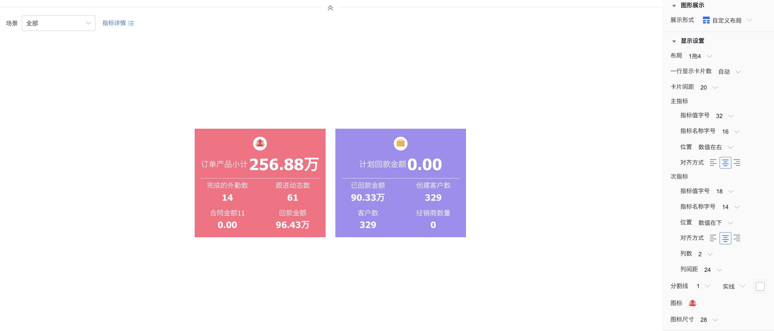
- Layout types: Tile, 1-to-1, 1-to-2, 1-to-4, 1-to-6, 1-to-8. The Tile layout is equivalent to the existing advanced layout but offers more flexible configuration.
- Style settings:
*Cards per row: Customize how many cards appear per row (not supported for Tile type).
*Card spacing: Adjust spacing between individual cards.
*Font size: Customize font size for both metric values and metric labels.
*Primary/secondary metric position: Set positions for metric values and labels, including value left, value right, value above, value below (not supported for Tile type).
*Columns: Set how many columns sub-metrics display per row (not supported for Tile type).
*Column spacing: Configure spacing between sub-metric columns (not supported for Tile type).
*Divider: Customize divider style including weight, type, and color (not supported for Tile type).
*Alignment: Set label/value alignment: left, center, or right.
*Icon: Customize icon style including size, type, color, and border.
*Color scheme: Multiple preset color themes are available.
*Border: Add a border to cards and set its color and weight.
*Corner radius: Set card corner radius.
 </img>
Tile layout
 </img>
1-to-1
 </img>
1-to-2
 </img>
1-to-4
 </img>
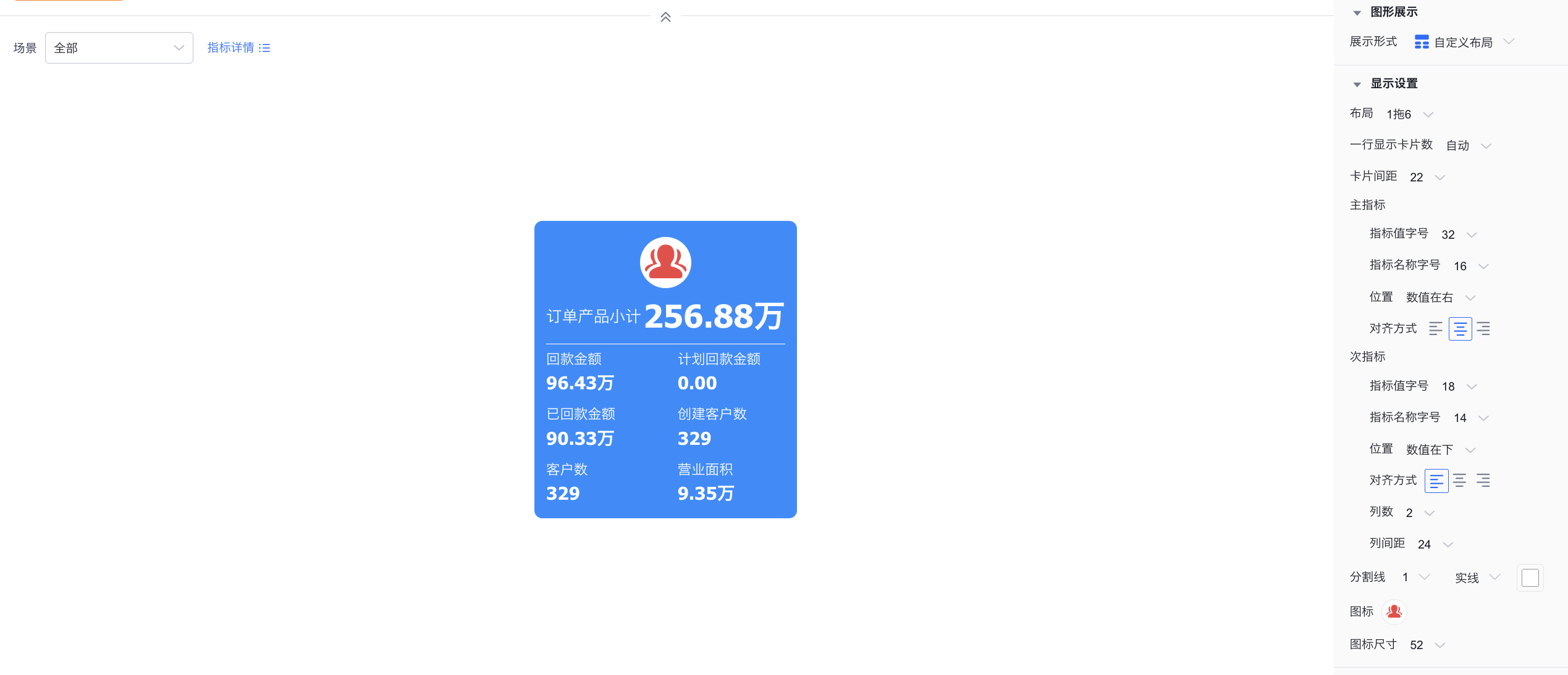
1-to-6
 </img>
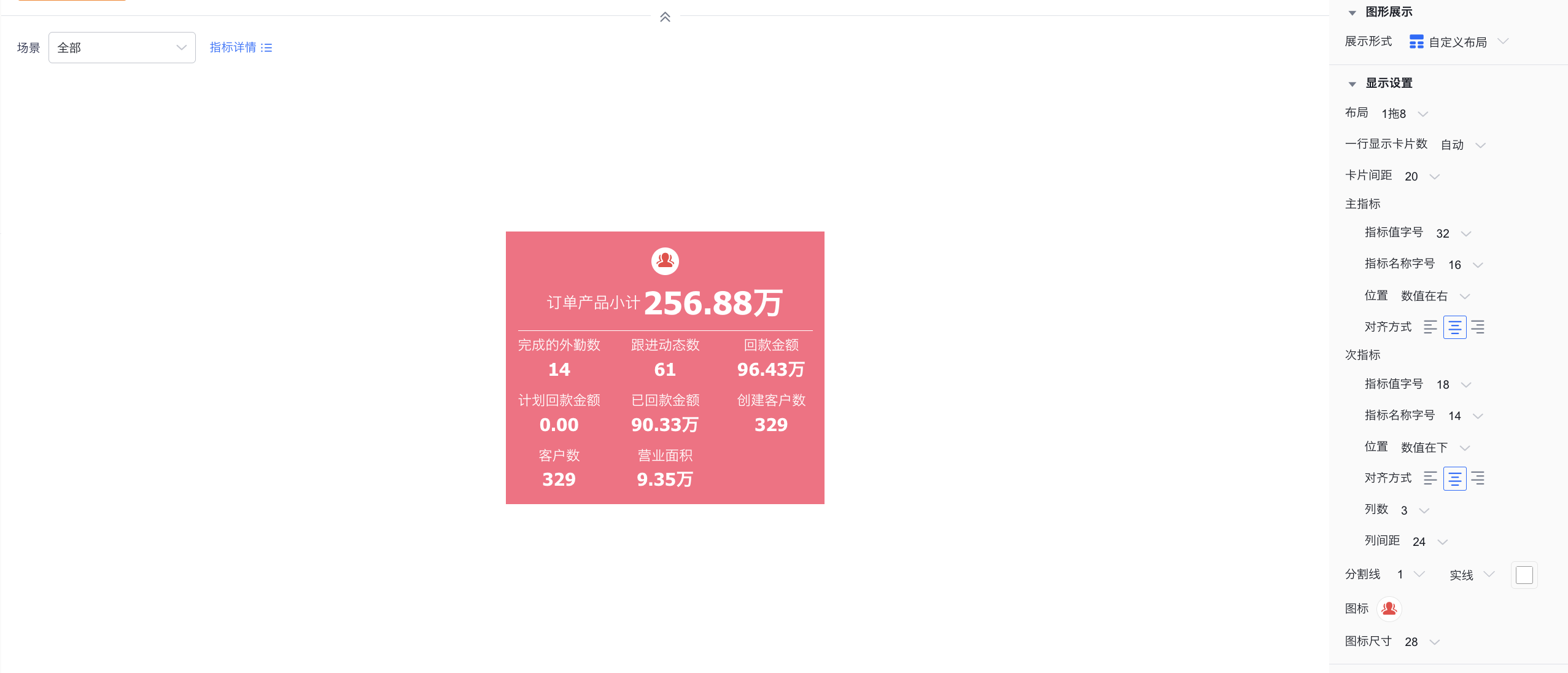
1-to-8
1.2.3 Style (Mobile)
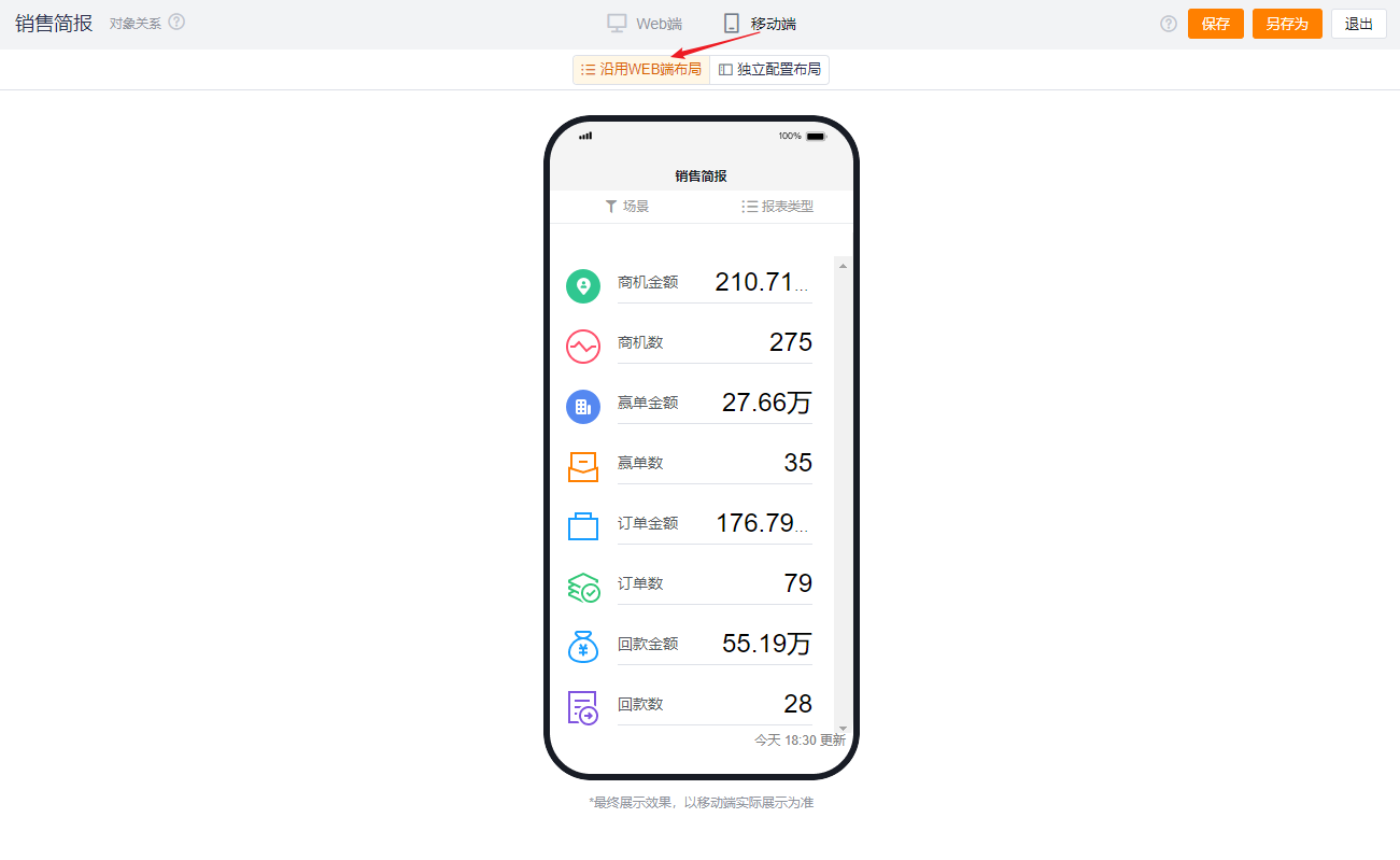
1.2.3.1 Inherit Web Layout
- Follows the Web layout rendering and cannot be set independently.
 </img>
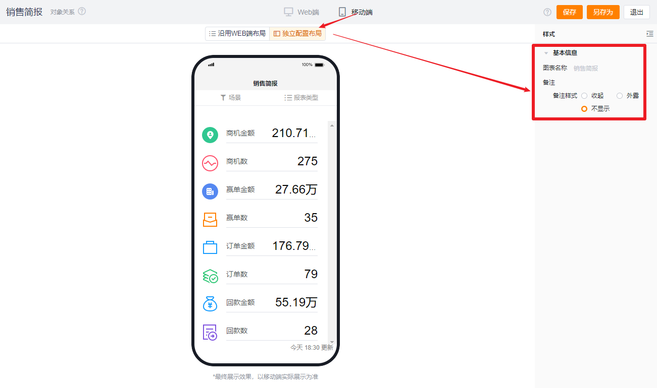
1.2.3.2 Independent Mobile Layout
- By default, it reflects the selected Web configuration but you can further adjust it for better mobile presentation.
- Available configuration options are fewer than on Web. Settings that cannot be configured on mobile will follow the Web configuration. Configurable options on mobile follow the same behavior and presentation logic as on Web.
 </img>