Published at: 2025-10-30
Line Chart
Line Chart
1.1 Use Cases
Line charts show trend changes of a single dimension over a range of data. For example, compare monthly changes of Sales Orders for the current year.
1.2 Chart Configuration
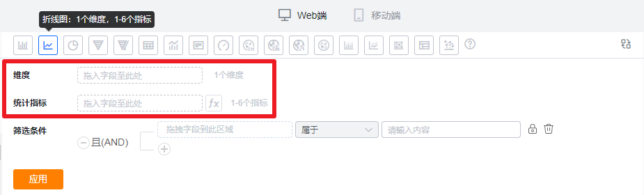
1.2.1 Axis Data
- Dimension: 1 dimension
- Metrics: 1–6 metrics
1.2.2 Style (Web)
1.2.2.1 Basic Information
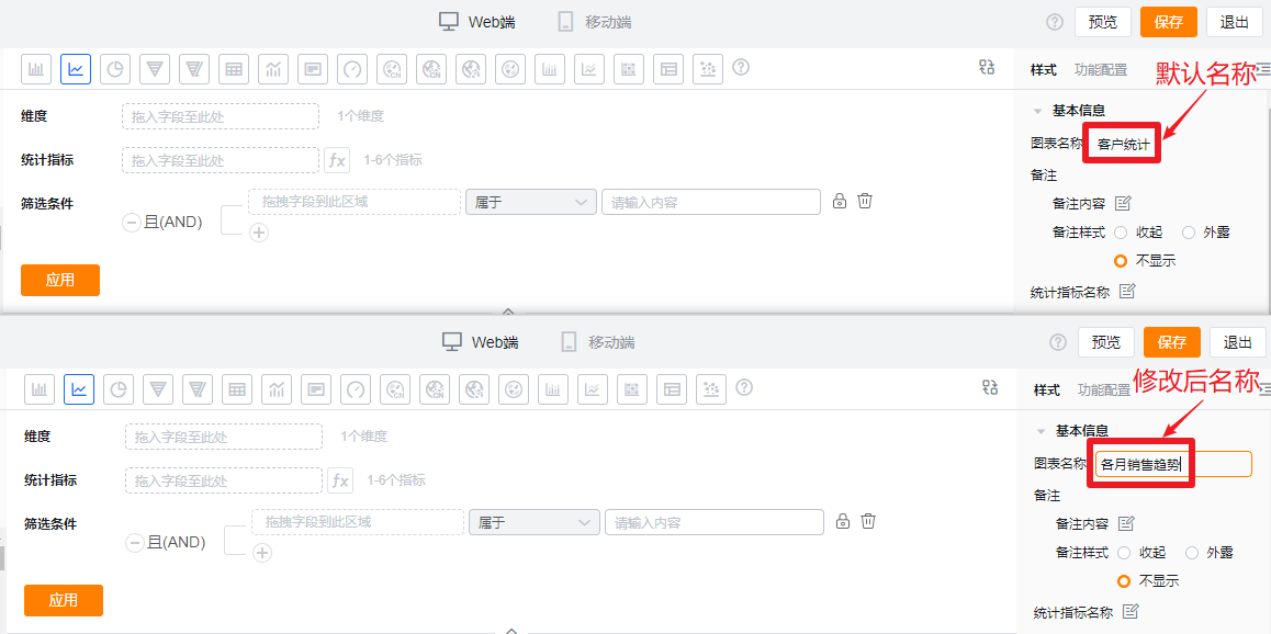
- Chart name: When created, the chart name defaults to the analysis Subject. You can customize the chart name in the chart settings.
- Notes:
- Note content: Add contextual notes for this chart to help viewers understand the chart’s intent.
- Note display:
- Collapsed: Shows an icon after the chart title in detail and card views; hover to read the note.
- Exposed: Shows the note text directly after the chart title in detail and card views.
- Hidden: Note is not shown in detail or card views.
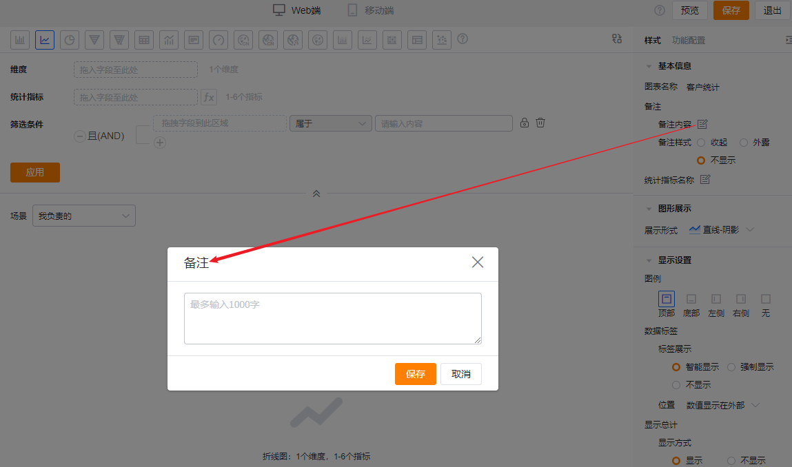
* Add note content
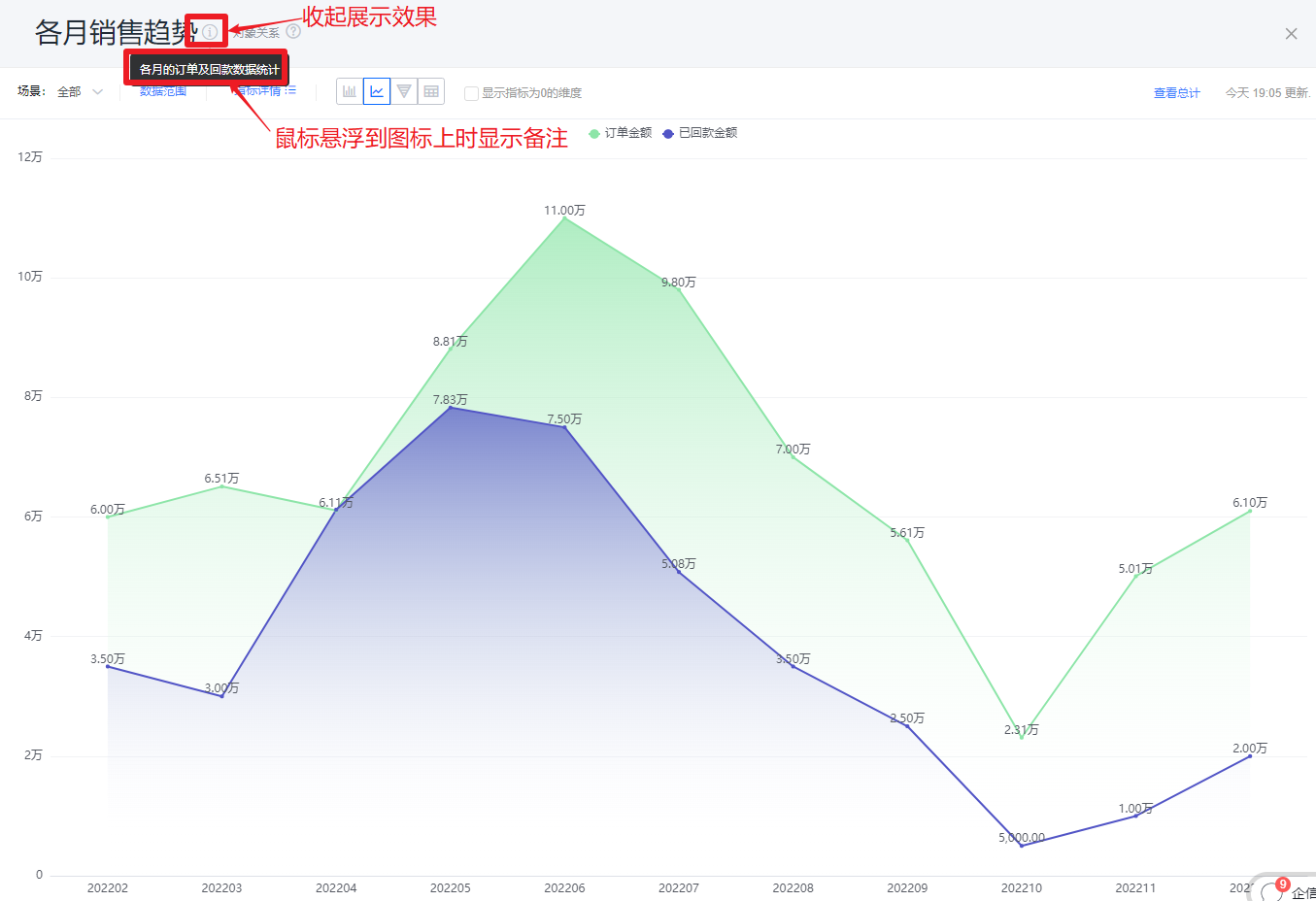
* Collapsed note display
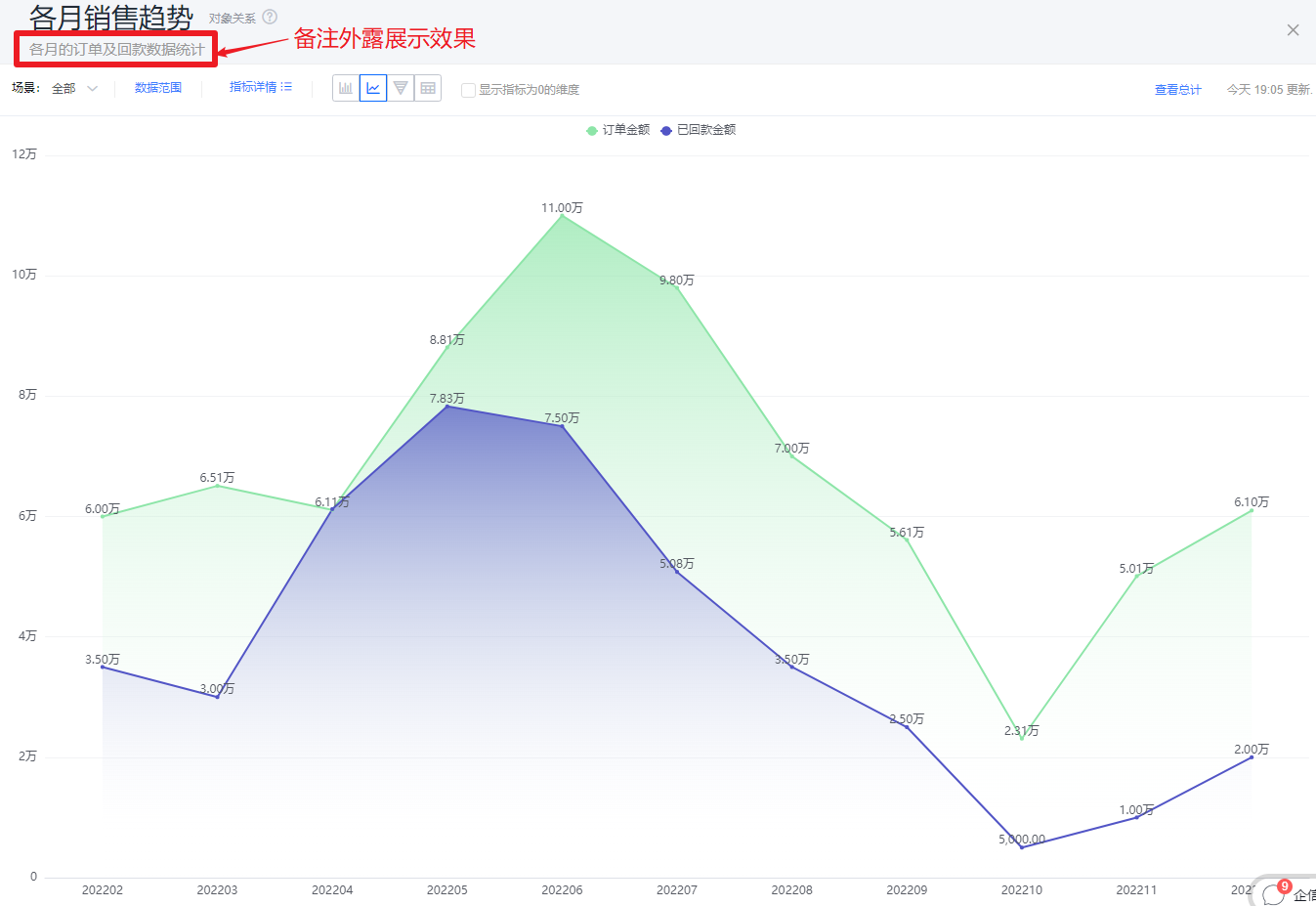
* Exposed note display
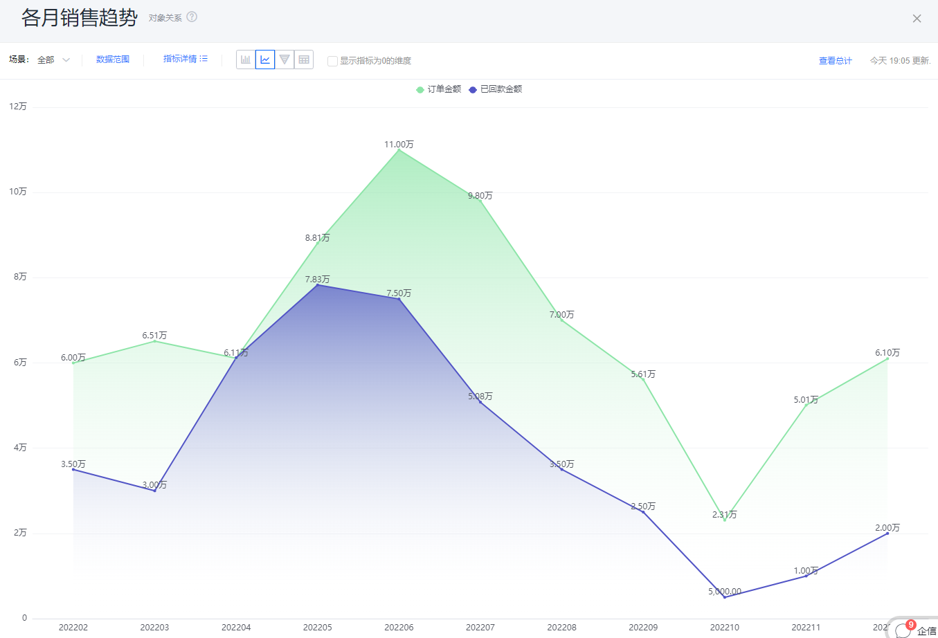
* Hidden note display
- Metric label: By default, the metric name displays; you can edit the displayed text.
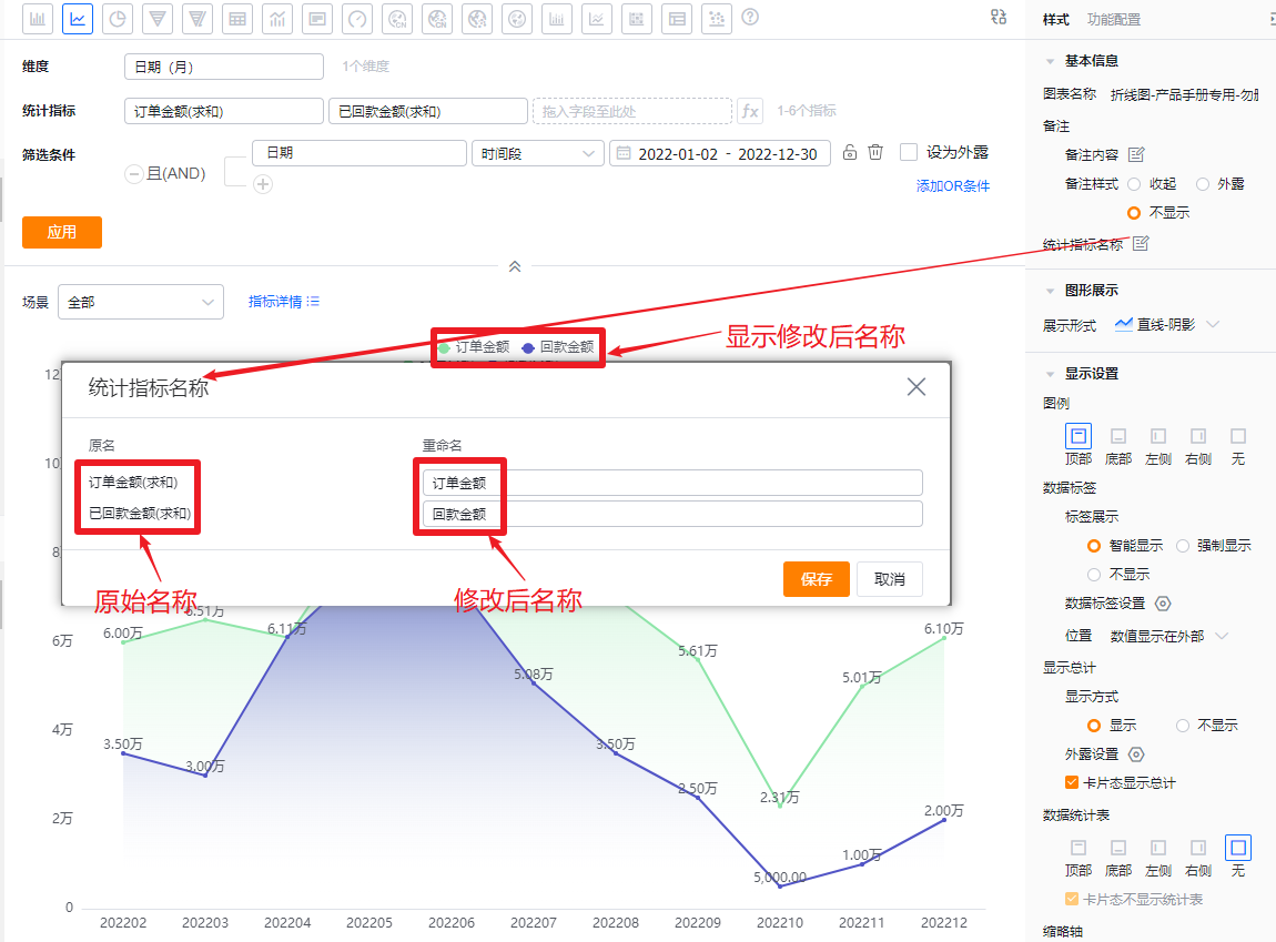
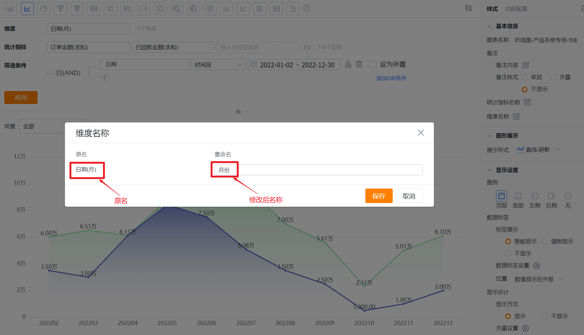
- Dimension label: By default, the dimension name displays; you can edit the displayed text.
1.2.2.2 Chart Appearance
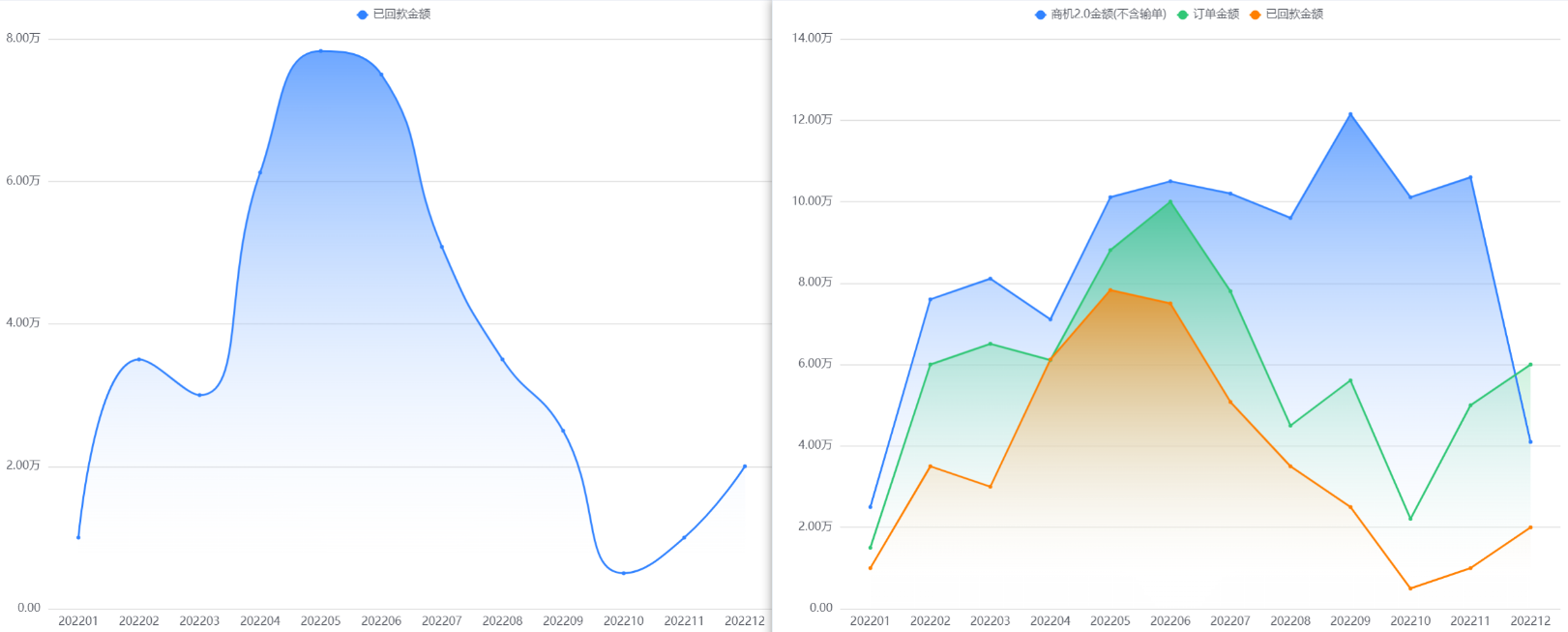
- Style: Default is Line with area shadow. You can switch to Line, Smooth with area shadow, or Smooth.
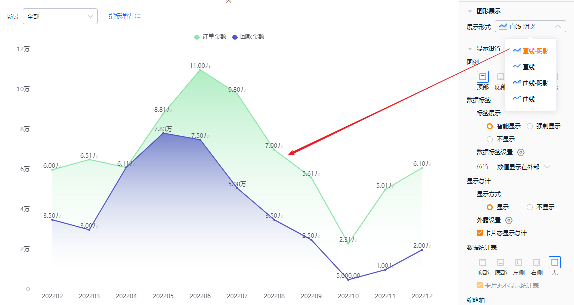
* Line with area shadow
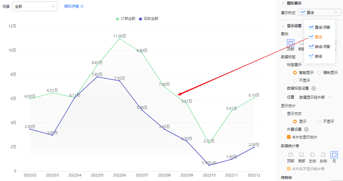
* Line
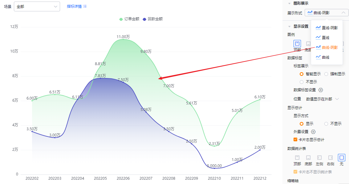
* Smooth with area shadow
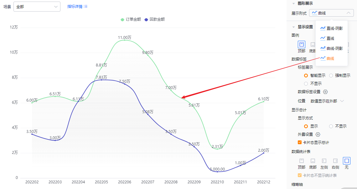
* Smooth
1.2.2.3 Display Settings
- Legend: Default position is Top. Options: Bottom, Left, Right, None (None hides the legend).
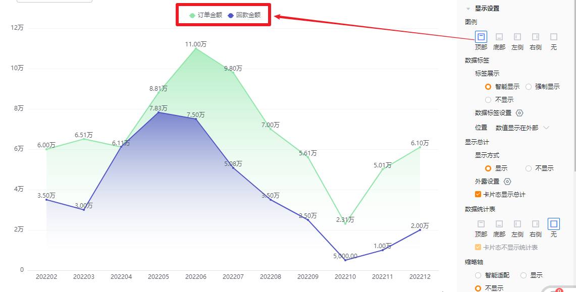
* Legend top
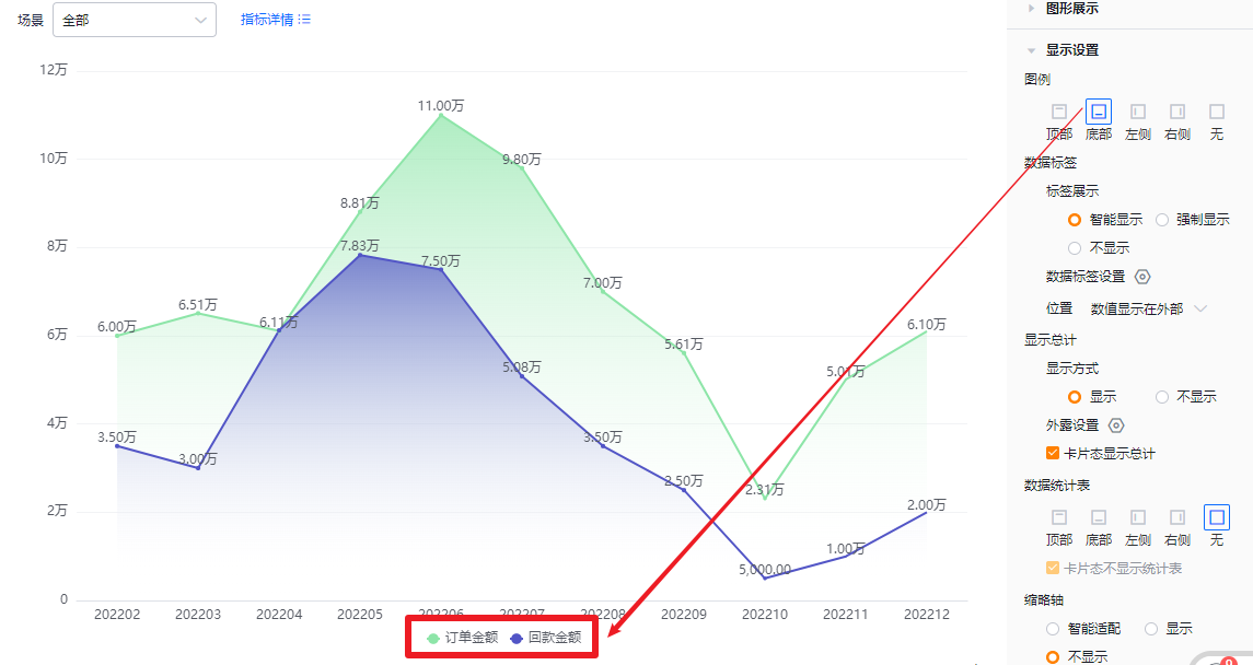
* Legend bottom
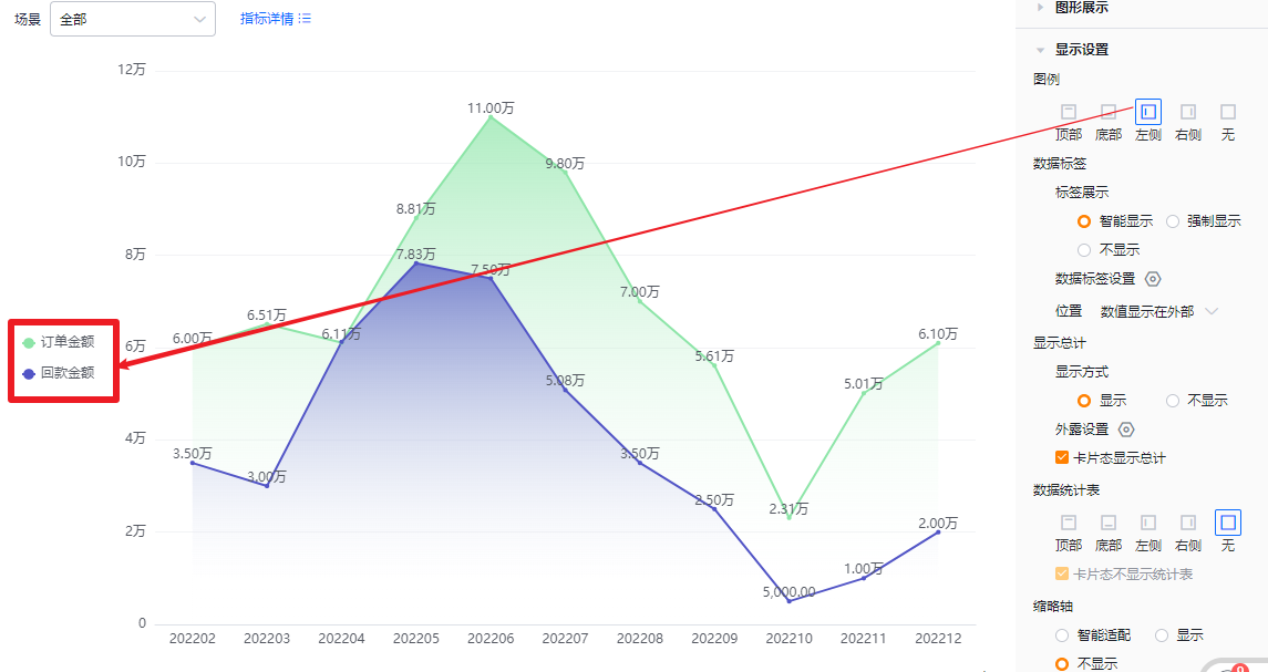
* Legend left
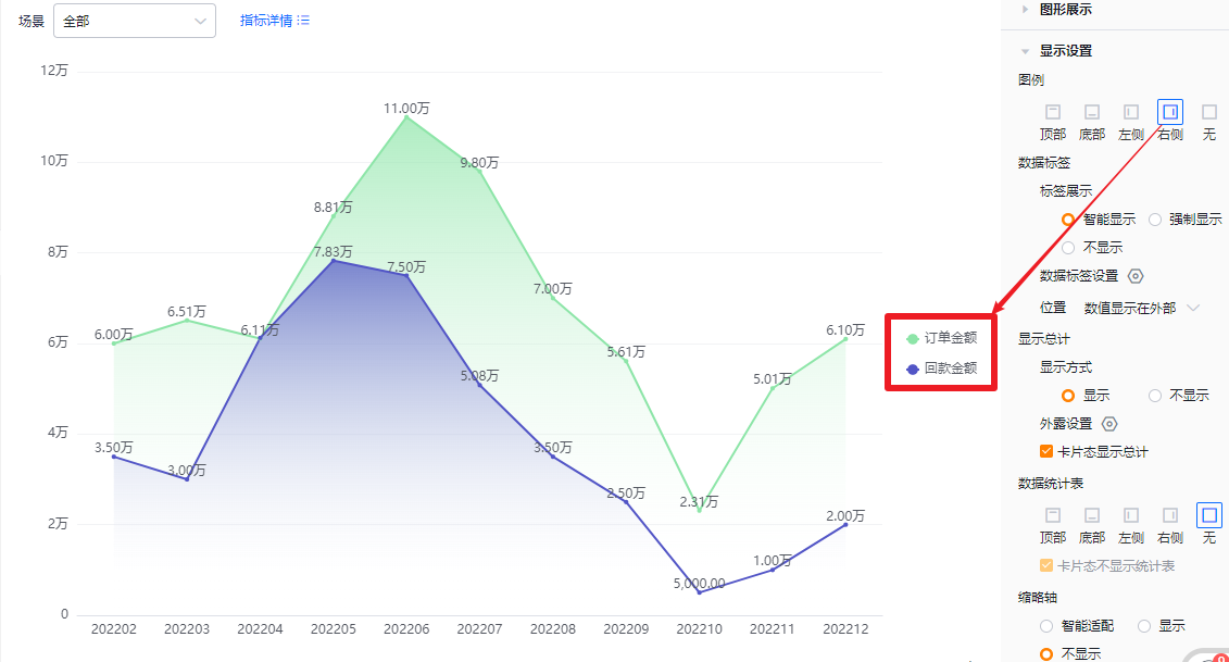
* Legend right
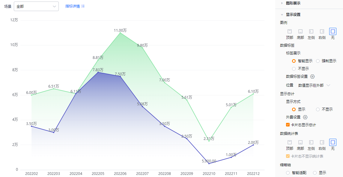
* No legend
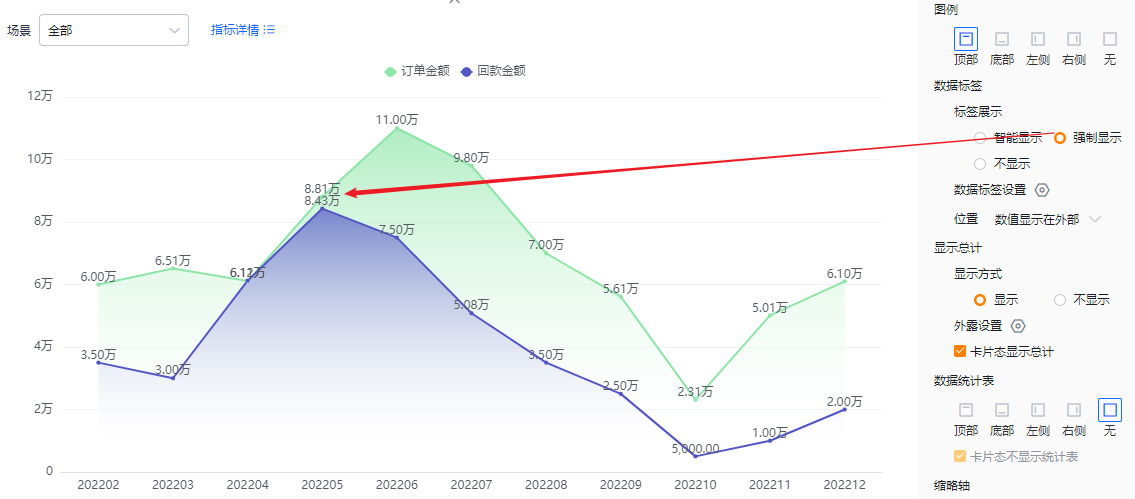
- Data labels:
- Label display:
- Smart: The system shows value labels intelligently based on available display area; when values across metrics are close, some labels hide automatically.
- Force: Show all value labels; labels may overlap if values are similar.
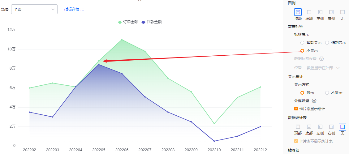
- None: Do not show value labels.
- Label display:
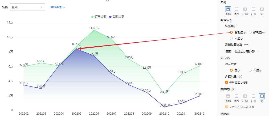
* Smart data labels
* Forced data labels
* No data labels
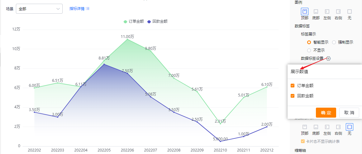
- Data label options: When two or more metrics exist, choose which metrics’ labels to show. Defaults to all selected. If Label display is set to None, this option is read-only.
- Label position:
- Outside: Values display outside the data markers.
- Inside: Values display inside the data markers. When Label display is None, this setting is read-only.
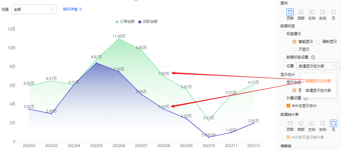
* Values outside
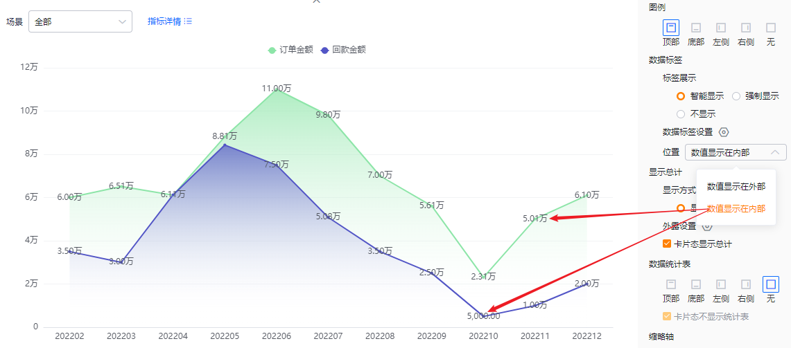
* Values inside
- Show totals:
- Display mode: Default is On. Toggle to Off to hide totals. When On, totals can appear in Edit, Detail, and Card views (depending on configuration). When Off, totals are hidden in all views.
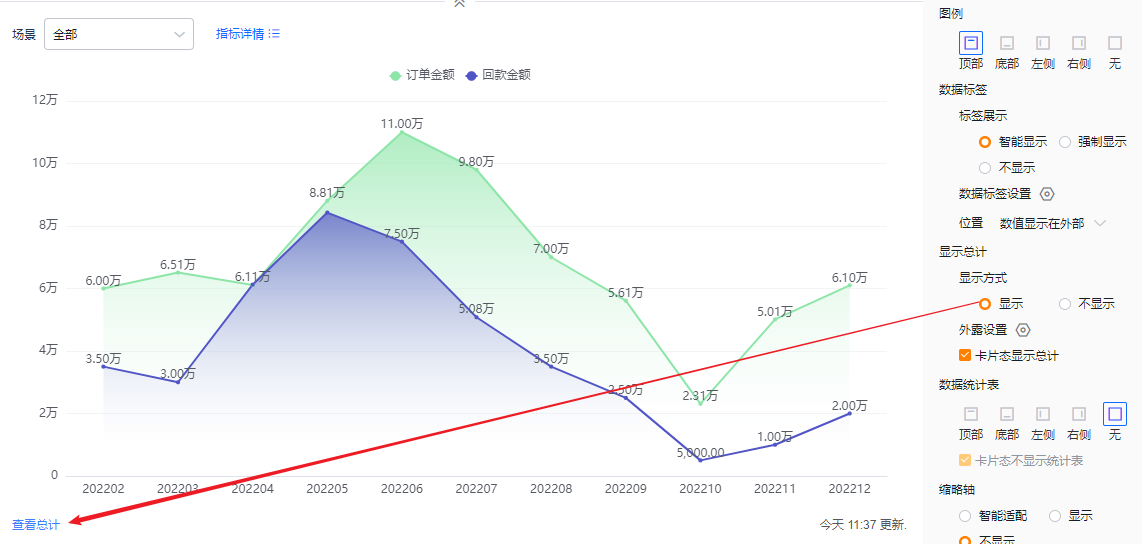
* Totals displayed
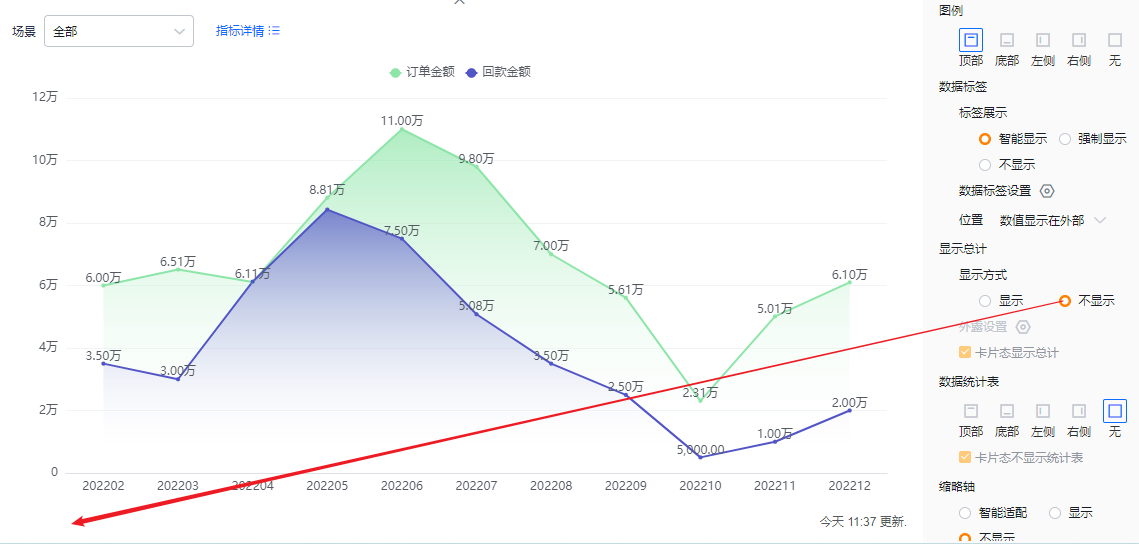
* Totals hidden
- Exposed totals: When two or more metrics exist, select which metrics’ totals to display outside. Defaults to none selected. If Display mode is Off, this option is read-only.
- Card view totals: Default is checked (show totals in card view). You can uncheck to hide totals in card view. If Display mode is Off, this option is read-only.
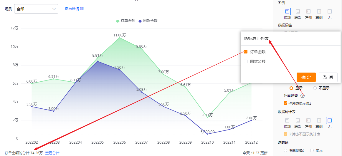
* Exposed totals display
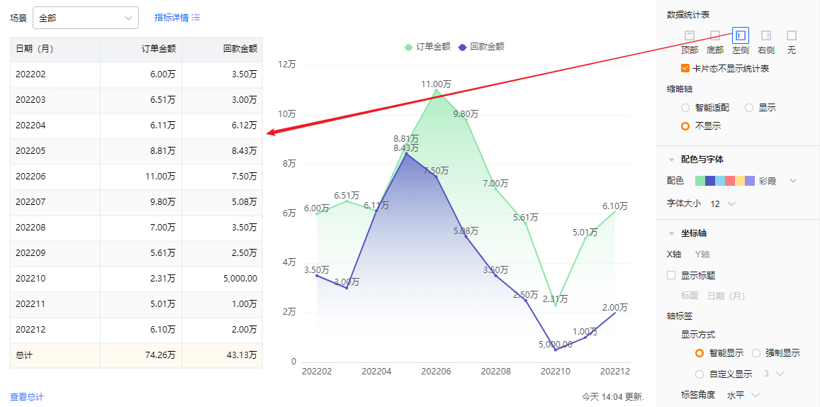
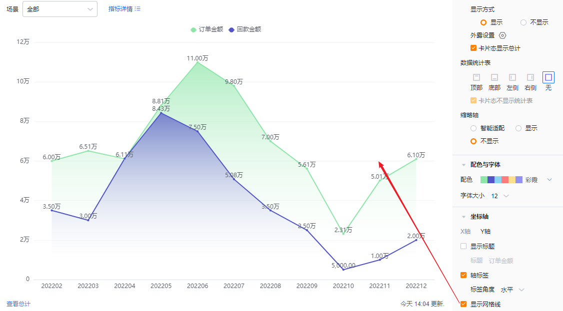
- Data table: You can choose whether to show a data table and its position. Default is hidden. Options: Top, Bottom, Left, Right of the chart.
- Hide table in card view: When a data table is enabled, you can also opt to hide it in card view. Default is checked.
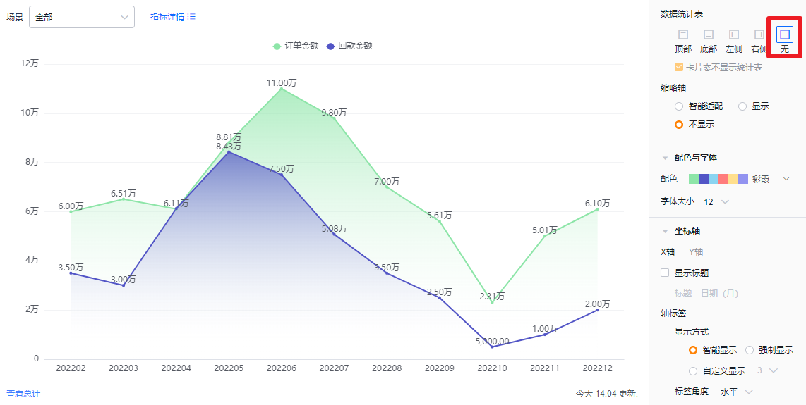
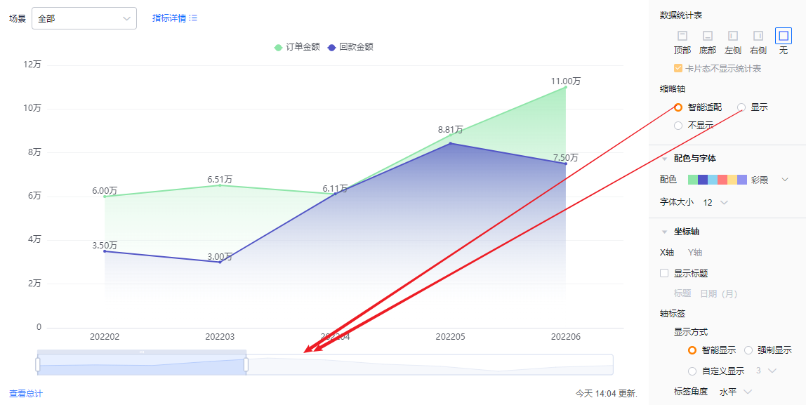
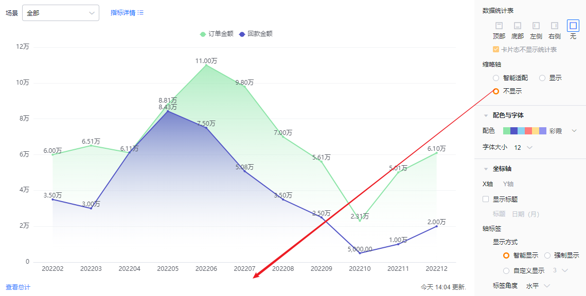
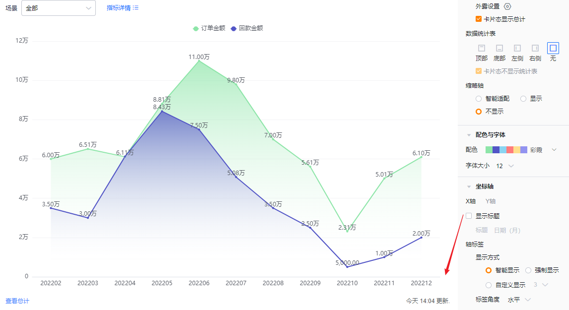
- Mini-axis (thumbnail axis): Default is Smart. Options: Smart, Show, Hide.
- Smart: The system determines how many dimension values can be displayed given the chart area. If values exceed capacity, the mini-axis appears; otherwise it does not.
- Show: Always show the mini-axis regardless of screen size or number of dimension values.
- Hide: Never show the mini-axis regardless of screen size or number of dimension values.
* Mini-axis shown and smart mini-axis behavior
* Mini-axis hidden
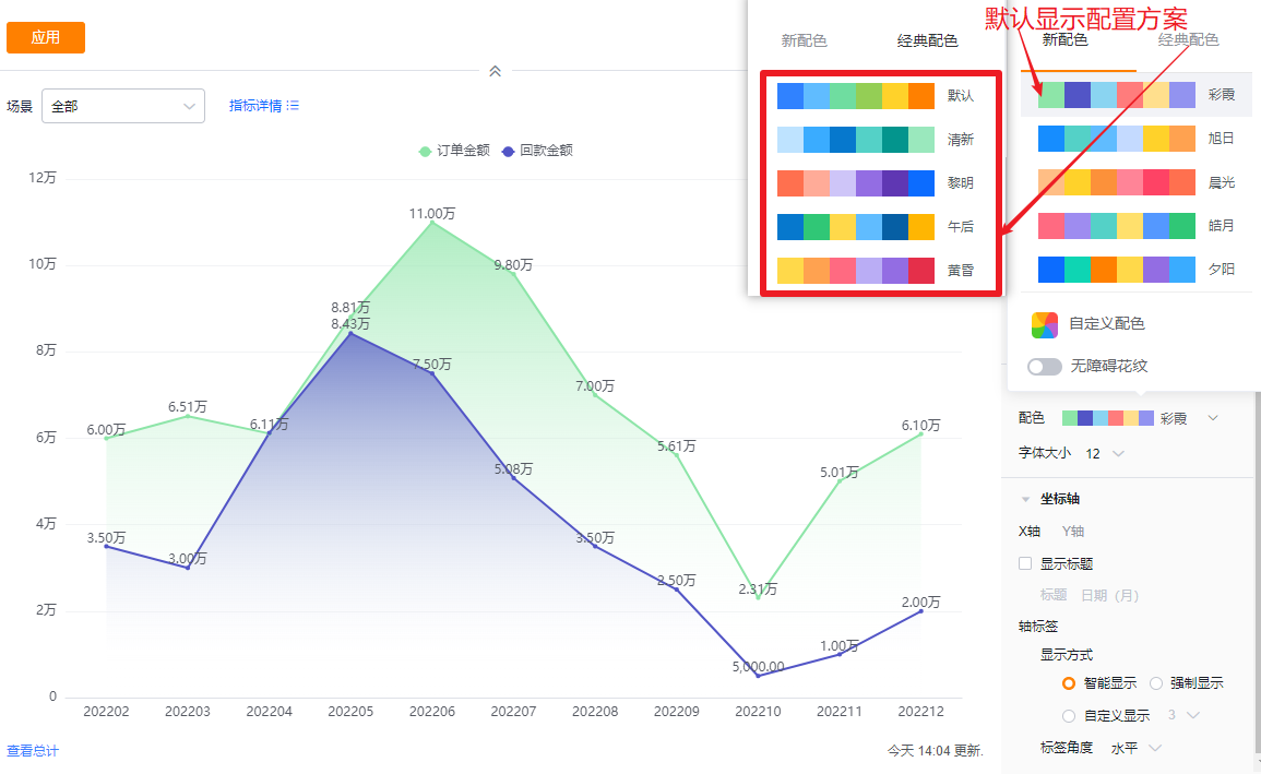
1.2.2.4 Colors & Fonts
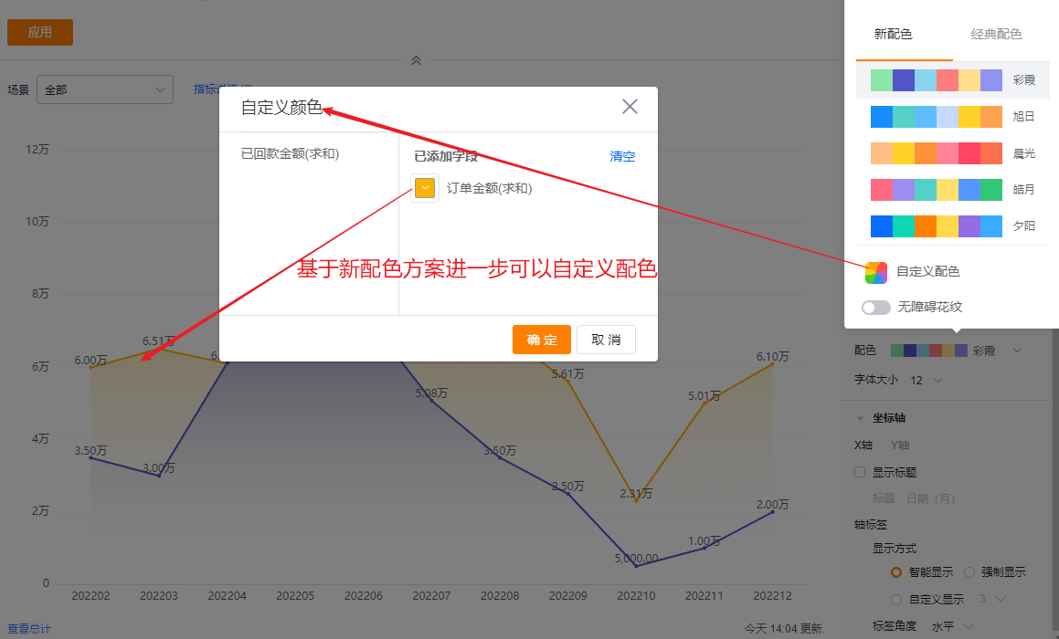
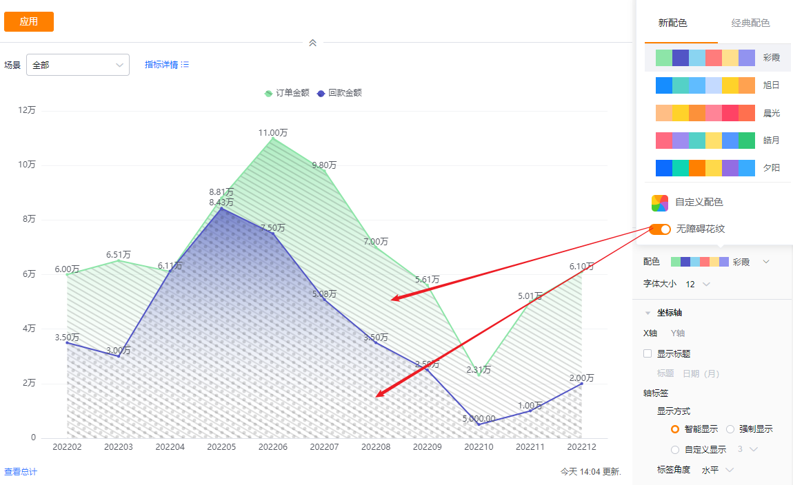
- Color schemes: The system supports New and Classic color schemes. Default selects the first New palette. You can also enable accessibility patterns.
- New: Supports further customization based on a chosen palette.
- Classic: Does not support custom colors.
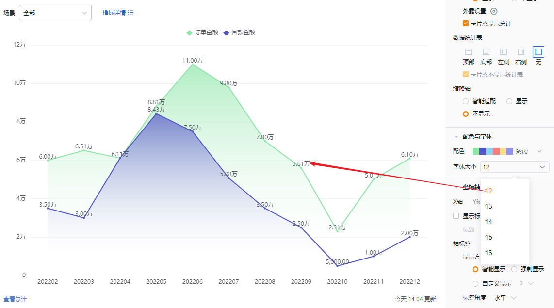
- Font size: Default 12 px. Options: 13, 14, 15, 16 px.
1.2.2.5 Axes
- X axis
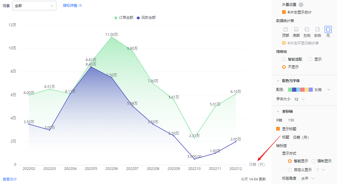
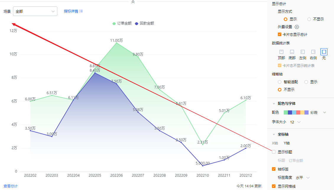
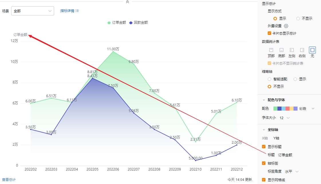
- Show title: Default unchecked. When checked, it echoes the dimension field name and can be edited.
- Title: When Show title is unchecked, the field is read-only. When checked, you can edit it.
- Show title: Default unchecked. When checked, it echoes the dimension field name and can be edited.
- Axis labels
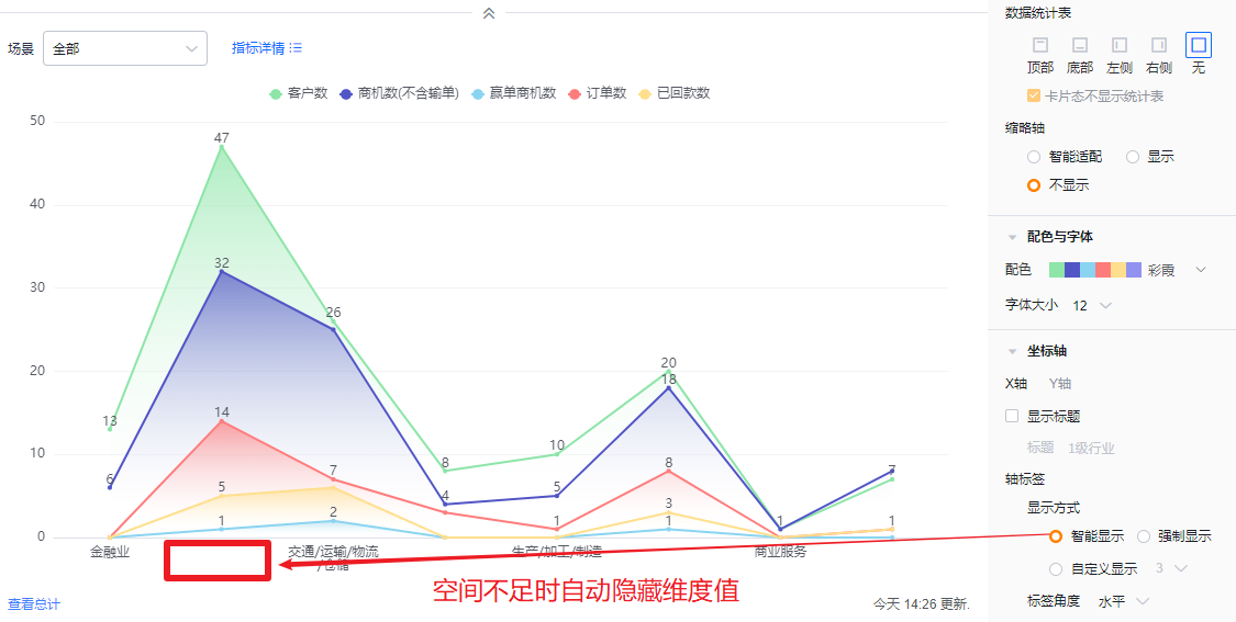
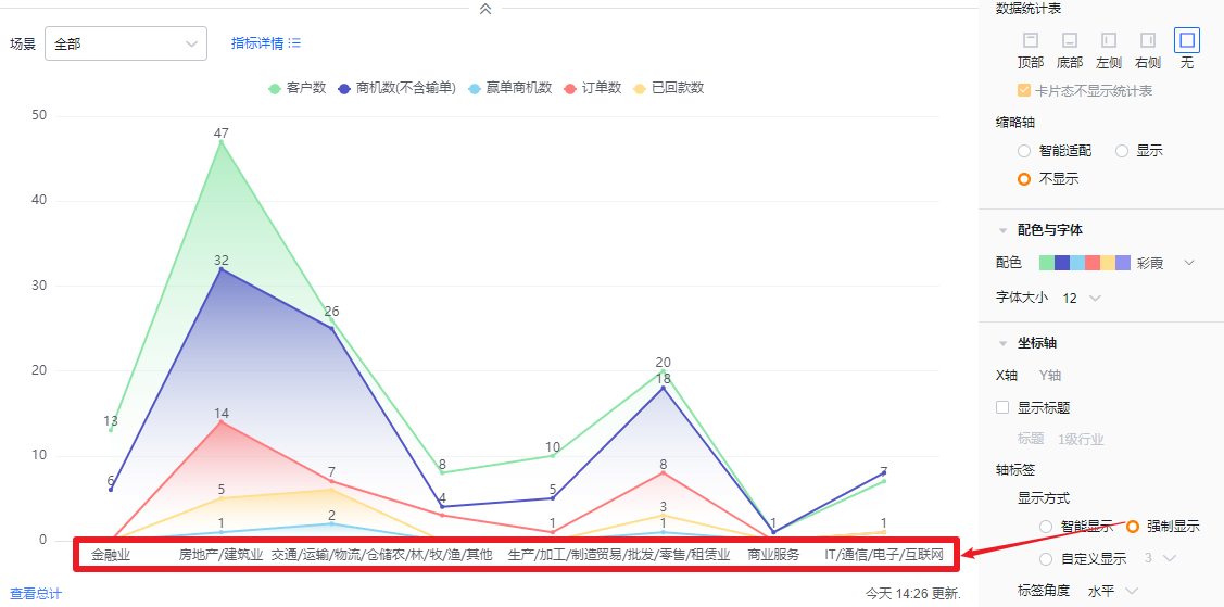
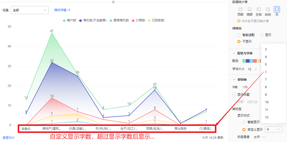
- Display mode:
- Smart: The system truncates labels based on the available label area and shows "..." when truncated.
- Force: Show all labels; long labels may overlap.
- Custom: Default shows 3 characters; supports 3–12 characters.
- Display mode:
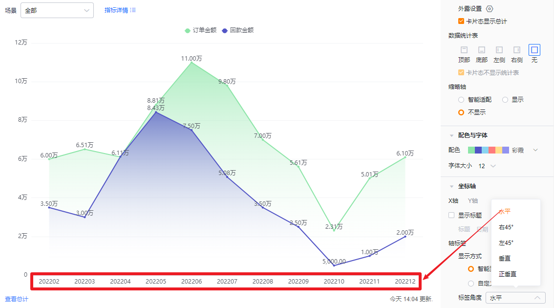
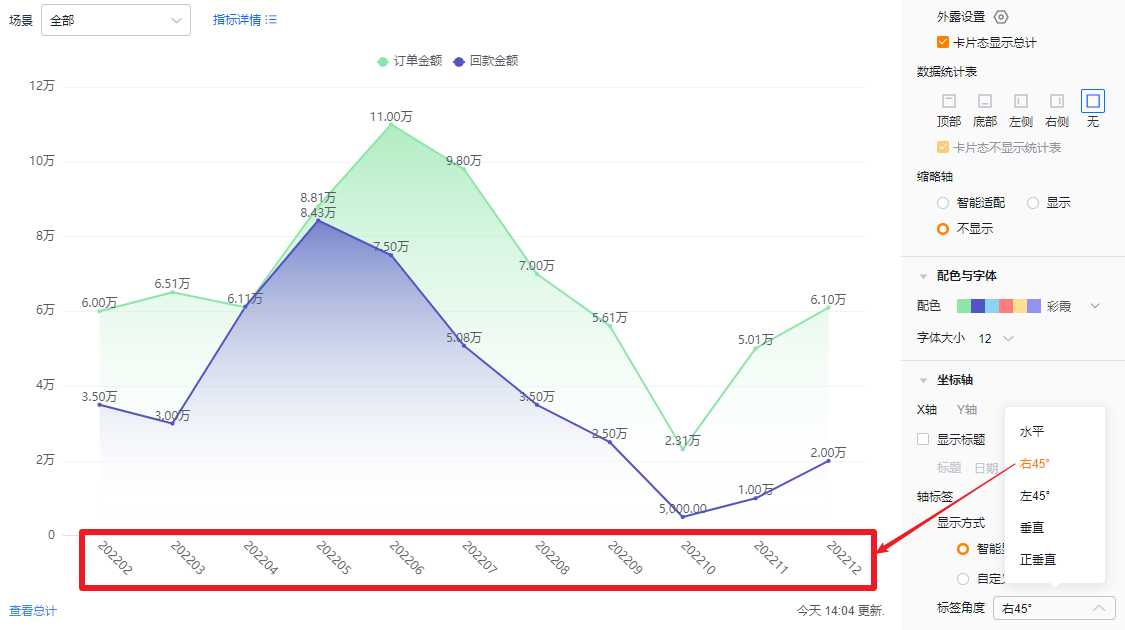
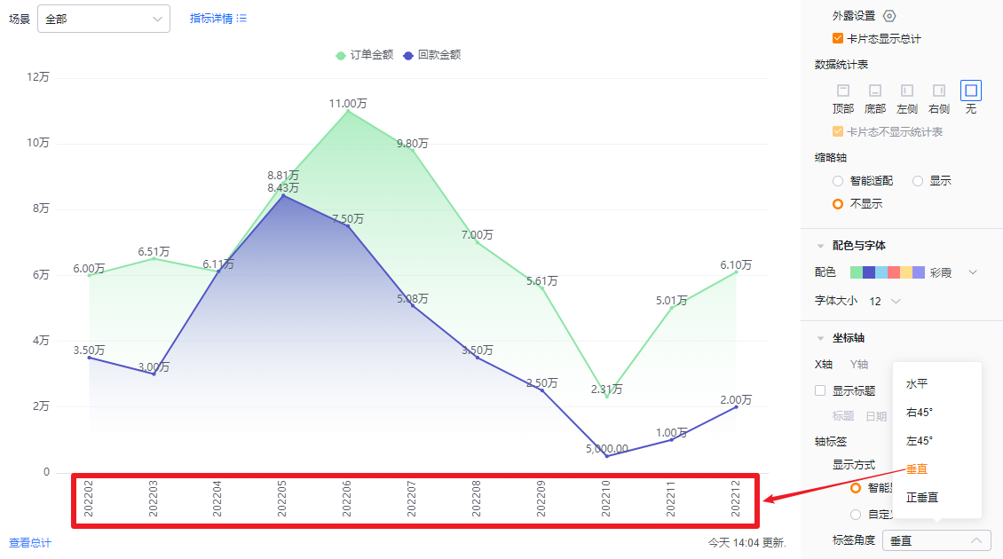
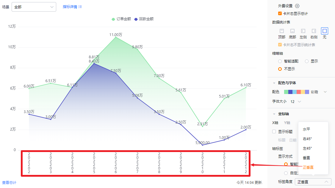
- Label angle: Default horizontal. Options: Right 45°, Left 45°, Vertical, Upright vertical.

- Y axis
- Show title: Default unchecked. When checked, it defaults to the first metric name and can be edited.
- Title: When Show title is unchecked, it is read-only. When checked, you can edit it.
- Show title: Default unchecked. When checked, it defaults to the first metric name and can be edited.
- Axis labels: Checked by default; you may uncheck.
- Label angle: When axis labels are enabled, set angle. Default horizontal; options include Left 45° or Vertical (same visual options as X axis).
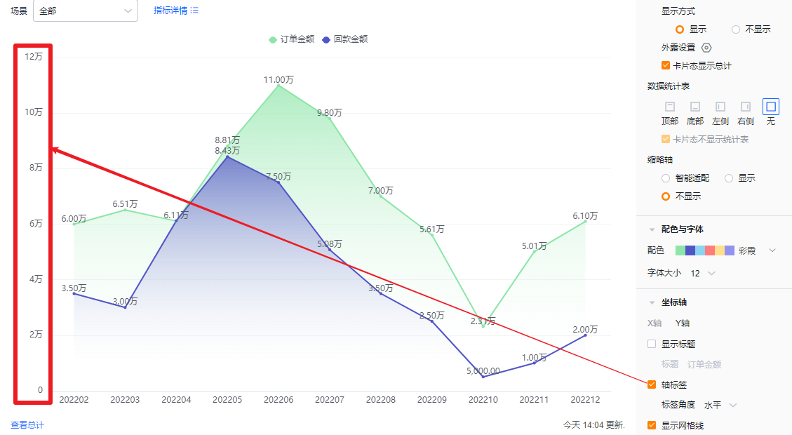
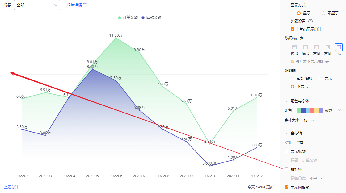
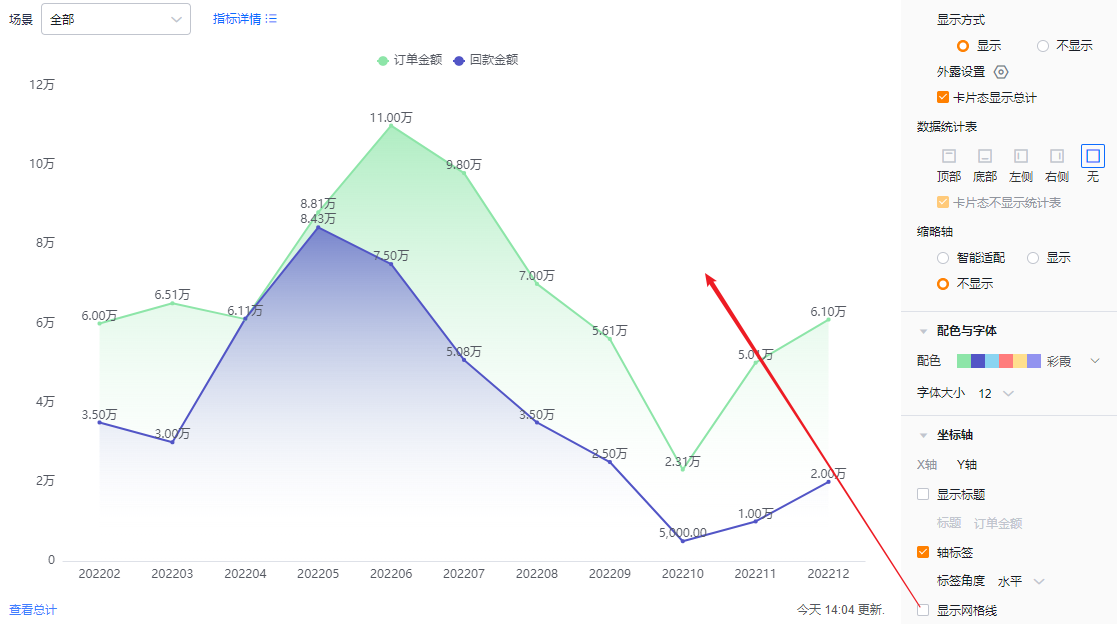
- Show grid lines: Checked by default; you may uncheck.
1.2.3 Functional Settings
1.2.3.1 Advanced Settings
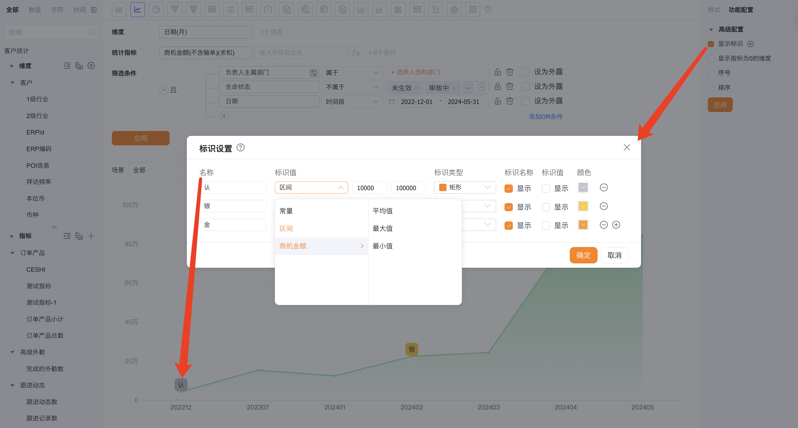
- Marker lines: You can add up to 6 marker lines per chart. Default is Off.
- Name: Set the marker line name.
- Marker value: Default is Constant. Options: Constant, Range, or metric-based Average/Max/Min. When Constant is selected, specify the value.
- Marker shape: Default is Dashed. Options: Circle, Diamond, Rectangle, Droplet.
- Show marker name: Default Off; enable to show.
- Show marker value: Default Off; enable to show.
- Color: Customize the marker color.
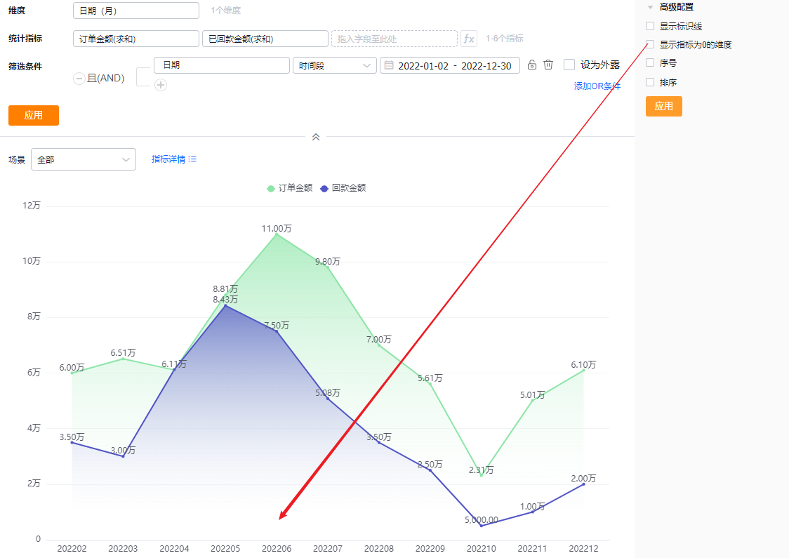
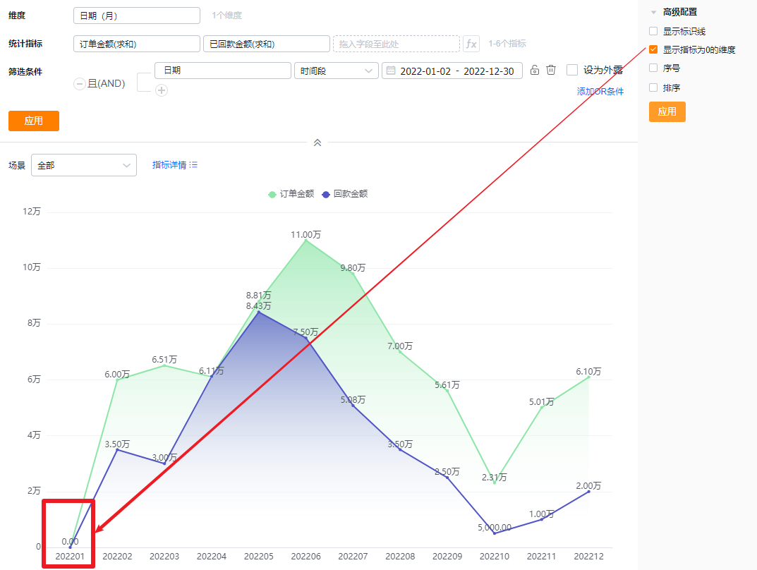
- Show dimensions with zero metric values: Default Off. Check to display dimensions whose metric value is zero.
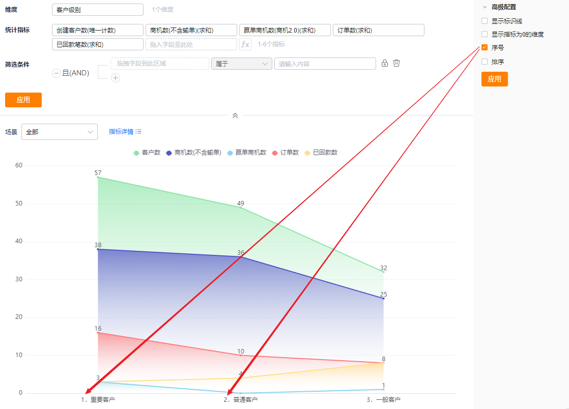
- SN: Default Off. Check to display serial numbers.
- Sorting: Default Off. When enabled, sort dimensions either by their natural order with Top N or by a metric value with Top N. Top N options include presets or a custom number.
- When the dimension is an enumeration or a Dept., custom ordering is supported.
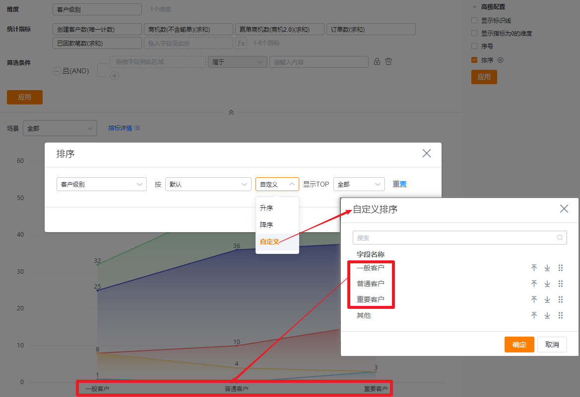
* Custom order by dimension values
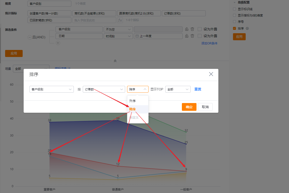
* Sort dimension by metric descending
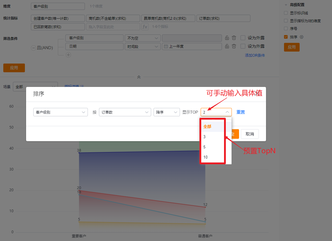
* Show Top N after sorting
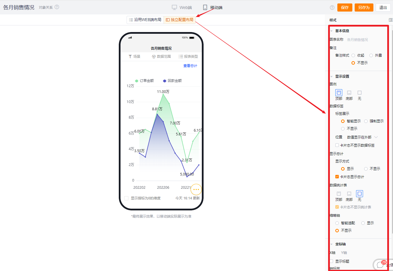
1.2.4 Style (Mobile)
1.2.4.1 Follow Web Layout
- Mobile view follows the Web configuration and cannot be set independently.
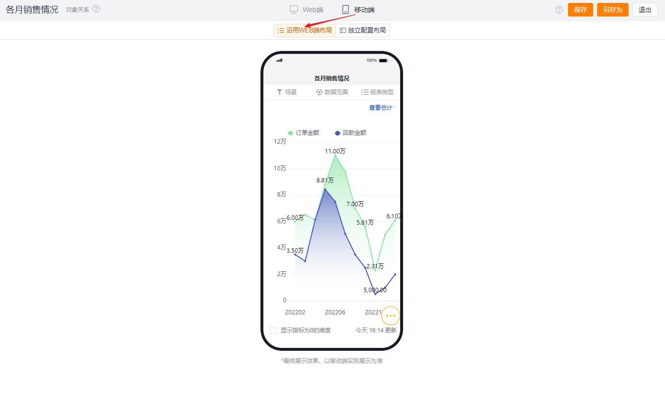
1.2.4.2 Independent Mobile Layout
- By default, mobile inherits the selected Web settings but you can further adjust for better mobile presentation.
- Mobile has fewer configurable options than Web. Options that cannot be set on mobile use the Web settings. Configurable mobile options follow the same behavior and visual logic as Web.