Published at: 2025-10-30
Dual-Axis Chart
Dual-Axis Chart
1.1 Use Cases
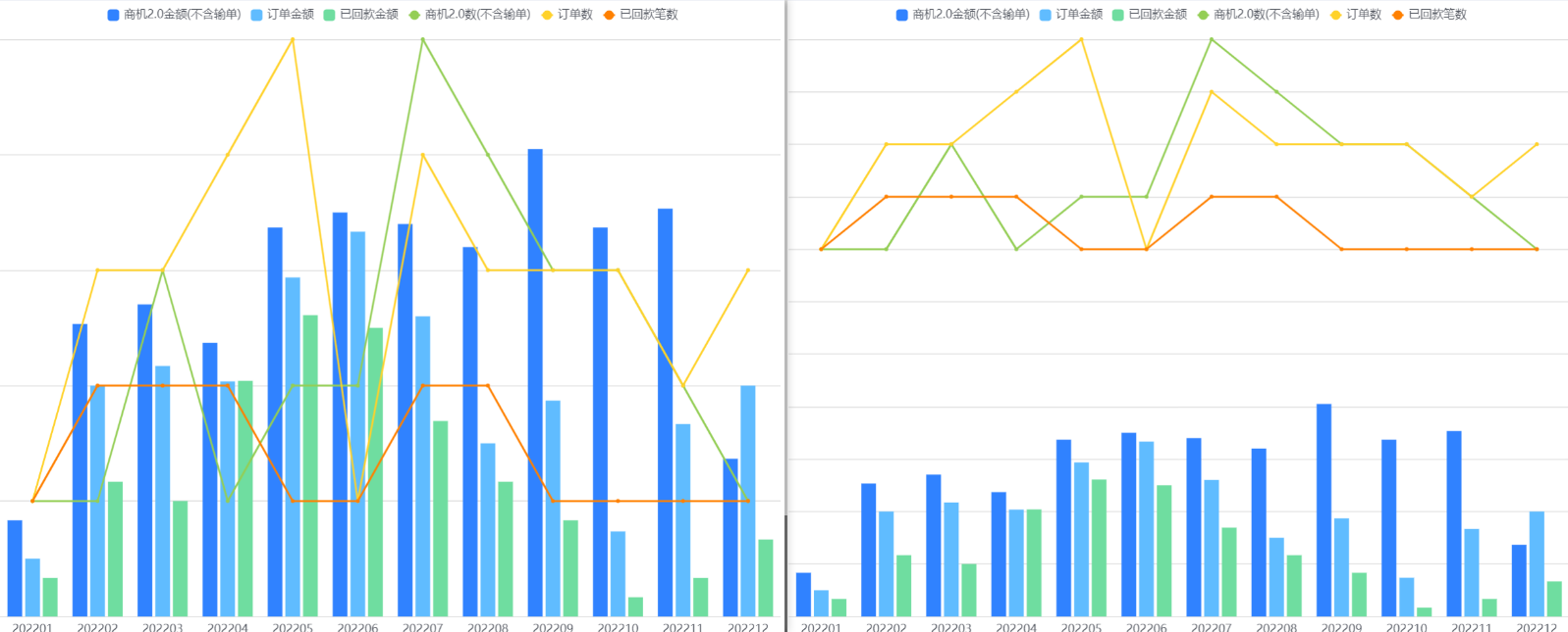
The dual-axis chart helps visualize indicators with significantly different scales under a single dimension. For example, you can compare Sales Order amount vs. quantity across Account tiers, or annual Opportunity amount vs. count across Departments.
1.2 Chart Configuration
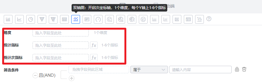
1.2.1 Axis Data
- Dimension: 1 dimension
- Metrics: 1–6 metrics per Y axis
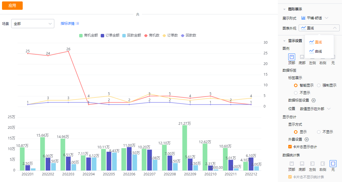
1.2.2 Style (Web)
1.2.2.1 Basic Information
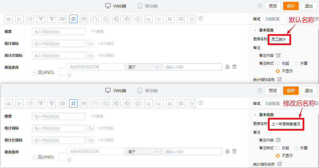
- Chart name: Defaults to the analysis Subject when created; you can edit to a custom chart name.
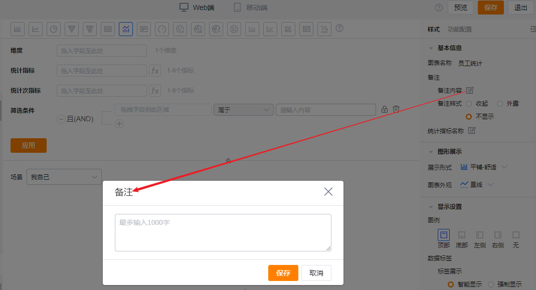
- Notes:
- Note content: Add contextual notes to help viewers understand what the chart conveys.
- Note style:
- Collapsed: Shown as an icon after the chart title in detail and card views; hover to see the note content.
- Exposed: Displayed as inline text after the chart title in detail and card views.
- Hidden: Not shown in detail or card views.
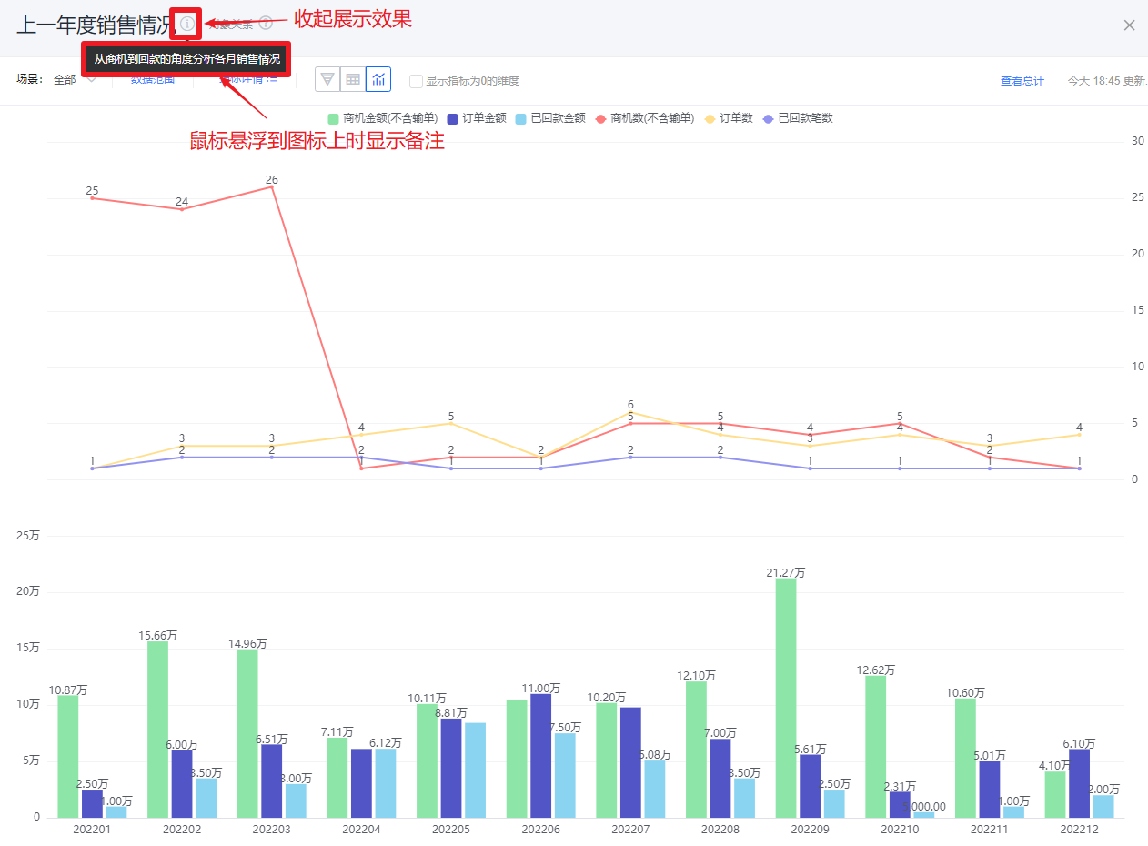 Collapsed note style
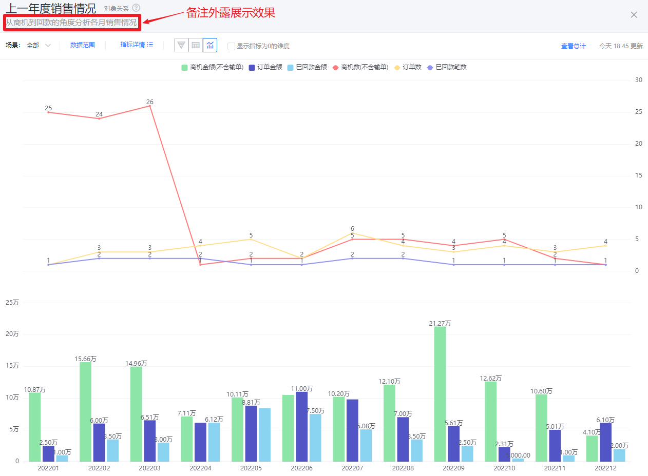 Exposed note style
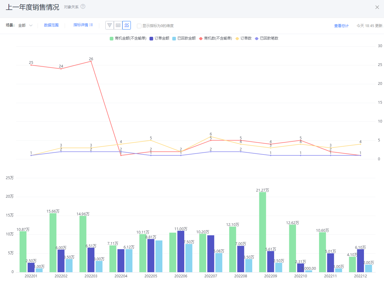 Hidden note style
- Metric label: By default, shows metric names; you may edit the displayed label.
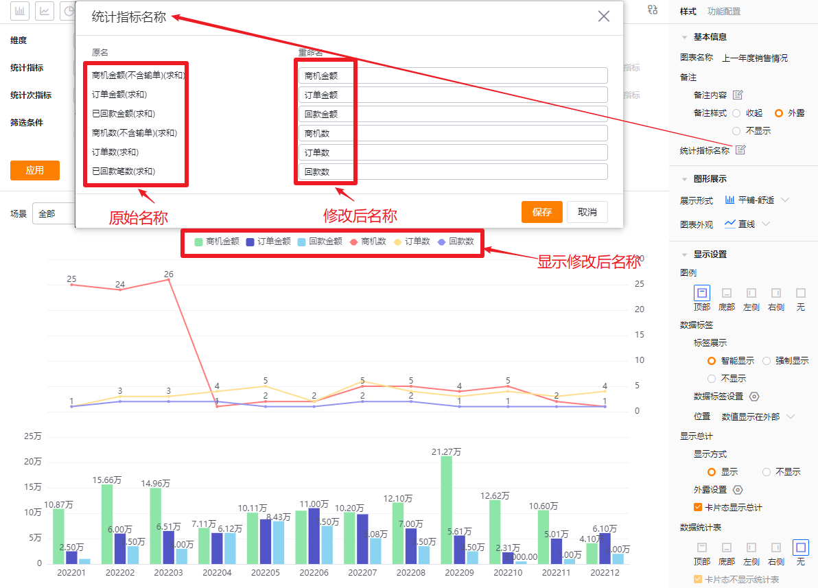
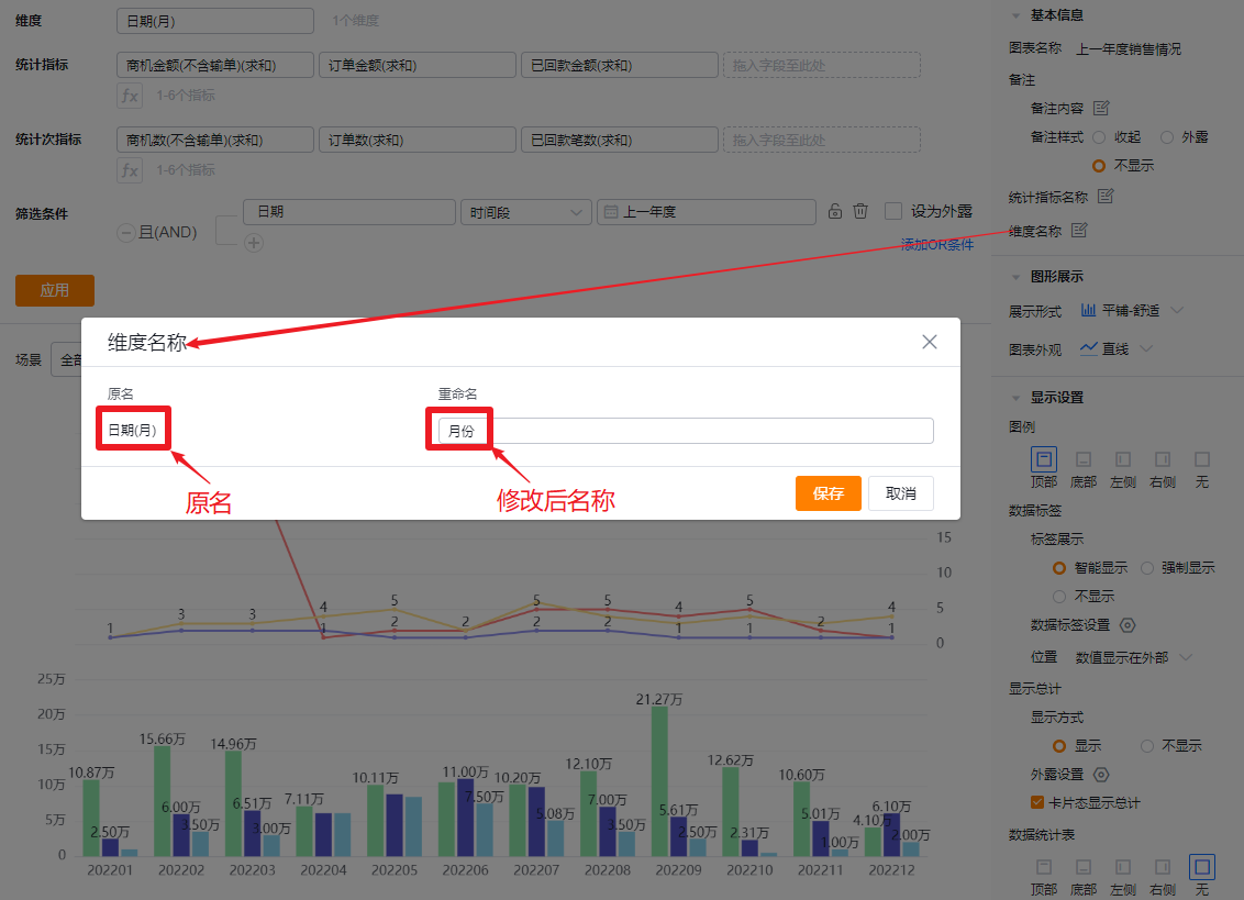
- Dimension label: By default, shows the dimension name; you may edit the displayed label.
1.2.2.2 Chart Display
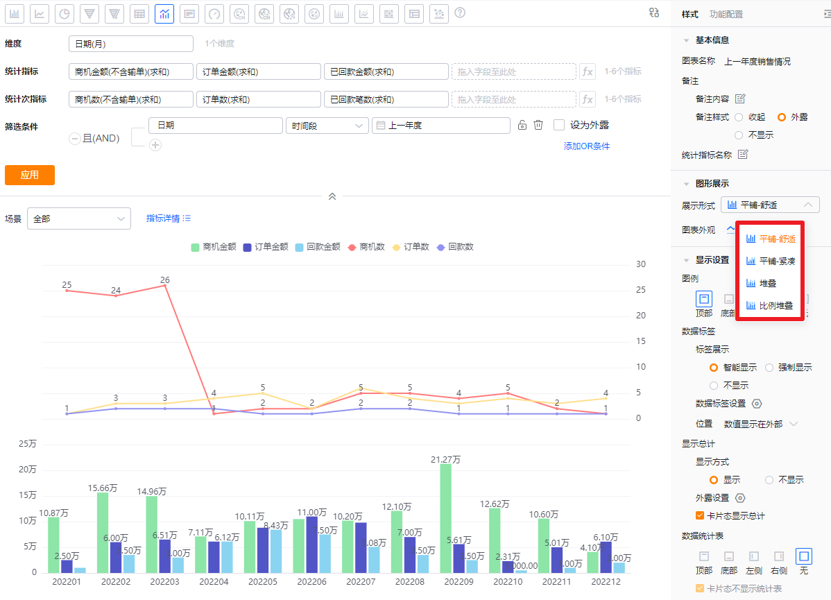
- Display mode: Default is Tile - Comfortable. Options: Tile - Comfortable, Tile - Compact, Stacked, Percentage Stacked.
- Tile - Comfortable: Each metric is a separate column with spacing between columns.
- Tile - Compact: Each metric is a separate column with no spacing.
- Stacked: Columns stack; when stacked, Data Label Position cannot be set and labels default to internal.
- Percentage Stacked: Columns share equal height and show percentage contributions; when using percentage stacking, Data Label Position cannot be set and labels default to internal.
 Display mode controls
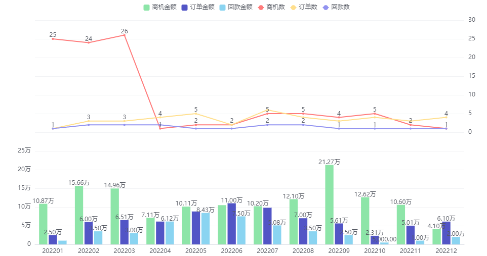 Tile - Comfortable
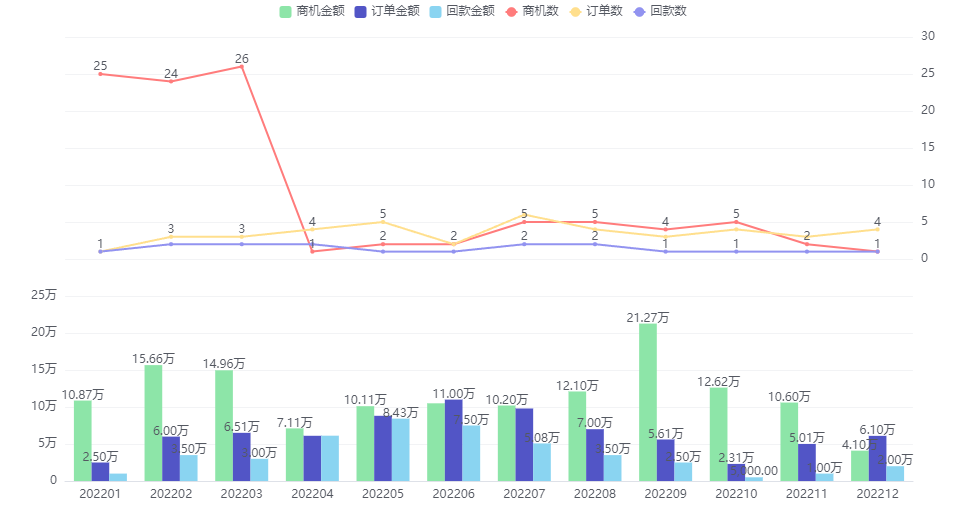 Tile - Compact
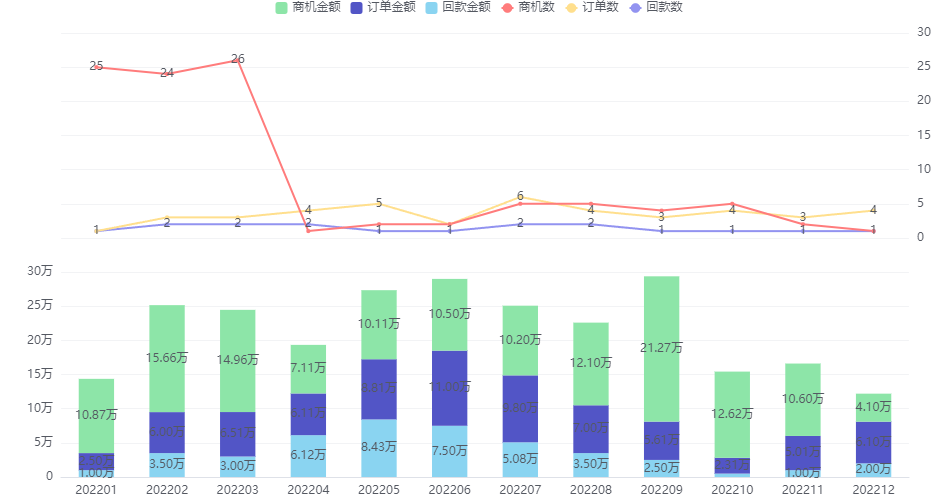 Stacked
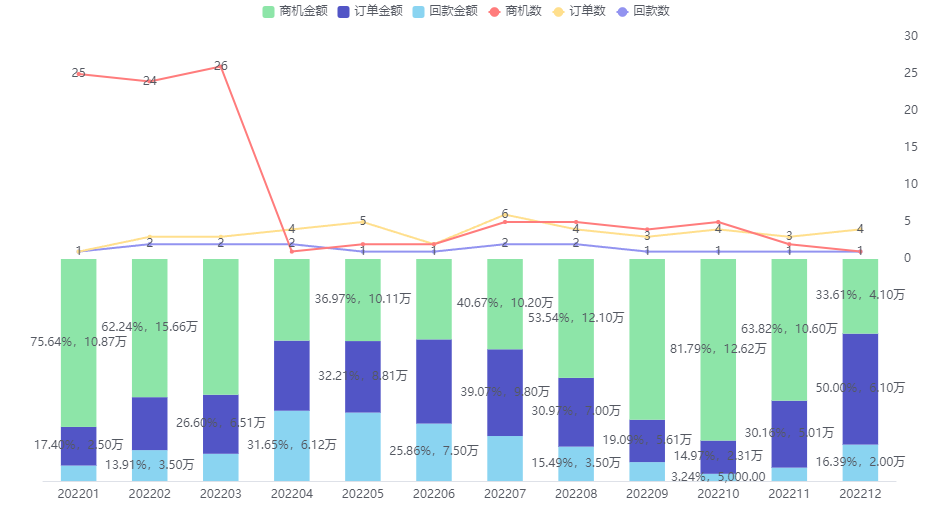 Percentage Stacked
- Chart appearance: Default is straight lines for line elements; you can switch to curves.
 Appearance settings and straight line sample
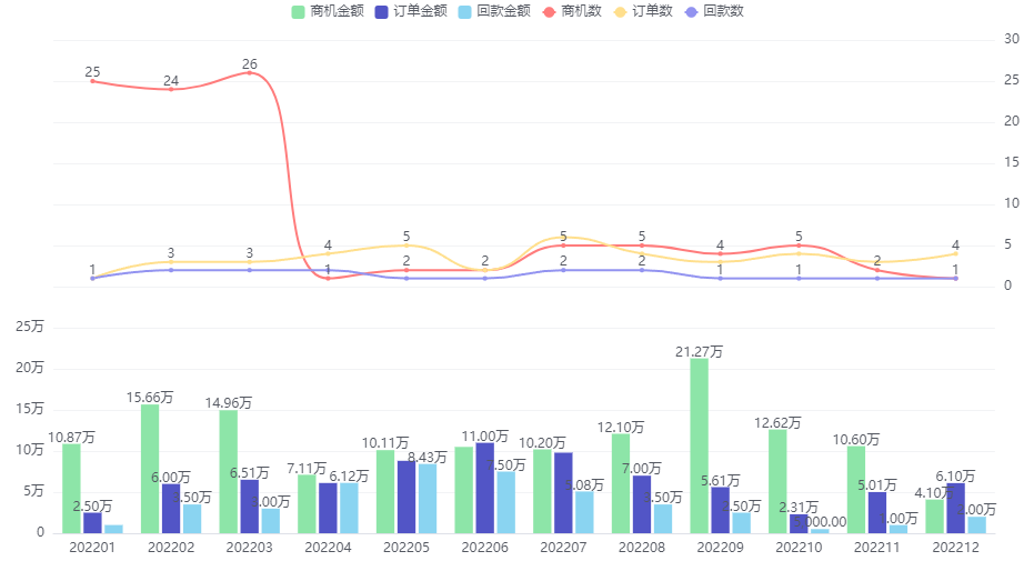 Curve sample
1.2.2.3 Display Settings
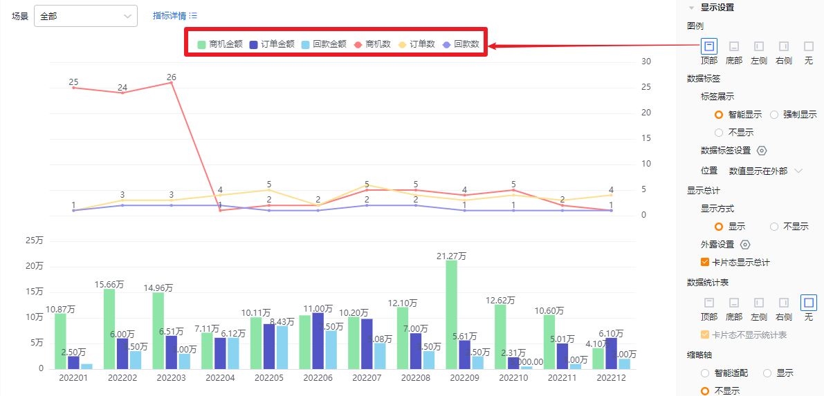
- Legend: Default position is top. Options: top, bottom, left, right, none.
 Legend at top
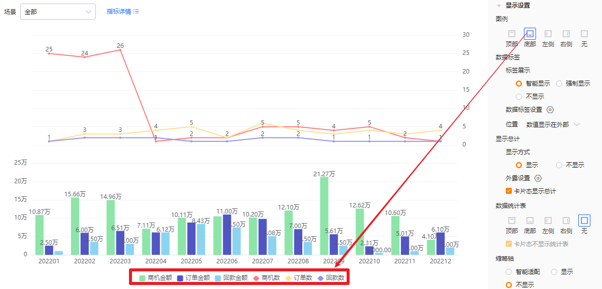 Legend at bottom
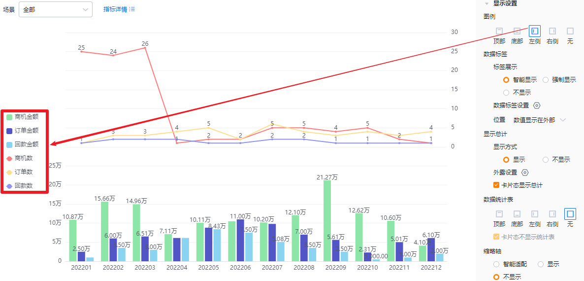 Legend at left
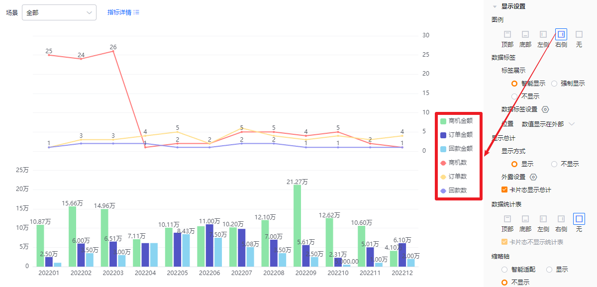 Legend at right
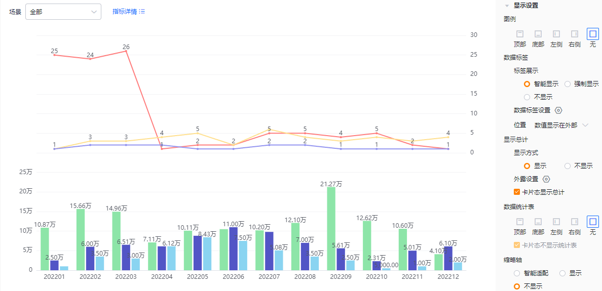 No legend
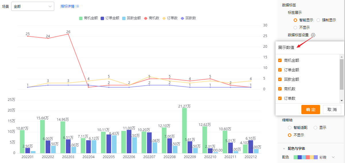
- Data labels:
- Label display modes:
- Smart: Shows labels intelligently based on available space; when values across metrics are similar, some labels may hide automatically.
- Force: Shows all labels regardless of overlap; similar values may cause overlap.
- Hidden: Do not show labels.
- Label display modes:
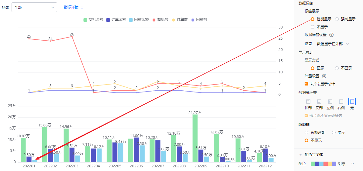 Smart label display
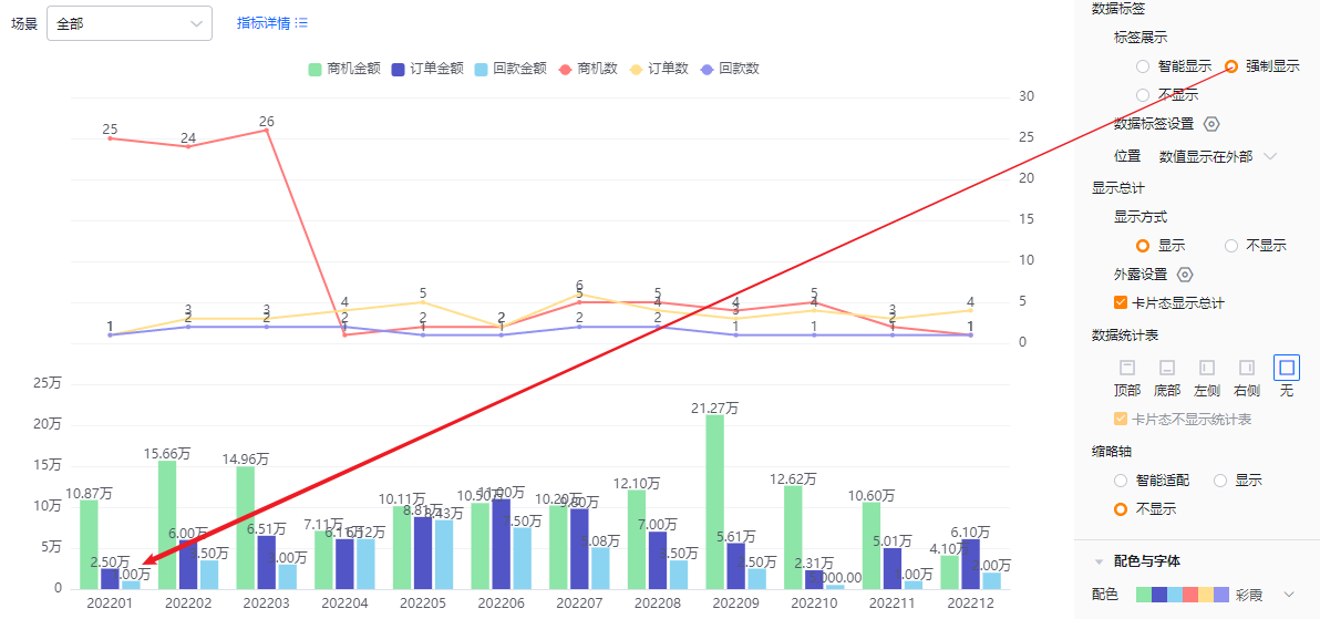 Force label display
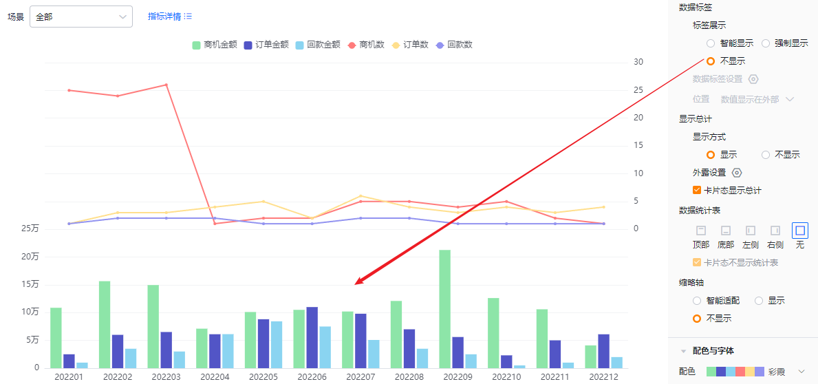 Labels hidden
- Data label settings: When two or more metrics exist, you can choose which metrics show in labels. All are selected by default. If Data Labels are set to Hidden, this control is read-only.
- Position:
- Values outside: labels appear outside the column.
- Values inside: labels appear inside the column.
- When Data Labels are Hidden, this control is read-only.
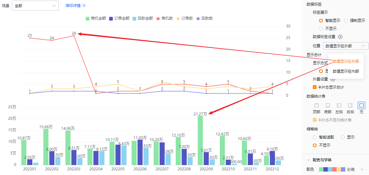 Values outside
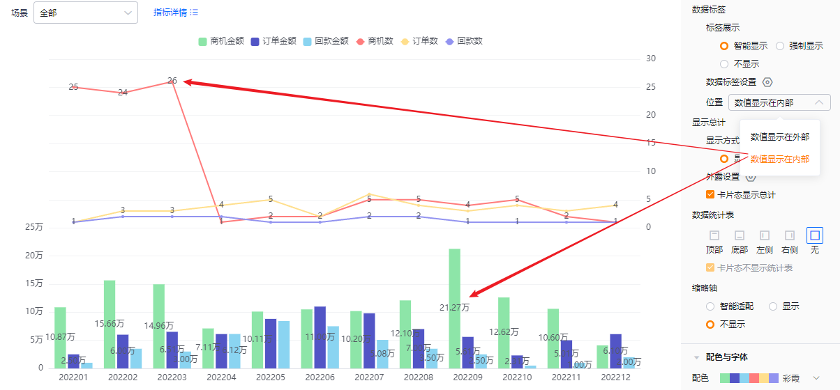 Values inside
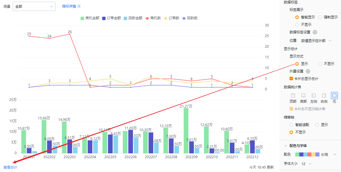
- Show totals:
- Mode: Defaults to shown; you can hide totals. When shown, totals appear in edit, detail, and card views according to configuration. When hidden, totals do not appear in any view.
 Totals shown
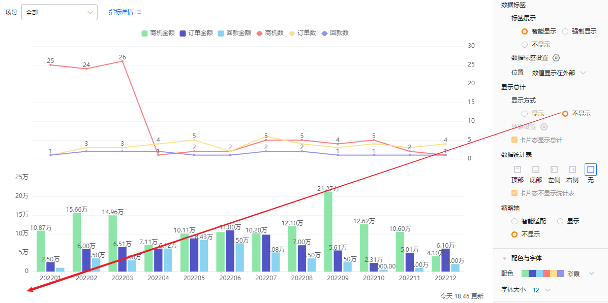 Totals hidden
- Exposed totals: When two or more metrics exist, you can choose which metrics display their totals externally; defaults are unchecked. If Show totals is set to Hidden, this control is read-only.
- Card view totals: Checked by default. Uncheck to hide totals in card view. If Show totals is Hidden, this control is read-only.
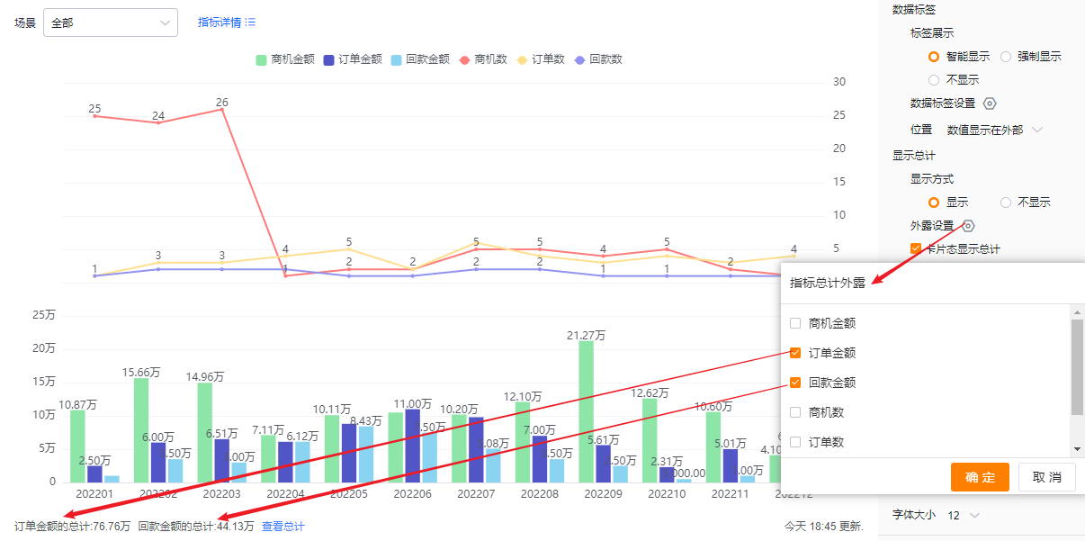 Exposed totals appearance
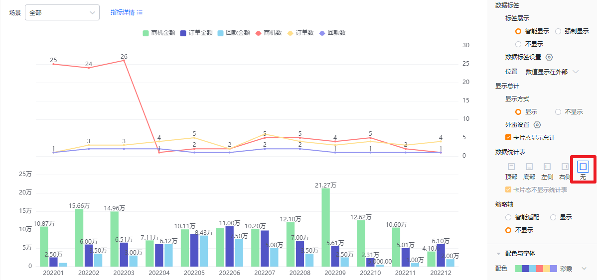
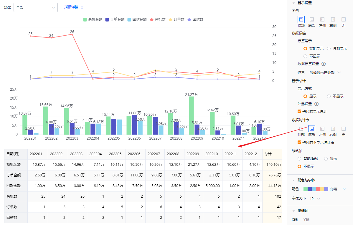
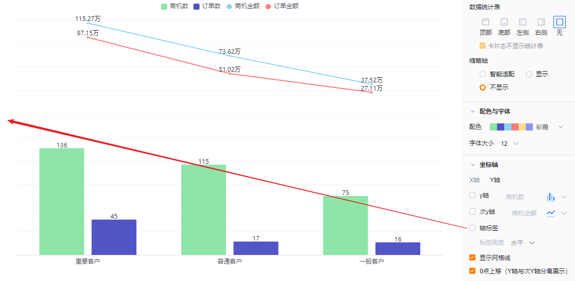
- Data table: Optionally show a data table and choose its position: top, bottom, left, or right of the chart. Default is hidden.
- Card view hides table: When showing the data table, you can also choose to hide it in card view. This option is checked by default.
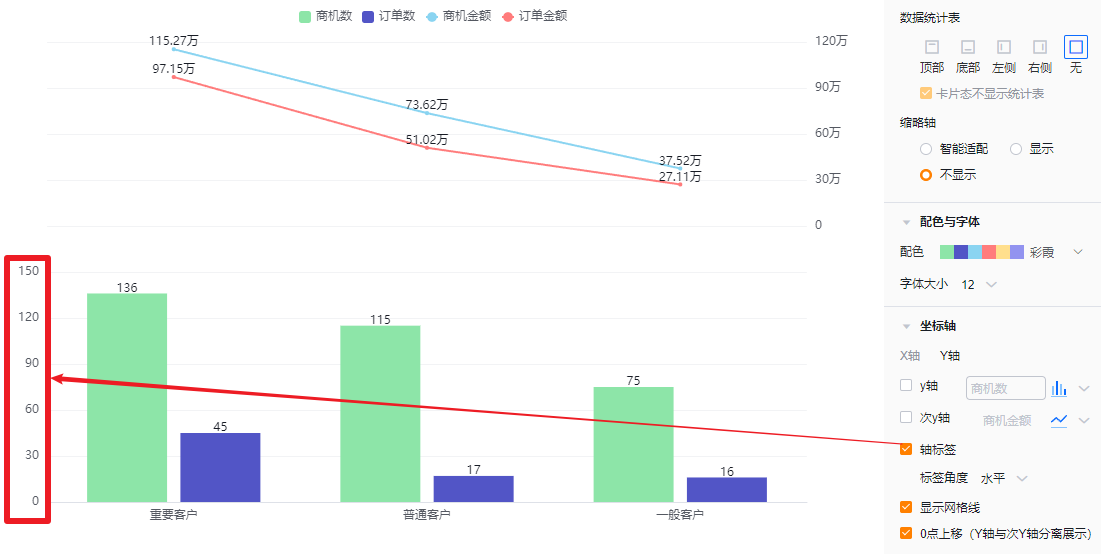
- Mini-axis (scroll axis): Default is Smart. Options: Smart, Show, Hide.
- Smart: Shows a mini-axis when the number of columns exceeds what fits in the current display area; otherwise hides it.
- Show: Always display the mini-axis.
- Hide: Never display the mini-axis.
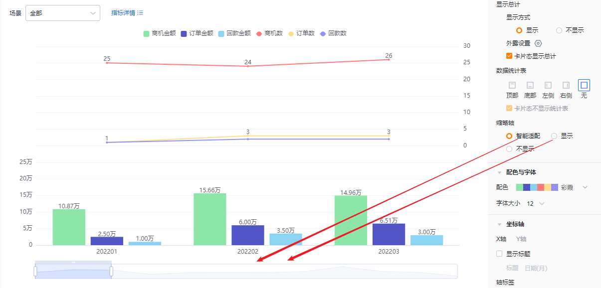 Mini-axis shown / Smart behavior
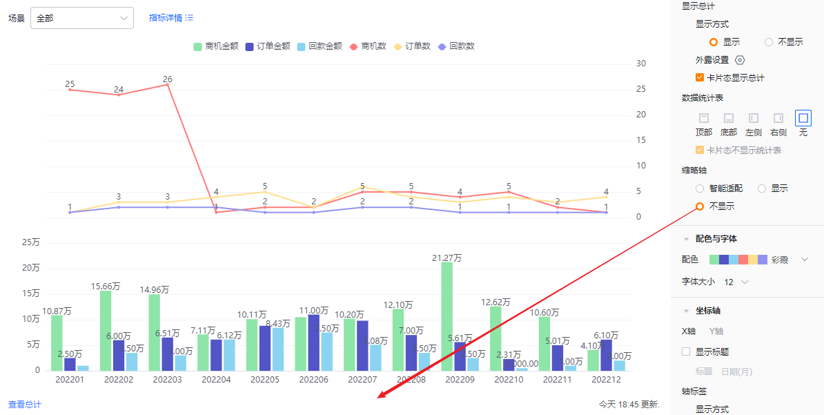 Mini-axis hidden
1.2.2.4 Colors & Fonts
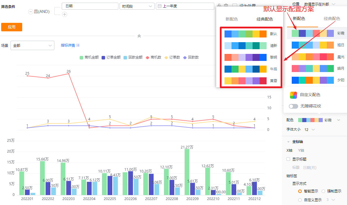
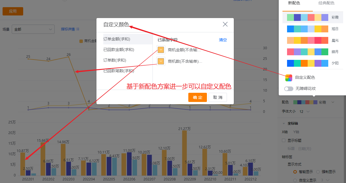
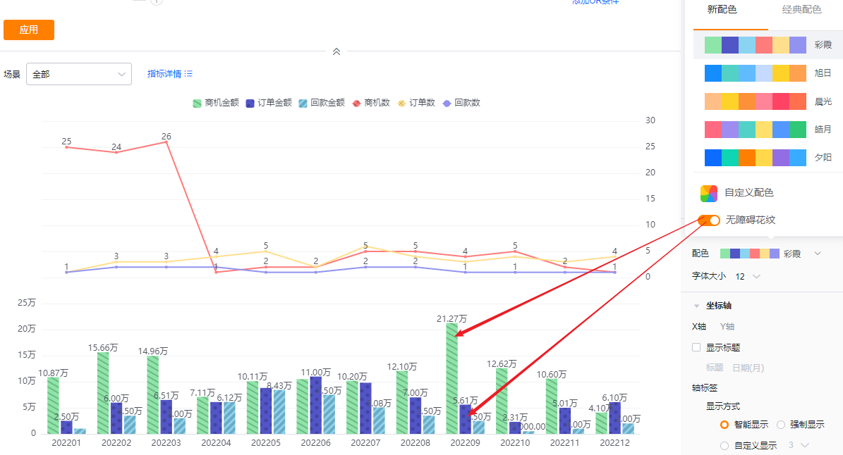
- Color schemes: The system supports New and Classic color schemes. Default is the first New palette. An accessibility pattern option is available.
- New: Allows customizing colors based on a chosen palette.
- Classic: Does not support custom colors.
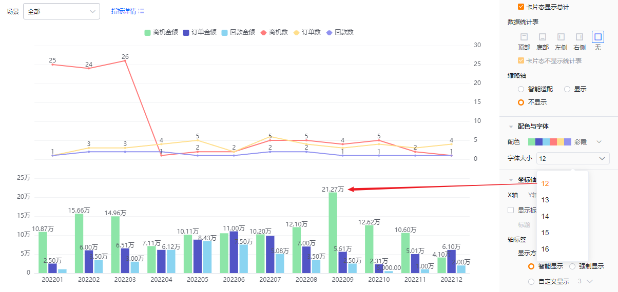
- Font size: Default 12; options: 13, 14, 15, 16.
1.2.2.5 Axes
- X axis
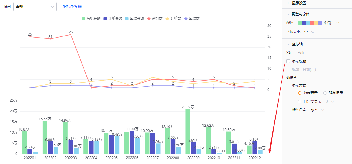
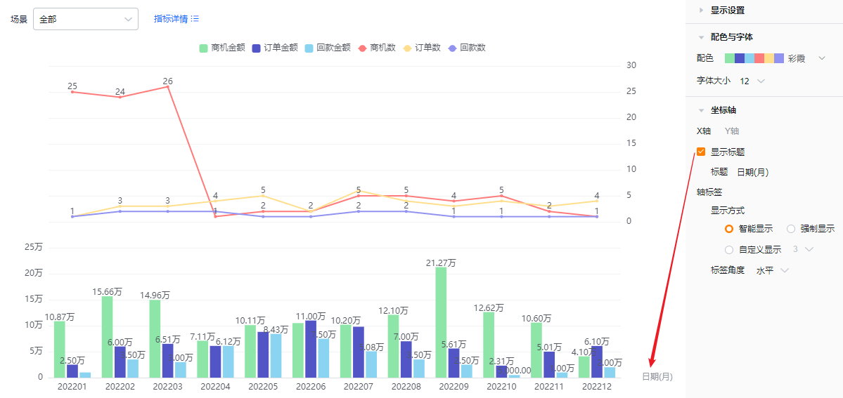
- Show title: Unchecked by default. When checked, the dimension field name displays and is editable.
- Axis labels
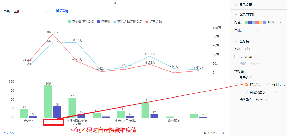
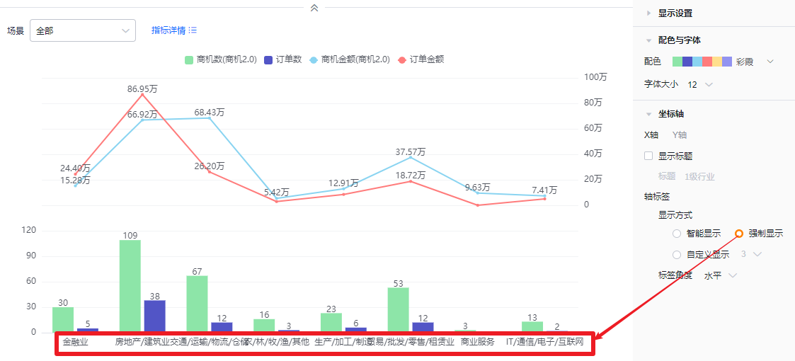
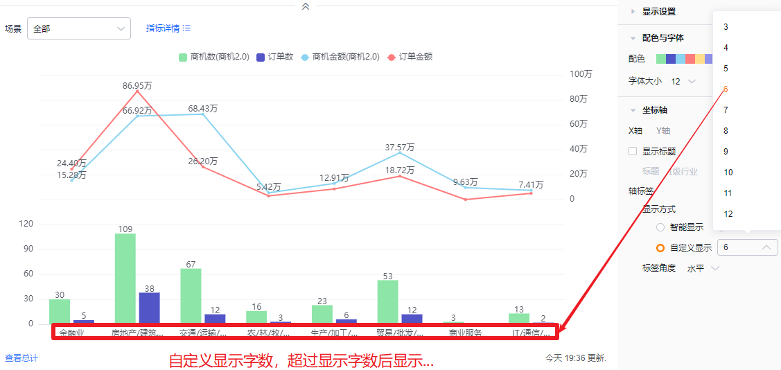
- Display mode:
- Smart: Truncates label text based on available space and shows “…” when truncated.
- Force: Shows full labels; long labels may overlap.
- Custom: Default shows 3 characters; supports 3–12 characters.
- Display mode:
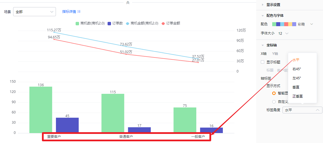
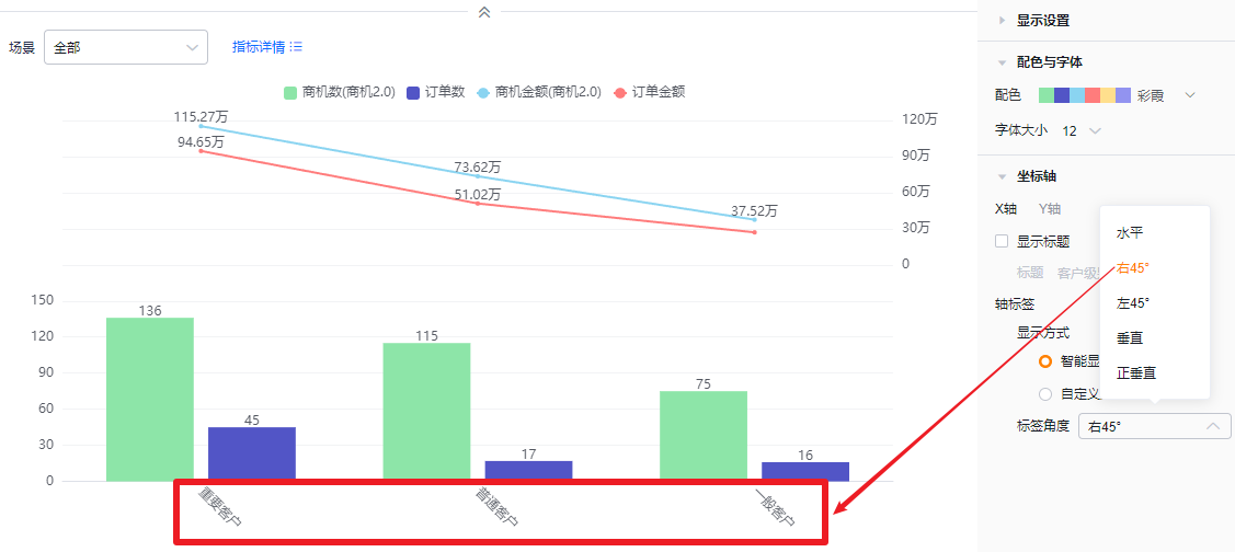
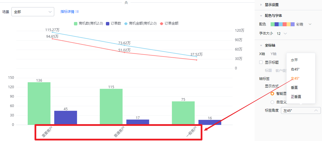
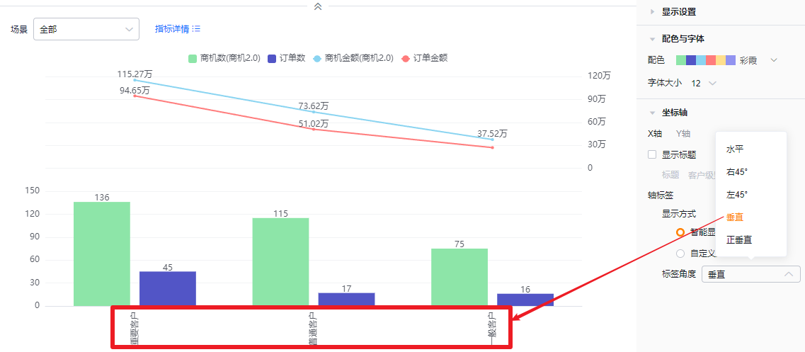
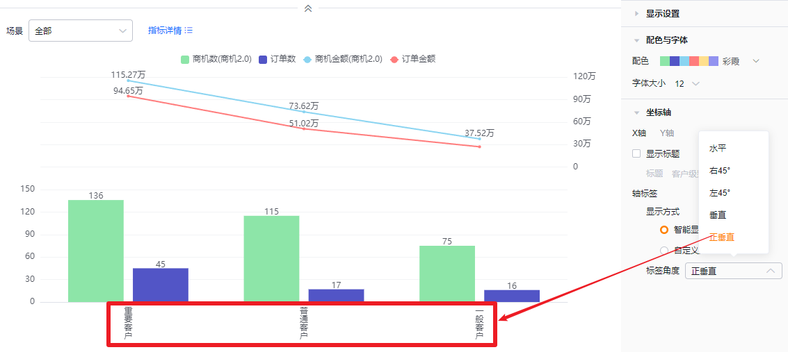
- Label angle: Default horizontal. Options: Right 45°, Left 45°, Vertical, Upright.
- Y axis
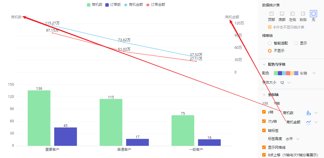
- Y axis: Unchecked by default. When checked, it defaults to the first selected metric name, which you can edit.
- Title: When Show title is unchecked, title is read-only. When checked, editable.
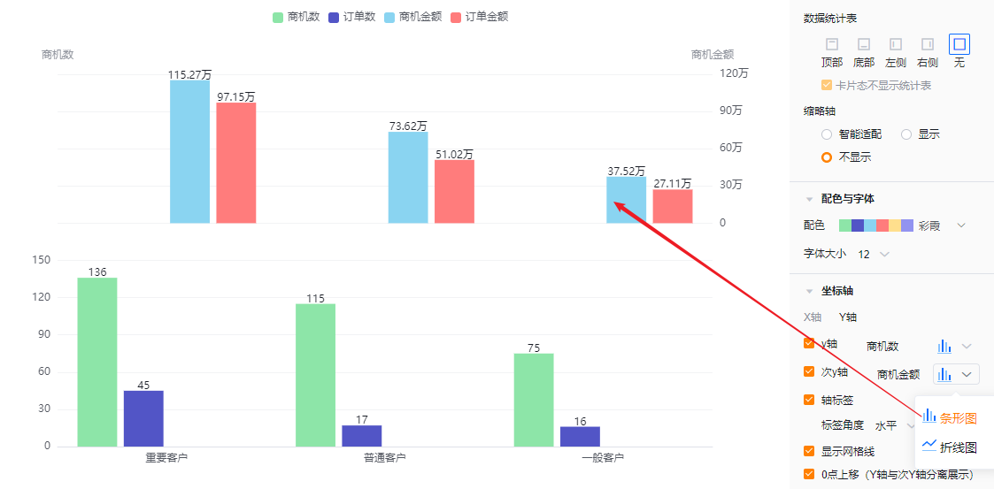
- Chart type: Default column; switchable to line.
- Secondary Y axis: Unchecked by default. When checked, defaults to the first selected metric name, editable.
- Title: Same edit behavior as primary Y axis.
- Chart type: Default line; switchable to column.
- Y axis: Unchecked by default. When checked, it defaults to the first selected metric name, which you can edit.
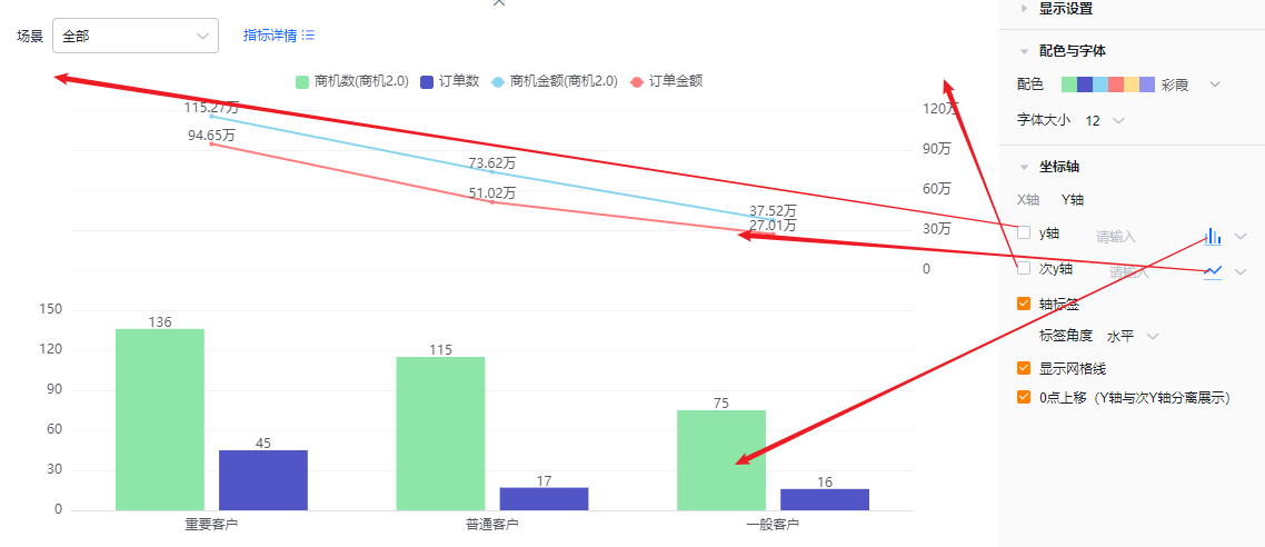
- Axis labels: Checked by default; you can uncheck.
- Label angle: When axis labels are enabled, you can set the label angle. Default horizontal; options include Left 45° or Vertical (same visual options as X axis).
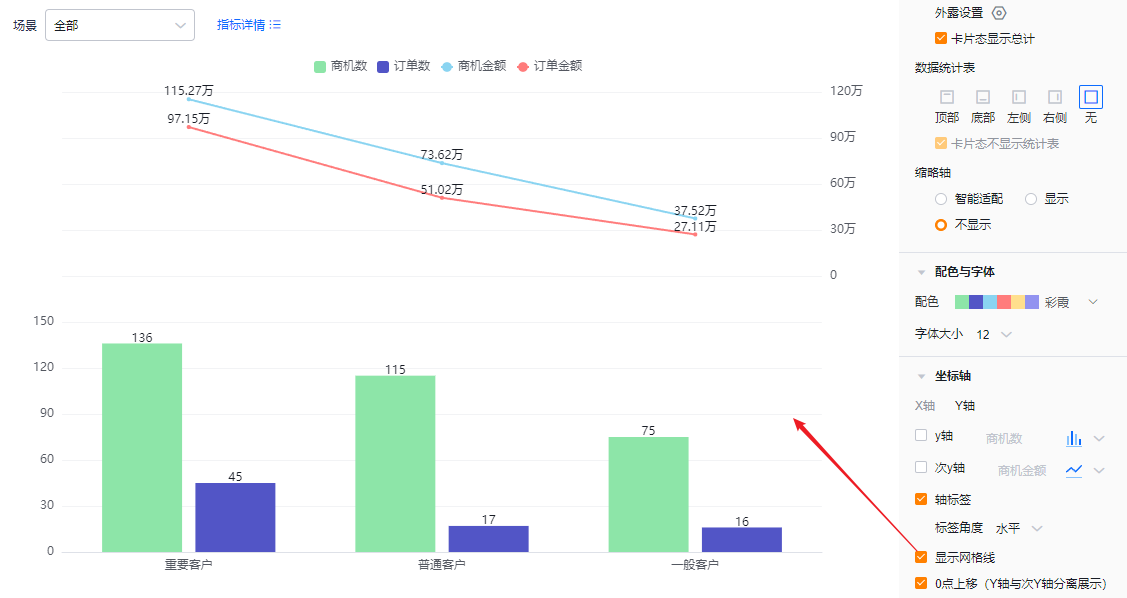
- Show gridlines: Checked by default; you can uncheck.
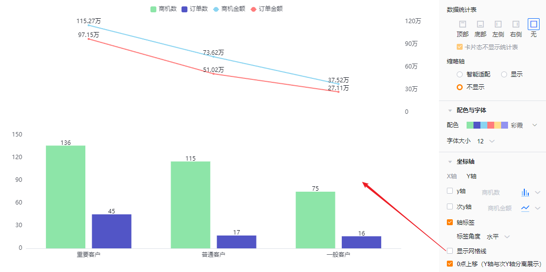
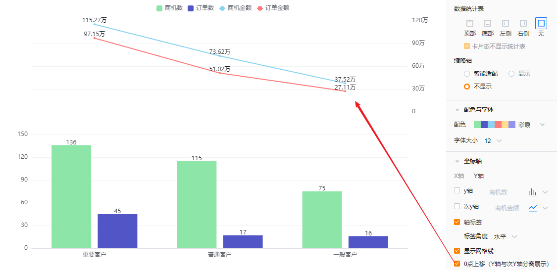
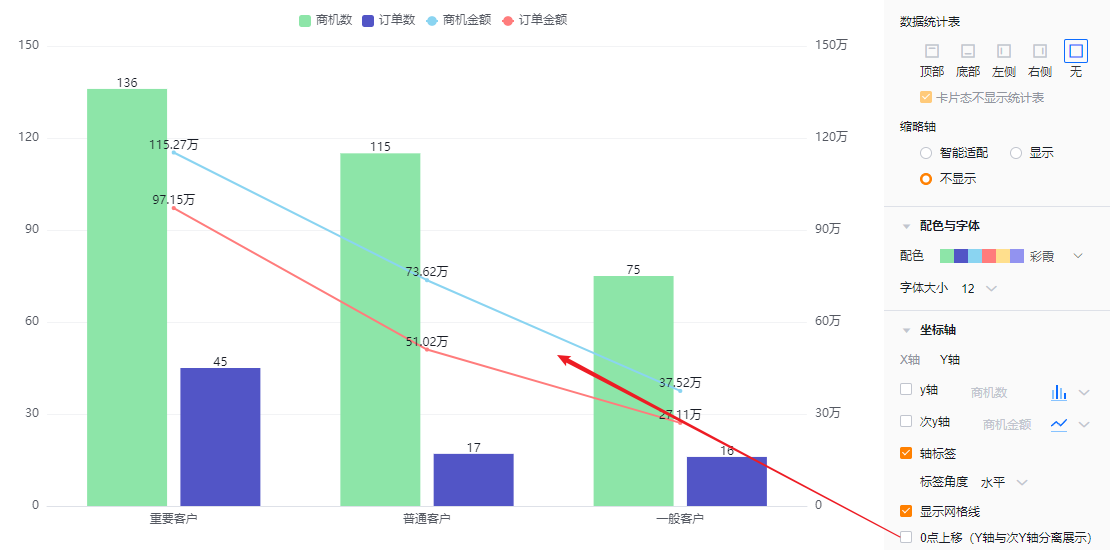
- Zero baseline offset (separate Y and secondary Y display): Checked by default; you may uncheck.
1.2.3 Feature Configuration
1.2.3.1 Advanced Configuration
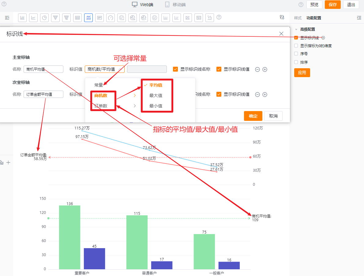
- Show marker lines: Configure up to 6 marker lines on either the primary or secondary axis. Default off.
- Name: Set the marker line label.
- Value: Default is Constant; can use metric average, max, or min. When Constant is selected, enter a specific value.
- Show marker name: Off by default; check to show.
- Show marker value: Off by default; check to show.
- Show dimensions with zero metrics: Off by default. Check to display dimensions whose metrics are zero.
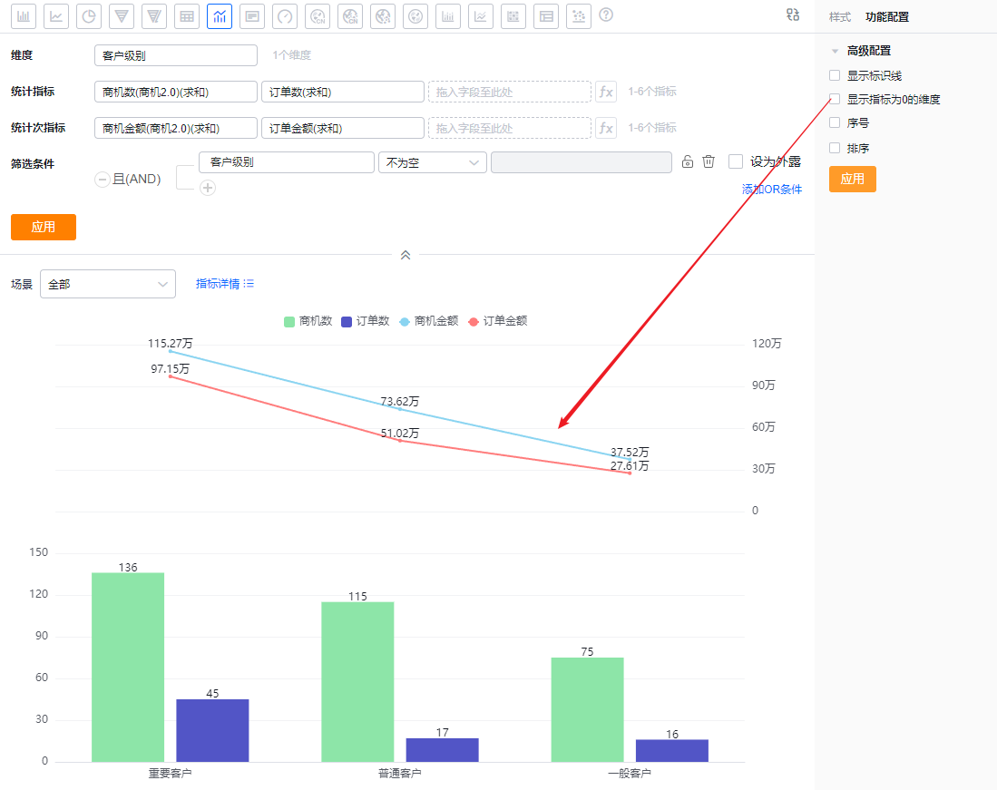 Not showing zero-value dimensions
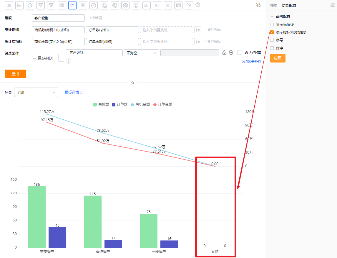 Showing zero-value dimensions
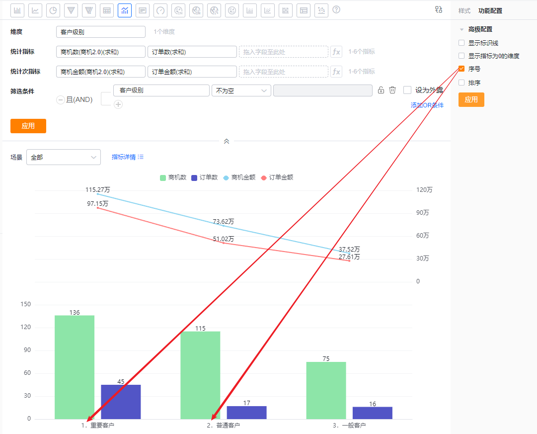
- SN: Off by default; check to show serial numbers.
- Sorting: Off by default. When enabled, you can sort the dimension by its own values (including TopN) or by a metric (including TopN). TopN supports presets and custom numeric input.
- When the dimension is an enum or Dept. field, custom ordering is supported.
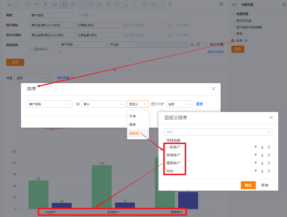 Custom ordering by dimension values
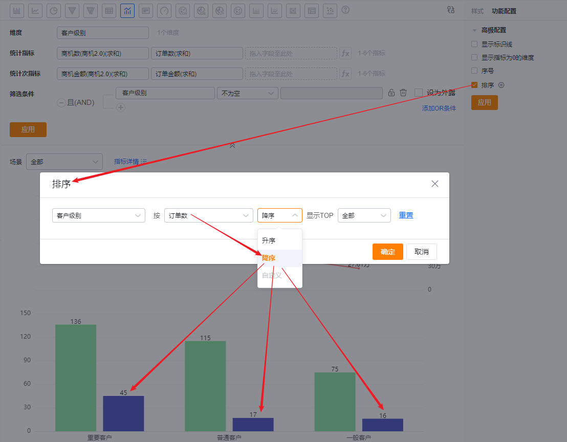 Sort dimension by metric descending
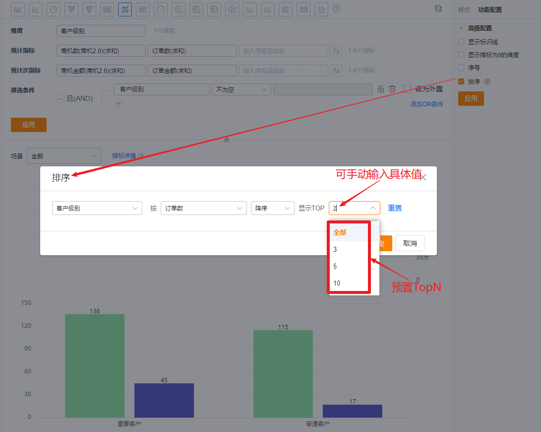 Show TopN after sorting
1.2.4 Style (Mobile)
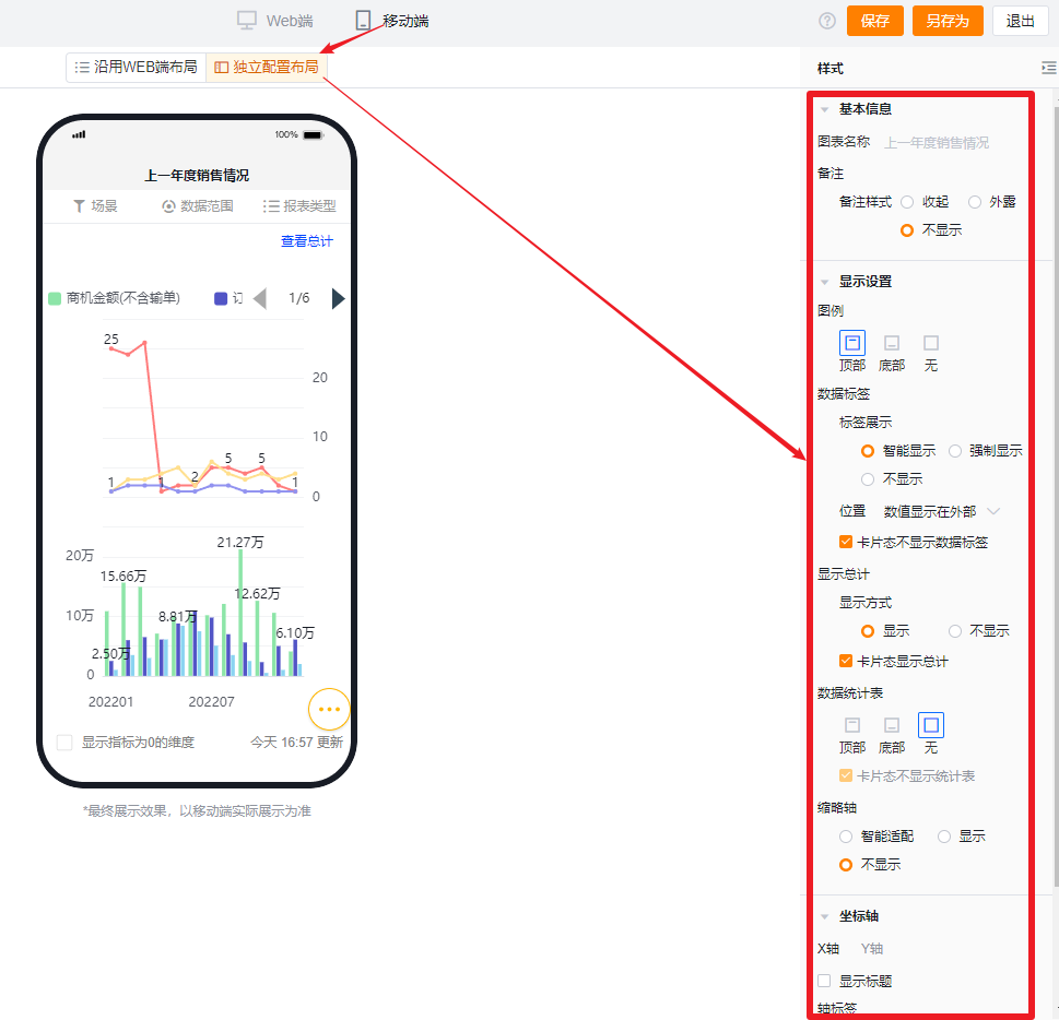
1.2.4.1 Inherit Web Layout
- Mobile view follows the Web layout and cannot be set independently.
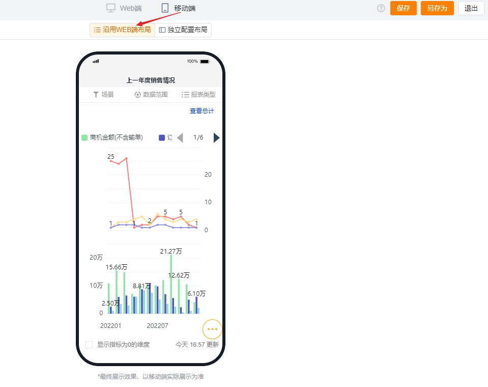
1.2.4.2 Independent Mobile Layout
- Default: Mobile inherits the checked Web settings but you can further adjust layouts for better mobile presentation.
- Mobile has fewer configurable options than Web. Settings unavailable on mobile inherit the Web configuration. For configurable items, behavior and logic match the Web version.