
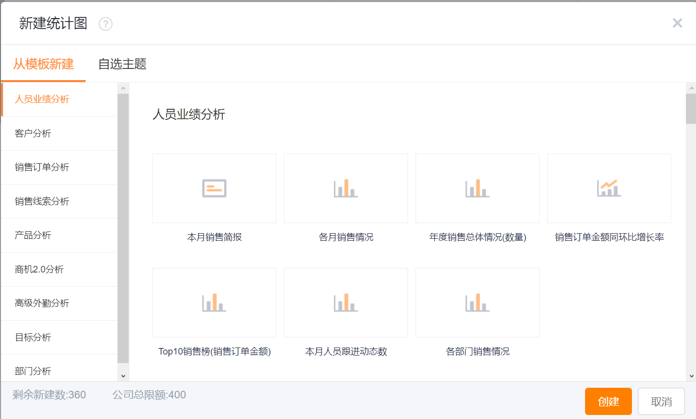
1. Create Statistical Chart
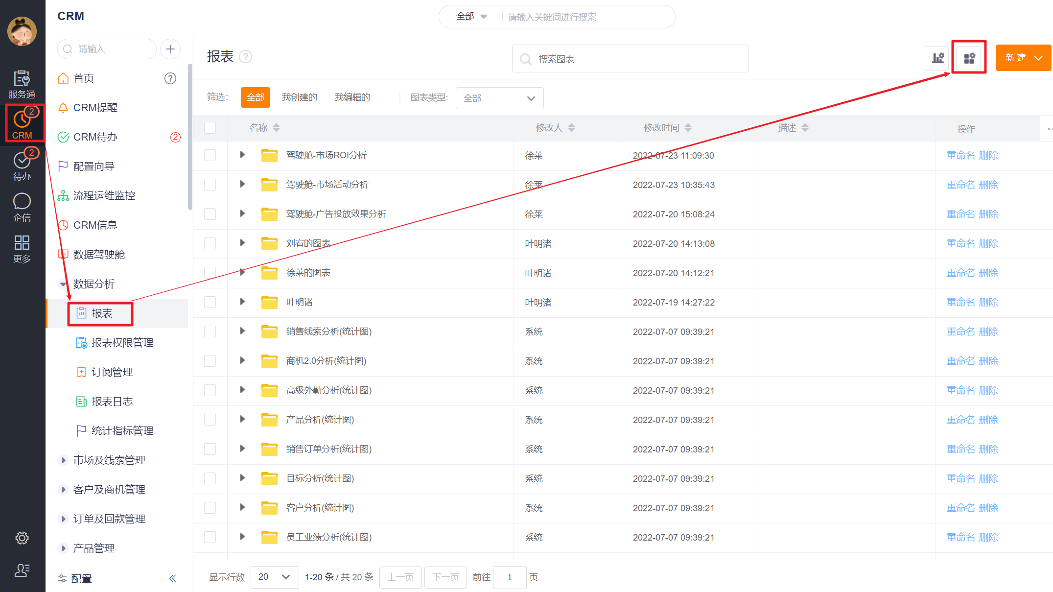
1.1 Create a new statistical chart based on a preset template
According to different business categories, the product has preset multiple statistical chart templates, and you can choose an appropriate template to create a new statistical chart according to actual needs.
- Template Description: All statistical charts are based on a business subject domain, such as "account analysis" which focuses on analyzing accounts, including analysis of the proportion of sales orders for different levels of accounts, transaction status of accounts at each level, account follow-up trend statistics and other statistical charts related to accounts.
- Use of Statistical Chart Template: When you click New Statistical Chart, the system will jump to the preset statistical chart template, you need to select the subject domain and statistical chart template according to the business scene to create a statistical chart.
- New All Statistical Charts: Create a new statistical chart according to the latest statistical chart template in the system. If the chart category already exists, the new one will fail. When you add the ShareCRM application, the system will create all statistical graphs for the enterprise according to the system preset template by default, that is, the report category and statistical charts you see when you enter the "Reports" menu for the first time, so you don't need to click this action now.
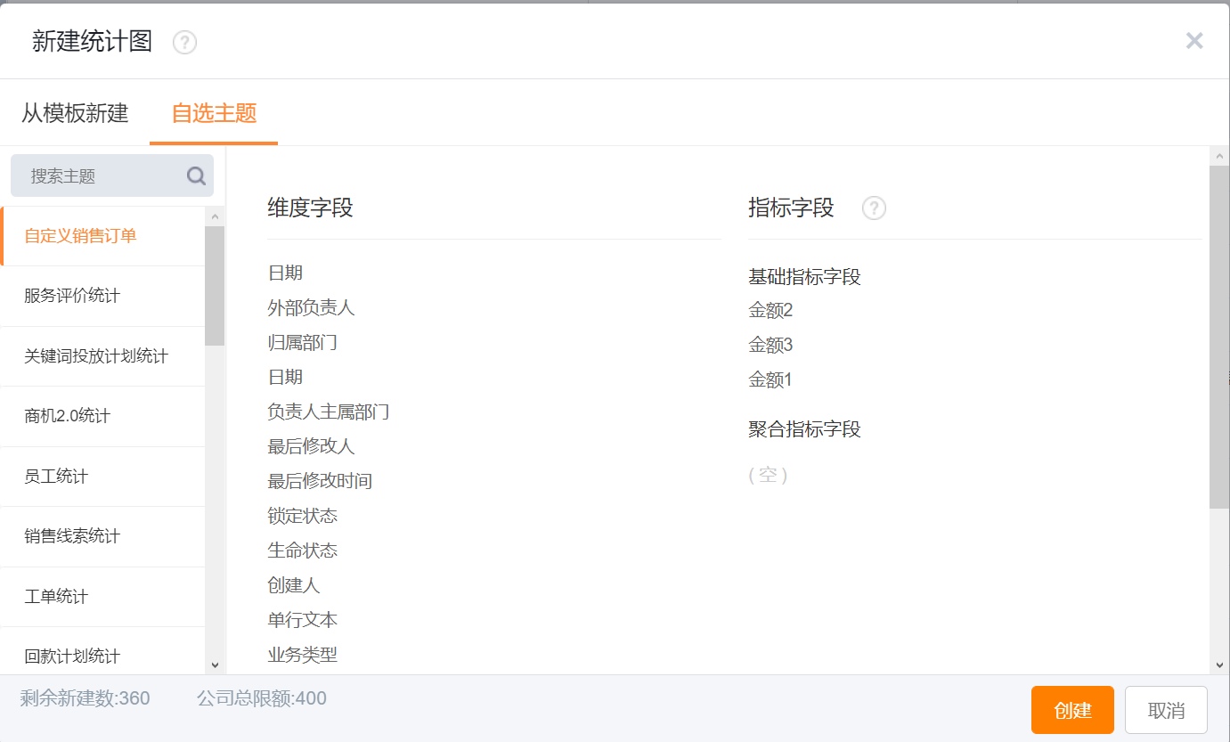
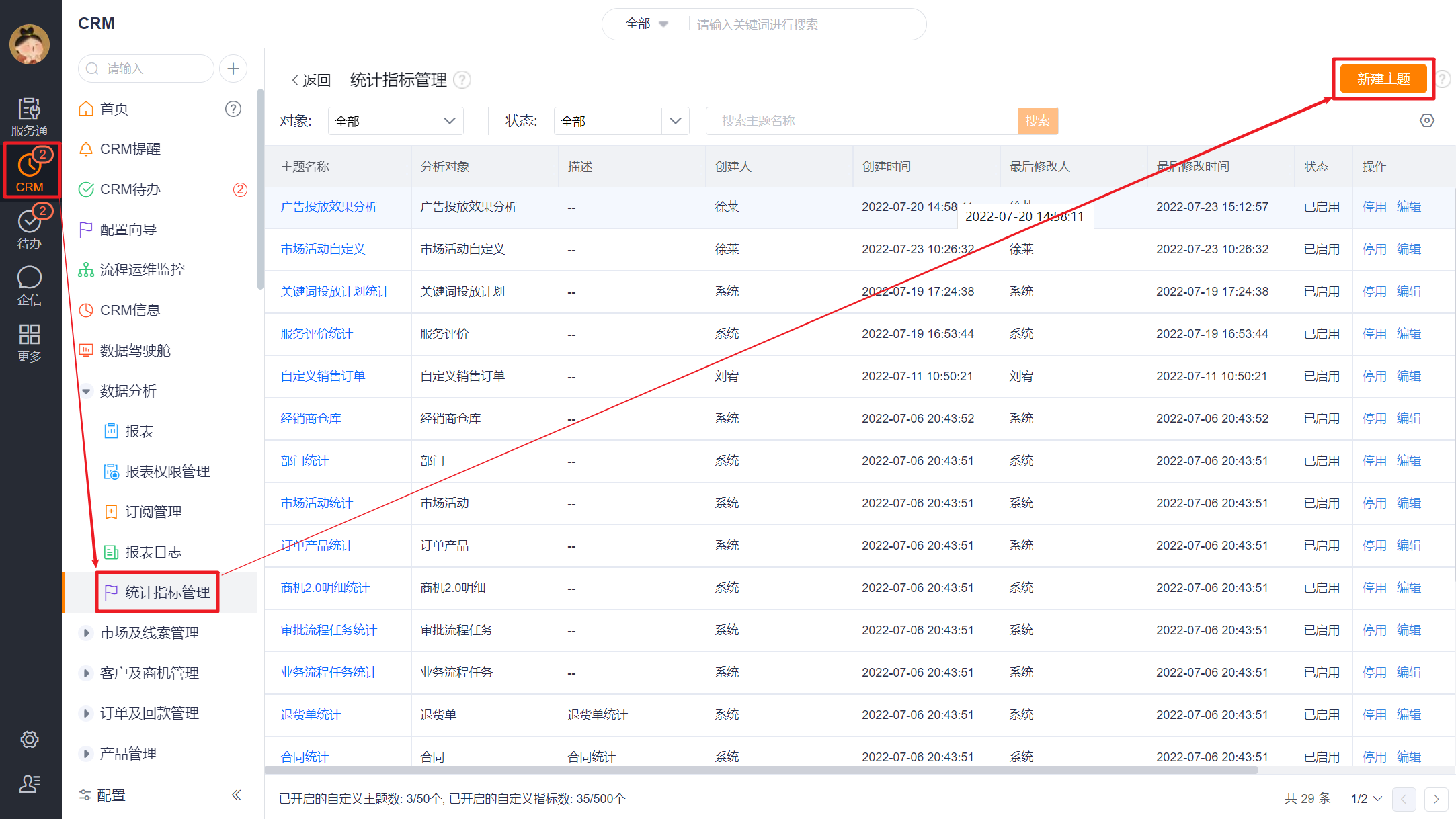
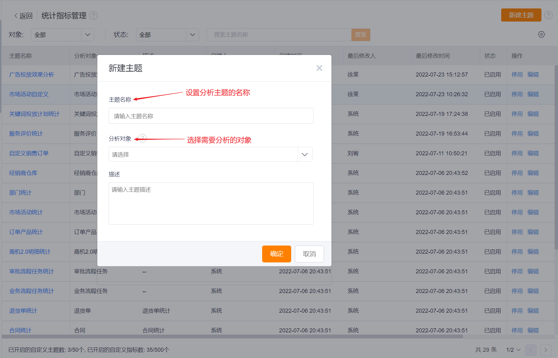
1.2 New Statistical Chart Based on Custom Theme
If there is no need in the preset statistical chart templates, you can select a theme to create a new statistical chart and select the desired theme.
2. Edit Statistical Chart
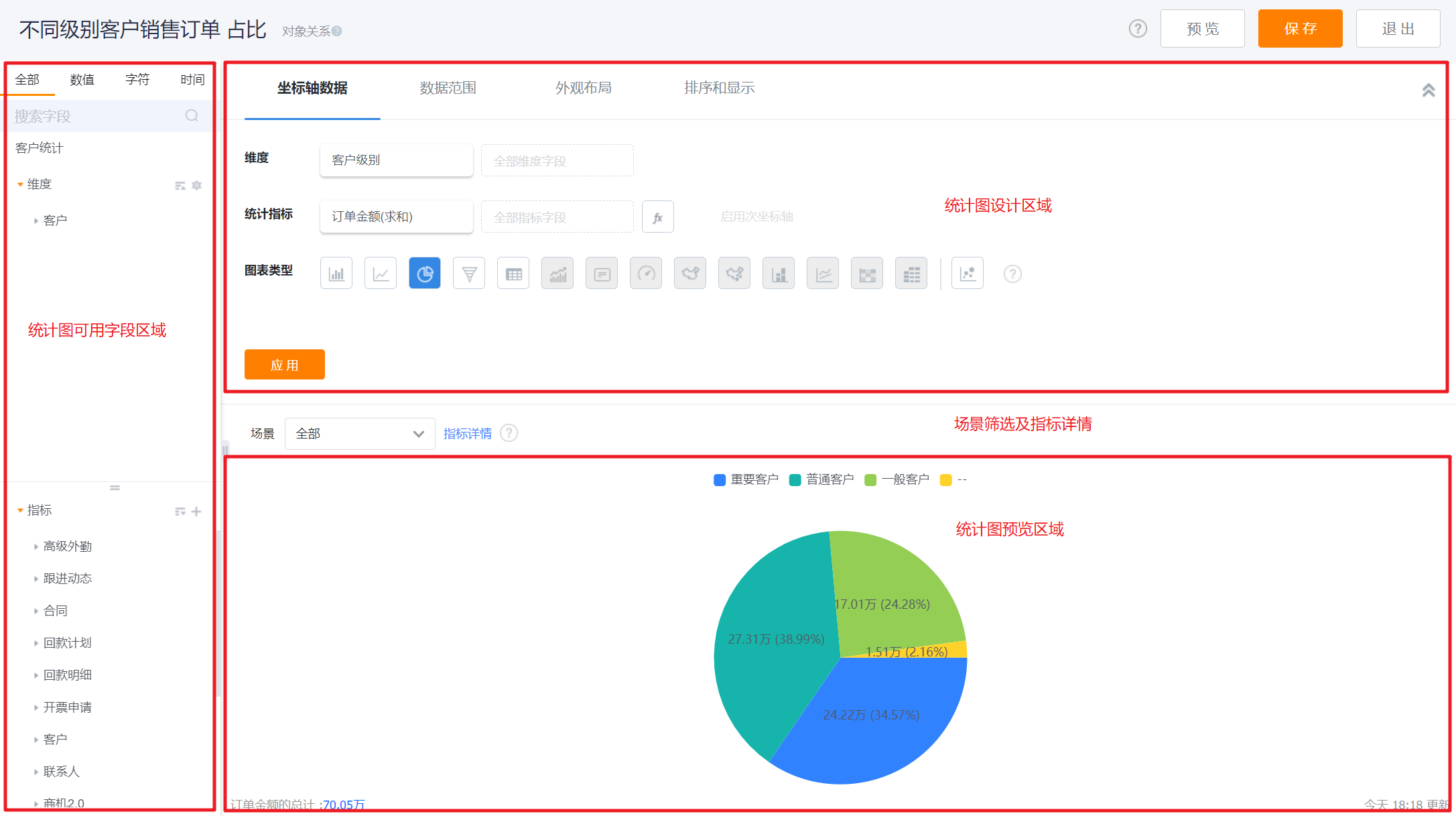
2.1 Designer Layout
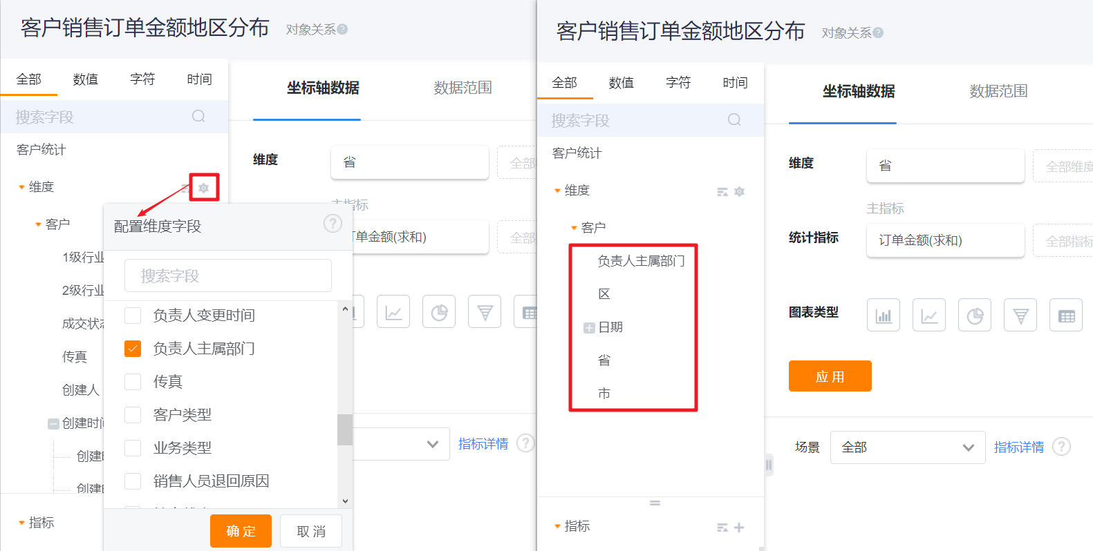
- Left: The available field area, which varies according to the selected template, can be dragged to the right.
- Upper Right: Statistical chart design area, where you can design the coordinate axis, data range, appearance layout, sorting and display of the statistical chart, and retract the design area.
- Middle Right: filter scene, you can specify the default scene of the statistical chart.
- Bottom Right: Statistical graph preview area.
*Notes: The available fields of the statistical graph include some attributes of the object itself and some characteristic values of the objects associated with the object. Taking the account theme as an example, the attributes of the account itself include the account name, account status, industry, company, person in charge, etc., and the characteristic value is the relevant situation of the business opportunities, visits, orders and other objects associated with the account, such as the number of associated opportunities, the amount of opportunities, etc.
2.2 Configure Statistical Chart
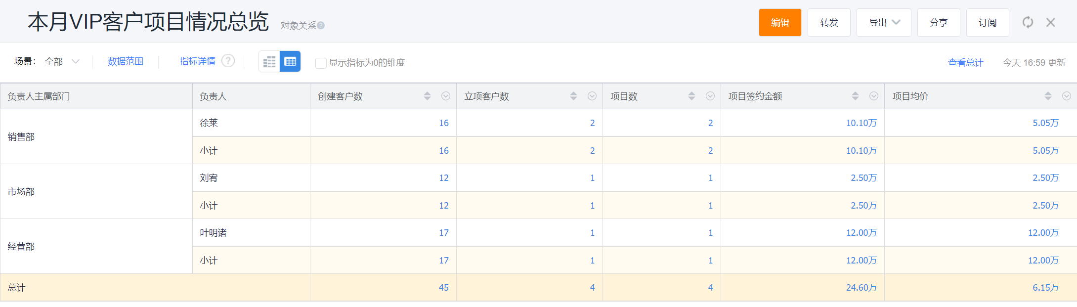
The following is a specific case to explain the process from receiving requirements to configuring and completing the statistical chart. For example, we have received a report request from an account, and we need to count the project progress of VIP accounts this month. After receiving such a request, can we make a BI statistical chart?
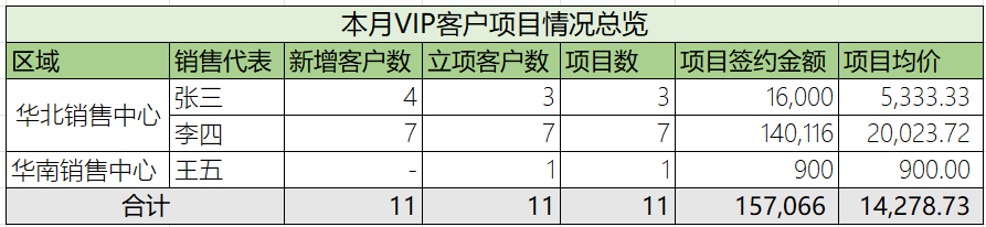
2.2.1 Step 1: Requirements Dismantling
- Accounts need to make statistics on This Month·Each Region·VIP account project's process
- Measures to be counted on the progress of the project - business language:
- Number of new accounts, number of approved accounts, number of projects, contracted amount of projects, average price of projects
- Measures corresponding to CRM system - system language:
- Number of new accounts, number of accounts with new opportunities, number of opportunities, amount of opportunities, average price of opportunities
*Remarks: The number of approved accounts and the number of projects are different, because there can be multiple opportunities under the same account
- Number of new accounts, number of accounts with new opportunities, number of opportunities, amount of opportunities, average price of opportunities

2.2.2 Step 2: Determine Dimension/Measures/Data Range
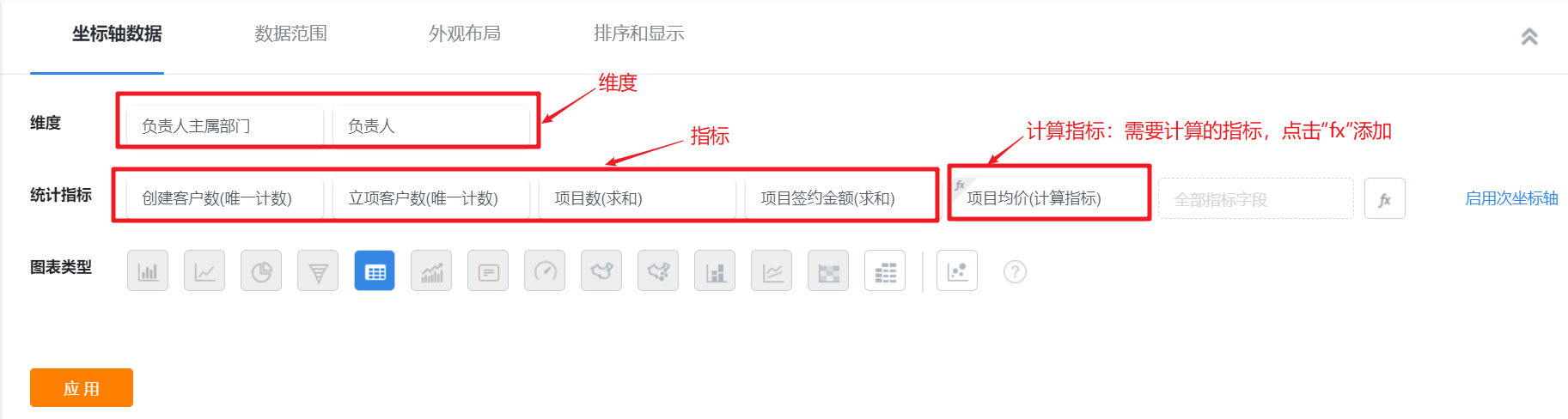
- Dimension: refers to how to look at the data, the X-axis in the statistical chart; for example: department, personnel, region, industry, status, type, date, etc. Corresponding to the current case, regions and sales representatives are both dimensions.
- Measures: the number and amount to be viewed, the Y-axis in the statistical chart; for example: number of accounts, order amount, product sales, payment amount, etc. Corresponding to the current case, the number of new accounts, the number of project-approved accounts, the number of projects, the contracted amount of projects, and the average price of projects are all measures.
- Calculation Measures: calculate the measures, such as: account unit price = order amount / number of accounts, leads conversion rate = number of converted leads / total number of leads, etc. Corresponding to the current case, the average price of the project = the contracted amount of the project / the number of projects, which is the calculation measure.
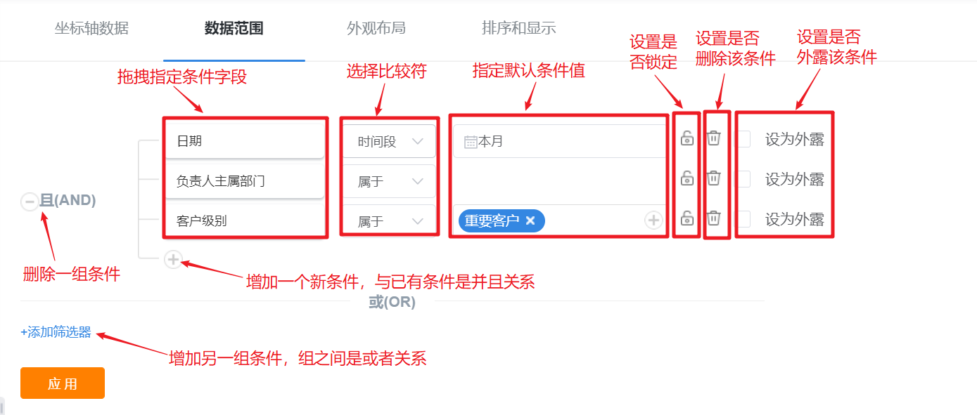
- Data Range: Limit the conditions for viewing the configured statistical charts, for example: date = current year, life status = normal, etc. Corresponding to the current case, date = this month, account level = important account.

2.2.3 Step 3: Select Theme
Generally, the dimension field can determine the theme required for the statistical chart, but some dimension fields are common to each theme analysis. At this time, you need to look at the fields used in the data range, and select the required theme according to the fields in the data range .
- In this example, region and sales representative are dimension fields, date and account level are data ranges, and general fields such as region, sales representative and date are available in every business analysis. In this case, it is necessary to rely on "account level" in the data range to select the analysis theme - account theme.
- New Theme Entry:
- CRM→Data Analysis→Measures Management→New Theme
- CRM→Data Analysis→Reports→Measures Management→New Theme
- New Theme Entry:
2.2.4 Step 4: Select Measures
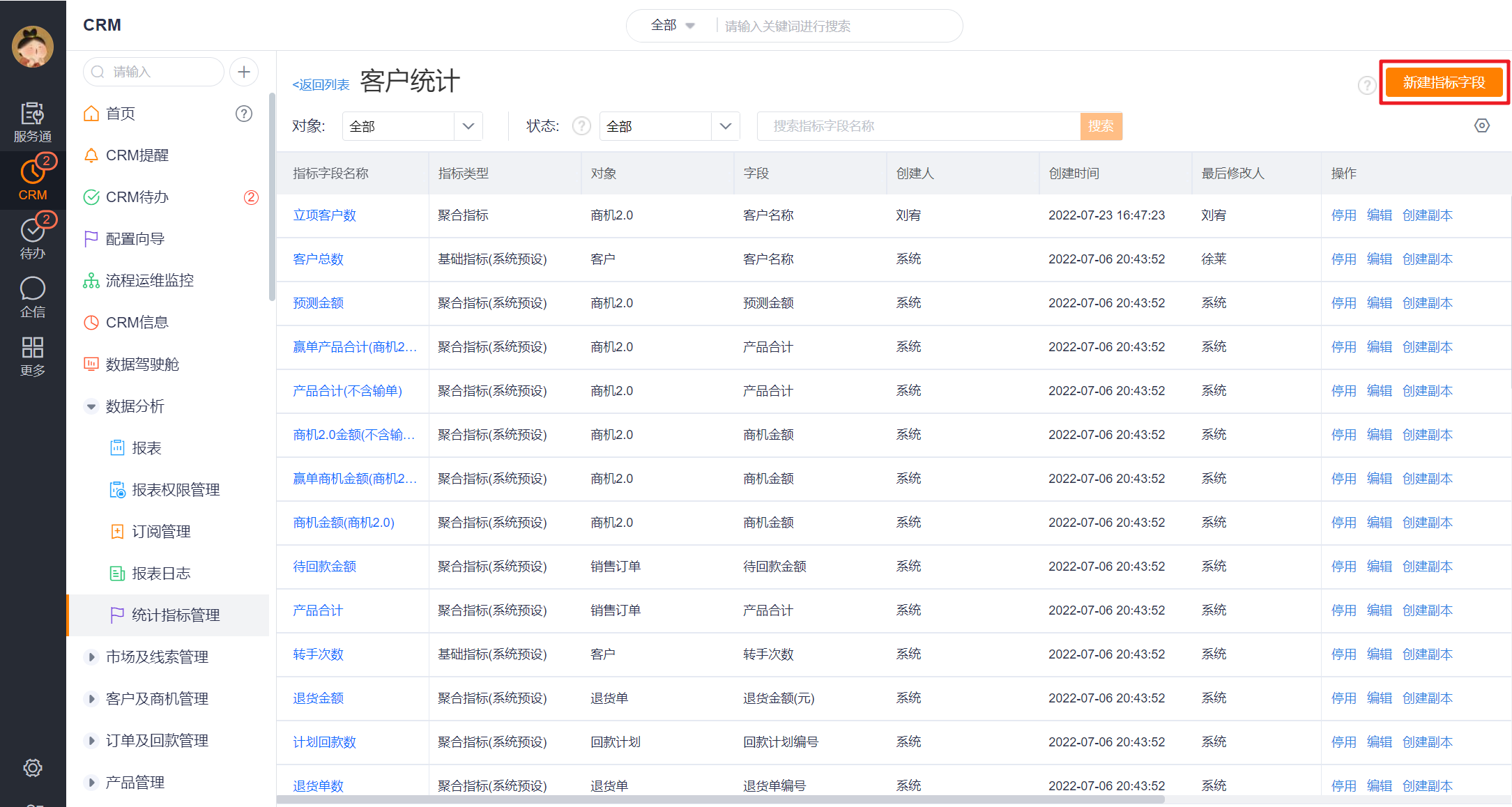
Check whether the preset measures under the current theme meet the measures required for report analysis. If not, you need to create a new measure. The status of the measures in this example: the number of new accounts (system preset); the number of approved accounts, the number of projects, and the contracted amount of the project (need to be newly created); the average price of the project (calculated between the measures)
- New Measures Entry: On the basis of step 3, click to enter the measures list page of a theme to create new measures

- If the enterprise has enabled the multi-time zone function, you can customize the statistical time zone of the indicator when creating a new indicator. The default is the tenant-level time zone. When the aggregation date selection is empty, the statistical time zone is not available. When the field attribute of the aggregated date is set to not use multiple time zones, the statistics time zone is fixed as [Business Occurrence Time Zone]. Changing the indicator timezone triggers the initialization of the indicator.
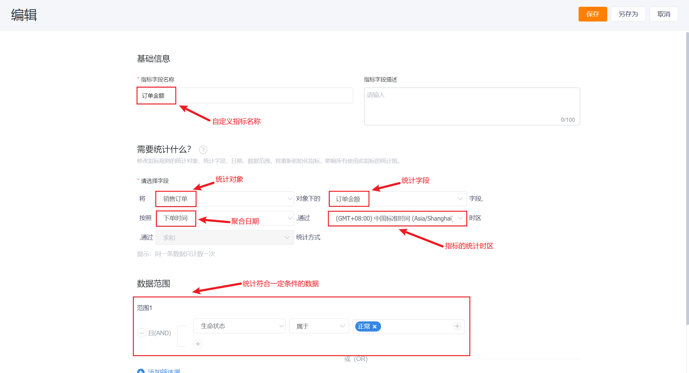
- For more details about measures management, please refer to: Measures Management
2.2.5 Step 5: Configure Statistical Chart
*Entrance: CRM→Data Analysis→Reports→New Statistical Chart→Custom Theme→Select Built Theme [Account Statistics]→Enter Configuration Page

- Drag and drop the dimensions and indicators determined in the second step to the corresponding positions, and set the display format of the indicators
- Drag and drop the date, owner's main department, and account level fields into the data range.
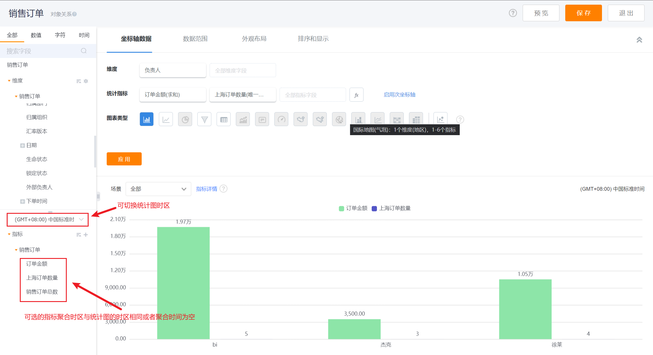
- If the enterprise has enabled the multi-time zone function, the time zone of the statistical graph can be switched in the editing state of the statistical graph. After switching the time zone, the configured indicators will be cleared, and only indicators with the same time zone as the chart, indicators with empty aggregation dates, and indicators without multiple time zones can be selected.
- Appearance layout, sorting and display can be set as needed. For details of appearance layout, sorting and display configuration under each chart type, please refer to [Introduction to Statistical Chart Types](http://help.fxiaoke.com/2615/5df2/dfdb/ b23f)
- Click Apply to complete the configuration.
Some operating instructions for the statistical chart design area in the process of configuring the statistical chart
2.2.5.1 The administrator configures the visible dimension
- CRM administrators and report administrators can press [Subject] to hide unnecessary dimension fields. This configuration is at the topic level, that is, after the administrator configures it, all employees can only see the configured dimensions when using this topic.
2.2.5.2 Switch Chart Type
- Depending on the number of dimensions and measures, the types of charts that can be used are different. For details, please refer to [Introduction to Statistical Chart Types] (http://help.fxiaoke.com/2615/5df2/dfdb/b23f)

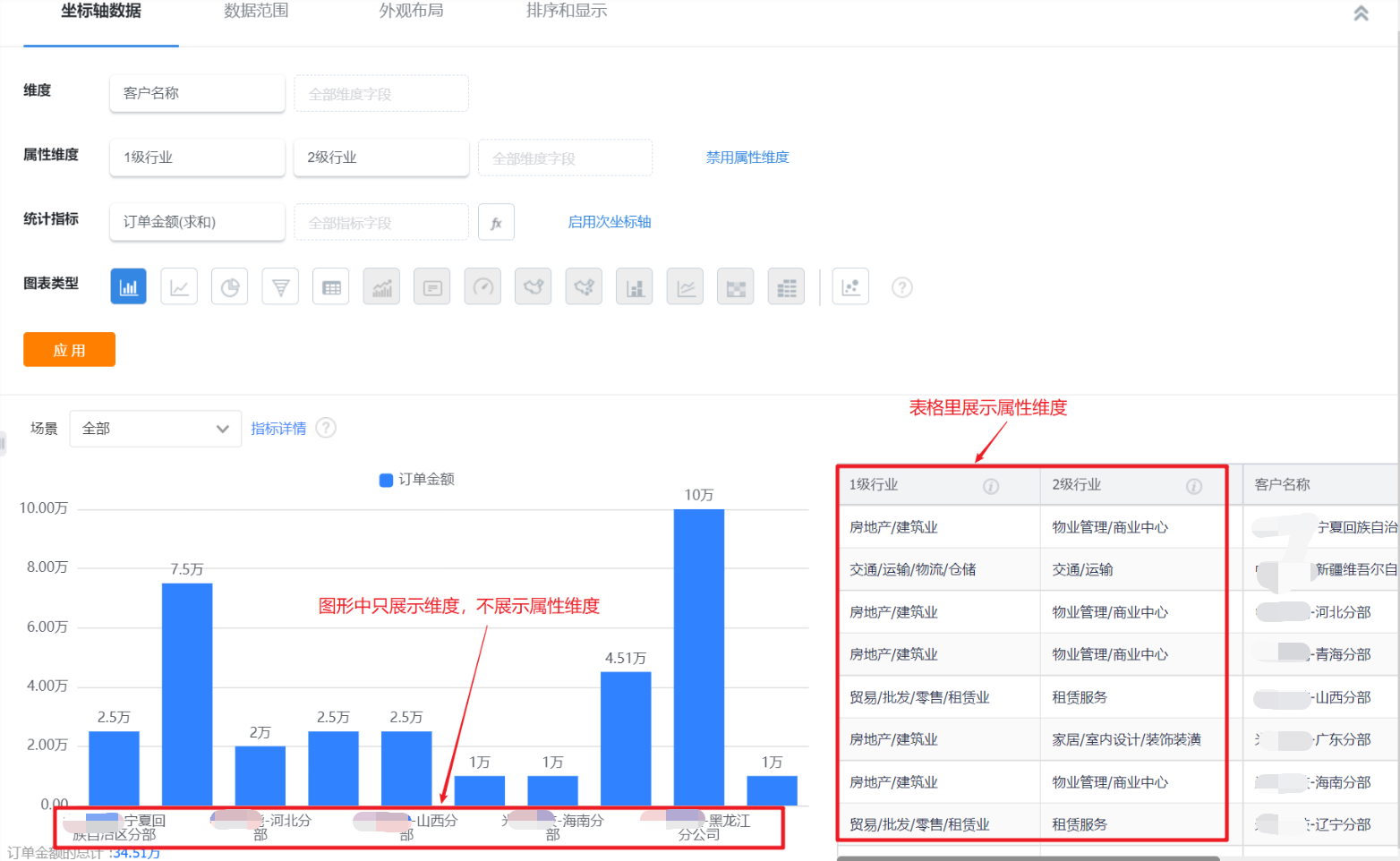
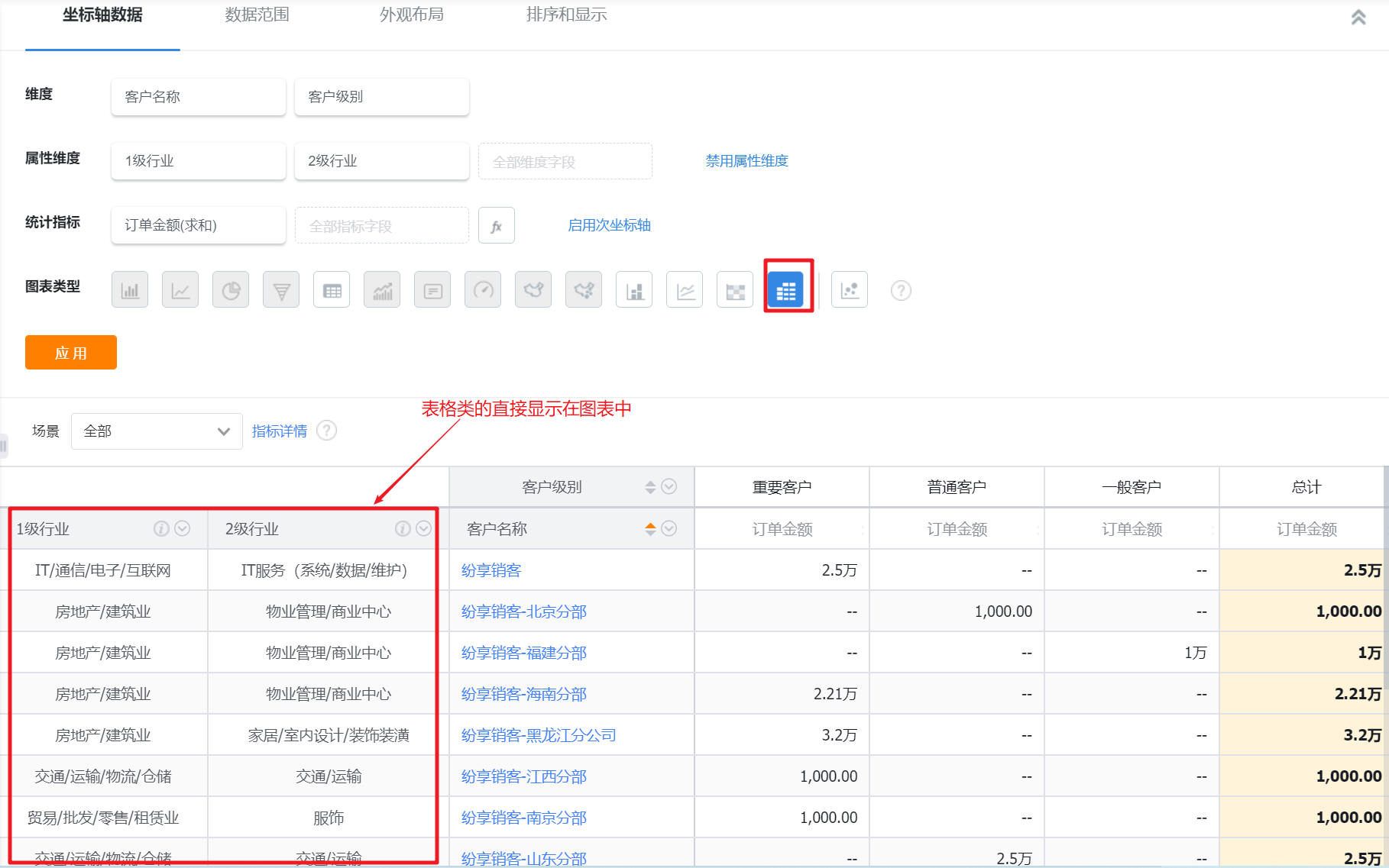
2.2.5.3 Attribute Dimension
- When the dimension is dragged into the main attribute field under the current theme object, the attribute dimension can be opened without distinguishing the chart type. For graphics, after the attribute dimension is added, it will not be displayed in the chart, but will only be displayed when the statistical table is displayed; for tables, it will be directly displayed in the chart.
- When the main attribute field is removed from the grouping dimension, the attribute dimension is also disabled.
2.2.5.4 Enable Secondary Axis
- It is mainly used for dual-axis graphs, and is displayed separately for multiple measures.

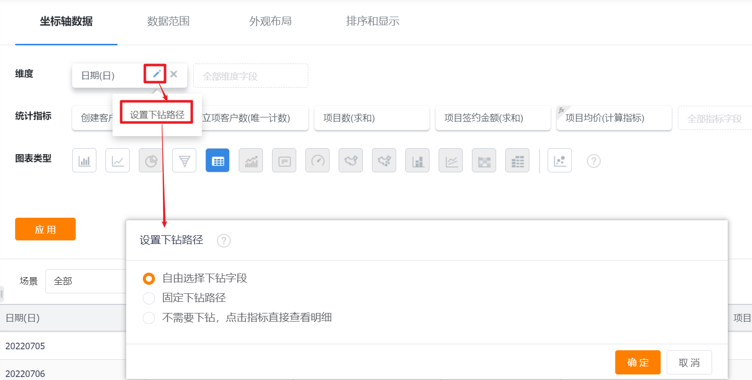
2.2.5.5 Set Drill-down Path
- The drill-down path can be set for the dimension field, and the default is to freely select the drill-down field:
- Freely select the drill-down field: when drilling down, you can select the dimension field to drill on as needed;
- Fixed drill-down path: When configuring the statistical chart, set the drill fields and order, and automatically drill down according to the set path when clicking;
- No need to drill down, click on the indicator to view the details directly.
2.2.5.6 Add Calculation Measures
- Add, subtract, multiply and divide the measures based on the existing measures fields, and add calculation measures.
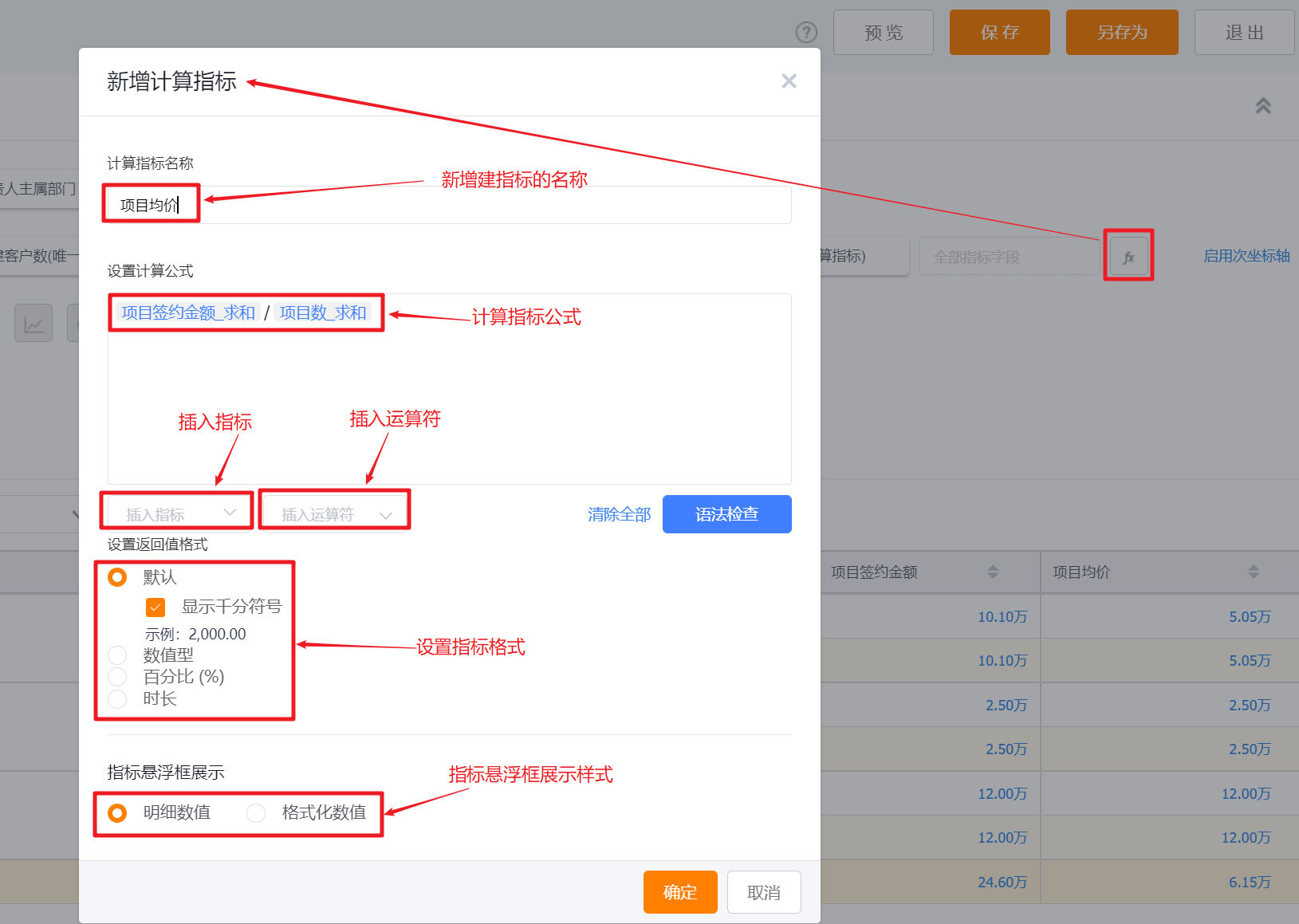
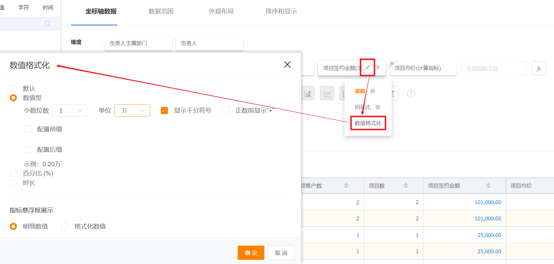
2.2.5.7 Numeric Formatting
- Default: The indicator displays the effect by default;
- Number: Convert the display effect of the indicator into a numerical type. You can set the number of decimal places, the display unit, whether to display the thousand mark, whether to display "+" before positive numbers, and whether to set the prefix and suffix;
- Percentage: Convert the indicator to a percentage display
- Duration: convert the indicator into a duration display
*Measures Floating Box Display:- Detailed Value: the default display style of the measures;
- Format Value: the display style after the measure is formatted.
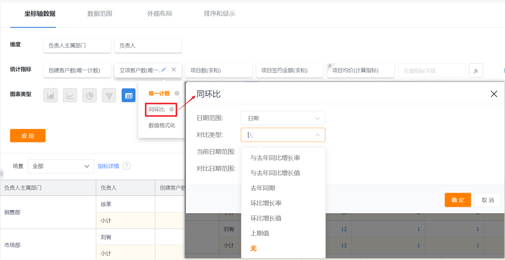
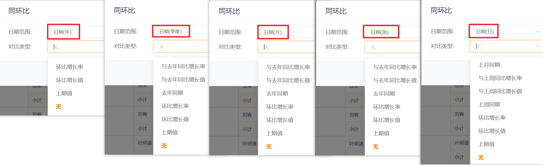
2.2.5.8 Measures Year-on-Year Rate
- When the dimension is date or the date is used as a filter for the data range, the year-on-year rate can only be set, and the filtering of different date granularities supports different types of year-on-year rate.
2.2.5.9 Appearance Layout
- Appearance layout is mainly to design the display form of statistical charts.
- Selecting different chart types will have different appearance layouts that can be selected.
- You can adjust the appearance and display of statistical charts.
- You can set the name of the axis and the angle of the tag.
2.2.5.10 Sorting & Display
- Select a field of the axis to sort.
- You can select to display all or part of the data.
- It is supported to select whether to display the dimension whose measure is 0, and it is not checked by default.

2.2.5.11 Scene Filter
- BI pre-configures the filter scenes for each chart, and you can specify which scene tag to use as the default value when viewing the statistical chart.
3. View Statistical Chart
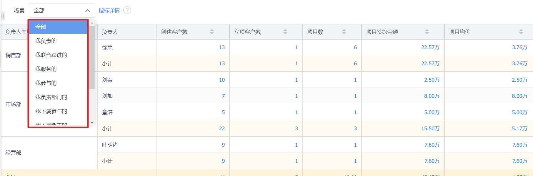
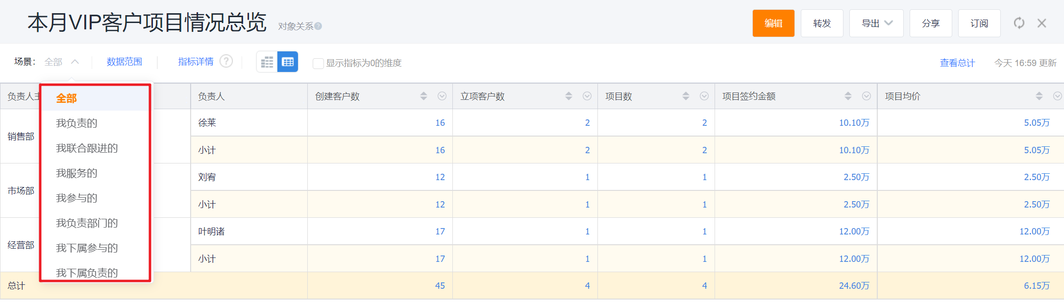
3.1 Scene Filter
- Switch scene tags to quickly view data in different scenes.
The display effect on web:
Mobile Display Effect:

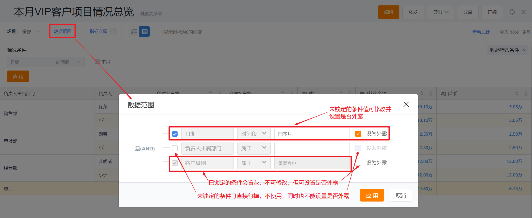
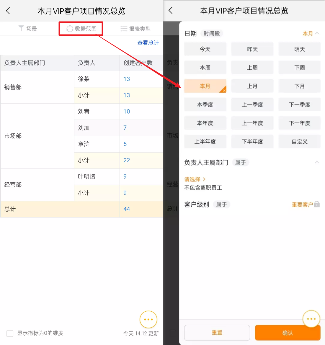
3.2 Data Range
- When viewing the report, you can modify the unlocked condition value in the data range popup and set whether to expose it.
The display effect on web:
Mobile Display Effect:
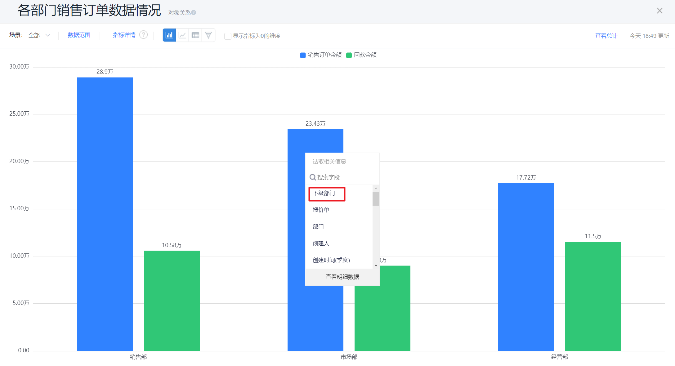
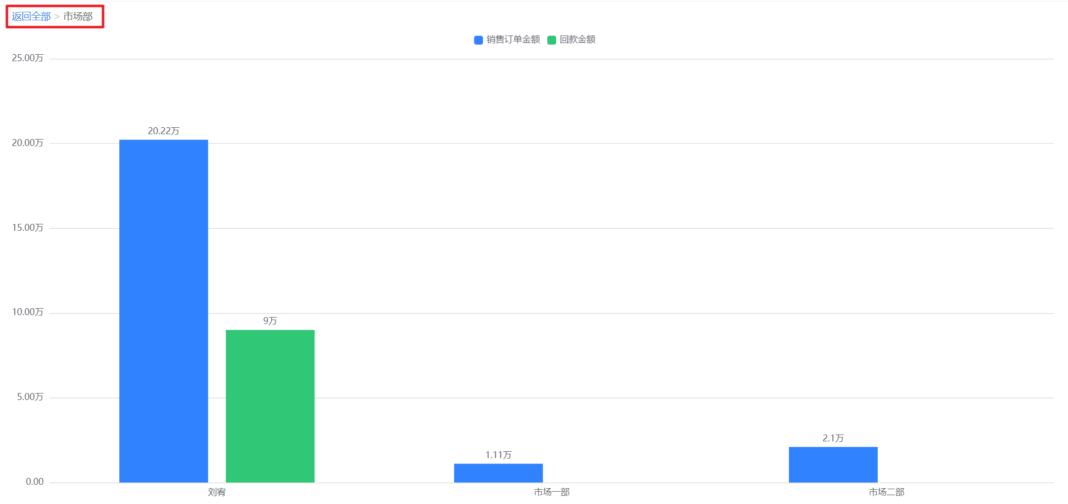
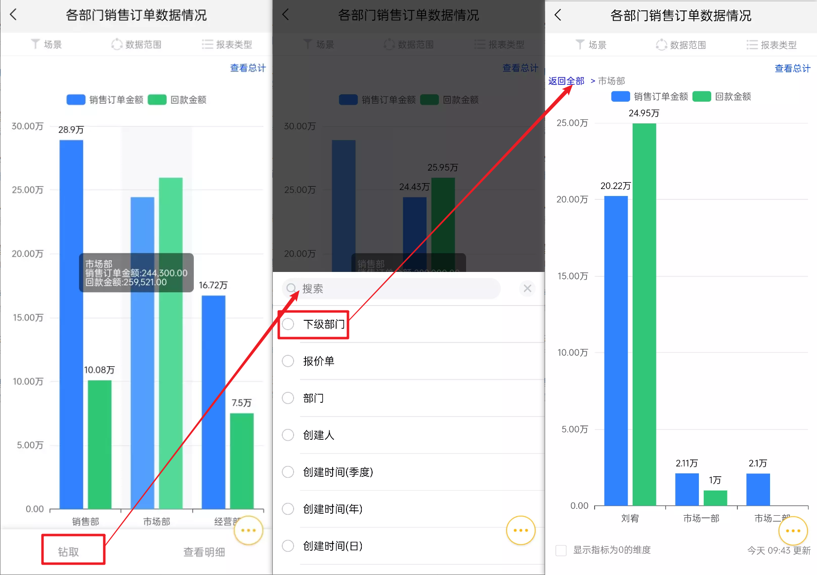
3.3 Drilling
- Drilling can better view the data of other dimensions of the data of this layer. For example, if the main department of the person in charge is the dimension, you can drill down to the subordinate departments of the current department to view the data of the secondary departments.
The display effect on web:
Mobile Display Effect:
3.4 View Details
- The statistical chart shows the statistically aggregated data in a certain dimension. Select "View Details" to view the detailed data of the statistical data.
- When the Y-axis contains multiple indicator fields, the detailed data of the corresponding indicator field can be displayed by placing the mouse on the corresponding indicator field.
The display effect on web:

Mobile Display Effect:
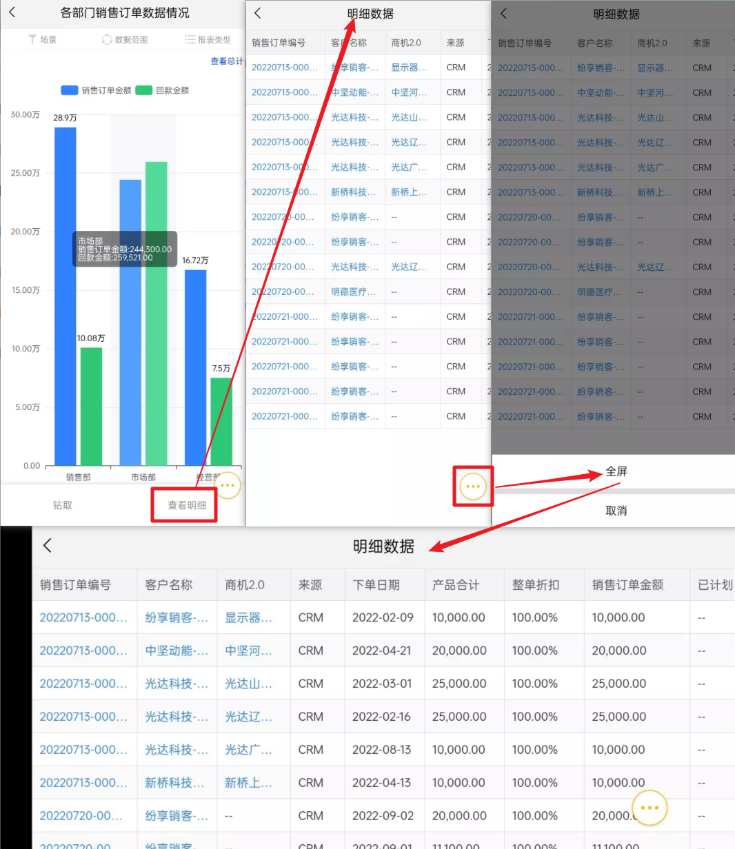
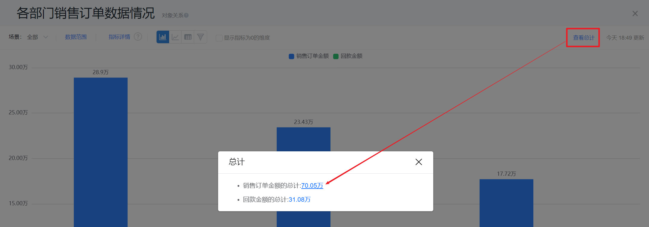
- Click the total in the upper right corner to view the detailed data of the total.
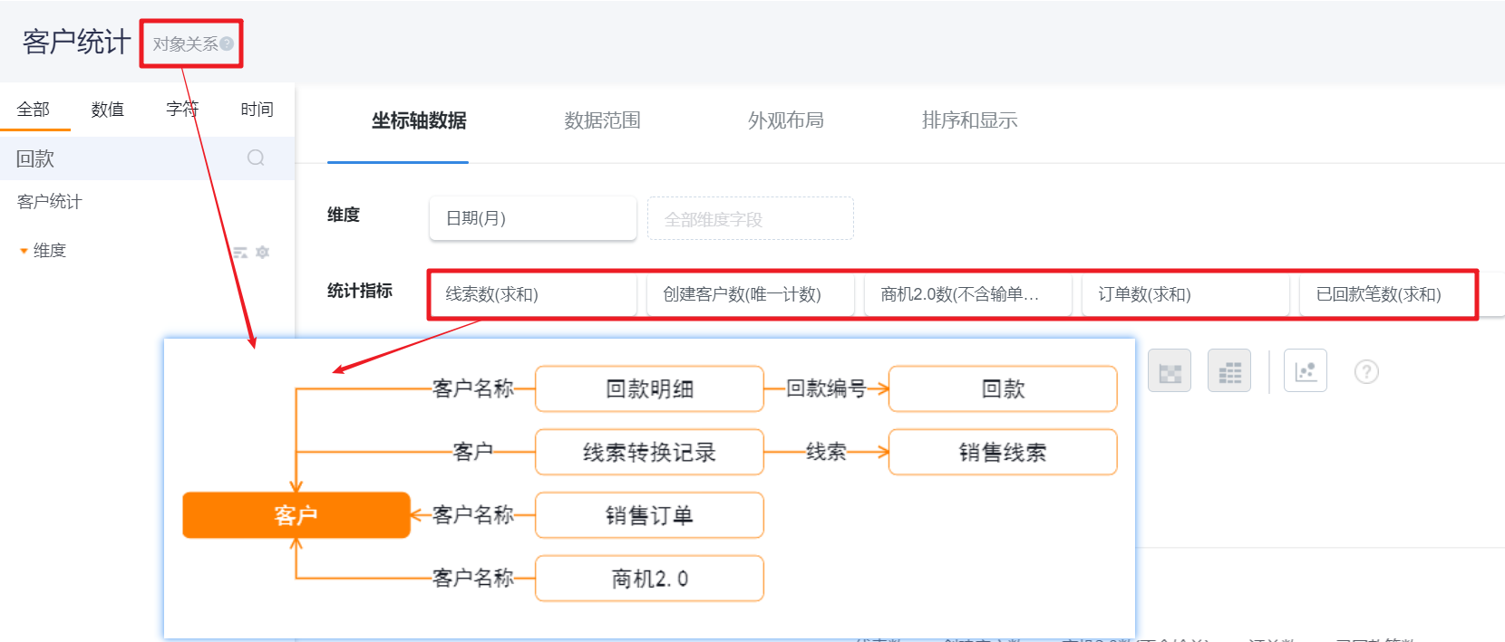
3.5 View Object Relationship
- The statistical chart shows multiple indicator data. Click the object relationship to view the direct relationship between each indicator object and the analysis object.
3.6 Others
- Forward: When forwarding the statistical chart to other users, what other users see is the data within their authority, and cannot see the data of the current user;
- Share: When sharing a statistical chart, the statistical chart is shared in the form of a picture, and other users in the visible range see the same picture;
- Export:
- When exporting from the statistical chart page, the filter scene and data range set in the current page will be brought along to ensure that the exported data is consistent with the currently viewed data;
- When exporting in the operation bar of the chart list, the default filtering scene and data range will be used;
- When selecting export on the view statistical graph page, you can choose to export as a picture or export report data.
- Subscribe: The subscription statistical chart received by each user is the data within the scope of their own authority, and the subscription report will not expand the scope of his visible data.
Notes: The filter scene and data range set when viewing the statistical graph are one-time and will not be saved. If you need to save it, please enter the statistical graph designer to modify it.