
In order to allow enterprises to better use statistical charts, the system provides us with a variety of chart types to meet chart needs in different scenes.
1. Bar Chart
1.1 Applicable Scenes
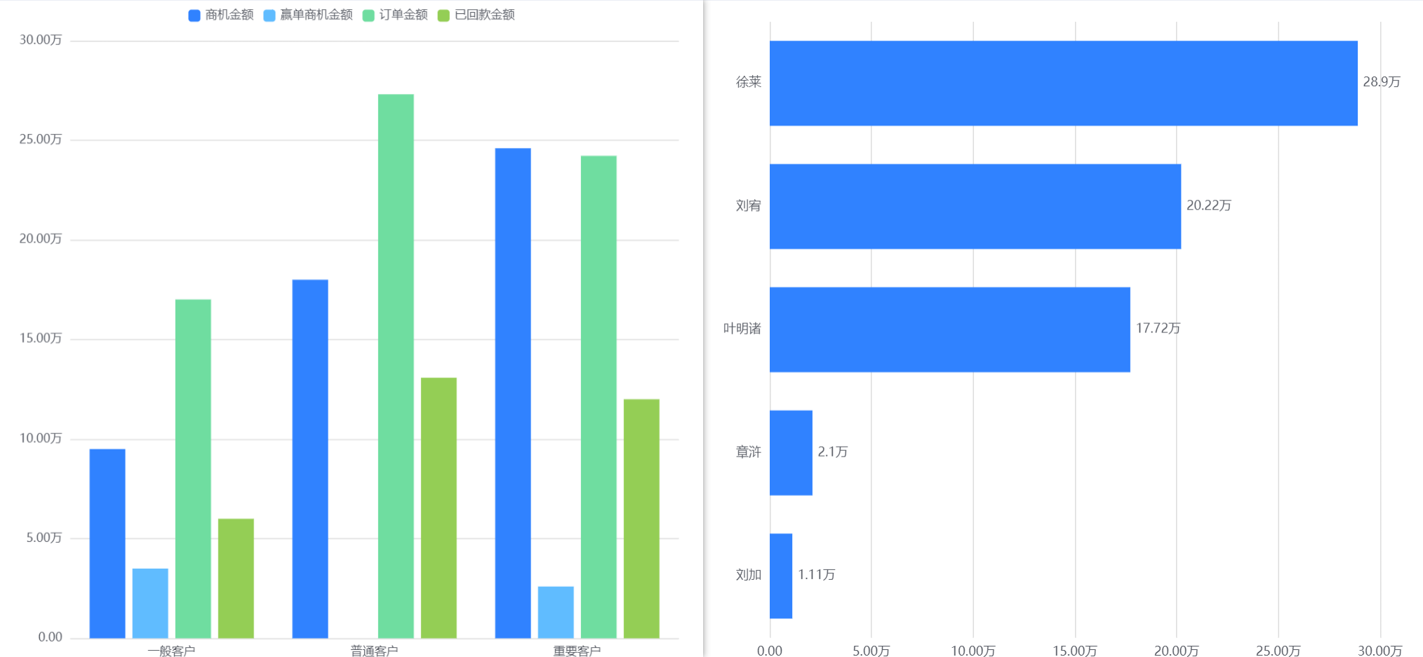
The column chart can show the change or comparison of each dimension within a certain data range. For example, the column chart can compare the sales order status of different account levels, the annual sales order status of each department, etc.
1.2 Chart Configuration
1.2.1 Axis data
- Dimensions: 1 dimension
- Measures: 1-6 measures
1.2.2 Appearance Layout
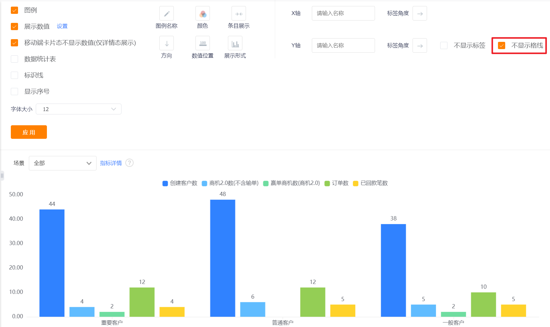
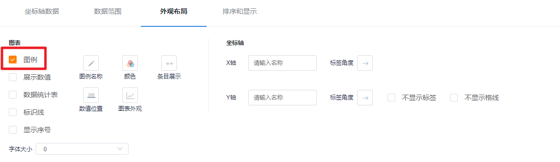
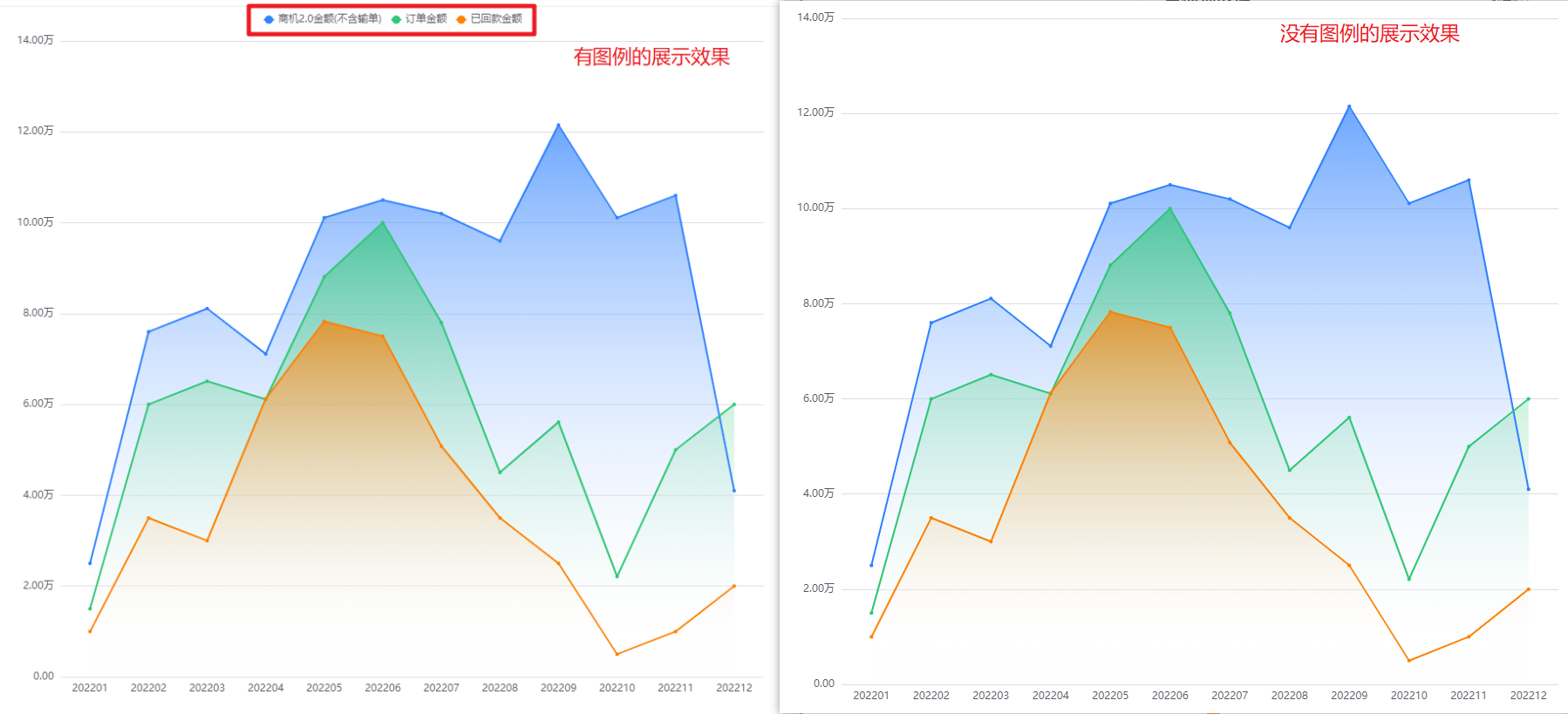
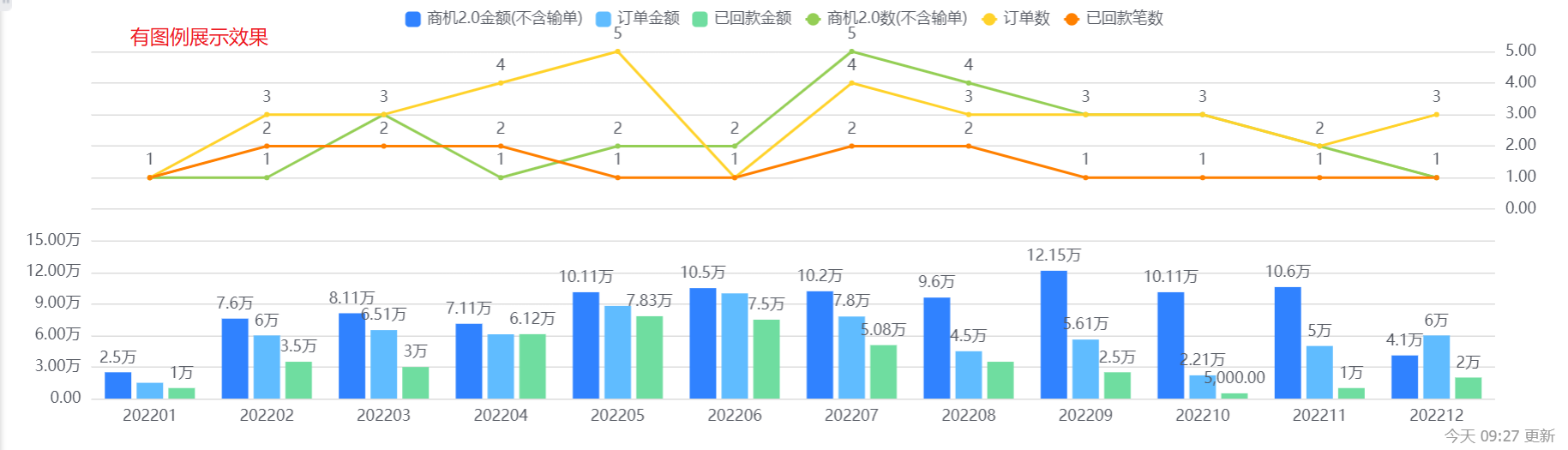
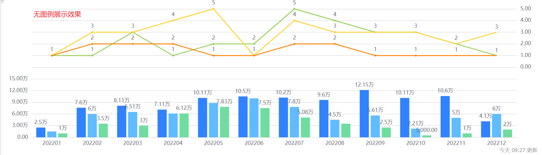
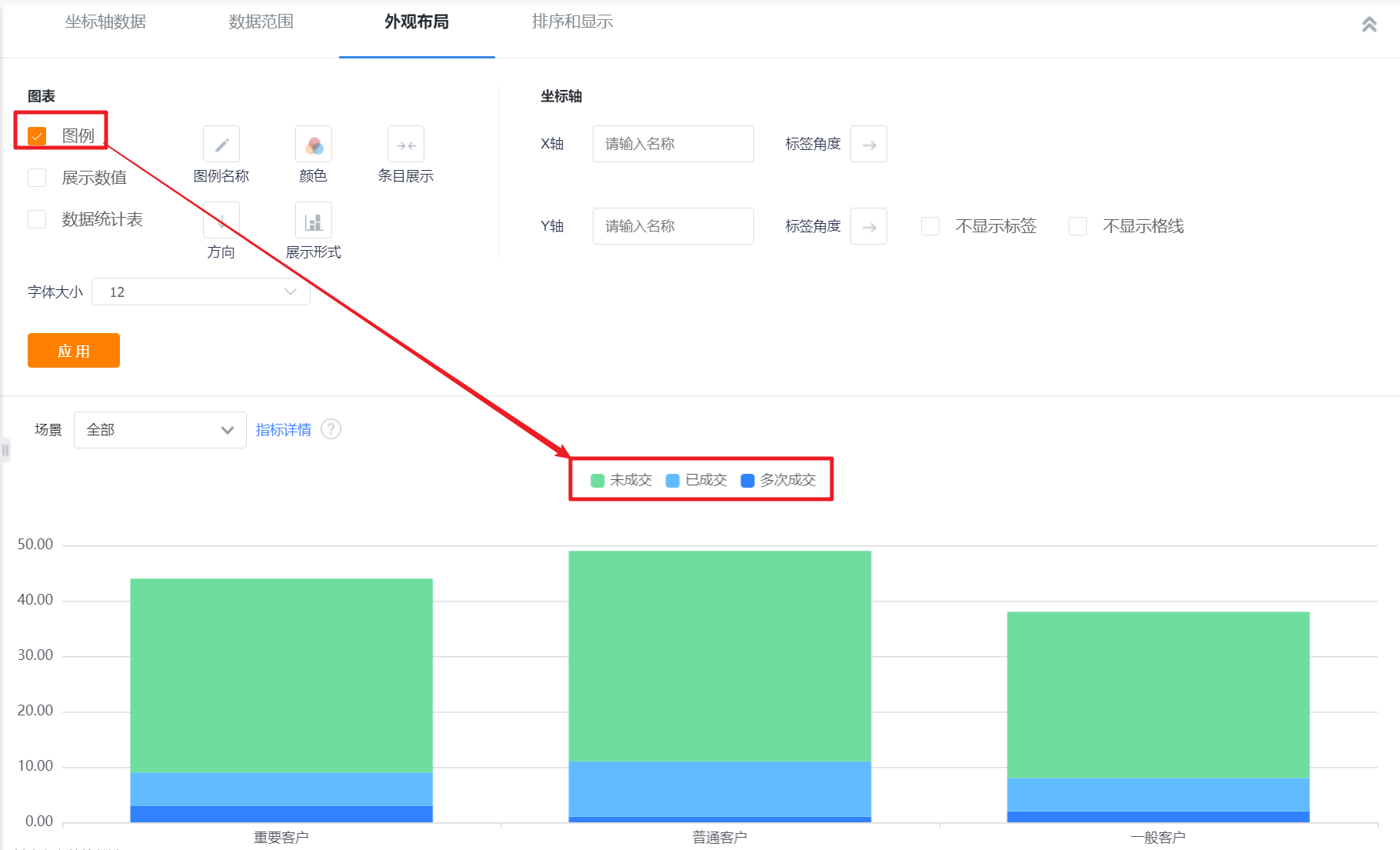
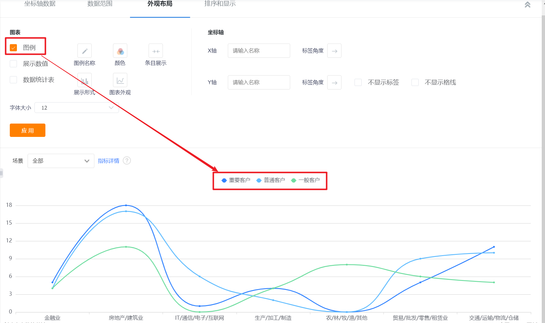
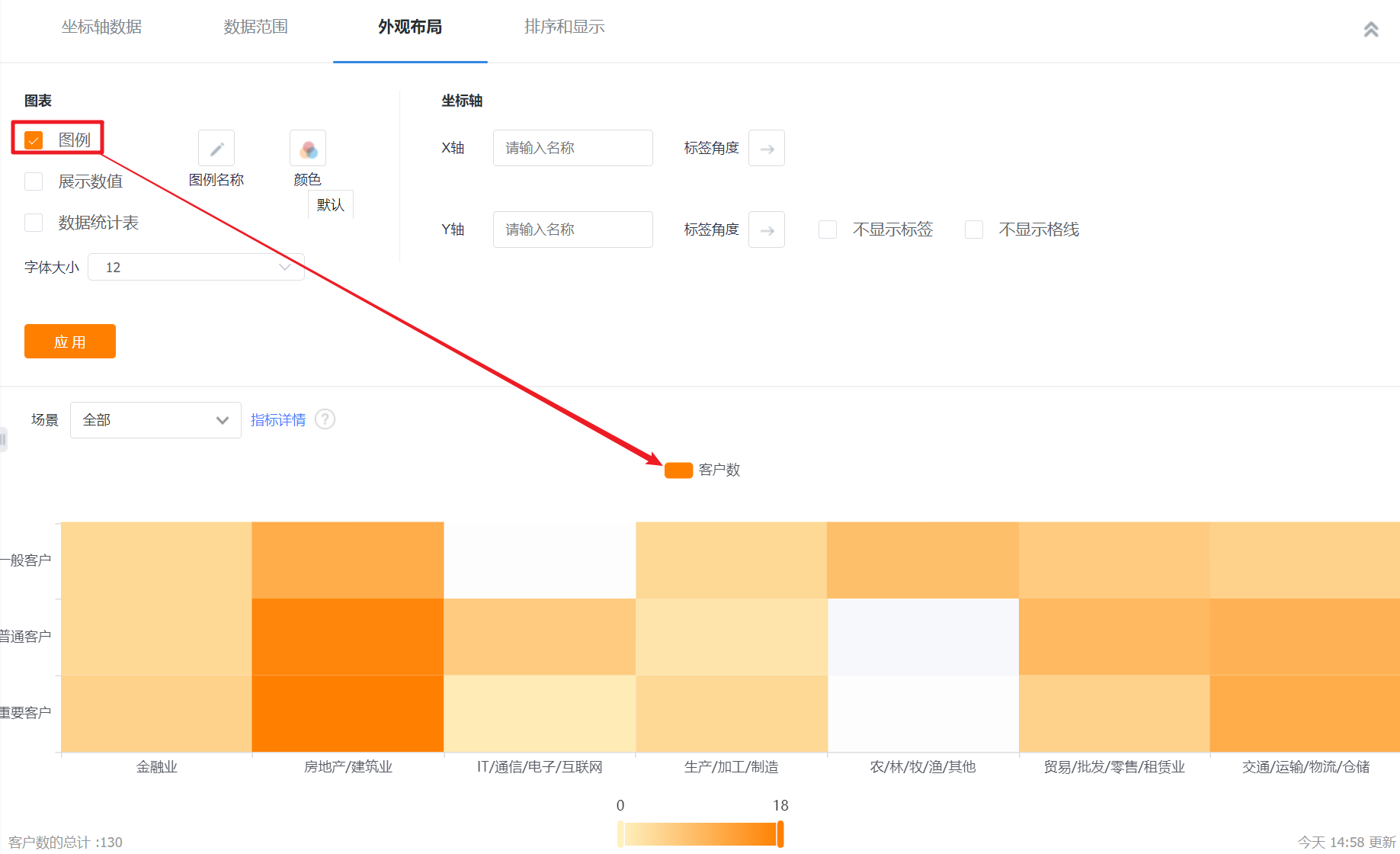
- Display Legend: You can check whether to display the legend, and it is checked by default
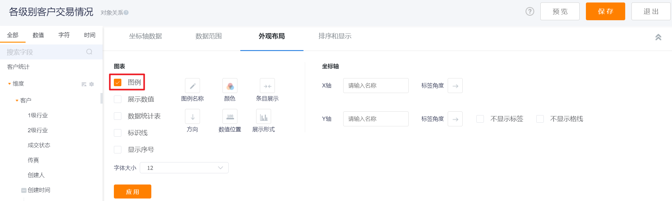

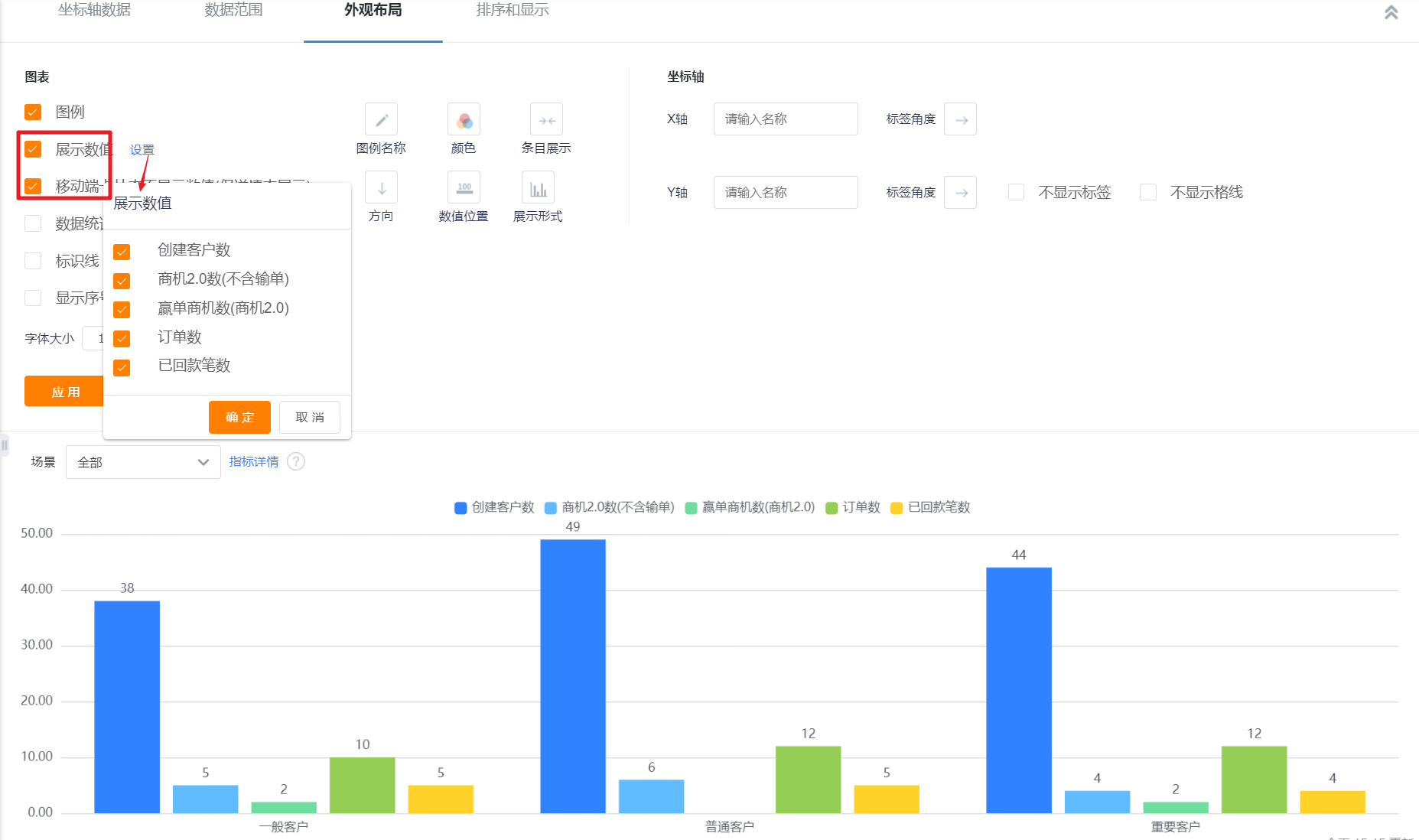
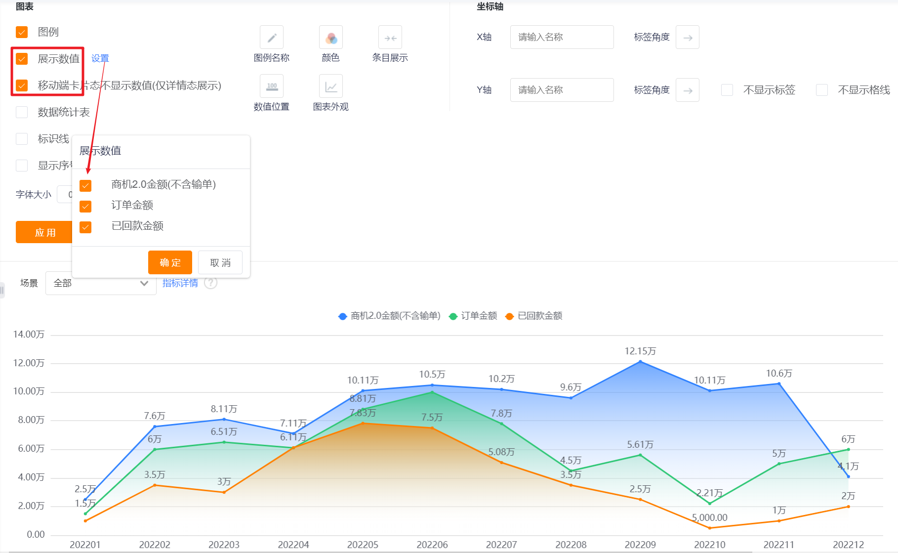
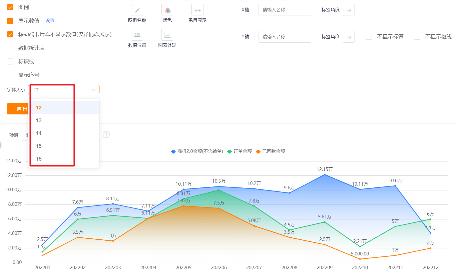
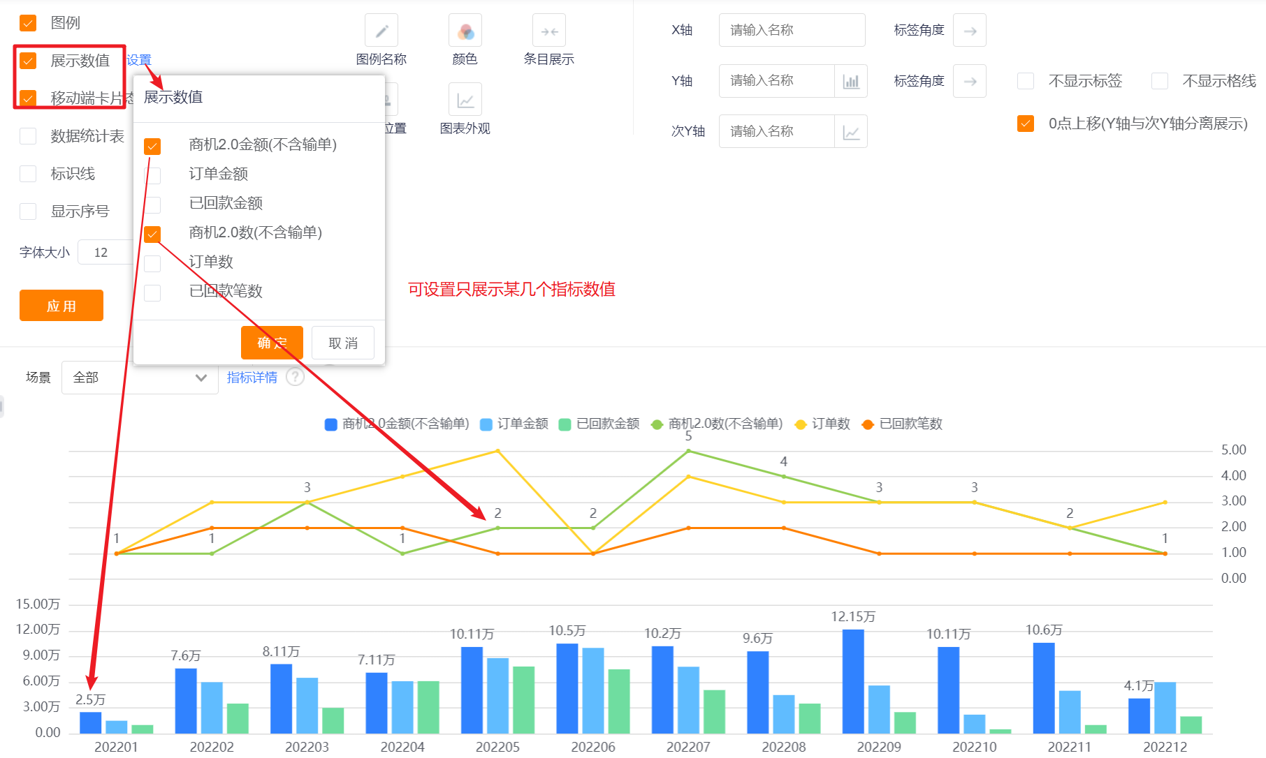
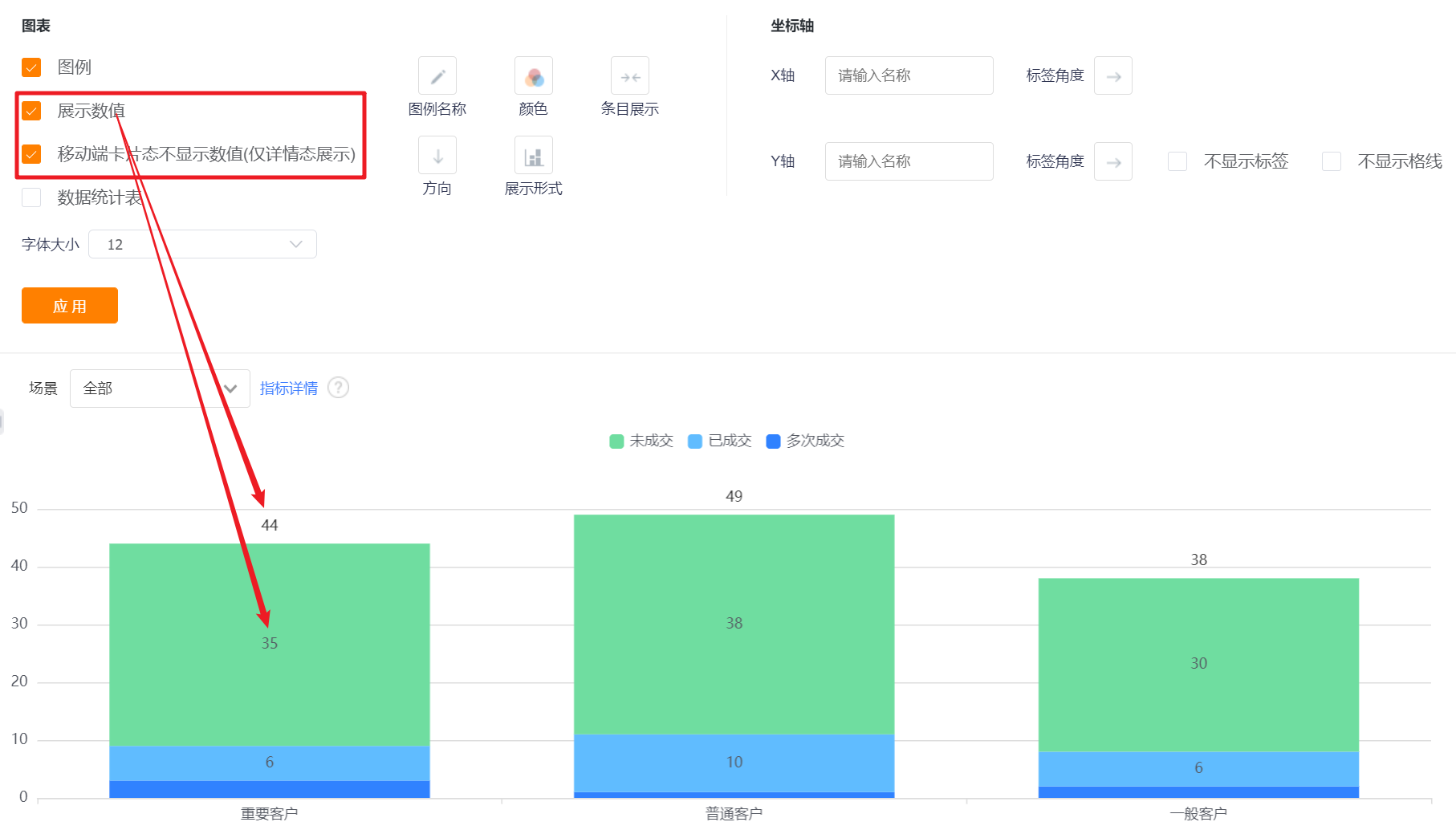
- Display Value: You can check whether to display the value, and it is checked by default.
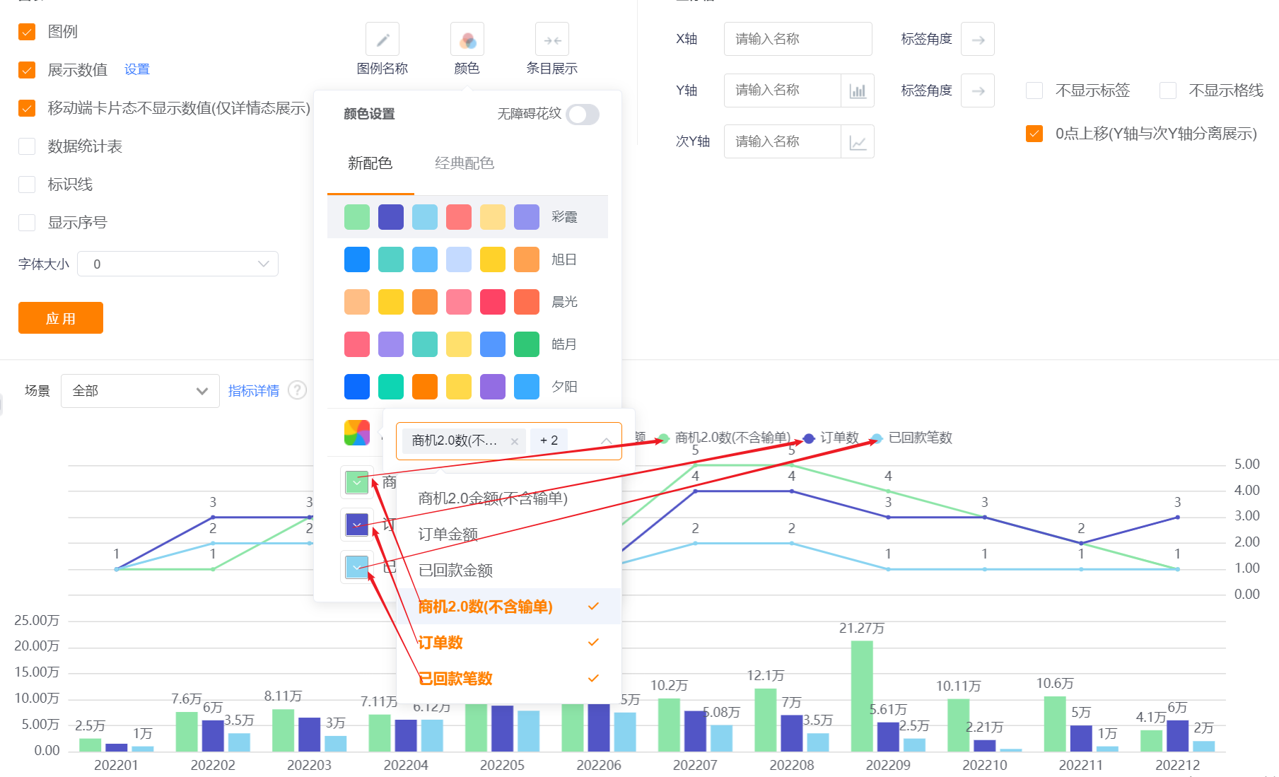
- Settings: When there are two or more measures, you can set to display the content of the measures, and they are all checked by default;
- The card state of the mobile terminal does not display the value (only displayed on the details state): it will only be displayed when [Display Value] is checked, and it is checked by default when it is displayed.
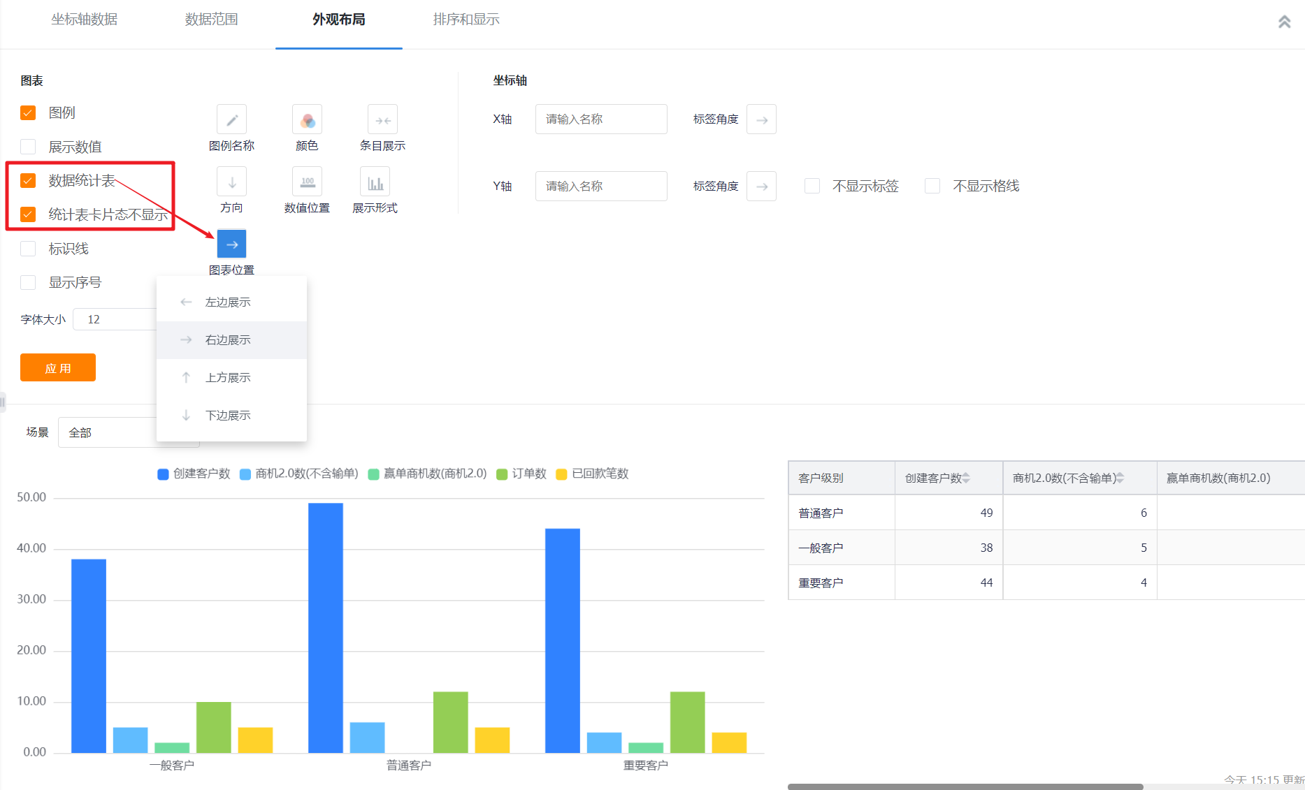
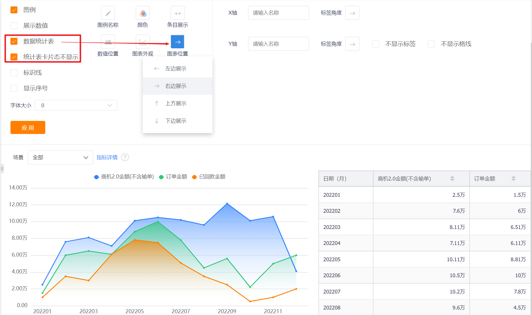
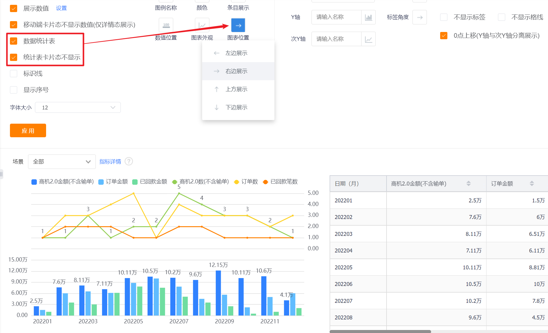
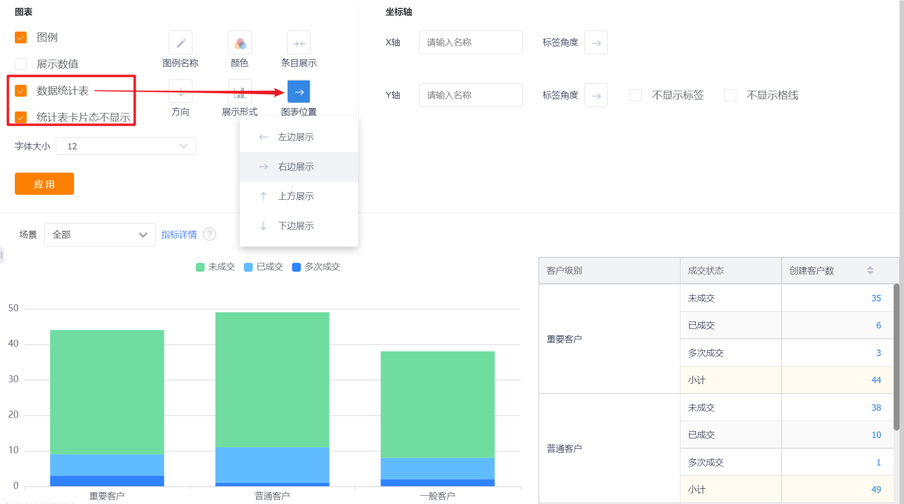
- Data Statistics Table: You can set whether to display the data statistics table, and it will not be displayed by default.
- Statistical table card status is not displayed: This configuration is displayed after the display data statistical table is checked, which is checked by default;
- Chart Position: After checking the display data statistics table, this configuration is displayed. By default, it occupies the right side of the chart, and can be switched to the left, top or bottom.
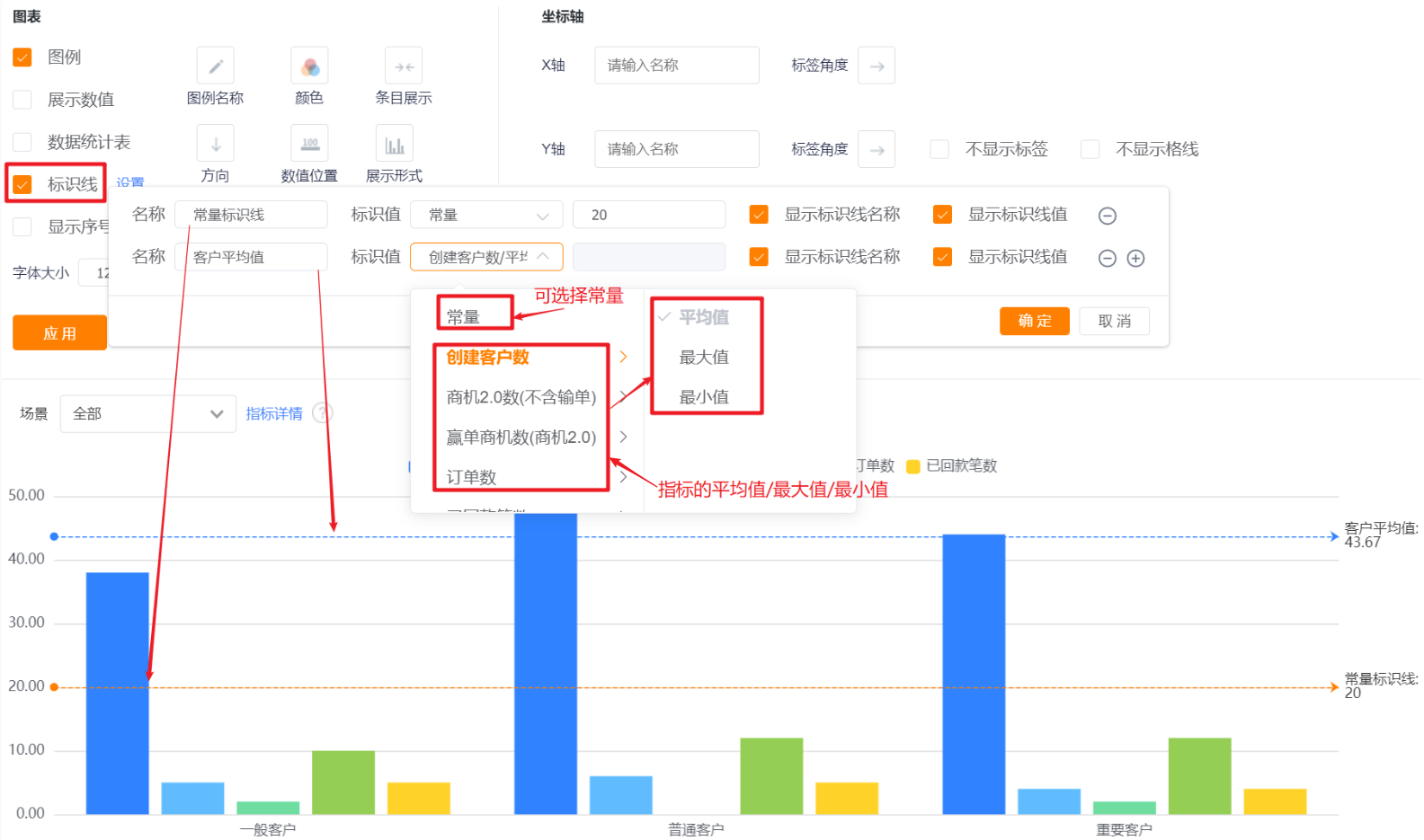
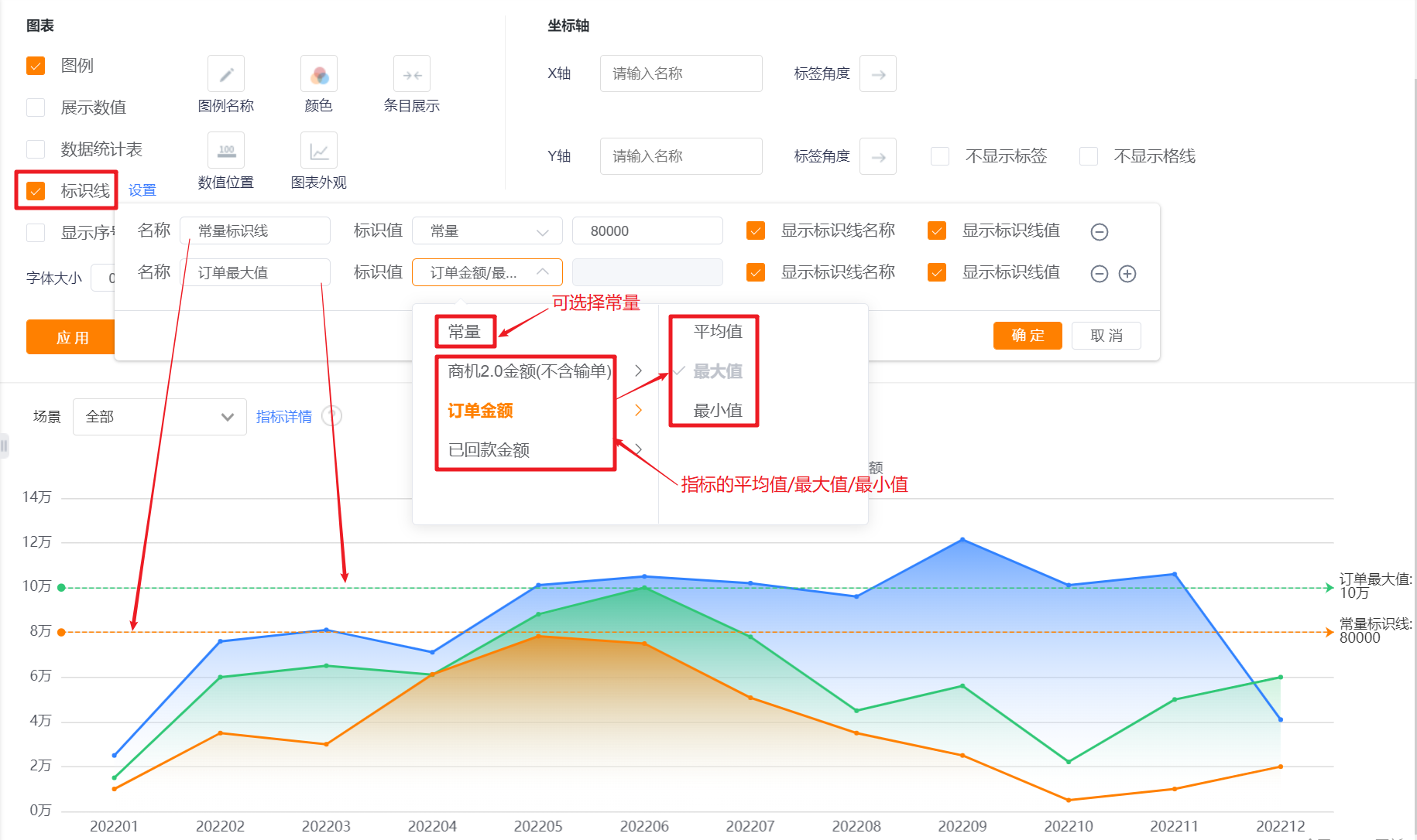
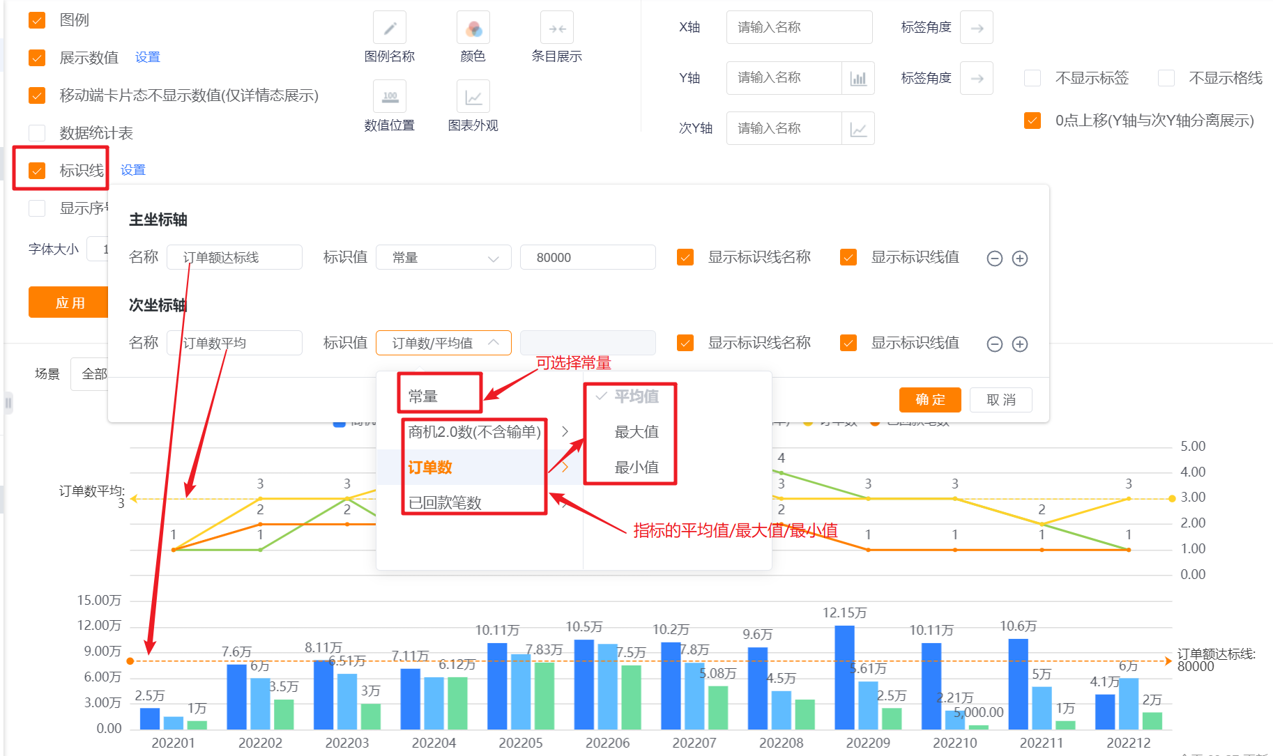
- Identification Line: You can set the identification line of the chart, which is not checked by default, and a maximum of 6 identification lines can be set for a chart.
- Name: Set the name of the identification line;
- Identification Value: the default is a constant, which can be switched to the average value, maximum value and minimum value of the indicator. When a constant is selected, a specific value can be set;
- Display Identification Line Name: it is not displayed by default, and it can be checked to display;
- Display Identification Line Value: not displayed by default, you can check it to display.
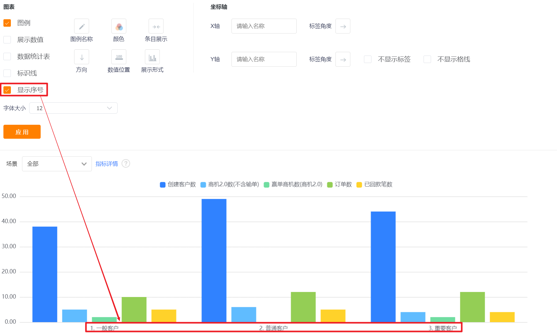
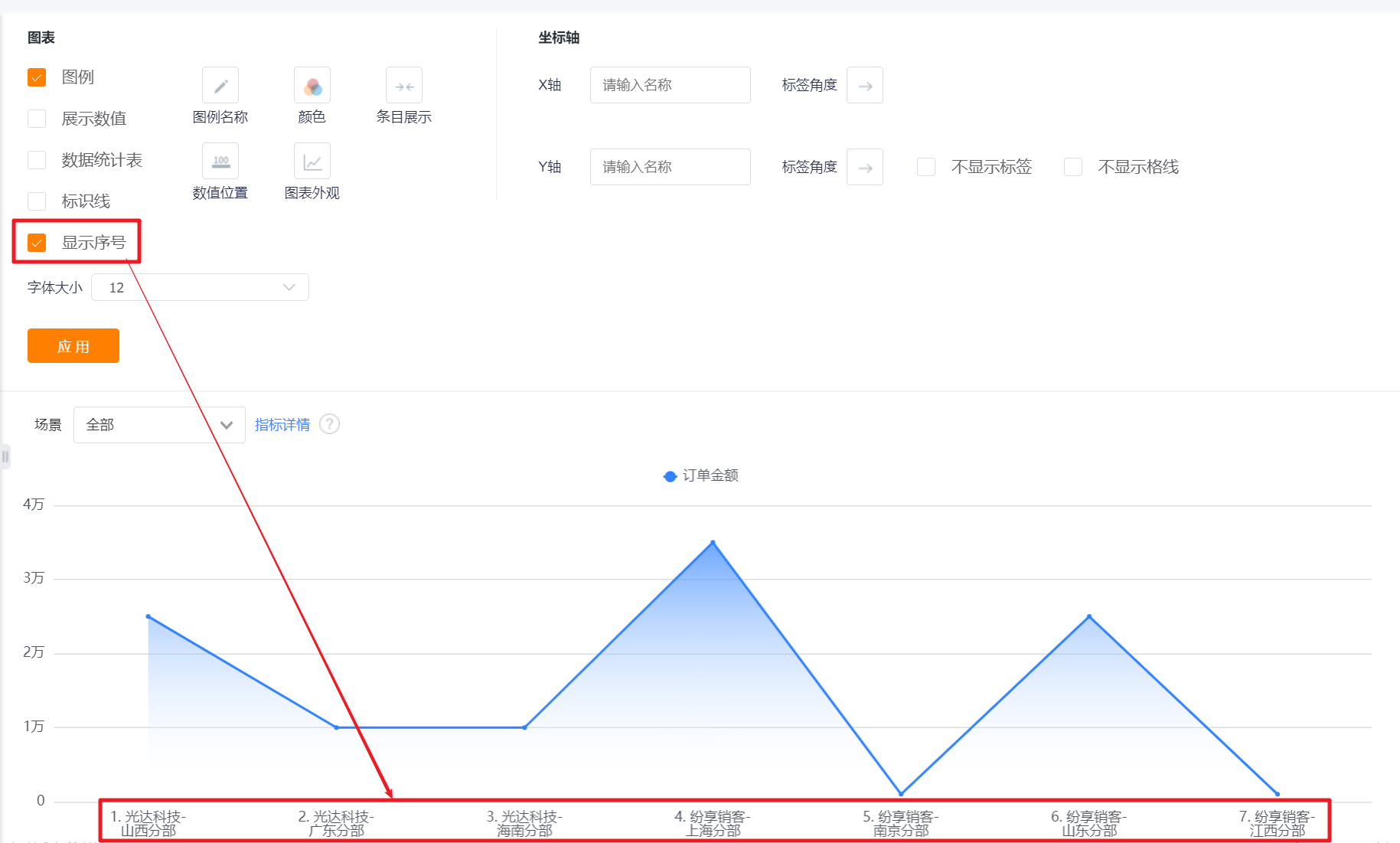
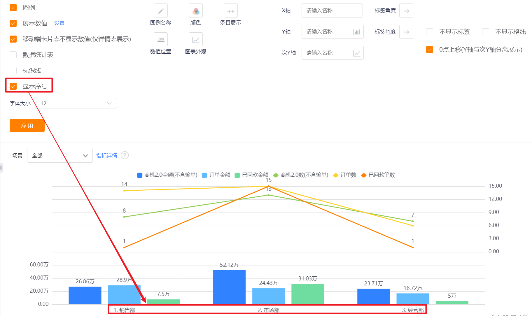
- Display Serial Number: It is not checked by default, and the serial number will be displayed in front of the dimension after checking. Generally, it is used together with [Direction].
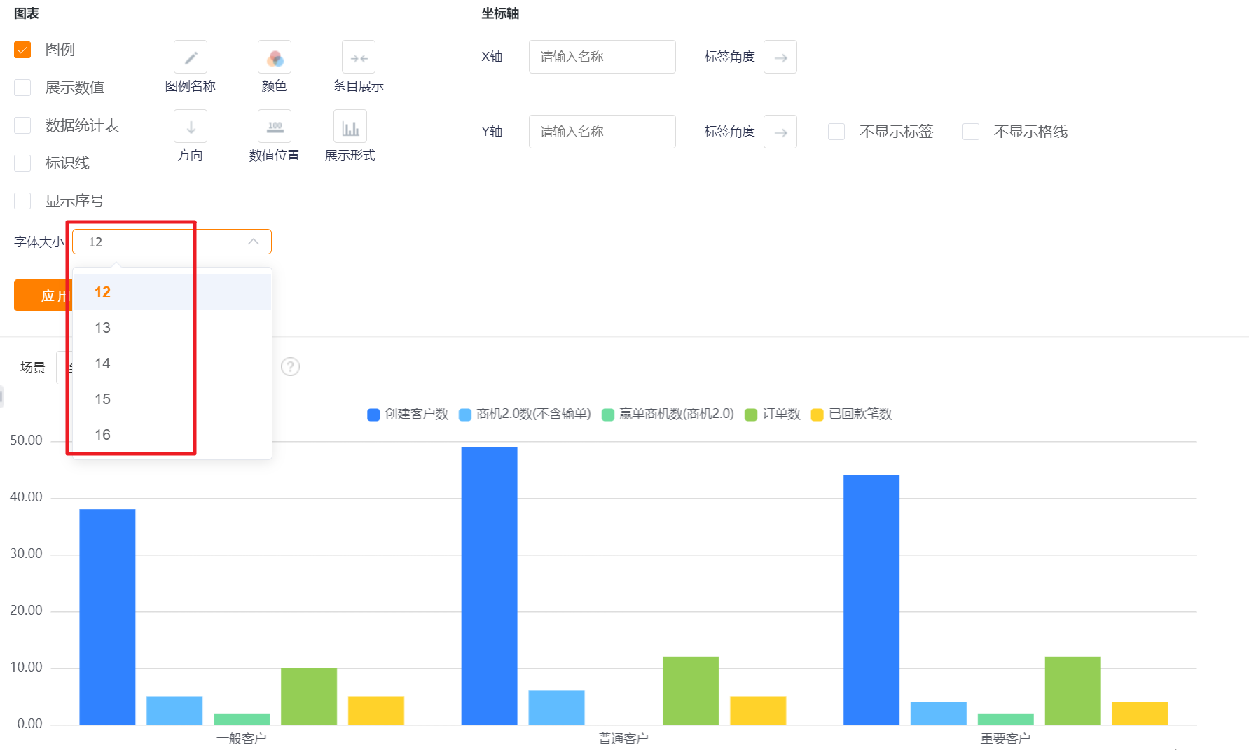
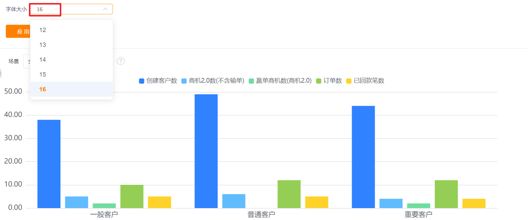
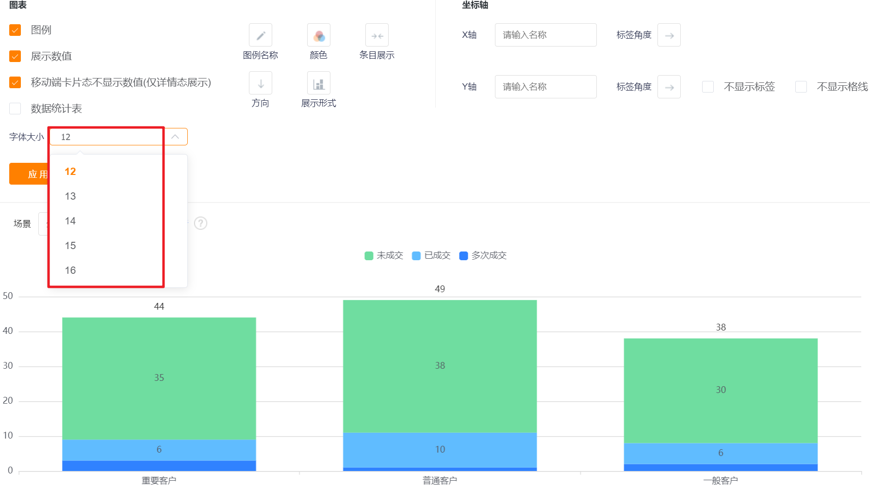
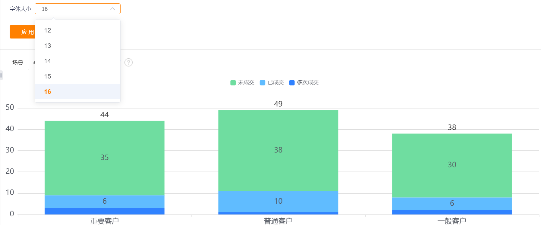
- Font Size: The default is 12, which can be switched to 13, 14, 15, 16 for display.
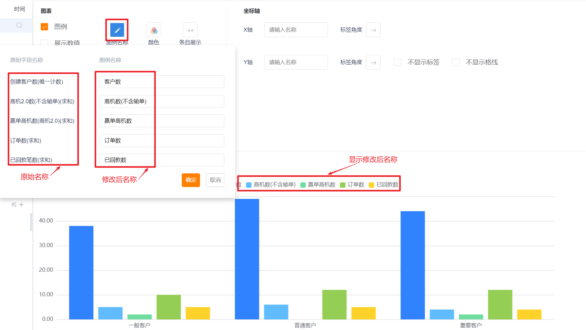
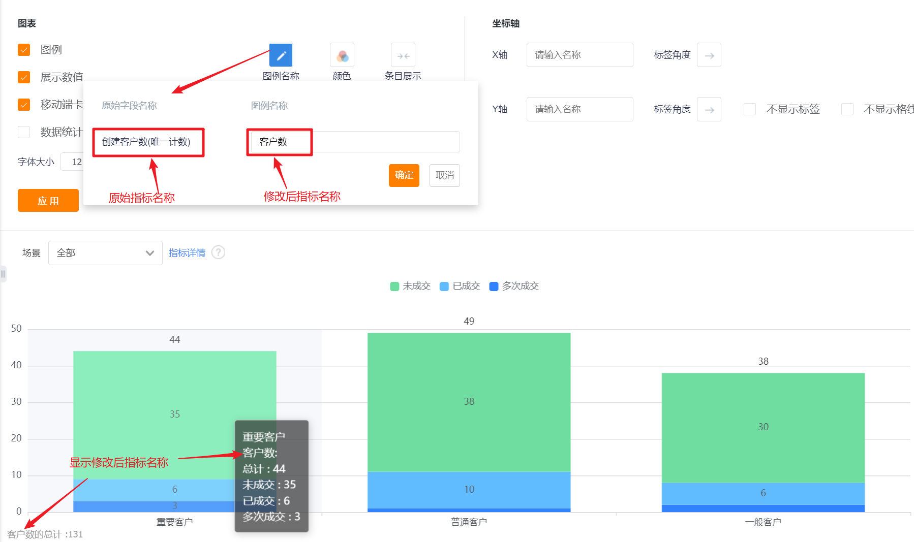
- Legend Name: Displayed by measure name by default, you can modify the displayed content by yourself.
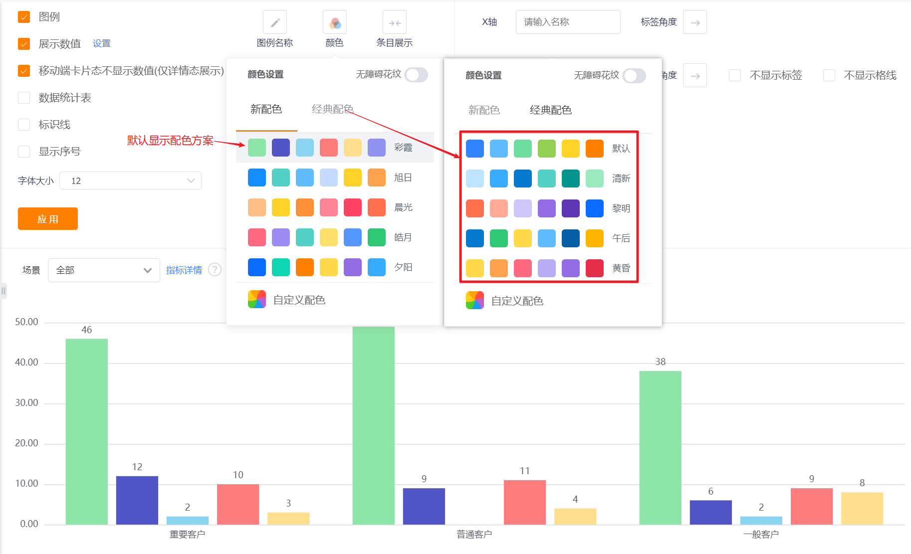
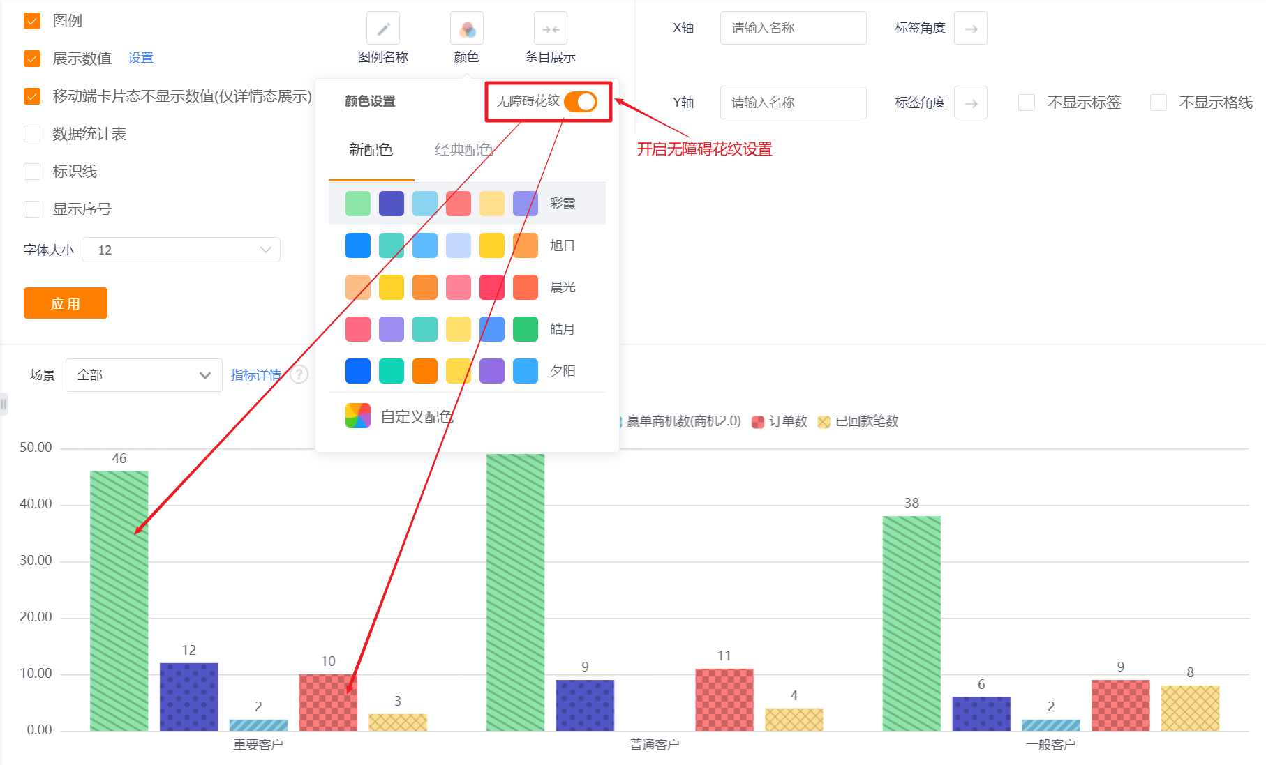
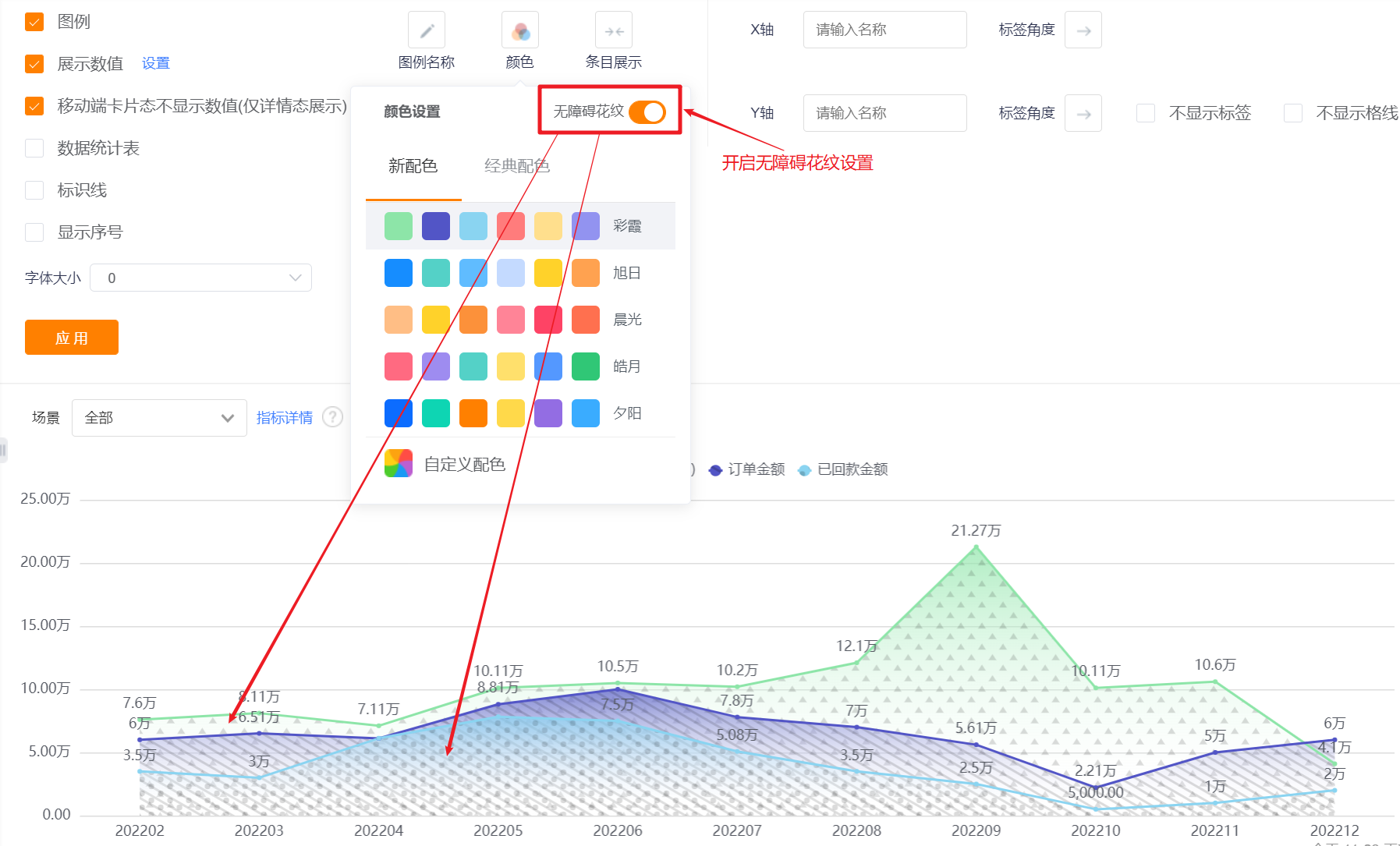
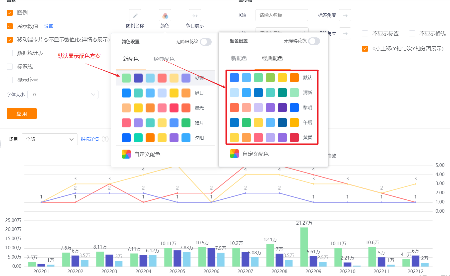
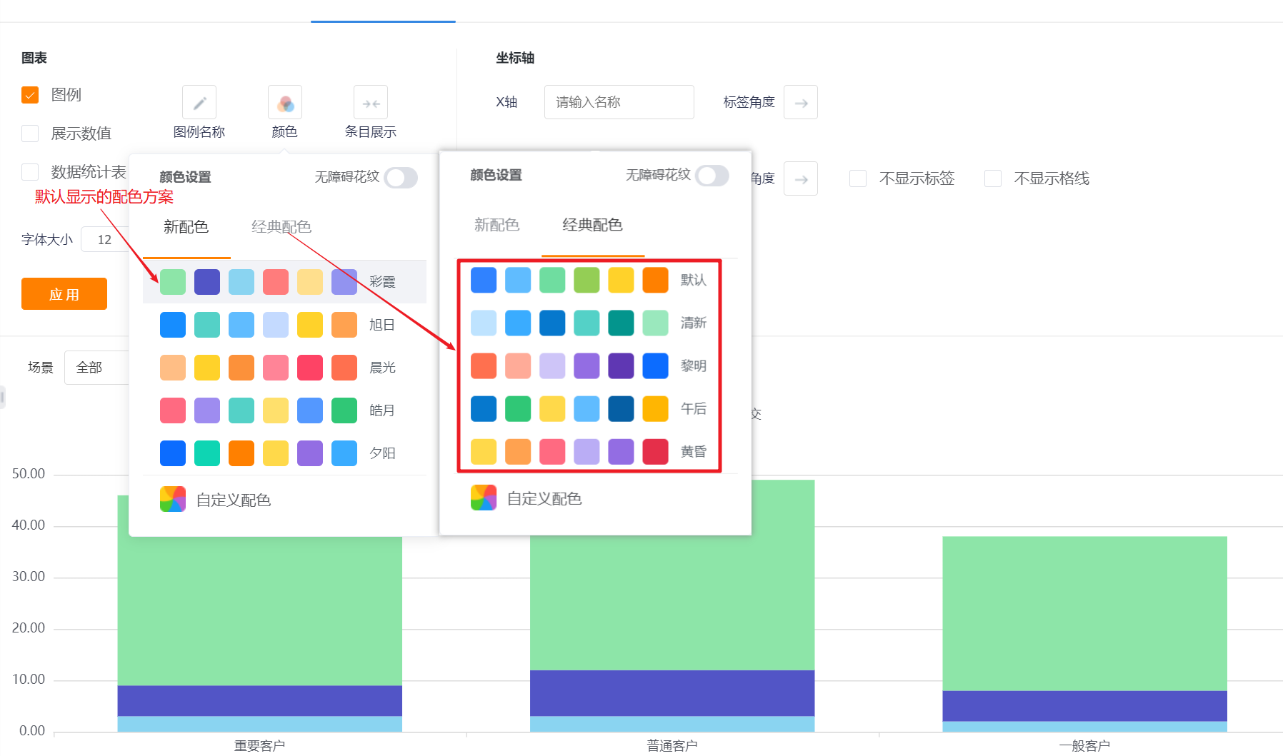
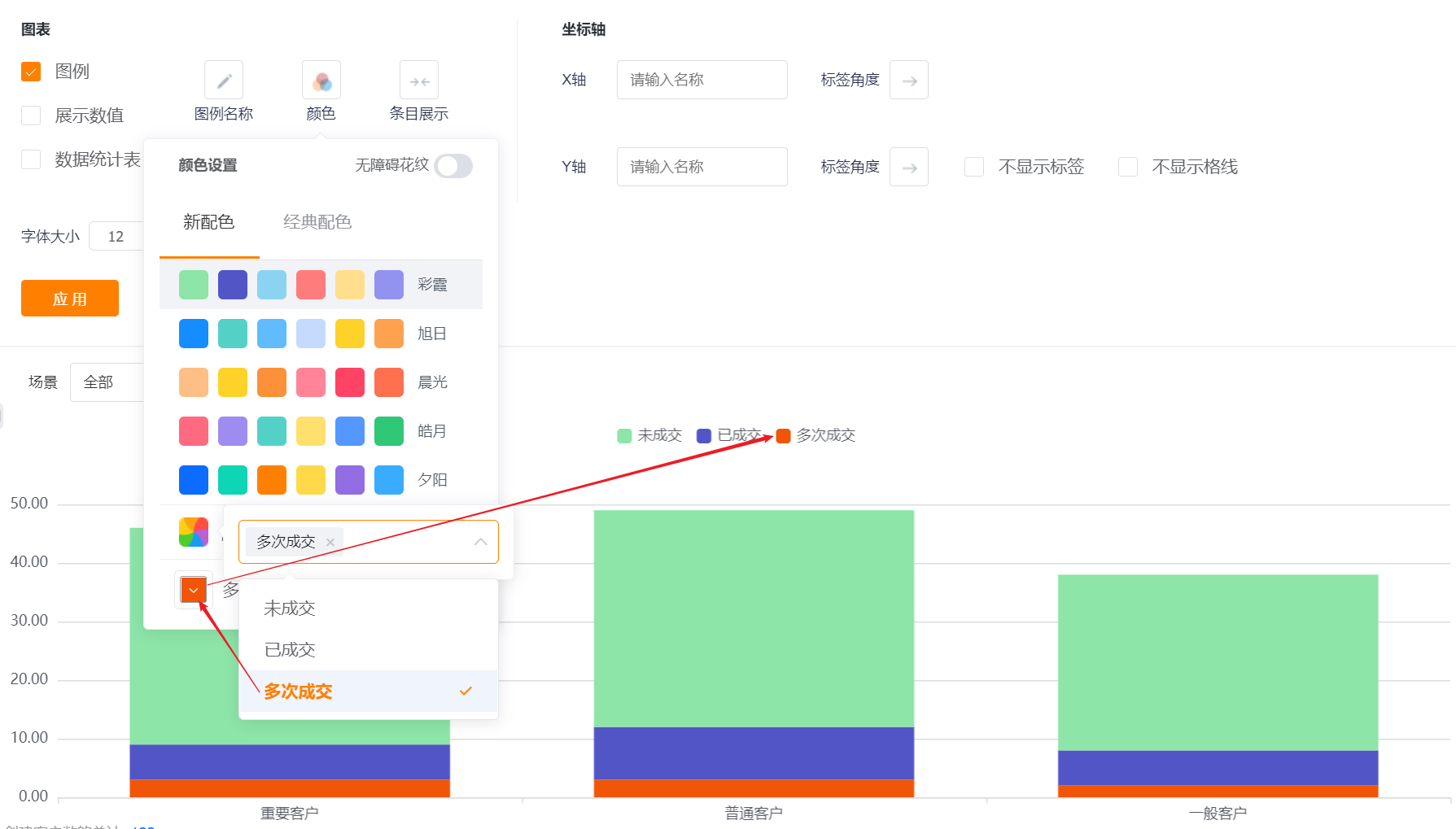
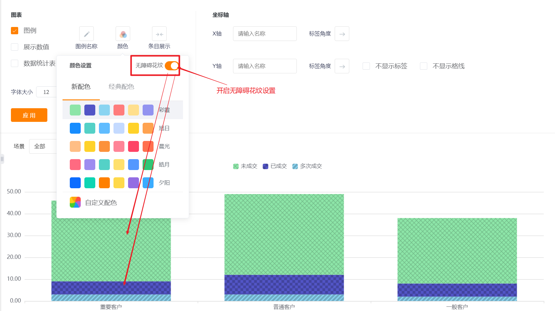
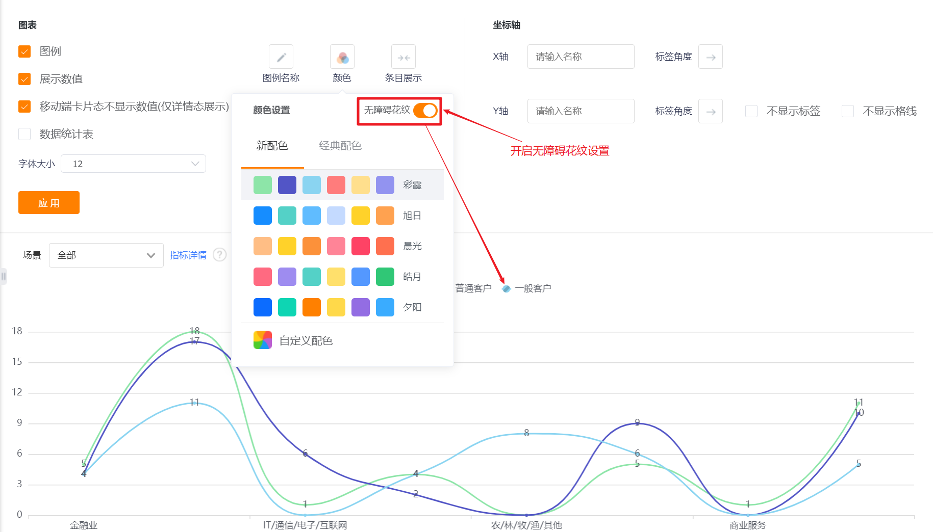
- Color: The system supports two types of color schemes: new color scheme and classic color scheme. The first set under the new color scheme is displayed by default. In addition, the barrier-free pattern setting can be enabled
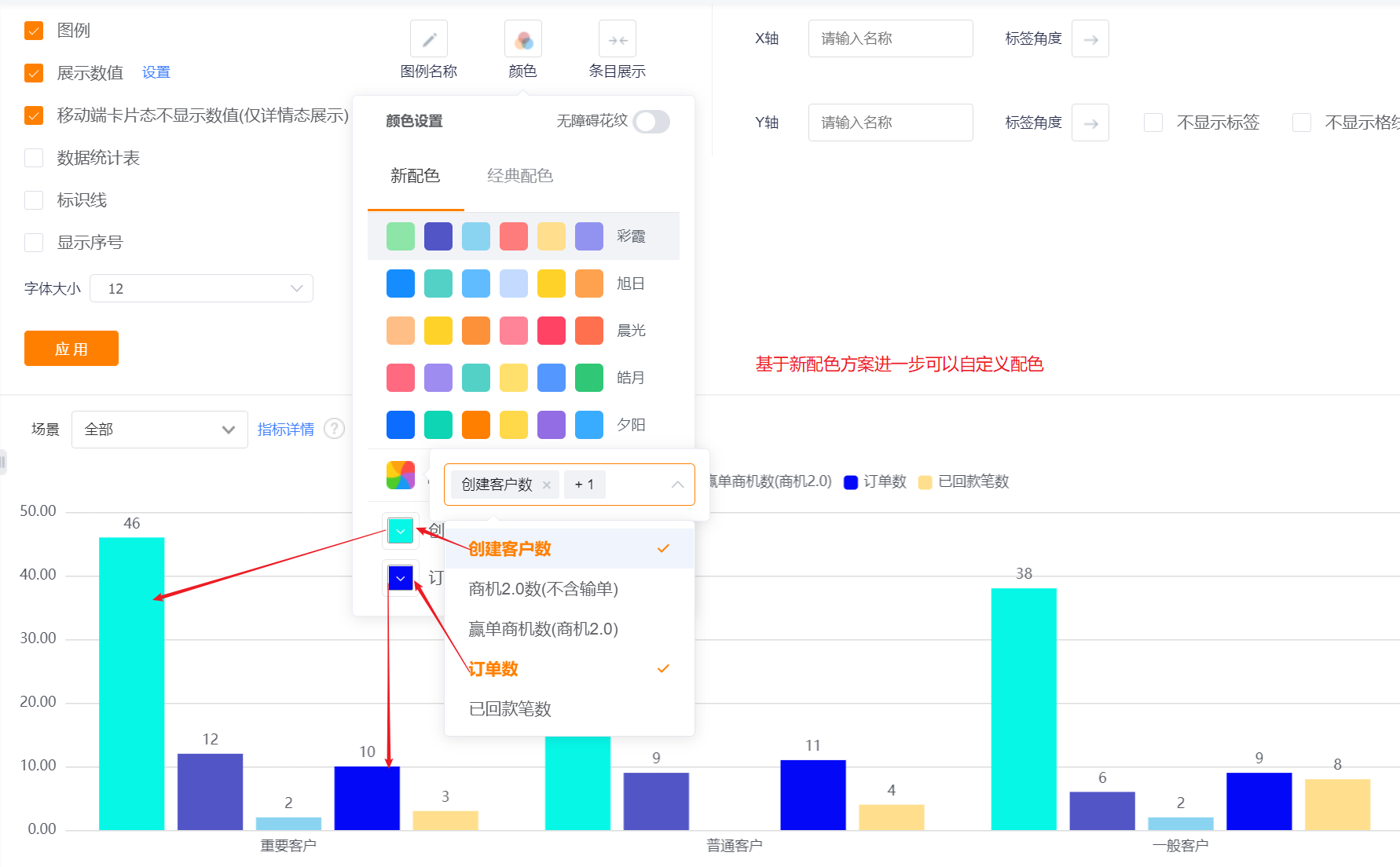
- New Color: support custom color based on a certain color scheme
- Classic Color: custom color is not supported
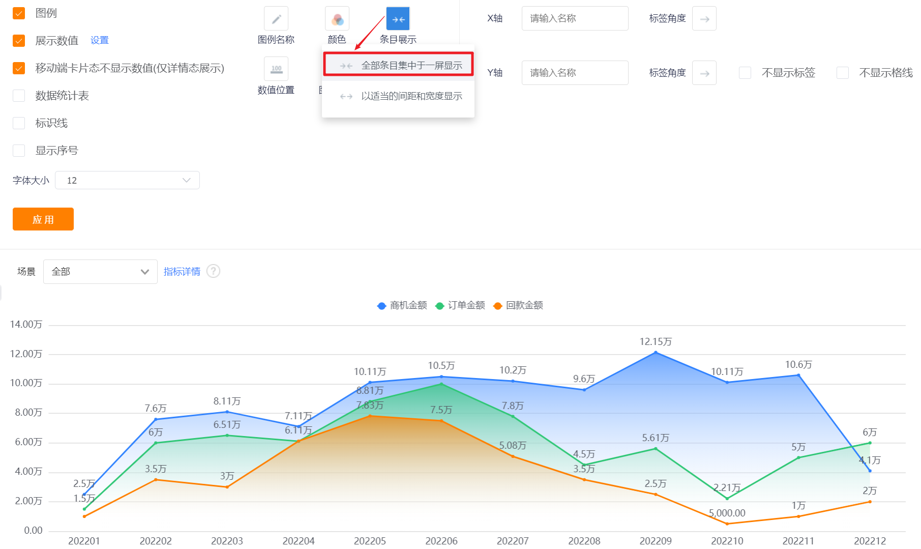
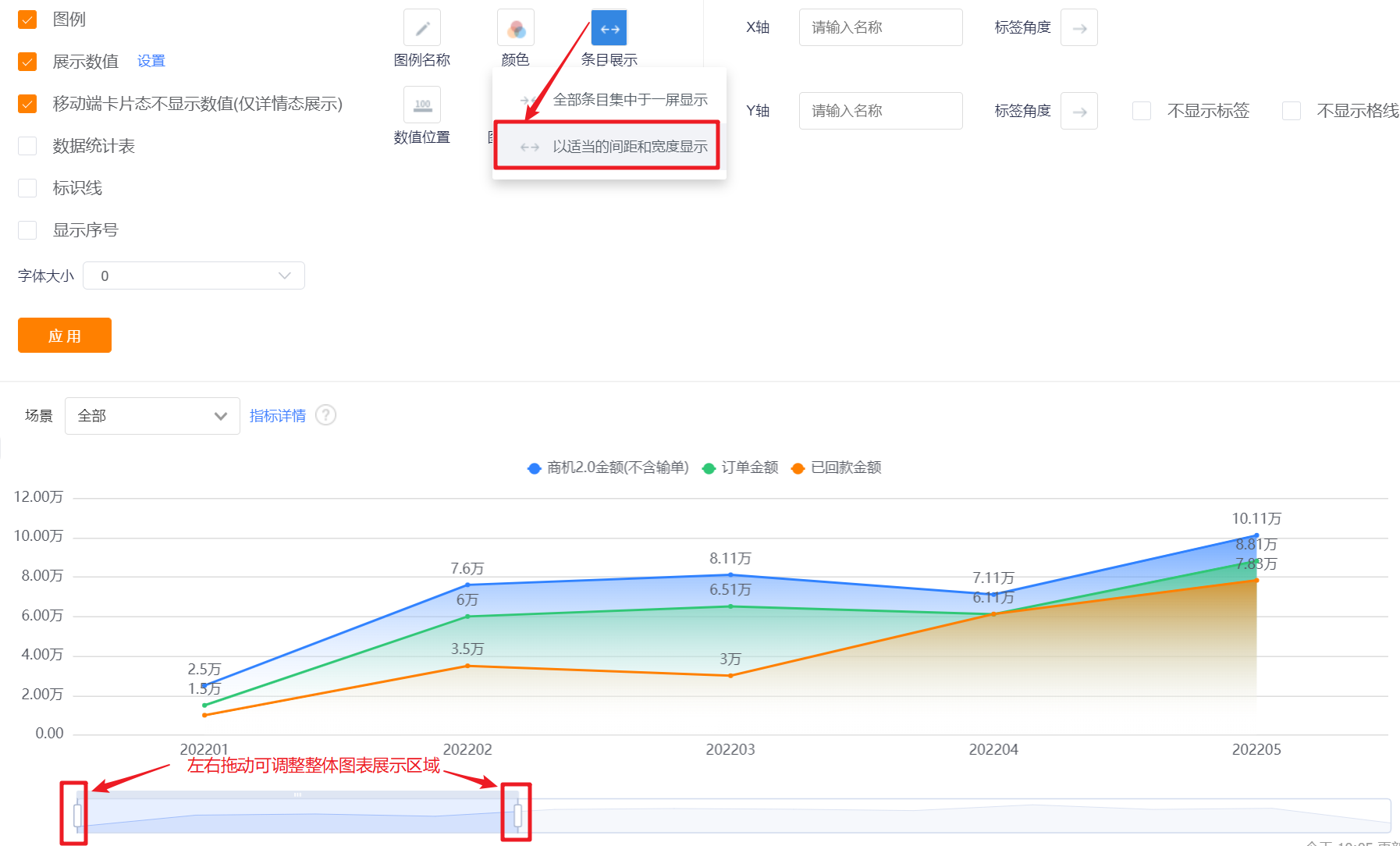
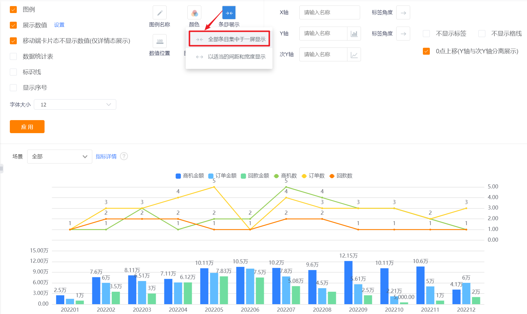
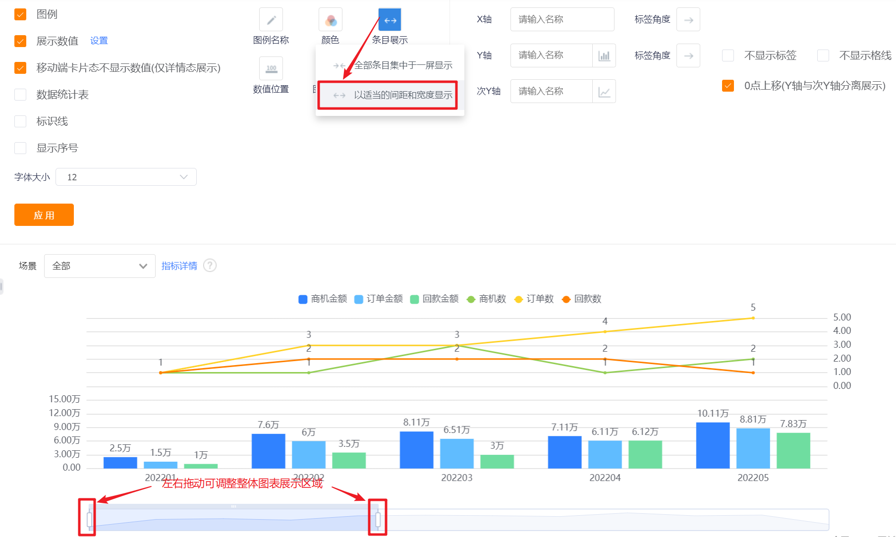
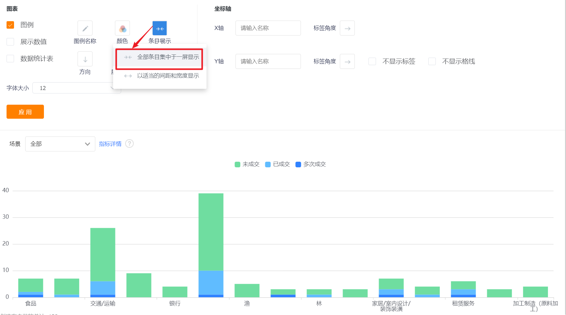
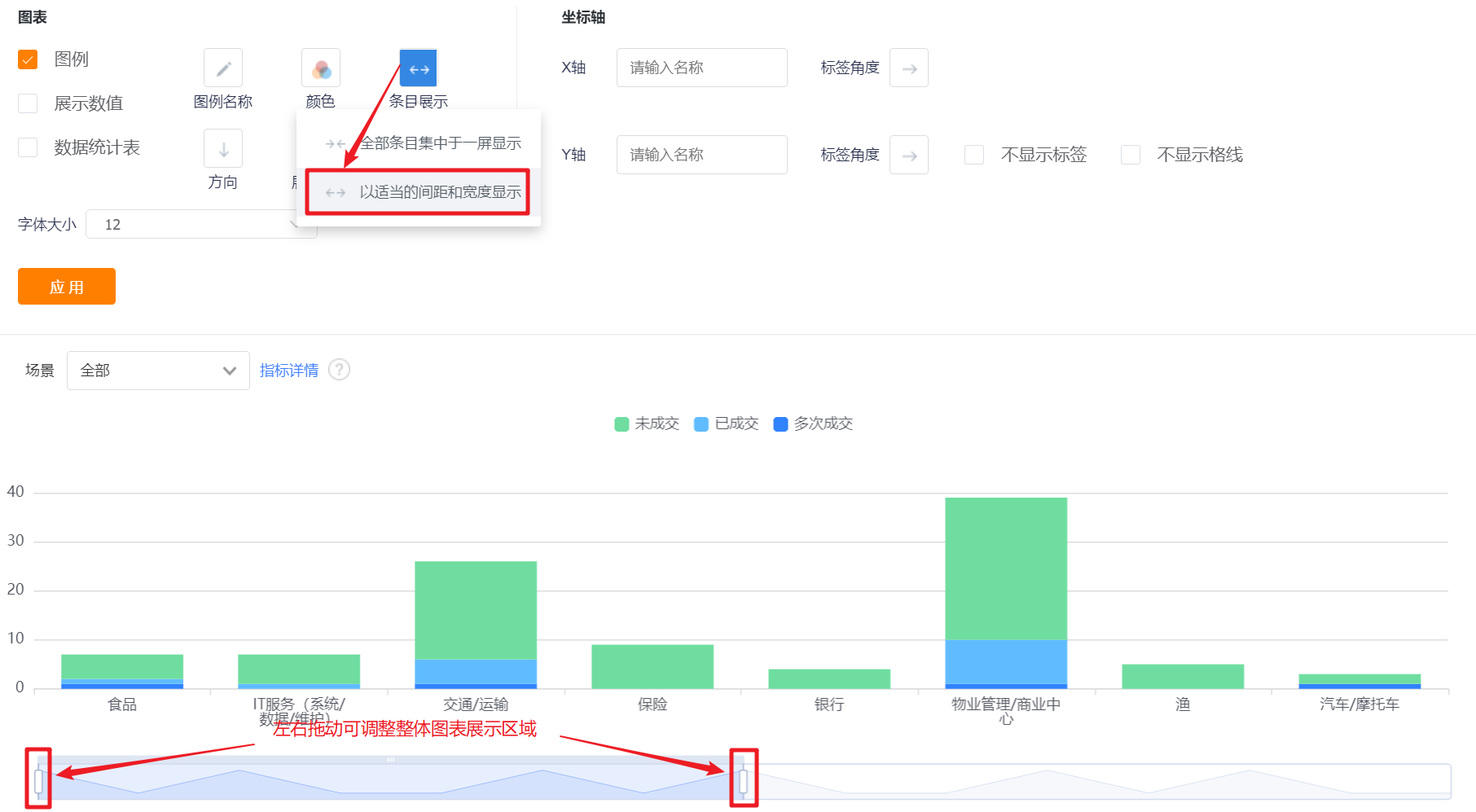
- Item Display: Set the data area displayed in the current area. By default, all items are displayed on one screen, which can be switched to display with appropriate spacing and width.

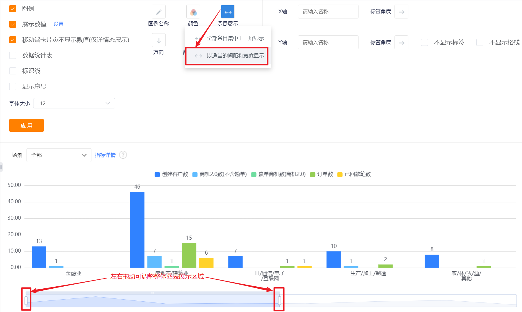
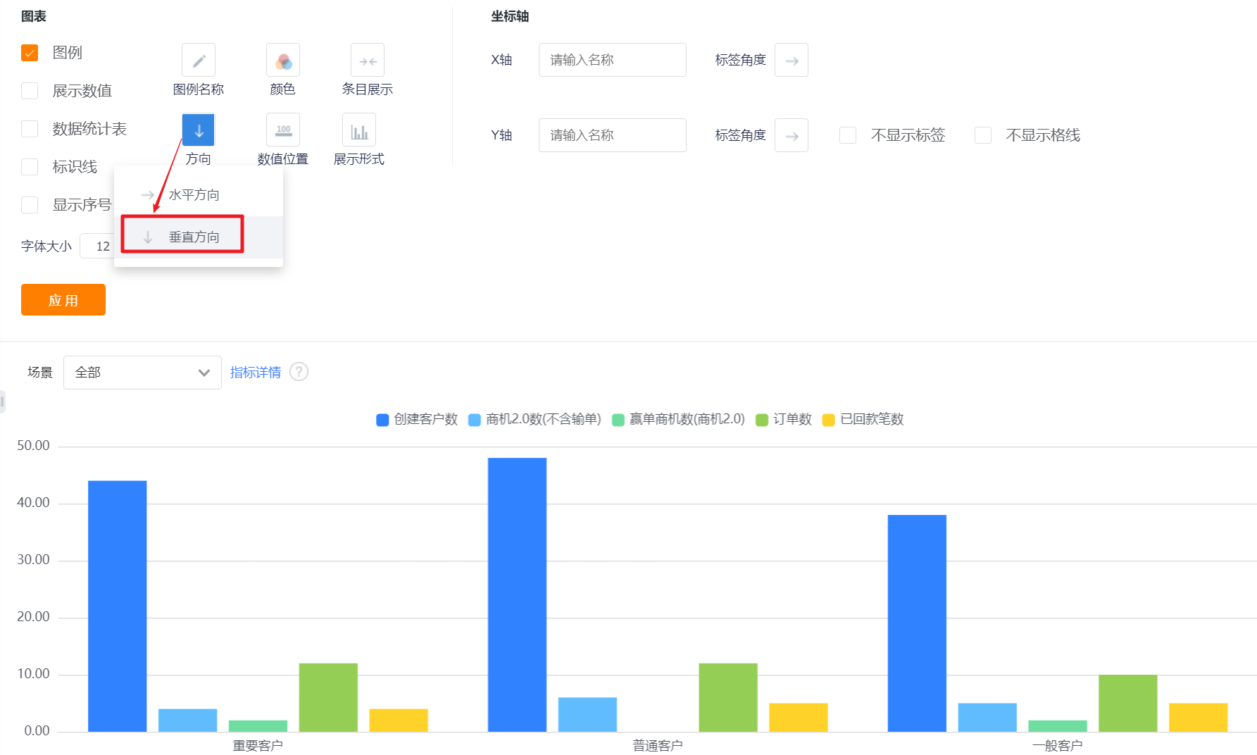
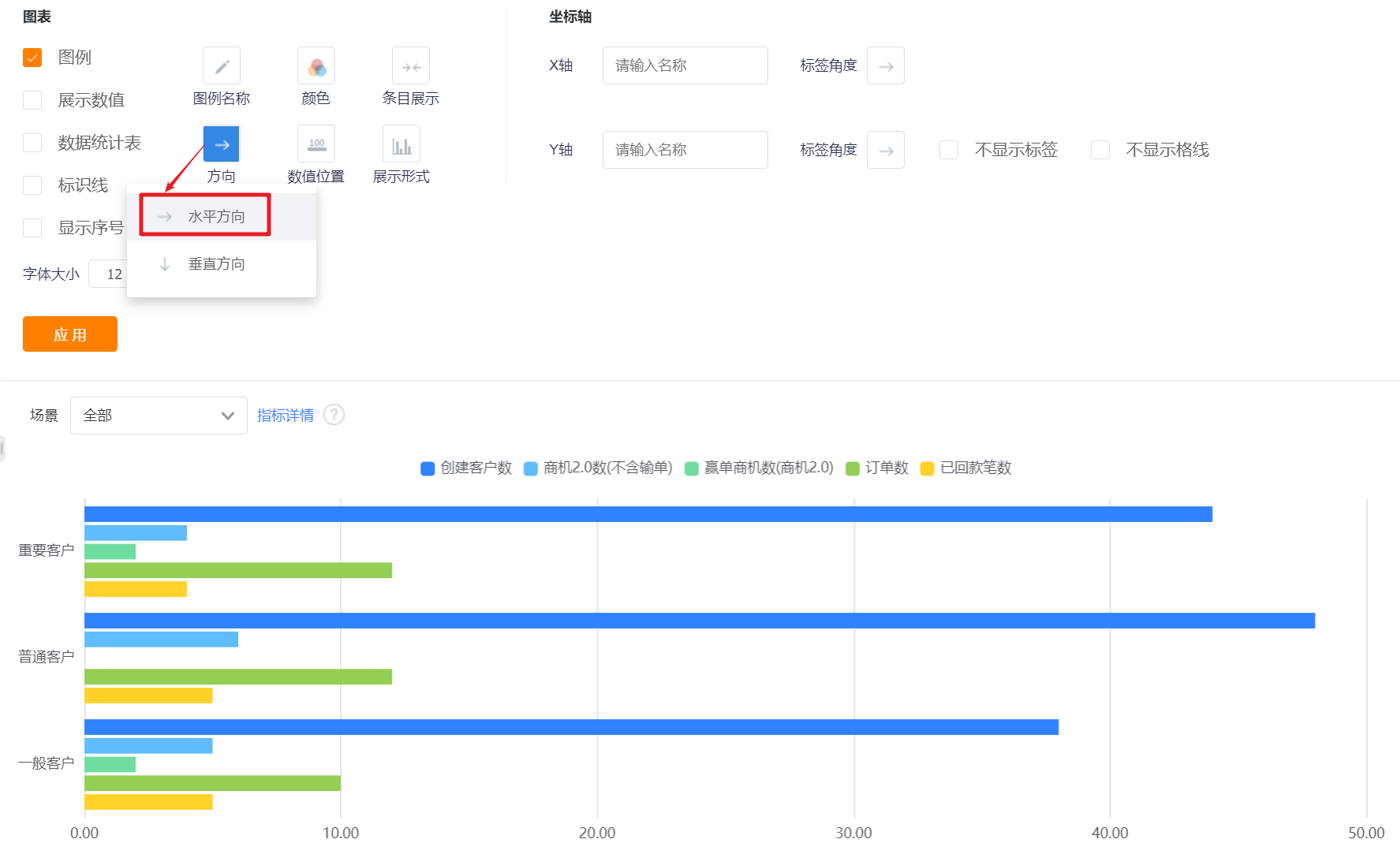
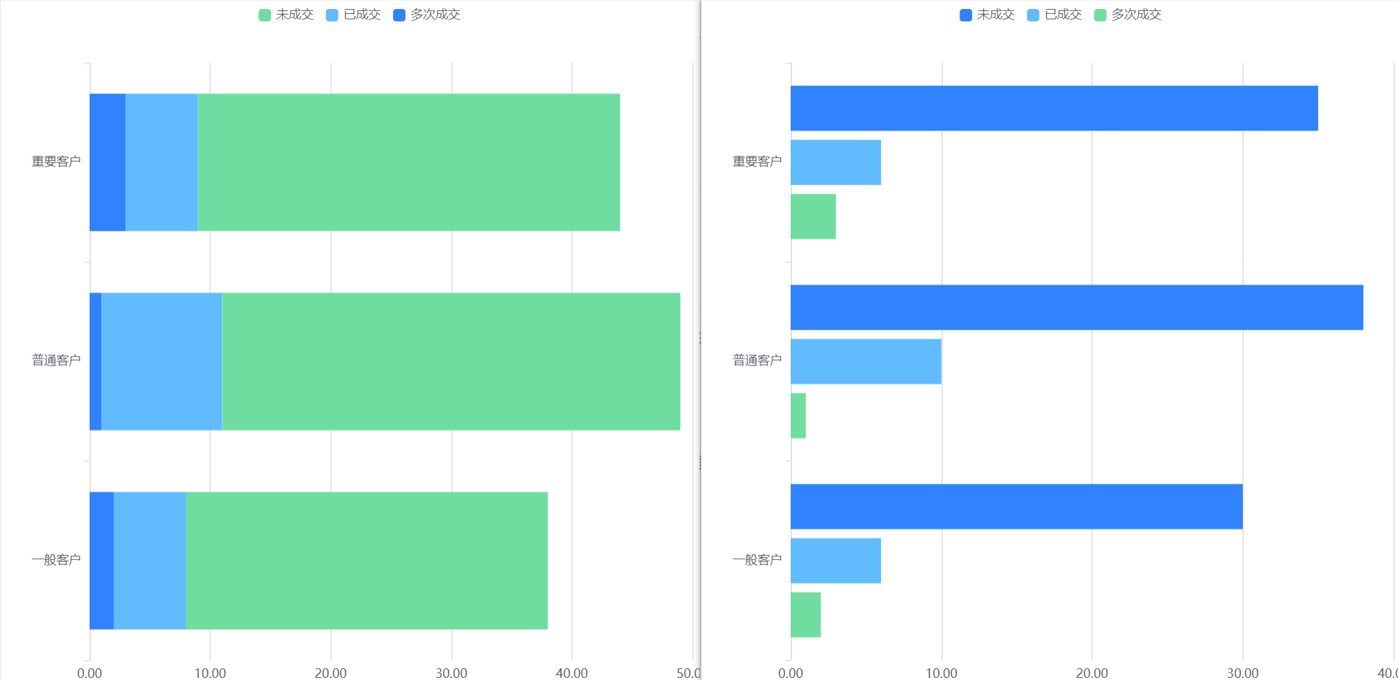
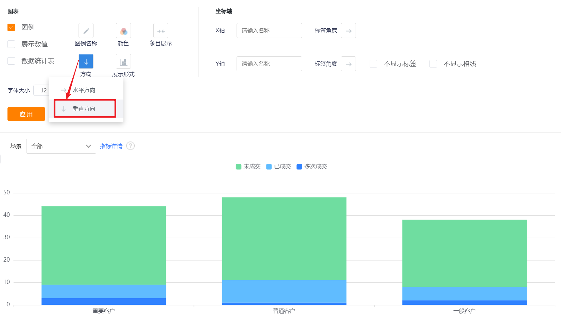
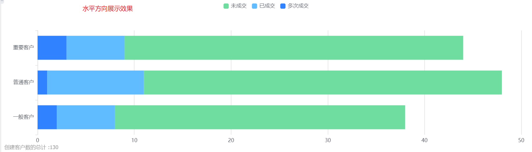
- Orientation: Default vertical display, can be switched to horizontal.
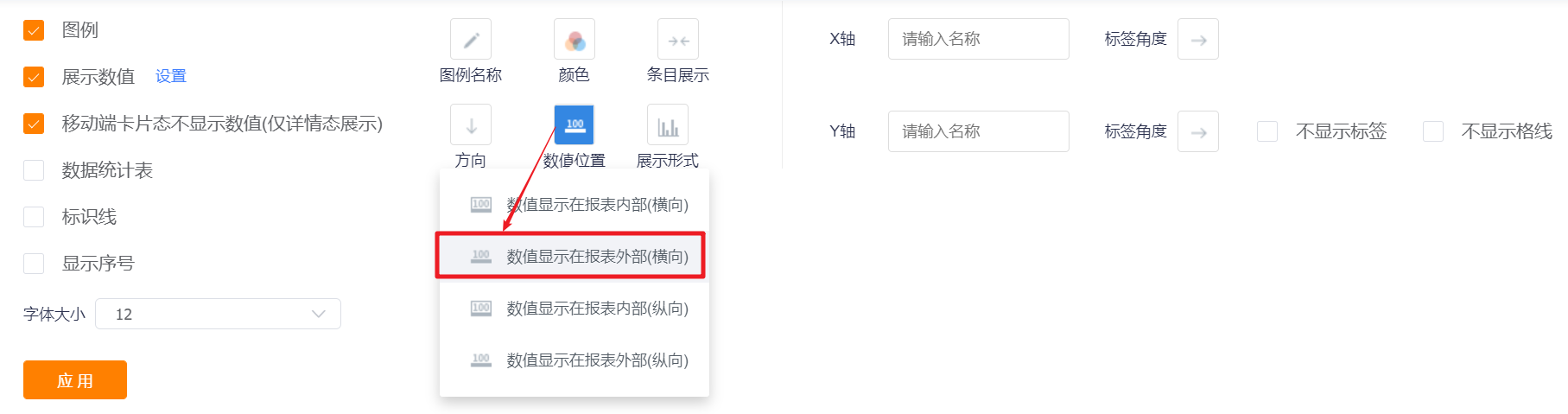
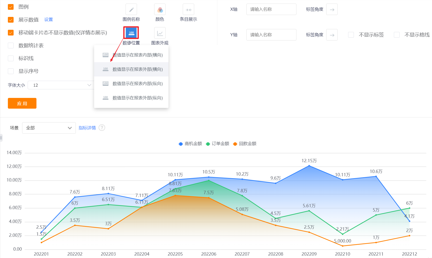
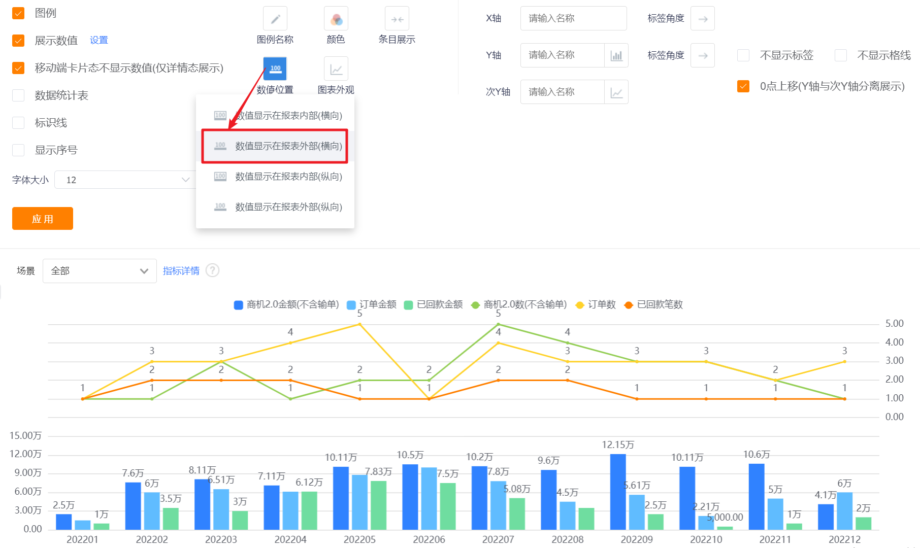
- Number Position: You can set the numerical display position of the column chart, and the default is that the numerical value is displayed outside the report (horizontal).
- Values are displayed inside the report (horizontal): For vertical bar charts, the values are displayed inside the bar chart;
- Values are displayed outside the report (horizontal): For a column chart in the vertical direction, the value is displayed outside the column chart;
- Values are displayed inside the report (vertical): For horizontal bar charts, the values are displayed inside the bar chart;
- Values are displayed outside the report (vertical): for horizontal column charts, the values are displayed outside the column chart.

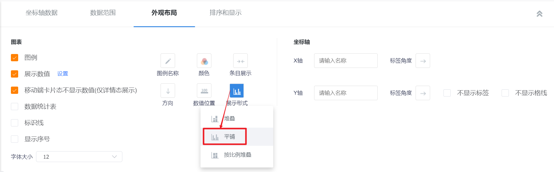
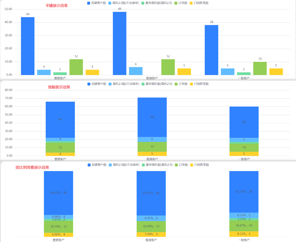
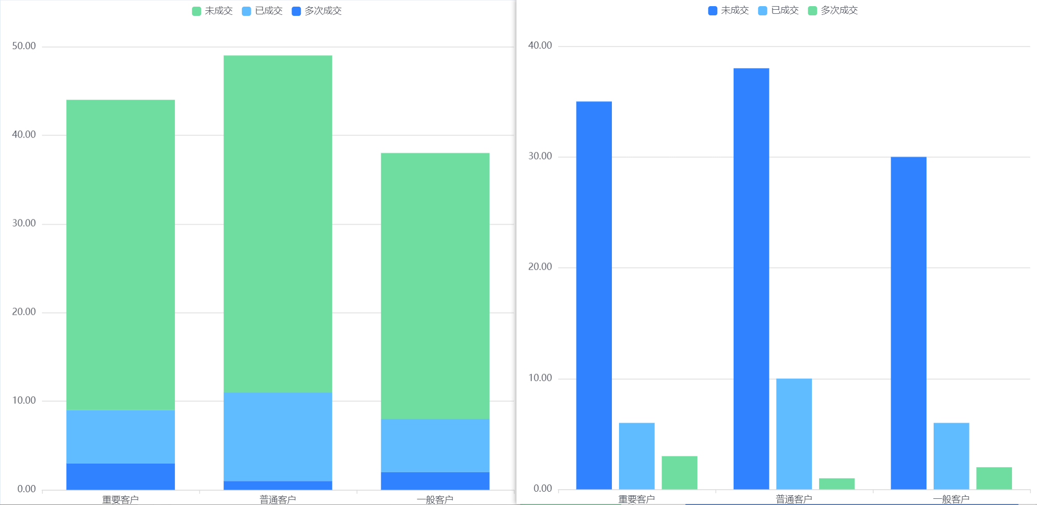
- Display Form: The default tile display can be adjusted to stack or stack in proportion.
- Tile: All indicators are displayed in a tiled manner, and an indicator is a column;
- Stack: All columns are stacked together for display. When stacking and displaying, [value position] cannot be set, and the value is displayed inside by default;
- Proportional Stack: The overall height of the columns is the same. According to the data size of each indicator, it is converted into a percentage to display each area. When stacking and displaying in proportion, [value position] cannot be set, and the value is displayed internally by default.
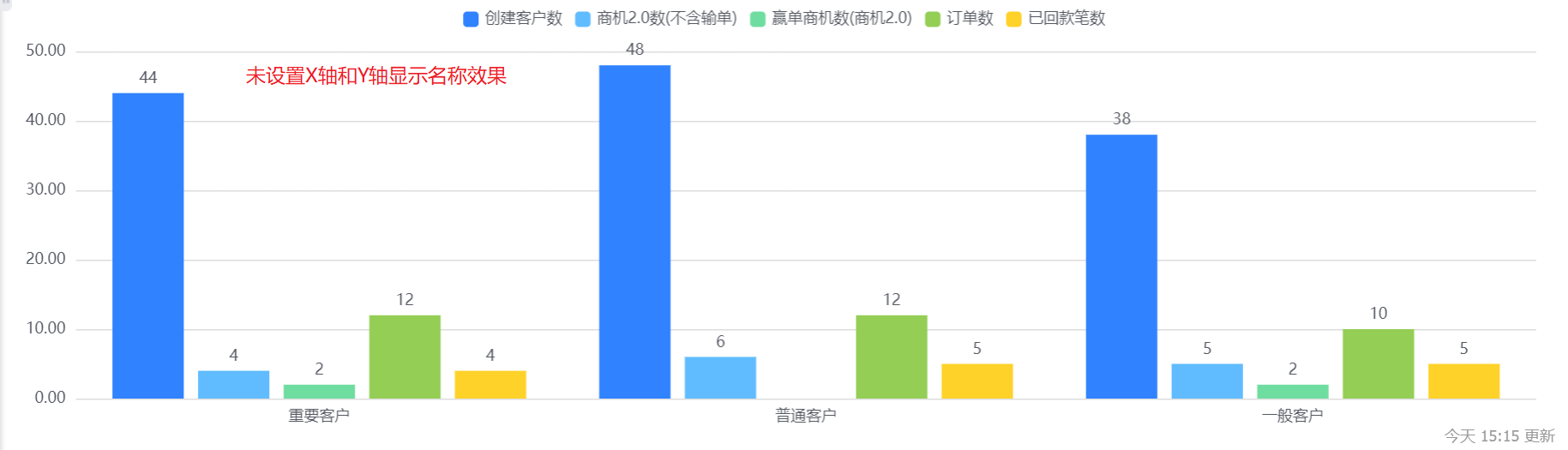
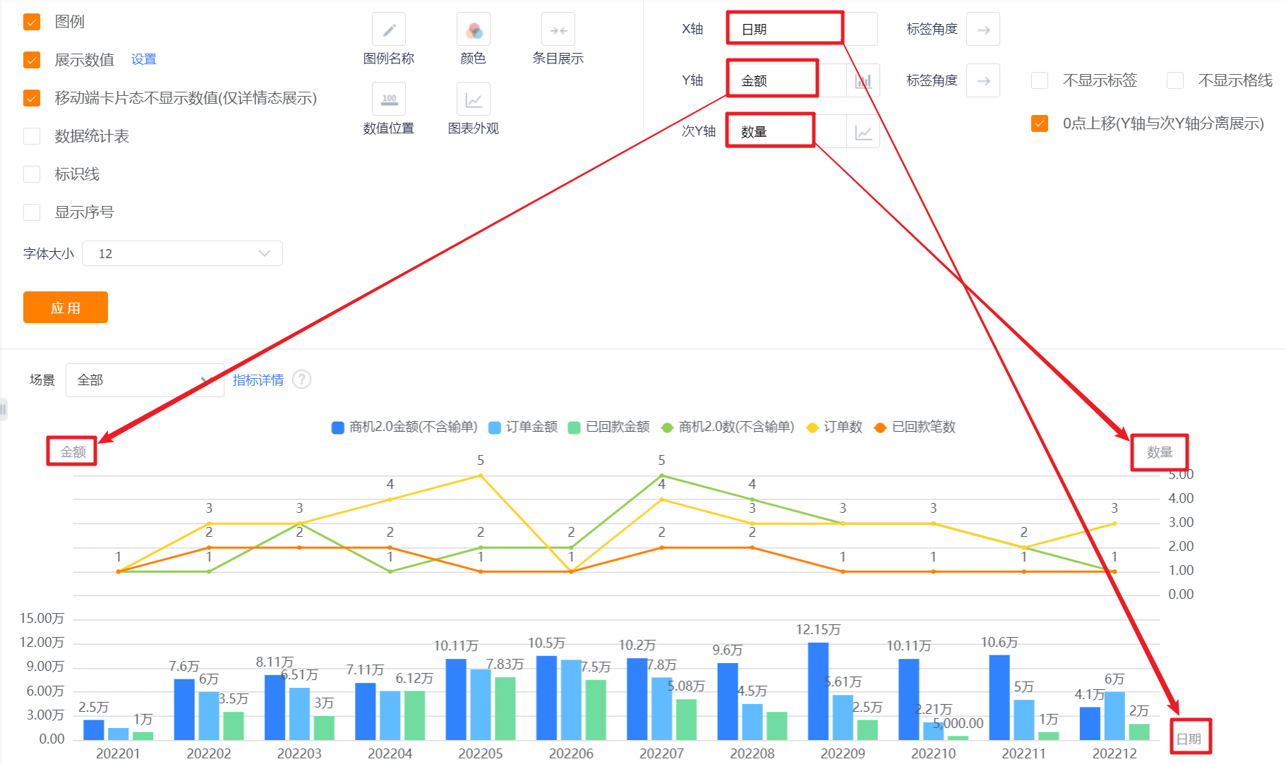
- Axis-X/Y: You can set the display name of X axis/Y axis, if not set, it will not be displayed.
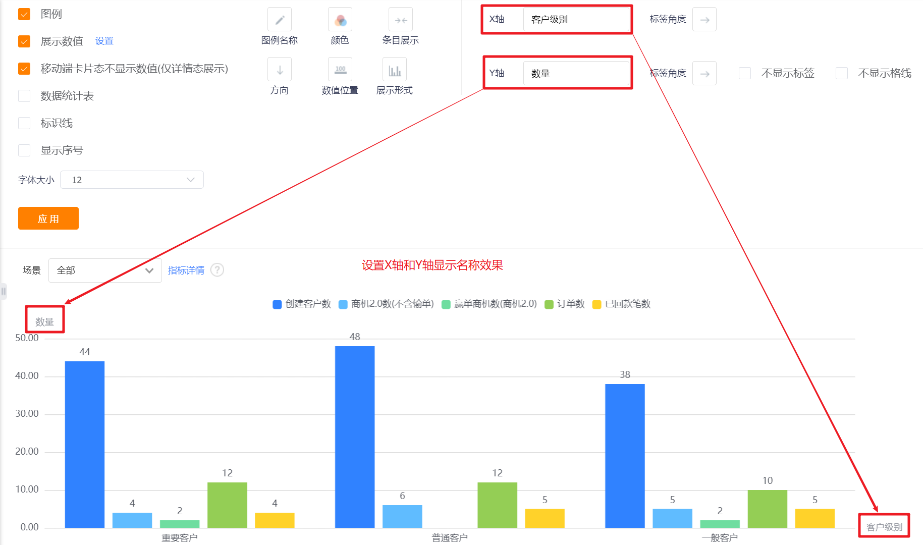
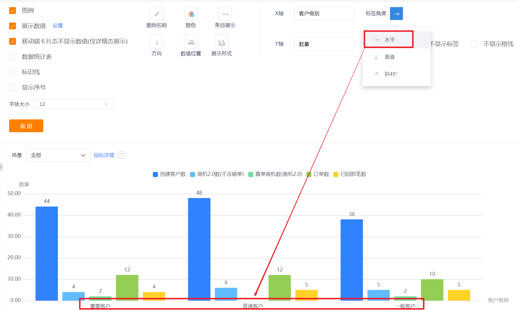
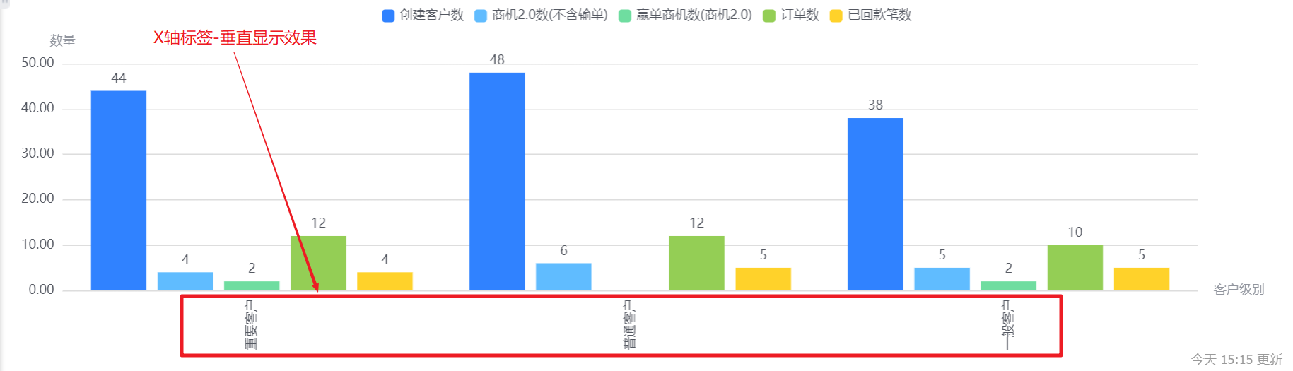
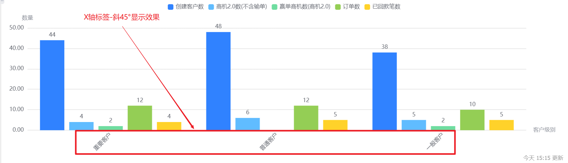
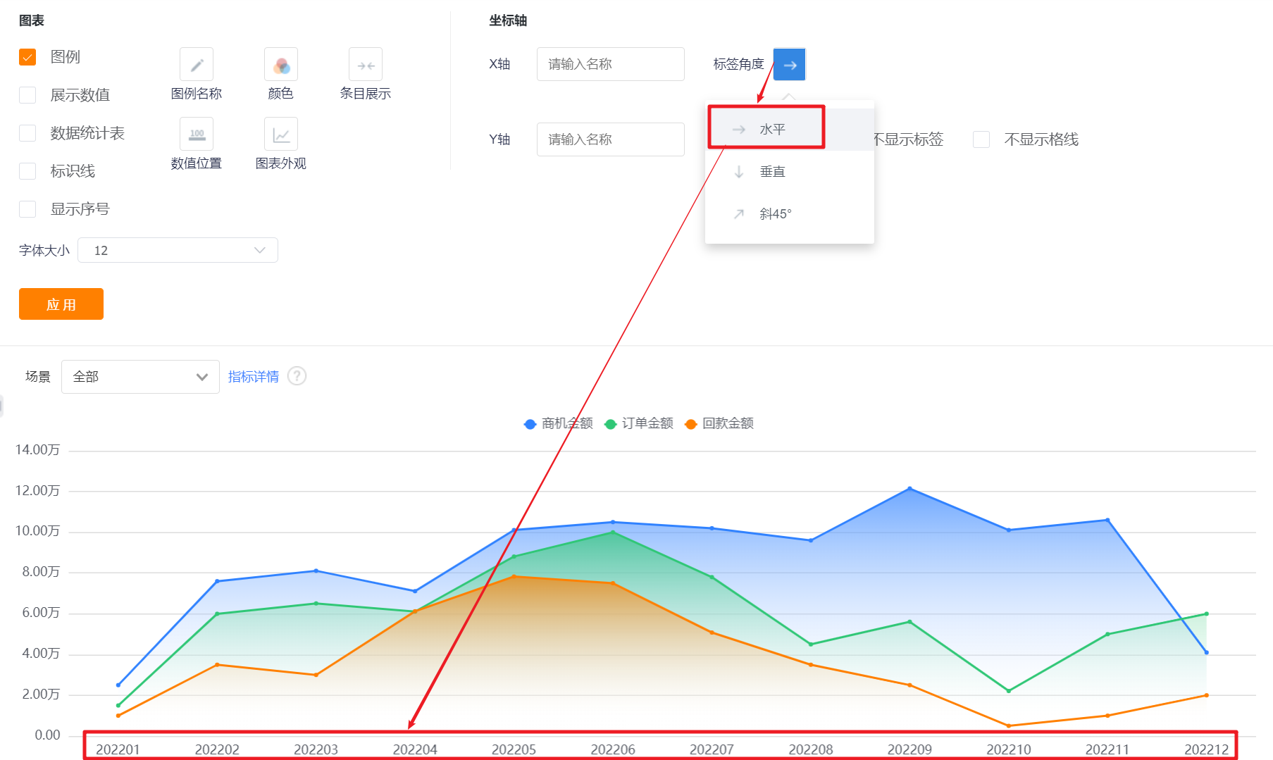
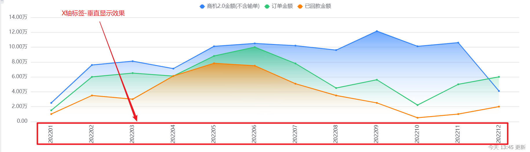
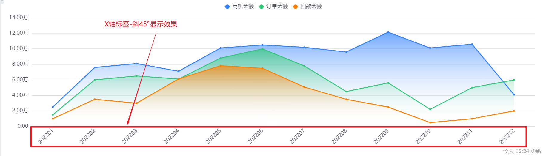
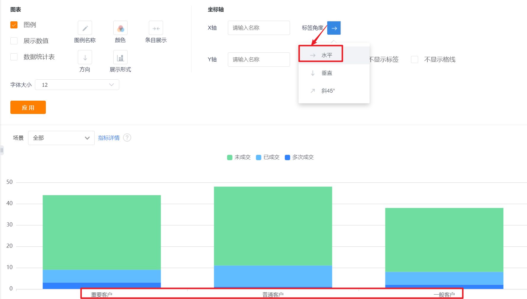
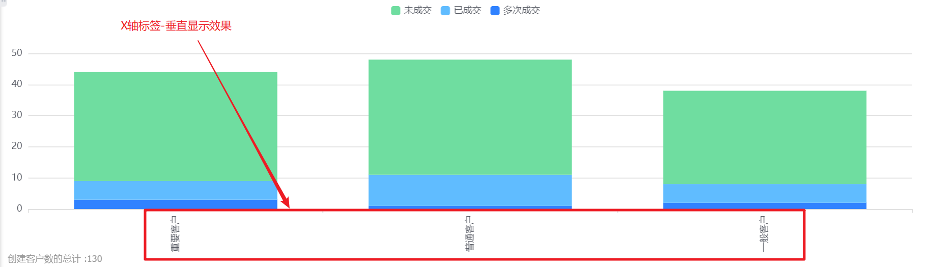
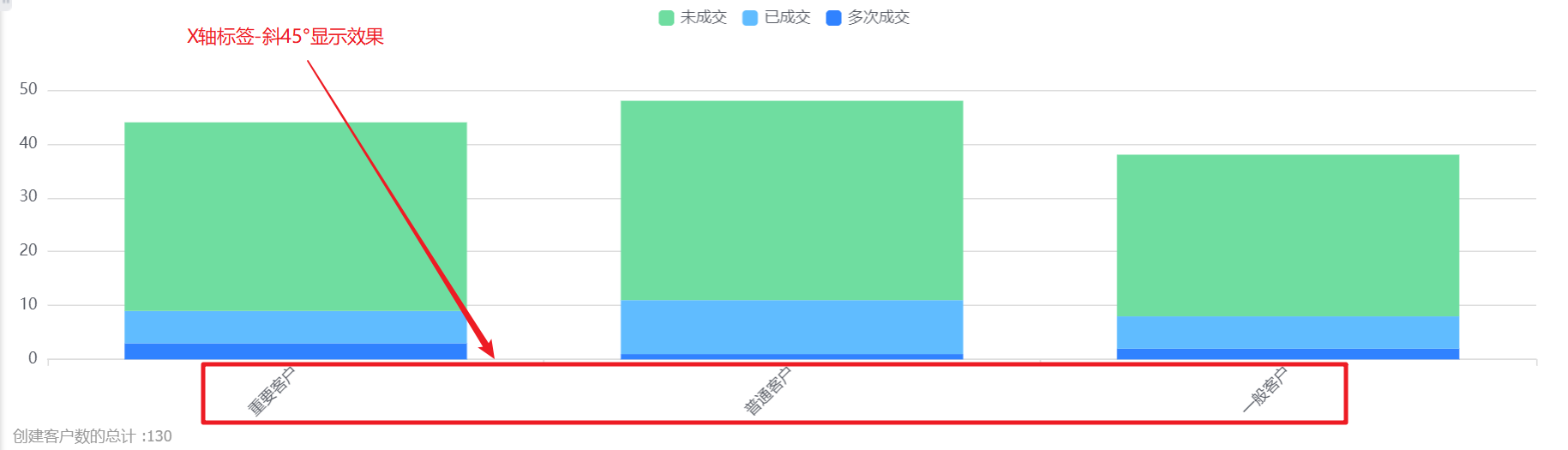
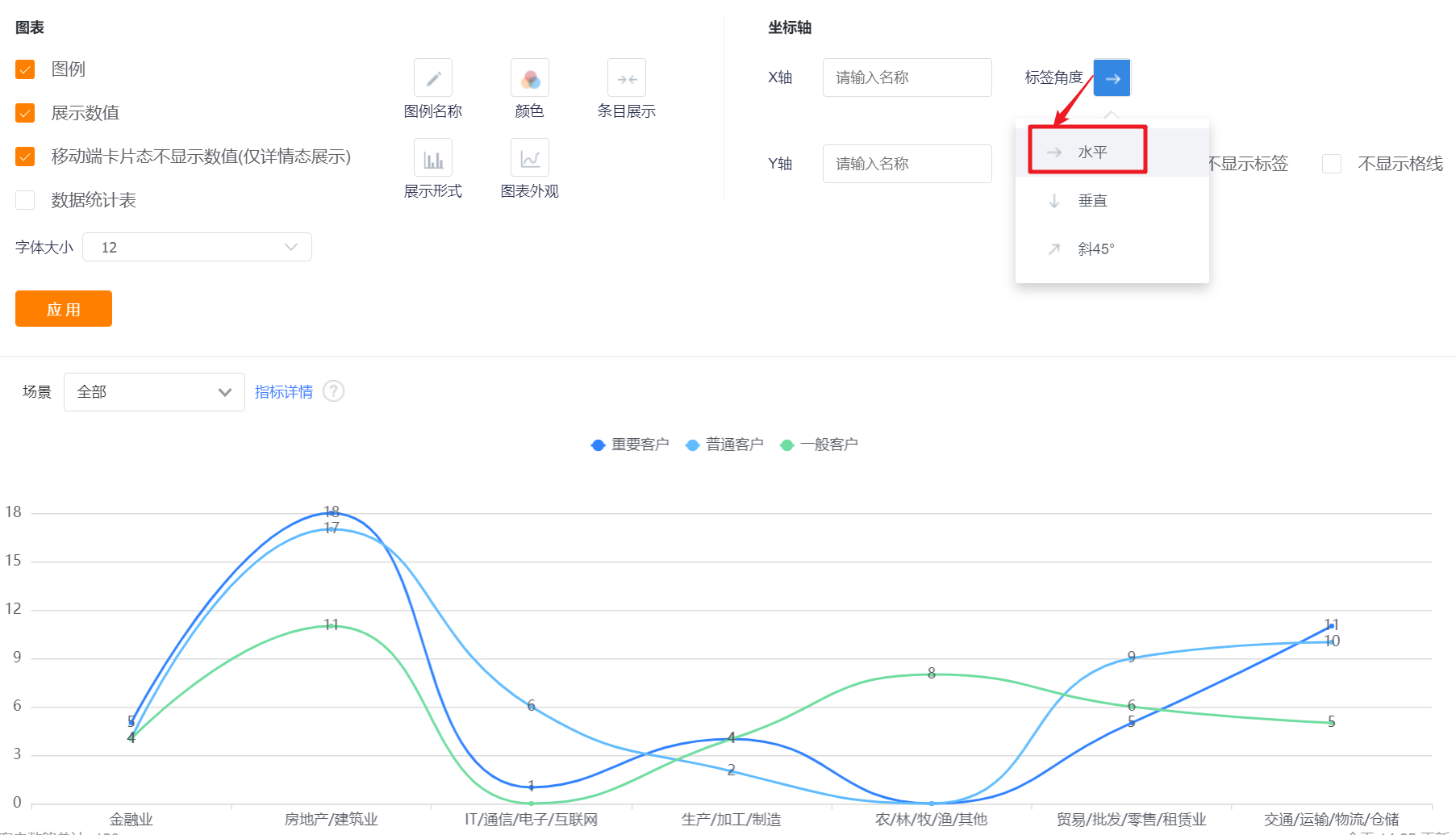
- Axis-Tag Angle: default horizontal display, can be switched to vertical or oblique 45°; (X-axis and Y-axis are set separately, the following figure takes the X-axis as an example, and the Y-axis is the same).
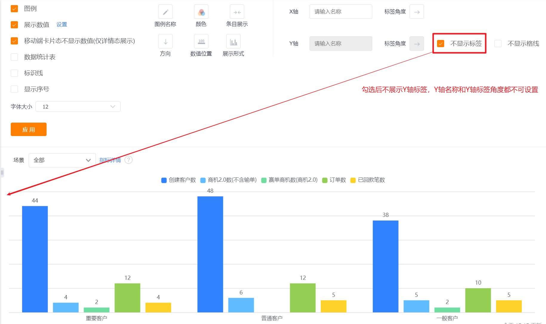
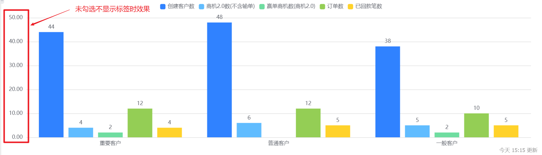
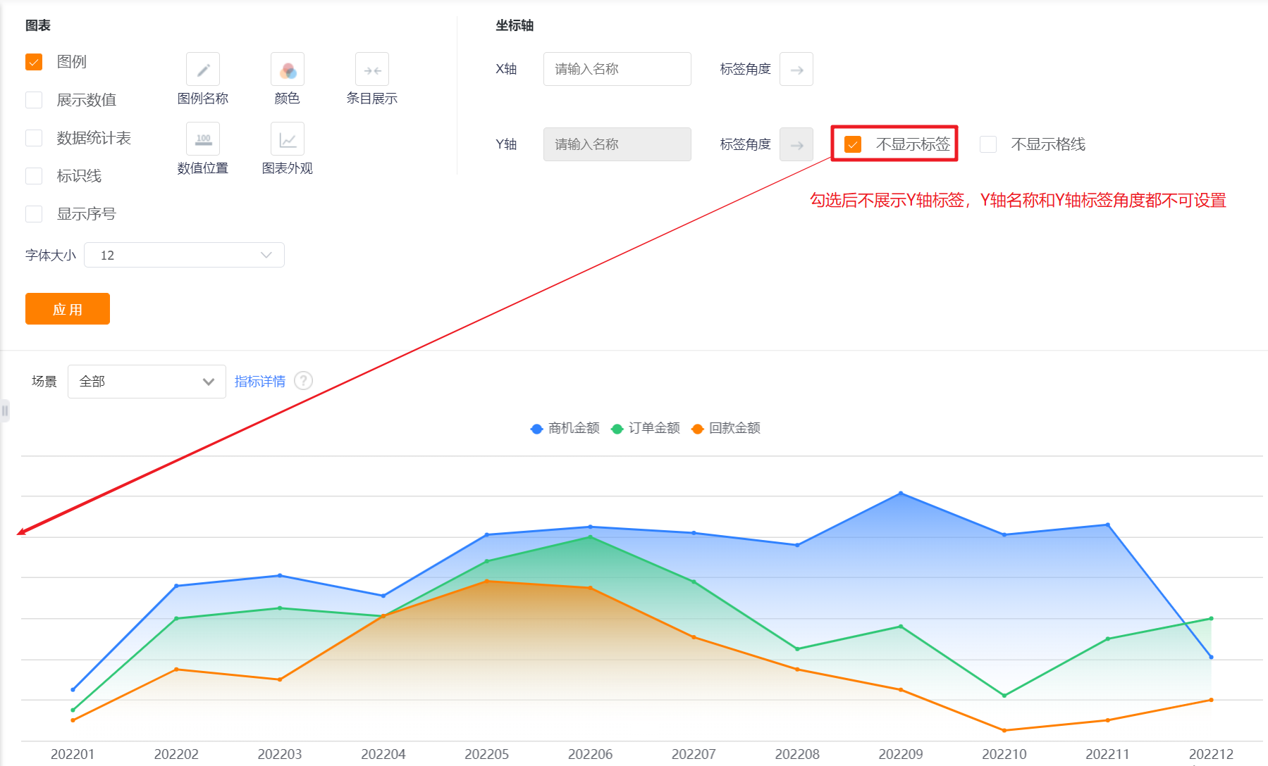
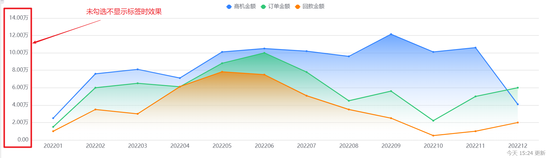
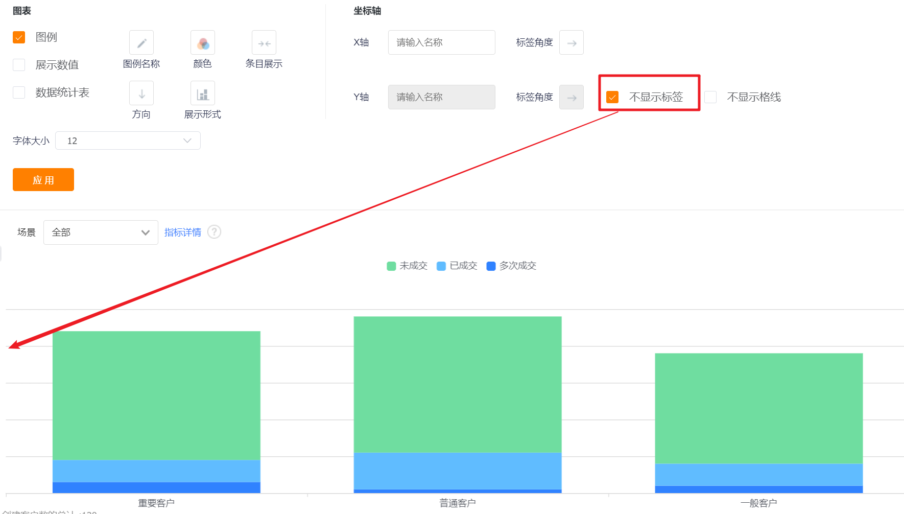
- Don't Display Tags: The labels are displayed by default. After checking, the Y-axis labels cannot be displayed, and the Y-axis name and label angle cannot be set.
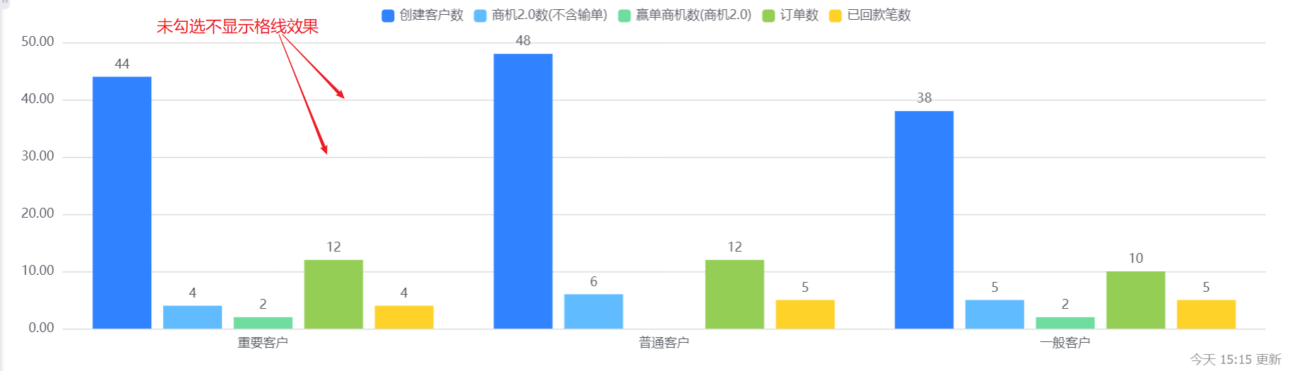
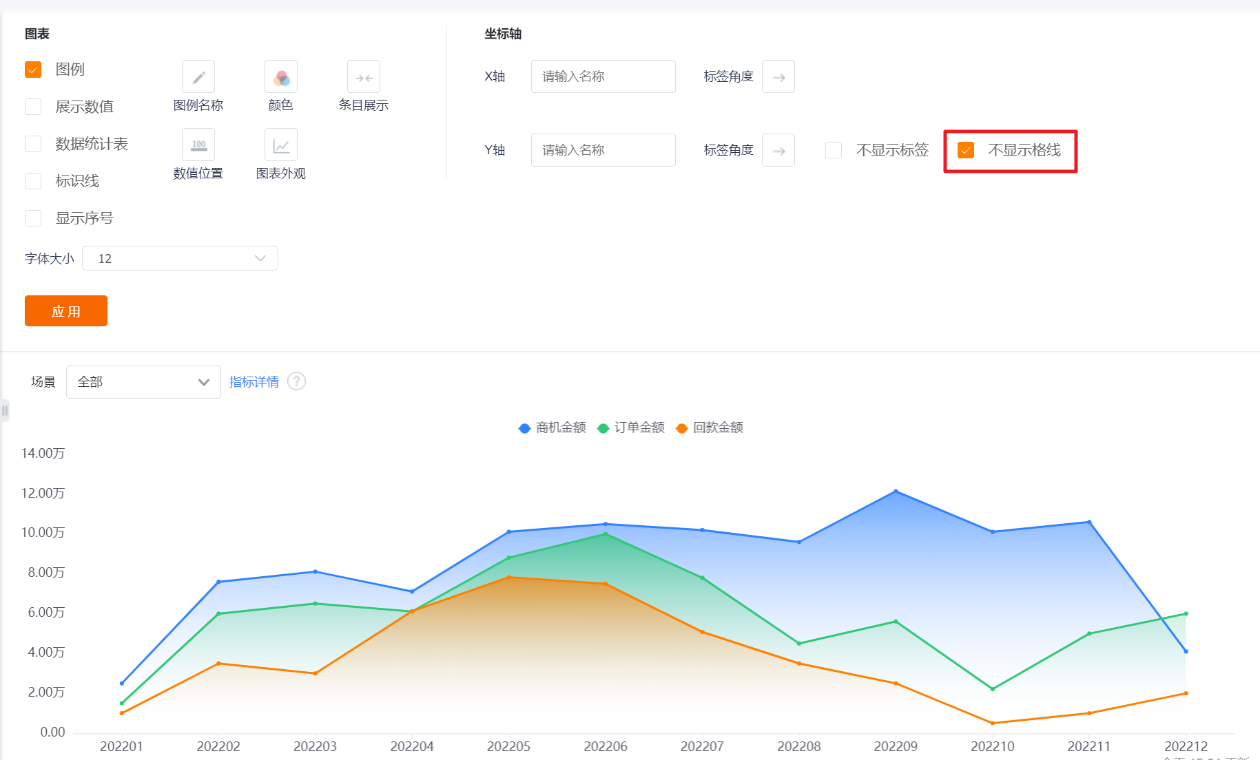
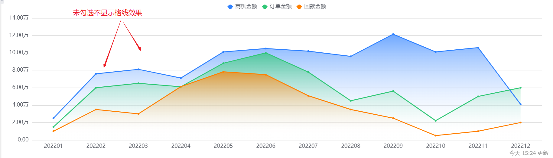
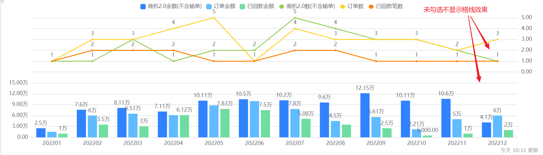
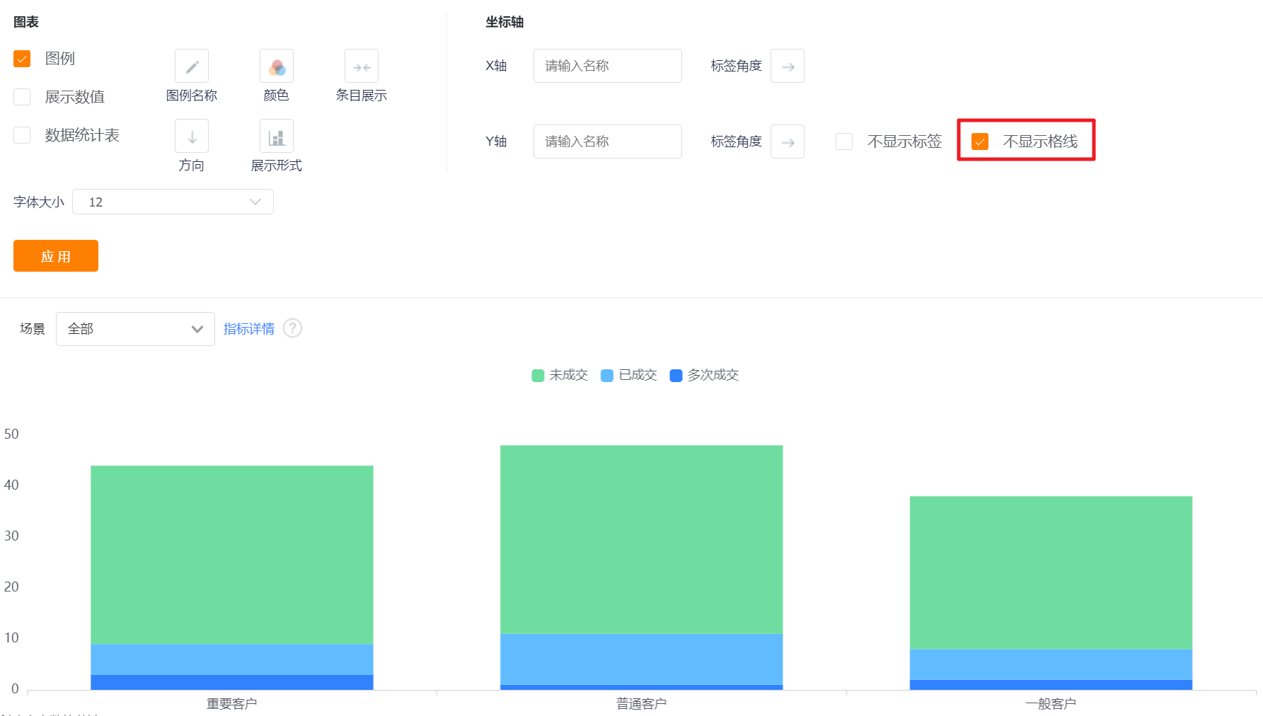
- Don't Display Grid Line: the grid line is displayed by default, and the Y-axis grid line can not be displayed after checking it.
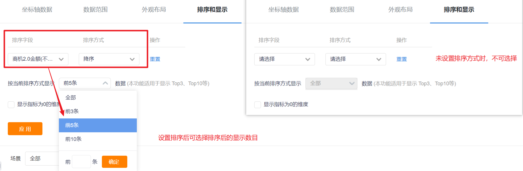
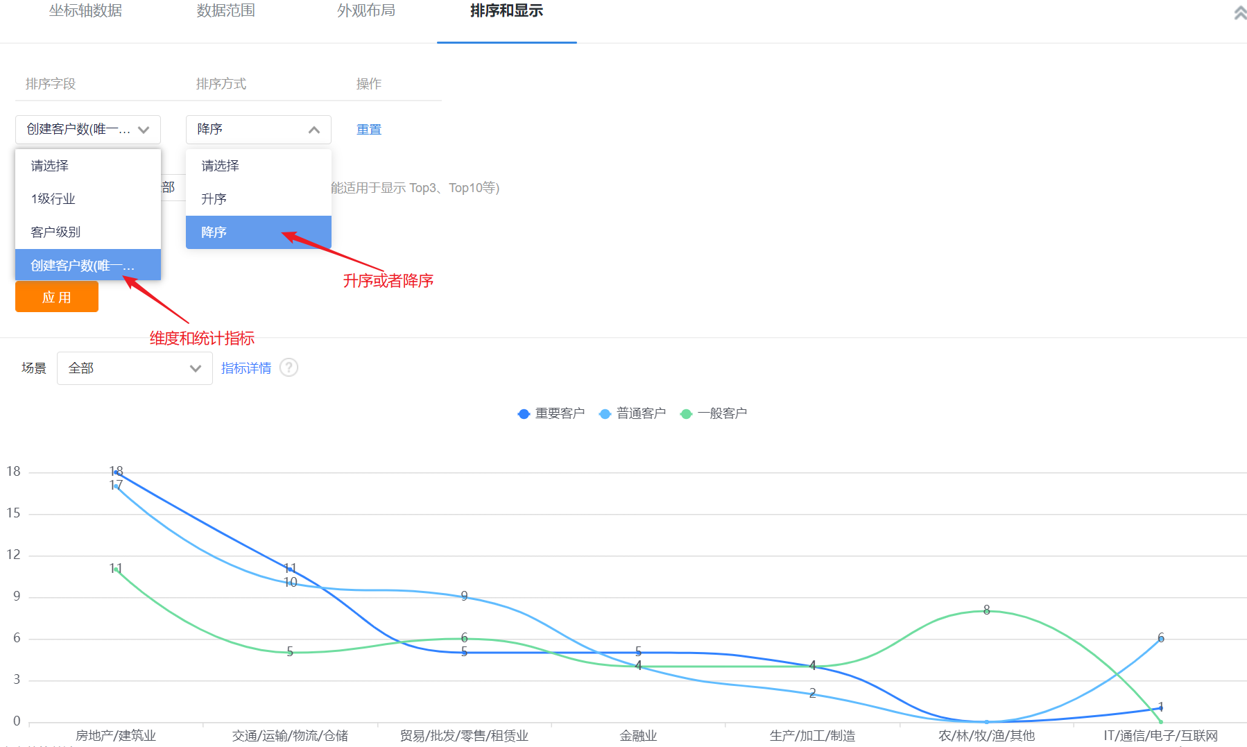
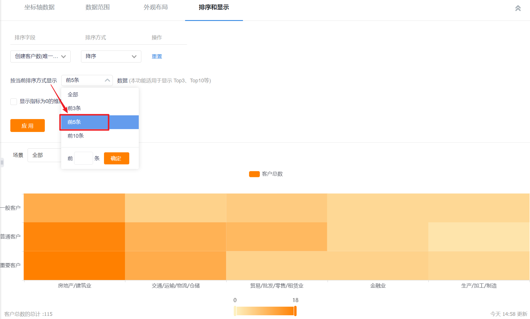
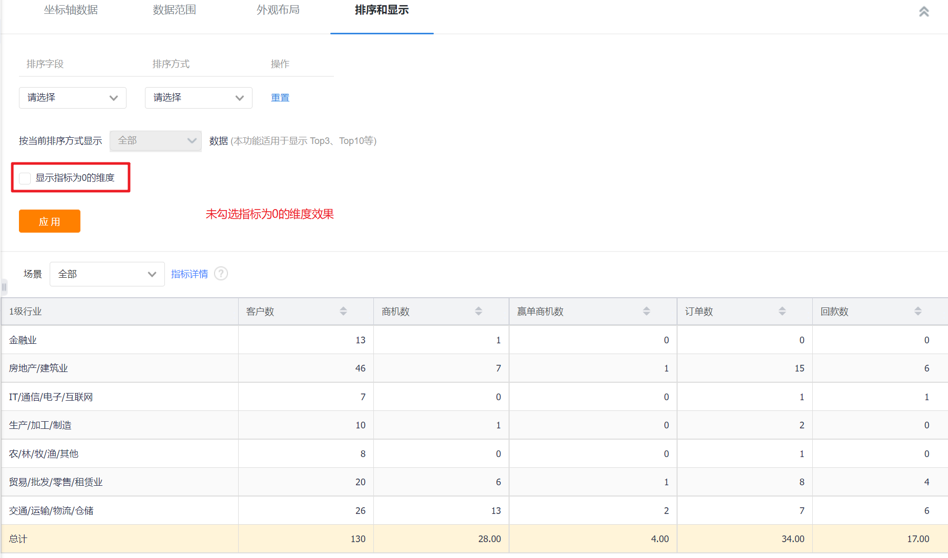
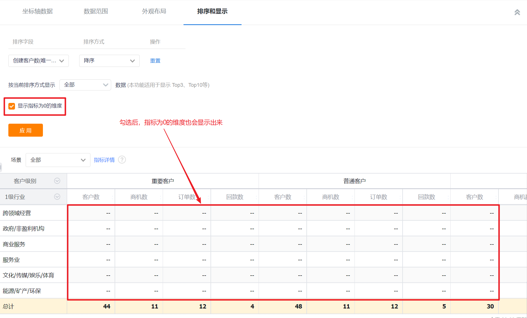
1.2.3 Sorting & Display
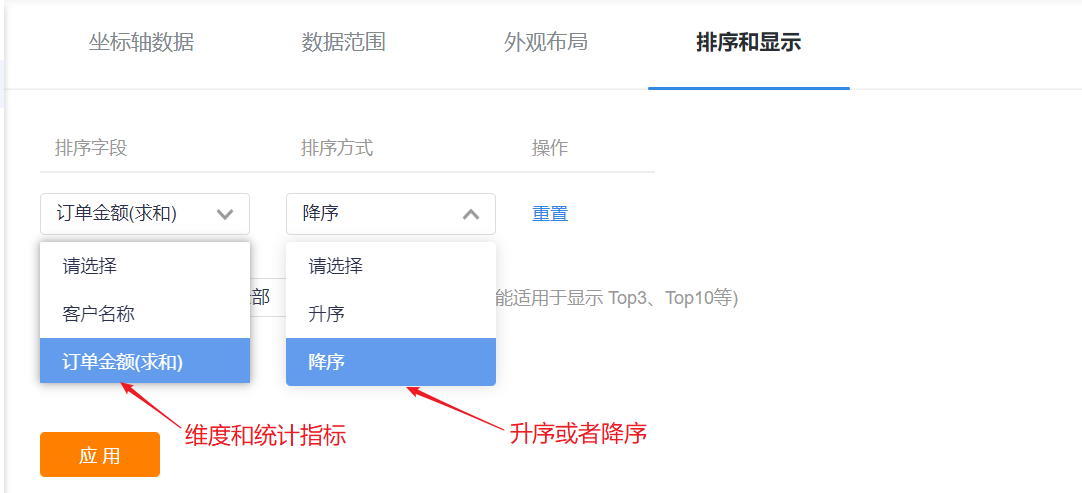
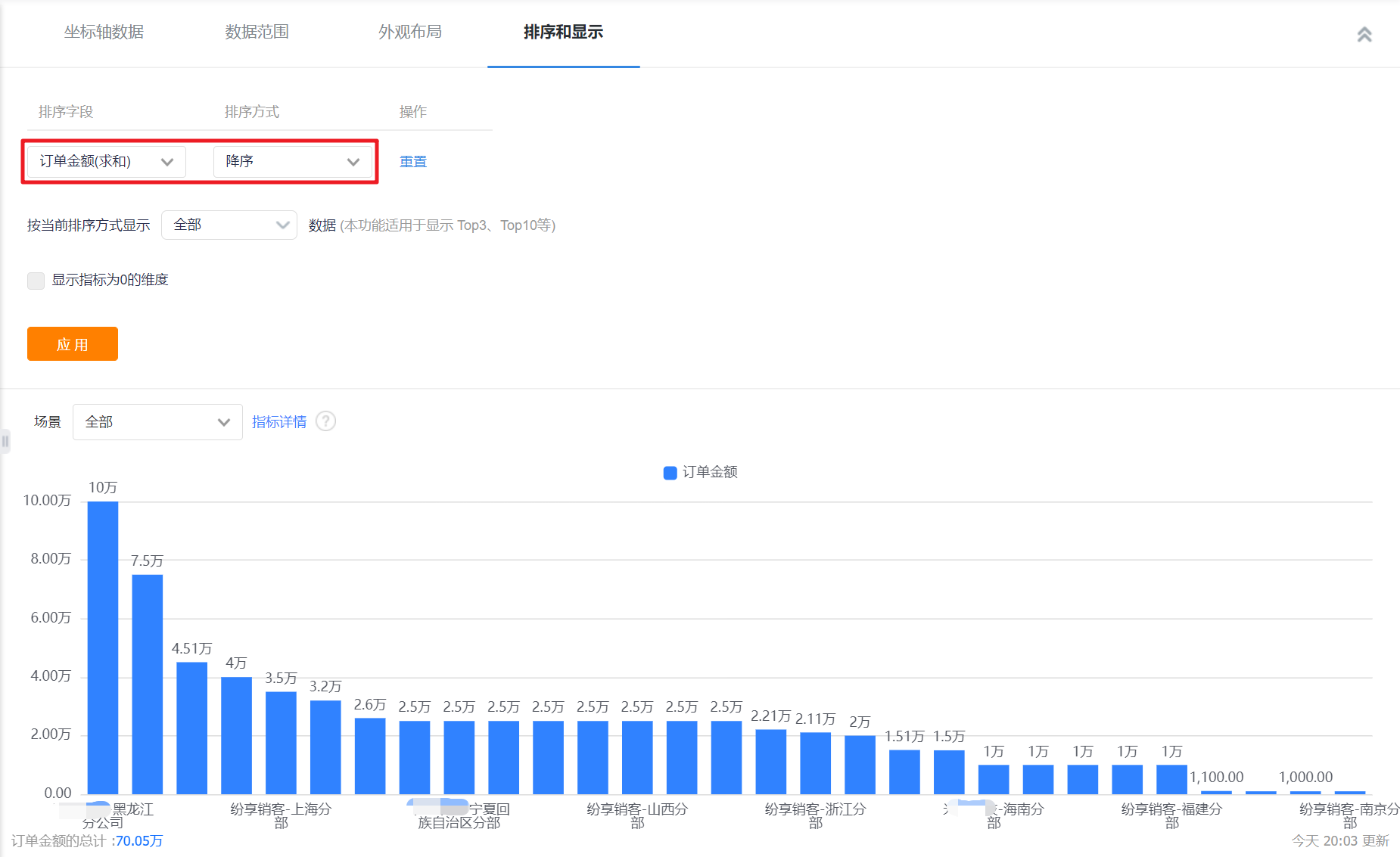
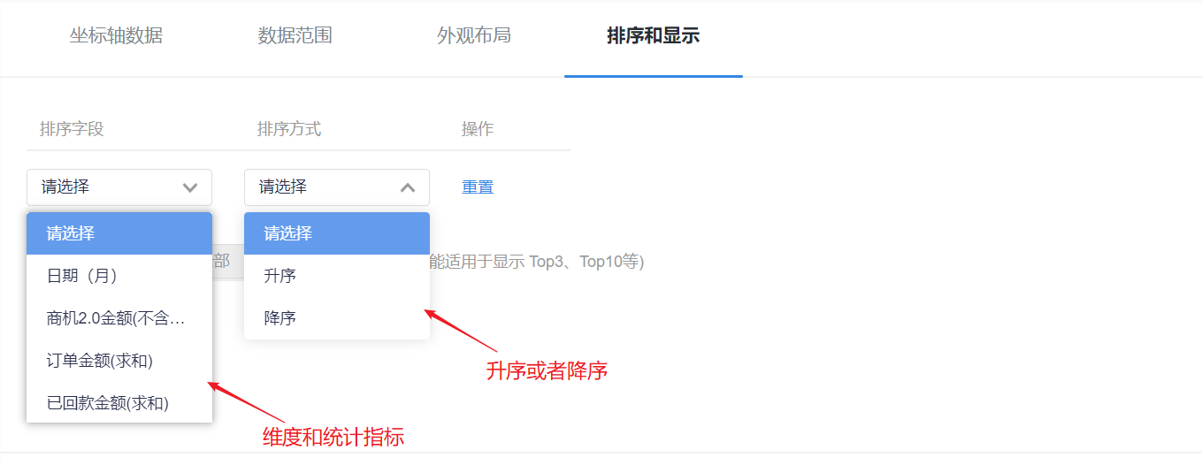
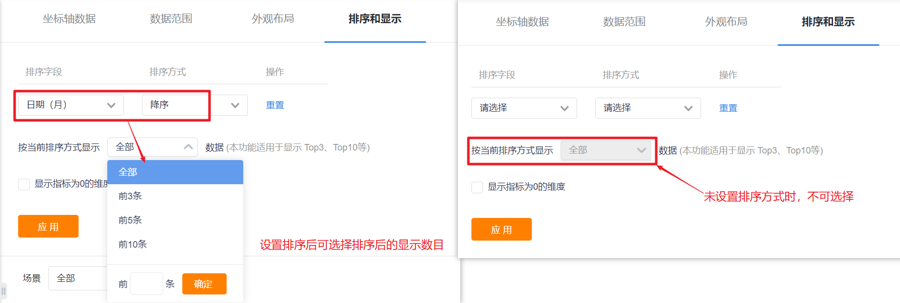
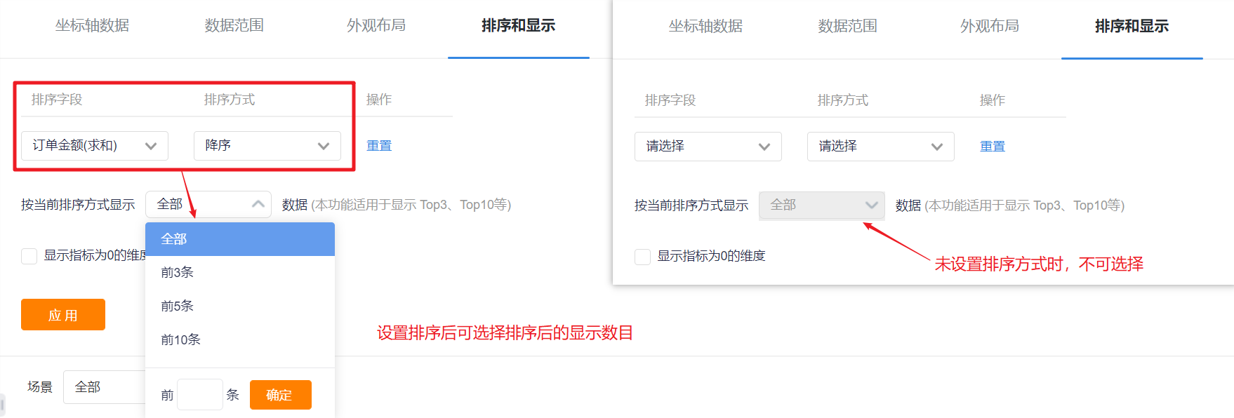
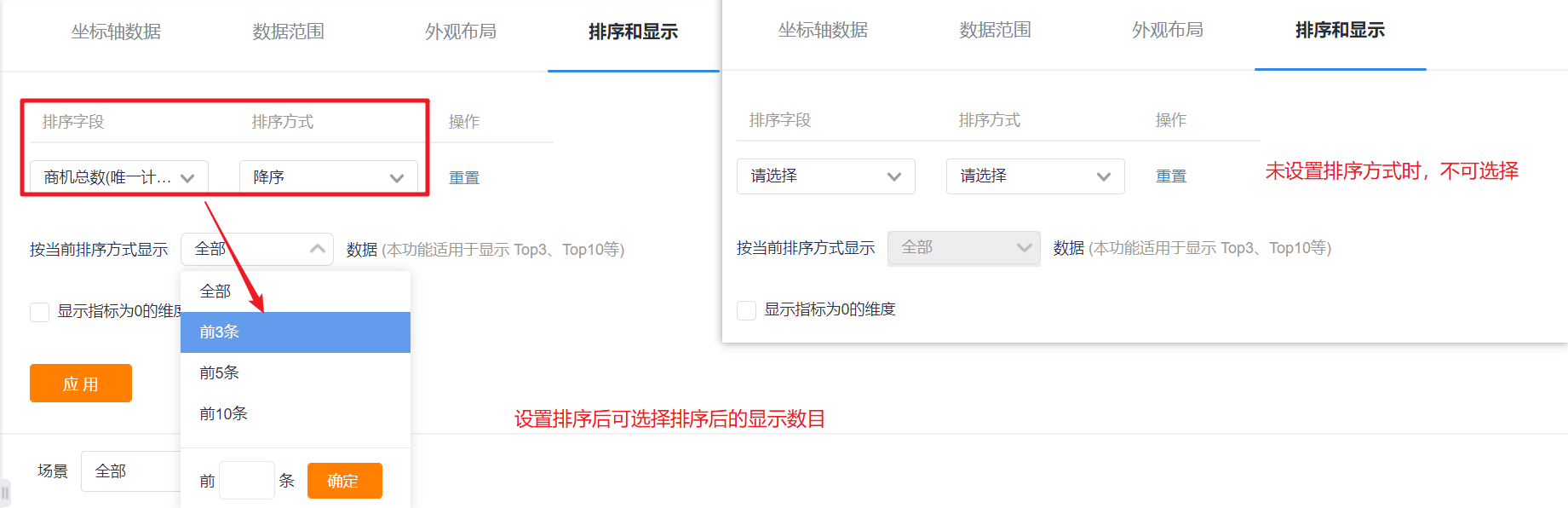
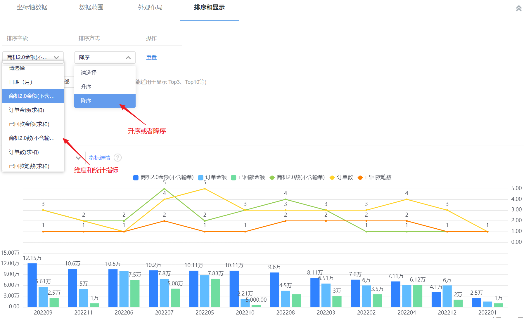
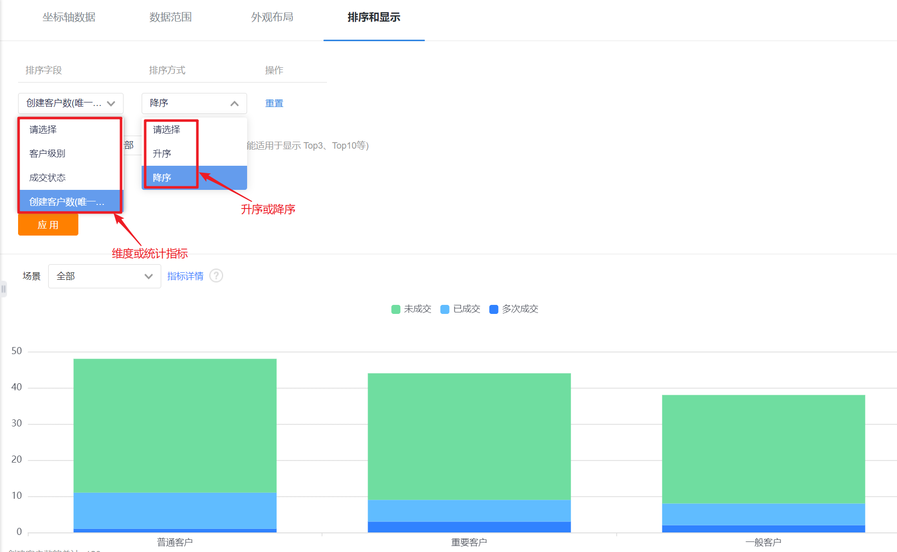
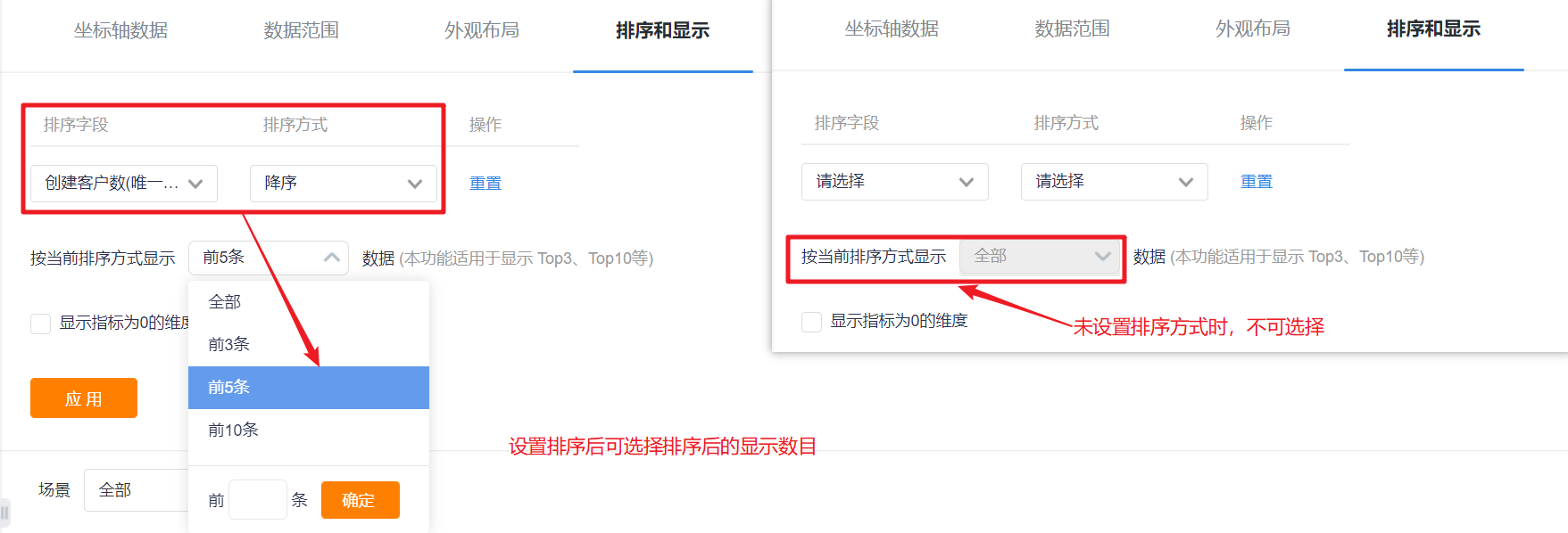
- Sorting: You can set the sorting fields and sorting methods.
- Sorting Field: the optional content is the dimension or the statistical index selected in the current statistical chart;
- Sorting Method: no sorting by default, you can choose ascending or descending order.
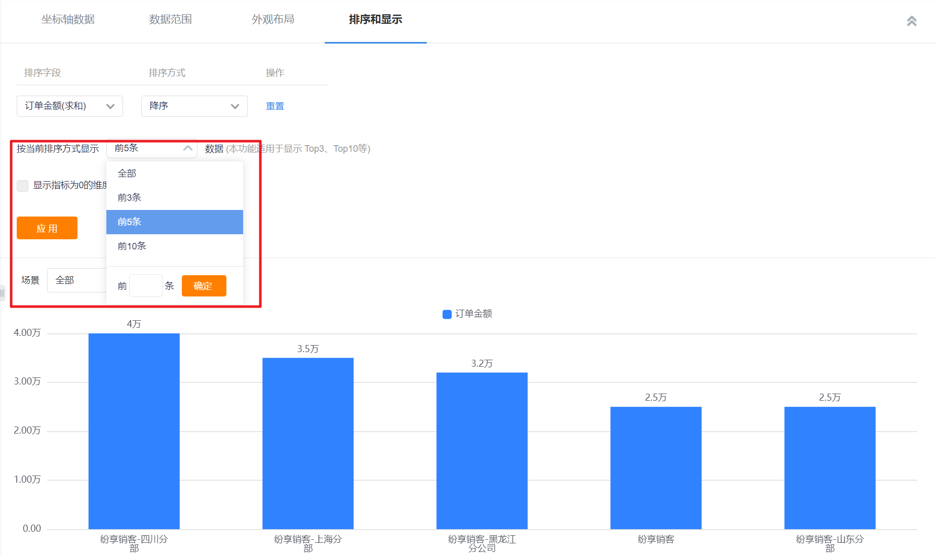
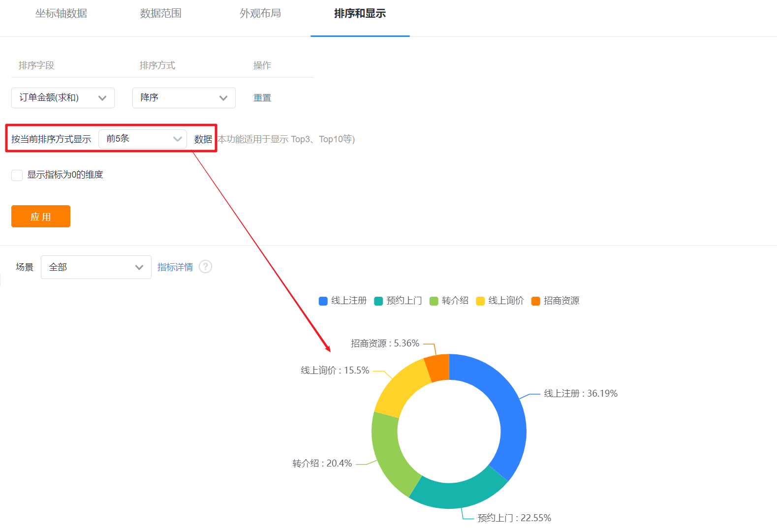
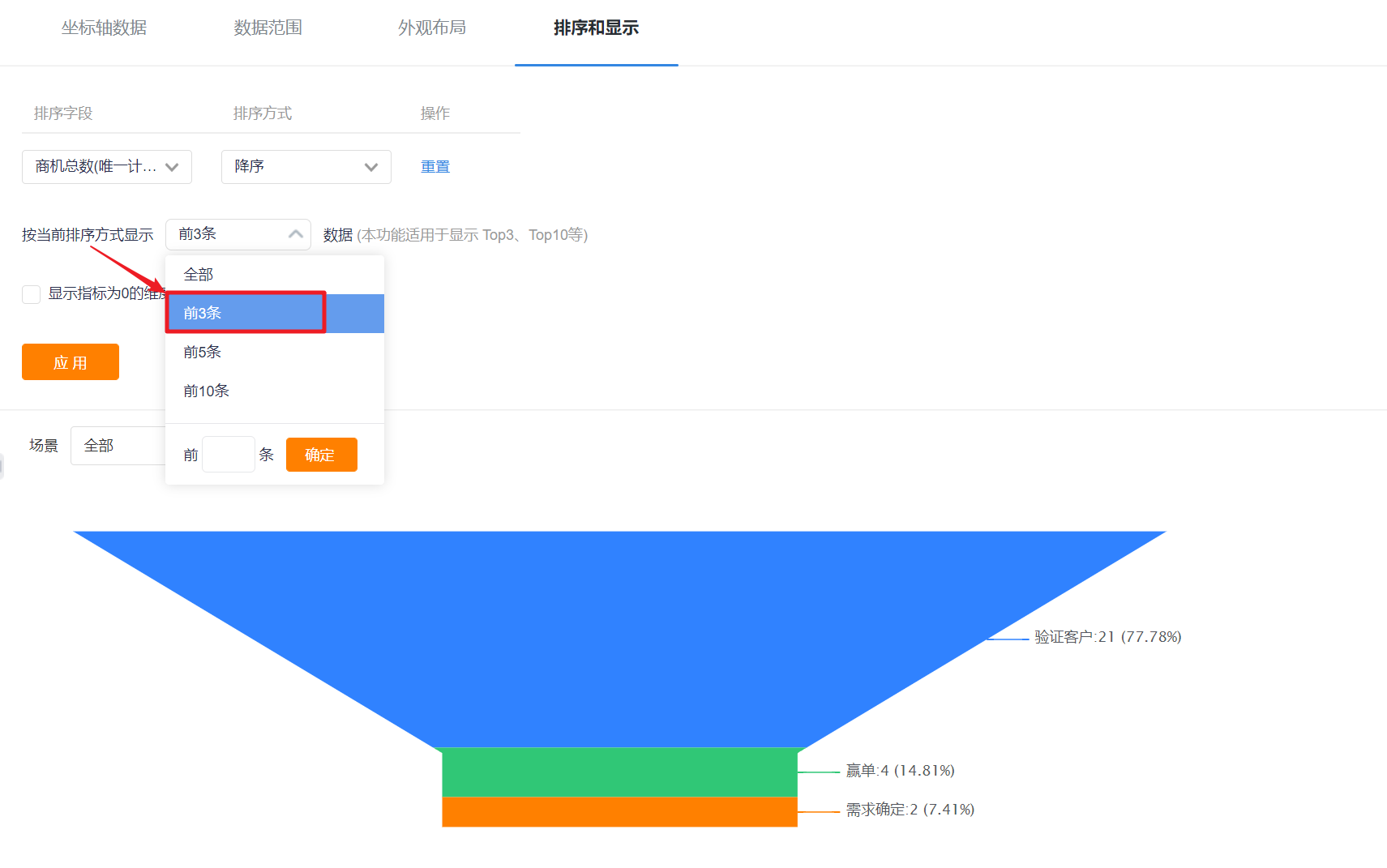
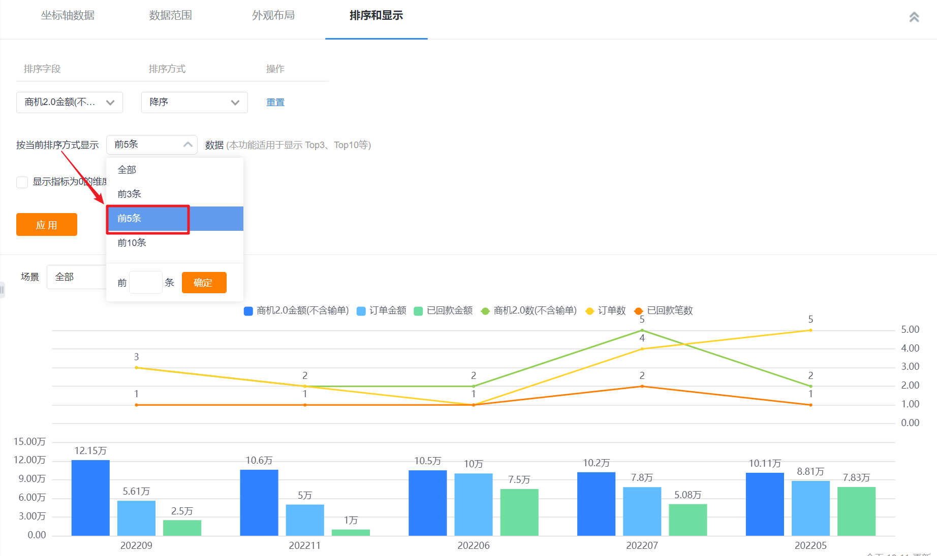
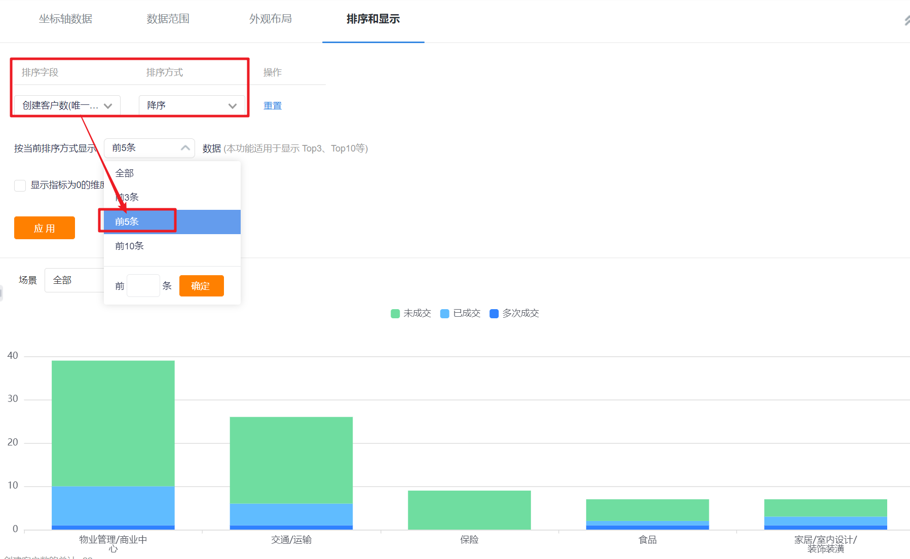
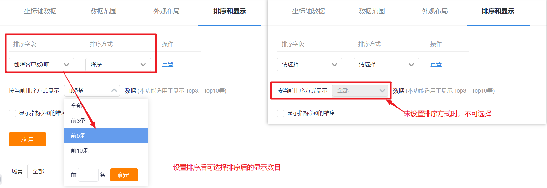
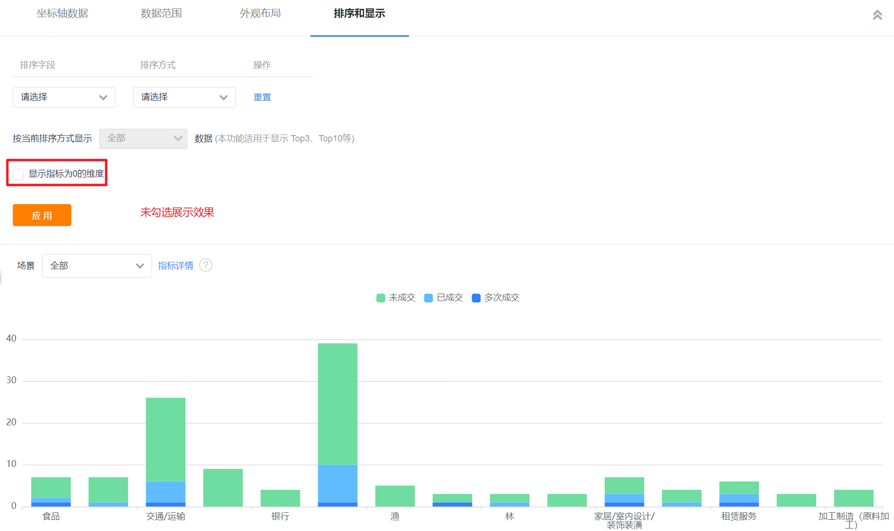
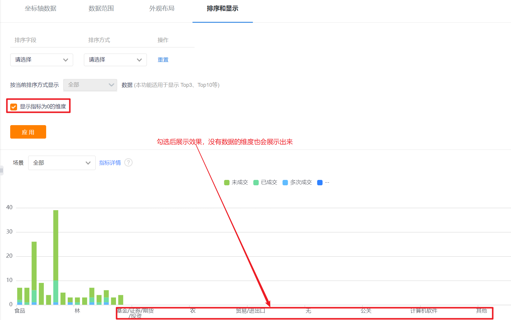
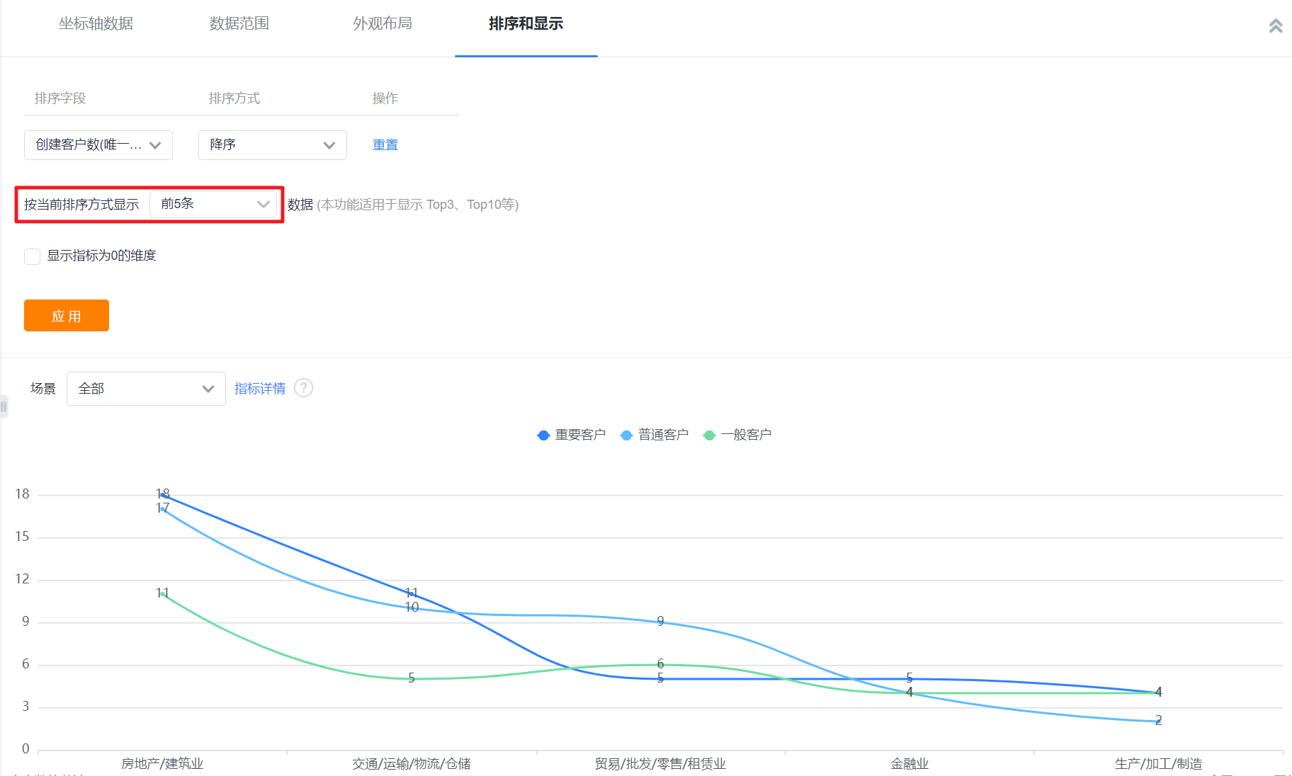
- Displayed Data by Current Sorting Method: After setting the sorting rules, you can set the number of displayed data according to the current sorting rules. The default is all, and you can switch the first 3, top 5, top 10, or customize the number of data.

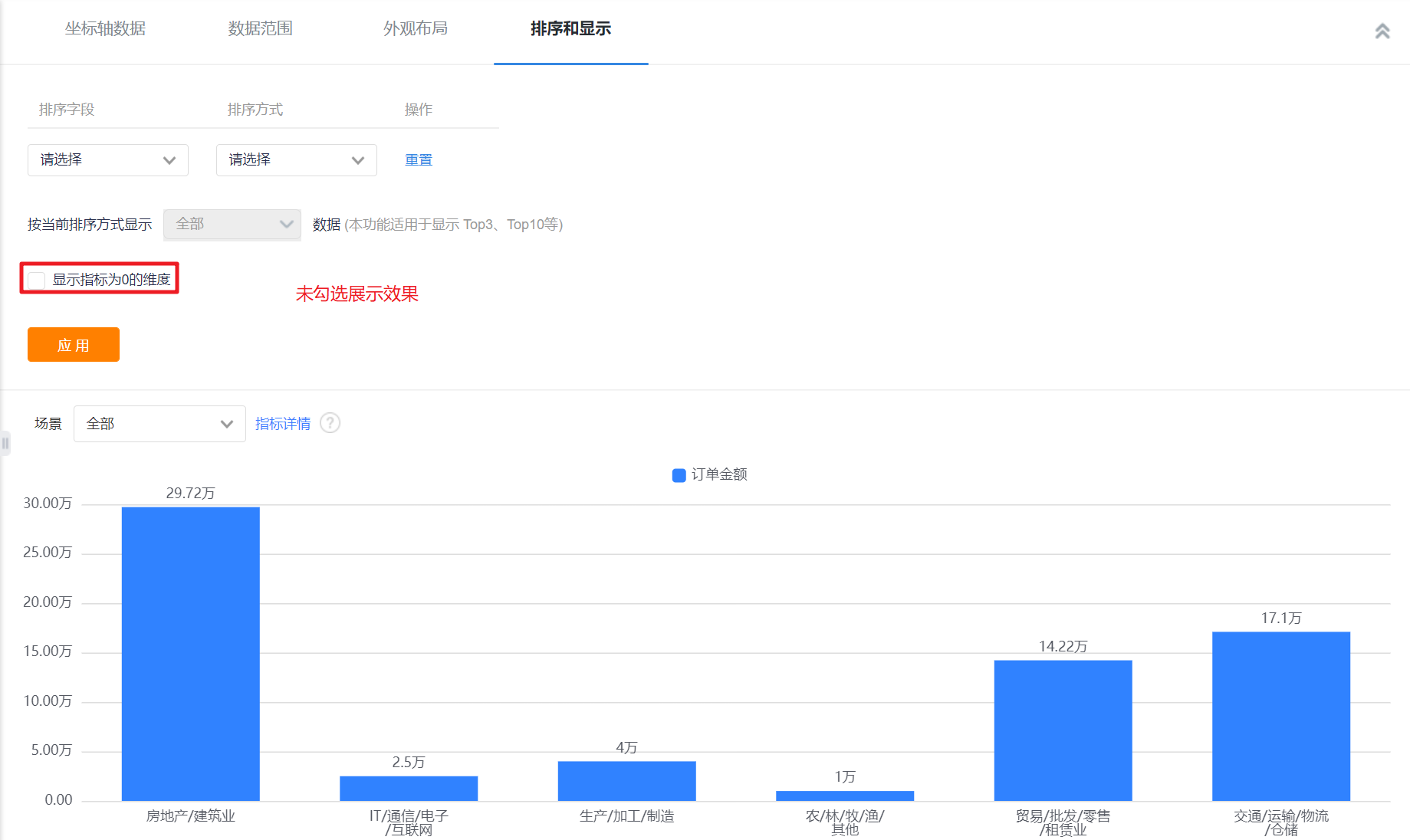
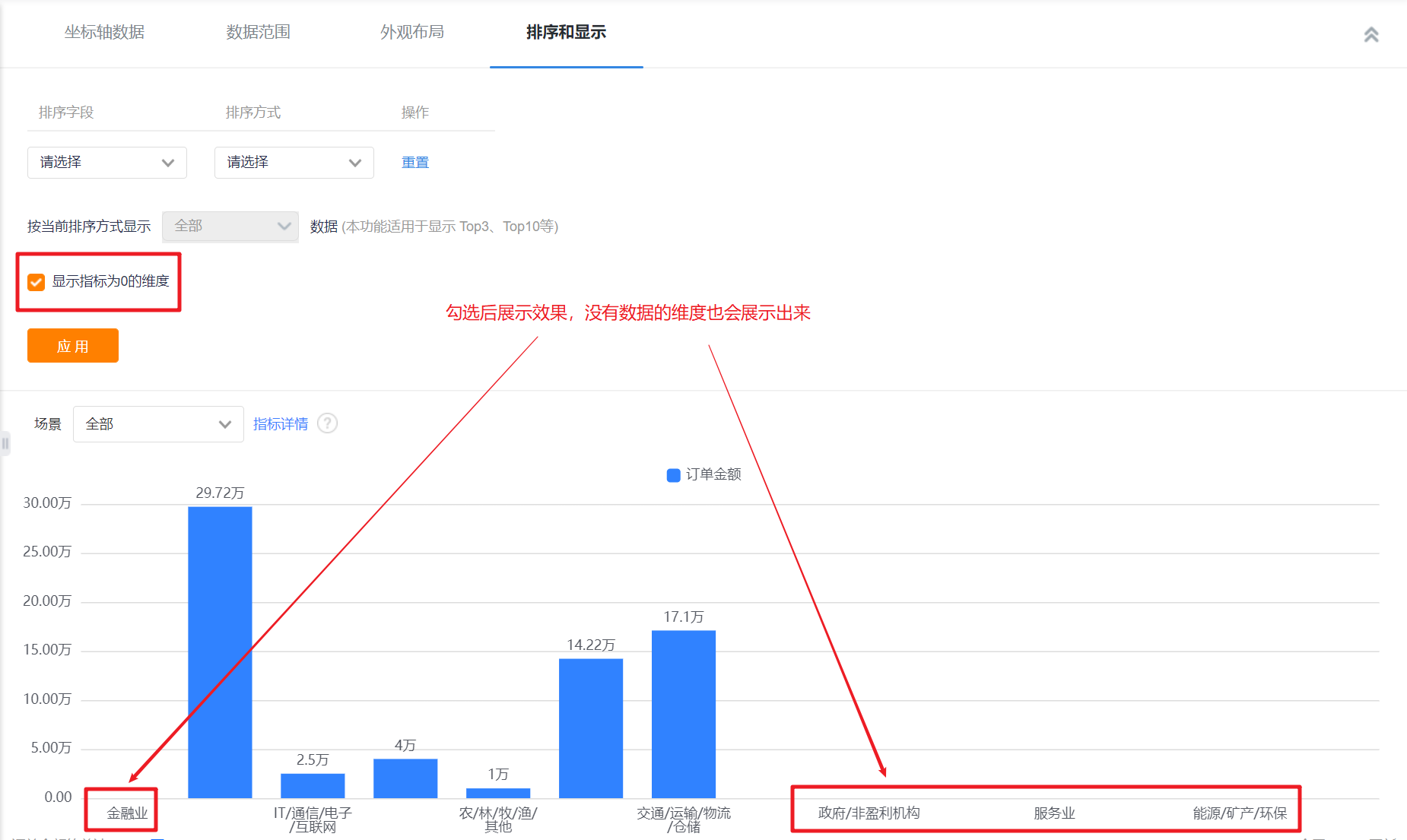
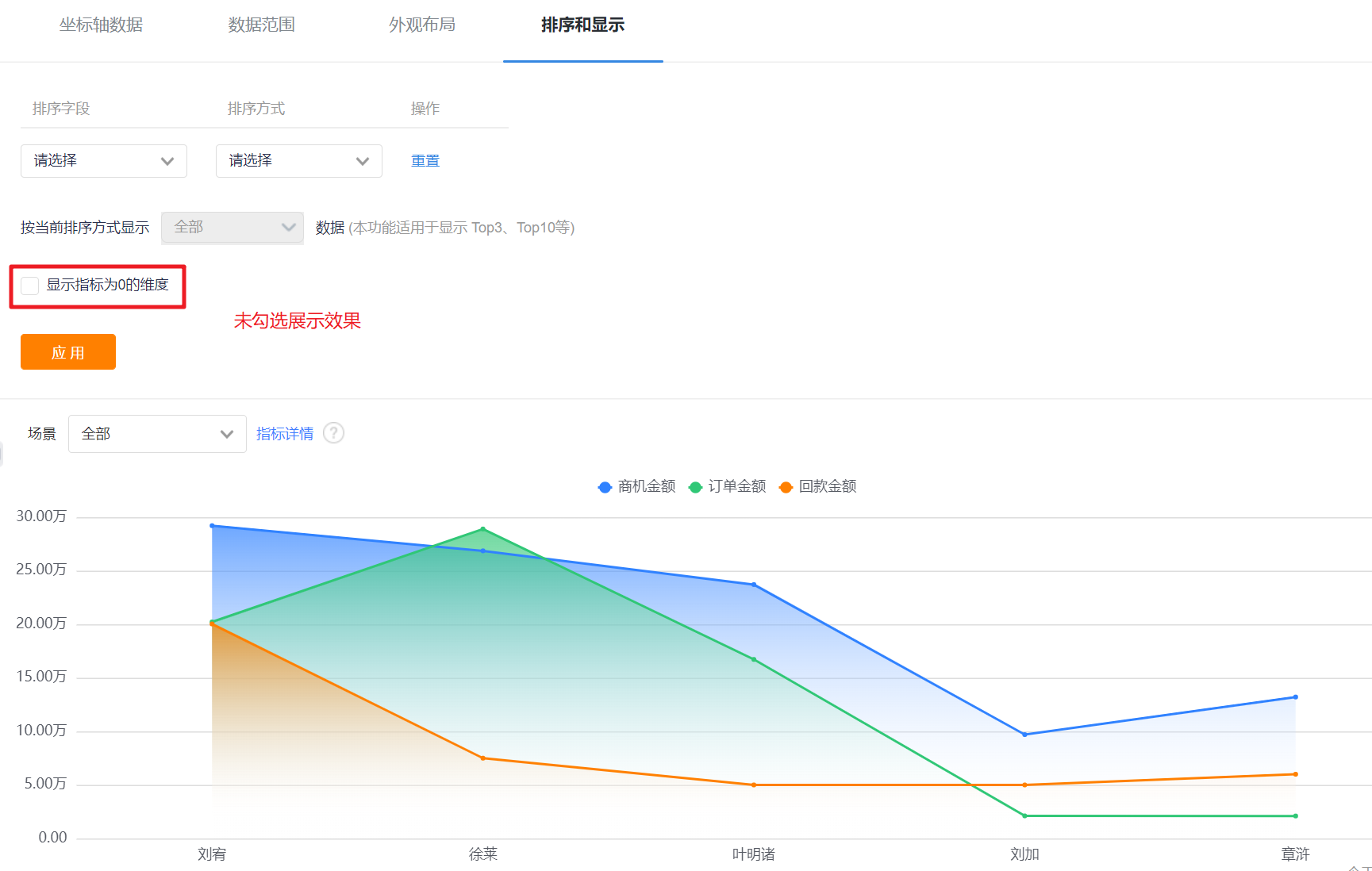
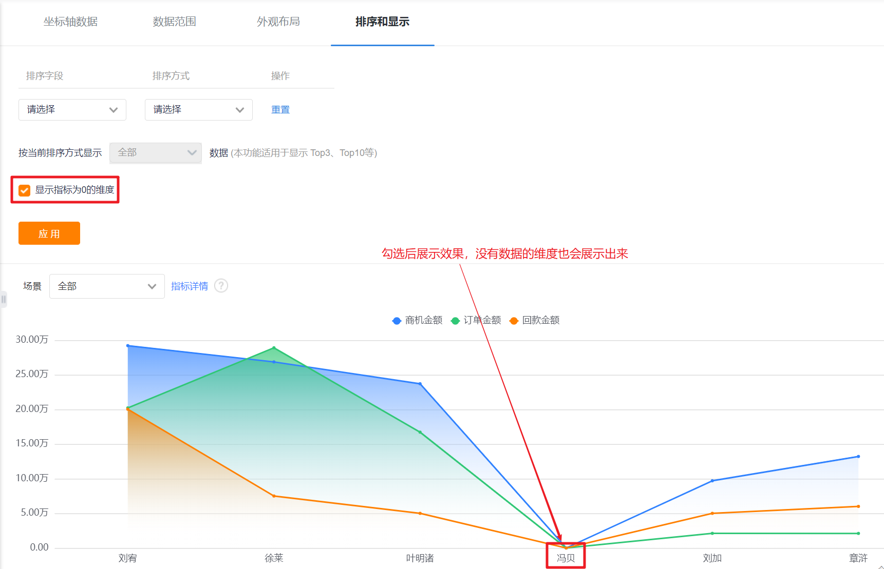
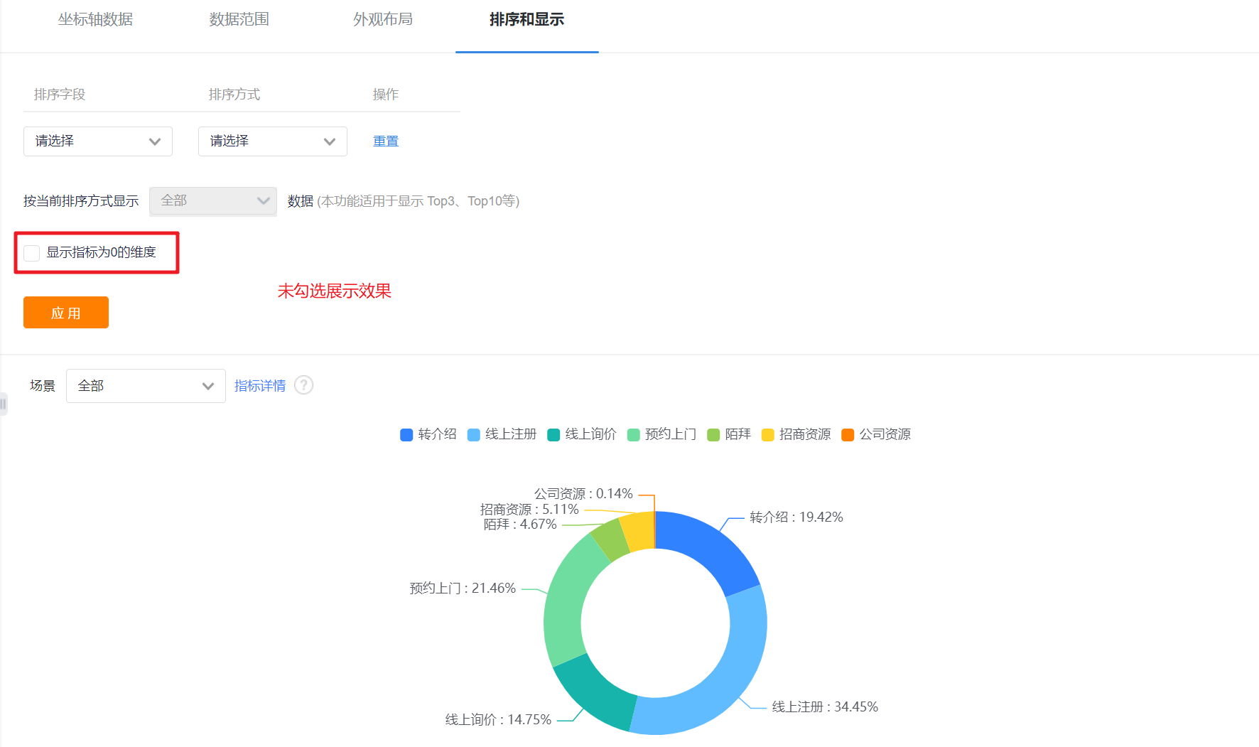
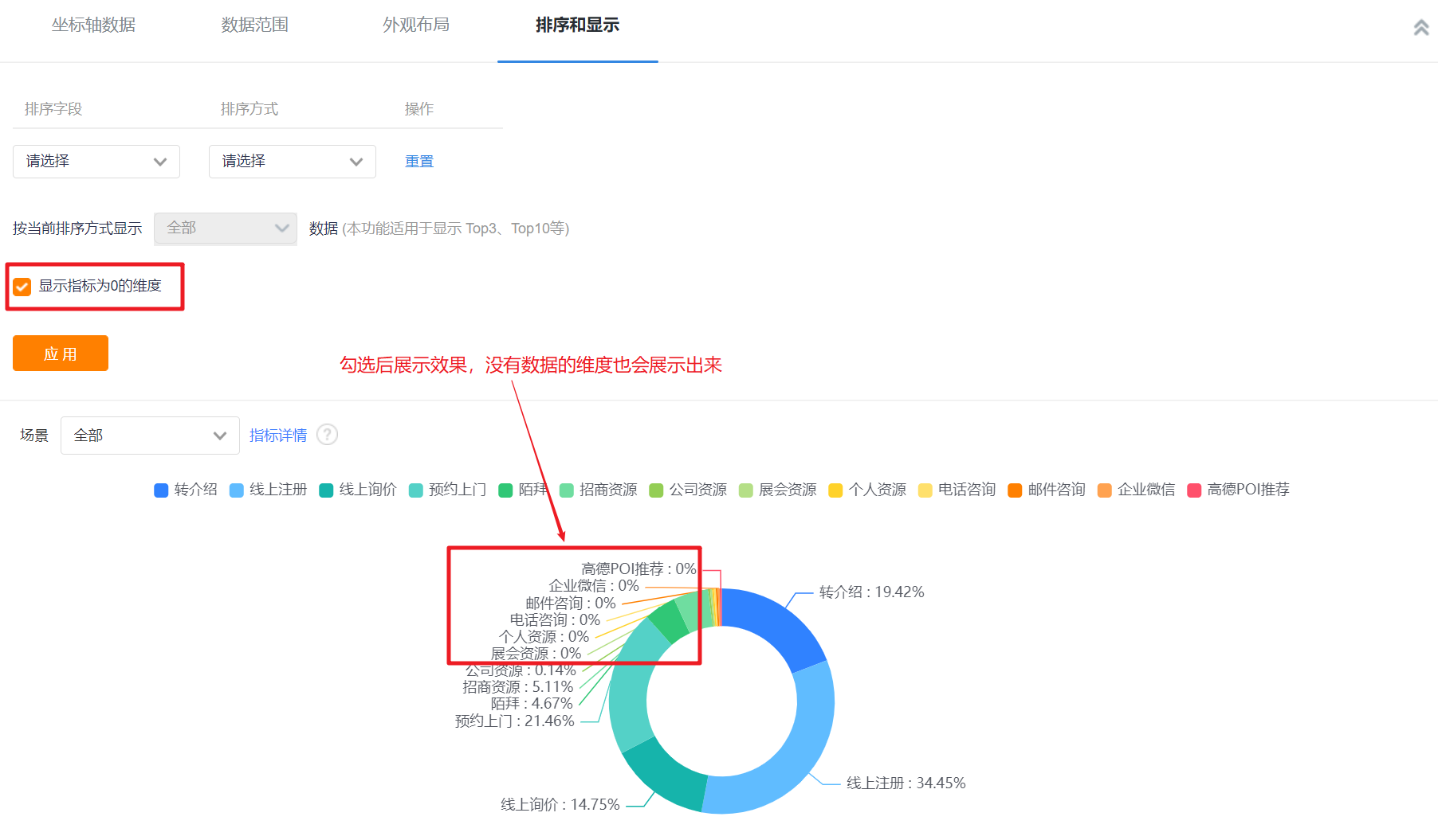
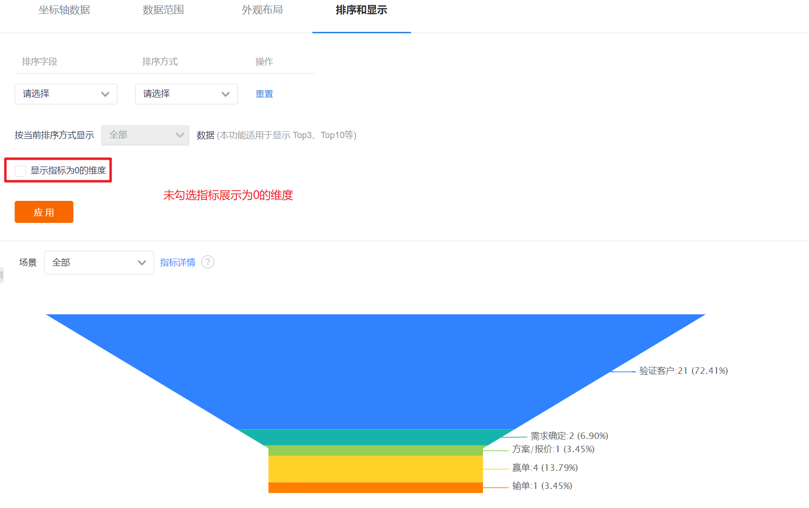
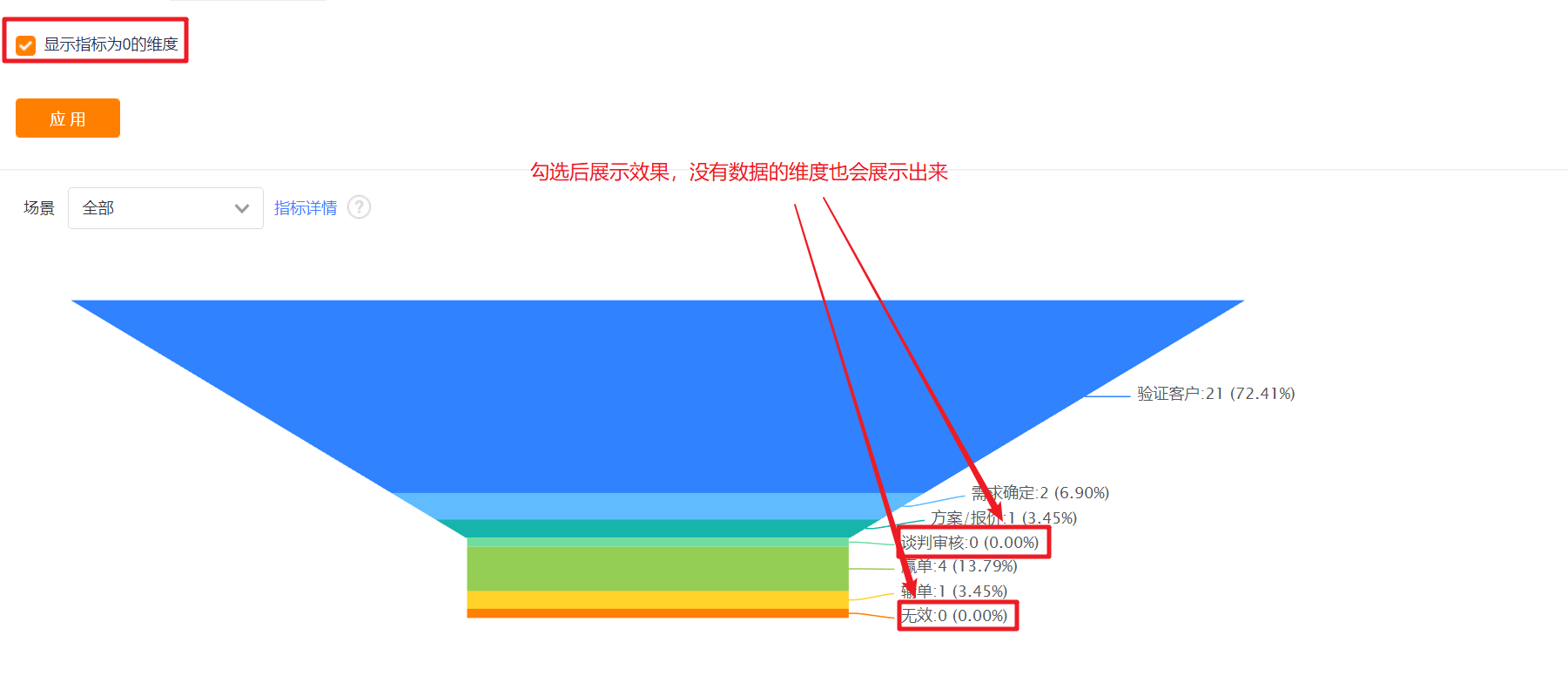
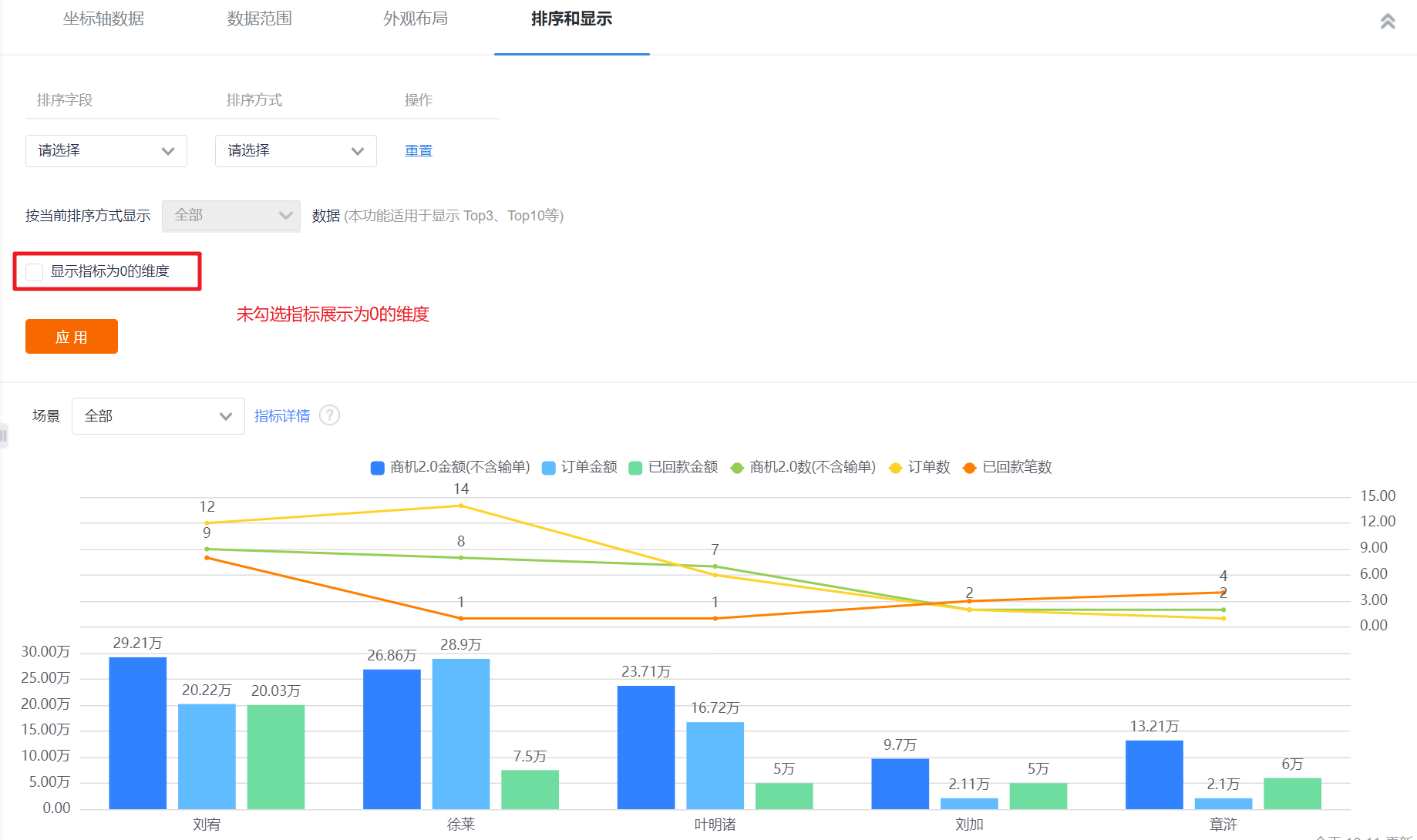
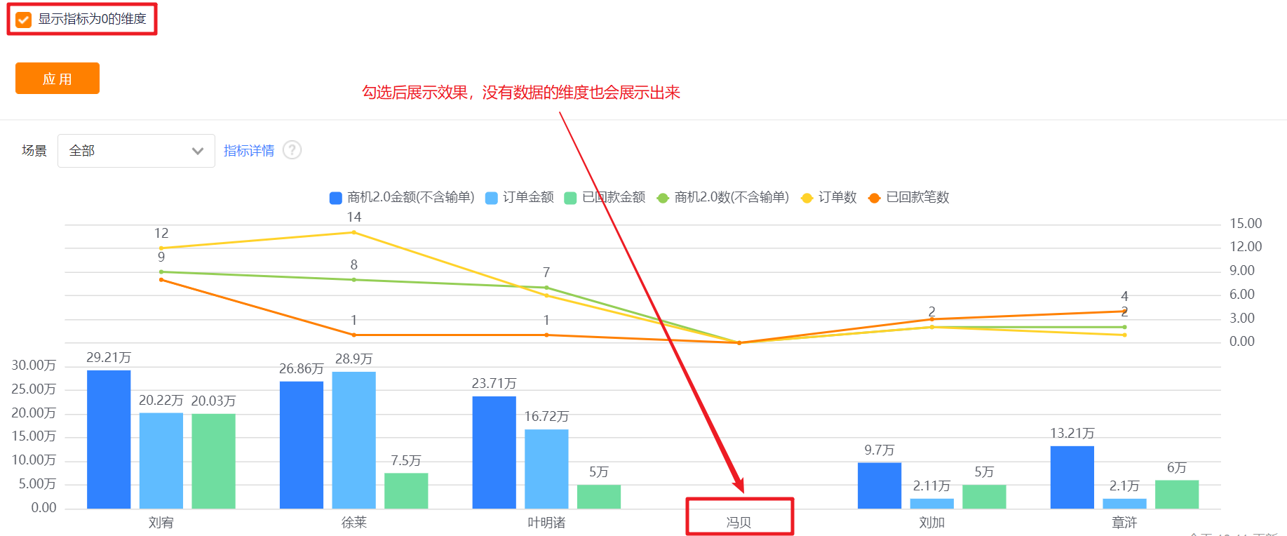
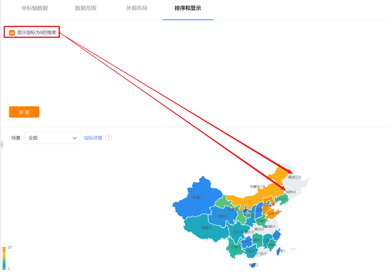
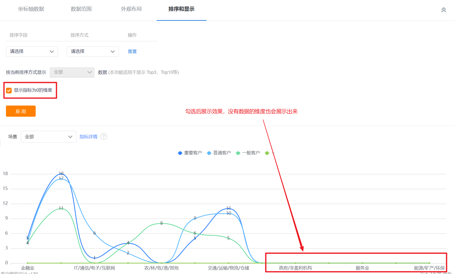
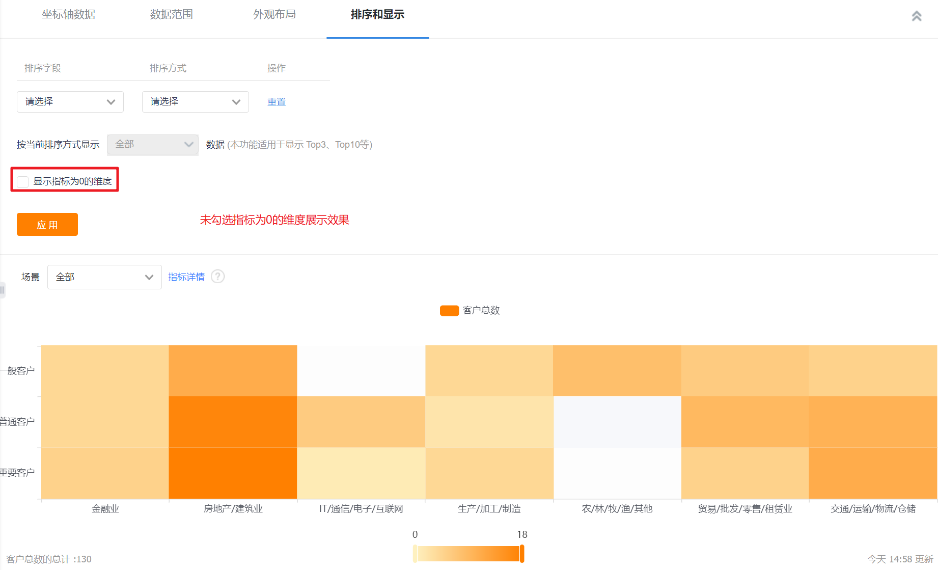
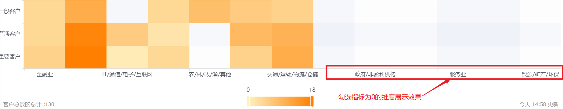
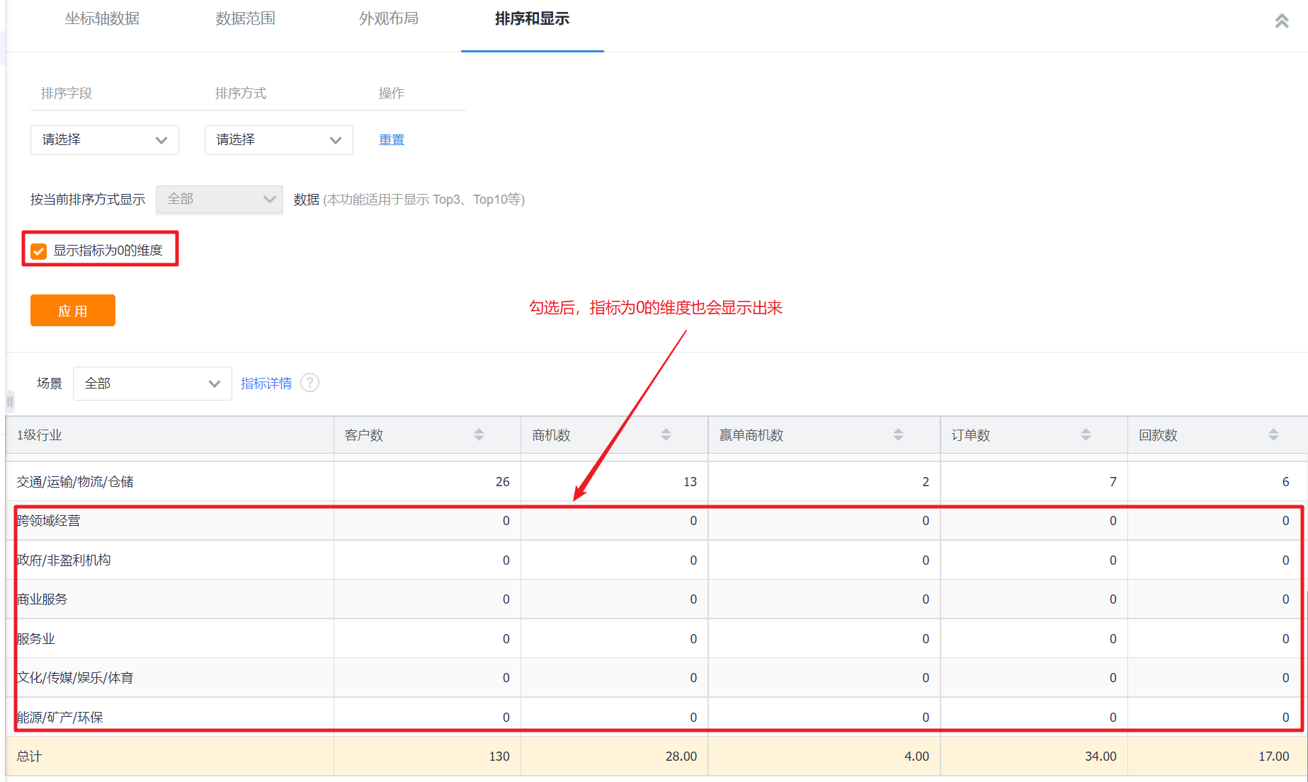
- Display Dimensions with 0 Measure: unchecked by default, and can be checked to display dimensions with 0 measure.
2. Line Chart
2.1 Applicable Scenes
A line chart can show the change trend of each dimension within a certain data range. For example, a line chart can compare the trend of sales orders in each month of the year, etc.
2.2 Chart Configuration
2.2.1 Axis Data
- Dimensions: 1 dimension
- Measures: 1-6 measures
2.2.2 Appearance Layout
- Display Legend: You can check whether to display the legend, and it is checked by default.
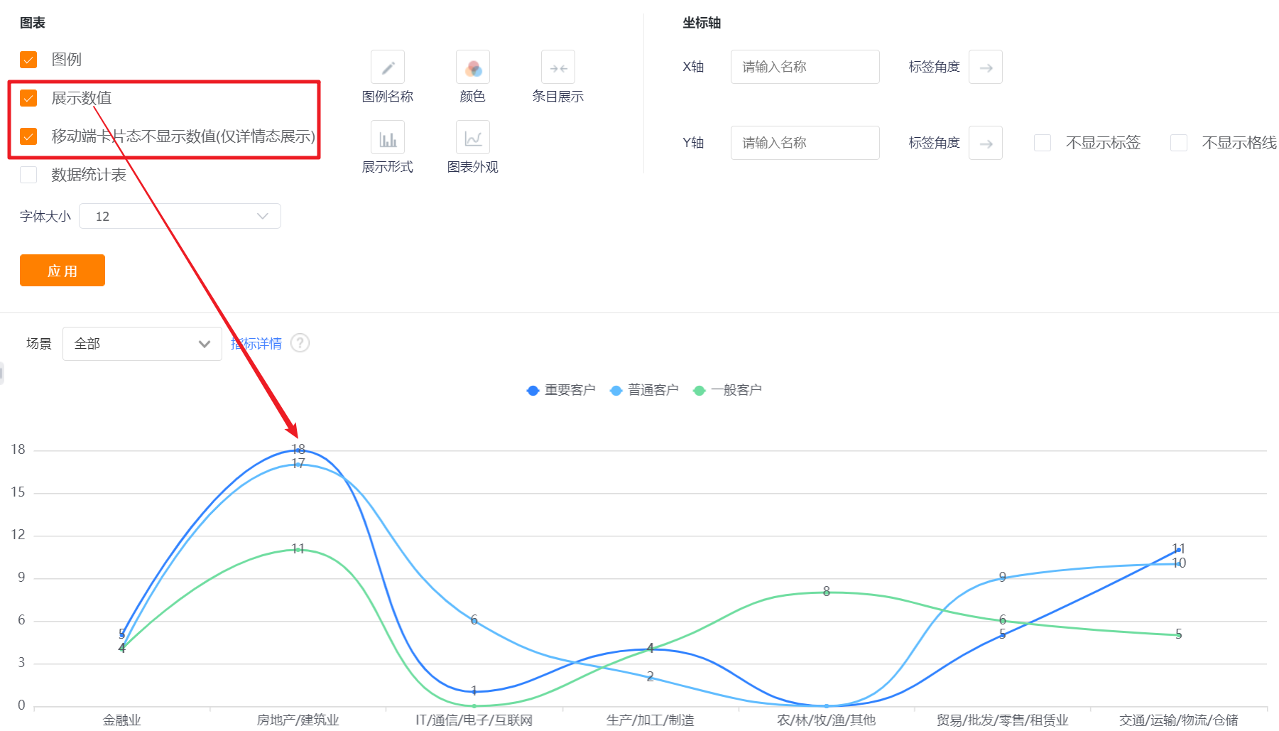
- Display Value: You can check whether to display the value, and it is not checked by default.
- Settings: When there are two or more measures, you can set the content of the display measures, and they are all checked by default;
- The card state of the mobile terminal does not display the value (only the detail state display): it will only be displayed when [Display Value] is checked, and it is checked by default when it is displayed.
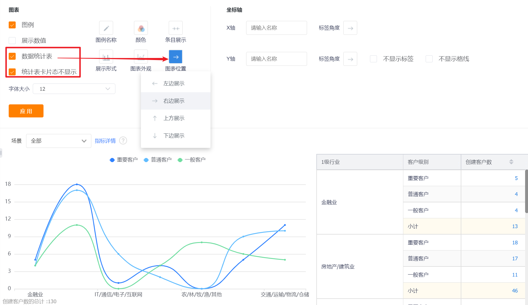
- Data Statistics Table: You can set whether to display the data statistics table, and it will not be displayed by default.
- Statistical table card status is not displayed: This configuration is displayed after the display data statistical table is checked, which is checked by default;
- Chart Position: After checking the display data statistics table, this configuration is displayed. By default, it occupies the right side of the chart, and can be switched to the left, top or bottom.
- Identification Line: You can set the identification line of the chart, which is not checked by default, and a maximum of 6 identification lines can be set for a chart.
- Name: Set the name of the identification line;
- Identification Value: the default is a constant, which can be switched to the average value, maximum value and minimum value of the indicator. When a constant is selected, a specific value can be set;
- Display Identification Line: it is not displayed by default, and it can be checked to display;
- Display Identification Line Value: not displayed by default, you can check it to display.
- Display Serial Number: It is not checked by default, and the serial number will be displayed in front of the dimension after checking.
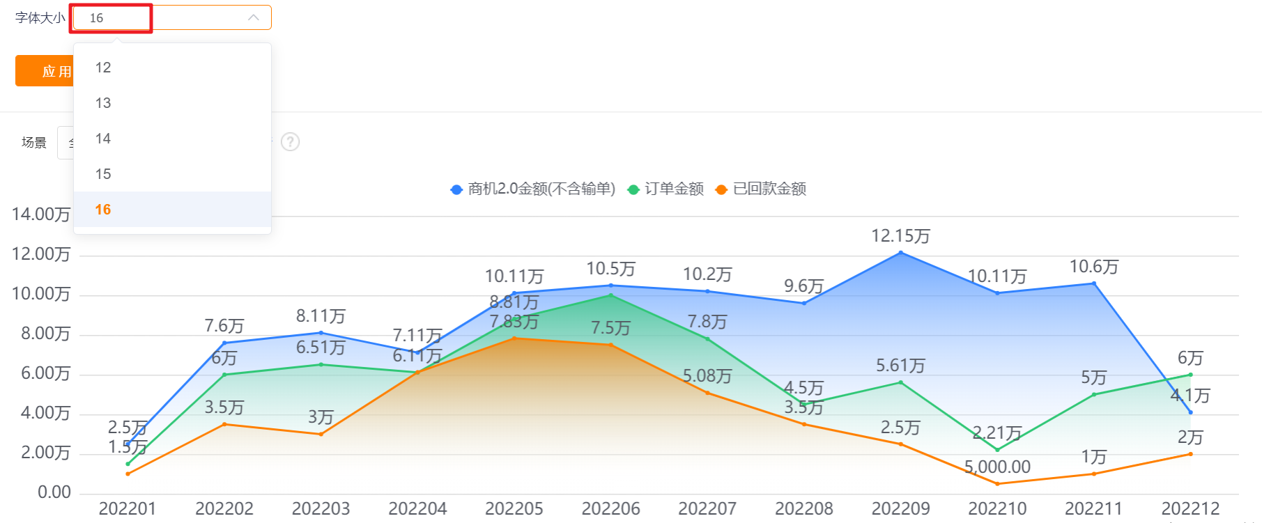
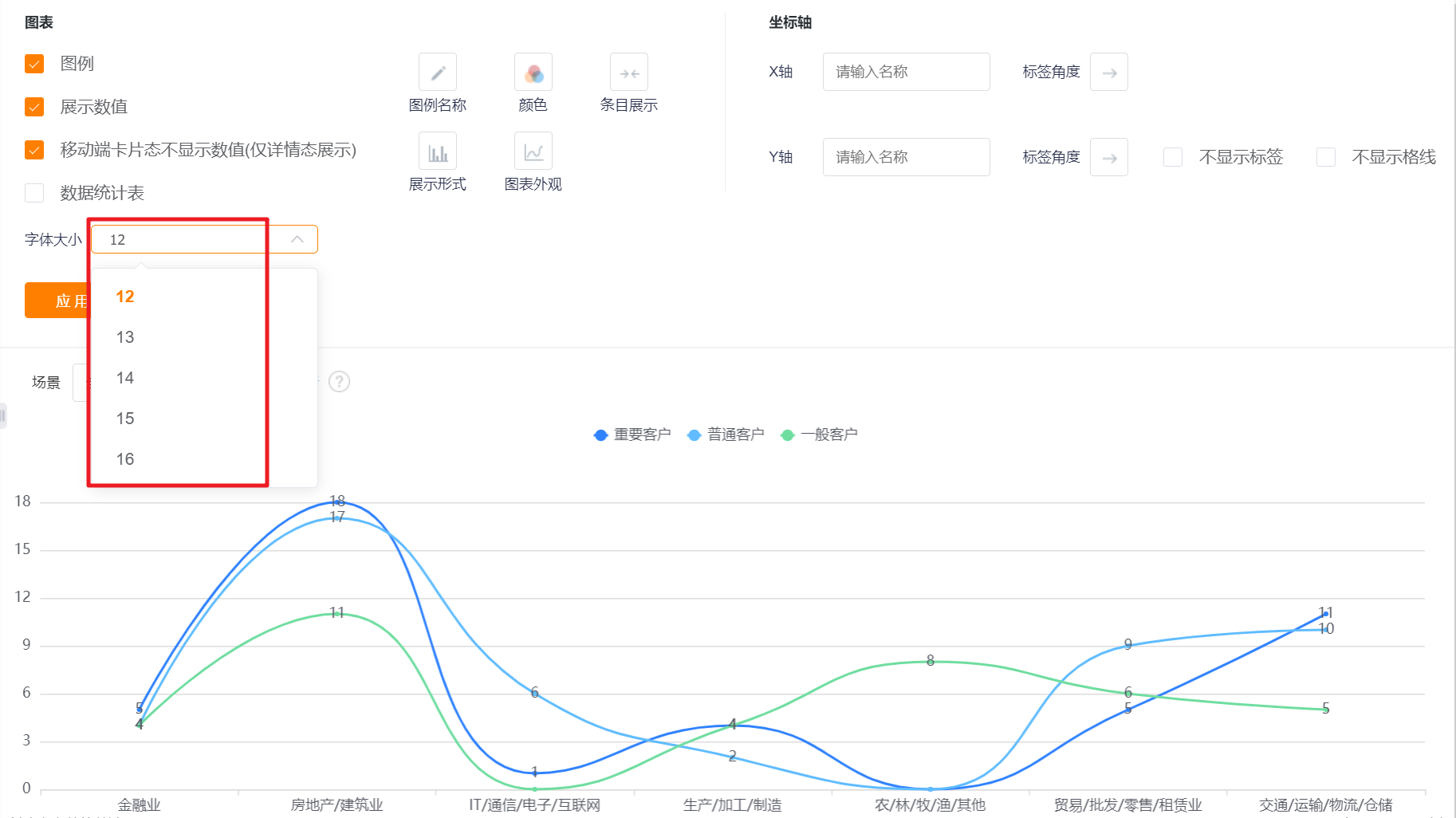
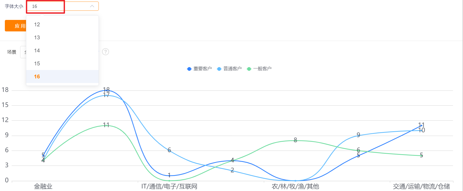
- Font Size: The default is 12, which can be switched to 13, 14, 15, 16 for display.
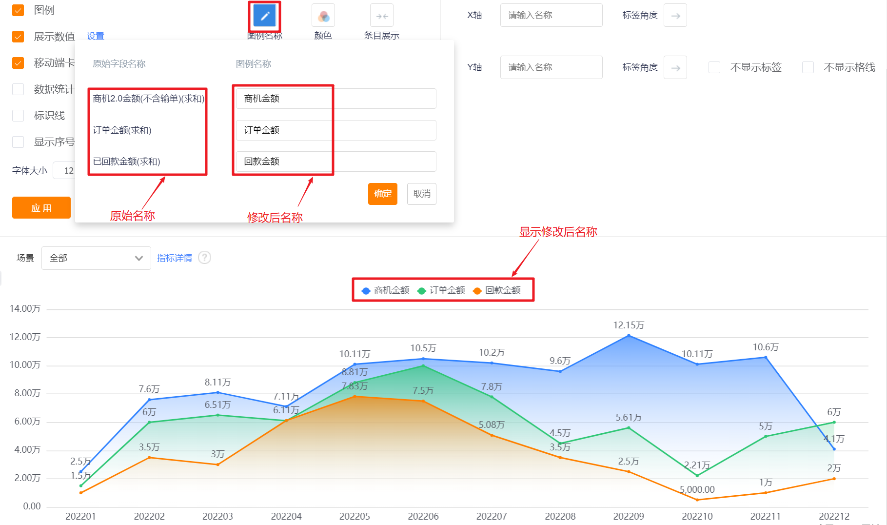
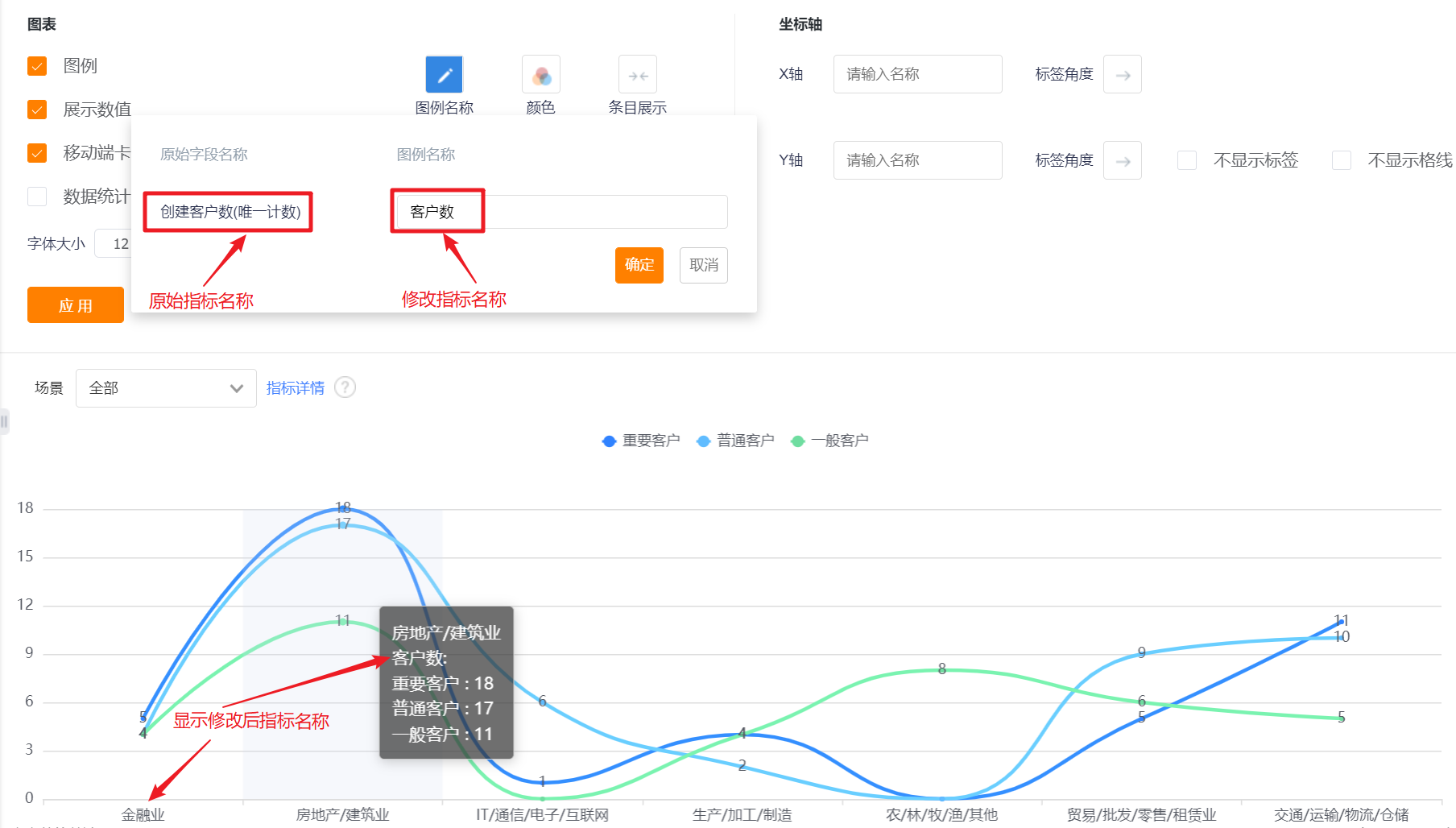
- Legend Name: Displayed by indicator name by default, you can modify the displayed content by yourself.
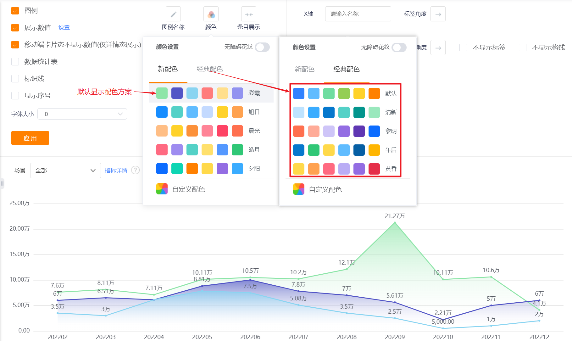
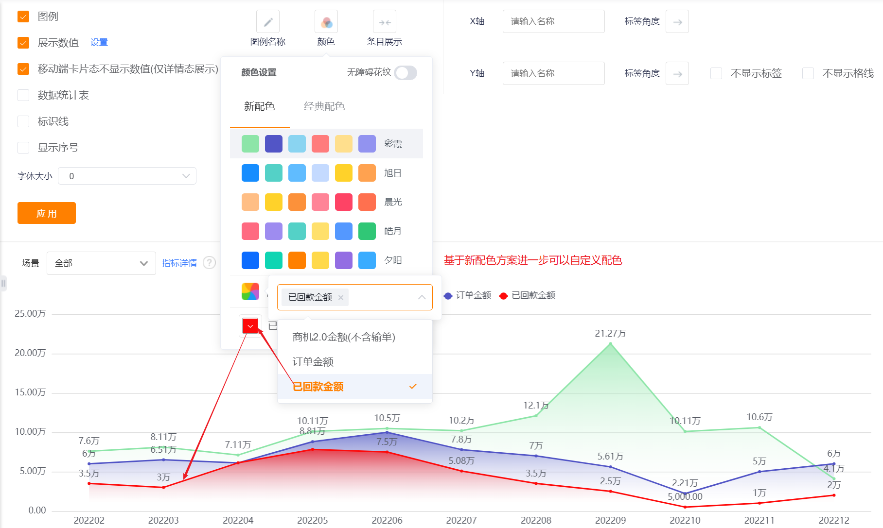
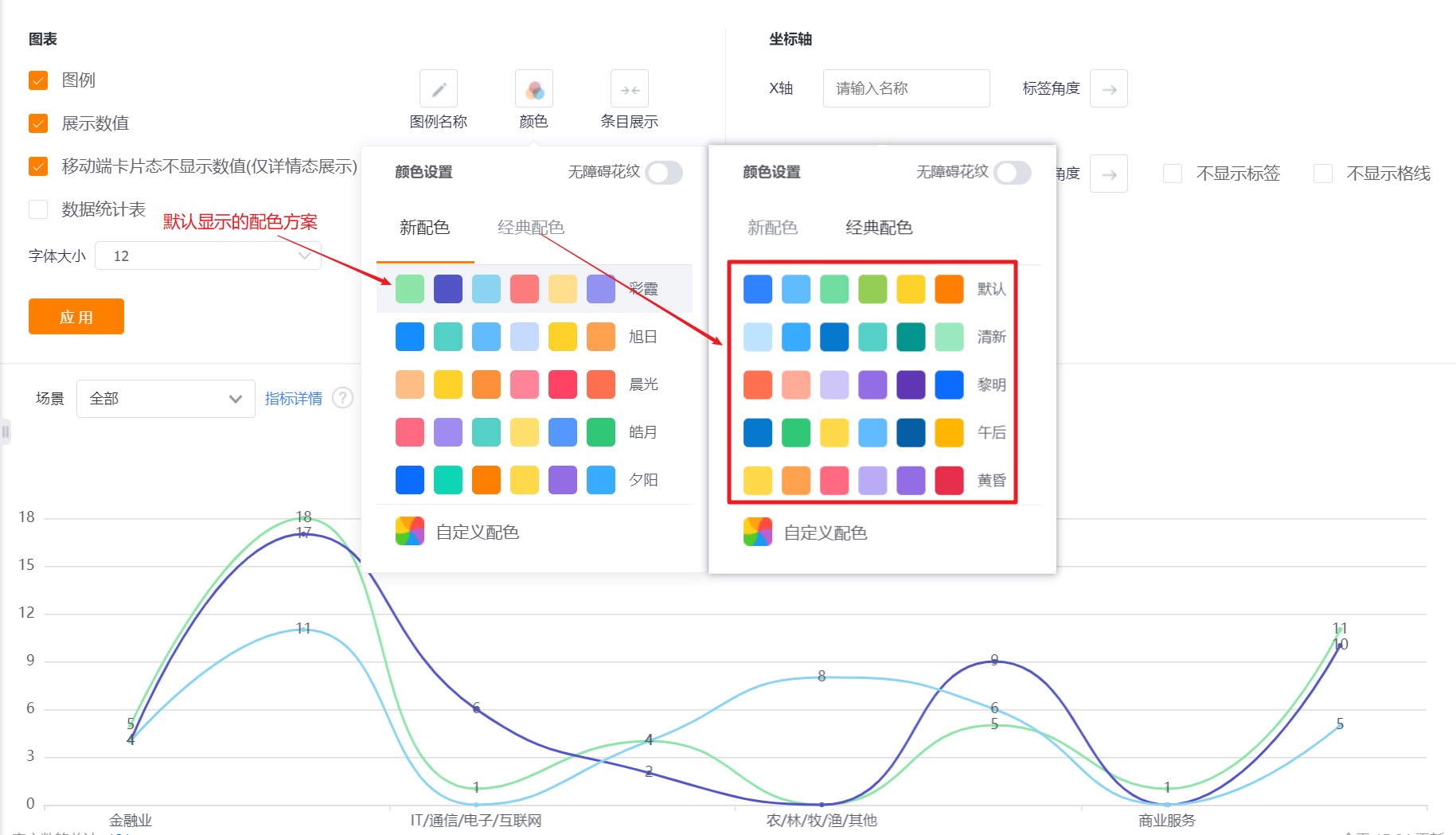
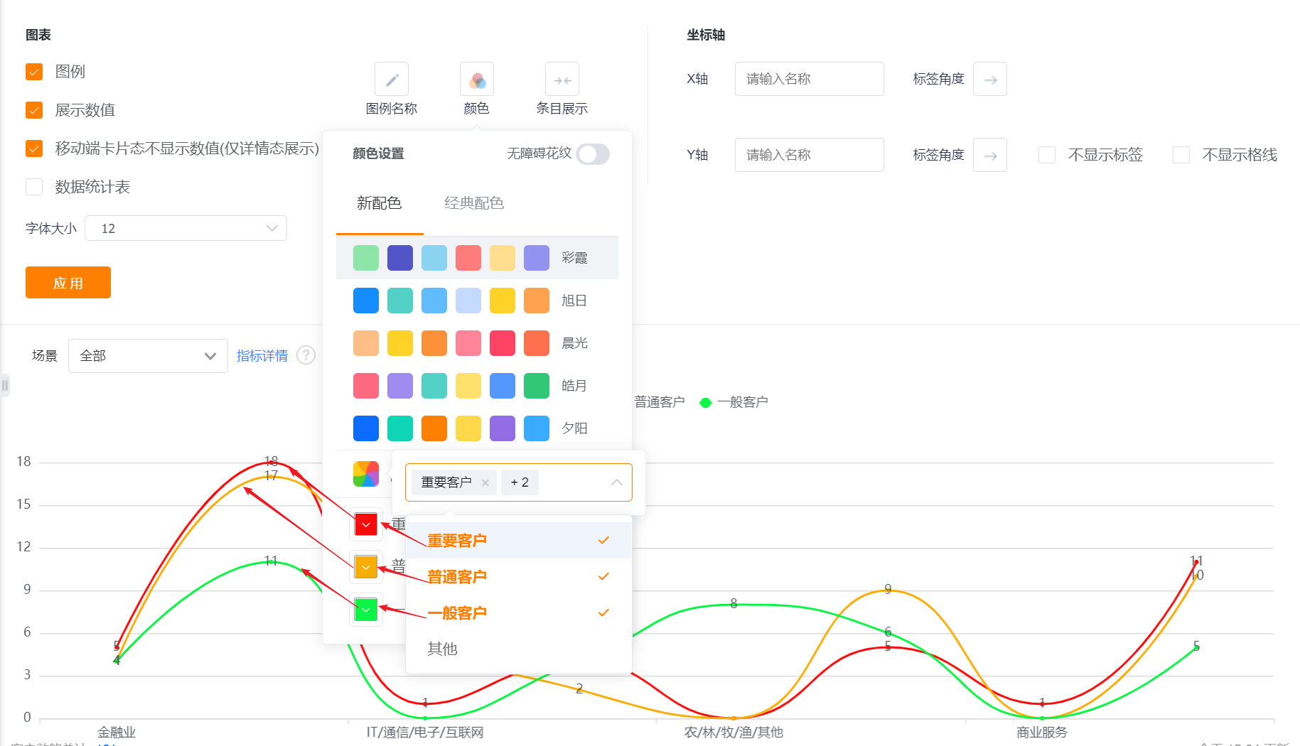
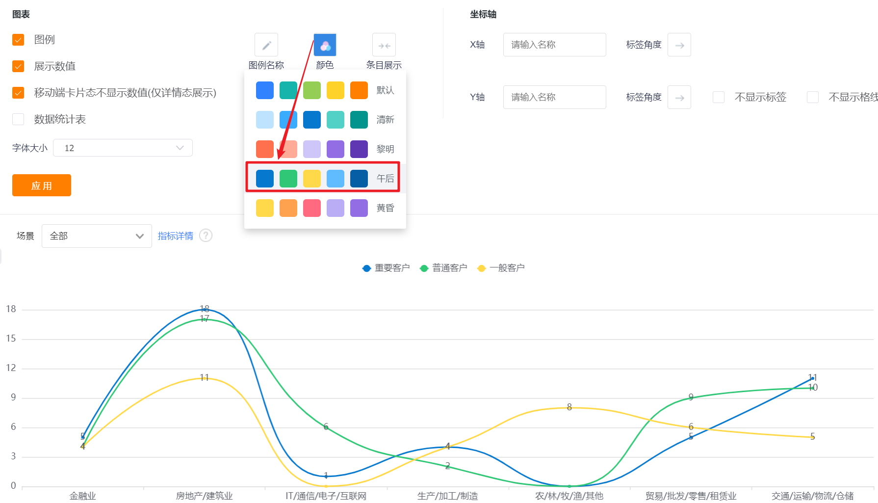
- Color: The system supports two types of color schemes: new color scheme and classic color scheme. The first set under the new color scheme is displayed by default. In addition, the barrier-free pattern setting can be enabled
- New Color: support custom color matching based on a certain color scheme
- Classic Color: custom color matching is not supported
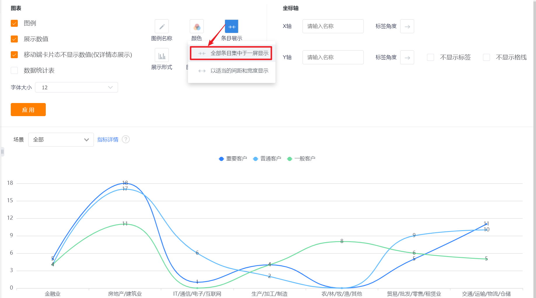
- Item Display: Set the data area displayed in the current area. By default, all items are displayed on one screen, which can be switched to display with appropriate spacing and width.
- Number Position: You can set the numerical display position of the column chart, and the default is that the numerical value is displayed outside the report (horizontal).
- Values are displayed inside the report (horizontal): For vertical bar charts, the values are displayed inside the bar chart;
- Values are displayed outside the report (horizontal): For a column chart in the vertical direction, the value is displayed outside the column chart;
- Values are displayed inside the report (vertical): For horizontal bar charts, the values are displayed inside the bar chart;
- Values are displayed outside the report (vertical): for horizontal column charts, the values are displayed outside the column chart.
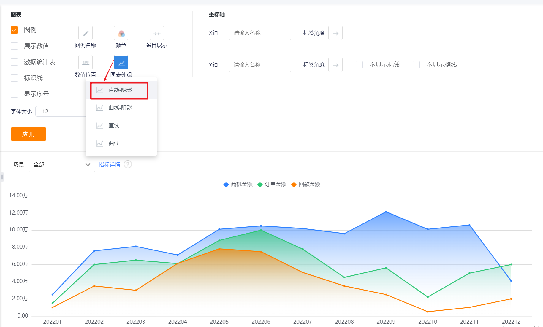
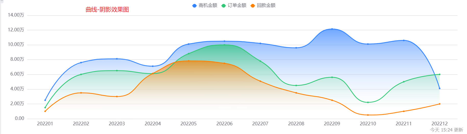
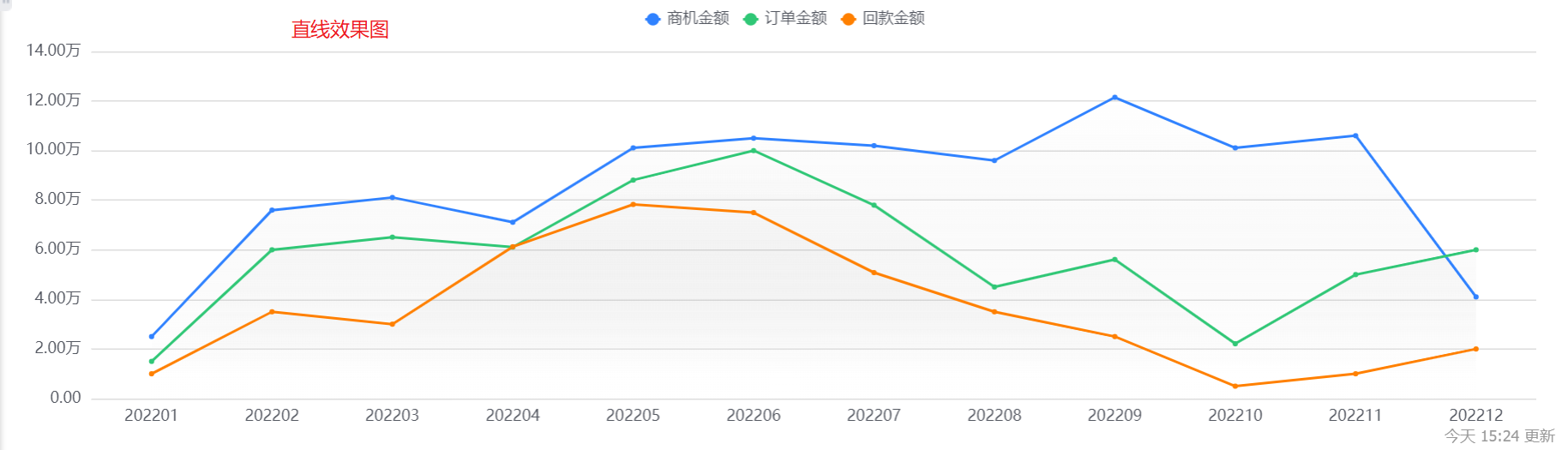
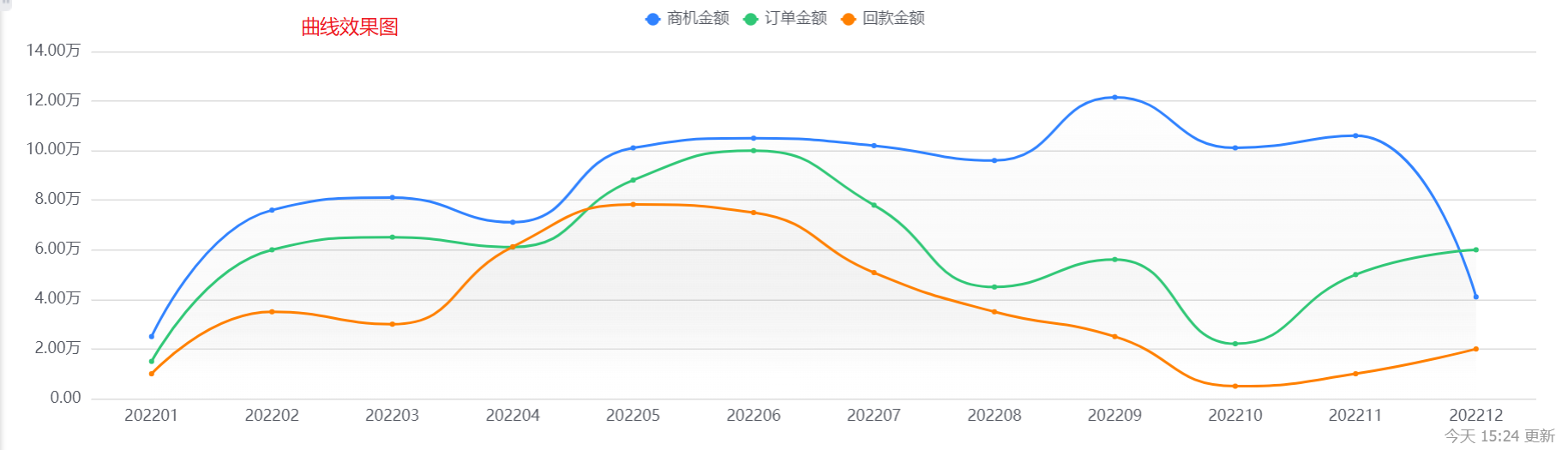
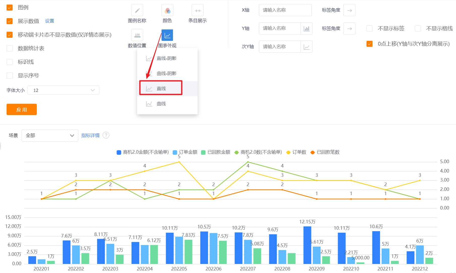
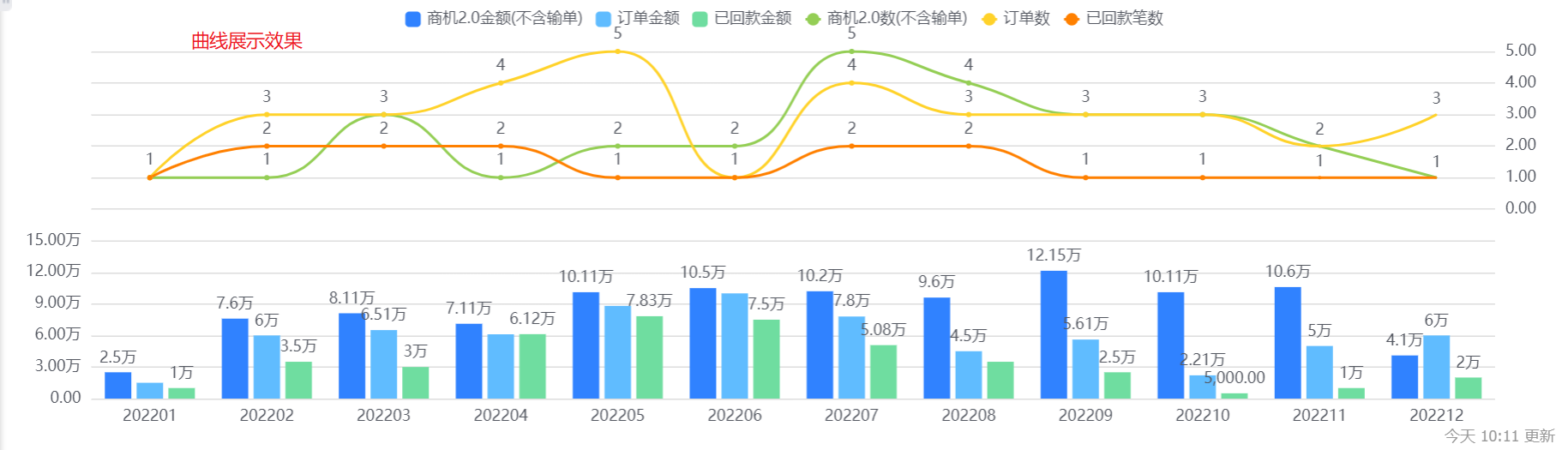
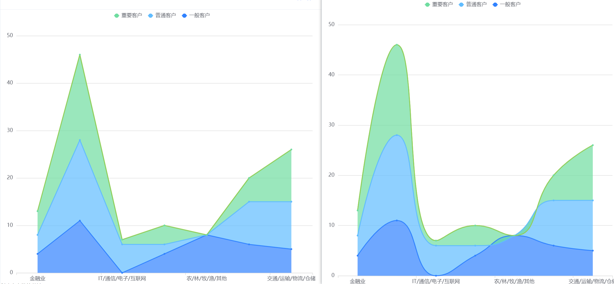
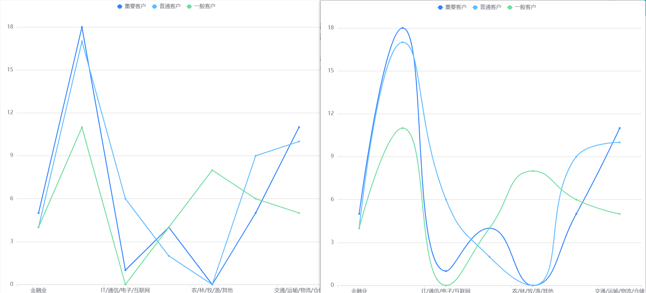
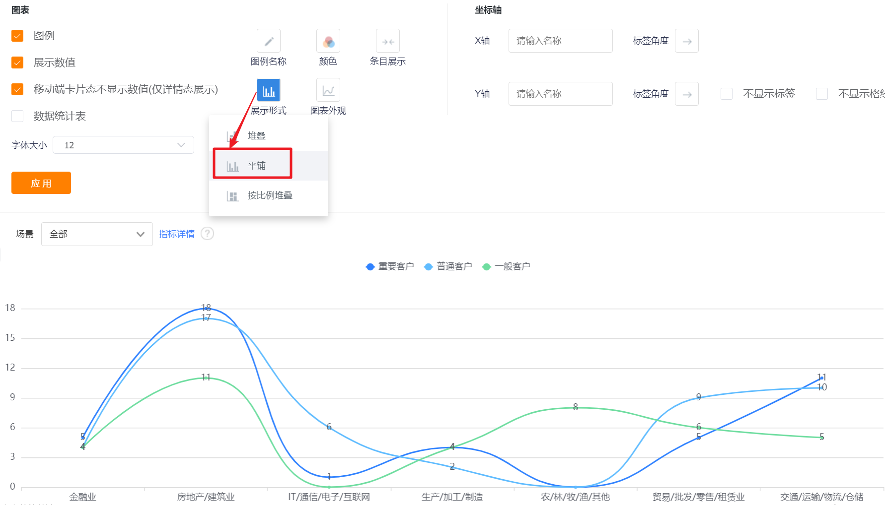
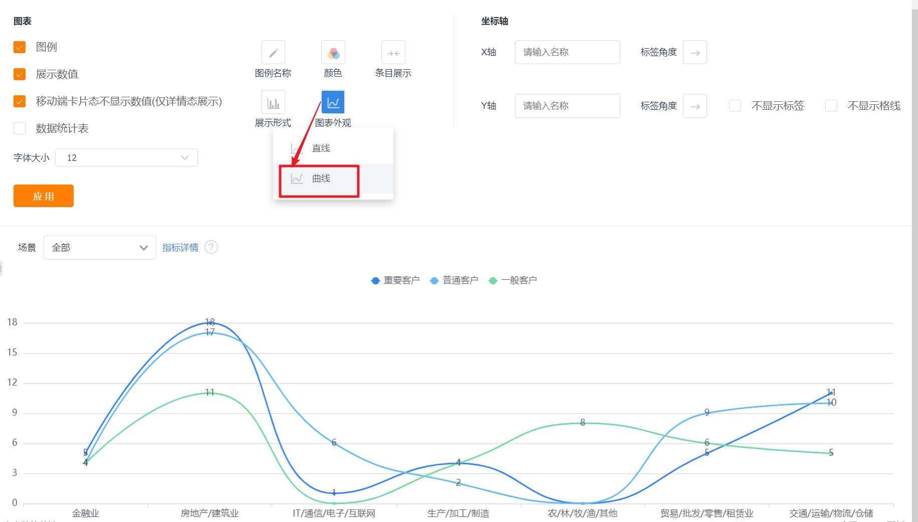
- Chart Appearance: The default line-shading can be switched to curve-shading, straight line or curve display.
- Axis-X/Y: You can set the display name of X axis/Y axis, if not set, it will not be displayed.
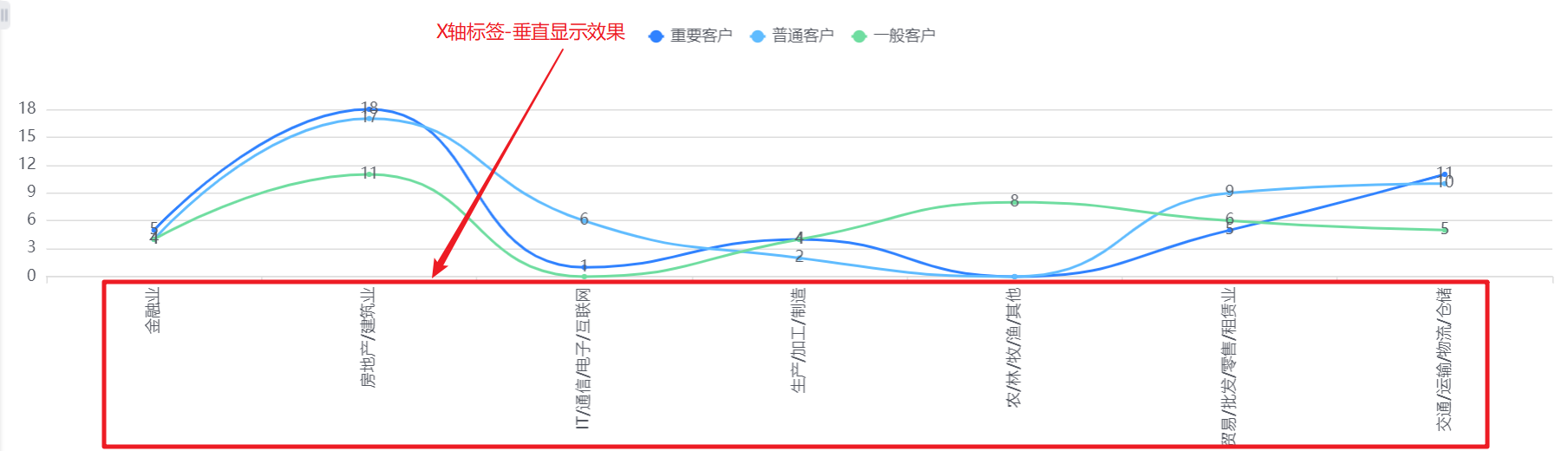
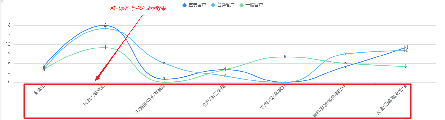
- Axis-Tag Angle: default horizontal display, can be switched to vertical or oblique 45°; (X-axis and Y-axis are set separately, the following figure takes the X-axis as an example, and the Y-axis is the same).
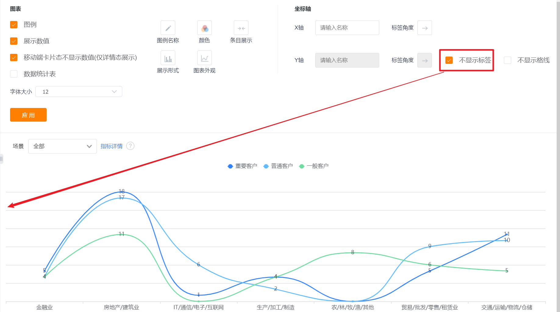
- Do not display tags: The labels are displayed by default. After checking, the Y-axis labels cannot be displayed, and the Y-axis name and label angle cannot be set.
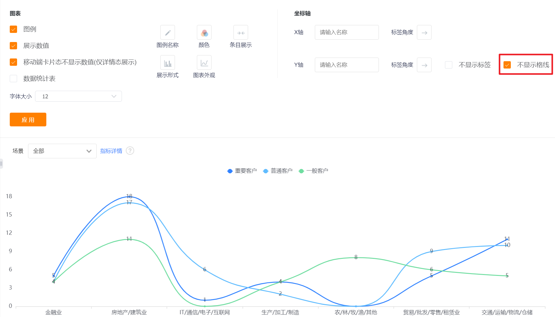
- Do not display grid line: the grid line is displayed by default, and the Y-axis grid line can not be displayed after checking it.
2.2.3 Sorting & Display
- Sorting: You can set the sorting fields and sorting methods.
- Sorting Field: the optional content is the dimension or the statistical index selected in the current statistical chart;
- Sorting Method: no sorting by default, you can choose ascending or descending order.

- Displayed Data by Current Sorting Method: After setting the sorting rules, you can set the number of displayed data according to the current sorting rules. The default is all, and you can switch the first 3, top 5, top 10, or customize the number of data.

- Display Dimensions with 0 Measure: unchecked by default, and can be checked to display dimensions with 0 measure.
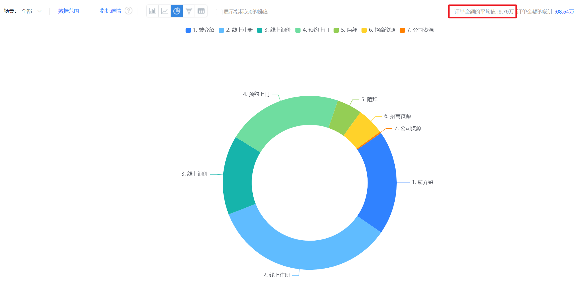
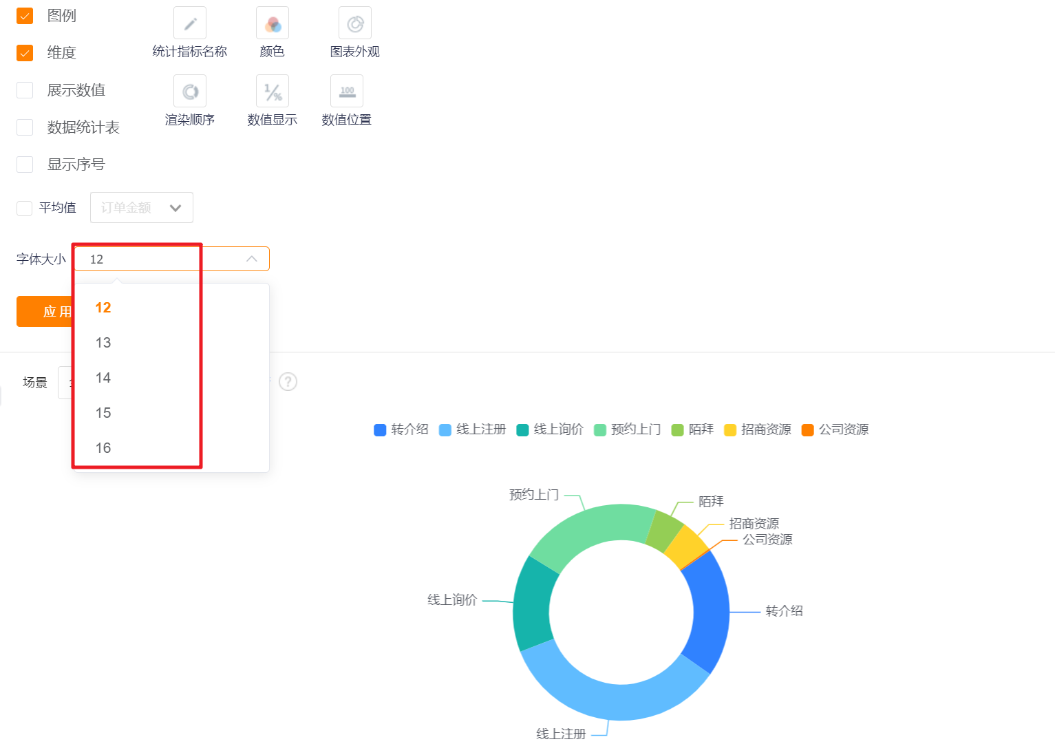
3. Pie Chart
3.1 Applicable Scenes
Pie charts can show the proportion of each dimension within a certain data range. For example, the pie chart can compare the proportion of sales orders of different account levels, the proportion of annual payment of each department, etc.
3.2 Chart Configuration
3.2.1 Axis Data
- Dimensions: 1 dimension
- Measures: 1 measure
3.2.2 Appearance Layout
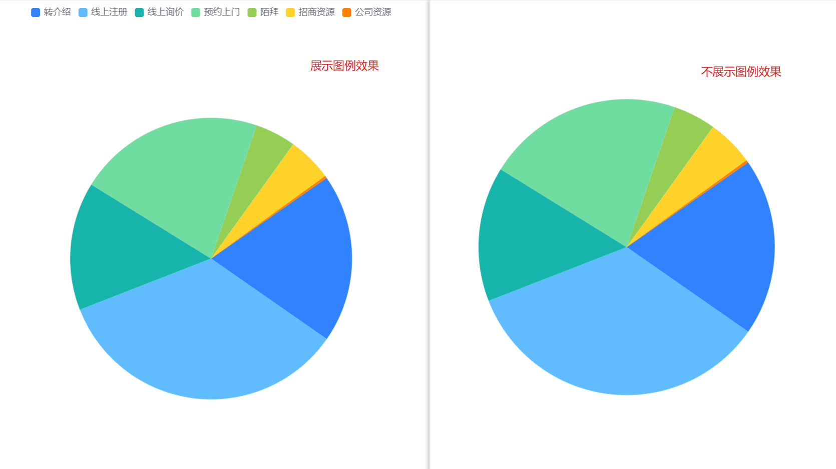
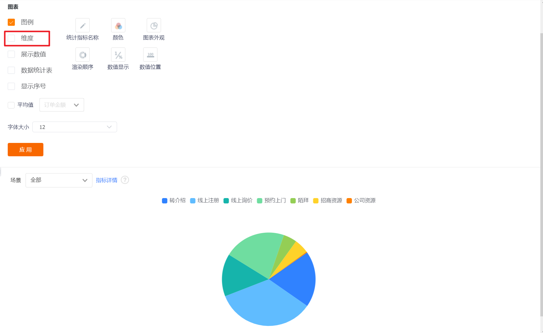
- Display Legend: You can check whether to display the legend, and it is checked by default
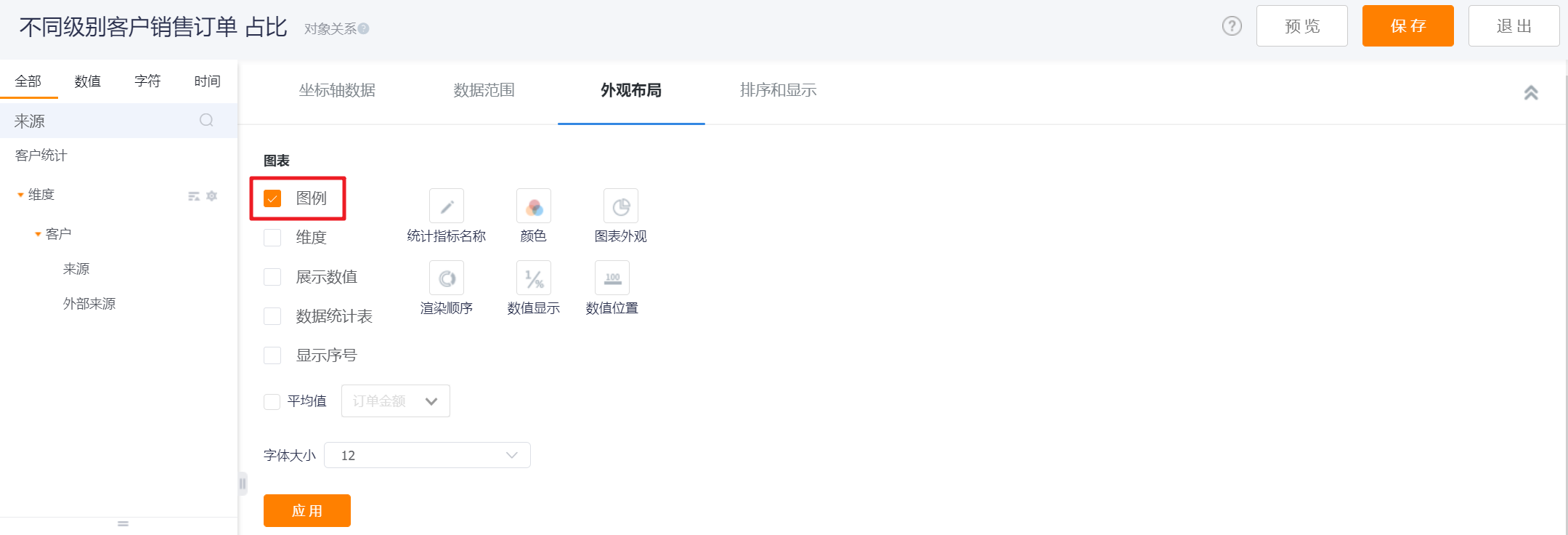
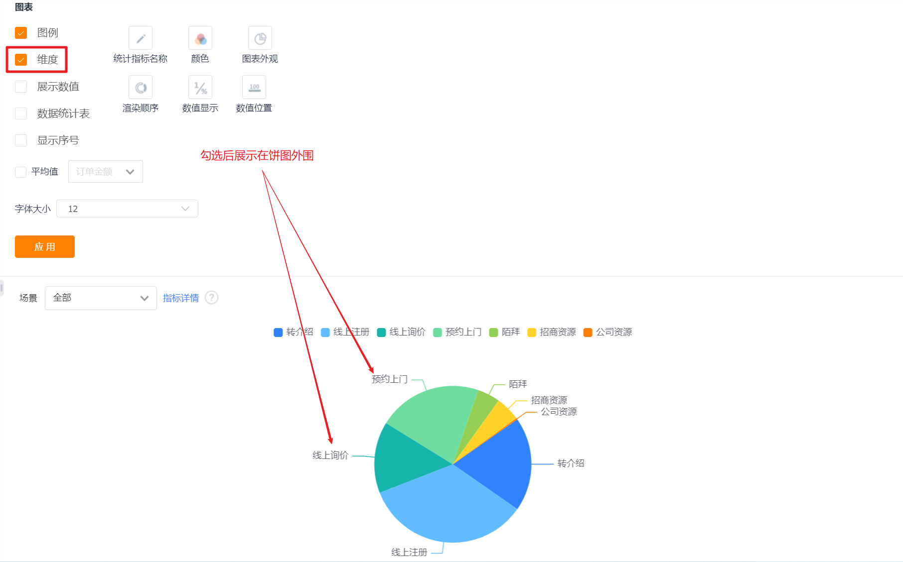
- Dimension: It is not checked by default, and the dimension value of the pie chart is not displayed. It can be checked and displayed.
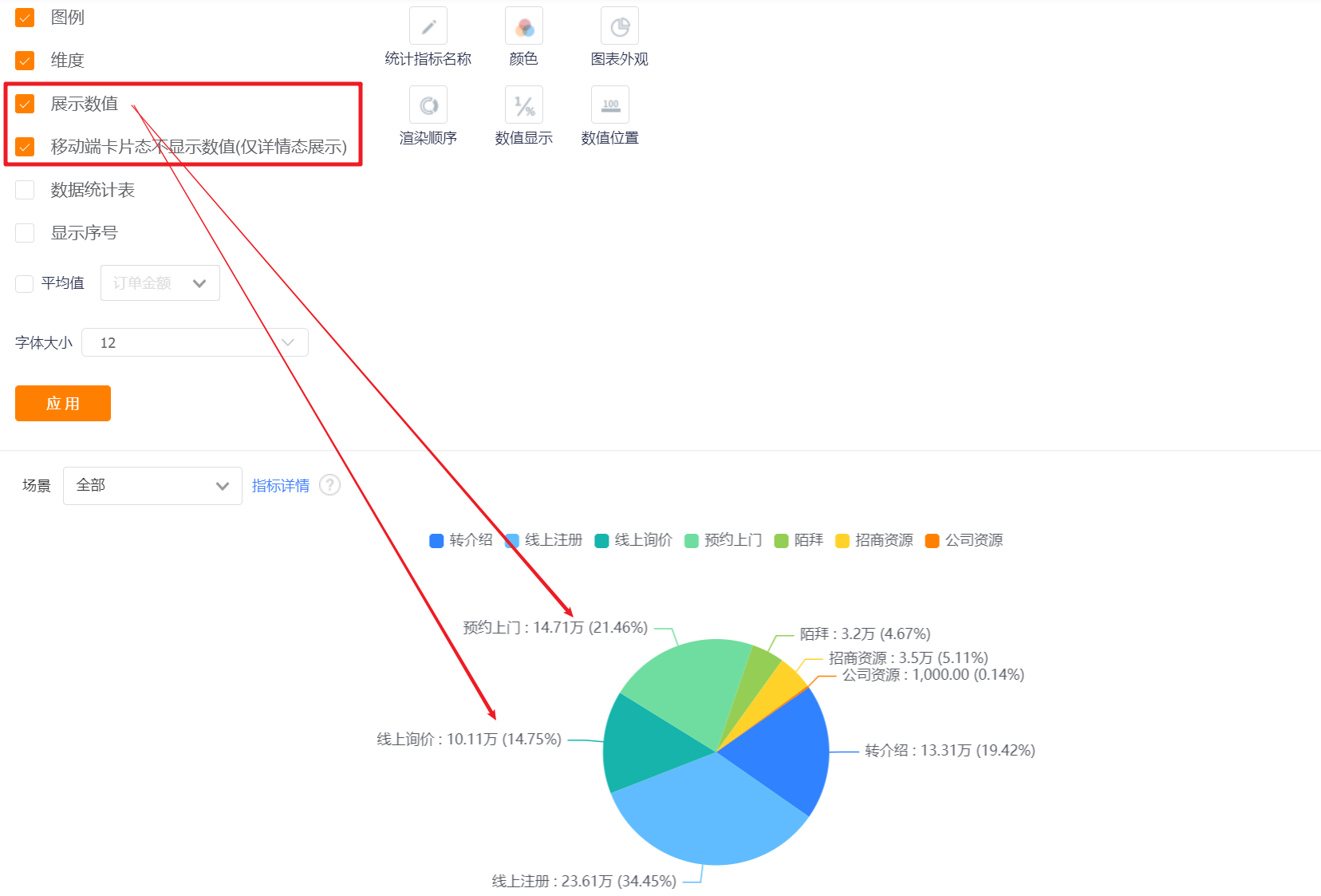
- Display Value: You can check whether to display the value, and it is checked by default.
- The card state of the mobile terminal does not display the value (only the detail state display): it will only be displayed when [Display Value] is checked, and it is checked by default when it is displayed.
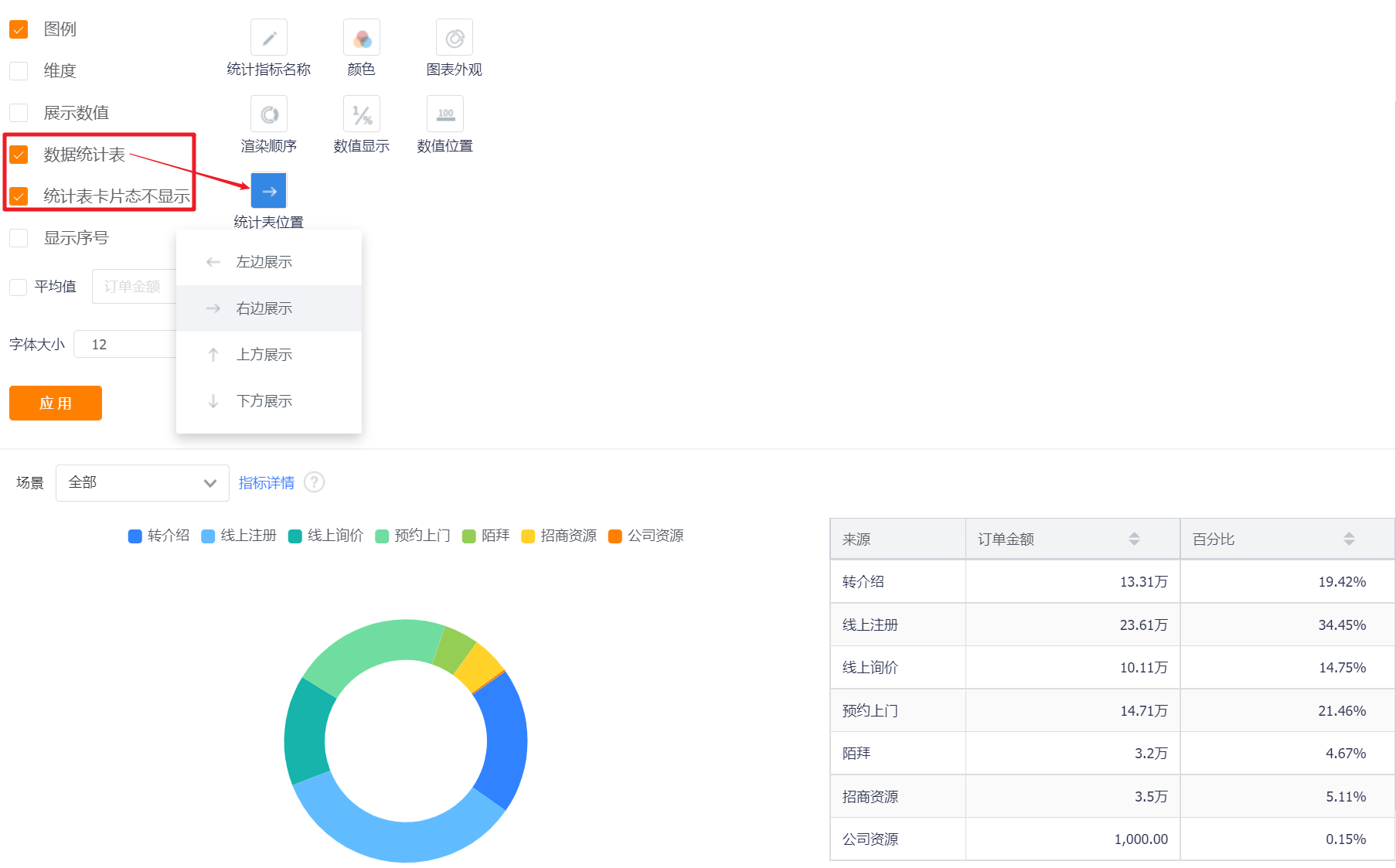
- Data Statistics Table: You can set whether to display the data statistics table, and it will not be displayed by default.
- Statistical table card status is not displayed: This configuration is displayed after the display data statistical table is checked, which is checked by default;
- Chart Position: After checking the display data statistics table, this configuration is displayed. By default, it occupies the right side of the chart, and can be switched to the left, top or bottom.
*The displayed content in the chart is related to the numerical format set by the pie chart. What is displayed in the numerical format is what is displayed in the statistical table.
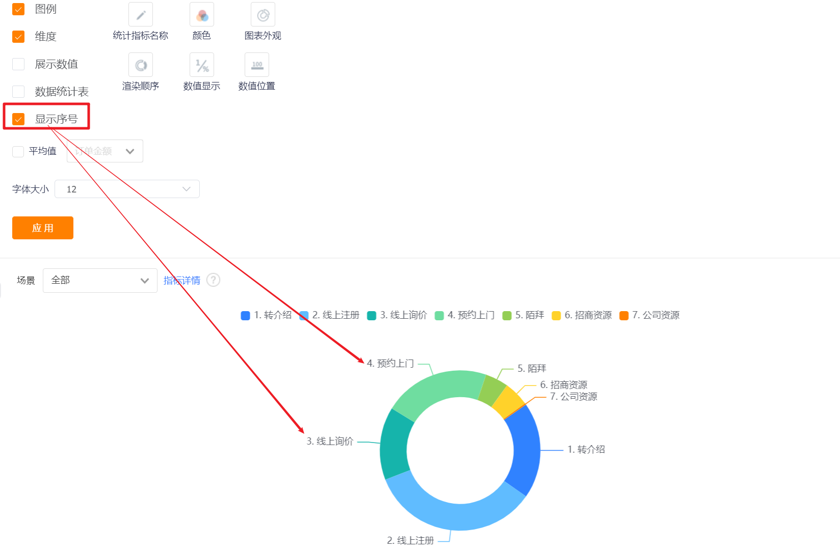
- Display Serial Number: It is not checked by default, and the serial number will be displayed in front of the dimension after checking. It is used together with checking [Dimension].
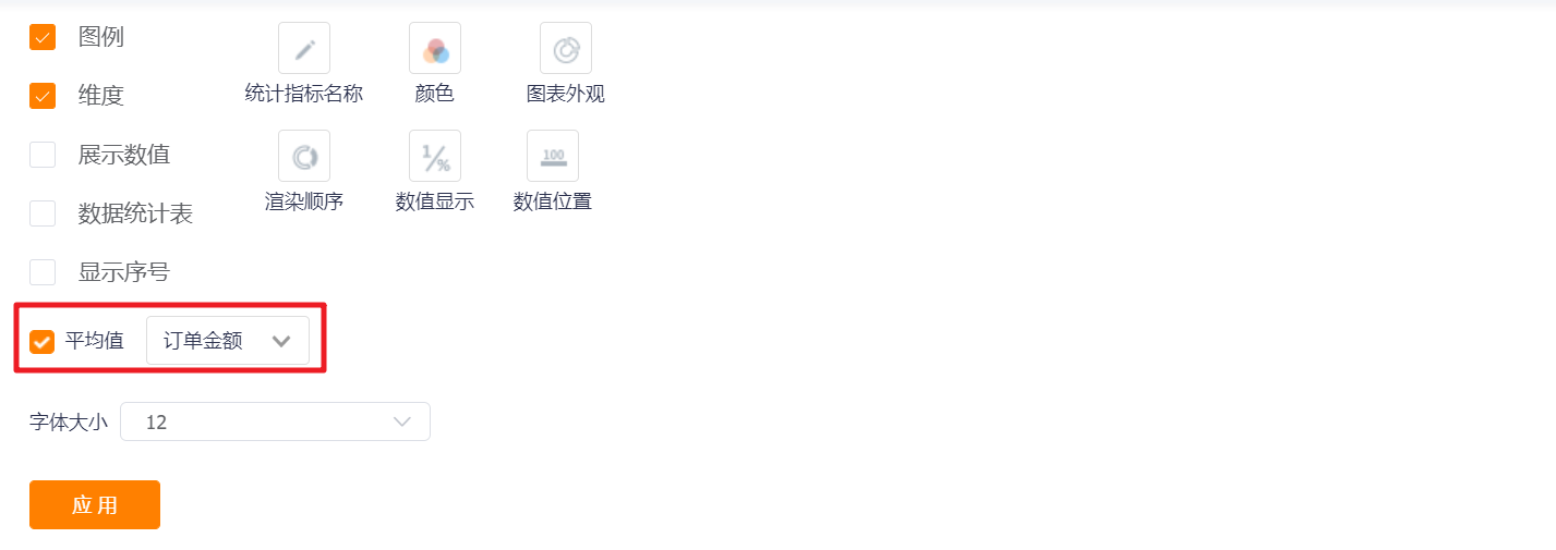
- Average: Unchecked by default. After checking, the average value of the current indicator will be displayed in the preview state and detailed state.
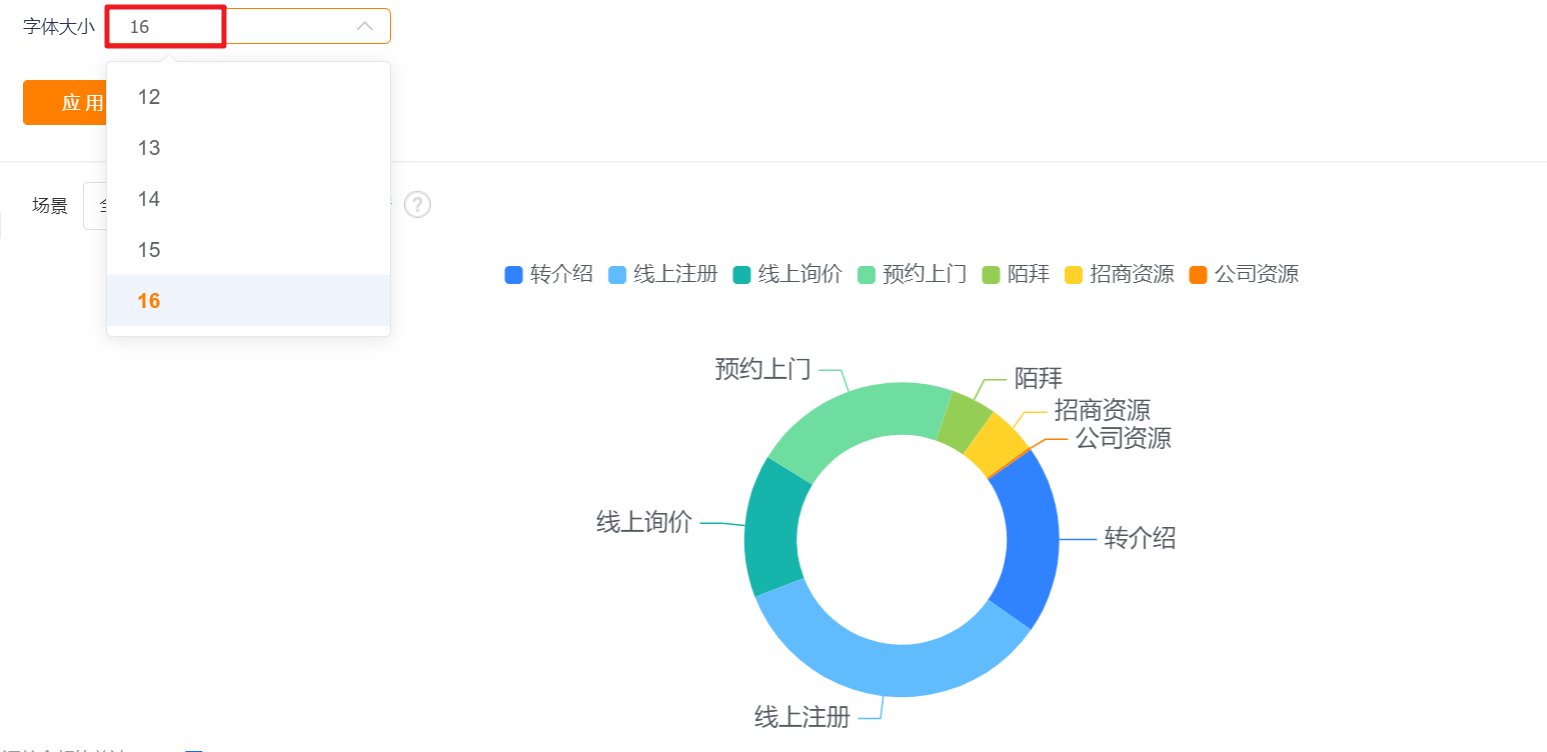
- Font Size: The default is 12, which can be switched to 13, 14, 15, 16 for display.
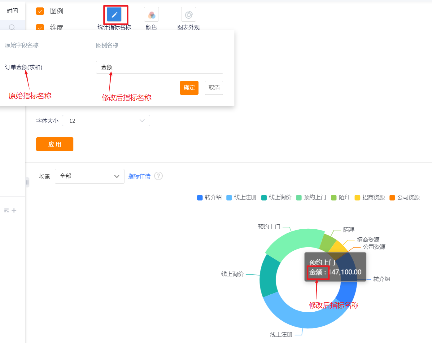
- Measures Name: Displayed by the measures name by default, you can modify the display content by yourself, and the measure echo in the chart will be adjusted synchronously after modification.
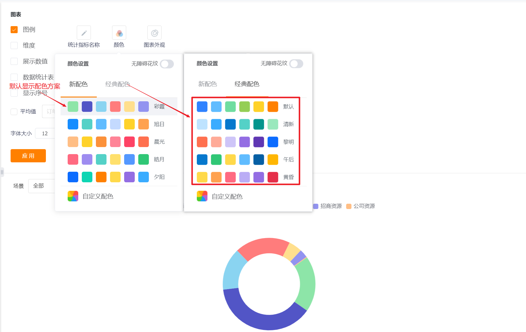
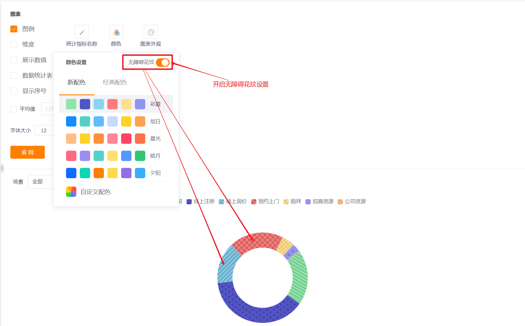
- Color: The system supports two types of color schemes: new color scheme and classic color scheme. The first set under the new color scheme is displayed by default. In addition, the barrier-free pattern setting can be enabled
- New Color: support custom color based on a certain color scheme
- Classic Color: custom color is not supported

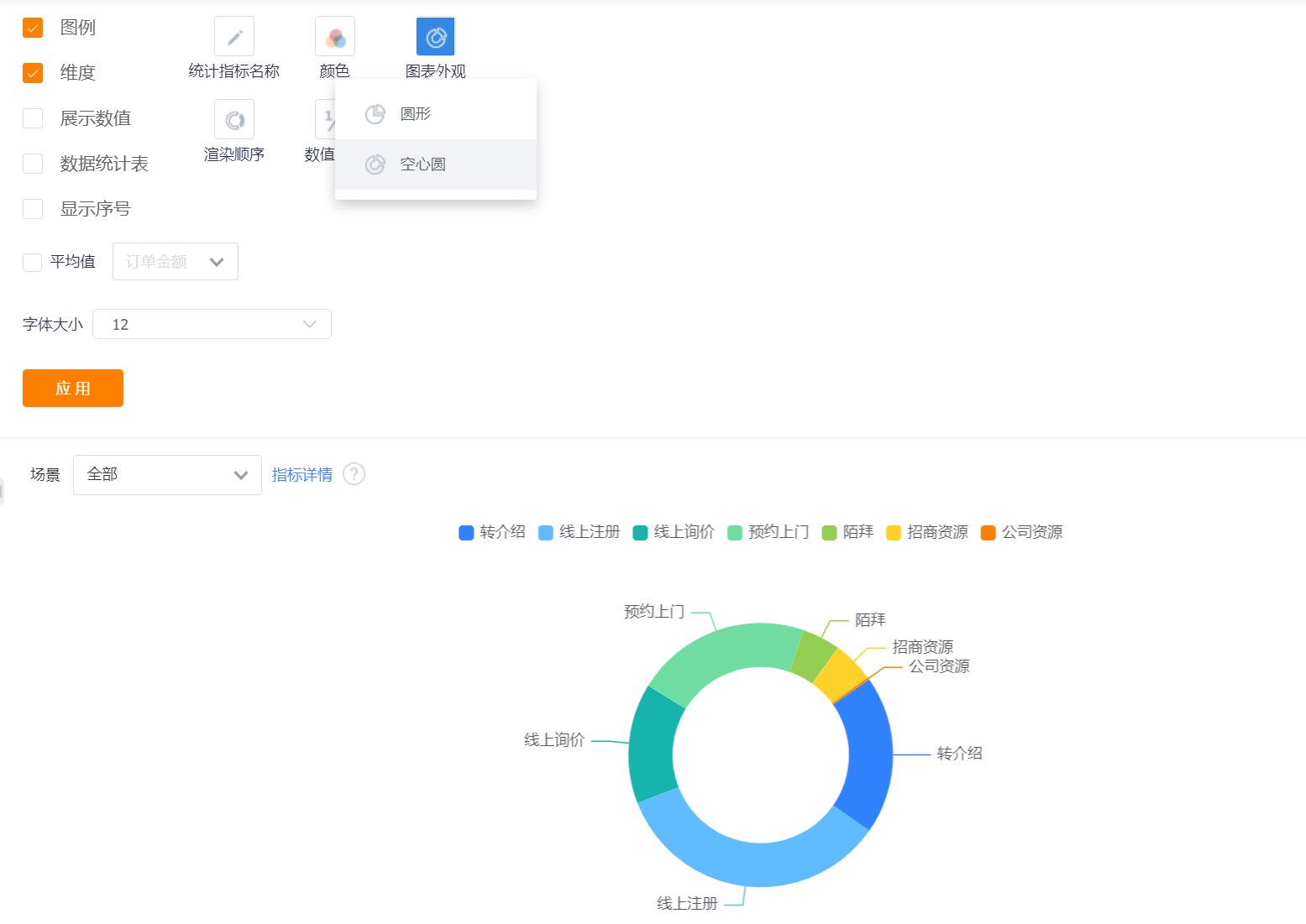
- Appearance Layout: the default hollow circle, which can be switched to a circular display.

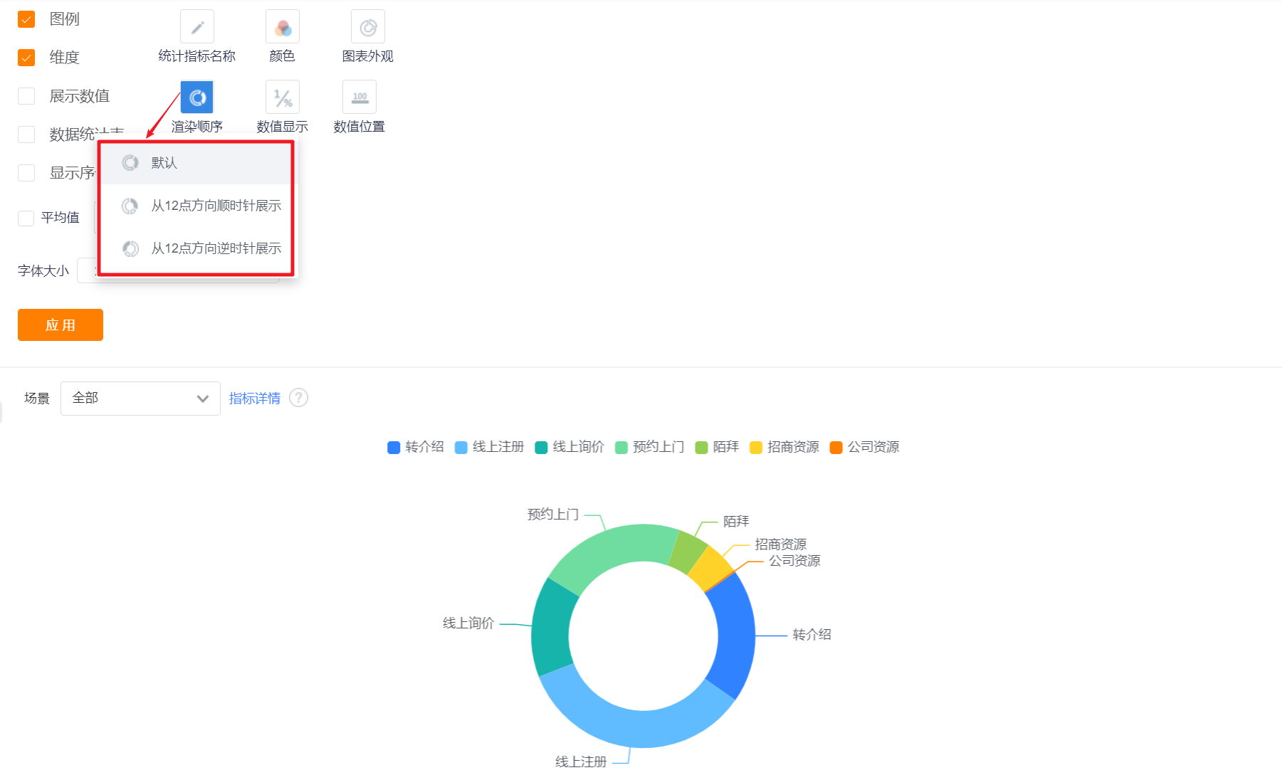
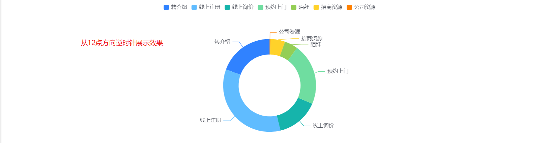
- Rendering Order: the default rendering order, which can be switched to display clockwise from 12 o'clock or counterclockwise from 12 o'clock.

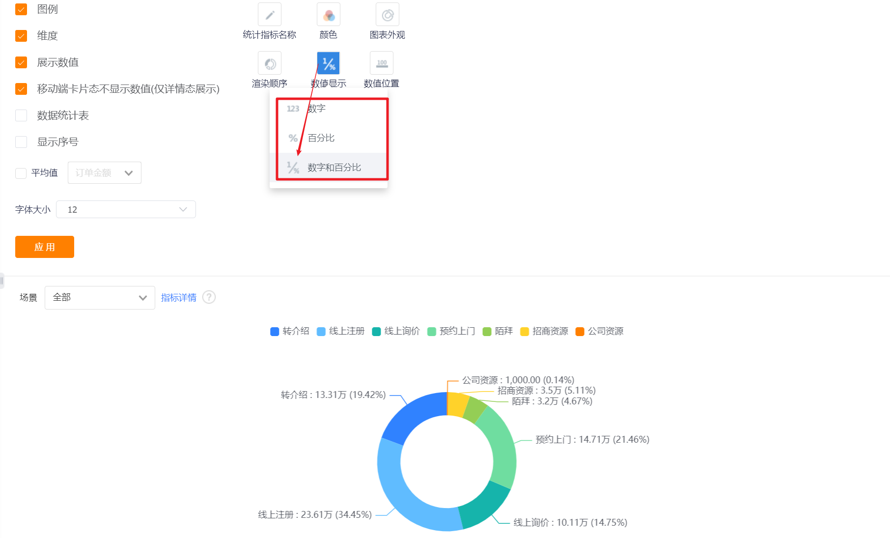
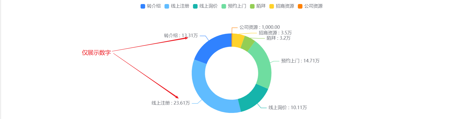
- Numerical display: By default, numbers and percentages are displayed, which can be switched to display numbers or percentages. After the setting is completed, the display content in the [Data Statistics Table] will be consistent with this setting.

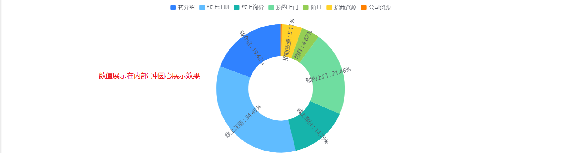
- Value Position: You can set the value display position of the pie chart. The default is that the value is displayed outside, and it can be switched to display the value inside-horizontal or display the value inside-the center of the circle.


3.2.3 Sorting & Display
- Sorting: You can set the sorting fields and sorting methods.
- Sorting Field: the optional content is the dimension or the statistical index selected in the current statistical chart;
- Sorting Method: no sorting by default, you can choose ascending or descending order.


- Displayed Data by Current Sorting Method: After setting the sorting rules, you can set the number of displayed data according to the current sorting rules. The default is all, and you can switch the first 3, top 5, top 10, or customize the number of data.
- Display Dimensions with 0 Measure: unchecked by default, and can be checked to display dimensions with 0 measure.
4. Funnel Chart
4.1 Applicable Scenes
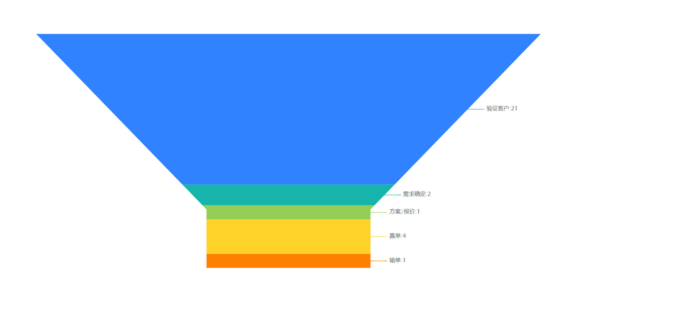
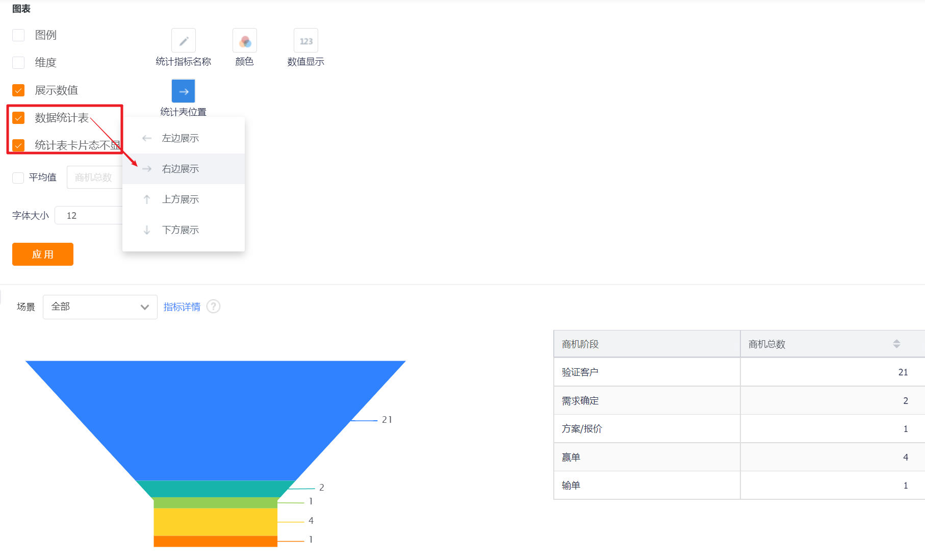
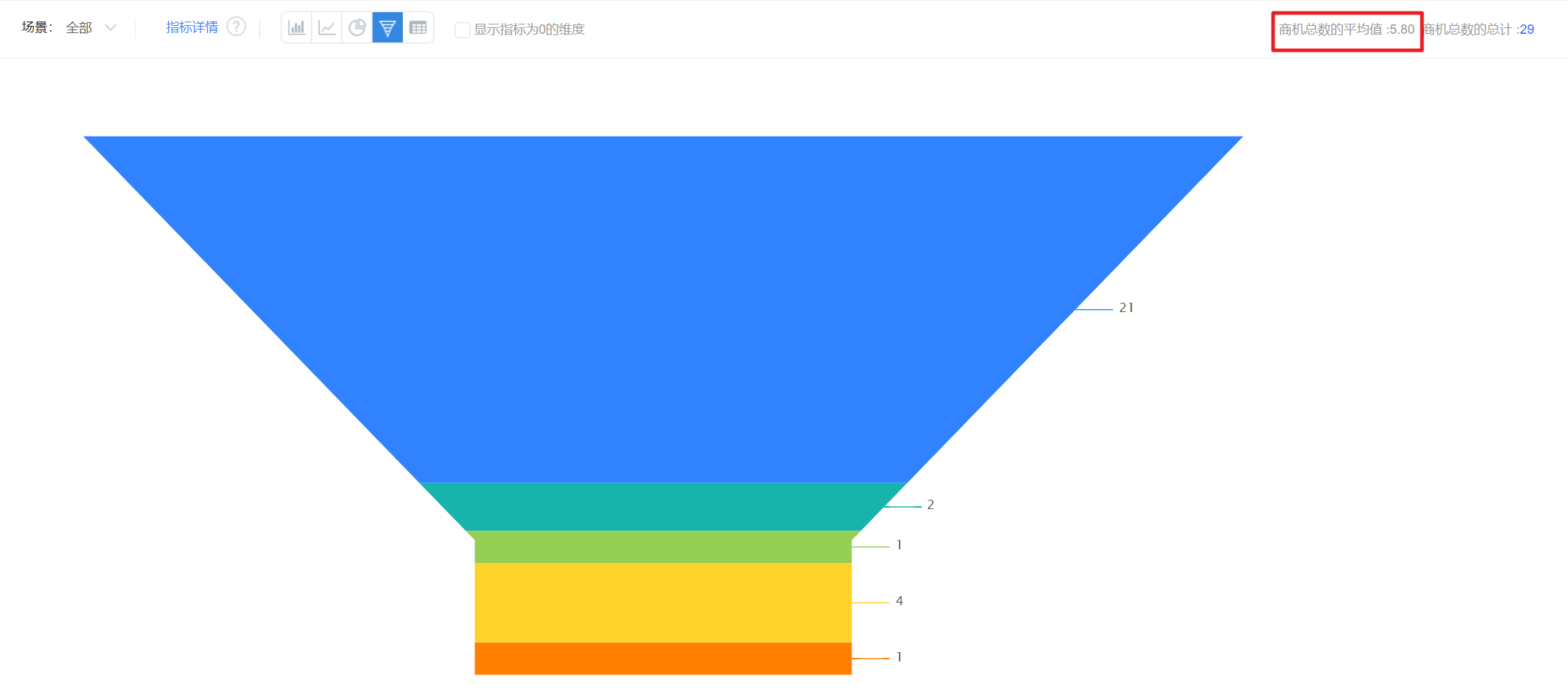
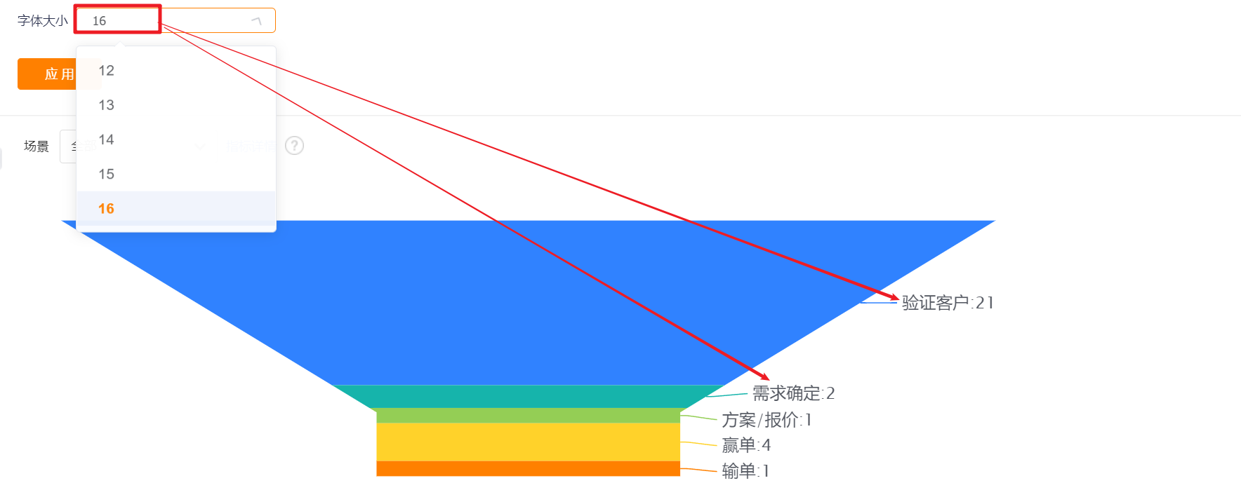
The funnel chart can show the distribution of each dimension within a certain data range. For example, the business opportunities in each business opportunity stage, etc.
4.2 Chart Configuration
4.2.1 Axis Data
- Dimensions: 1 dimension
- Measures: 1-6 measures
4.2.2 Appearance Layout
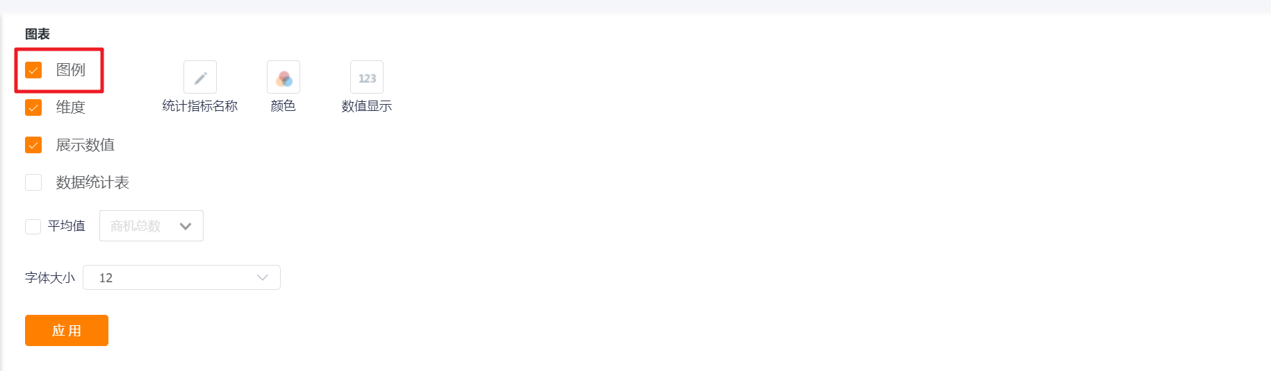
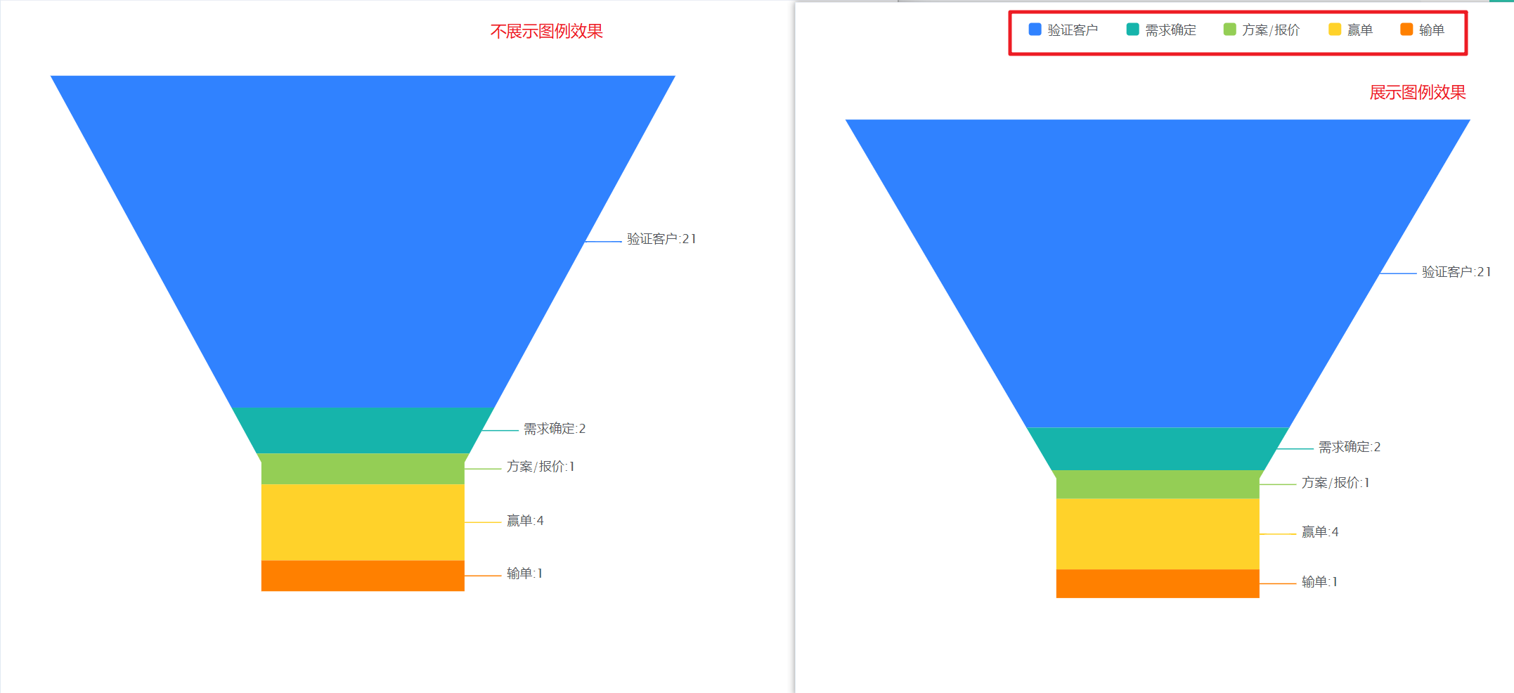
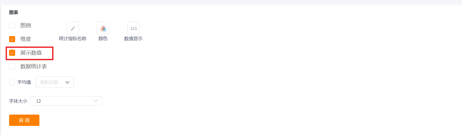
- Display Legend: You can check whether to display the legend, and it is not checked by default.
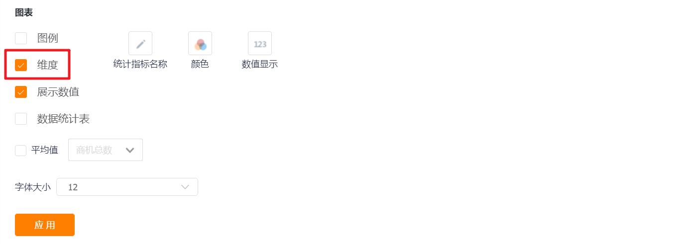
- Dimension: It is not checked by default, and the dimension value of the funnel chart is not displayed. It can be checked and displayed.

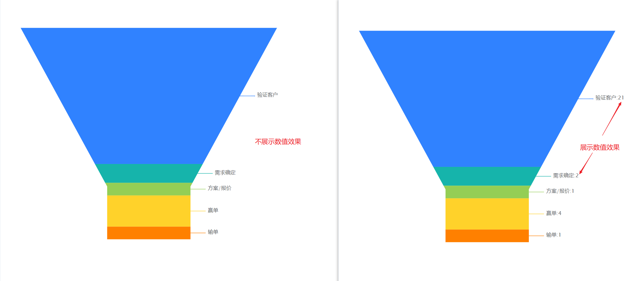
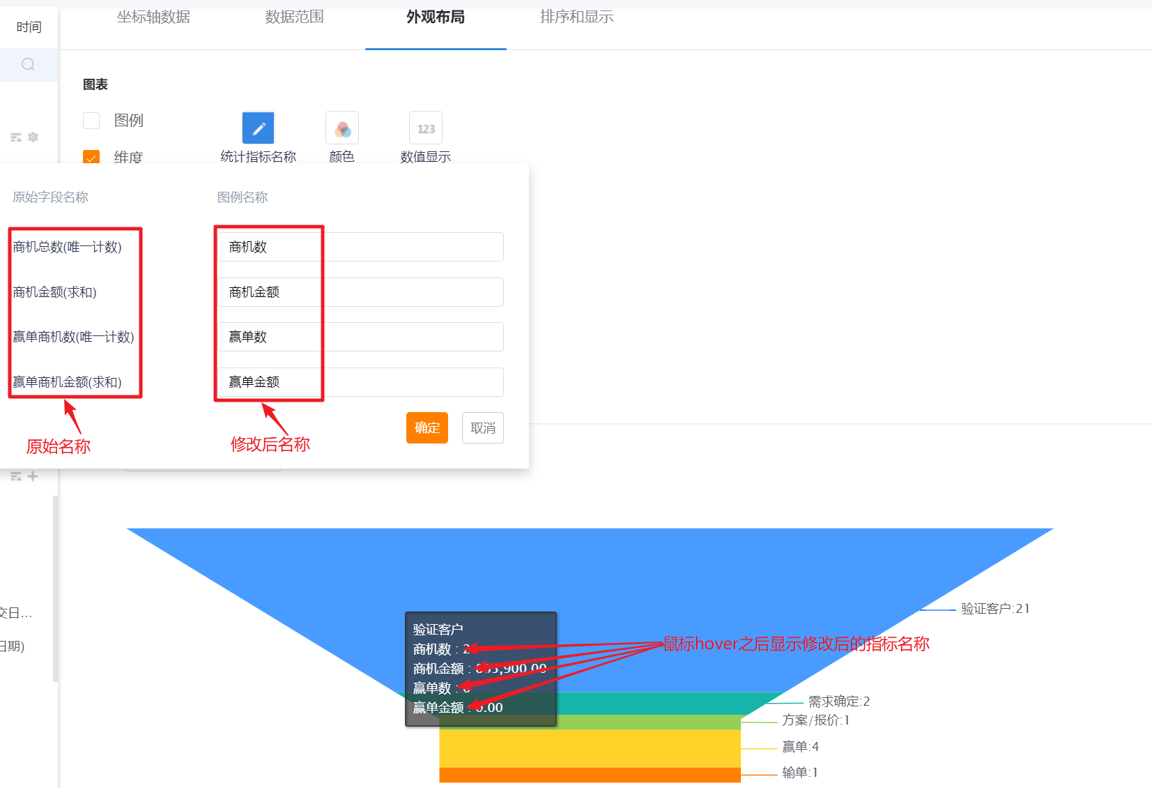
- Display Value: You can check whether to display the value, and it is checked by default.
- Data Statistics Table: You can set whether to display the data statistics table, and it will not be displayed by default.
- Statistical table card status is not displayed: This configuration is displayed after the display data statistical table is checked, which is checked by default;
- Chart Position: After checking the display data statistics table, this configuration is displayed. By default, it occupies the right side of the chart, and can be switched to the left, top or bottom.
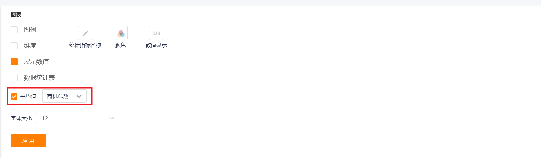
- Average: Unchecked by default. After checking, the preview state and detail state display the average value of the currently selected indicators.
- Font Size: The default is 12, which can be switched to 13, 14, 15, 16 for display.

- Measures Name: Displayed by measure name by default, you can modify the displayed content by yourself.
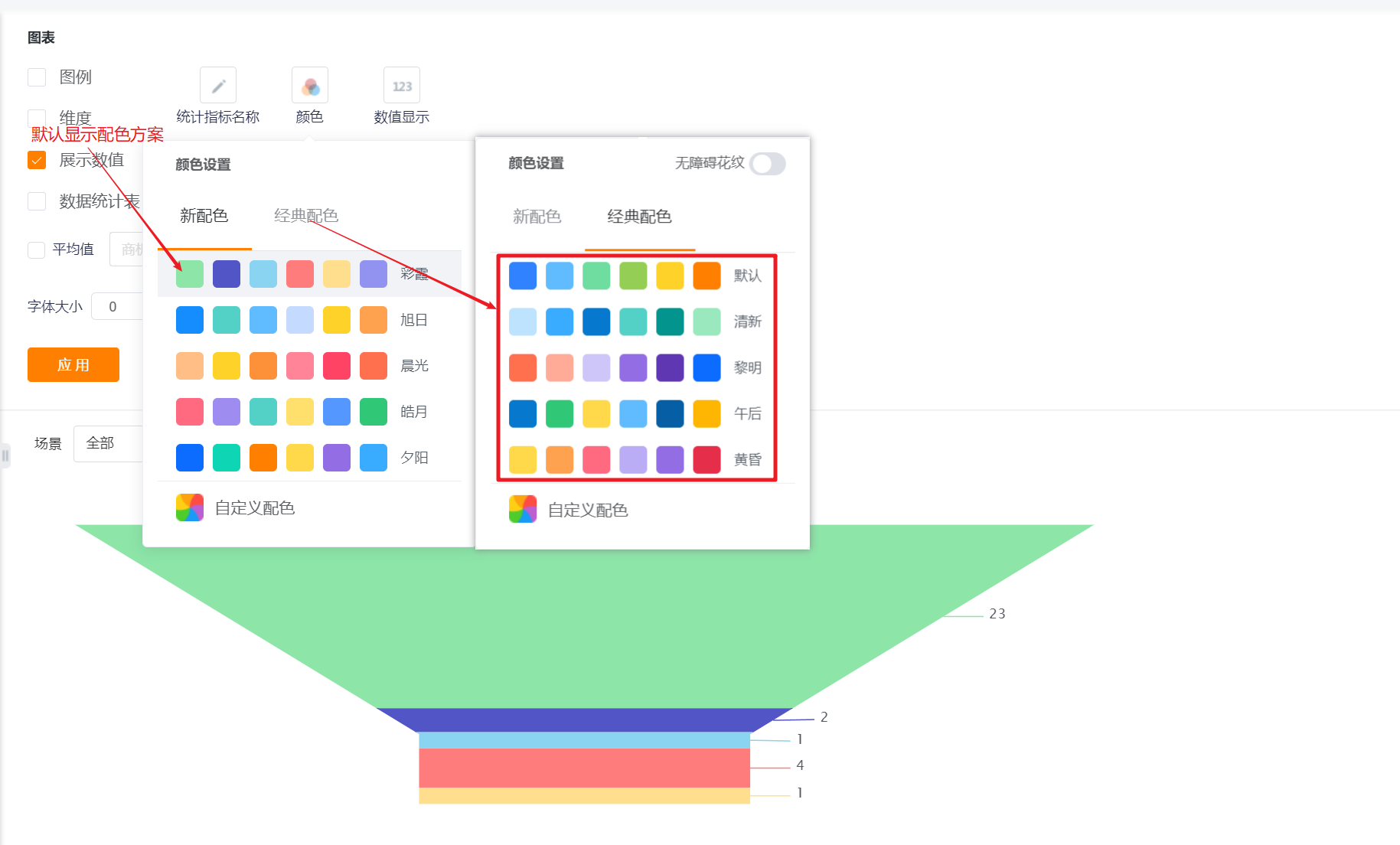
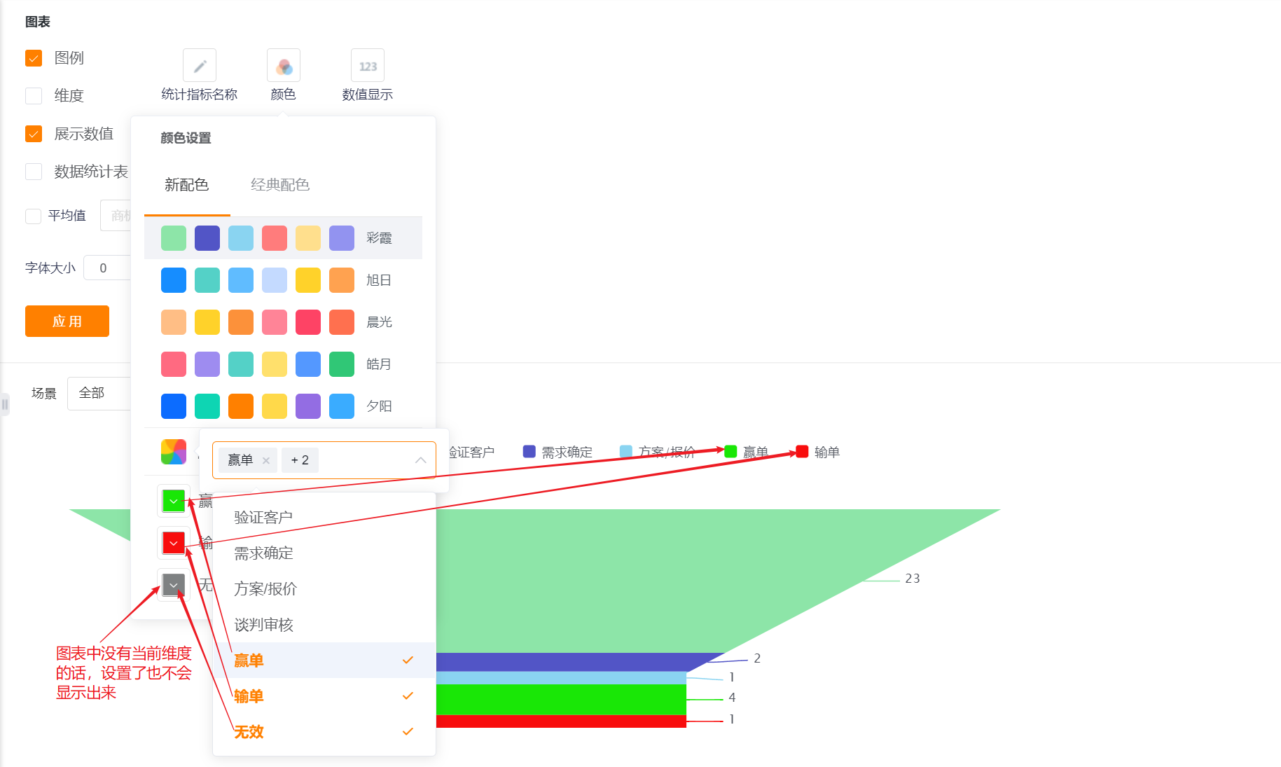
- Color: The system supports two types of color schemes: new color scheme and classic color scheme, and the first set under the new color scheme is displayed by default
- New Color: support custom color matching based on a certain color scheme
- Classic Color: custom color matching is not supported
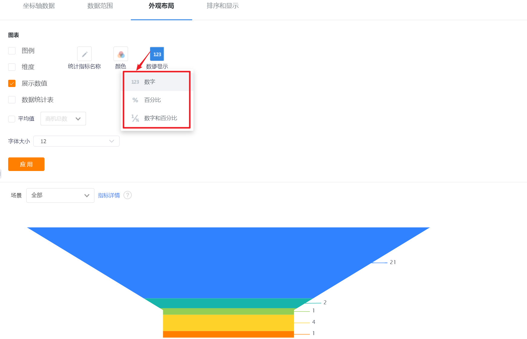
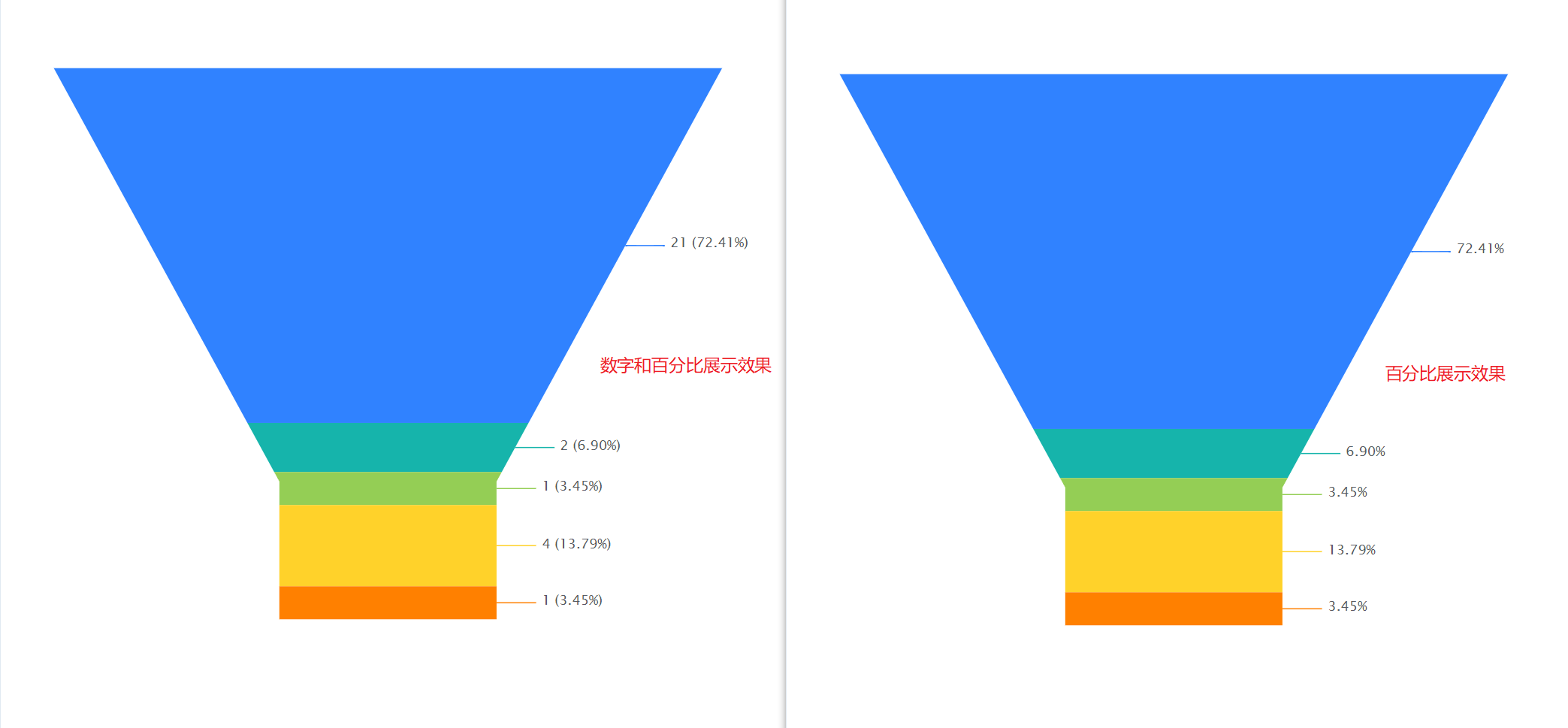
- Number Display: By default, numbers are displayed, which can be switched to display numbers and percentages or only percentages.
4.2.3 Sorting & Display
- Sorting: You can set the sorting fields and sorting methods.
- Sorting Field: the optional content is the dimension or the statistical index selected in the current statistical chart;
- Sorting Method: no sorting by default, you can choose ascending or descending order.
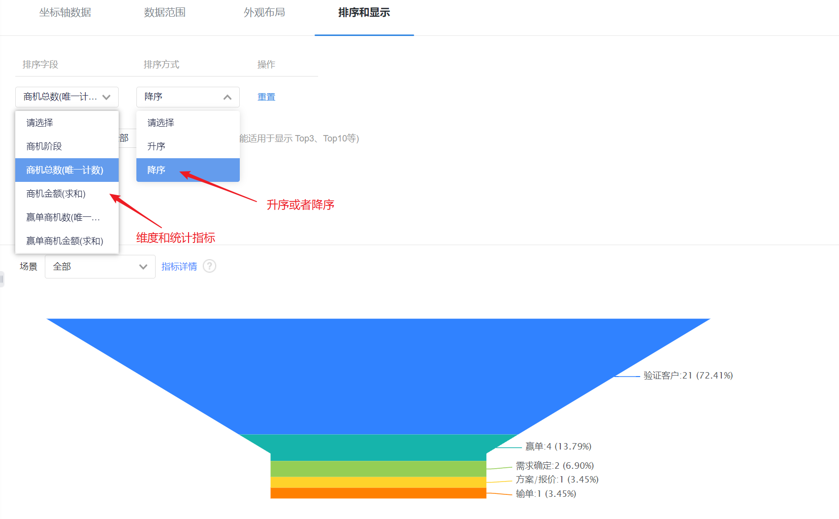
- Displayed Data by Current Sorting Method: After setting the sorting rules, you can set the number of displayed data according to the current sorting rules. The default is all, and you can switch the first 3, top 5, top 10, or customize the number of data.
- Display Dimensions with 0 Measure: unchecked by default, and can be checked to display dimensions with indicators of 0.
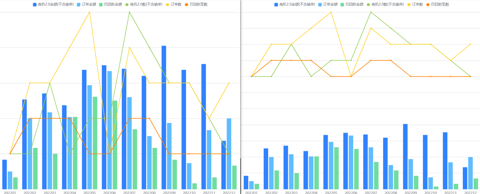
5. Dual Axis Chart
5.1 Applicable Scenes
The dual-axis chart can show the situation where the data level of indicators varies greatly within a certain data range under one dimension. For example, a dual-axis chart can compare the amount and quantity of sales orders at different customer levels, the amount and quantity of annual business opportunities in each department, and so on.
5.2 Chart Configuration
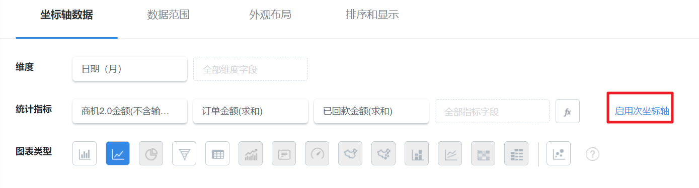
5.2.1 Axis Data
- Need to enable the secondary axis
- Dimensions: 1 dimension
- Measures: 1-6 measures on each Y axis
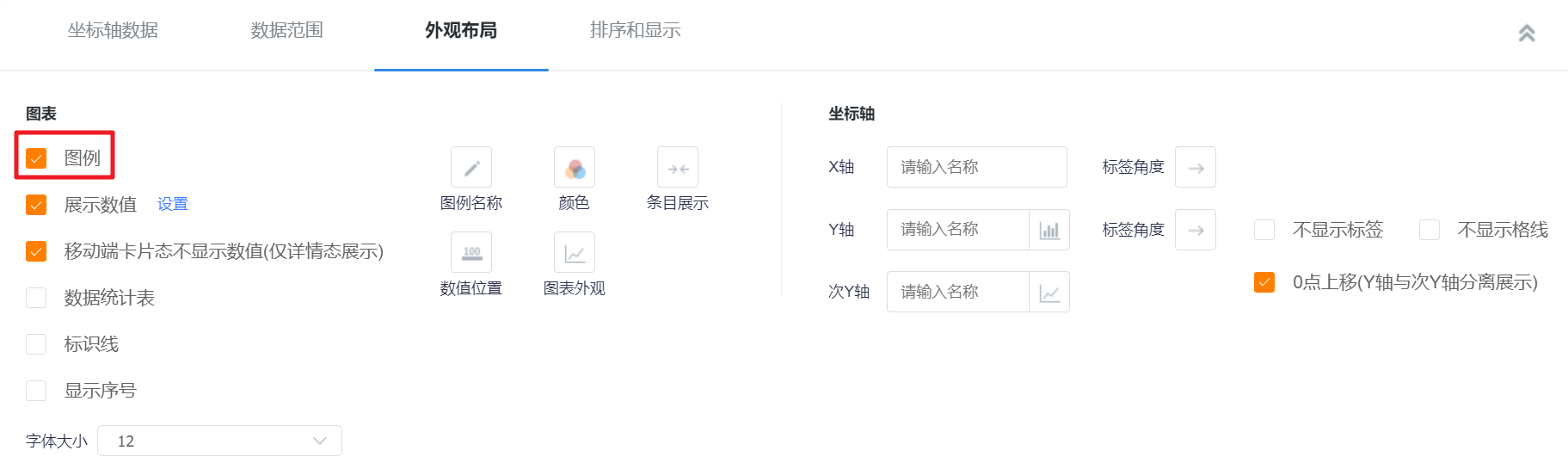
5.2.2 Appearance Layout
- Display Legend: You can check whether to display the legend, and it is checked by default.
- Display Value: You can check whether to display the value, and it is checked by default.
- Settings: When there are two or more indicators, you can set the content of the display indicators, and they are all checked by default;
- The card state of the mobile terminal does not display the value (only the detail state display): it will only be displayed when [Display value] is checked, and it is checked by default when it is displayed.
- Data Statistics Table: You can set whether to display the data statistics table, and it will not be displayed by default.
- Statistical table card status is not displayed: This configuration is displayed after the display data statistical table is checked, which is checked by default;
- Chart Position: After checking the display data statistics table, this configuration is displayed. By default, it occupies the right side of the chart, and can be switched to the left, top or bottom.
- Identification Line: You can set the main axis or the secondary axis identification line of the chart. By default, it is not checked, and each axis can set up to 6 identification lines.
- Name: Set the name of the identification line;
- Identification Value: the default is a constant, which can be switched to the average, maximum, and minimum values of the current coordinate axis indicators. When a constant is selected, a specific value can be set;
- Display Ientification Line Name: it is not displayed by default, and it can be checked to display;
- Display Identification Line Value: not displayed by default, you can check it to display.
- Display Serial Number: It is not checked by default, and the serial number will be displayed in front of the dimension after checking.
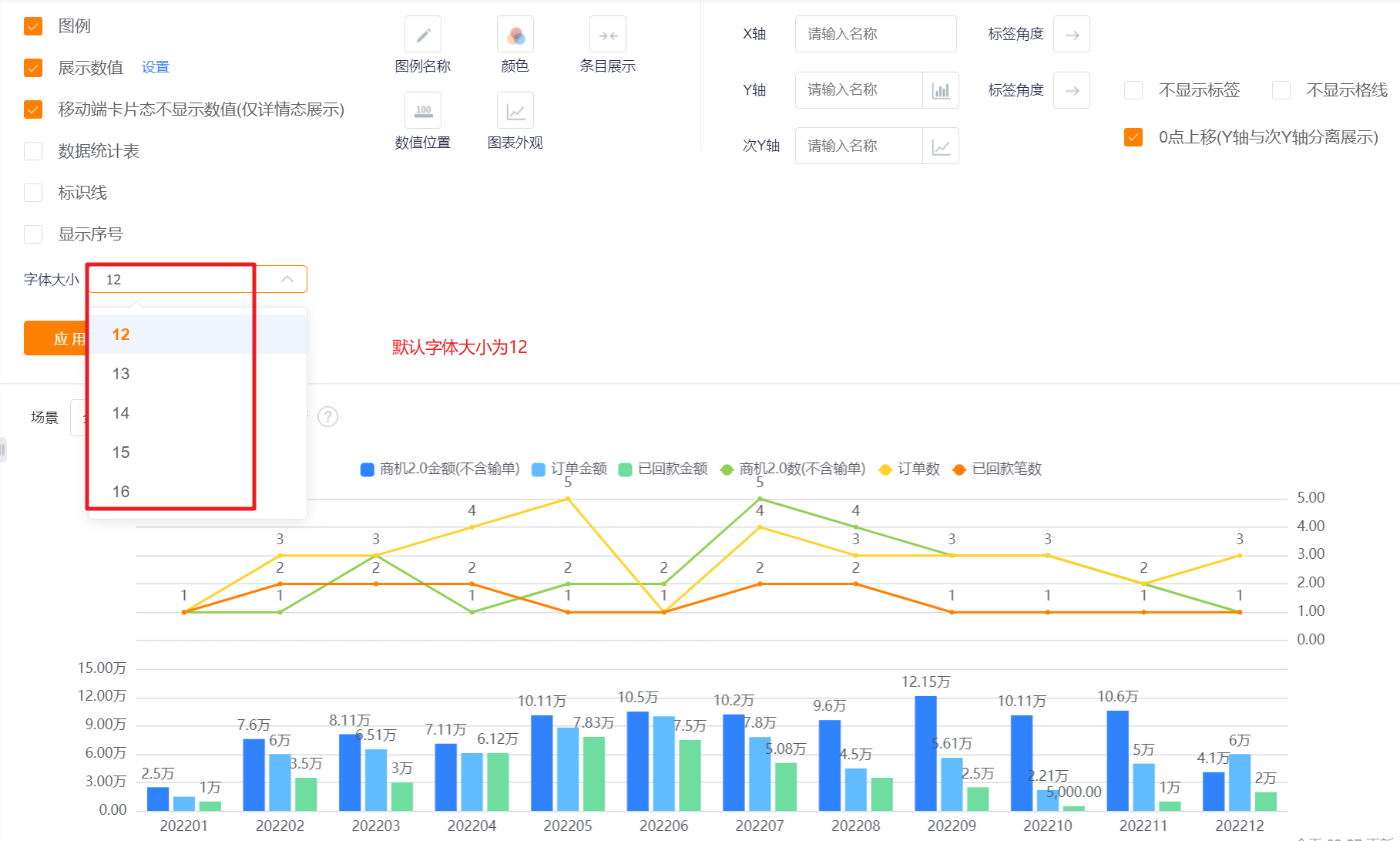
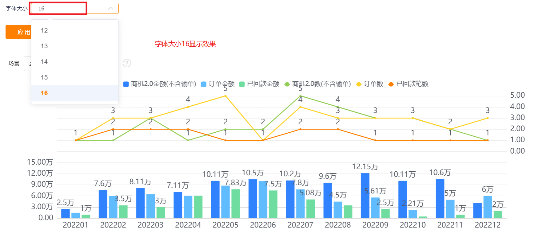
- Font Size: The default is 12, which can be switched to 13, 14, 15, 16 for display.
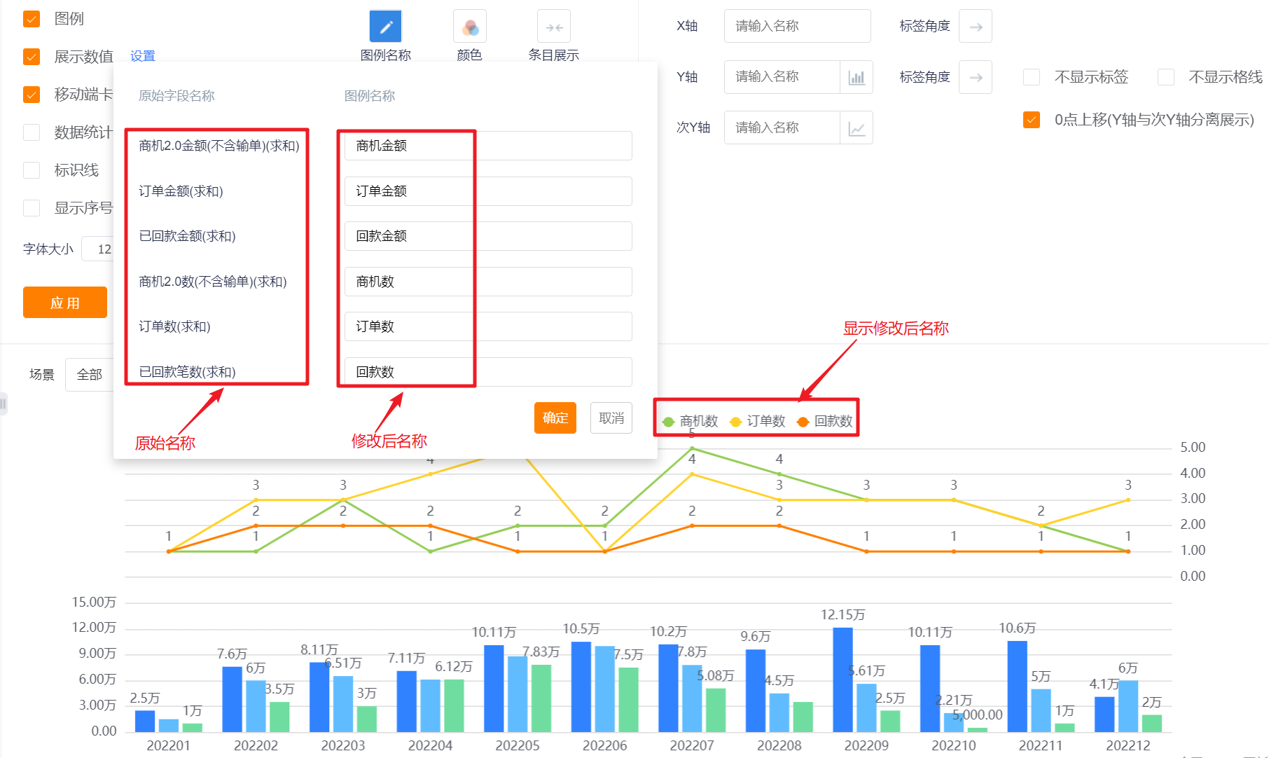
- Legend Name: Displayed by indicator name by default, you can modify the displayed content by yourself.
- Color: The system supports two types of color schemes: new color scheme and classic color scheme. The first set under the new color scheme is displayed by default. In addition, the barrier-free pattern setting can be enabled
- New Color: support custom color matching based on a certain color scheme
- Classic Color: custom color matching is not supported

- Item Display: Set the data area displayed in the current area. By default, all items are displayed on one screen, which can be switched to display with appropriate spacing and width.
- Value Position: You can set the value display position of the dual-axis graph, and the default value is displayed outside the report (horizontal).
- Values are displayed inside the report (horizontal): For a dual-axis graph in the vertical direction, the values are displayed inside the column graph;
- Values are displayed outside the report (horizontal): For a dual-axis graph in the vertical direction, the values are displayed outside the column graph;
- Values are displayed inside the report (vertical): For a dual-axis graph in the horizontal direction, the values are displayed inside the column graph;
- Values are displayed outside the report (vertical): For a dual-axis graph in the horizontal direction, the values are displayed outside the column graph.
- Chart Appearance: The default display of the dual-axis chart is straight-shaded, which can be switched to curve-shaded, straight or curved. The appearance of the chart is mainly for the line chart, and the display form of the column chart will not change.
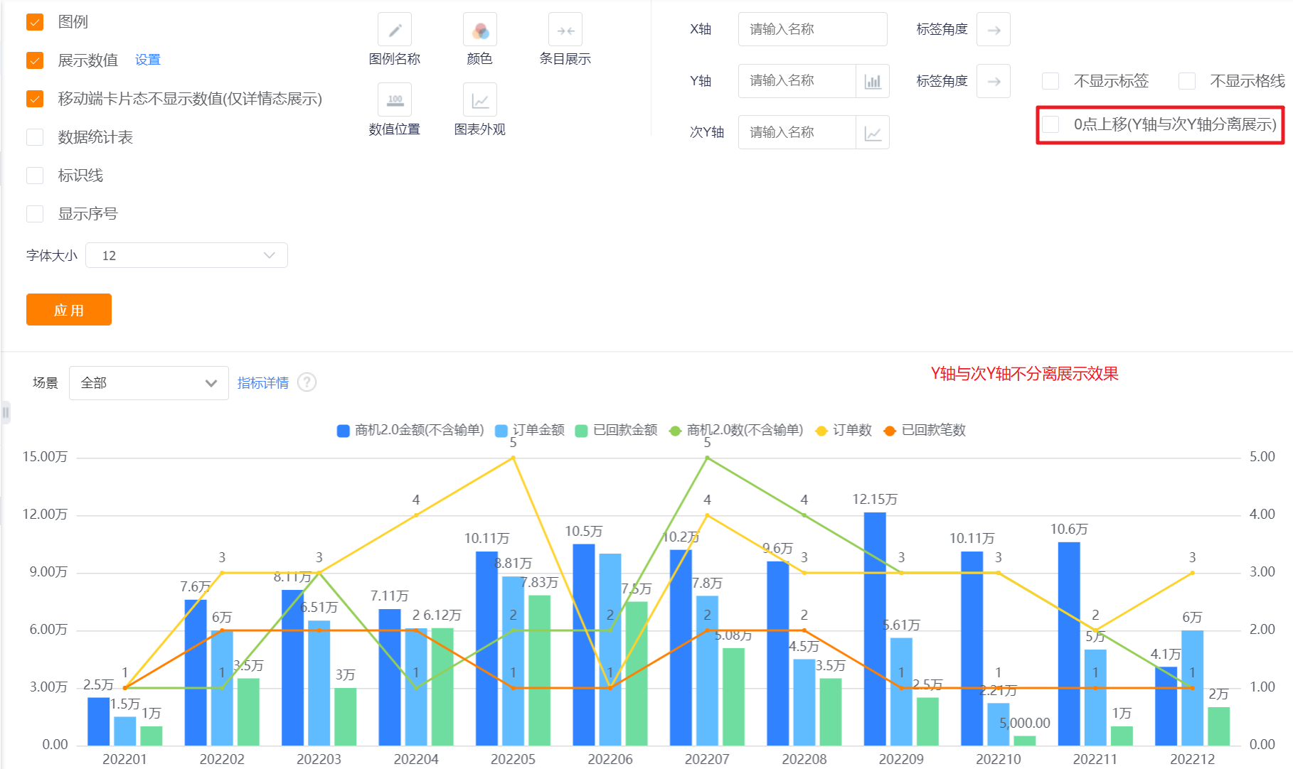
- Axis-X/Y: You can set the display name of X axis/Y axis, if not set, it will not be displayed. In addition, the chart display type can be switched for the Y-axis. The default Y-axis is a bar chart, which can be switched to a line chart; the secondary Y-axis is a line chart, which can be switched to a bar chart. When the secondary Y-axis is switched to a bar chart indicator, the chart Appearance is not configurable.
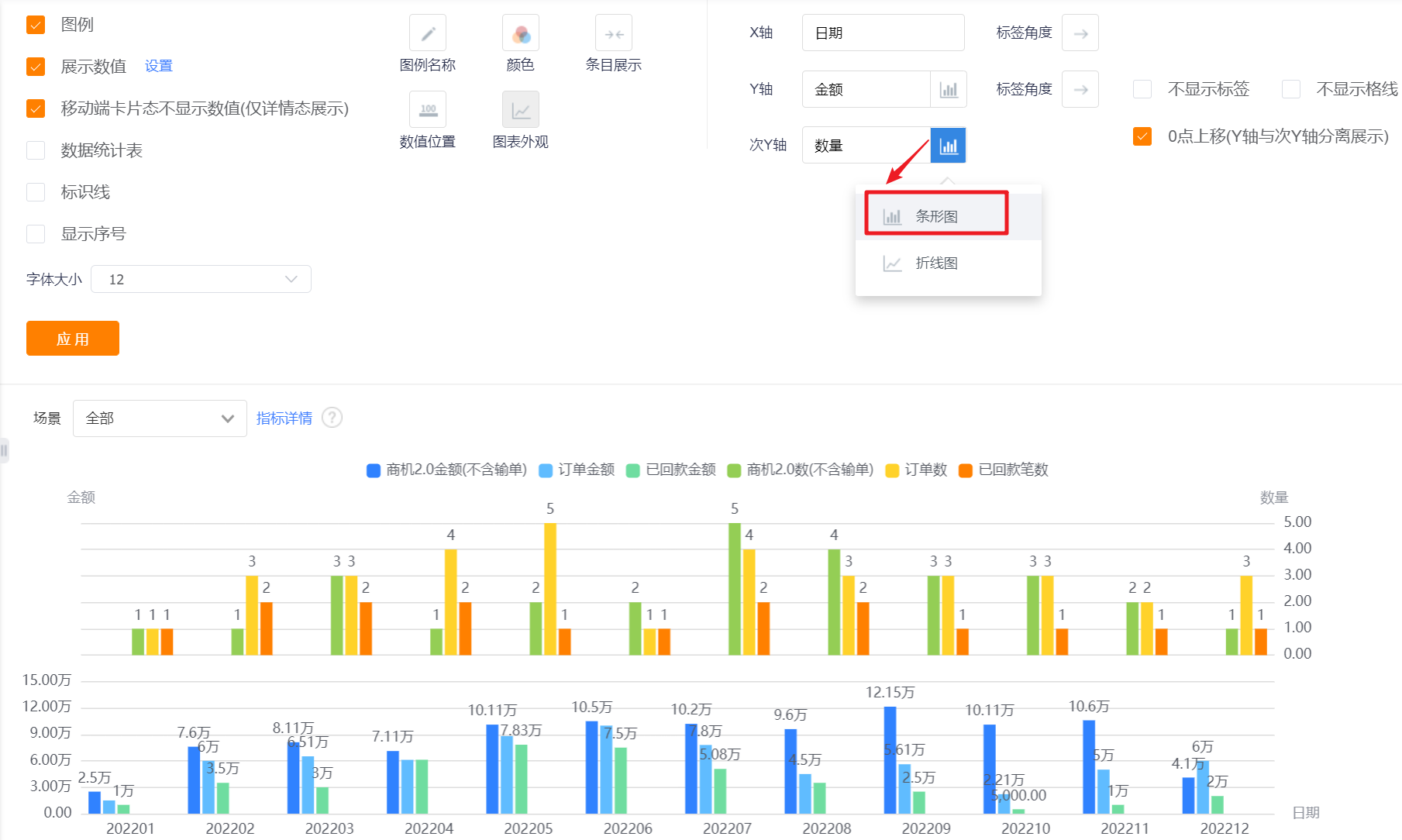
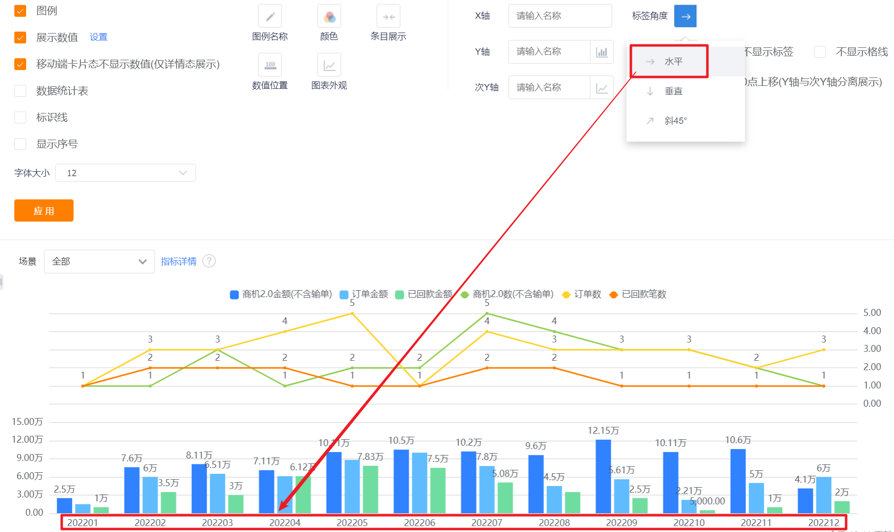
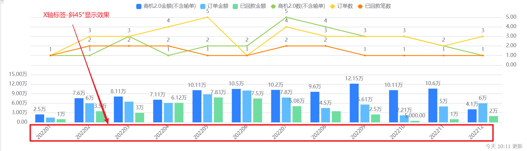
- Axis-Tag Angle: default horizontal display, can be switched to vertical or oblique 45°; (X-axis and Y-axis are set separately, the following figure takes the X-axis as an example, and the Y-axis (including the secondary Y-axis) is the same).

- Do not display tags: Labels are displayed by default. After checking, the Y-axis and sub-Y-axis labels cannot be displayed. At the same time, the Y-axis and sub-Y-axis names and label angles cannot be set.
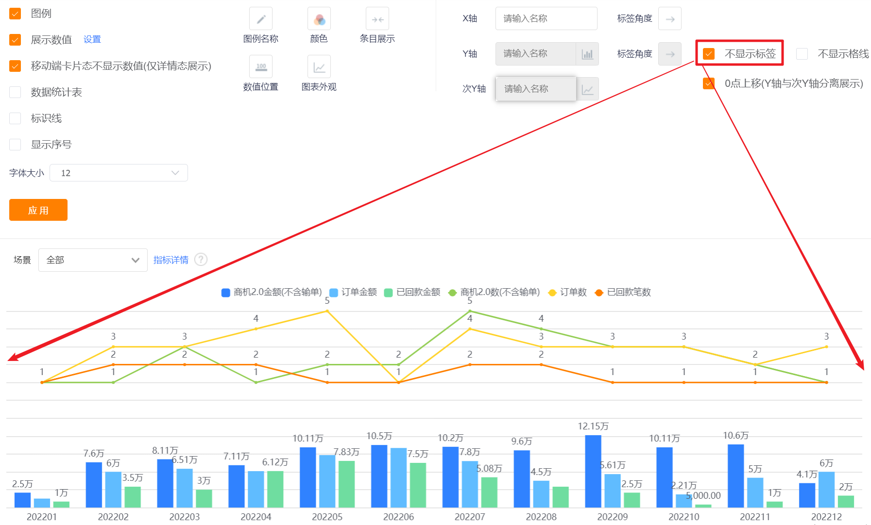
- Do not display grid line: the grid line is displayed by default, and the Y-axis grid line can not be displayed after checking it.

- Move up 0 point (separate display of Y-axis and sub-Y-axis): It is checked by default, and can be unchecked to realize that the Y-axis and sub-Y-axis are not displayed separately.
5.2.3 Sorting and displaying
- Sorting: You can set the sorting fields and sorting methods.
- Sorting field: the optional content is the dimension or the statistical index selected in the current statistical chart;
- Sorting method: no sorting by default, you can choose ascending or descending order.
- Display data in the current sorting method: After setting the sorting rules, you can set the number of displayed data according to the current sorting rules. The default is all, and you can switch the first 3, top 5, top 10, or customize the number of data.
- Display dimensions with indicators of 0: unchecked by default, and can be checked to display dimensions with indicators of 0.
Six, KPI card
6.1 Application scenarios
KPI can directly display the value of the selected indicator. For example, opportunity amount, number of orders, number of employees, etc.
6.2 Chart configuration
6.2.1 Coordinate axis data
- Dimensions: 0 dimensions
- Indicators: 1-30 indicators
6.2.2 Appearance layout
- Indicator configuration: Modify the indicator name; you can open the [Advanced] settings. After [Advanced] is turned on, the [Card Format] configuration will not be editable.
- Card format: When [Advanced] is not turned on, the card format can be set. Depending on the number of indicators, the card formats that can be set are different, and up to 6 types are supported.

- Layout 1: Two indicators form a group, displayed on the left and right.
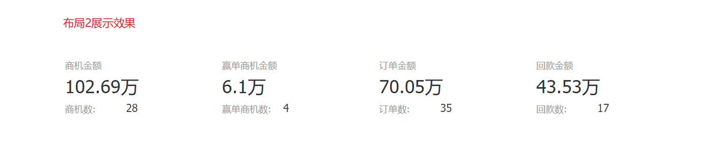
- Layout 2: Two indicators form a group, displayed up and down.
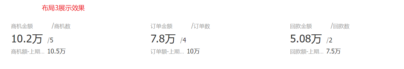
- Layout 3: Three indicators form a group, displayed up and down, with two indicators on the top and one indicator on the bottom.
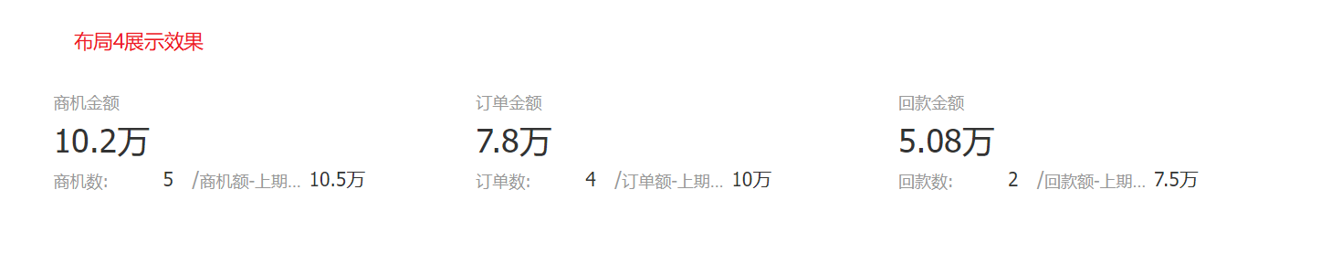
- Layout 4: Three indicators form a group, displayed up and down, with one indicator on the top and two indicators on the bottom.
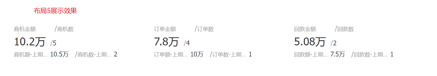
- Layout 5: Four indicators form a group, displayed up and down, with two indicators on the top and two indicators on the bottom.
- Layout 6: Display directly without grouping.
6.2.3 Sorting and displaying
- KPI cards do not support sorting.
7. Dashboard
7.1 Application scenarios
The dashboard can show the overall completion status and is mainly used with the goal. For example, the company's overall goal completion rate, etc.
7.2 Chart configuration
7.2.1 Coordinate axis data
- Dimensions: 0 dimensions
- Index: 1 index
7.2.2 Appearance layout
- Indicators: You can check whether to display indicators, which is checked by default.
- Display value: You can check whether to display the value, and it is checked by default.
- Data statistics table: You can set whether to display the data statistics table, and it will not be displayed by default.
- Statistical table card status is not displayed: This configuration is displayed after the display data statistical table is checked, which is checked by default;
- Chart position: After checking the display data statistics table, this configuration is displayed. By default, it occupies the right side of the chart, and can be switched to the left, top or bottom.

- Statistical indicator name: Displayed by indicator name by default, you can modify the displayed content by yourself.

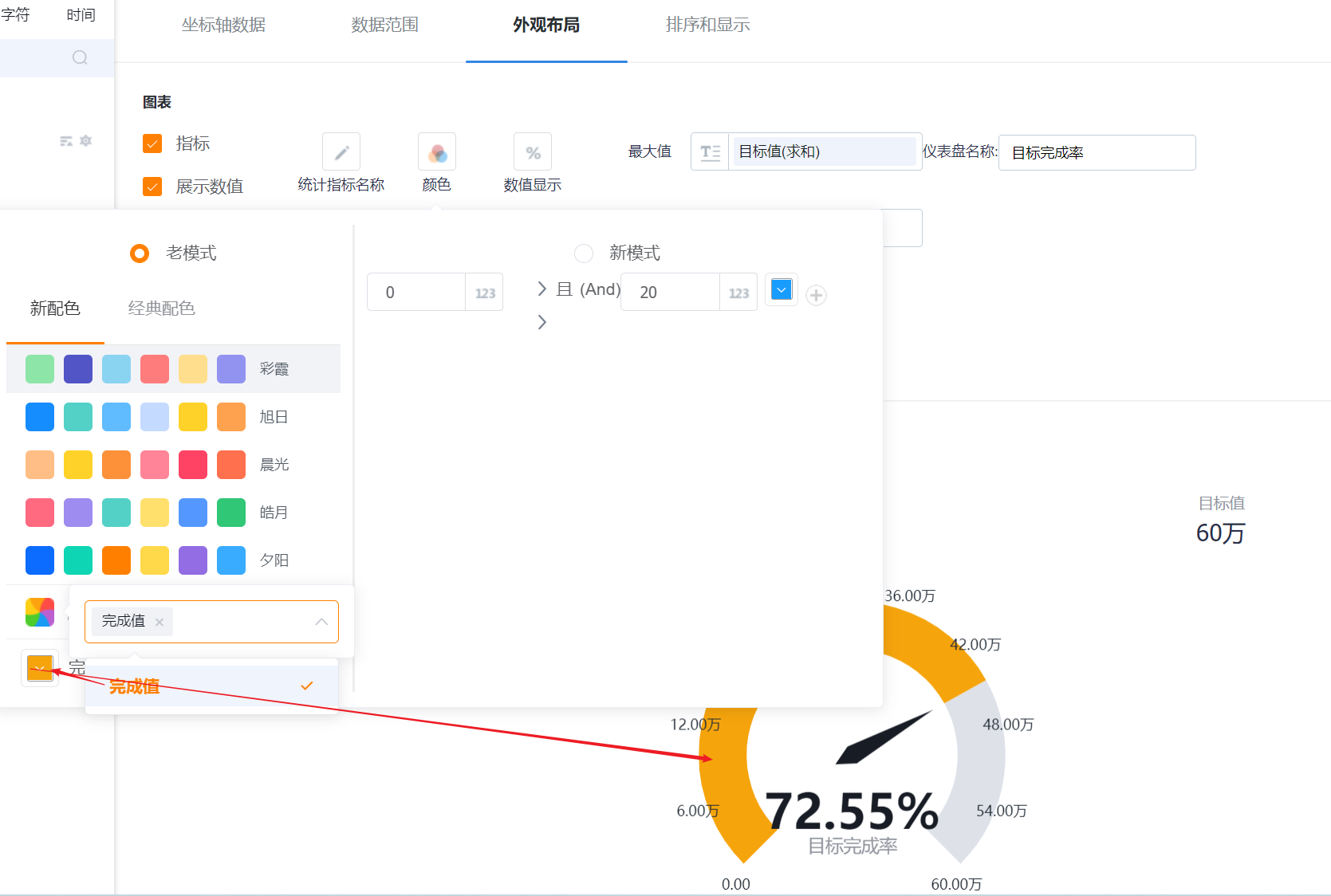
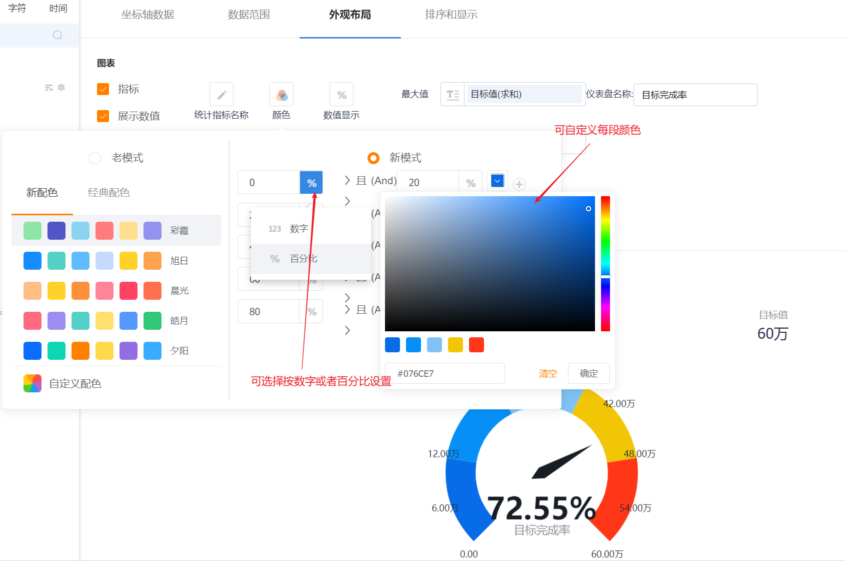
- Color: Divided into old mode and new mode, the default is the old mode, supports two types of color schemes: new color scheme and classic color scheme, the first set under the new color scheme is displayed by default; it can be switched to the new mode, and the display color can be set by segment, up to Support 5 segments, customizable color matching
- New color matching: support custom color matching based on a certain color scheme
- Classic color matching: custom color matching is not supported

- Numerical display: the default display percentage, can be switched to display numbers.

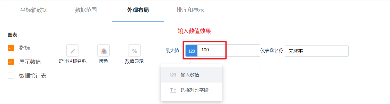
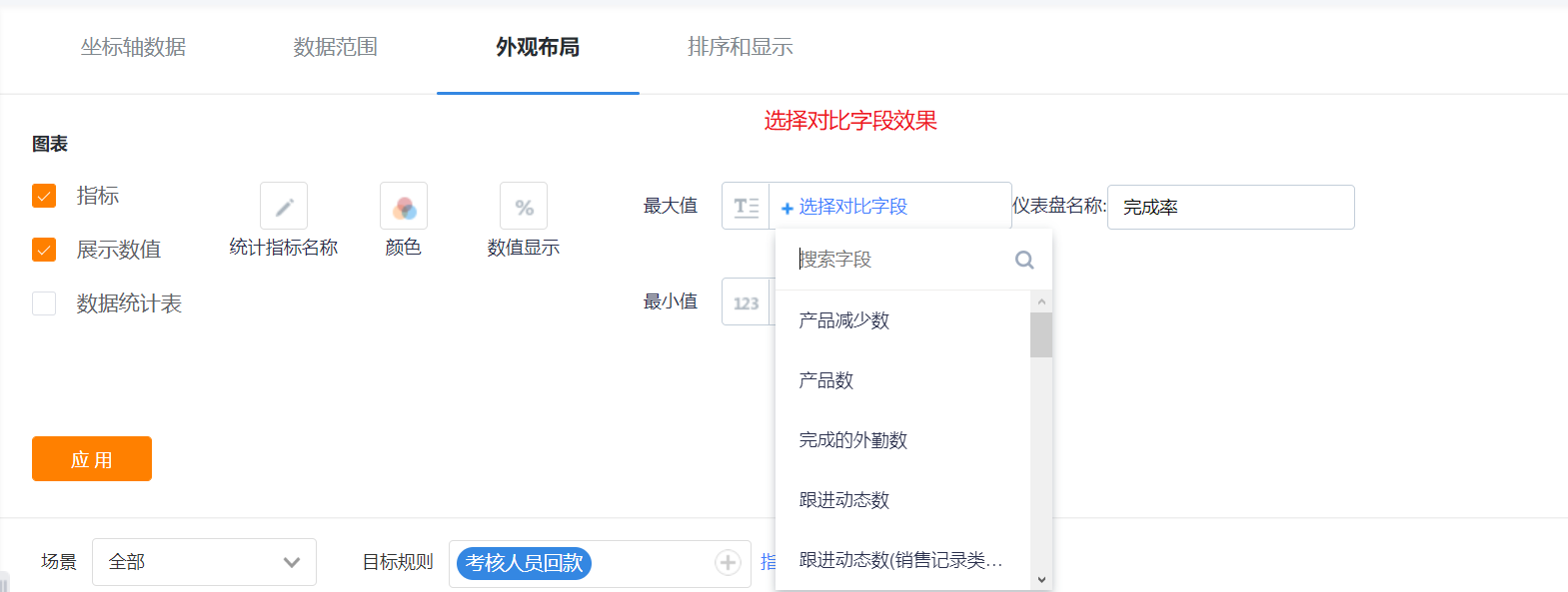
- Maximum value/minimum value: The default is to select the input value, the maximum value is 100 by default, and the minimum value is 0 by default; it can be switched to select a comparison field, and select indicators from the current topic for comparison.
- Dashboard name: The default is the completion rate, and the name of the dashboard can be modified.

7.2.3 Sorting and displaying
- Dashboards do not support sorting.
8. Map
The map is divided into map (heat) and map (bubble) charts. Except for the different display effects, the rest of the configuration items are exactly the same.
8.1 Application scenarios
The map can display the regional positioning component under the current theme, that is, the distribution of the graphs with the dimensions of provinces, cities, and districts on the map.
- The map (thermal power) indicates a distribution of each data in the current dimension through the shade of color.
- The map (bubble) represents a distribution of each data in the current dimension through the size of the bubble.

8.2 Chart configuration
8.2.1 Coordinate axis data
- Dimensions: 1 dimension
- Indicators: 1-6 indicators
8.2.2 Appearance layout
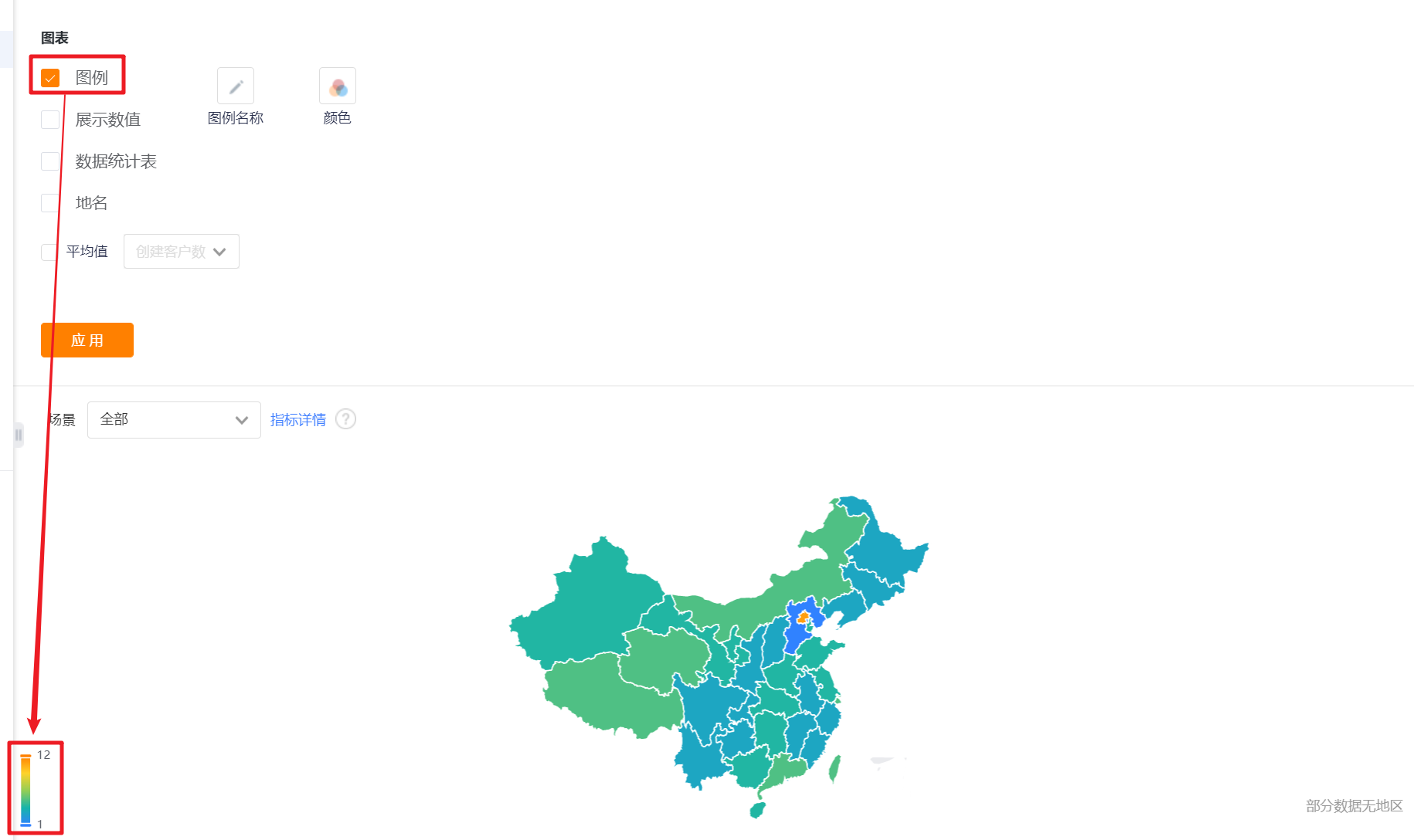
- Display legend: You can check whether to display the legend, and it is checked by default.
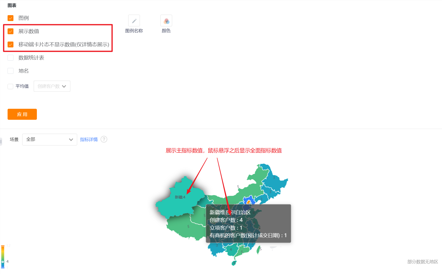
- Display value: You can check whether to display the value. By default, it is not checked. After checking, only the value of the main indicator will be displayed in the chart, and the value of the secondary indicator will be displayed when the mouse hovers.
- The card state of the mobile terminal does not display the value (only the detail state display): it will only be displayed when [Display value] is checked, and it is checked by default when it is displayed.
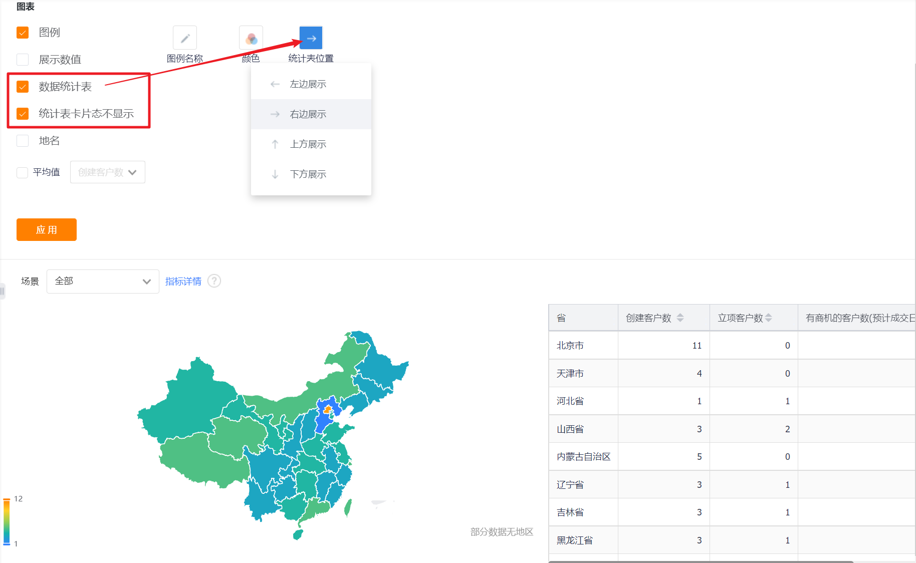
- Data statistics table: You can set whether to display the data statistics table, and it will not be displayed by default.
- Statistical table card status is not displayed: This configuration is displayed after the display data statistical table is checked, which is checked by default;
- Chart position: After checking the display data statistics table, this configuration is displayed. By default, it occupies the right side of the chart, and can be switched to the left, top or bottom.
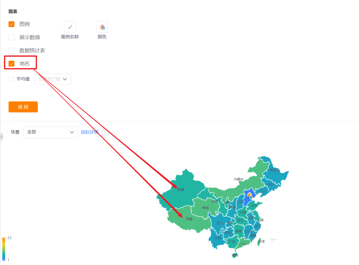
- Place name: Unchecked by default, place name can be displayed after checked.
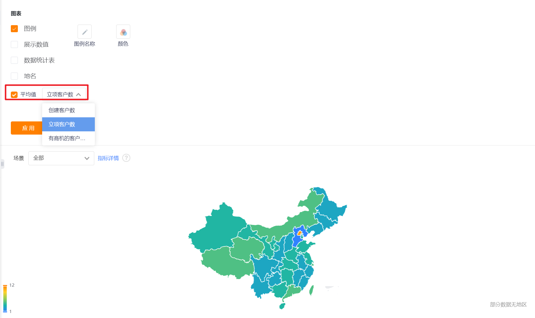
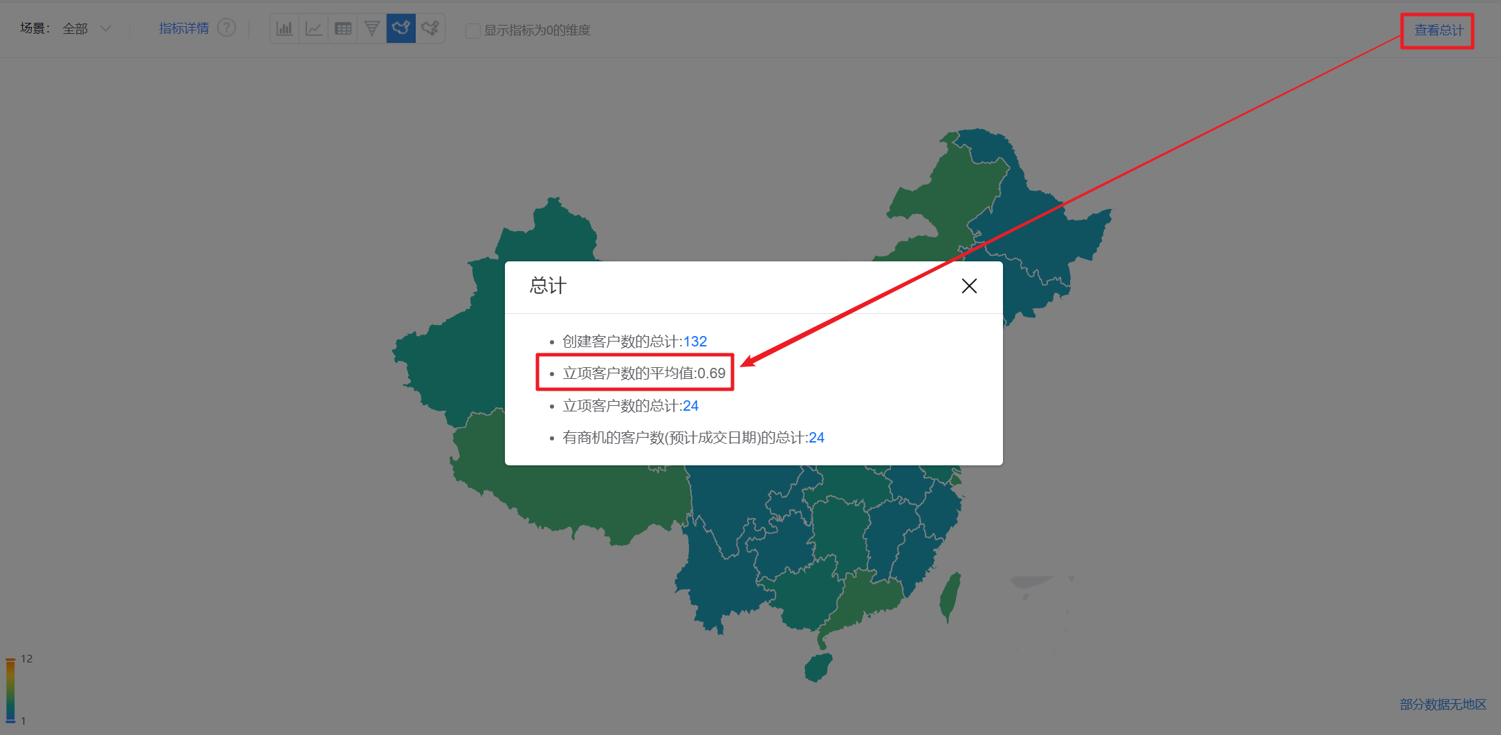
- Average: Unchecked by default. After checking, the average value of the current indicator will be displayed in the preview state and detailed state.
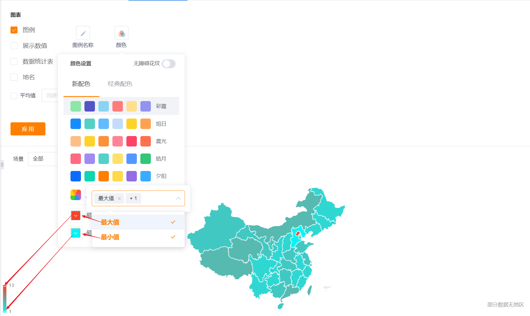
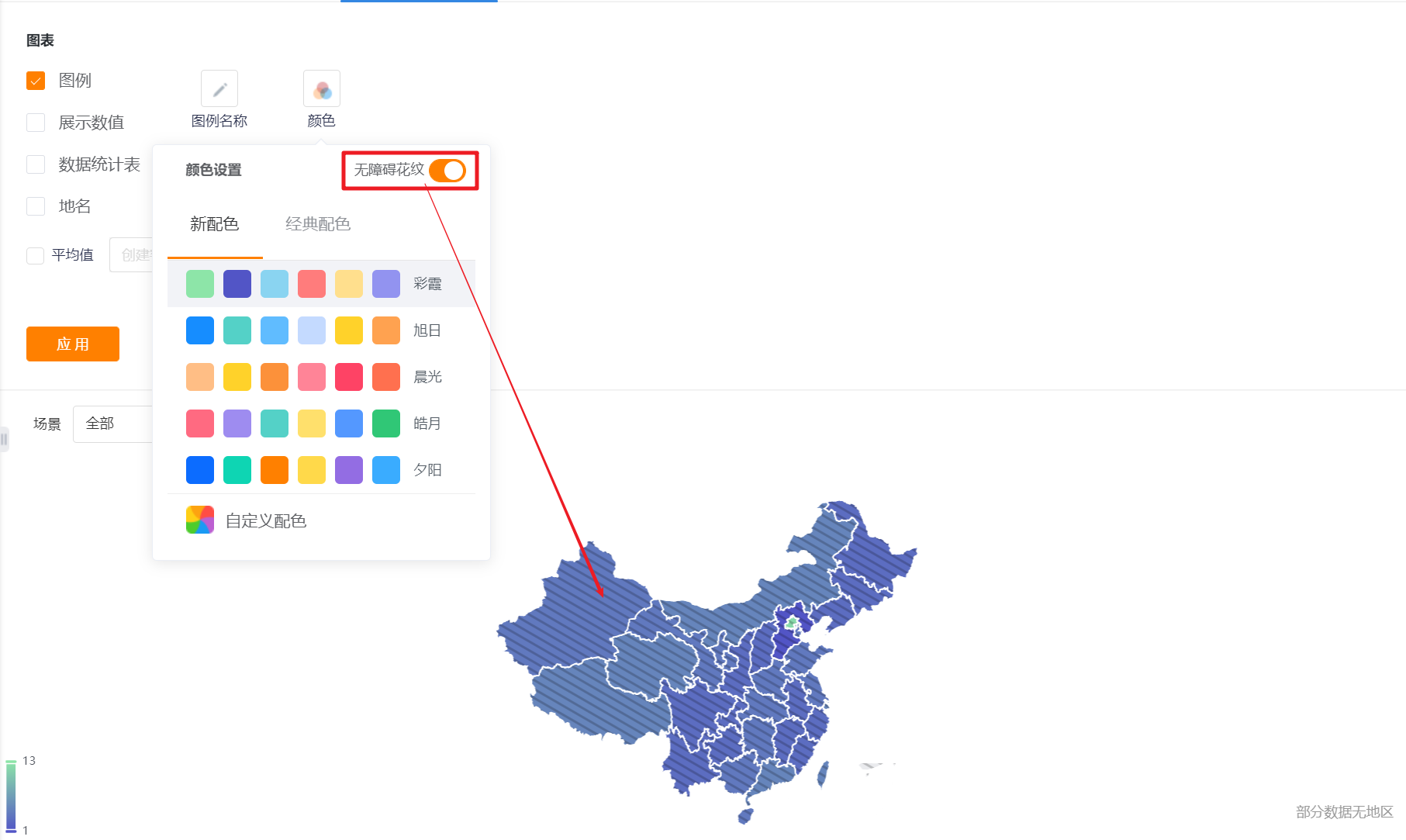
- Color: The system supports two types of color schemes: new color scheme and classic color scheme. The first set under the new color scheme is displayed by default. In addition, the barrier-free pattern setting can be enabled
- New color matching: support custom color matching based on a certain color scheme
- Classic color matching: custom color matching is not supported
*The map (bubble) is a custom color based on the main indicator setting, and does not support the setting of the barrier-free pattern

8.2.3 Sorting and displaying
- Display the dimension whose index is 0: It is not checked by default, and it can be checked to display the dimension whose index is 0. It is generally used with [Display Value] or [Place Name] in the appearance layout.
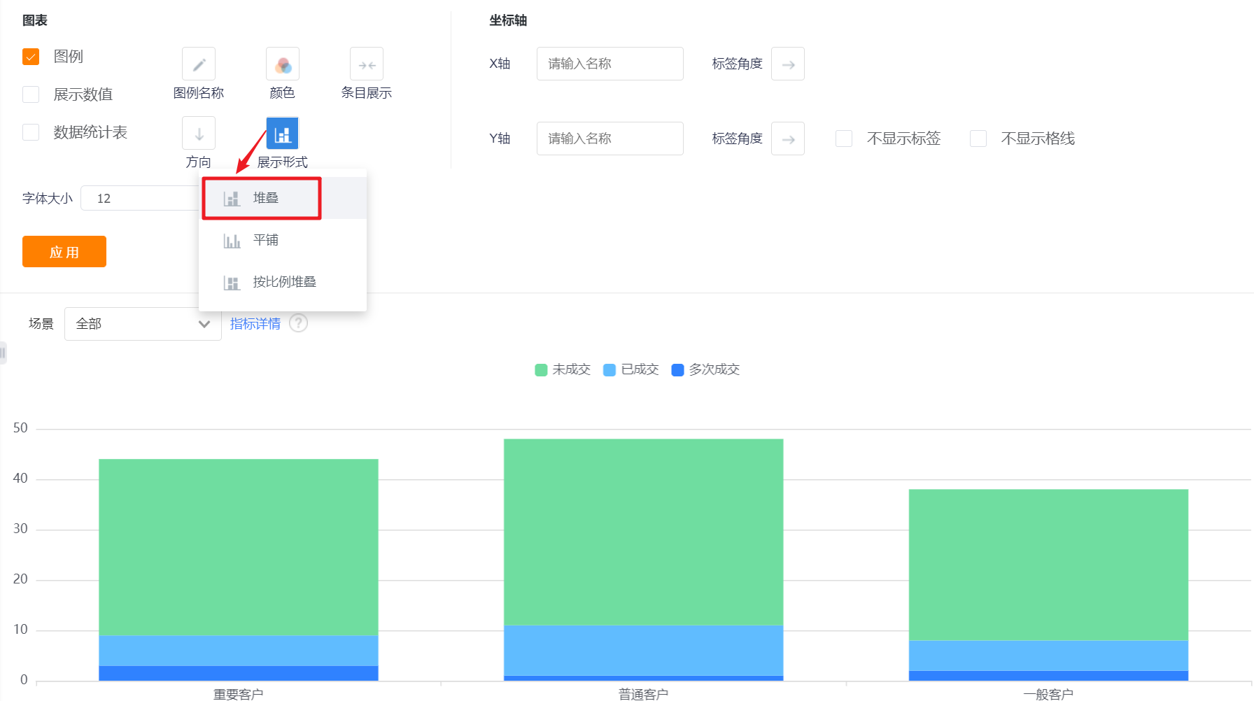
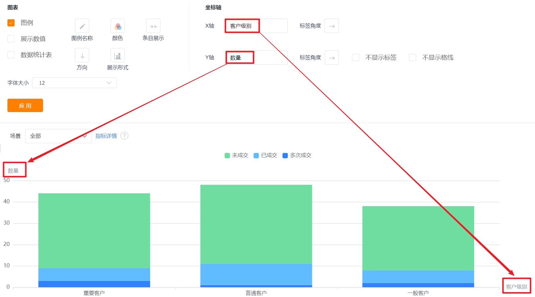
Nine, stacked column chart
9.1 Application scenarios
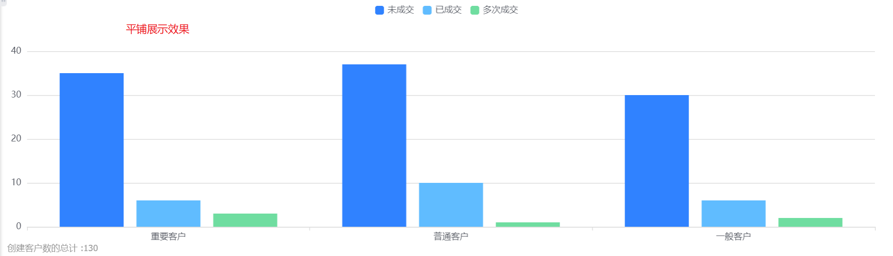
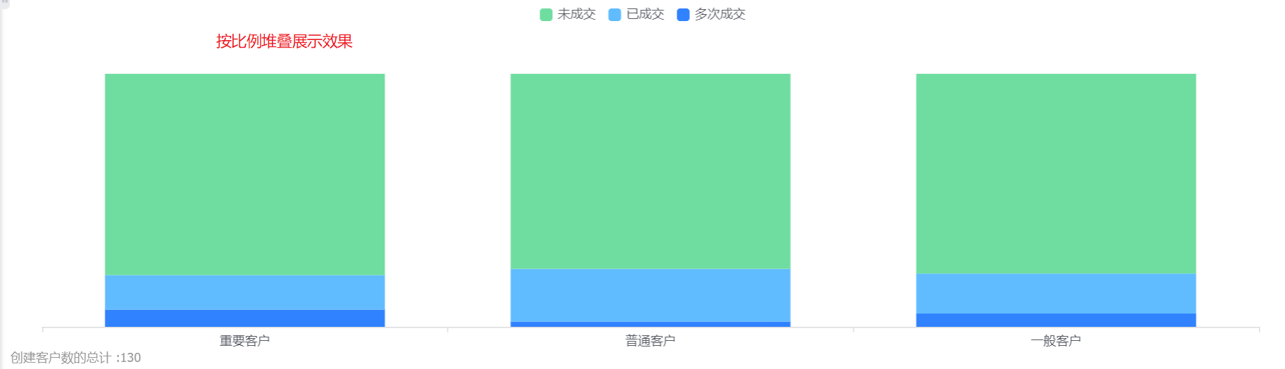
The stacked column chart can display the data and proportion of each second dimension within a certain data range under the first dimension. For example, a stacked column chart can compare the number of customers with different transaction status at different customer levels, etc.
9.2 Chart configuration
9.2.1 Coordinate axis data
- Dimensions: 2 dimensions
- Index: 1 index
9.2.2 Appearance layout
- Display legend: You can check whether to display the legend, and it is checked by default.
- Display value: You can check whether to display the value, and it is checked by default.
- The card state of the mobile terminal does not display the value (only the detail state display): it will only be displayed when [Display value] is checked, and it is checked by default when it is displayed.
- Data statistics table: You can set whether to display the data statistics table, and it will not be displayed by default.
- Statistical table card status is not displayed: This configuration is displayed after the display data statistical table is checked, which is checked by default;
- Chart position: After checking the display data statistics table, this configuration is displayed. By default, it occupies the right side of the chart, and can be switched to the left, top or bottom.
- Font size: The default is 12, which can be switched to 13, 14, 15, 16 for display.
- Legend name: Displayed by indicator name by default, you can modify the displayed content by yourself.
- Color: The system supports two types of color schemes: new color scheme and classic color scheme. The first set under the new color scheme is displayed by default. In addition, the barrier-free pattern setting can be enabled
- New color matching: support custom color matching based on a certain color scheme
- Classic color matching: custom color matching is not supported
- Item display: Set the data area displayed in the current area. By default, all items are displayed on one screen, which can be switched to display with appropriate spacing and width.
- Orientation: Default vertical display, can be switched to horizontal orientation.
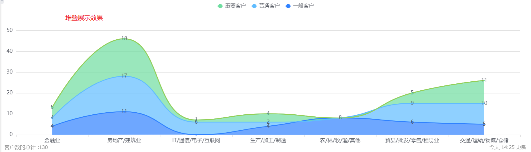
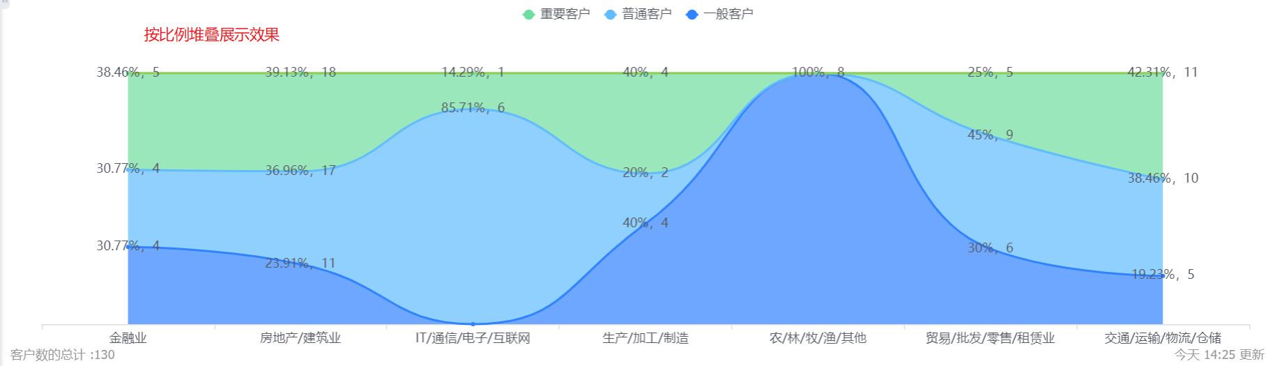
- Display form: default stacked display, which can be switched to tiled or proportionally stacked display.
- Coordinate axis-X axis/Y axis: You can set the display name of X axis/Y axis, if not set, it will not be displayed.
- Coordinate axis-label angle: default horizontal display, can be switched to vertical or oblique 45°; (X-axis and Y-axis are set separately, the following figure takes the X-axis as an example, and the Y-axis is the same).
- Do not display labels: The labels are displayed by default. After checking, the Y-axis labels cannot be displayed, and the Y-axis name and label angle cannot be set.
- Do not display the grid line: the grid line is displayed by default, and the Y-axis grid line can not be displayed after checking it.
9.2.3 Sorting and displaying
- Sorting: You can set the sorting fields and sorting methods.
- Sorting field: the optional content is the dimension or the statistical index selected in the current statistical chart;
- Sorting method: no sorting by default, you can choose ascending or descending order.
- Display data in the current sorting method: After setting the sorting rules, you can set the number of displayed data according to the current sorting rules. The default is all, and you can switch the first 3, top 5, top 10, or customize the number of data.
- Display dimensions with indicators of 0: unchecked by default, and can be checked to display dimensions with indicators of 0.
Ten, stacked line chart
10.1 Application scenarios
The stacked chart can show the change or comparison of each dimension within a certain data range. For example, the column chart can compare the sales order status of different customer levels, the annual sales order status of each department, etc.
The stacked line chart can display the data number trend of each second dimension under the first dimension within a certain data range. For example, a stacked line chart can compare the number of customers in different customer levels in different industries, etc.
10.2 Chart configuration
10.2.1 Coordinate axis data
- Dimensions: 2 dimensions
- Index: 1 index
10.2.2 Appearance layout
- Display legend: You can check whether to display the legend, and it is checked by default.
- Display value: You can check whether to display the value, it is not checked by default.
- The card state of the mobile terminal does not display the value (only the detail state display): it will only be displayed when [Display value] is checked, and it is checked by default when it is displayed.
- Data statistics table: You can set whether to display the data statistics table, and it will not be displayed by default.
- Statistical table card status is not displayed: This configuration is displayed after the display data statistical table is checked, which is checked by default;
- Chart position: After checking the display data statistics table, this configuration is displayed. By default, it occupies the right side of the chart, and can be switched to the left, top or bottom.
- Font size: The default is 12, which can be switched to 13, 14, 15, 16 for display.
- Legend name: Displayed by indicator name by default, you can modify the displayed content by yourself.
- Color: The system supports two types of color schemes: new color scheme and classic color scheme. The first set under the new color scheme is displayed by default. In addition, the barrier-free pattern setting can be enabled
- New color matching: support custom color matching based on a certain color scheme
- Classic color matching: custom color matching is not supported
- Item display: Set the data area displayed in the current area. By default, all items are displayed on one screen, which can be switched to display with appropriate spacing and width.
- Display form: The default tile display can be switched to stack or stack in proportion.
- Chart appearance: default curve, can be switched to straight line.

- Coordinate axis-X axis/Y axis: You can set the display name of X axis/Y axis, if not set, it will not be displayed.

- Coordinate axis-label angle: default horizontal display, can be switched to vertical or oblique 45°; (X-axis and Y-axis are set separately, the following figure takes the X-axis as an example, and the Y-axis is the same).
- Do not display labels: The labels are displayed by default. After checking, the Y-axis labels cannot be displayed, and the Y-axis name and label angle cannot be set.
- Do not display the grid line: the grid line is displayed by default, and the Y-axis grid line can not be displayed after checking it.
10.2.3 Sorting and displaying
- Sorting: You can set the sorting fields and sorting methods.
- Sorting field: the optional content is the dimension or the statistical index selected in the current statistical chart;
- Sorting method: no sorting by default, you can choose ascending or descending order.
- Display data in the current sorting method: After setting the sorting rules, you can set the number of displayed data according to the current sorting rules. The default is all, and you can switch the first 3, top 5, top 10, or customize the number of data.

- Display dimensions with indicators of 0: unchecked by default, and can be checked to display dimensions with indicators of 0.

Eleven, heat map
11.1 Application scenarios
The heat map can show the value of each dimension within a certain data range through the color depth. For example, a heat map can compare the number of customers of different customer levels in different industries, etc.
11.2 Chart configuration
11.2.1 Coordinate axis data
- Dimensions: 2 dimensions
- Index: 1 index
11.2.2 Appearance layout
- Display legend: You can check whether to display the legend, and it is checked by default.
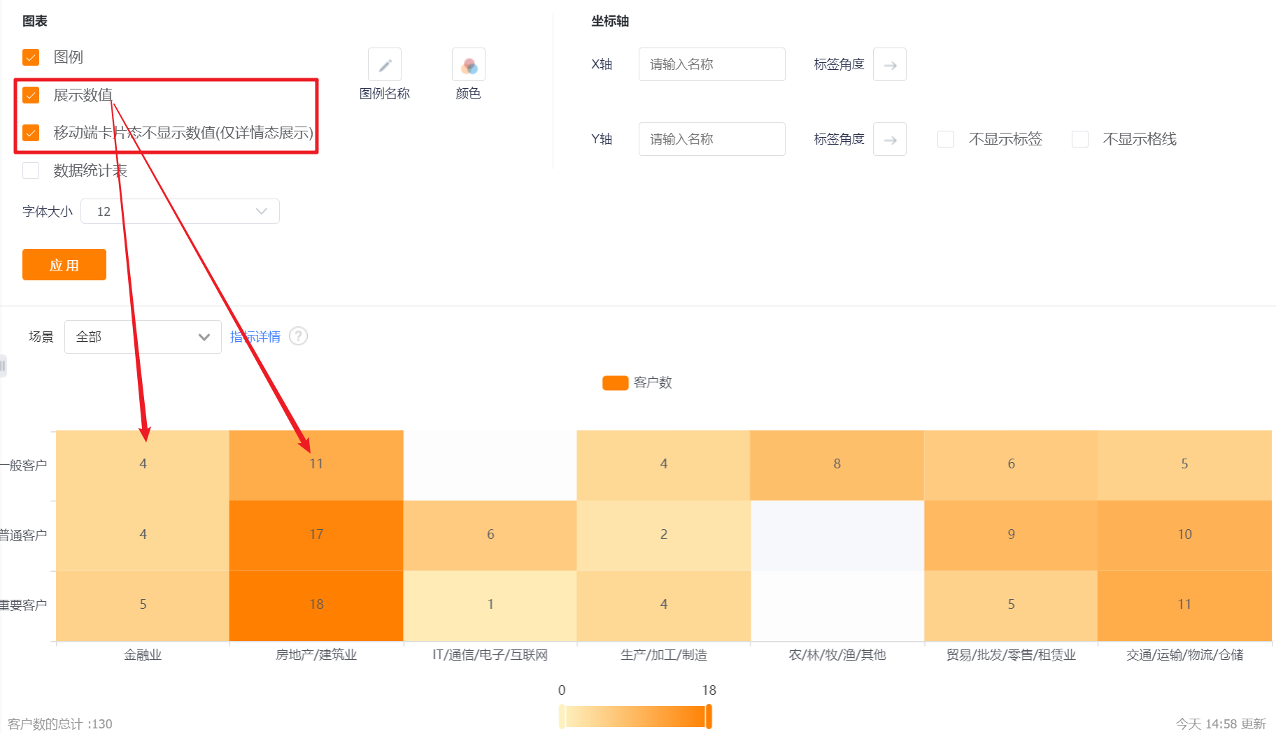
- Display value: You can check whether to display the value, and it is checked by default.
- The card state of the mobile terminal does not display the value (only the detail state display): it will only be displayed when [Display value] is checked, and it is checked by default when it is displayed.
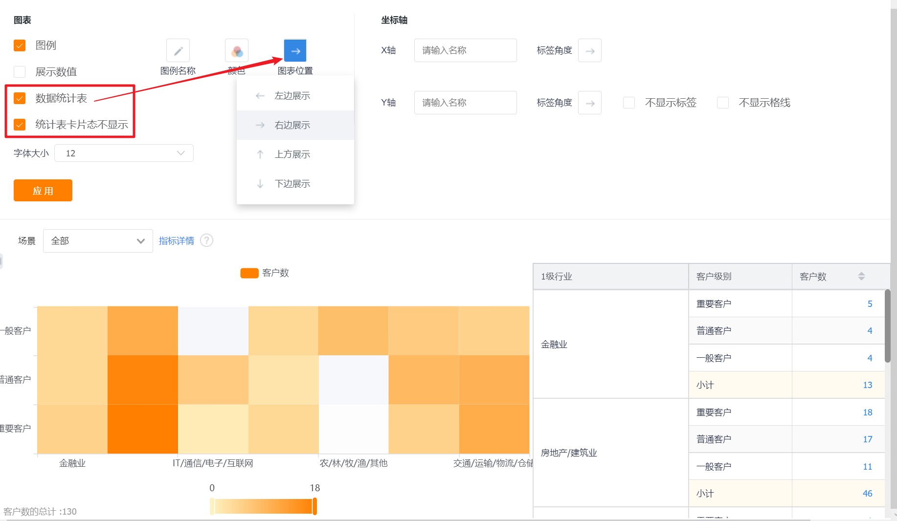
- Data statistics table: You can set whether to display the data statistics table, and it will not be displayed by default.
- Statistical table card status is not displayed: This configuration is displayed after the display data statistical table is checked, which is checked by default;
- Chart position: After checking the display data statistics table, this configuration is displayed. By default, it occupies the right side of the chart, and can be switched to the left, top or bottom.
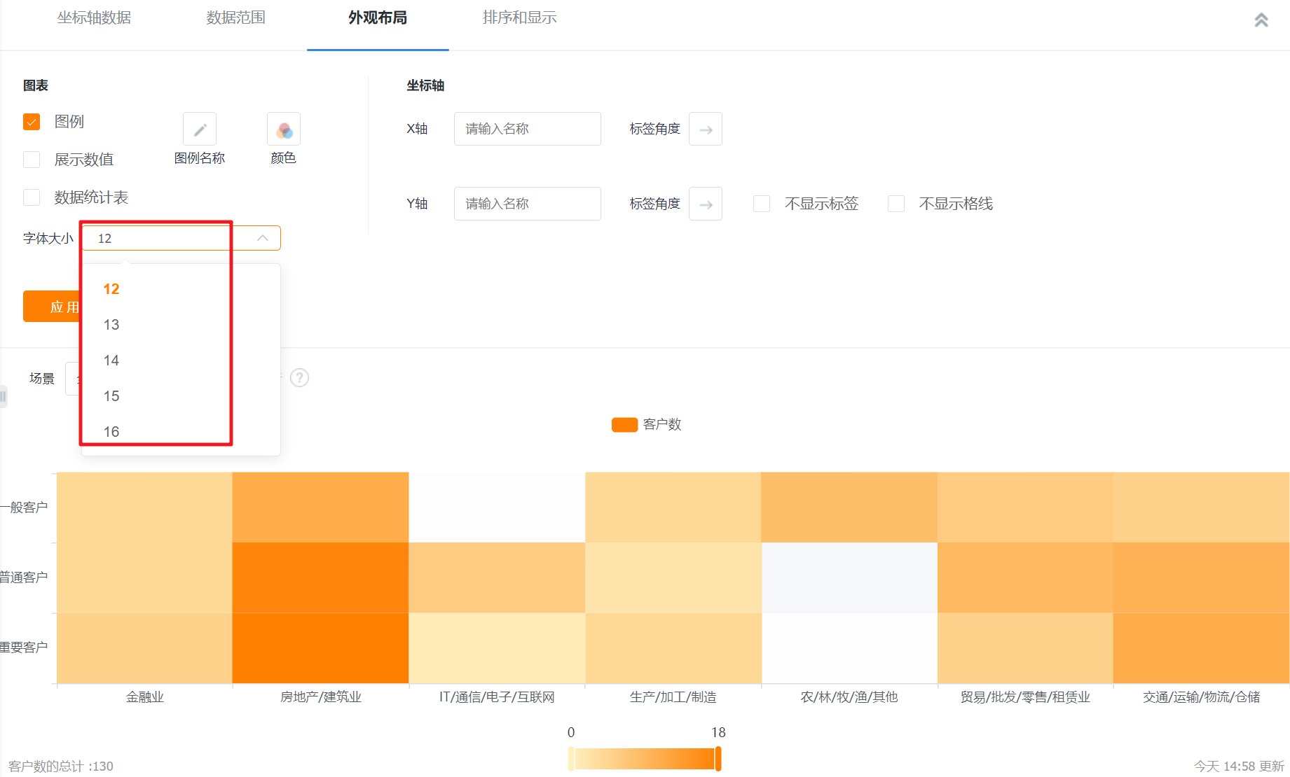
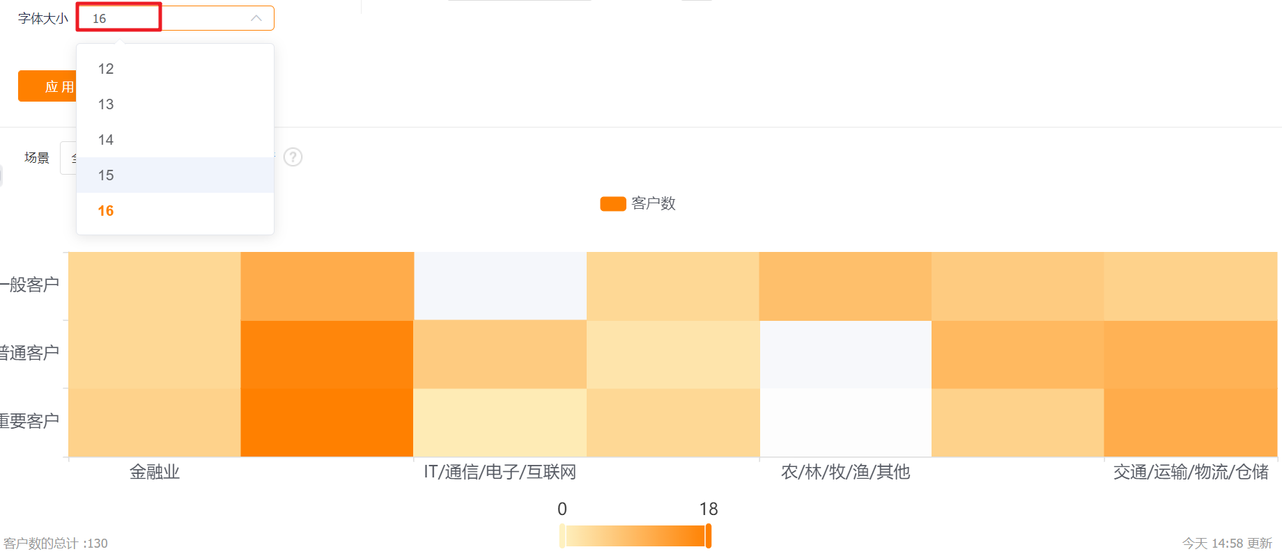
- Font size: The default is 12, which can be switched to 13, 14, 15, 16 for display.
- Legend name: Displayed by indicator name by default, you can modify the displayed content by yourself.

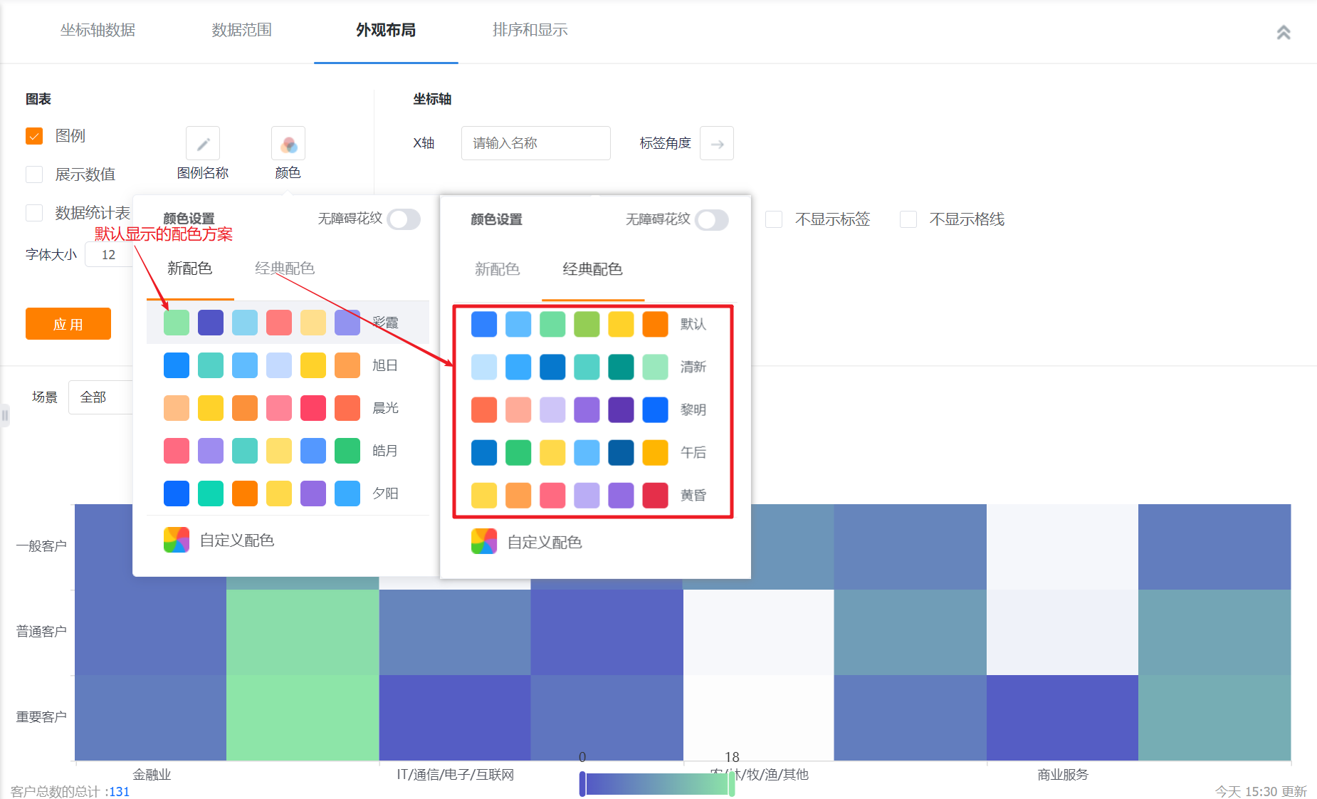
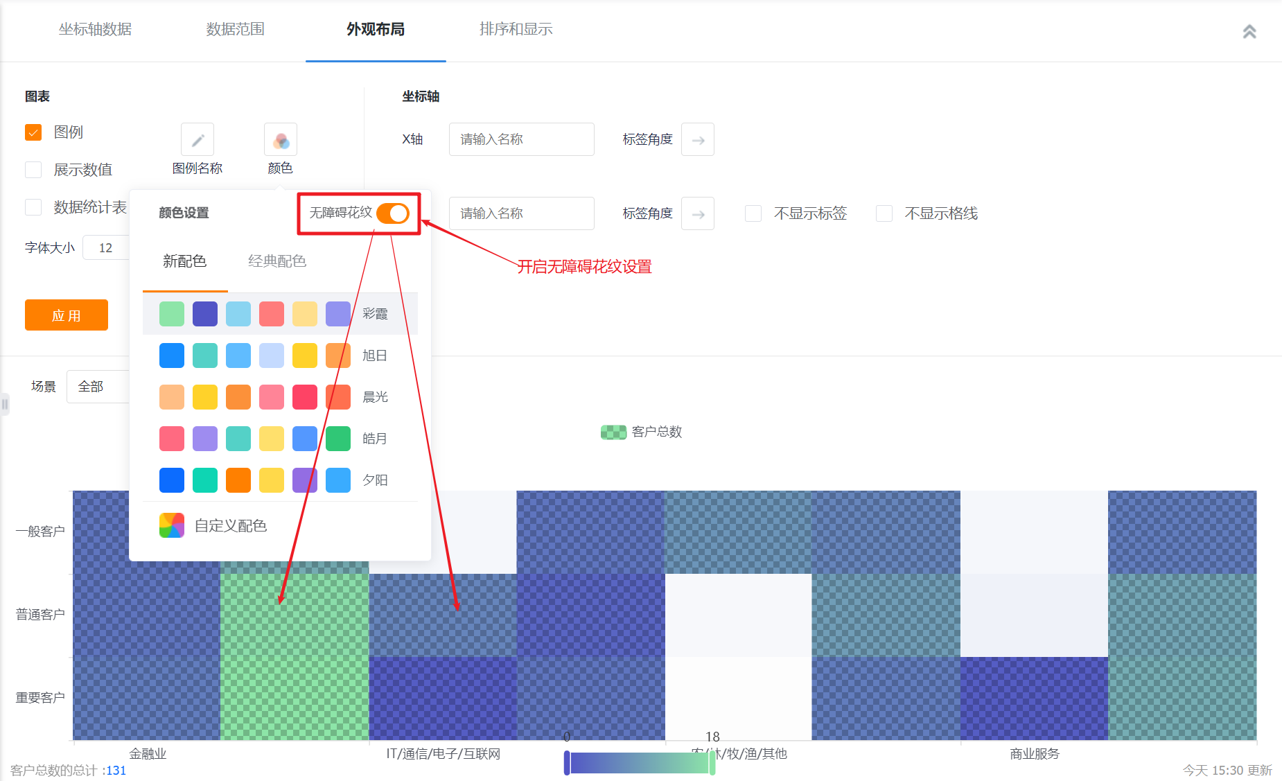
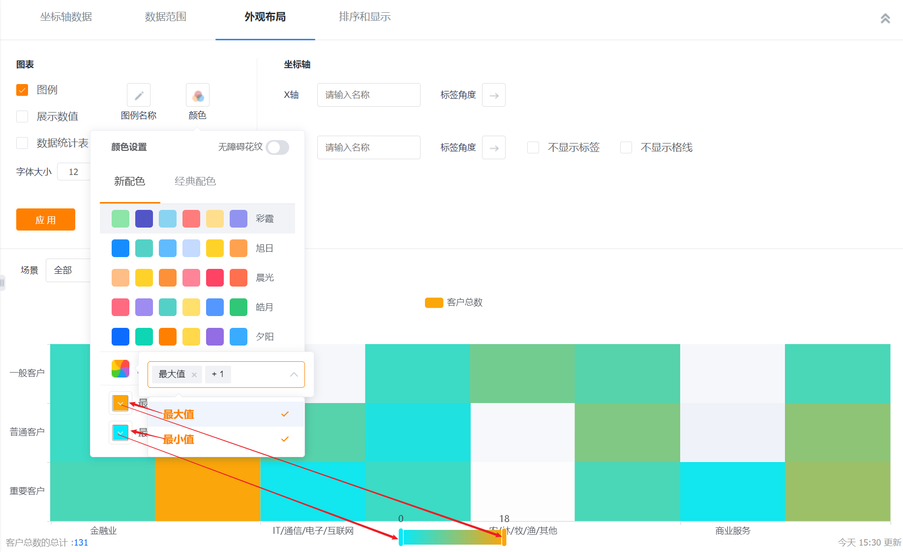
- Color: The system supports two types of color schemes: new color scheme and classic color scheme. The first set under the new color scheme is displayed by default. In addition, the barrier-free pattern setting can be enabled
- New color matching: support custom color matching based on a certain color scheme
- Classic color matching: custom color matching is not supported
- Coordinate axis-X axis/Y axis: You can set the display name of X axis/Y axis, if not set, it will not be displayed.
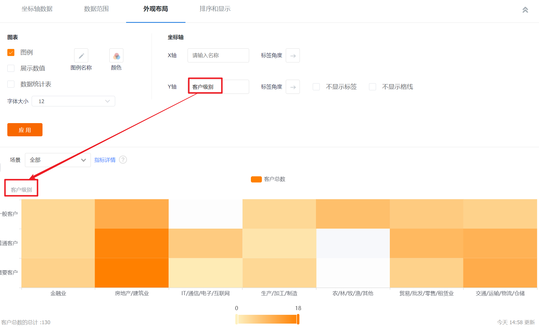
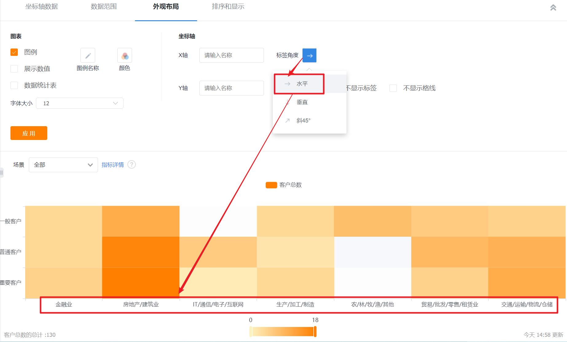
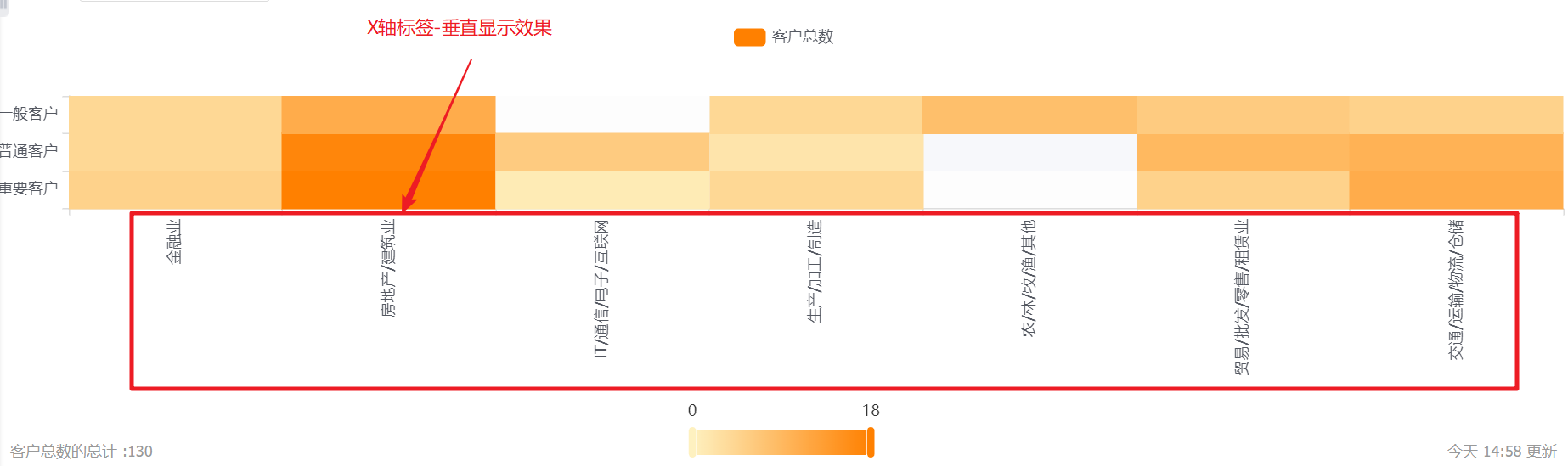
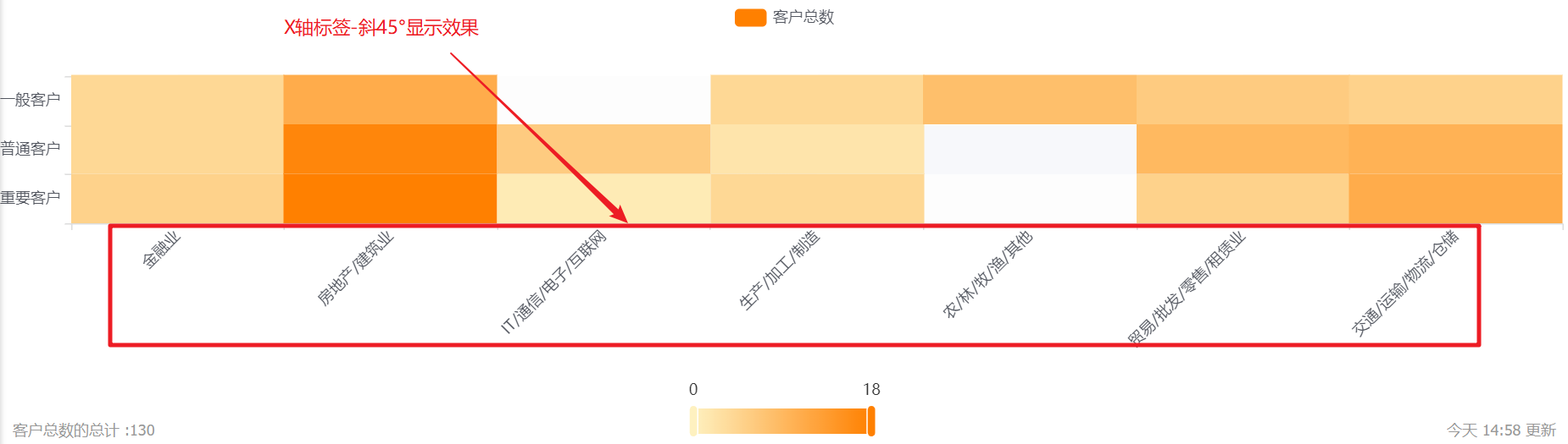
- Coordinate axis-label angle: default horizontal display, can be switched to vertical or oblique 45°; (X-axis and Y-axis are set separately, the following figure takes the X-axis as an example, and the Y-axis is the same).
11.2.3 Sorting and displaying
- Sorting: You can set the sorting fields and sorting methods.
- Sorting field: the optional content is the dimension or the statistical index selected in the current statistical chart;
- Sorting method: no sorting by default, you can choose ascending or descending order.
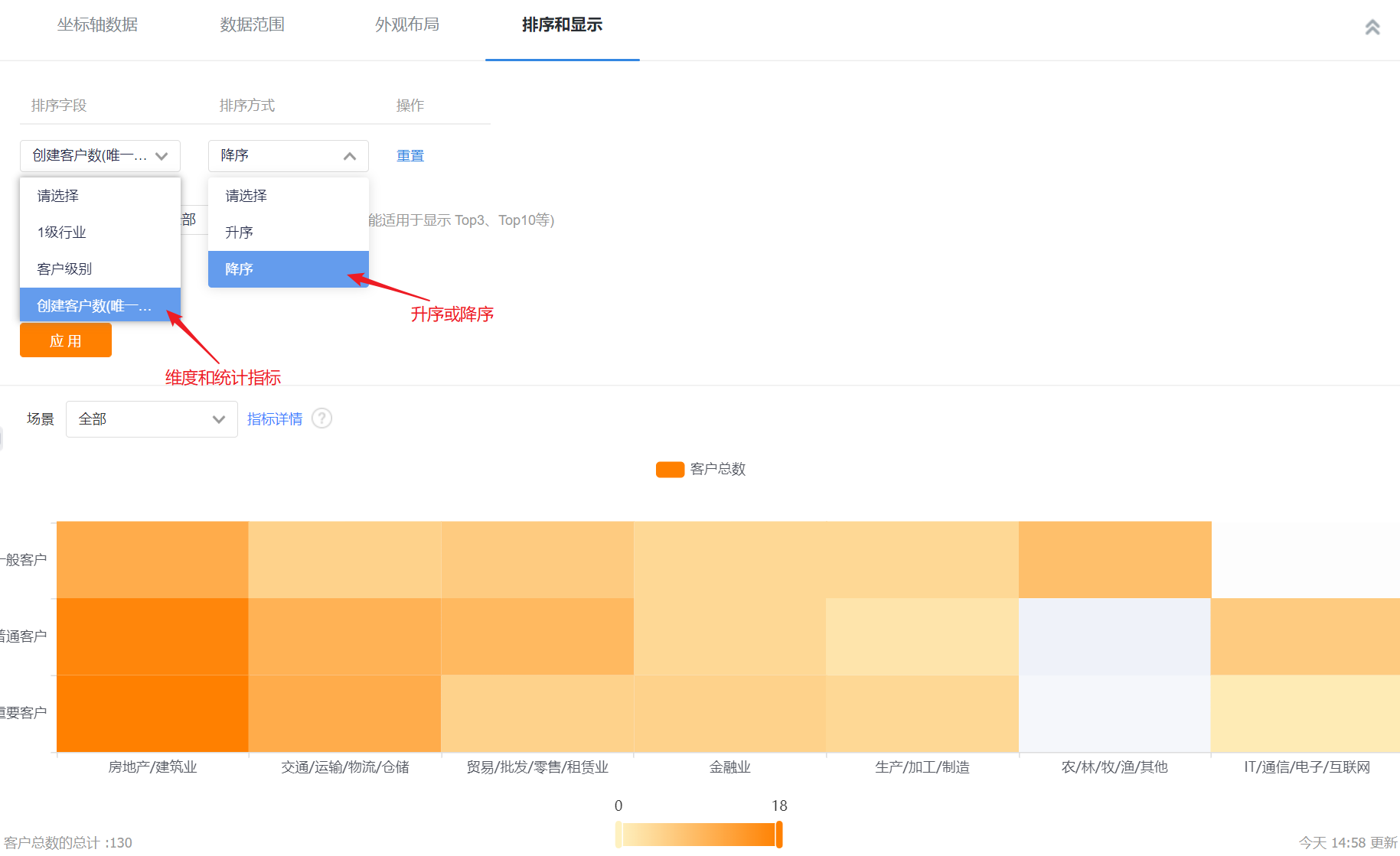
- Display data in the current sorting method: After setting the sorting rules, you can set the number of displayed data according to the current sorting rules. The default is all, and you can switch the first 3, top 5, top 10, or customize the number of data.
- Display dimensions with indicators of 0: unchecked by default, and can be checked to display dimensions with indicators of 0.
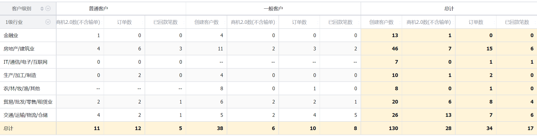
12. Statistical table
12.1 Application scenarios
Statistical tables can display data within a certain data range for each dimension. For example, the statistical table can compare the lead-to-order situation of different customer levels in each month of the year, the annual business opportunity situation of each department, and so on.

12.2 Chart configuration
12.2.1 Coordinate axis data
- Dimensions: 0-2 dimensions
- Indicators: 1-30 indicators
12.2.2 Appearance layout
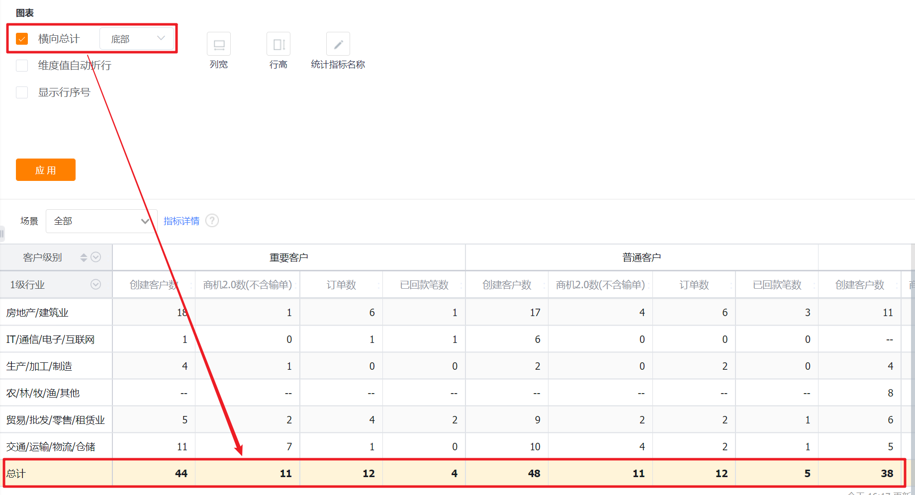
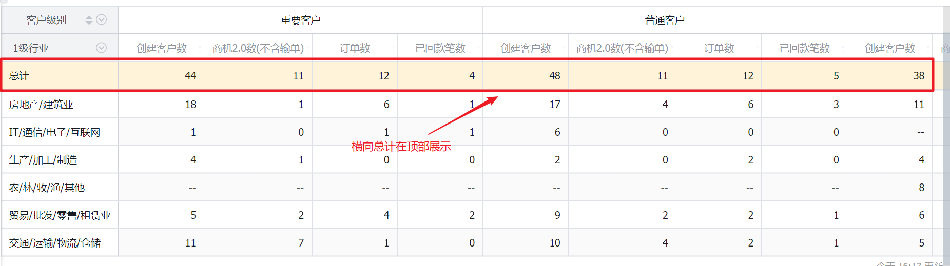
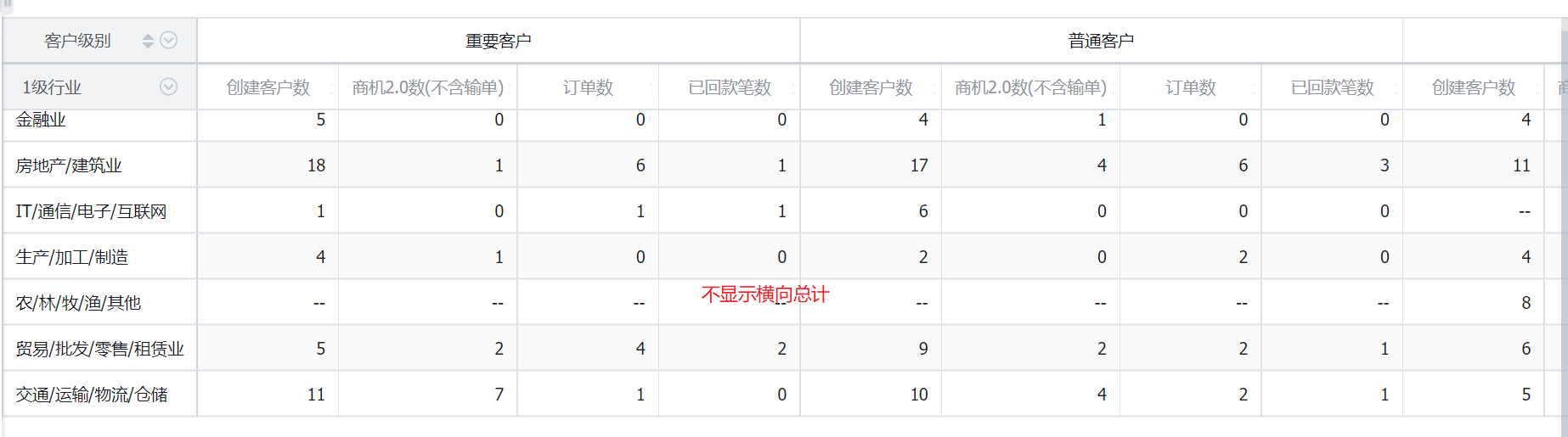
- Horizontal total: Checked by default and displayed at the bottom, can be switched to display at the top, and the total display position cannot be set after unchecking.
- Horizontal subtotal: This configuration is only available when the statistical table has two dimensions, and this configuration is not available for statistical tables with no dimension or single dimension. By default, it is checked and displayed at the bottom, and it can be switched to display at the top. After unchecking, the total display position cannot be set.
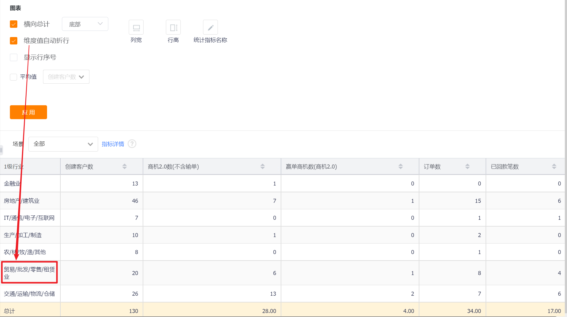
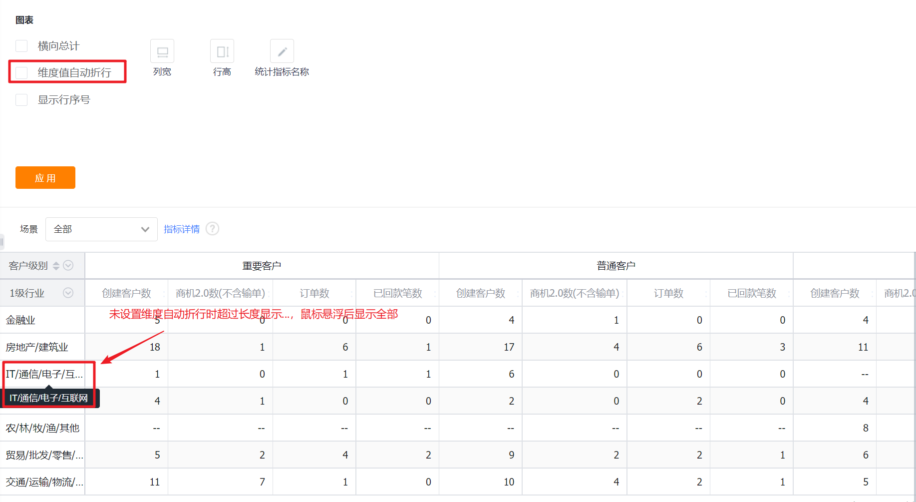
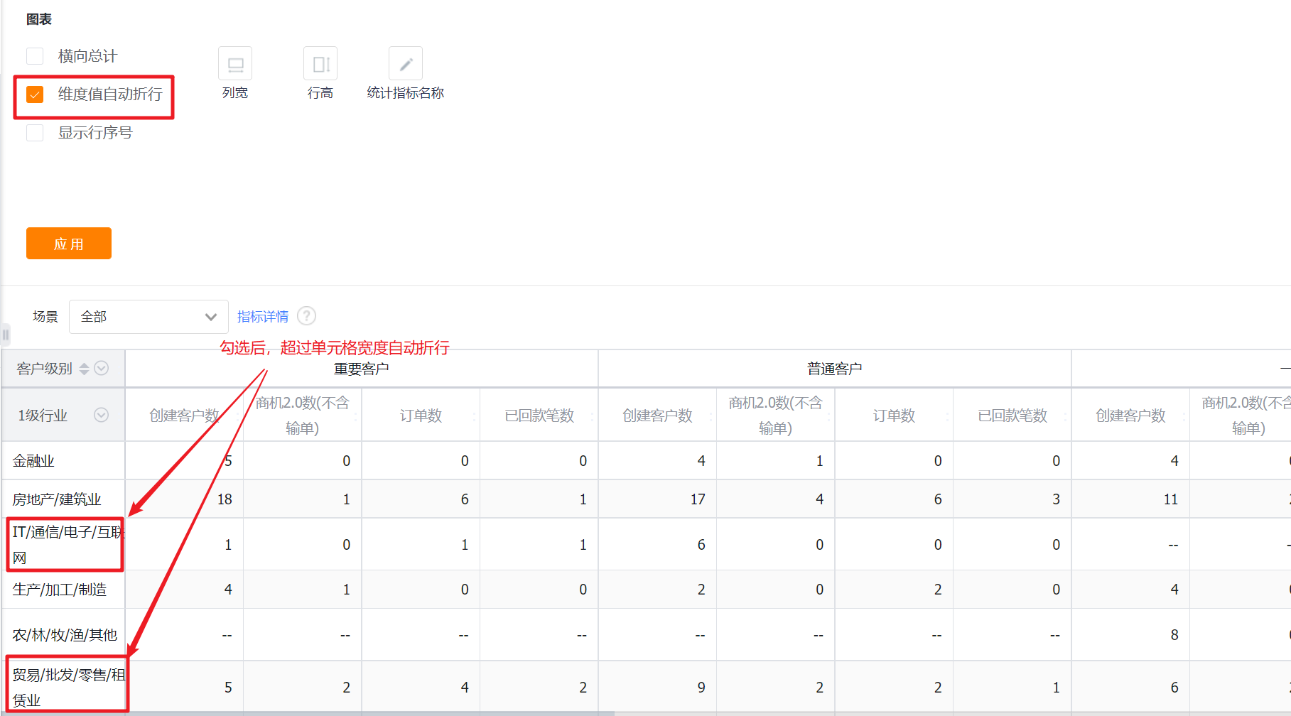
- Dimension value auto-wrapping: It is not checked by default. When the dimension value exceeds the current cell width, it will be hidden, and it will be displayed after hovering the mouse. After checking, when the dimension value exceeds the cell width, it will automatically wrap.
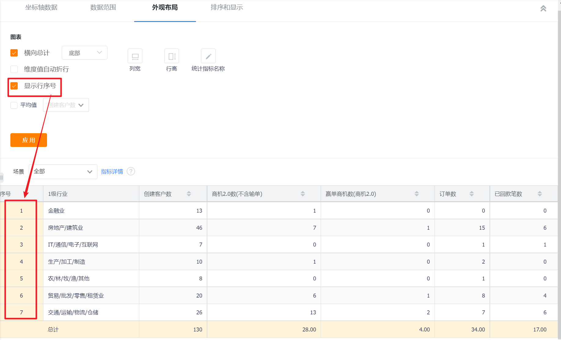
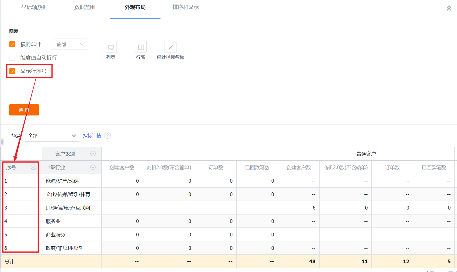
- Display row number: It is not checked by default. After checking, there will be an extra row to display the serial number in front of the dimension.
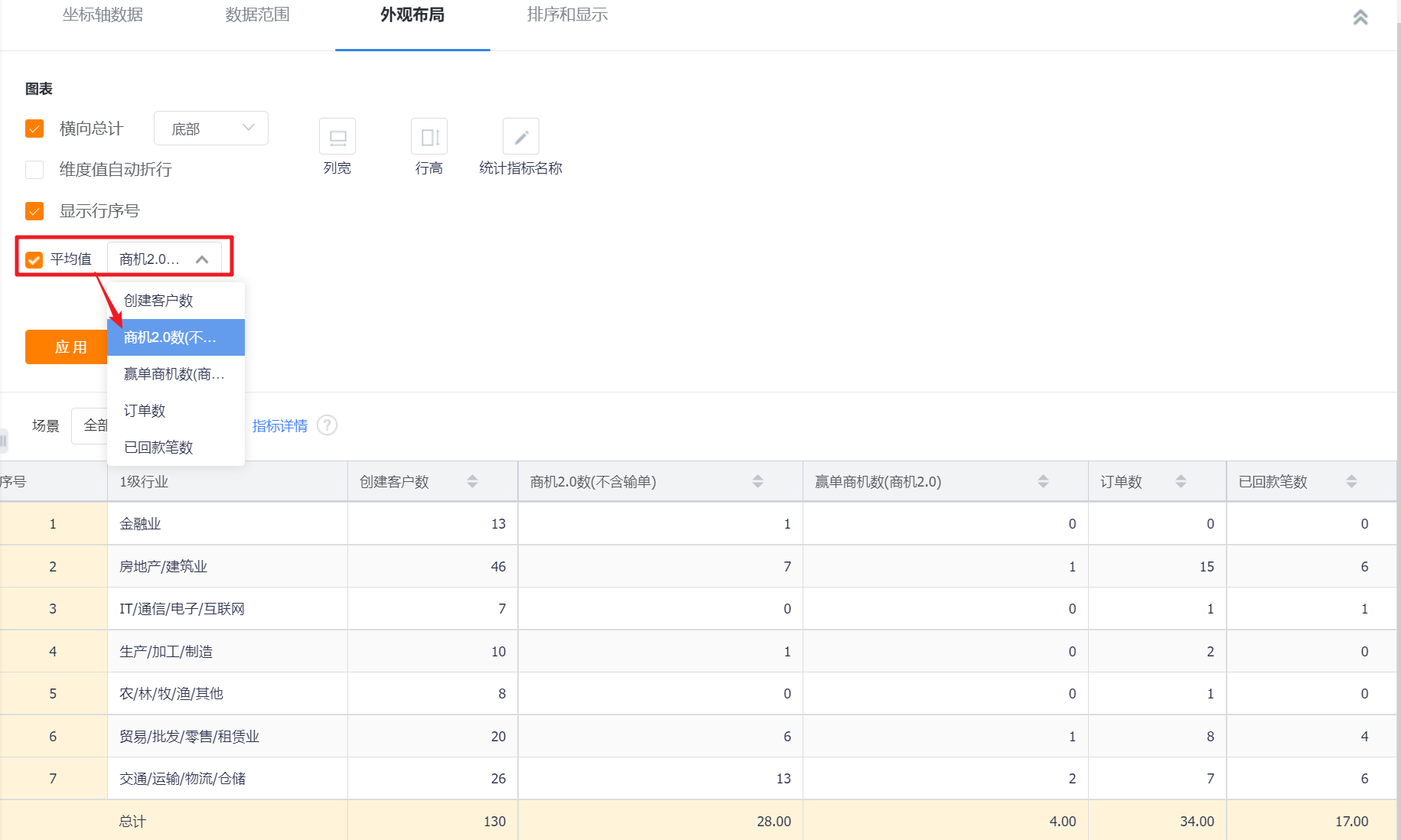
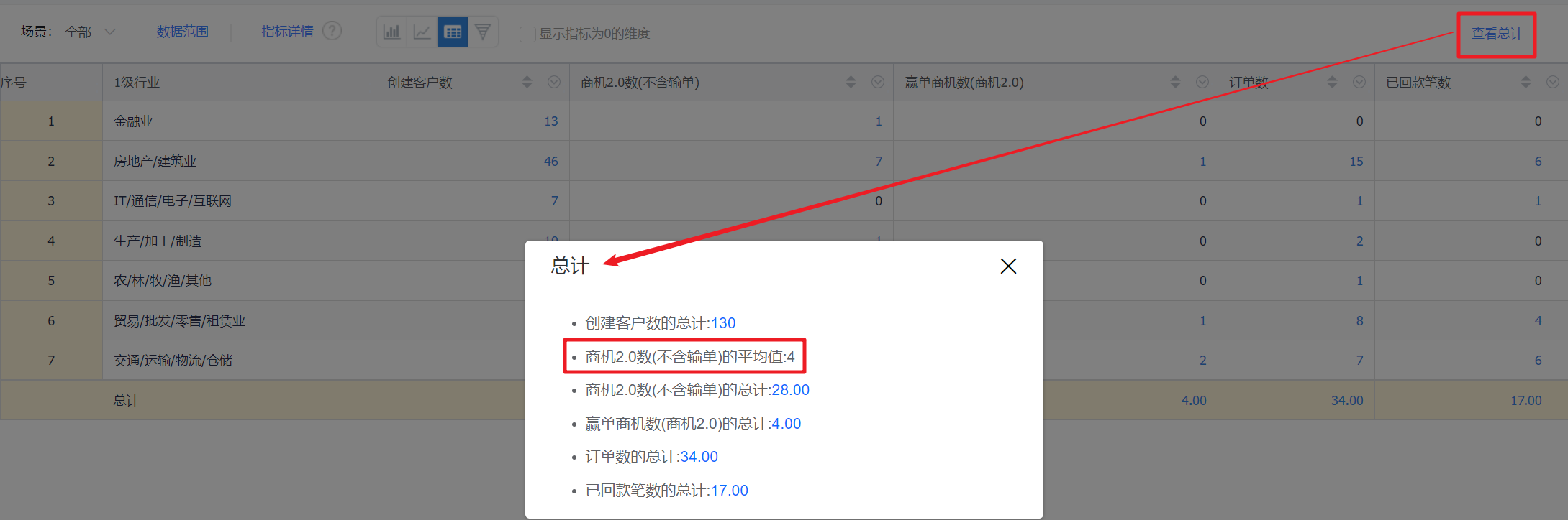
- Average: Unchecked by default. After checking, the average value of the current indicator will be displayed in the preview state and detailed state.
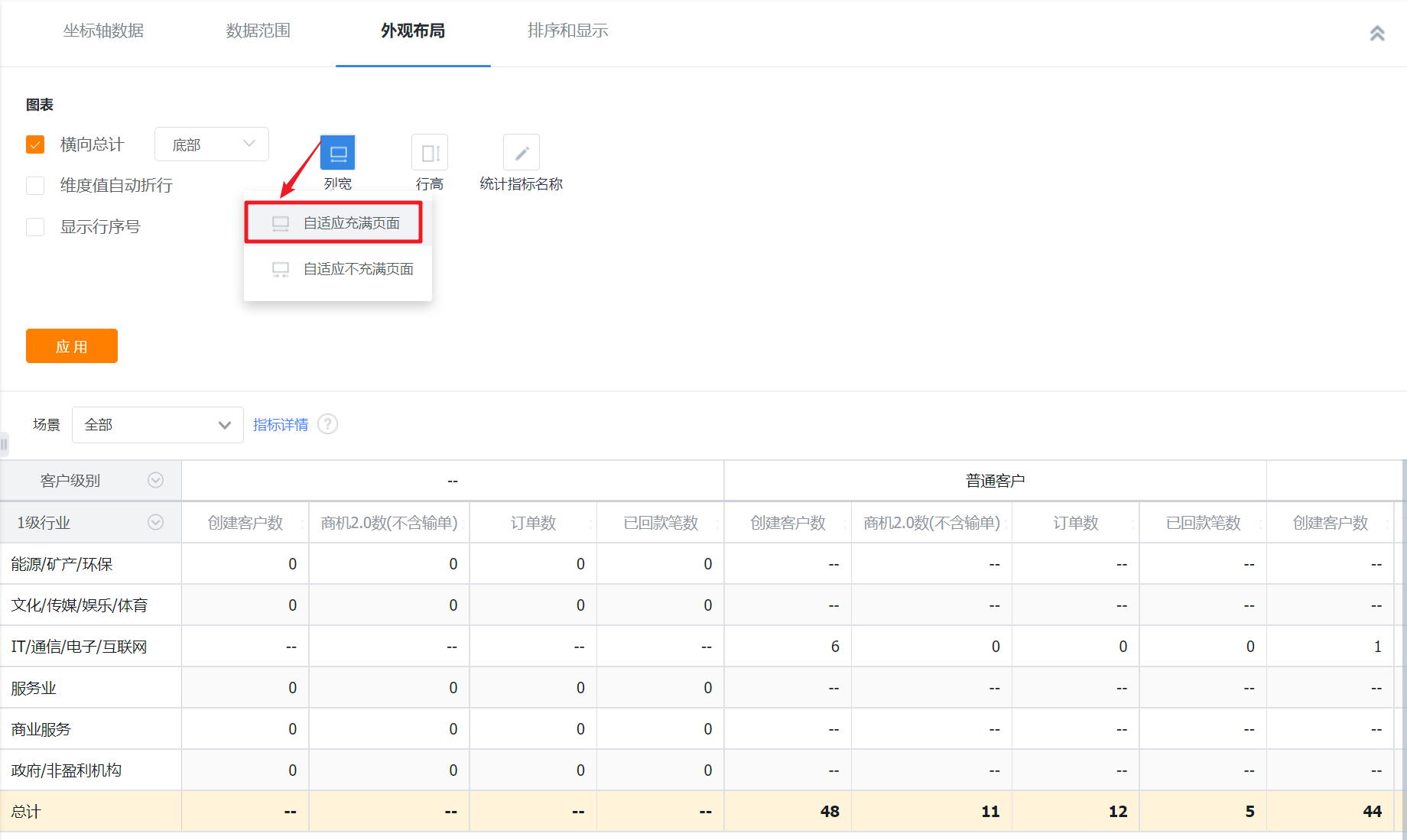
- Column width: the default adaptive full page, can be adjusted to adaptive not full page.
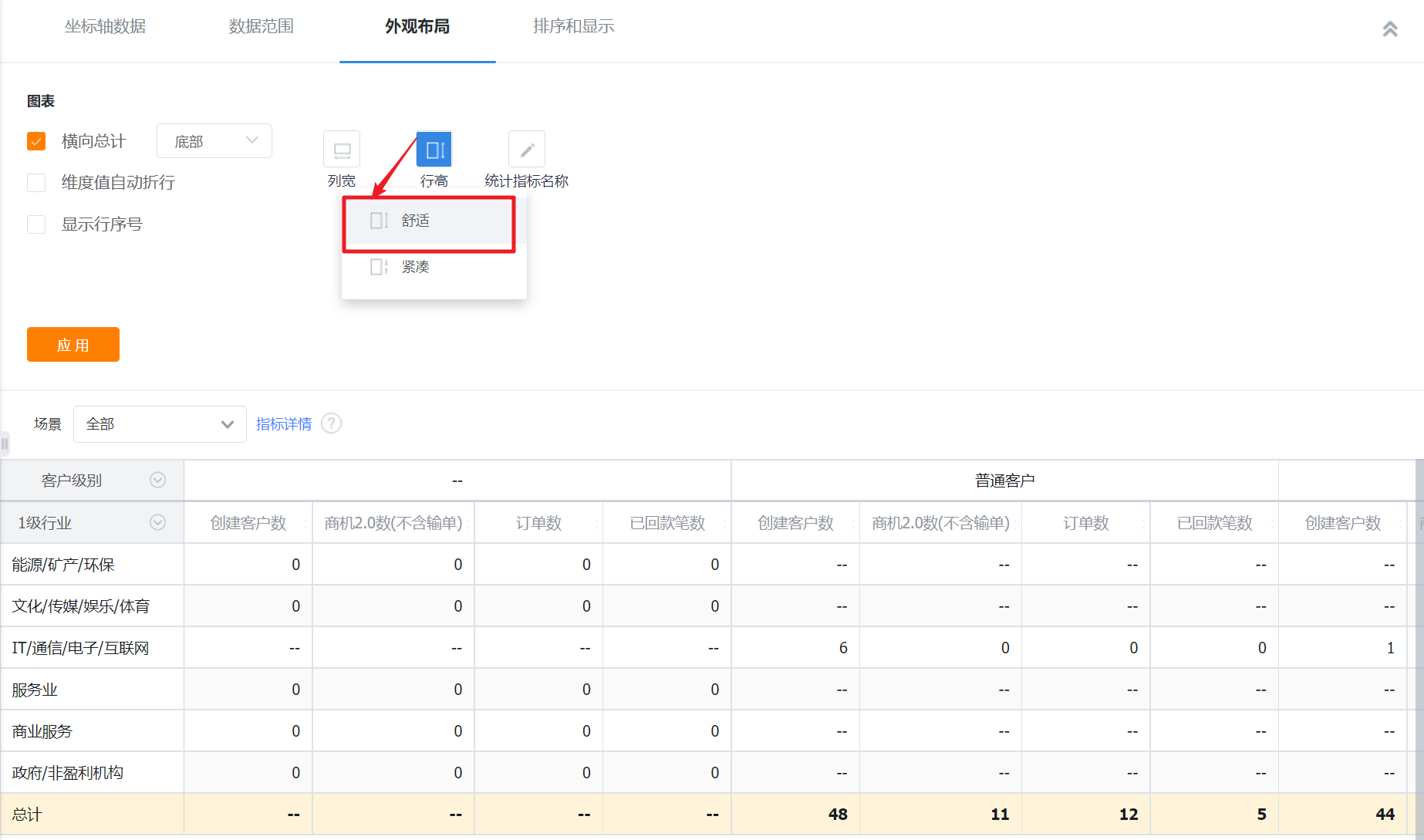
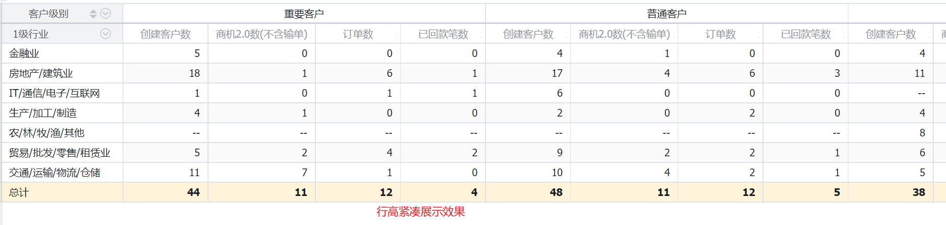
- Row height: comfortable by default, can be adjusted to compact.
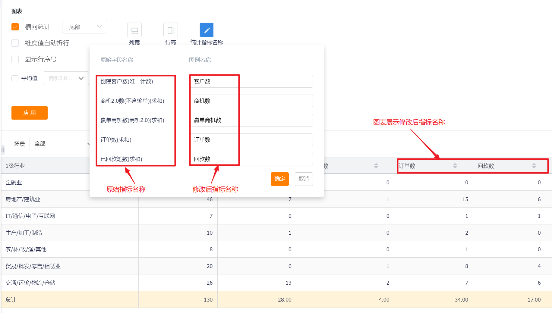
- Statistical indicator name: Displayed by indicator name by default, you can modify the displayed content by yourself.
12.2.3 Sorting and displaying
- Sorting: You can set the sorting fields and sorting methods.
- Sorting field: the optional content is the dimension or the statistical index selected in the current statistical chart;
- Sorting method: no sorting by default, you can choose ascending or descending order.
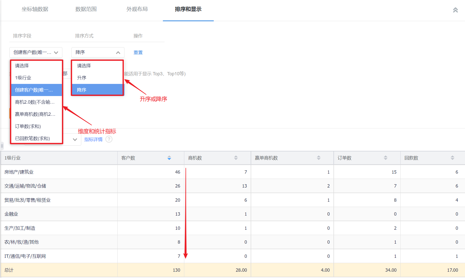
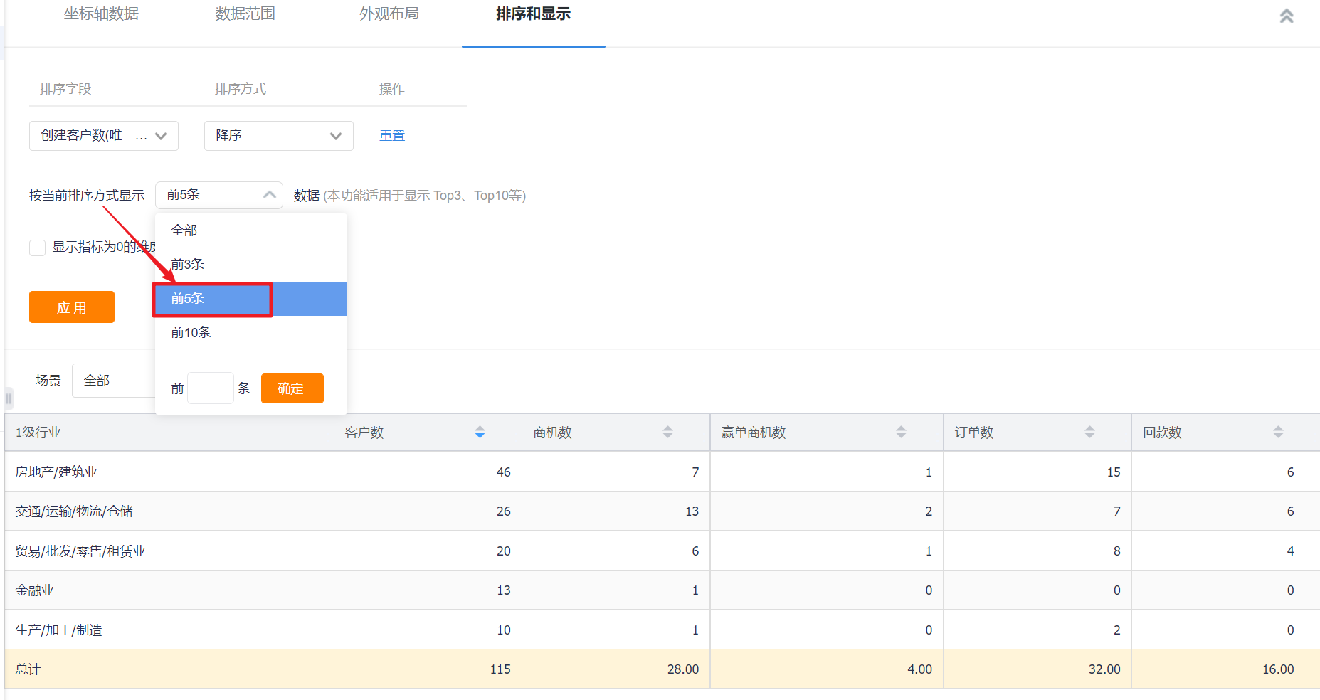
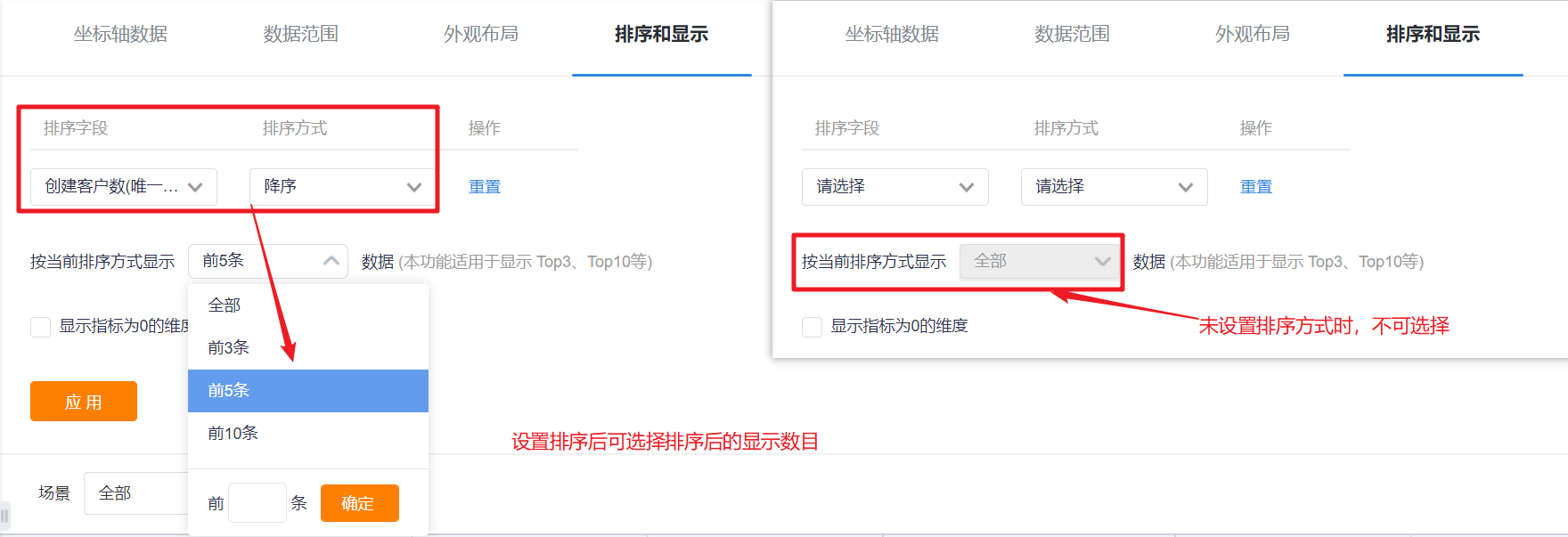
- Display data in the current sorting method: After setting the sorting rules, you can set the number of displayed data according to the current sorting rules. The default is all, and you can switch the first 3, top 5, top 10, or customize the number of data.
- Display dimensions with indicators of 0: unchecked by default, and can be checked to display dimensions with indicators of 0.
Thirteen, cross table
13.1 Application scenarios
The crosstab can display the data of the horizontal and vertical dimensions within a certain data range. For example, a crosstab can compare leads to orders for different customer levels in different industries, etc.
13.2 Chart configuration
13.2.1 Coordinate axis data
- Dimensions: 2 dimensions
- Indicators: 1-30 indicators
13.2.2 Appearance layout
- Horizontal total: Checked by default and displayed at the bottom, can be switched to display at the top, and the total display position cannot be set after unchecking.
- Dimension value auto-wrapping: It is not checked by default. When the dimension value exceeds the current cell width, it will be hidden, and it will be displayed after hovering the mouse. After checking, when the dimension value exceeds the cell width, it will automatically wrap.
- Display row number: It is not checked by default. After checking, there will be an extra row to display the serial number in front of the dimension.
- Column width: the default adaptive full page, can be adjusted to adaptive not full page.
- Row height: comfortable by default, can be adjusted to compact.
- Statistical indicator name: Displayed by indicator name by default, you can modify the displayed content by yourself.
13.2.3 Sorting and displaying
- Sorting: You can set the sorting fields and sorting methods.
- Sorting field: the optional content is the dimension or the statistical index selected in the current statistical chart;
- Sorting method: no sorting by default, you can choose ascending or descending order.
- Display data in the current sorting method: After setting the sorting rules, you can set the number of displayed data according to the current sorting rules. The default is all, and you can switch the first 3, top 5, top 10, or customize the number of data.

- Display dimensions with indicators of 0: unchecked by default, and can be checked to display dimensions with indicators of 0.
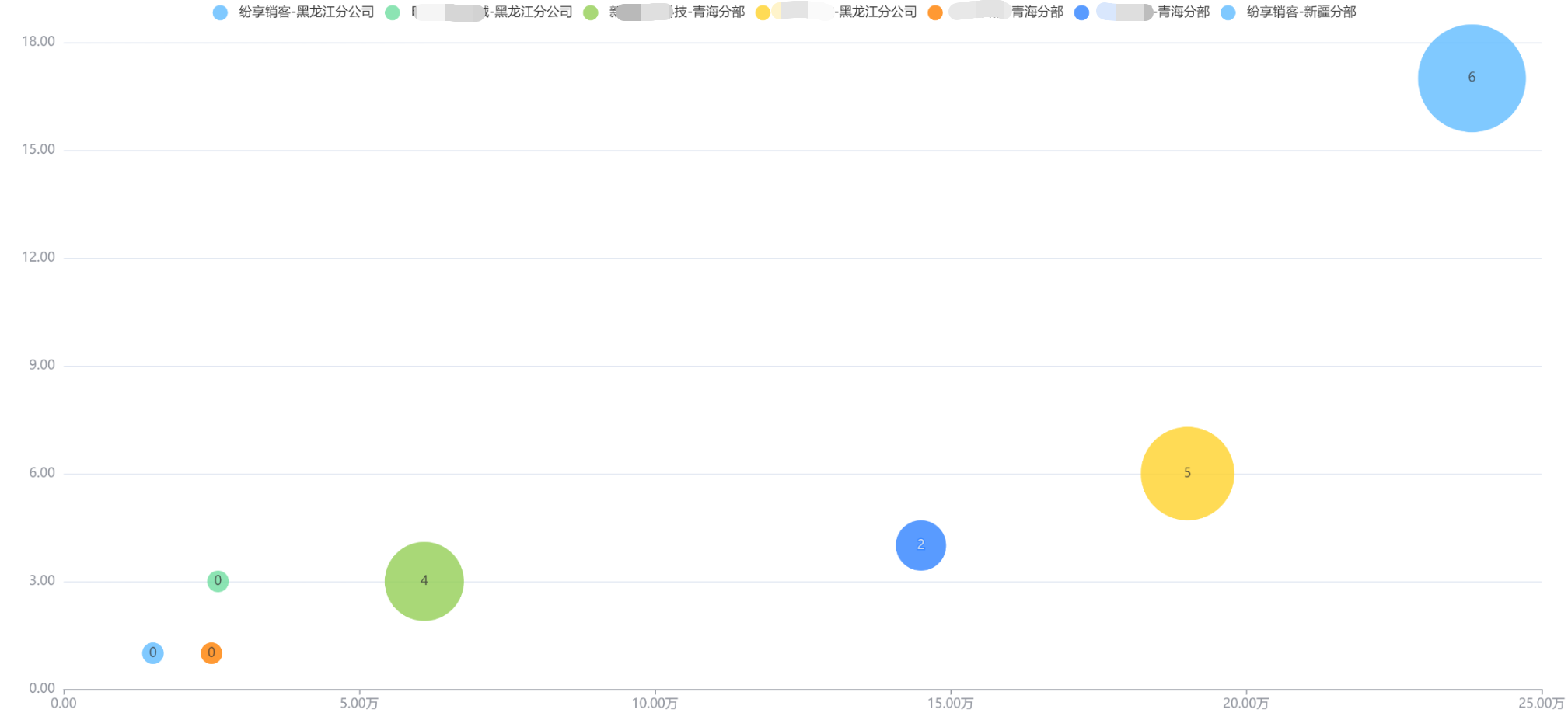
Fourteen, bubble chart
14.1 Application scenarios
The bubble chart can view the data distribution of a certain dimension through the size and position of the bubble. For example, a bubble chart can compare the data distribution of different customers within a certain data range.
14.2 Chart configuration
14.2.1 Coordinate axis data
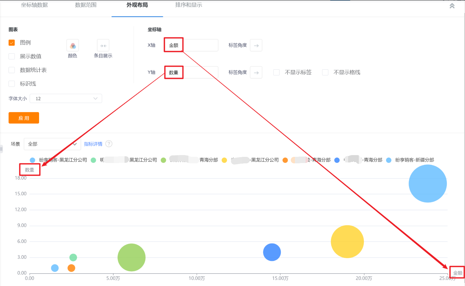
- Bubble position: 2 indicators
- Bubble size: 1 indicator
- Bubble color: 0-1 dimension
14.2.2 Appearance layout
- Display legend: You can check whether to display the legend, and it is checked by default
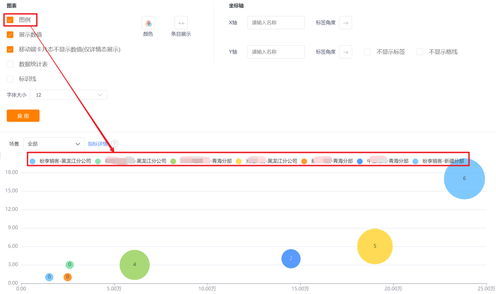
- Display value: You can check whether to display the value, and it is checked by default.
- The card state of the mobile terminal does not display the value (only the detail state display): it will only be displayed when [Display value] is checked, and it is checked by default when it is displayed.

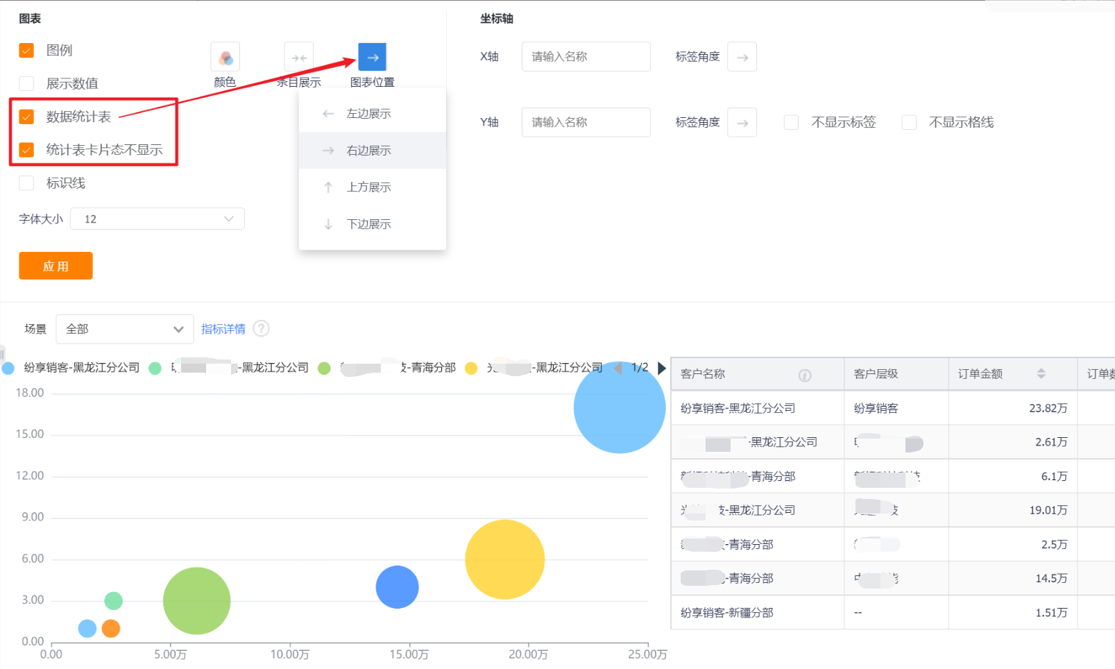
- Data statistics table: You can set whether to display the data statistics table, and it will not be displayed by default.
- Statistical table card status is not displayed: This configuration is displayed after the display data statistical table is checked, which is checked by default;
- Chart position: After checking the display data statistics table, this configuration is displayed. By default, it occupies the right side of the chart, and can be switched to the left, top or bottom.
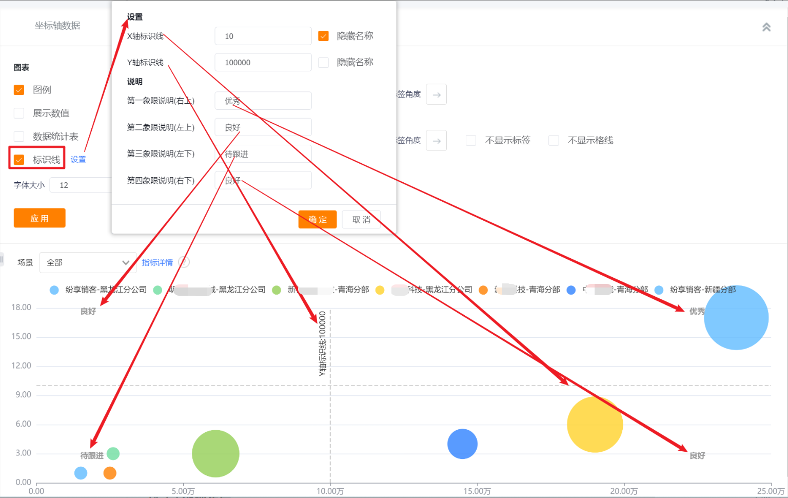
- Identification line: You can set the identification line of the chart, which is not checked by default.
- set up:
- X-axis and Y-axis identification line: set the value of the identification line, and choose whether to hide the name
- Explanation: Divide the entire chart area into 4 parts according to the marking line above, and you can set an explanation for each part.
- set up:
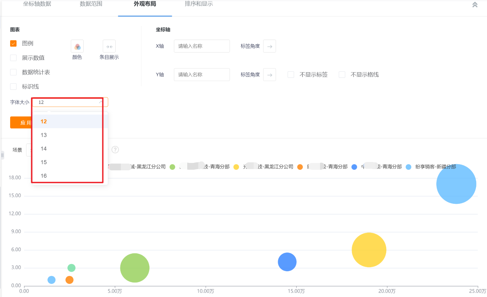
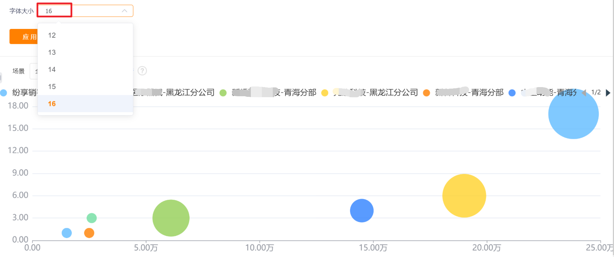
- Font size: The default is 12, which can be switched to 13, 14, 15, 16 for display.
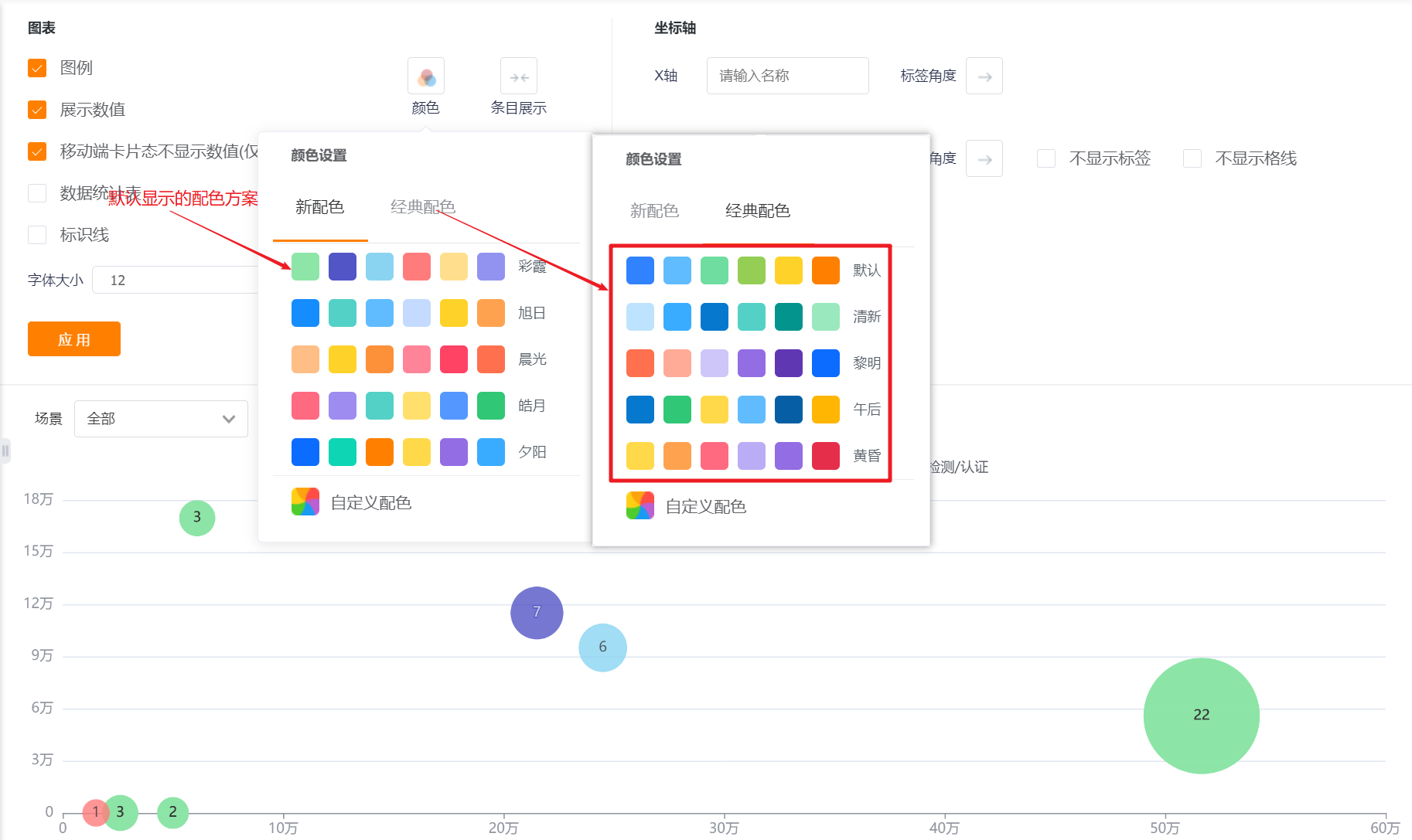
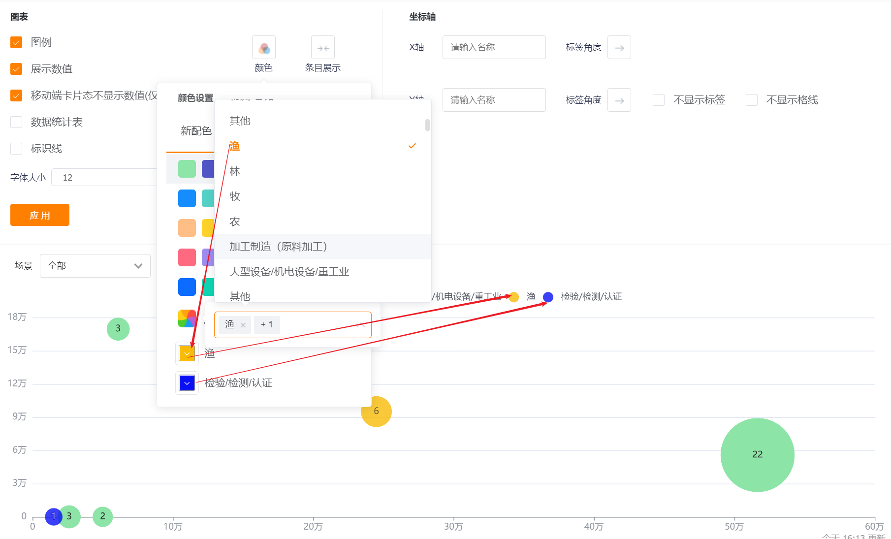
- Color: The system supports two types of color schemes: new color scheme and classic color scheme. The first set under the new color scheme is displayed by default, and the setting of barrier-free patterns is not supported
- New color matching: support custom color matching based on a certain color scheme
- Classic color matching: custom color matching is not supported
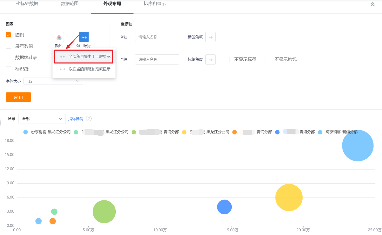
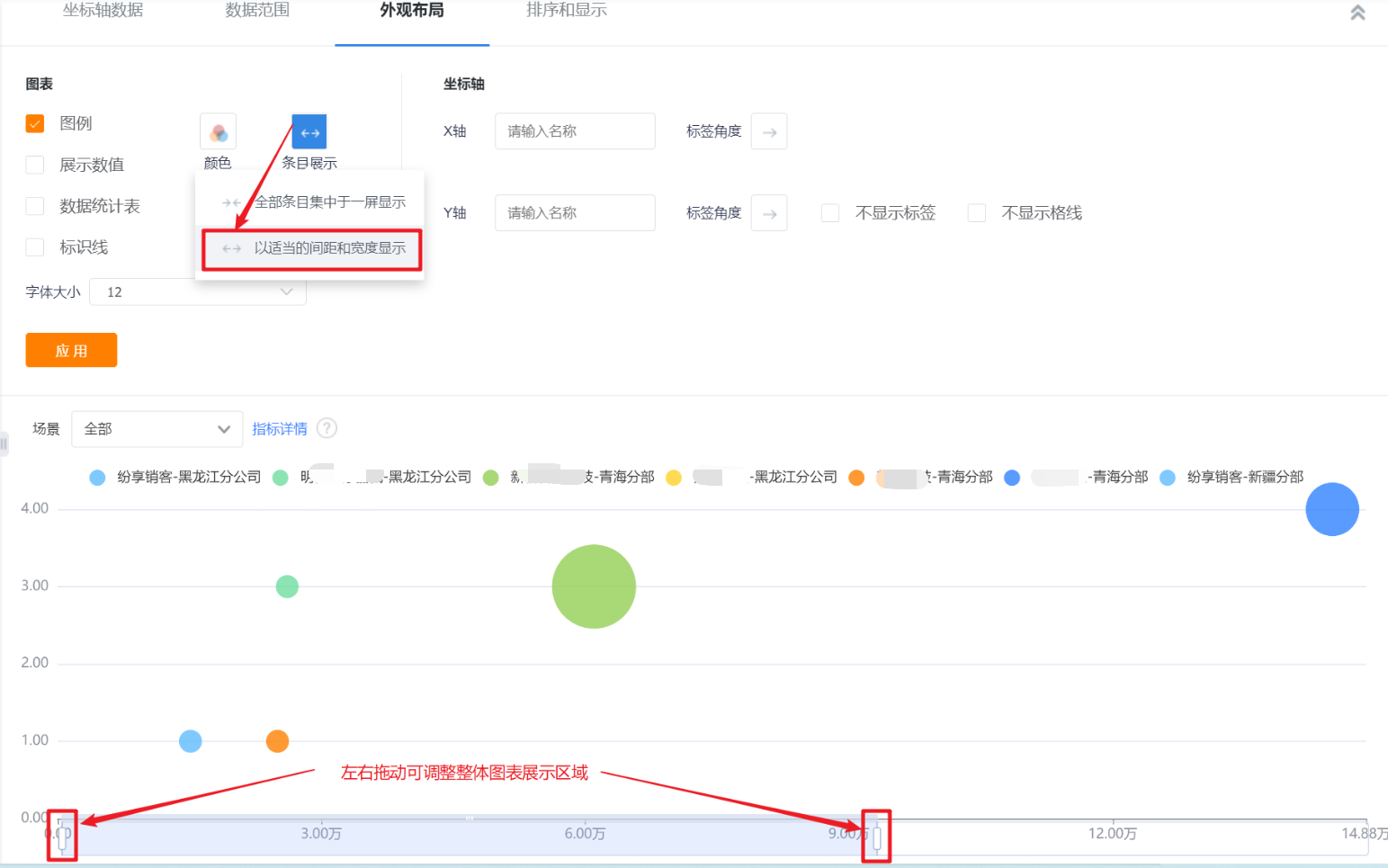
- Item display: Set the data area displayed in the current area. By default, all items are displayed on one screen, which can be switched to display with appropriate spacing and width.
- Coordinate axis-X axis/Y axis: You can set the display name of X axis/Y axis, if not set, it will not be displayed.
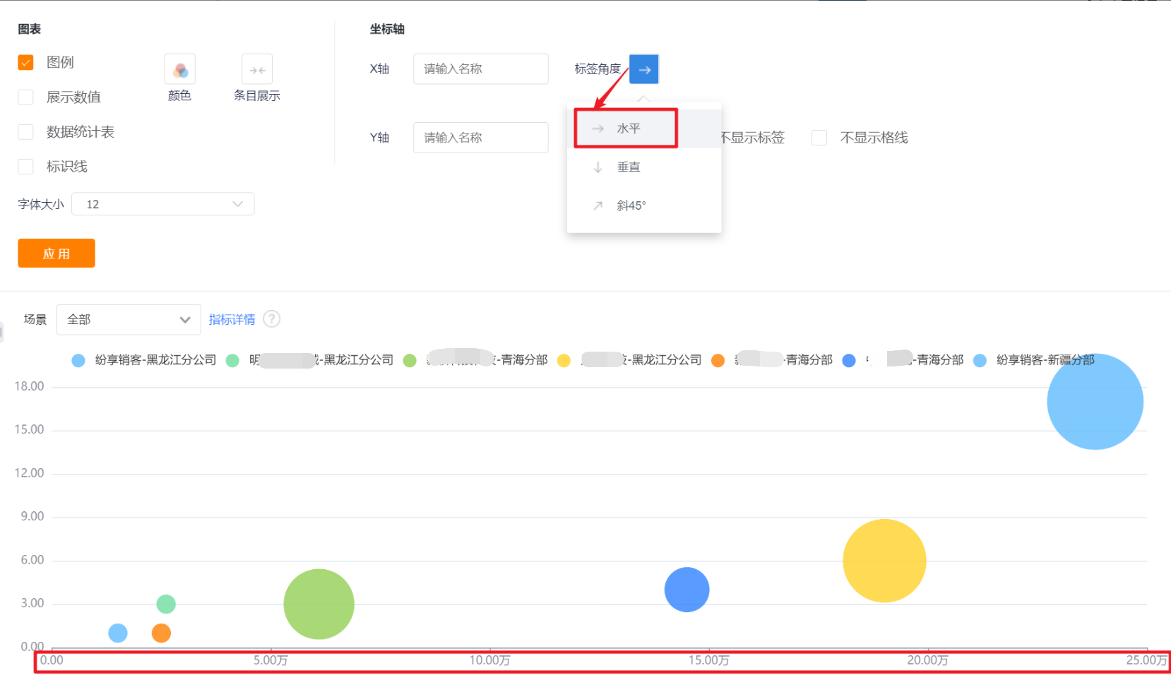
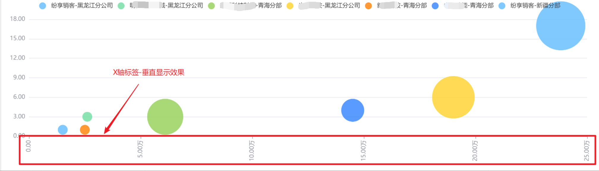
- Coordinate axis-label angle: default horizontal display, can be switched to vertical or oblique 45°; (X-axis and Y-axis are set separately, the following figure takes the X-axis as an example, and the Y-axis is the same).

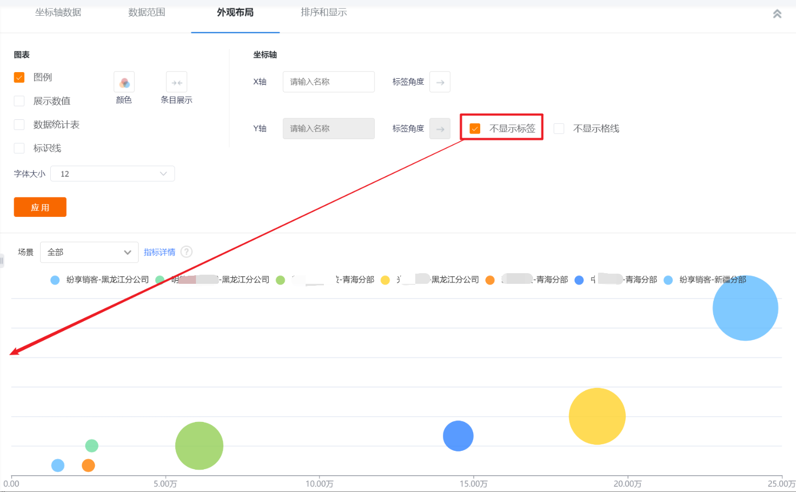
- Do not display labels: The labels are displayed by default. After checking, the Y-axis labels cannot be displayed, and the Y-axis name and label angle cannot be set.
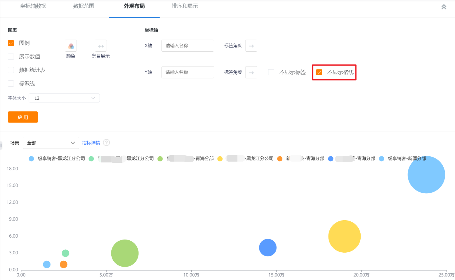
- Do not display the grid line: the grid line is displayed by default, and the Y-axis grid line can not be displayed after checking it.
14.2.3 Sorting and displaying
- Bubble charts do not support sorting.