
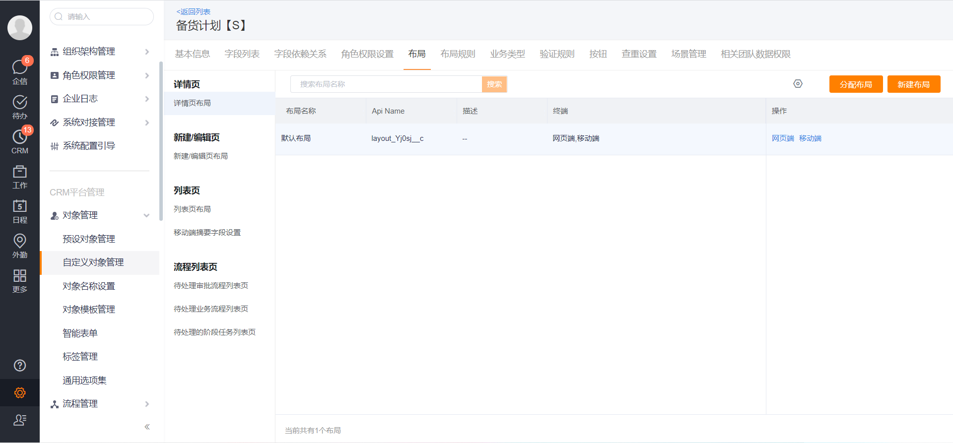
1. Layout Overview
- Configuration Entry: Management Background—Custom Object Management—Object Details—Layout
- Support custom configuration for details page, new/edit page, list page, process list page layout, style and field display, etc.
- Support the management of layouts, you can add, delete, and modify any layout to meet business demands
- Support that different roles and record types can be assigned to view different layouts
2. Details Page Layout
2.1 Details Page Layout—PC
- The PC layout configuration interface of the details page is divided into three parts: left, middle and right
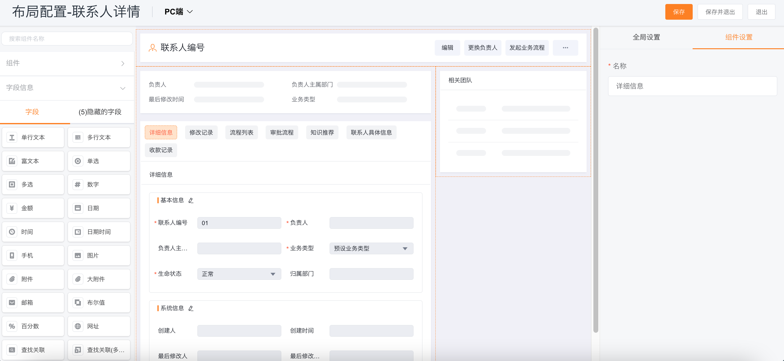
1. Left Side of Interface:
(1) The left side of the layout configuration interface mainly contains two parts, namely components and field information.
-
Supported components are the following types:
-
Common Components: common components preset by the platform, and components that exist in every custom object
- Title & Buttons: Configurable whether to display labels and buttons on the details page and the number of exposed buttons
- Summary Information: display the key information in the details page, which fields can be configured to be displayed
- It also includes related teams, follow-up dynamics, detailed information, modification records, process list, approval list, embedded pages, and chart components are settings
-
Business Components: components that contain related objects, slave objects, and SFA presets
- Sub-object Component: the independent configuration is not enabled, and the configuration of sub-object list page is inherited.
-
Container: tab container, grid container
-
-
Add and show hidden fields below
- Field information includes 32 supported field types and 3 scene-based field groups. For details, please refer to: Fields and Field Dependencies
2. The middle side is the preview interface of the page:
(1) You can directly drag components to the page for setting
(2) Hide and display of fields can be set
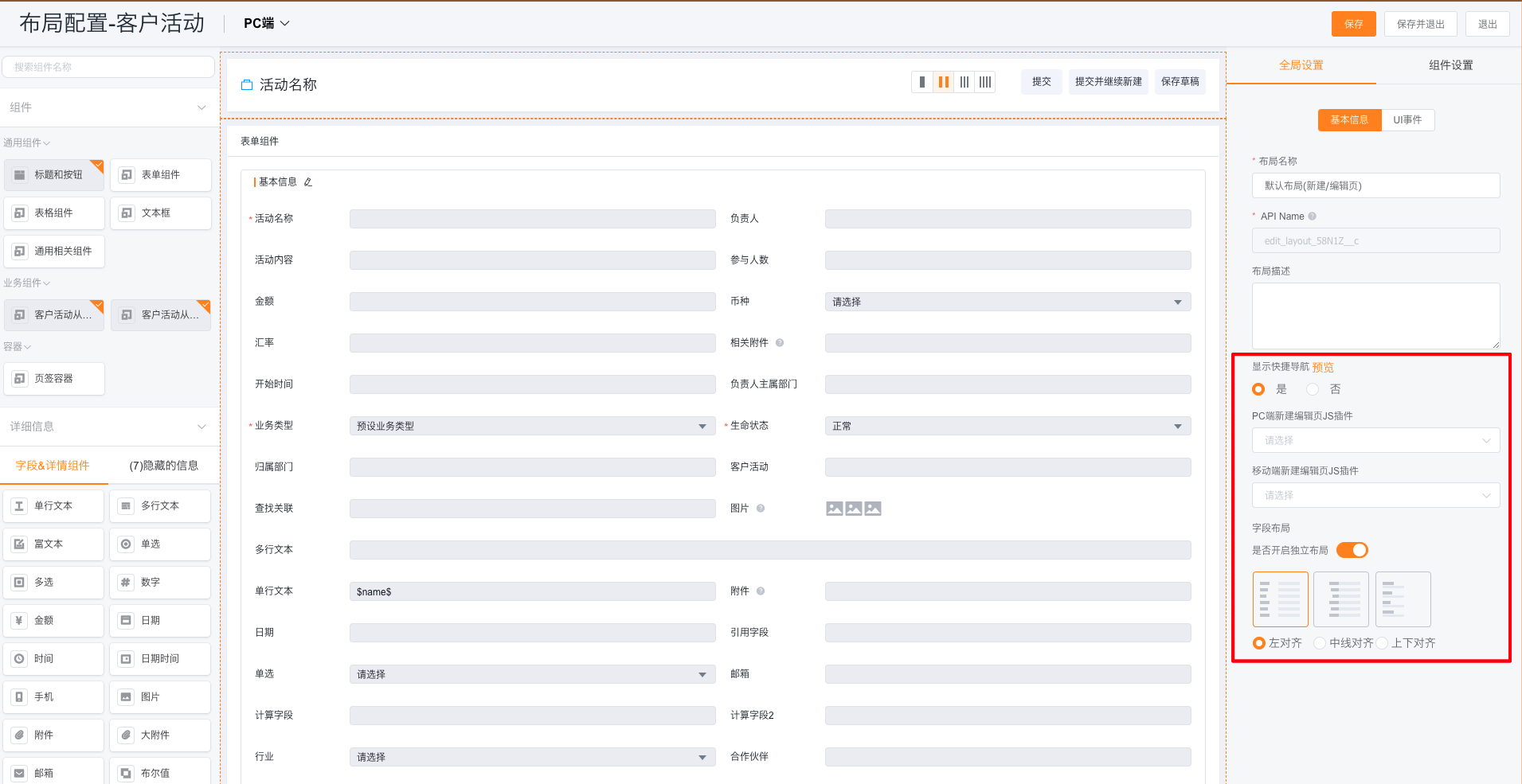
3. Right Side of Interface:
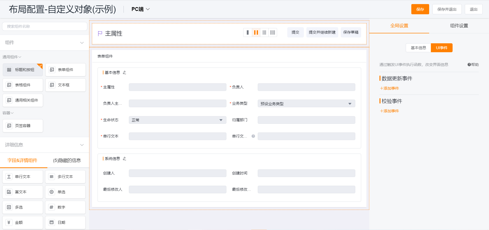
Tips: The right side of the layout configuration interface mainly includes two parts: global settings and component settings.
(1) Global settings include two parts: basic information settings and UI event settings.
- Basic Information Settings:
- Layout Name: You can customize the layout name.
- API Name: The system has automatically defaulted and does not support modification.
- Layout Description: You can customize the layout description of this details page layout.
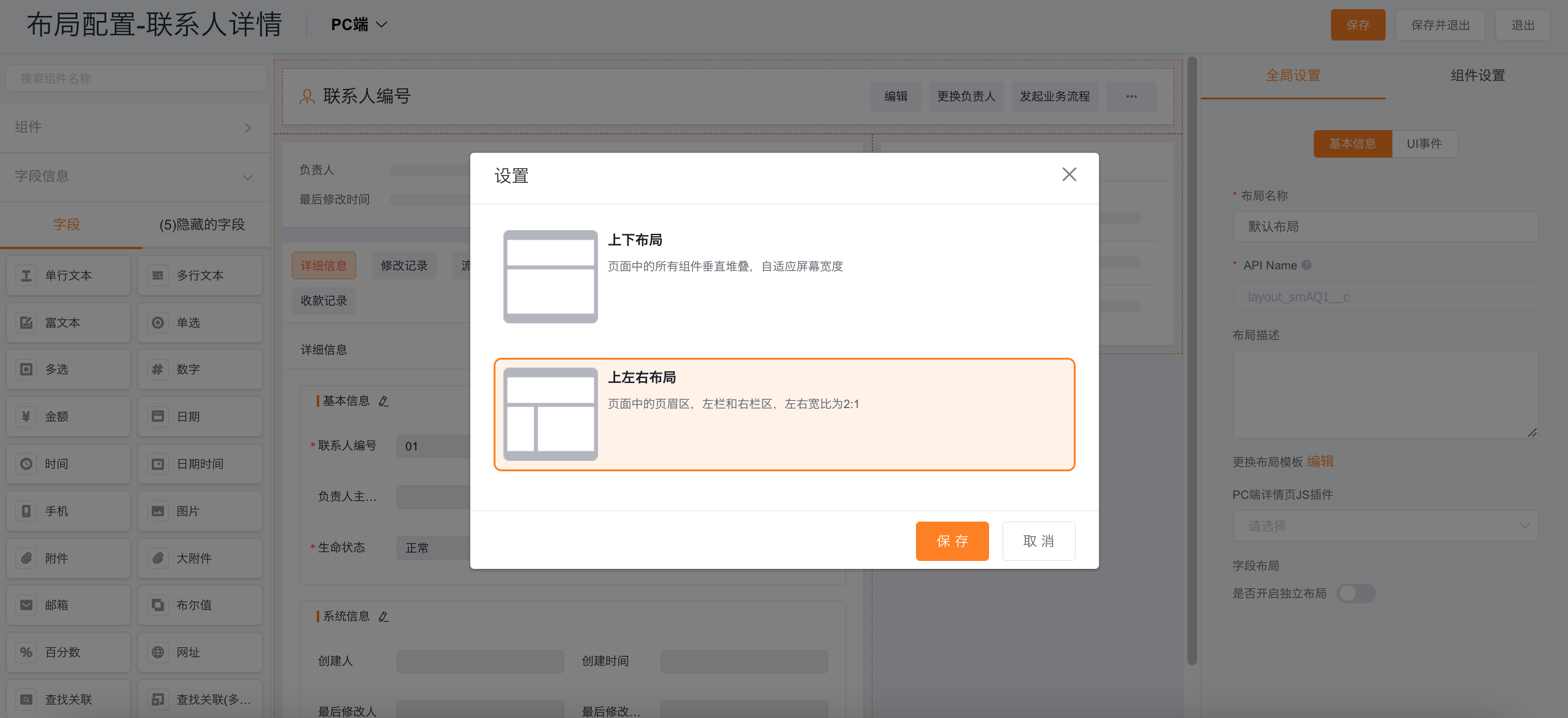
- Change Layout Template: On the edit page, it supports top-bottom layout and top-left layout.
- JS Plug-in for PC Details Page:
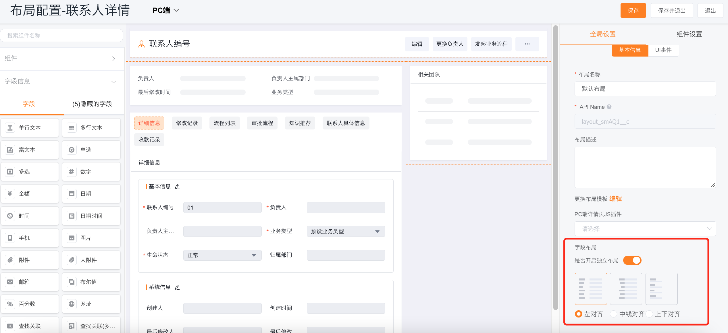
- Field Layout: It can support the independent layout of open fields, mainly divided into three ways: left alignment, center line alignment and - top and bottom alignment.
-
UI Event Settings: Execute functions by triggering UI events to change interface information
tips: 1. The execution result of the UI event is only applied to the new/edit page, and the actual effect depends on whether it is saved or not 2. All custom objects support UI events, and some preset objects support (sales leads, customers, orders/order products, business opportunities 2.0/business opportunities 2.0 details) 3. Only the flagship version and group version support this ability- Data Update Event
- Field Event: On the new/edit page, when a field is modified (value changes and out of focus), trigger a custom function to update the data of main or sub-object
- Actual Scene: When creating a new order, when the account is selected, the account's address can be directly synchronized to the delivery address field of the order
- Configuration Method: UI event - add data update event - classify selection field event
- Sub-object Event: create/edit pages at the same time in main and sub-object, when creating/editing/deleting a sub-object, trigger a custom function to update the data of the main object/sub-object (provided that the object has a sub-object, only then will there be an entry from the object event)
- Actual Scene: For each new order product detail, assign a value to the discount amount field of the product detail according to the account level
-** Configuration Method**: UI event - Add data update event - Classification selection from object event, trigger condition can be selected to add details/edit details/delete details - Page Loading Event: In the new/edit page, when the page loads, trigger a custom function to update the data of main object or sub-object
- Actual Scene: When creating an electronic signature, automatically create the signer's slave data based on the business data associated with the electronic signature
- Configuration Method: UI event - add data update event - category selection page load event
- Data Update Event

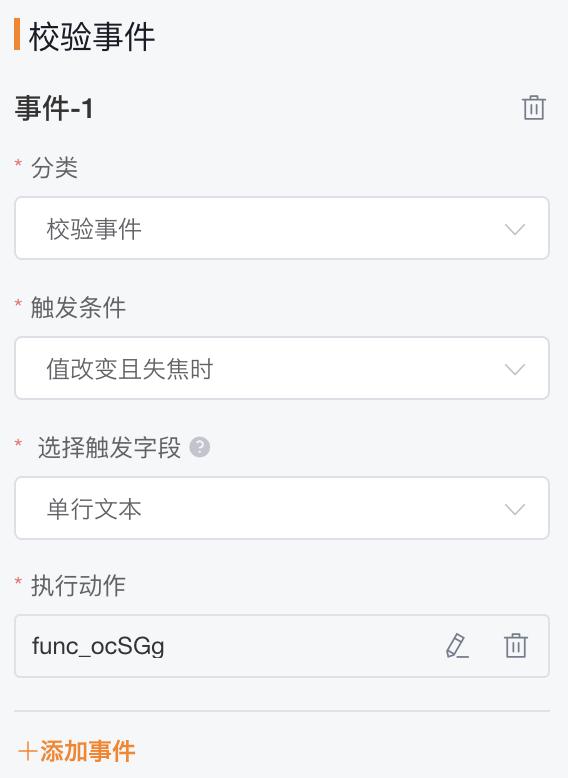
- Verification Event:
- New/Edit Page: When a field is modified (value changes and out of focus), trigger a custom function to verify whether the field value meets a specific condition
- Actual Scene: When the mobile number/email format is wrong, the front-end prompt can be given immediately
- Configuration Method: UI event — add verification event
(2) Component Settings
- Set the basic information of fields and components, as well as display and hide conditions
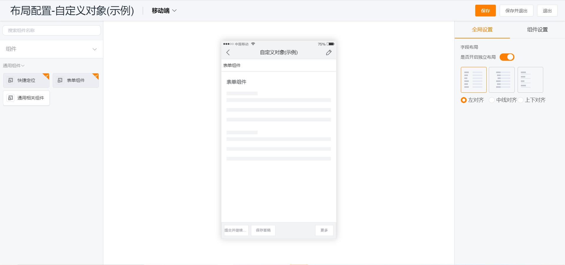
2.2 Details Page Layout—Mobile
Tips: The layout of the details page on the mobile terminal can follow the layout of the PC terminal, or configure the layout independently
- Following the PC layout will synchronize the setting of the detail page layout summary field and related information on the web
- The details page on the mobile terminal supports separate layout configuration
- Navigation Container: Click on the tab to configure the tab, sort the tabs, and add a custom tab; click on the component under the navigation to configure the properties of the component
- Notes: The independent configuration can be enabled from the object, and the independent configuration is not enabled, which is extended to the Web component setting
- Field Layout: In [Global Settings], you can configure the independent layout of the mobile terminal. If it is not enabled, it will be extended to the web settings
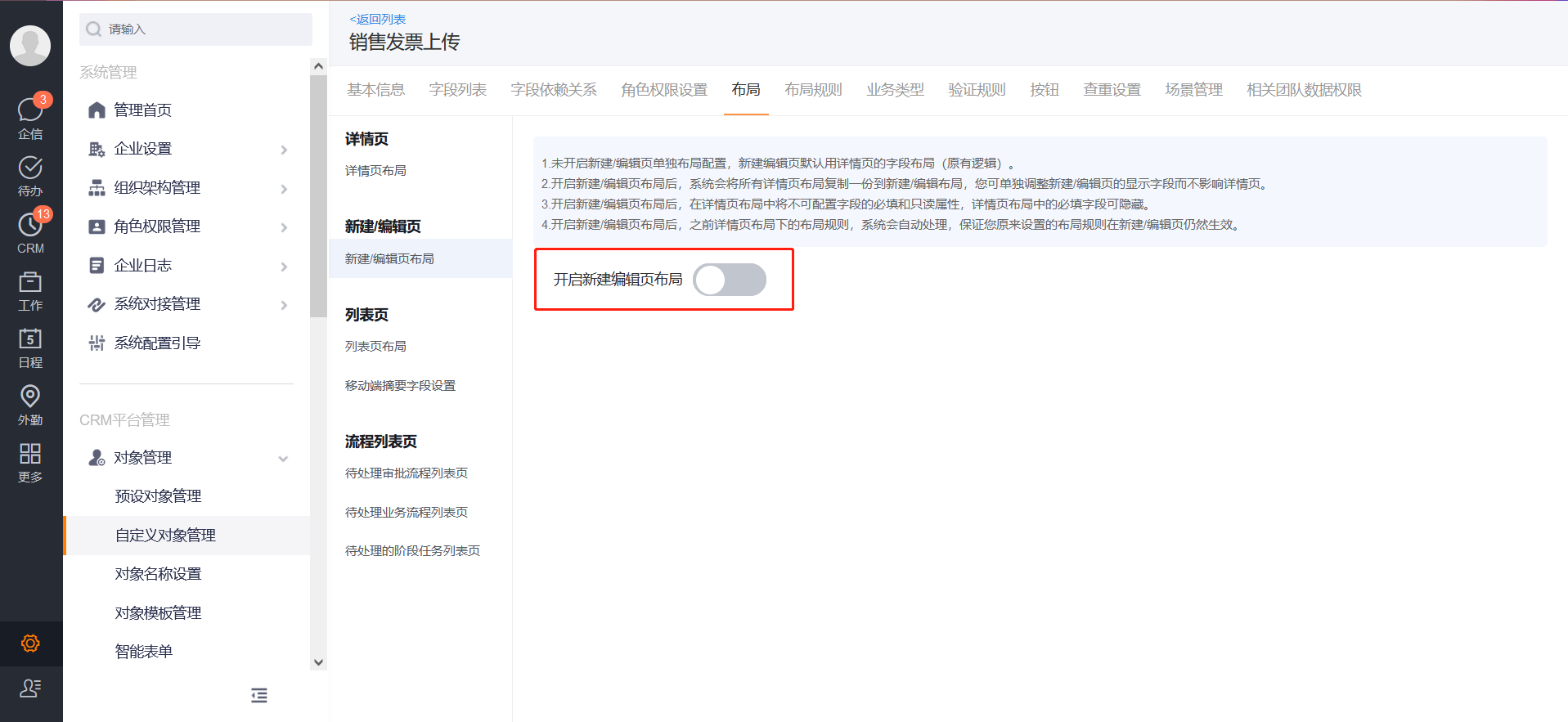
2. New/Edit Page Layout
1. The new/edit page layout is not enabled by default, and it will not be recalled after it is enabled
2. The designer structure is the same as the details page
- Global Settings of New/Edit Layout:
- Support whether to display shortcut navigation
- Selection of JS Plug-ins for PC and mobile
- Field Layout: left, middle, right
- The form component in the new/edit page layout supports configuring default columns settings
- Can be set to 1 column, 2 columns, 3 columns, 4 columns

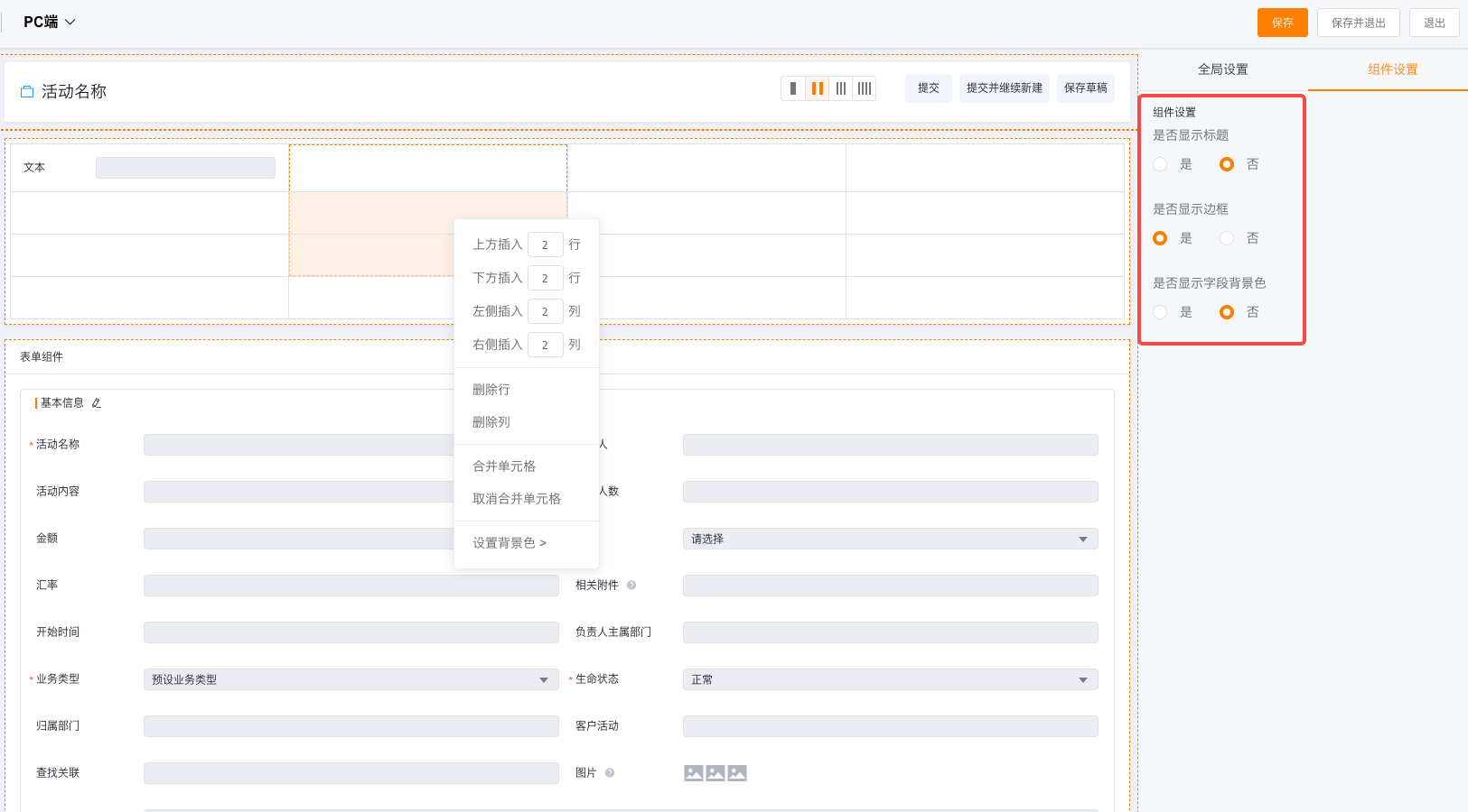
- Table components are supported in the new/edit page layout:
- Drag the table component to set the number of rows and columns of the table component
- The table component supports setting whether to display the title, whether to display the border, whether to display the background color of the field
- The table component can merge cells and unmerge cells
- The table component can set the cell background color
3. List Page Layout
1. List Page Layout - PC
- The PC layout configuration interface of the list page is divided into three parts: left, middle and right
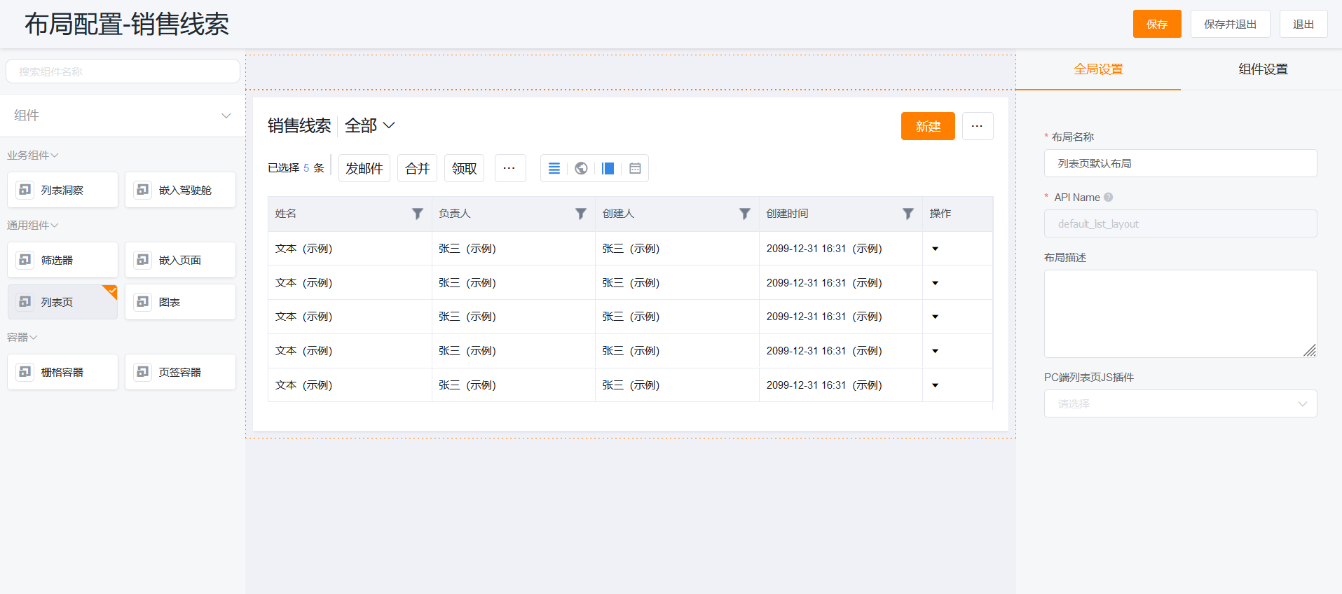
- The left side is the component settings, the supported components are the following types:
- Common Components: list pages, embedded pages, charts
- Container: tab container, grid container
- Custom Components: components set by yourself
- The middle side is the page preview interface
- Some common settings of the list page can be set on the right
-
List Page Layout: support setting the display of scenes, view settings, quick filters, buttons, batch operation buttons, shortcut buttons, and summary fields
Tips: The list page experience is a very important experience, be sure to configure best practices from a business perspective
-
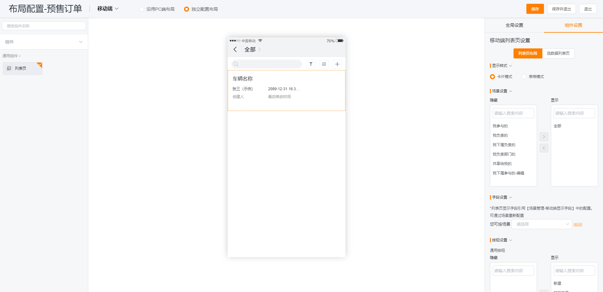
2. List Page Layout - Mobile
- Click the data in the list in the middle preview to configure the settings of the list page
- List Page Layout: support display settings, scene settings, field settings, quick filter settings, button settings
- You can follow up the business needs and select the display style: card or form
- The display of the selected data list page can be independently configured, and the display style and button settings can be configured
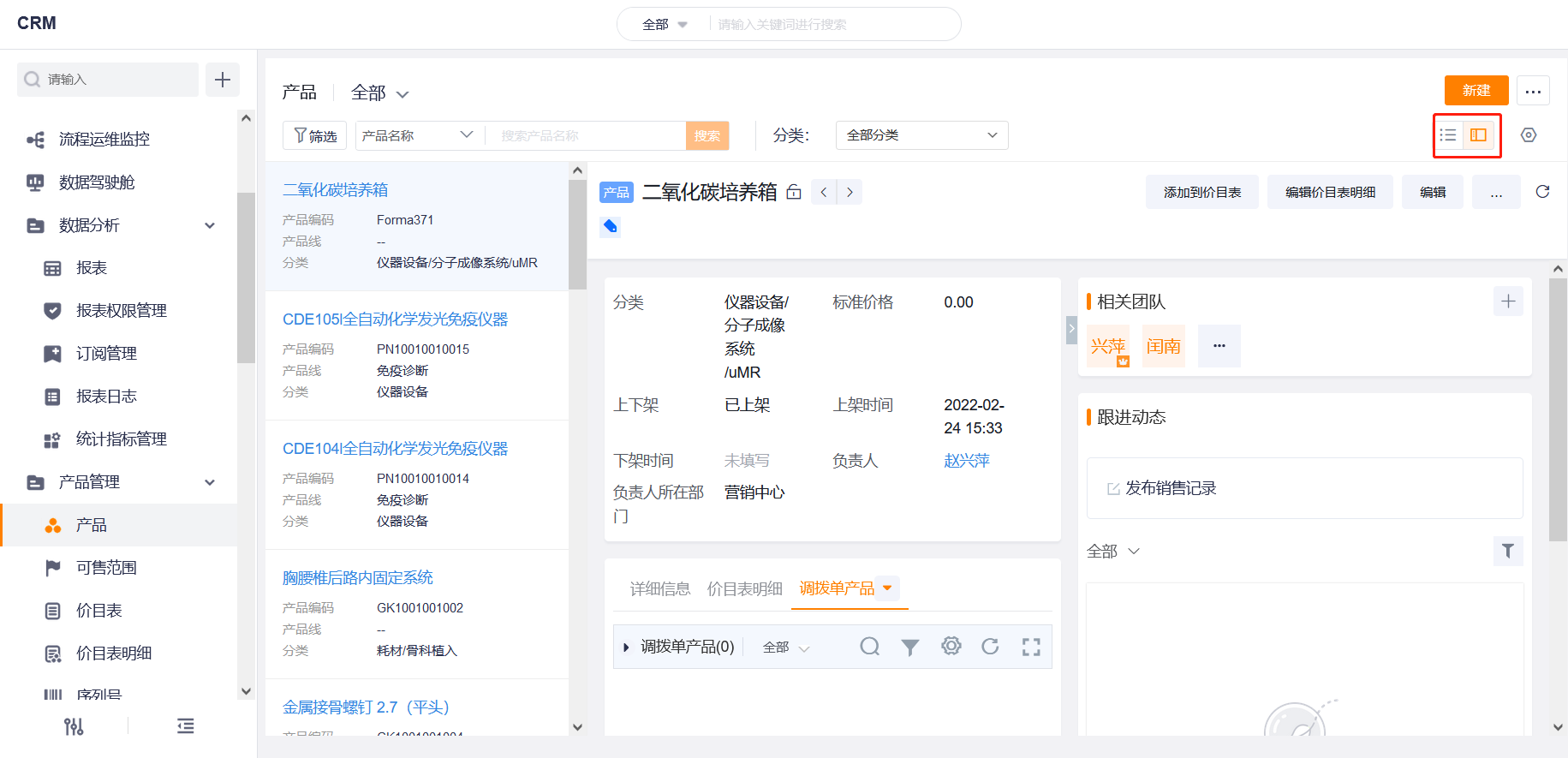
3. Support Multi-view Display of List Page
- Split View
- Switch to the split view, and the original table becomes a left-right structure, with the list on the left and the data details page on the right;
- The list on the left is displayed as a card, only the first three fields in the column settings are displayed, and quick filtering is not supported in the split view mode;
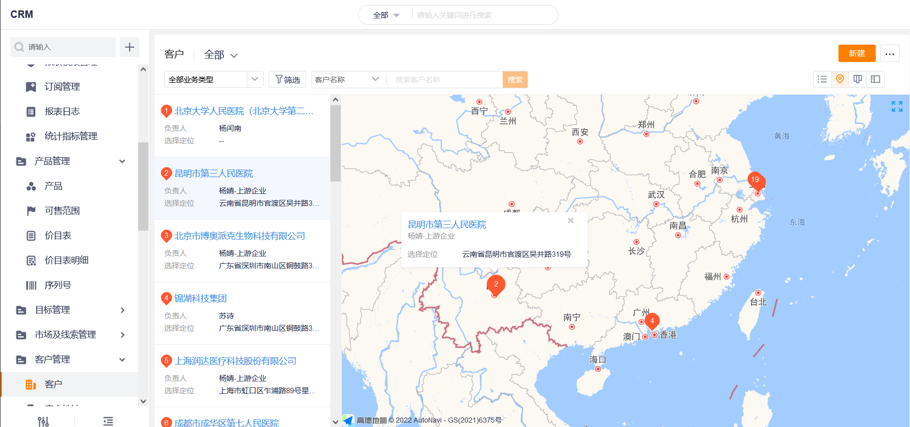
- Support Map View
- Fields with positioning type can switch the map view on the list page (only on the web page)
- When there are multiple targeting fields, the selection can be customized
- Supports custom configuration of fields in the front-end map point display bubble
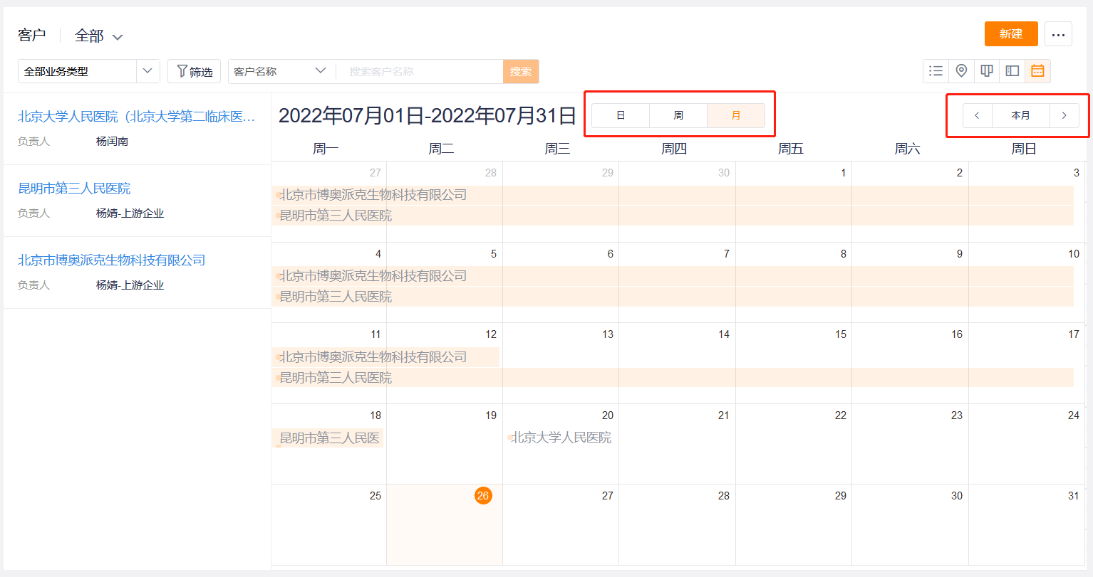
- Support Calendar View
- Scene/Value: Enterprises can choose objects by themselves, and display them in calendar mode according to the date and time fields in the objects. Arrange and manage business data from the time dimension, making schedule planning easier and more efficient;
- Function: Display Mode: Calendar Only, Calendar+List
- Select Time Dimension: the selected field must be a field-level required field of the date and time type (not required in the layout)**
- Summary field when configuring calendar display
- The front desk calendar supports viewing by day, week, and month, and supports general functions such as scenes, filters, and searches
- List Page Layout:
3. Summary Layout on Mobile Terminal
1. Applicable Scenes
- Applicable to the mobile list page display field configuration
2. Use Skills
- The scene configuration mobile display field follows the summary layout of the mobile terminal by default
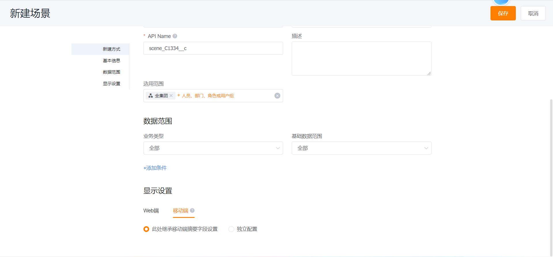
- The setting field reference in the list page layout of the mobile terminal is the mobile terminal configuration in the scene, and if the field display configuration of the mobile terminal in the scene is not modified, the summary layout of the mobile terminal directly controls the display and hiding of the list page
- The summary layout of the mobile terminal supports multiple business types, and different summary layouts can be allocated through different business types
- Summary: The list page supports custom display of different summary fields according to different scenarios and business types